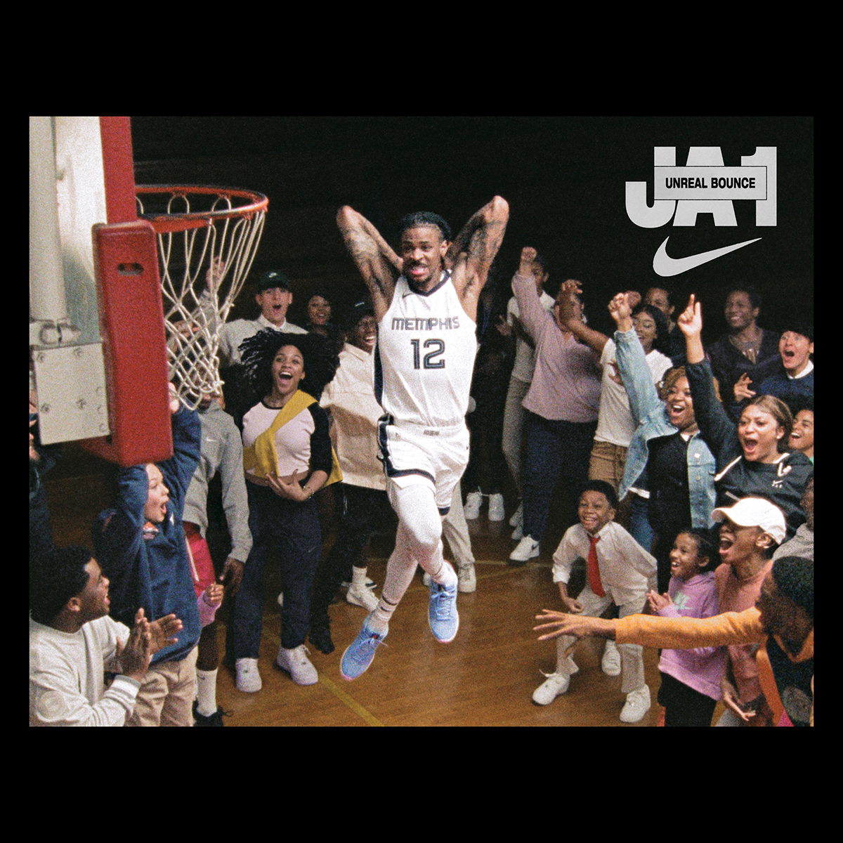
When art directing, Berlin-based graphic designer David Benski is always sure to deliver impact. And through his concept-led approach, he communicates both the tangible and intangible; the content itself and the feelings and sensations that surround it. So when asked to art direct a project for Nike Basketball, one which champions Memphis Grizzlies star Ja Morant and his partnership with Nike Basketball, Benski threw out the type rule book and created something dynamic and perfectly imperfect.
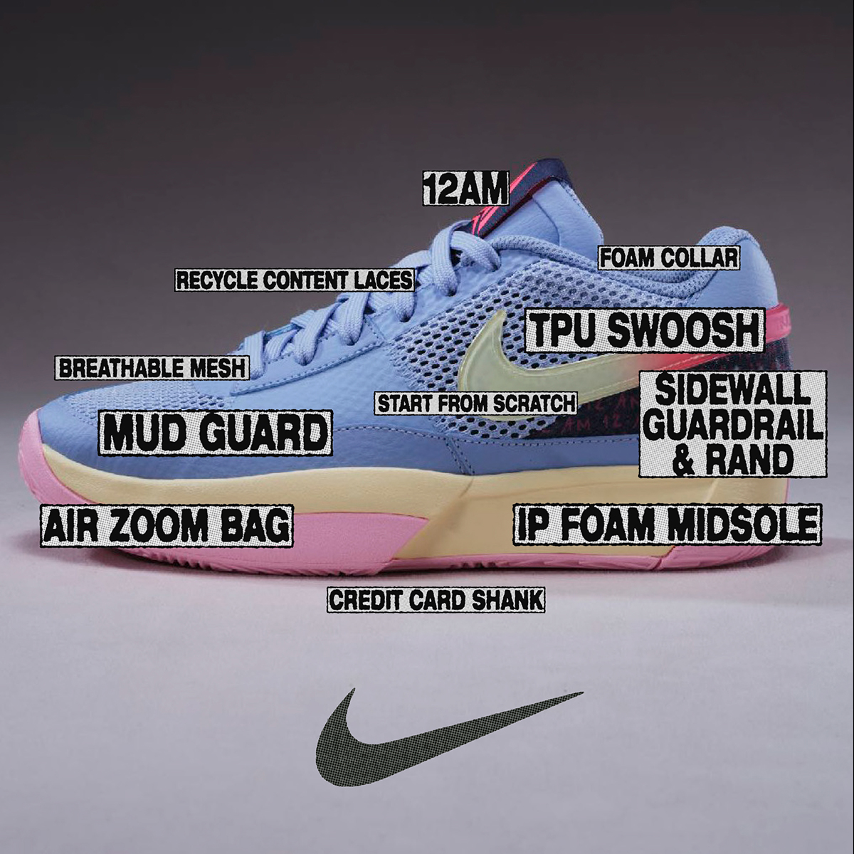
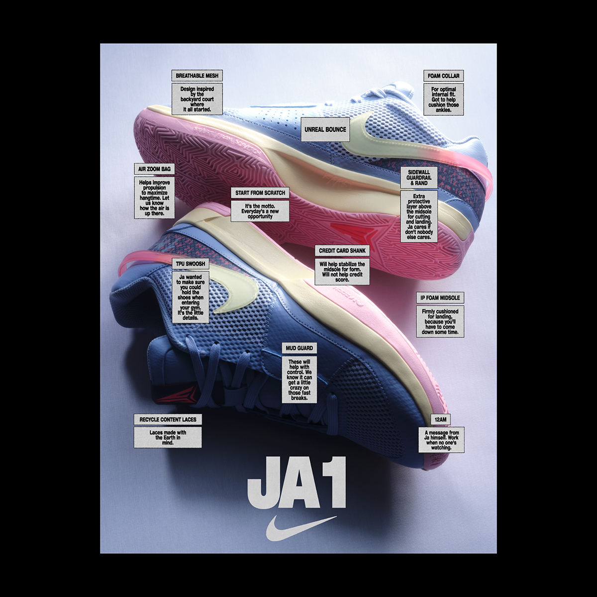
Nike Senior Creative Director Michael Spoljaric and Benski have collaborated on several projects since 2018, with the JA project kicking off in 2022. “When Michael shared his vision for this project with me,” Benski recalls, thinking back to the start of the project “he used the following keywords: raw, informational, designed without an overt attempt at design, imperfect, and straightforward.” Accompanying this was some imagery; visually encapsulating the project’s vision. “Following this,” he adds, “I immediately begin to brainstorm initial concepts.”
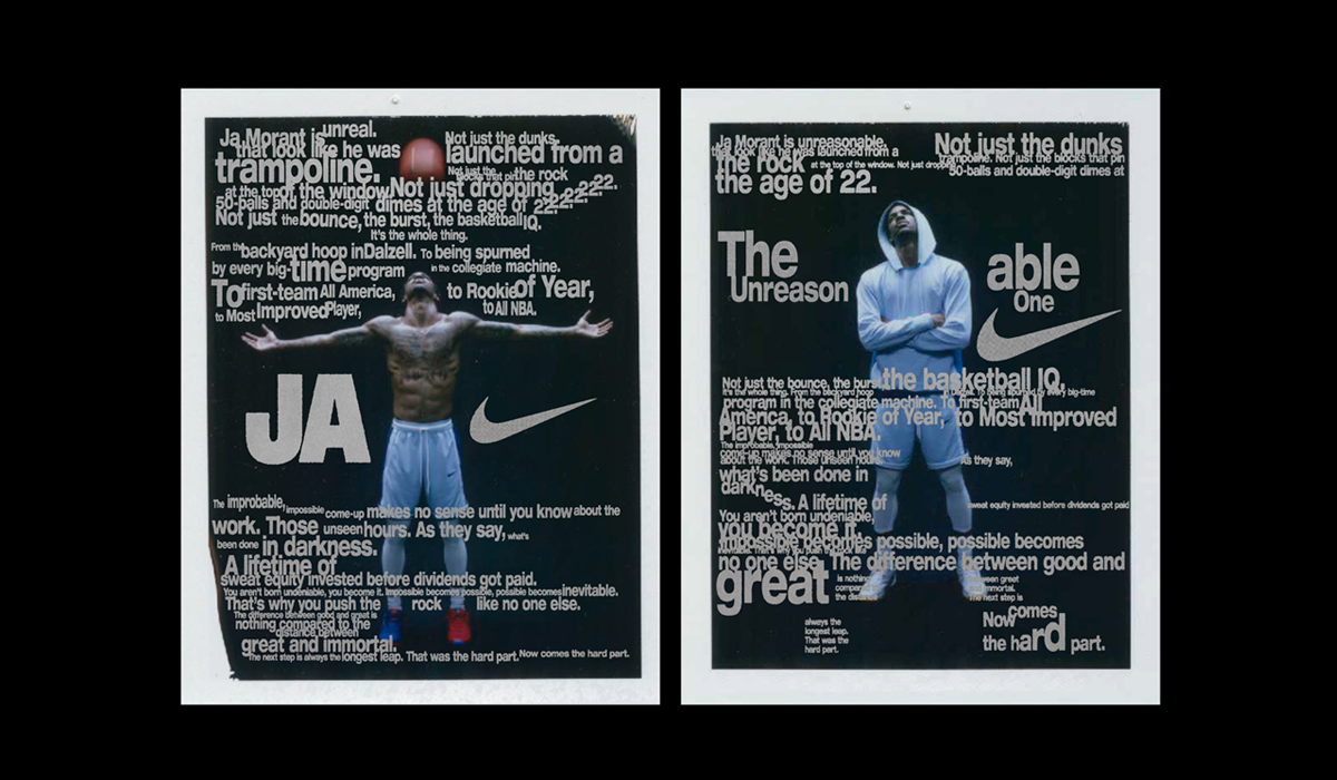
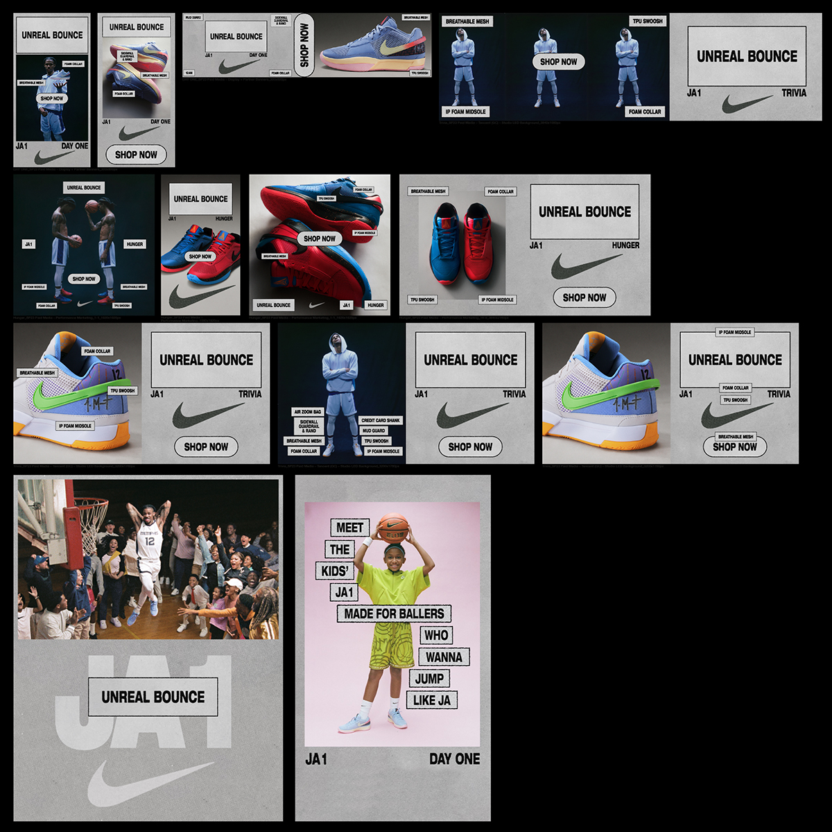
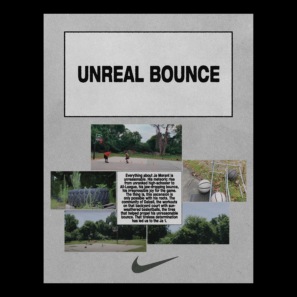
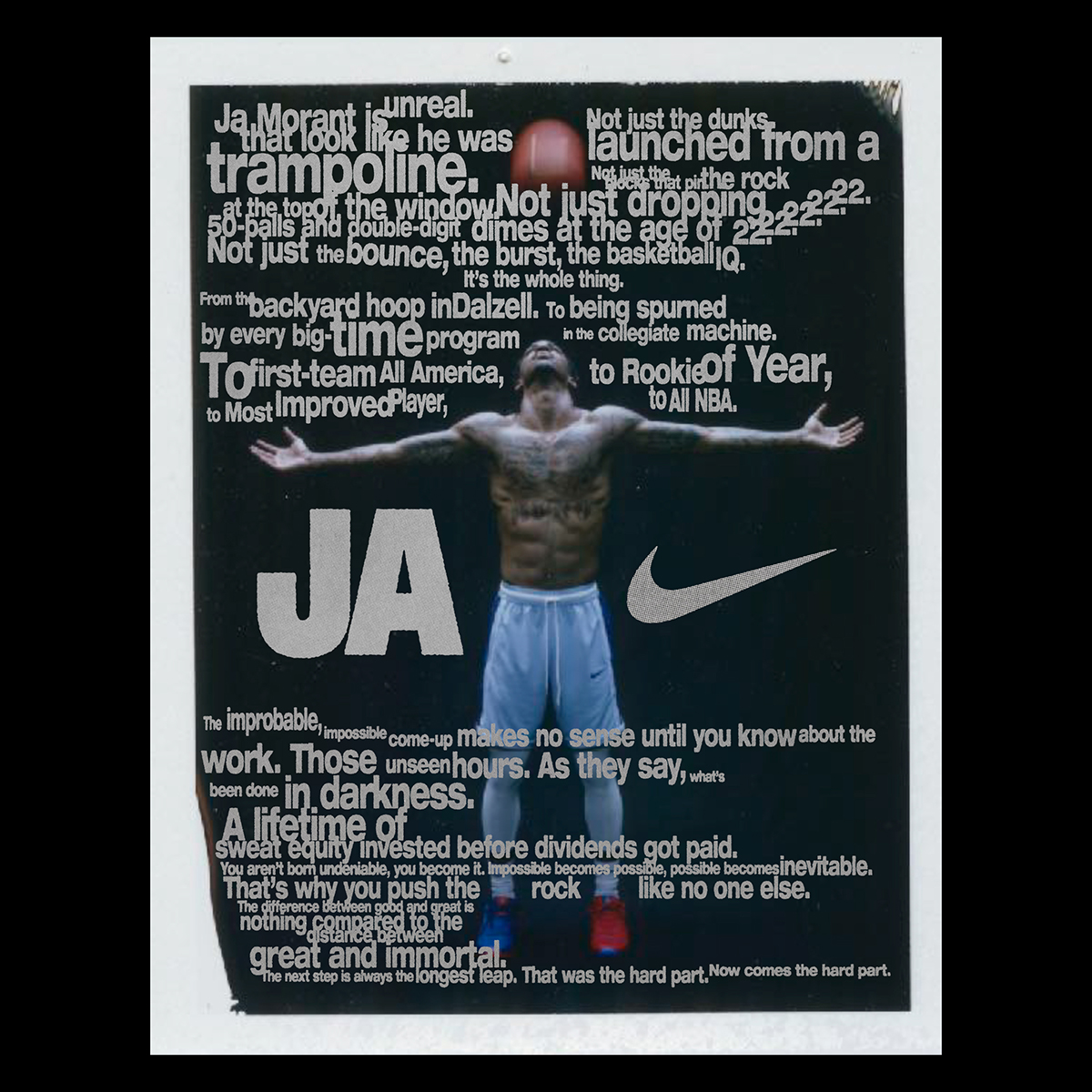
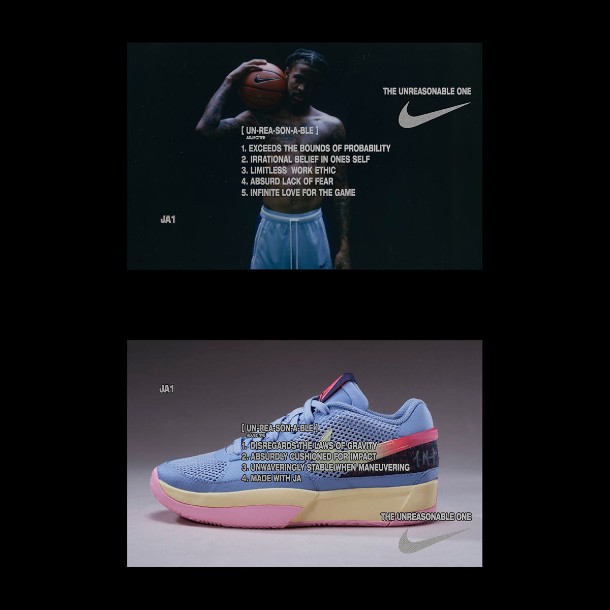
As the expressive and narrative-laden outcomes reveal, the approach Benski took was highly experimental and heavily revolved around incorporating texture. “Our objective was to reintroduce a sense of imperfection to this ‘uncomplicated design’, he explains. “We aimed to recreate the effect of scanning small sections of text pages and magnifying them to accentuate their intricate structure – essentially capturing the core of the information and its contextual essence.”
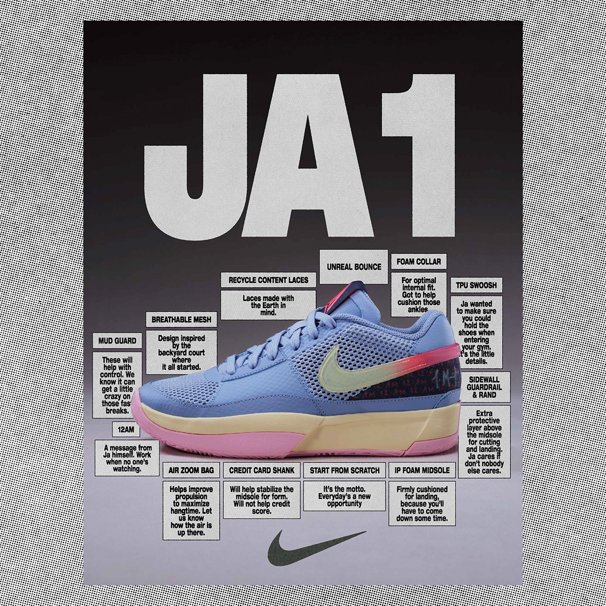
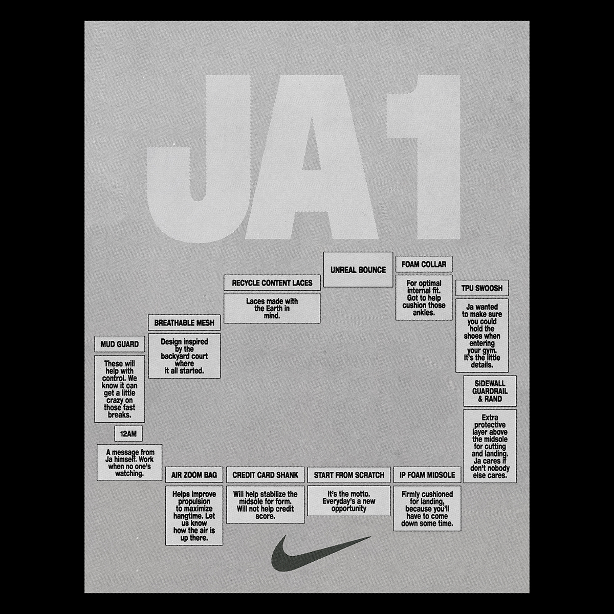
One of the best parts of the undertaking was witnessing the project’s evolution, Benski recalls. “Commencing with a clear vision in mind,” he says, “the approach led to the discovery of new possibilities, making the process truly engaging.” This transformation includes moving from a information-centred approach that uses text boxes and conventional design elements, to a more intricate and text-rich poster design featuring a “deliberately messy” appearance. “This shift marked the necessary breakthrough in the project’s evolution,” he says.
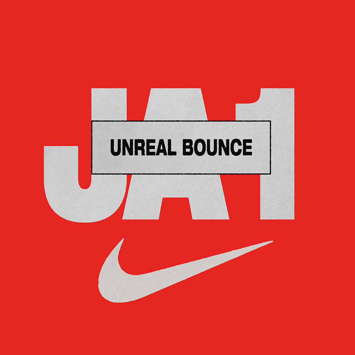
The key constant, however, was the central typeface — Helvetica Neue Heavy Extended — which plays a dominant role in the designs. Meanwhile, the project’s colour palette derives from the images themselves.

Interestingly, one of the project’s major challenges came from a logistics perspective — which involved finding an efficient workflow and management process. Benski’s own design process began in InDesign, followed by printing and scanning. “While designing solely in InDesign was enjoyable,” he admits, “the real challenge lay in establishing a structure that would facilitate the seamless continuation of the design process by others.” The solution arrived in the form of a Photoshop action that Benski created, which yielded the look they were aiming for, “complete with colour bleeding and special texturing,” and thus allowed the workload to move between InDesign and Photoshop. “The Photoshop files, laden with extensive smart layers, played a pivotal role,” the designer notes. “These files were remarkably sizable due to their complexity, and they offered the advantage of easy adjustments to wording. However, the refinement of this approach remained an ongoing journey, continually redefined until the final moments of the project.”
Looking back, one of Benski’s highlights of the project was creating a children’s book prop, read by Jamie Morant (Ja’s mom), in one of Michael’s films within the JA Project — ‘Beneath No One.’ According to Benski, this was “a delightful interlude amidst the extensive project,” and gave him some creative freedom to play around with. “At this juncture, a significant portion of the art direction had already been established, encompassing elements such as the font and overall structure,” he tells us. “This phase offered an opportunity to embrace a carefree spirit and rekindle a childlike enthusiasm.”
Thank you David for your insights.
Follow David on Instagram @davidbenski
Browse more graphic design & typography features here.

