
Founded by Egyptian designer Nada Hesham, Cairo-based design studio 40MUSTAQEL uses their practice to explore and aim to define what Arabic design means today. Central to this is a focus on the language, letterforms, and creative use of the Arabic script. Within their own branding, for instance, they collaborated with five Arabic calligraphers to create several iterations of the 40MUSTAQEL name.
Recently, they have opted for a more speculative, futurist direction in their identity design for Arab Cinema Week. For this project, explains 40MUSTAQEL’s Senior Art Director Hussein Salem, the direction was sparked by a desire to look through a post-colonial curtain into an Arab world that floats in an imagined futurist stratosphere. A speculative future that is neglected in popular discourse in favour of a Western and Eurocentric perspective.
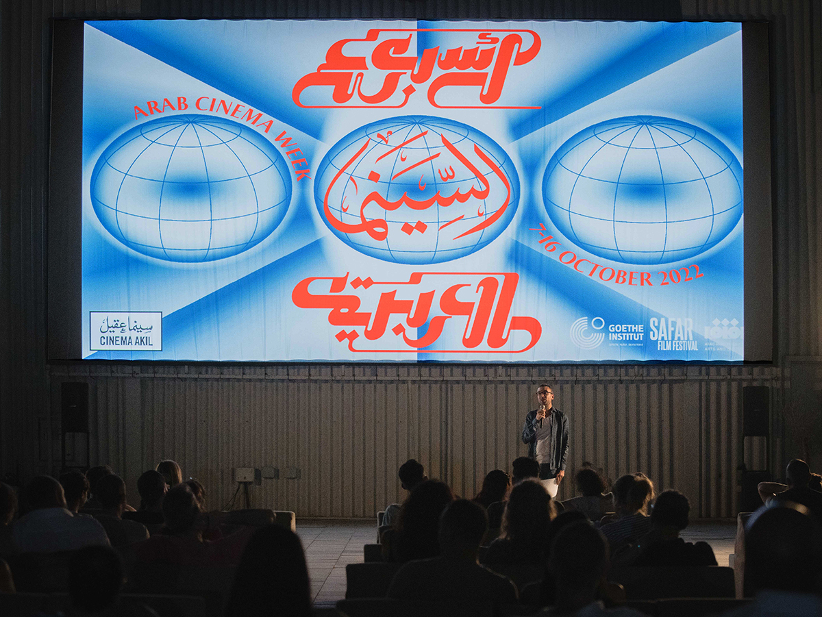
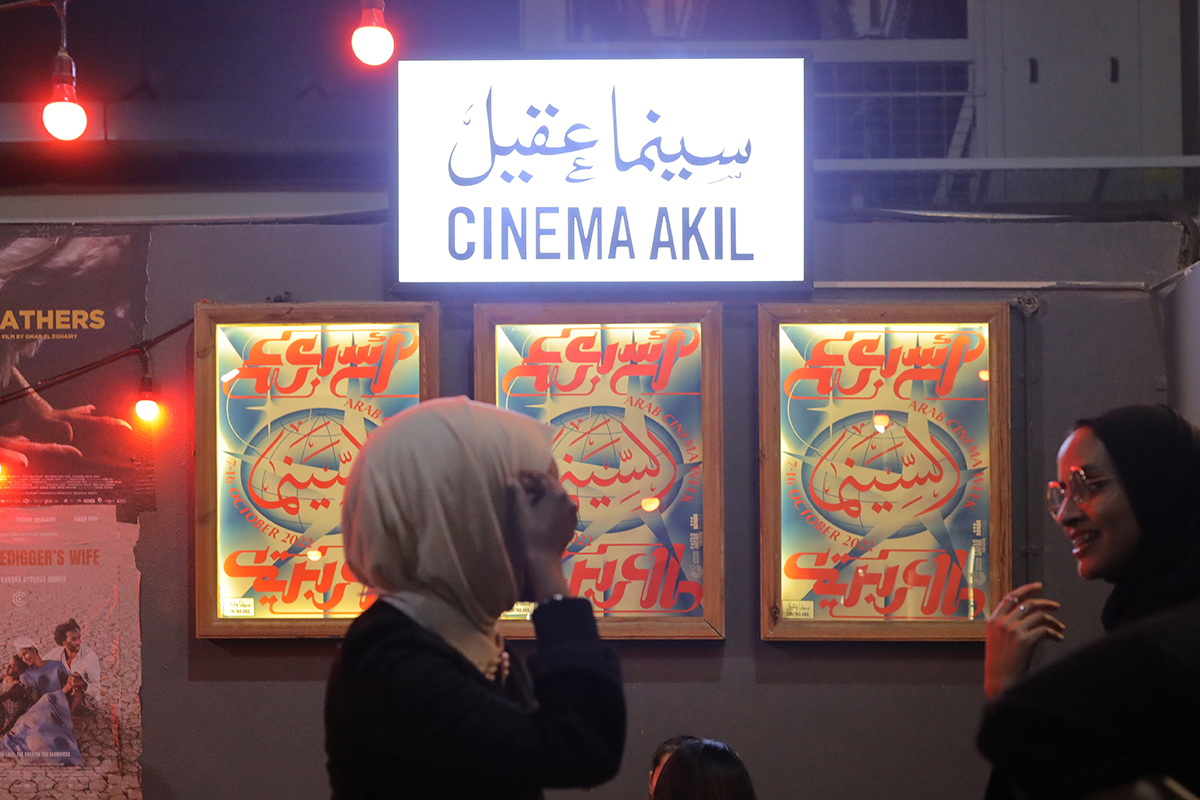
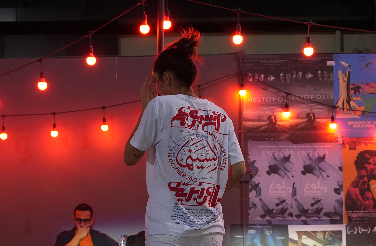
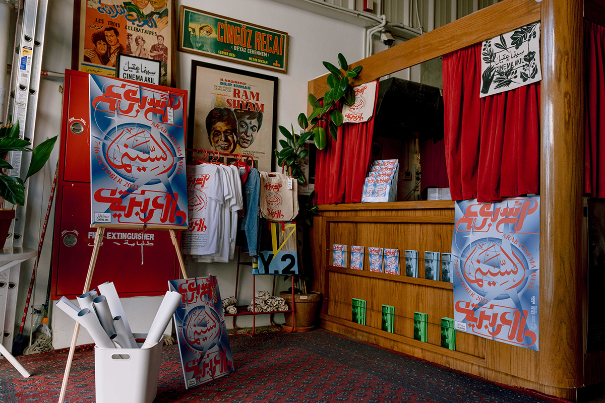
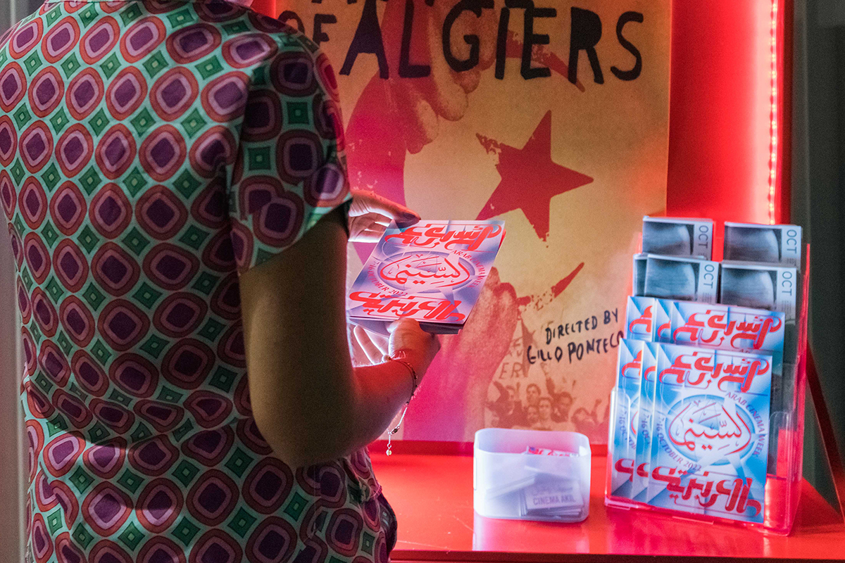
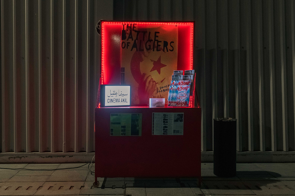
“This was our third time being commissioned by Cinema Akil, a Dubai-based arthouse cinema,” Salem tells us. For the first edition of Arab Cinema Week — a festival that brings stories and films from all over the Arab world to the big screen, while also celebrating 60 years of Algeria’s independence from French colonial powers — they approached the Cairo design studio to design the visual identity. “The brief came in with two very expansive prompts: ‘Film’ and ‘Arab’,” he continues. “We decided to focus on what exactly is film, and its intertwining of storytelling and technology, and how that projects on an Arab canvas.”
Finding Arabfuturism — Art Direction
In tandem with the initial research process, the 40MUSTAQEL team were conducting their own inquiry into Afrofuturism; a subject that explores the intersection of the African diaspora with science and technology. From not only a chrono-political perspective, but how it leads/contributes to the idea of ‘Arabfuturism’ (as it is called in the current cultural canon.) “A further dive into a relatively underdeveloped paradigm as Arabfuturism raised questions regarding the colonial discourse around the space race, the relationship of space to the future, and whose future/whose space are we talking about in the dominant western cultural narrative,” Salem explains.
For the studio, whose ethos is dedicated to working with a de-colonial and de-orientalist approach, specifically pertaining to Arabic type, the open brief was a “challenging” but “super exciting” opportunity to expand their investigation and curiosity for world building and coming up with a de-colonial-inspired narrative.
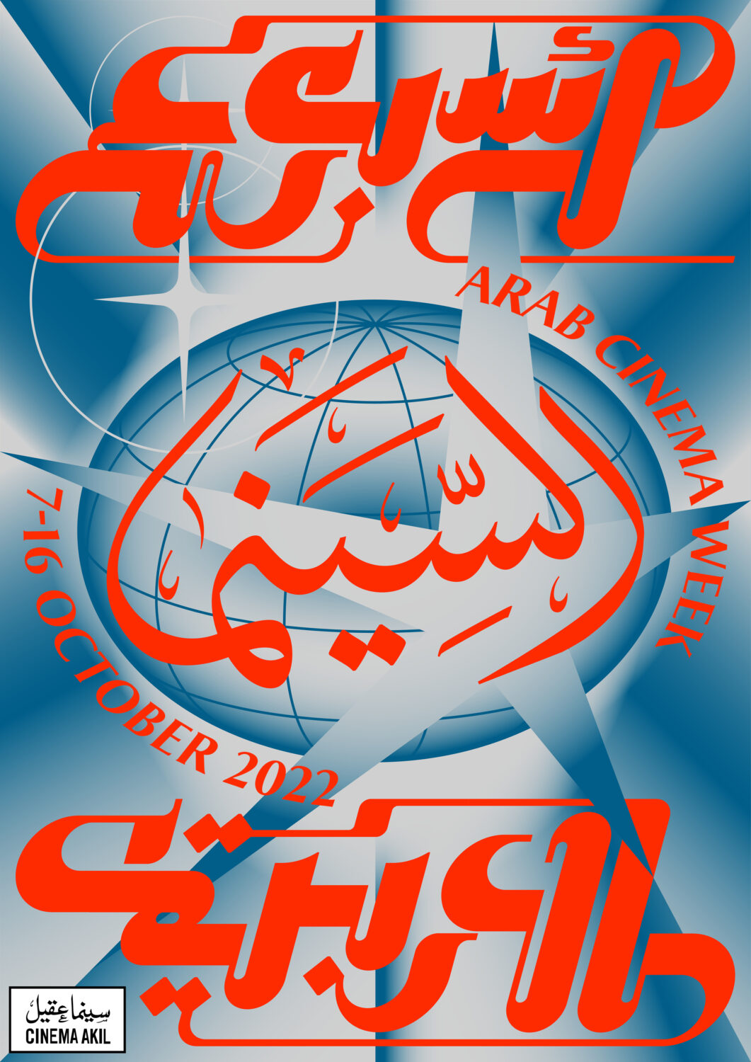
“Tackling critical topics in such an overt medium as a poster, we were very conscious of the pitfalls of self-orientalising and we wanted to go beyond the depiction of Aladdin on a rocketship and\or Frank Herbert mythos,” the art director says. “We started to scrutinise references that were born out of the Arab World that fell into the two aforementioned categories; storytelling (depictions of folktales, the stars/cosmos, sci-fi novels, arid landscapes, and the title card for the Egyptian Radio and Television Union) and technology (anatomical manuscripts of the human eye, scientific Islamic diagrams of quantum physics and Ibn Al-Haytham’s pinhole camera).”
The resulting look is striking and familiar, thanks to the captivating use of type against airbrushed gradient backdrops – calling to mind retrofuturist aesthetics.
Their areas of research also expanded into the realm of music, where the studio found inspiration in the sounds and visualised cues directly from the music itself.
For instance, Omar Khorshid and Ihsan Al Mounzer — veteran musicians who were known for bending Western instruments such as the electric guitar and synthesiser into Arabic melodies and arrangements that reverbed space-age music. The studio was greatly inspired by the music, and musicians that echoed the same sensibility, “so far as creating a Spotify playlist for the festival out of the selection,” Salem adds.
Blending Scripts — Typography
When it came to defining the identity’s typography and matchmaking the Arabic and Latin scripts, 40MUSTAQEL were careful not to overly edit or ‘frankenstein’ one script to suit the other. “We opted for a bespoke lettering piece for two-thirds of the Arabic title based on the Kufic script,” Salem reveals, “as its rigid/geometric curvilinear sensibility balances both a faithfulness to the Arabic script while echoing an industrial language of steam pipelines and metallic funnels.”
In the middle of the design, a custom-made traditional Thuluth calligraphic piece by Palestinian calligrapher Ahmed Zoabi balances out the composition. Finally, for the Latin script, they were in need of a versatile medium-contrast font to support the Arabic lettering. “We decided on Garda Nova No.2 by Feliciano Type because of its bold monumental distinction and humanist subtlety,” they note.
In contrast to the soft gradients of the poster, the type is given an electric intensity though a vibrant red hue. “We wanted a hue that was glaring yet legible against a blue time-agnostic extraterrestrial background,” he tells us, explaining the decision. “The usage of red was also very common in the visual production of the political sphere and liberation graphics during the Nasser Pan-Arabist era and is evident throughout flags in the SWANA region as well. Also, laser beams.” he concludes.
Follow 40MUSTAQEL on Instagram.
Read more of our graphic design and typography features here.


