The result of a collaboration between The Foundry Types (the independent type foundry of David Quay and Stuart de Rozario), and Amsterdam-based design studio Thonik (founded by Nikki Gonnissen and Thomas Widdershoven), Fernhout is the new typeface created for the Dutch Design Week.

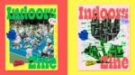
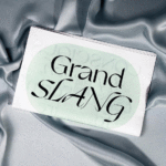
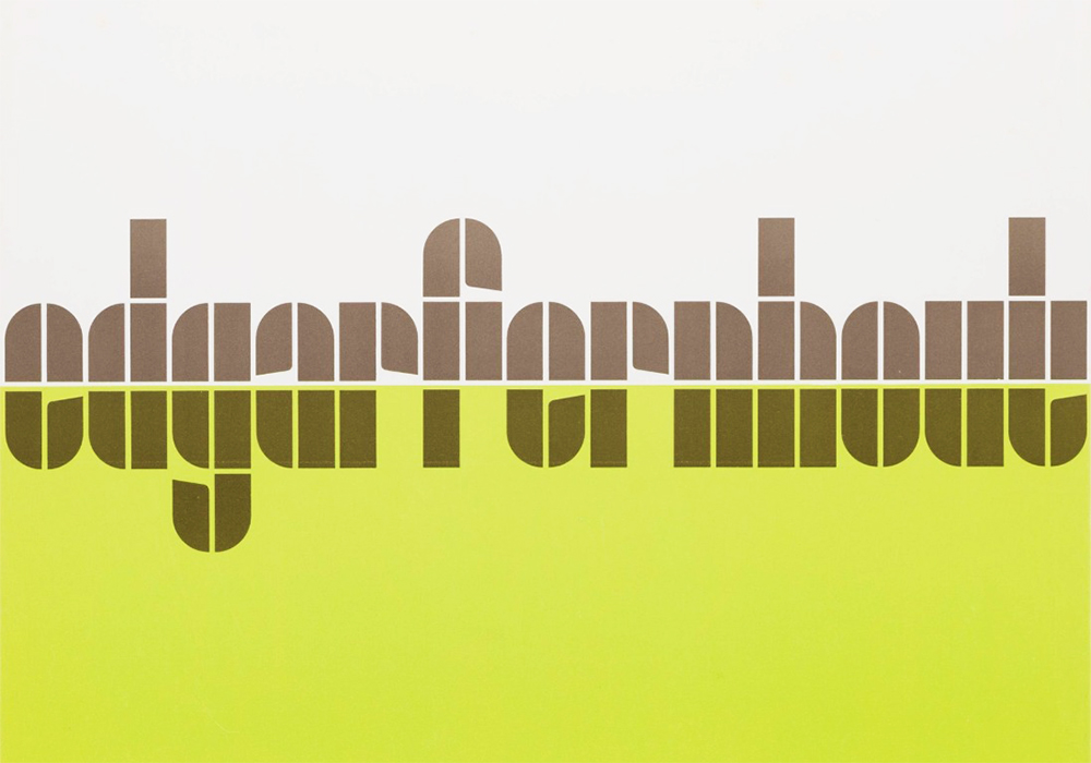
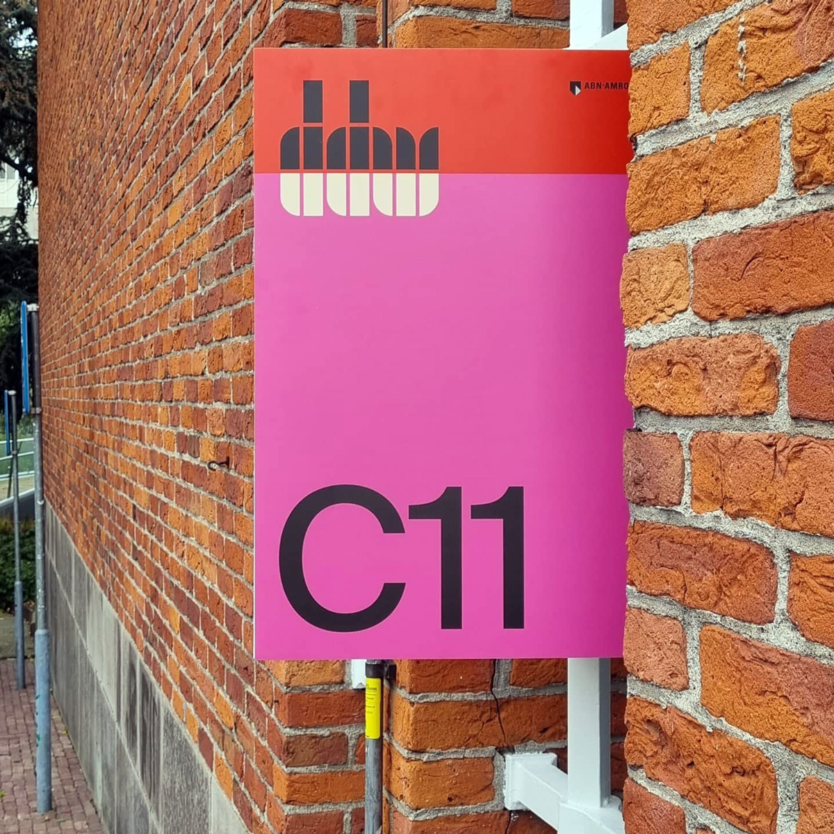
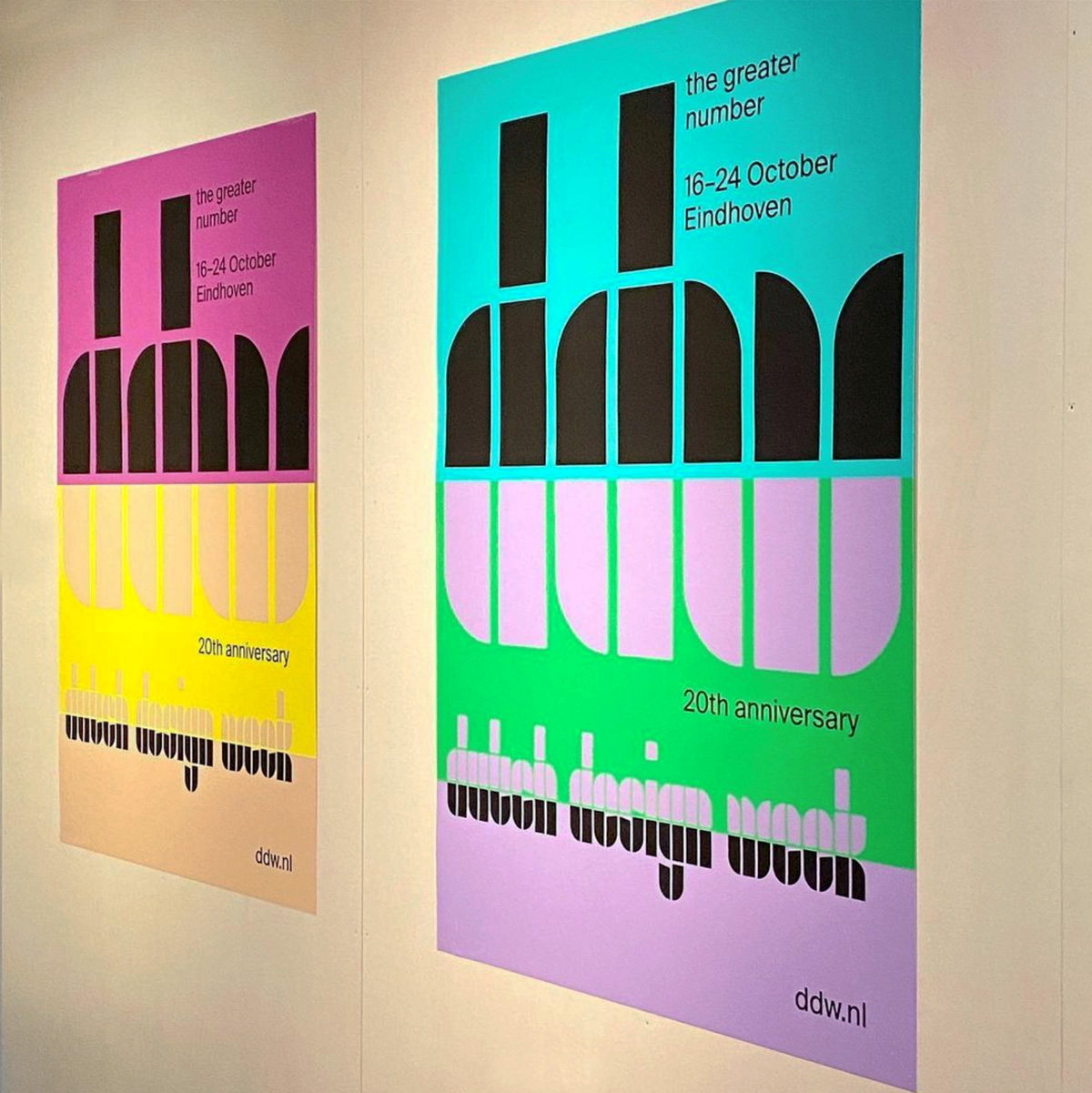
Preserving a connection with the Dutch Design Week‘s previous tulip logo, which was constructed through a collection of rectangles and quarter circles, Thonik decided to build the new visual concept around a revitalisation of these shapes. To do this, they turned to the work of the late Wim Crouwel – specifically, his exhibition poster and catalogue for the Van Abbemuseum retrospective of Dutch painter Edgar Fernhout, held in in 1963. Having been designed for a museum in DDW’s native Eindhoven, Thonik decided to expand the face into a full font that would characterise DDW’s new house style.
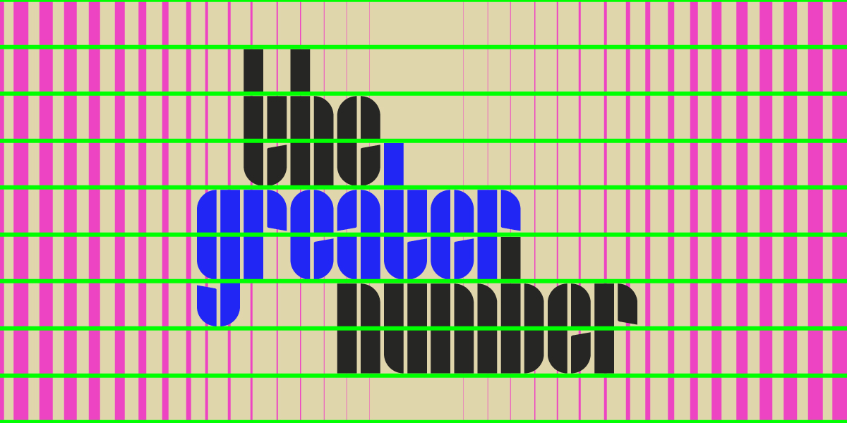
However, as Co-founder of Thonik Thomas Widdershoven notes, the task of expanding Crouwel’s work into a fully fledged typeface was not without its challenges. “Crouwel loved monospaced letters,” he says, “so the fact that Edgar Fernhout’s name doesn’t contain a ‘w, m, l, or i’ must have appealed to him. We did have to tackle those letters and have tried to finish the game while playing by the same rules. We’ve chosen all lowercase letters since they feel more democratic and look sympathetic. The use of indentations has helped increase legibility.”
Based off of the new logo design, Thonik called on The Foundry Types to create a new typeface based on the primitive shapes and forms of Crouwel’s poster and exhibition catalogue, which would transform the logo deign into a flexible type system to spread across the entirety of the DDW’s visual identity. The Foundry Types were therefore tasked with expanding the character set to include a-z in lowercase, figures, and punctuation glyphs.
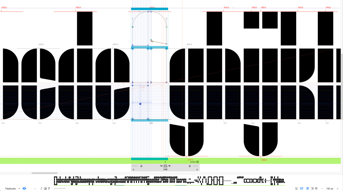
“The Foundry Types’ ethos throughout the design process was clarity, integrity and authenticity,” The Foundry Types reflect. “The constructed ‘Edgar Fernhout’ letterforms consist of a simplistic rectangle block system, two columns wide and four oblongs tall, circled segments and angled indentations. Although the glyph shapes are playful and simple, these basic forms often throw up challenging complex problems and limitations.”

“The purist, basic forms of ‘Fernhout’ offer little scope to break the grid without diminishing the overall visual virtues,” they continue. “Crouwel’s carefully devised grid often allowed many glyphs to design themselves, but complex glyphs with diagonal strokes, ‘k, s, x, z, 2, 4, 5, 7’ needed to be stripped back and simplified. Characteristics within the letterforms also threw up a few dilemmas – how to design an ‘i and j’ dot along with readable punctuation? The Foundry Types decided to introduce another element, the square. This allowed a little more freedom to express the concept in a more refined way. Problematic junctions to the centre section of the ‘3 and 8’ were the trickiest to achieve, a double quarter-circle was added to allow these glyphs to be easily recognisable.”
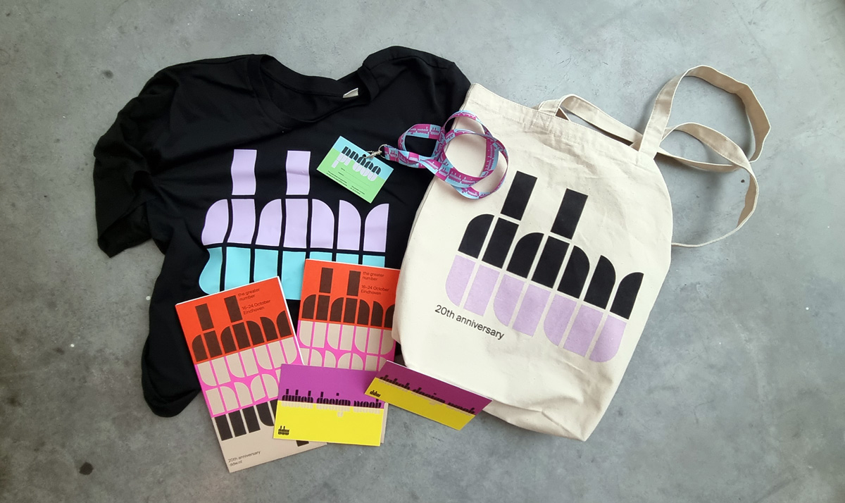
Despite the challenges faced, this collaboration has resulted in a stunning typeface the brings a new lease of life to the DDW’s communications. The Fernhout typeface consists of a single weight and a limited character set, due to its elemental forms, and is now exclusively available through The Foundry Types (currently with 50% off!). A big thank you to The Foundry Types for sharing more with us today.