Designing new type systems that are visually harmonised across diverse language contexts is no small feat. The aesthetics of the Latin script, for example, may not easily be translated to Arabic or Hebrew environments. In this way, the concept of ‘neutrality’ surrounding the no-frills sans serif is certainly questionable—the presence of the designer is always existent: whether that’s in the translation of aesthetics across scripts, the type treatment of a book, or the UX design of an app.
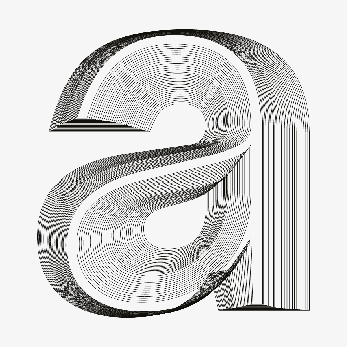
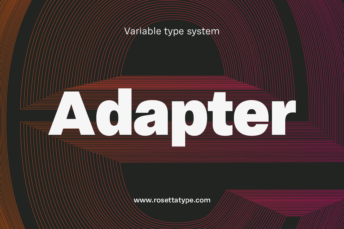
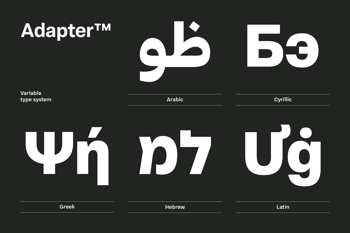
Considering all of this, when Rosetta type foundry settled on creating a no-frills sans serif appealing to contemporary modernist and post-modernist aesthetics—the starting point for the now fully fledged Adapter™—their understanding of the ‘neutral sans serif’ they were looking for became more complex. What they needed, they realised, was to create a harmonised and coherent type system that adapted across a wide scope of scripts and settings: a challenge that lies far beyond the abilities of an individual designer.
Taking a collaborative approach, Rosetta therefore worked with a large international cohort of expert designers and consultants, meaning Adapter arrives as a well informed, extensive, visually pleasing and culturally valid design, ready to carry messages to all comers of the world on every platform imaginable.
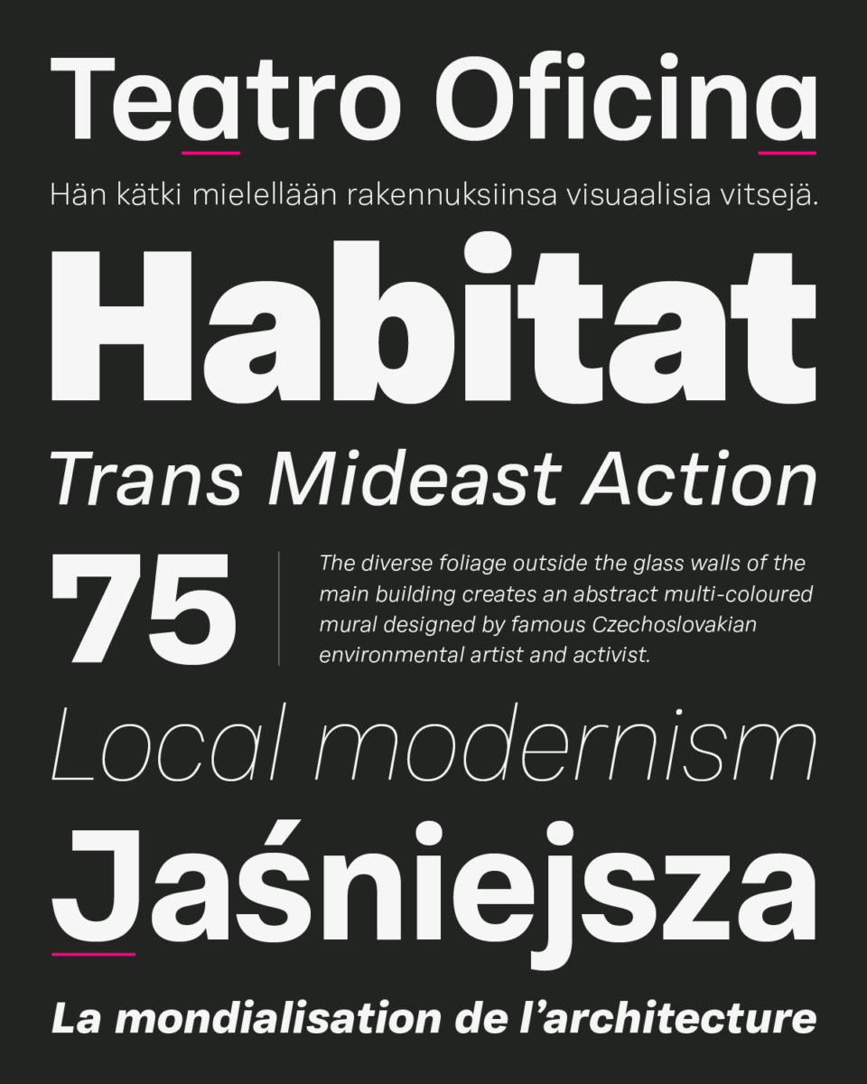
Not only adapting across scripts, Adapter has been tailored to accommodate designers needs across all settings and platforms. “We found it is nearly impossible to have a single sans-serif font that satisfies both requirements equally well,” writes David Březina, managing director of Rosetta. “Text sizes require stronger articulation of features which tends to look out of place in larger sizes. On the other hand, display sizes favour finer details and spatial economy which would inconvenience readers when used for continuous text.”
To this end, Rosetta decided it was important not to cut corners, so the Adapter type system was created with two faces: one for text, and another for display.
As David continues, “To maintain the distinction between the two objectives both functionally as well as stylistically, we thought of the two Adapters as being designed by two different designers. The Text designer was a typographer who focused on the ergonomics of reading, thus the rhythm and clarity of forms were his utmost concern. He would acknowledge the influence of production technology and shape the characters to comply with it. The Display designer, on the other hand, was a graphic designer or an architect with a sweet spot for smooth curves, symmetries, and alignments. She would not be eccentric, but would want to demonstrate her appreciation for form and introduce some statement details here and there while keeping an economy of expression.”
As a result of these two approaches, Adapter is able to accommodate a variety of settings without compromise; the squarish, solid forms, open apertures and pinched junctions of of Adapter Text bring clarity and loose spacing for a comfortable reading experience, while Adapter Display’s more rounded, narrower forms offer greater economy and a bolder appearance.
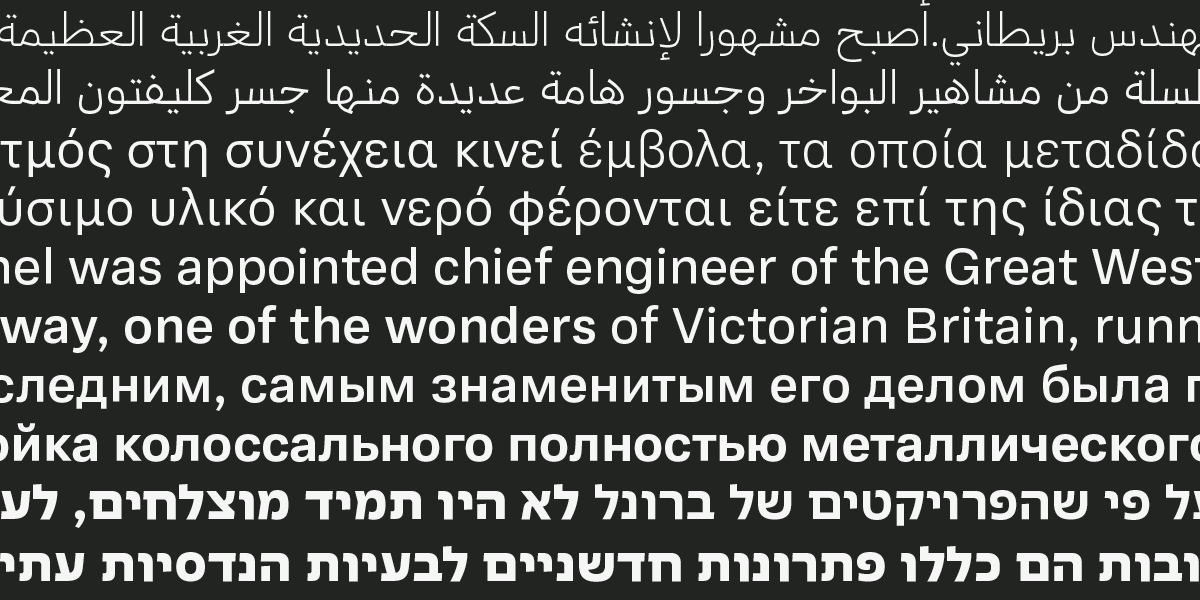
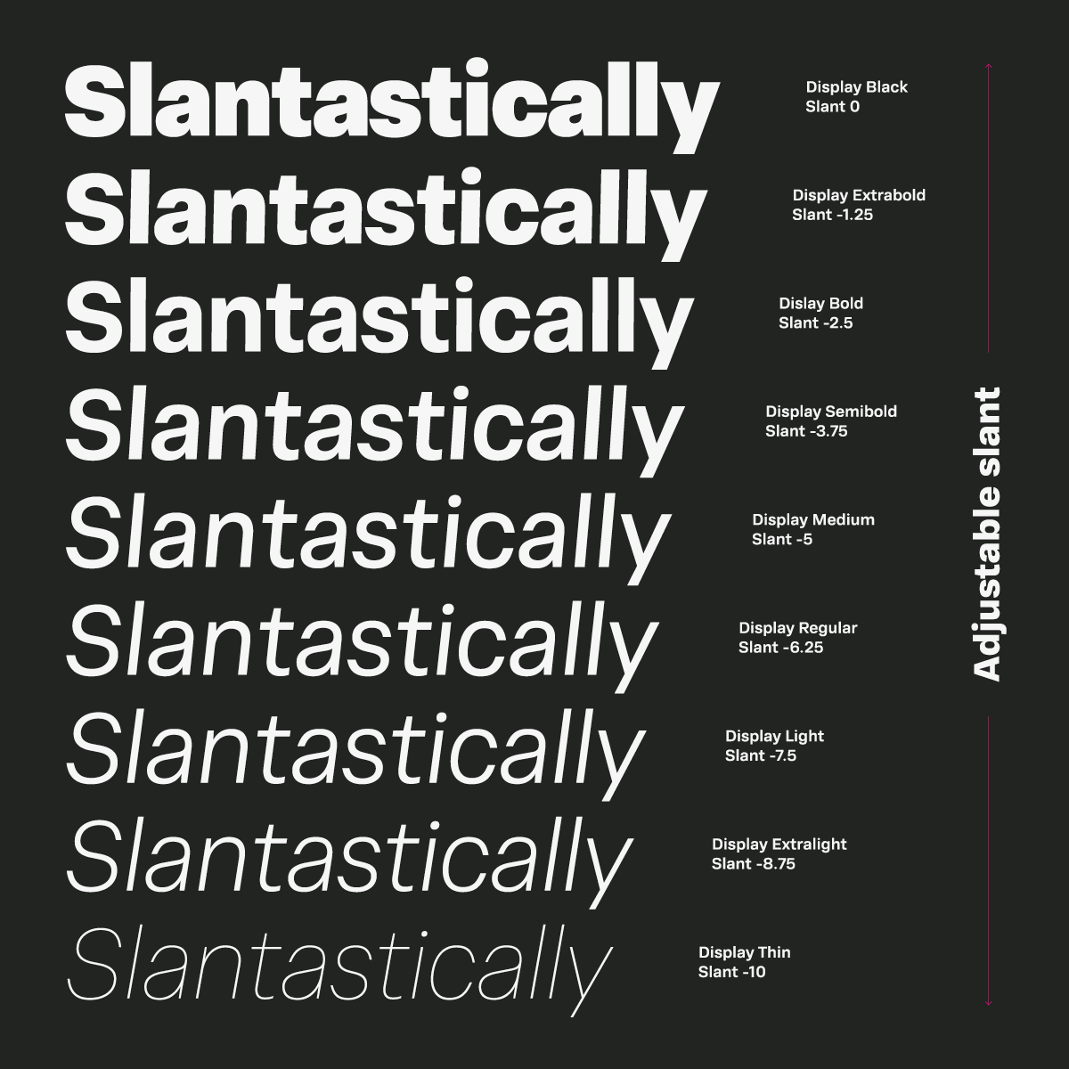
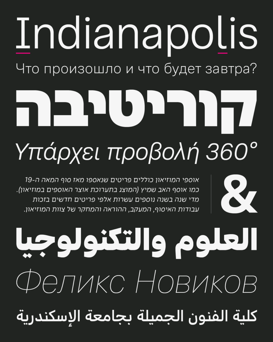
Adapter is a no-nonsense, easy to use, high quality sans serif type system, with nothing you could do without. Available as a variable font, Adapter is built to accommodate your every need, without any clutter. Not only does the system offer Latin, Cyrillic, Greek, Hebrew, and Arabic character sets, supporting over 325 languages, it has three variation axes (weight, slant, and optical sizing), with a huge number of glyphs offering a comprehensive scope of language and type system support. From UI to web design to promotional print materials, Adapter can connect your voice with everyone that needs to hear it.
A collaboration between William Montrose, Sláva Jevčinová, and David Březina, Adapter is available via Rosetta now.

