Based in Berlin and founded by Ivo Gabrowitsch, Fontwerk are committed to delivering modern typefaces alongside innovative font engineering and type design services. Their dedication to providing stunning, good quality fonts is coupled with a desire to make their acquisition easy and accessible; which means free trials, a simple licensing model and one of the fastest ordering processes around. ‘Our motivation is simply the love of good design’, Fontwerk say, ‘Outstanding type is our contribution to that’.
‘From the typographic epicentre in Berlin, we operate as a permanent team and freelance network of international designers, font engineers and marketing experts. Many of us are from the original FontShop universe; the place where typographic trends were set, simple license models devised, experimental limits explored and the largest library of contemporary typefaces emerged. We carry this DNA within us and develop it further – 100% independently’, they continue.
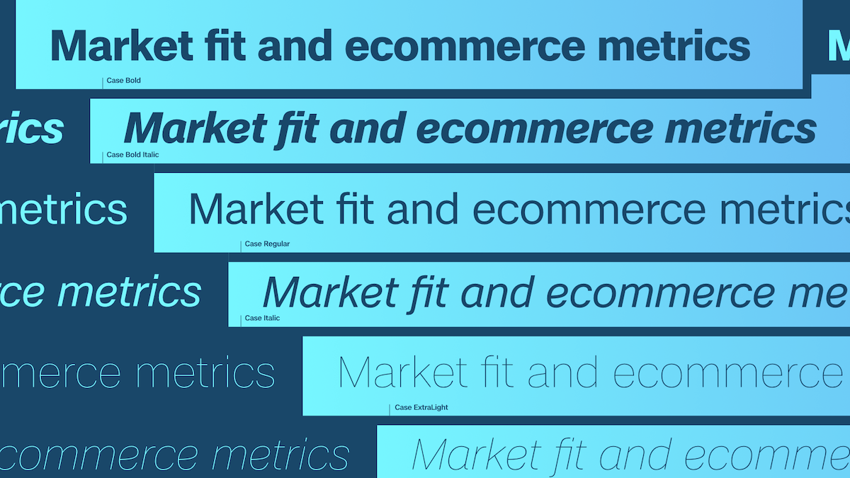
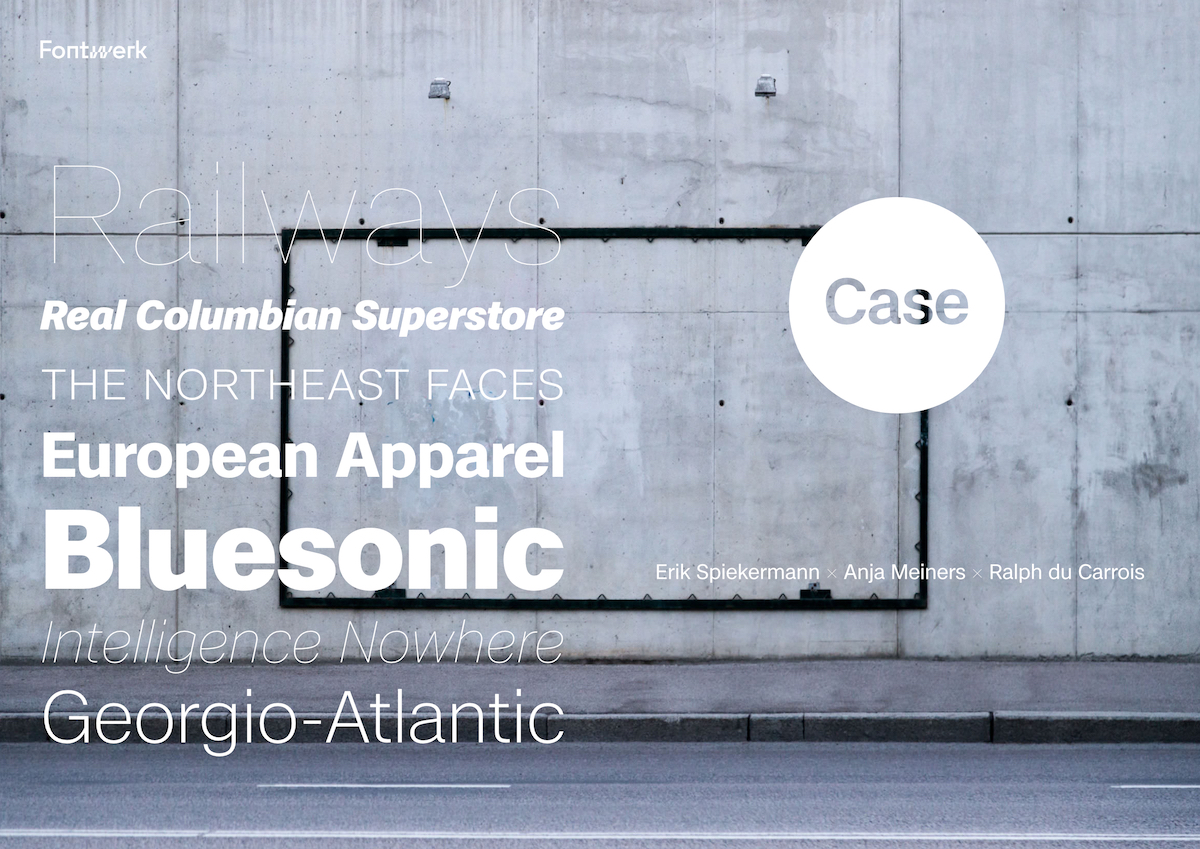
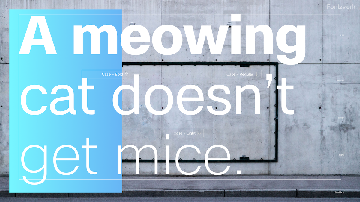
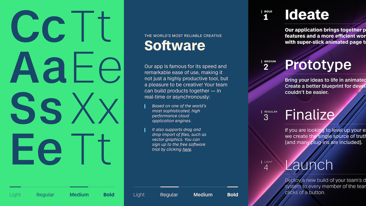
‘We believe that convincing communication is only possible with the most aesthetically pleasing and most technically sound fonts’, the foundry tell us. And their latest release, Case, is no exception. Aiming to provide impeccable aesthetic prowess encased in a familiar structure and laced with subtle individual flair, Case is perfect for clarity of communication and lasting brand building… The superfamily seriously holds potential to become the classic font of tomorrow.
‘Just a few weeks after we have launched our type foundry Fontwerk, we are excited to announce the release of our next superfamily, Case™ by none other than Erik Spiekermann, who collaborated with Anja Meiners and Ralph du Carrois to create a modern Neo-Grotesque for the new Twenties’, Fontwerk say.
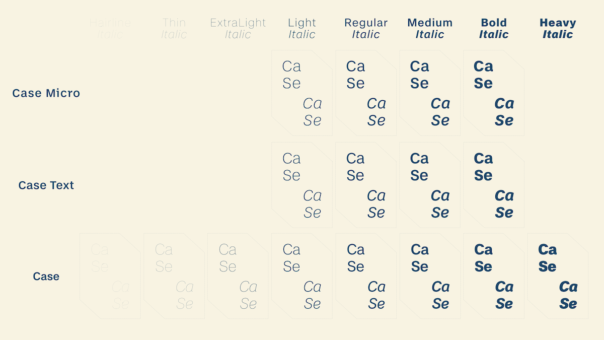
Case born from a challenge likely familiar to many designers: to create a font which cultivates an individual voice for a specific brand which also doesn’t stray too far from the familiarity of fonts such as Helvetica, Akzidenz Grotesk or Univers. ‘Corporate type designers know this situation all too well,’ Fontwerk explain. ‘Your client wants something new, something to call their own, something that stands out from the competition. However, in reality, they often end up wanting the same thing… Case is the essence of these experiences’.
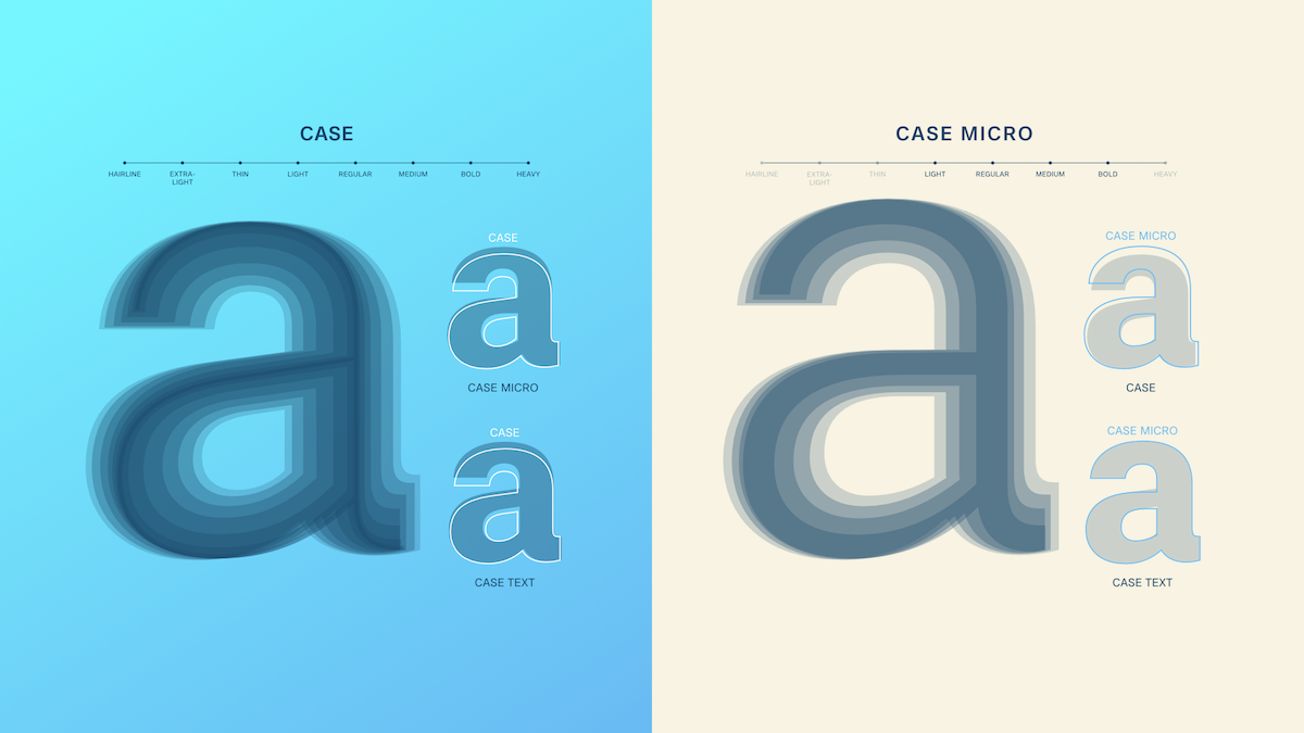
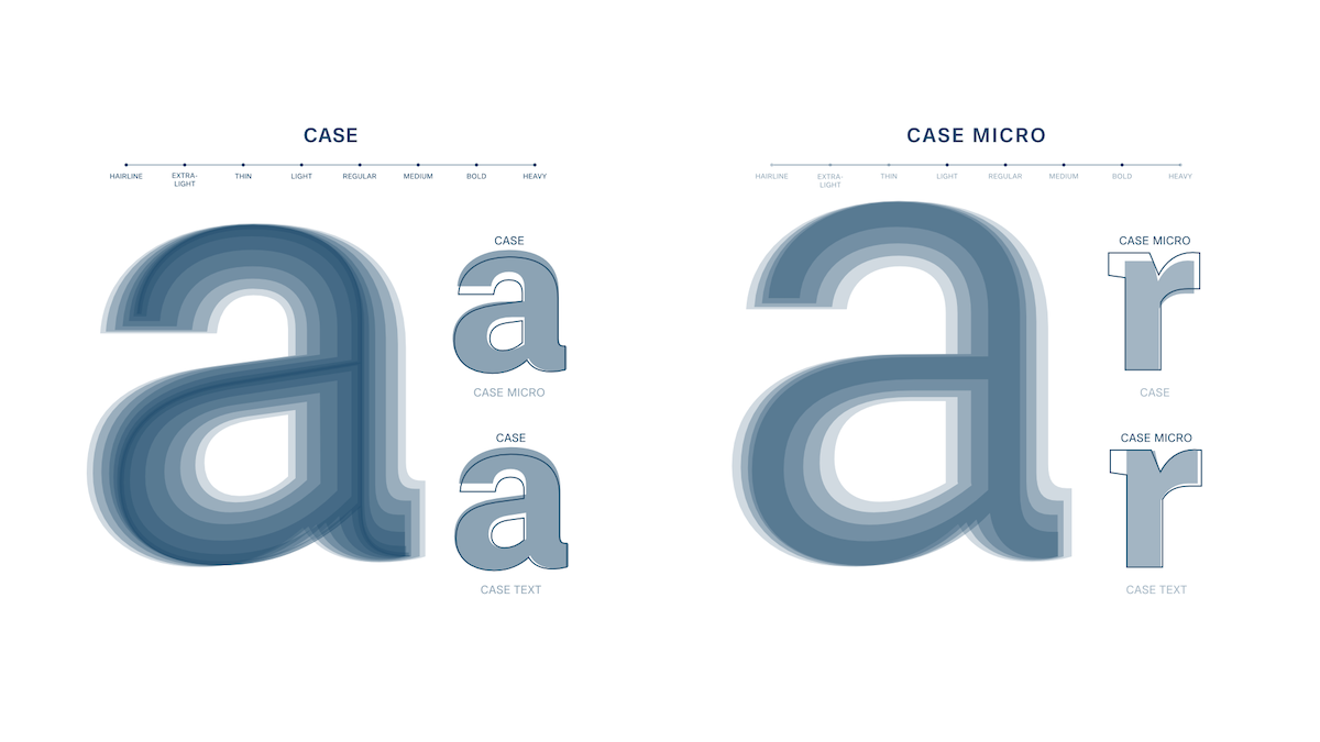
The designers crafted Case by cutting out anything that didn’t feel totally necessary in the world’s saturated market for this genre of typeface, whilst making sure to hold on to all of the best elements… ‘Building on the concentrate of the best bits, they added new ideas and conceptual solutions for a contemporary static grotesque. The result is the missing element in an otherwise strained and bloated genre: A typeface whose clear basic personality looks familiar and creates trust, but at the same time is novel and individual and is therefore perfect for strong brand building. An ideal font for complex branding projects born out of years of working on such complex branding projects’.
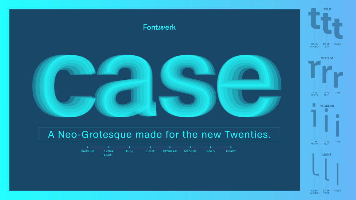
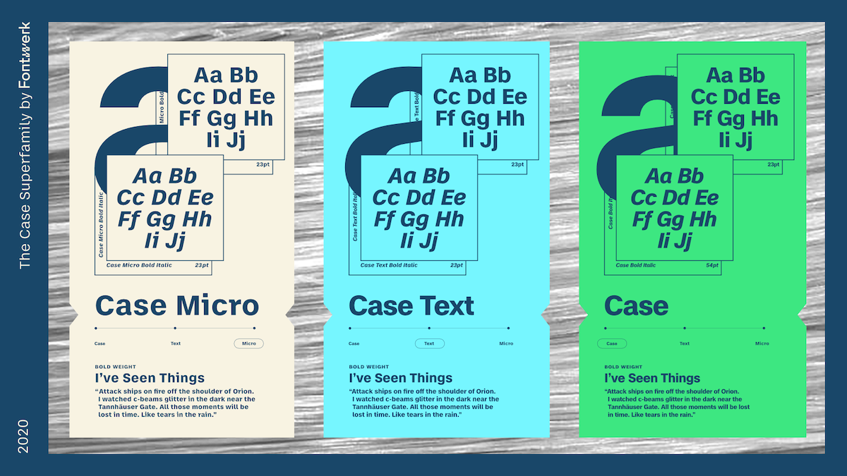
Case’s characteristics include the same horizontal terminals in letters such as ‘c’, ‘a’, ’s’, and ‘e’, in order to optimise its use for logos and wordmarks. Currently available in three optical sizes, the family is suited to a vast about of applications. In particular, the core family works well for ‘larger applications such as logos, wordmarks and headlines, whilst the Text family suits longer reads and the Micro version – surprise, surprise – small text’, Fontwerk expand. ‘Depending on the area of use, it can guarantee readability of 5pt, in some cases, even less’…
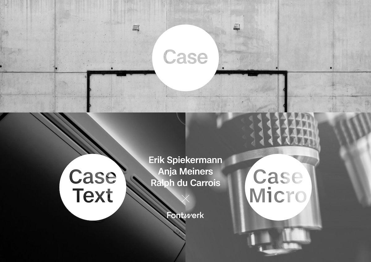
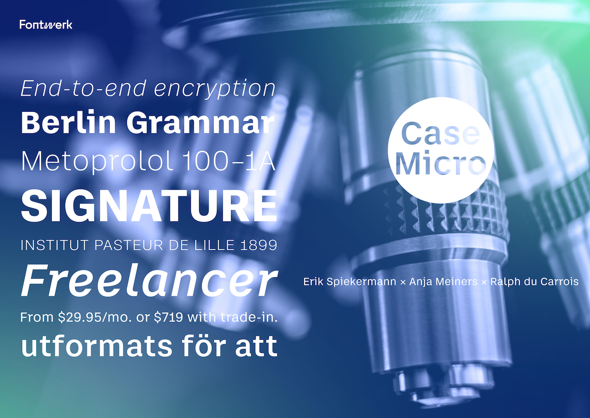
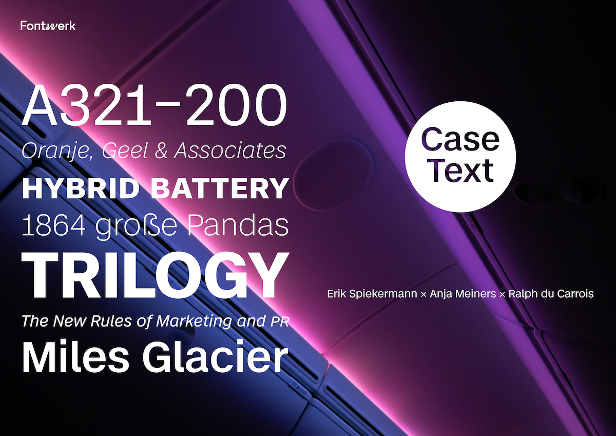
‘An important distinguishing criterion of the family members is their respective spacing’, Fontwerk note. ‘In comparison to the two versions for text applications, the main family’s spacing is narrow, whereas it is wider on the Text and widest on the Micro. For better readability, both Case Text and Case Micro have a higher x-height, an ‘l’ with a ‘foot’ and slightly more open shapes than its bigger sister. The Micro has more distinguishable character forms (r, i, j) or wider glyphs (f, t) as well as significant contrast at the the joints of the stems and bows’. In addition, Fontwerk tell us, ‘a unique quality is the Variable Fonts, since they are still a rarity in the Neo-Grotesque genre. These are included in the complete package at no extra cost’.
To get your hands on this sturdy, versatile typeface of the future, check out Case here. Also, be sure to check out Fontwerk’s website and Instagram to stay in the loop with their future projects.

