
Originally from Luxembourg and based in Berlin, Nadine Toussaint works on brand identities, editorial, cover and poster designs; all with typography taking centre stage. As the driving force behind all of Nadine’s visual stories, her love for type flourished throughout her time at university. Studying communication design, Nadine began to work on projects for music labels, producers and clubs. ‘This is where my affection for co-working projects with other creatives began’, the designer expands.
Later on, Nadine moved into working full time as a freelancer, allowing her to explore and combine her passion for design, music, culture and collaborations with other artists and since, Nadine’s portfolio has developed into an artful and sophisticated body of work and. Drawn by her unique typographic sensibility, we naturally wanted to learn more from the designer about her creative inclinations.
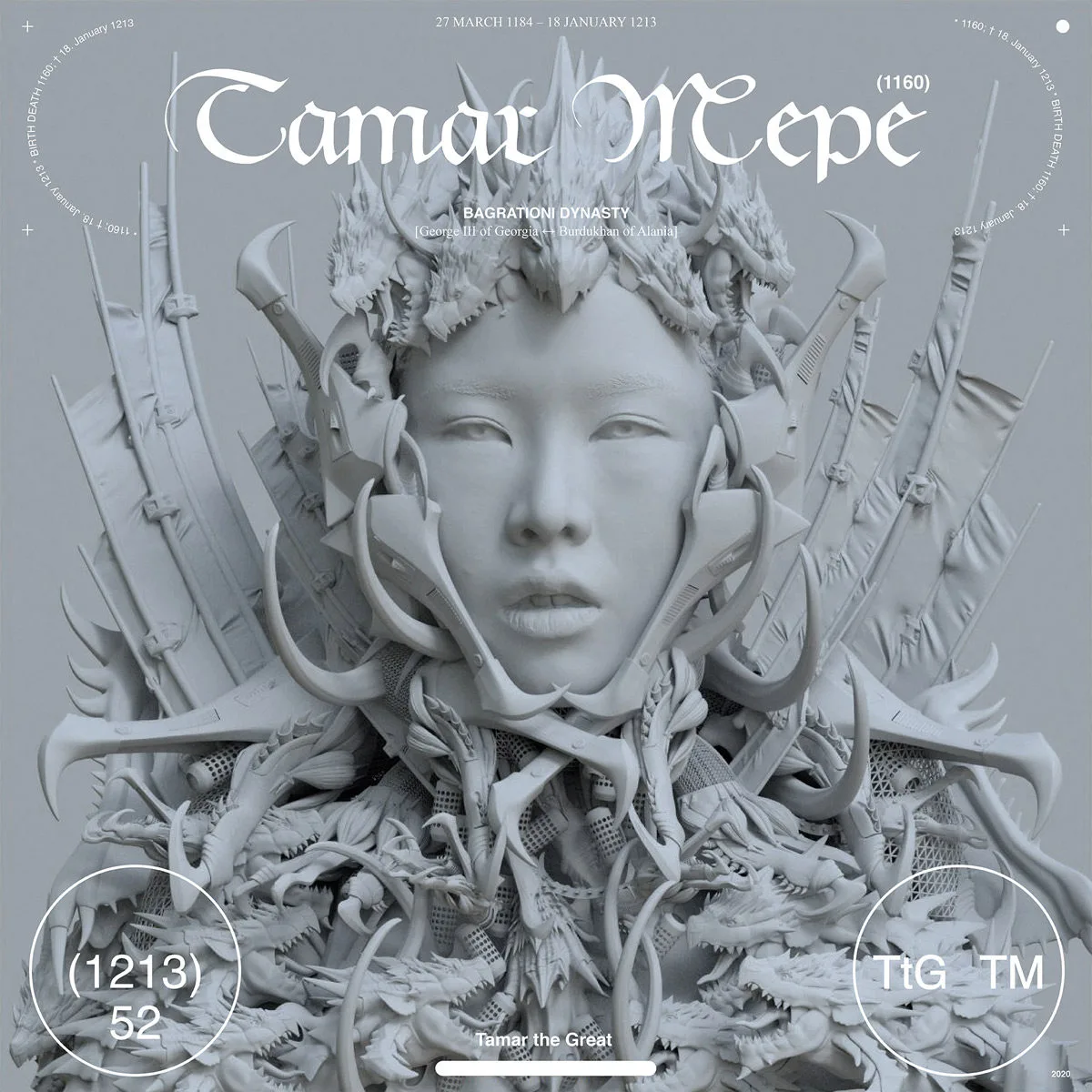
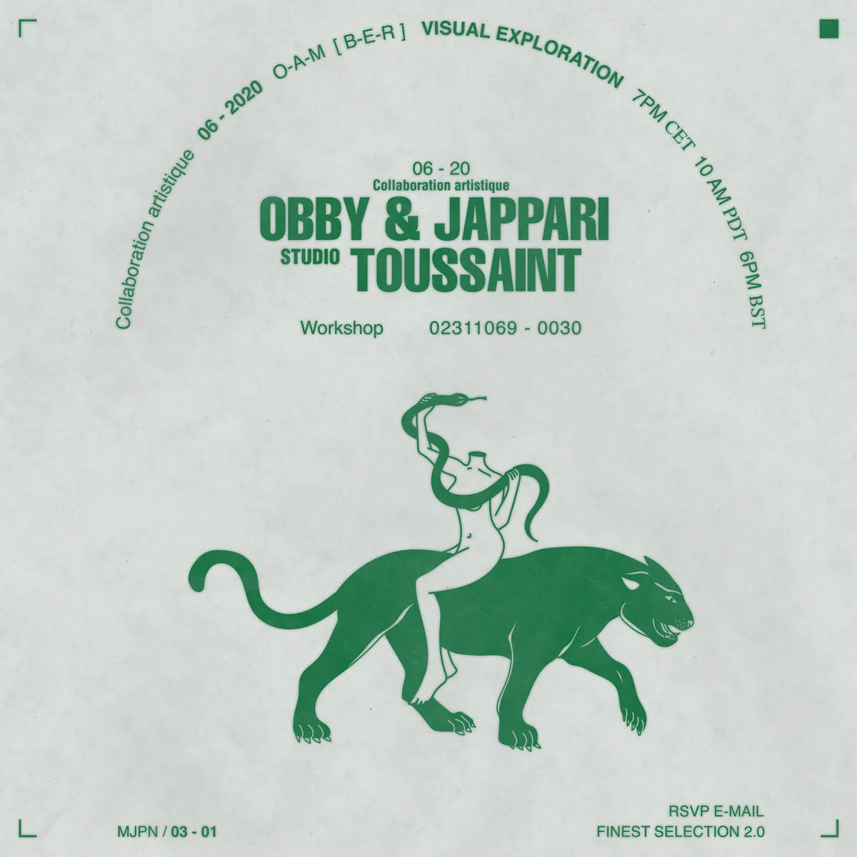
Creating with a keen eye for detail, Nadine tells us, ‘I love to combine clean and minimalistic layouts with 3D renderings from other artists/studios, such as Obby & Jappari… Small design elements like technical specifications, scales, ui elements and crop marks occur throughout my artworks’. We love Nadine’s inclusion of these details; it’s probably one of our favourite elements of her work.
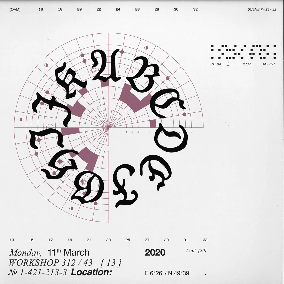
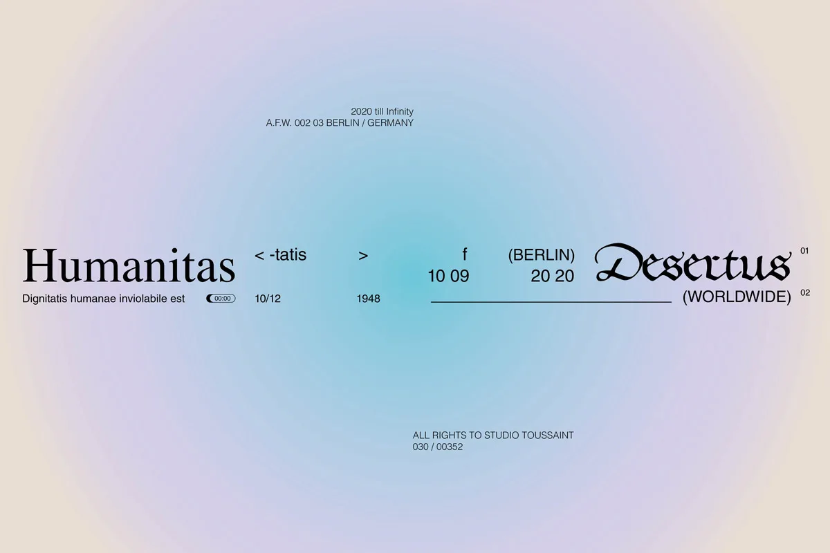
Nadine’s layouts are clean, dynamic and sparse. They’re brutal, purposeful and beautiful. Each element is meticulously well-crafted and no aspect of her compositional work ever feels clumsy or unnecessary. However, whilst a visually minimal approach feels characteristic to Nadine’s aesthetic eye, there are subtle intricacies of experimentation layered into her process and technique. ‘An important part in the design processes of young designers in to try alternative ways of working, for example, with incorporating analogue techniques’, Nadine tells us…
‘Taking inspiration from the aesthetics of old music festival flyers, I like to try and imitate their qualities through processes of scanning and copying… Rough textures of old scanned newspapers and blurry typography merge into each other and give an overall used and dirty look’.

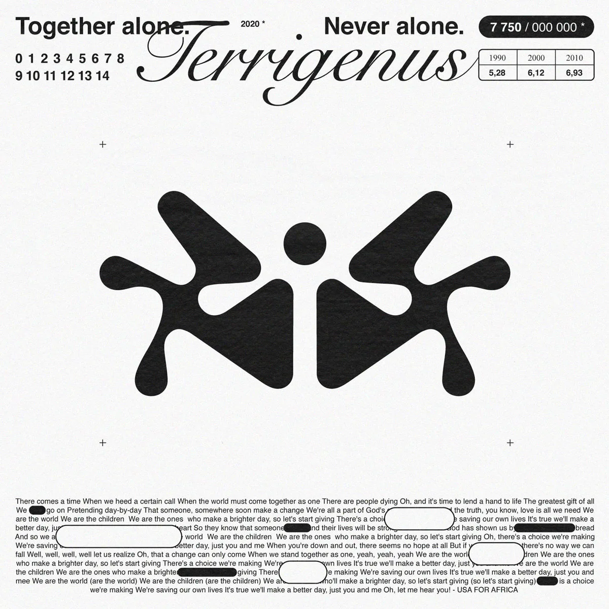
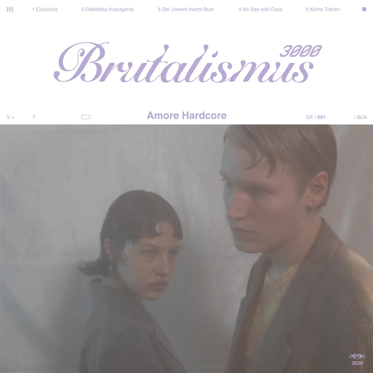
One of Nadine’s most recent endeavours includes a cover design for the music duo, Brutalismus 3000. ‘The typefaces reflect the music genre of the band, Nu Gabber mixed with Post Techno Punk. The romantic customised Brutalismus type clashes on the nostalgic bitmap 3000 font —softness on angularity, curves on edges’.
Thanks, Nadine! To keep up to date with Nadine’s work, check her out on Instagram.


