
This week, we welcome the amazing Frederik Samuel (@fsamuel) of @typegoodness to tell us about his top 20 favourite type works at the moment. The Amsterdam-based Design Director specialises in branding and advertising and works with some huge clients — including Adidas, Umbro and Magnum. The design director created Typegoodness in 2009, as a platform to showcase and celebrate his favourite type work out there.
‘I’ve always loved type and still believe it’s one of the key ingredients to good design’, Frederik tells us. ‘It originally started out as a website, which I slowly stopped updating as time went on. I started the Instagram account 2 years ago, which started to get more and more attention. After leaving my last job 2 months ago, I did a rebrand and a much needed website refresh. The main goal of the site is to inspire young creatives and give them tools to better themselves. The new designer series is going very well with lots of talented designers sharing how they got started with design/type.’
So, here’s Frederik’s top 20…
Yana & Jun Design + Art | @yanandjun
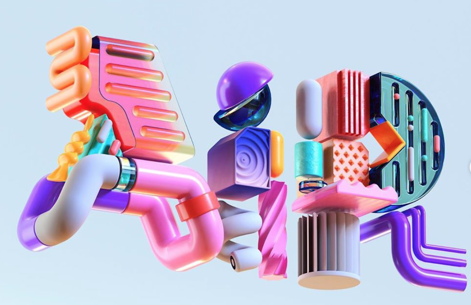
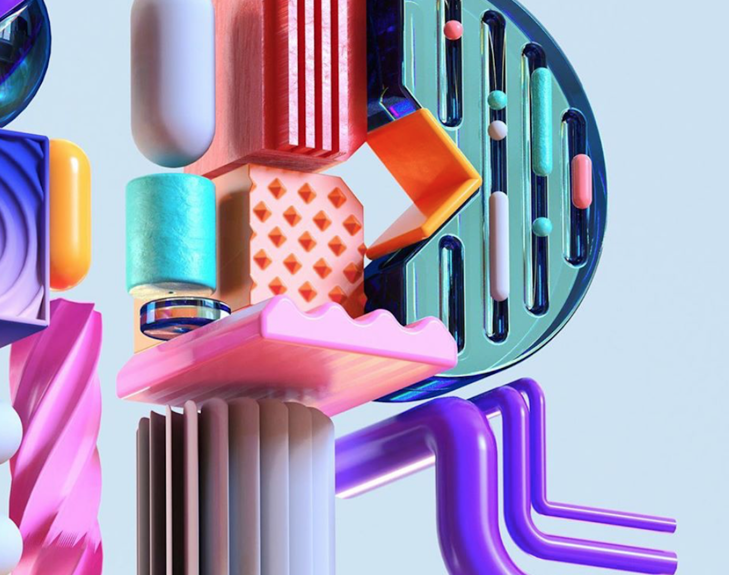
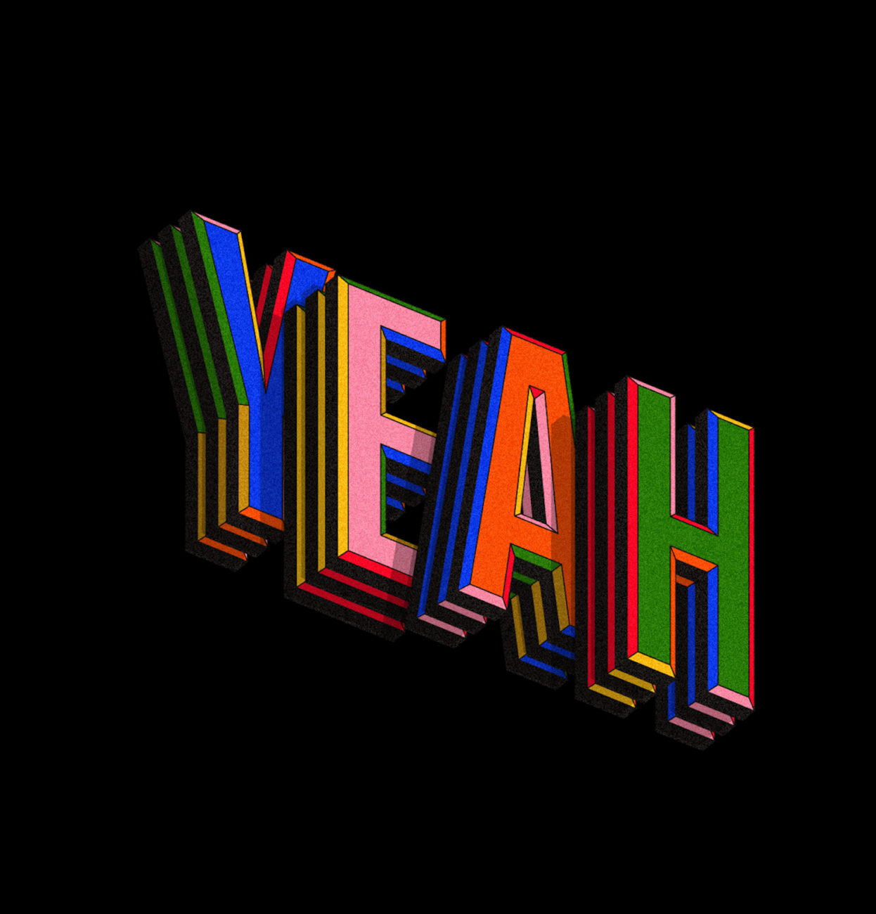
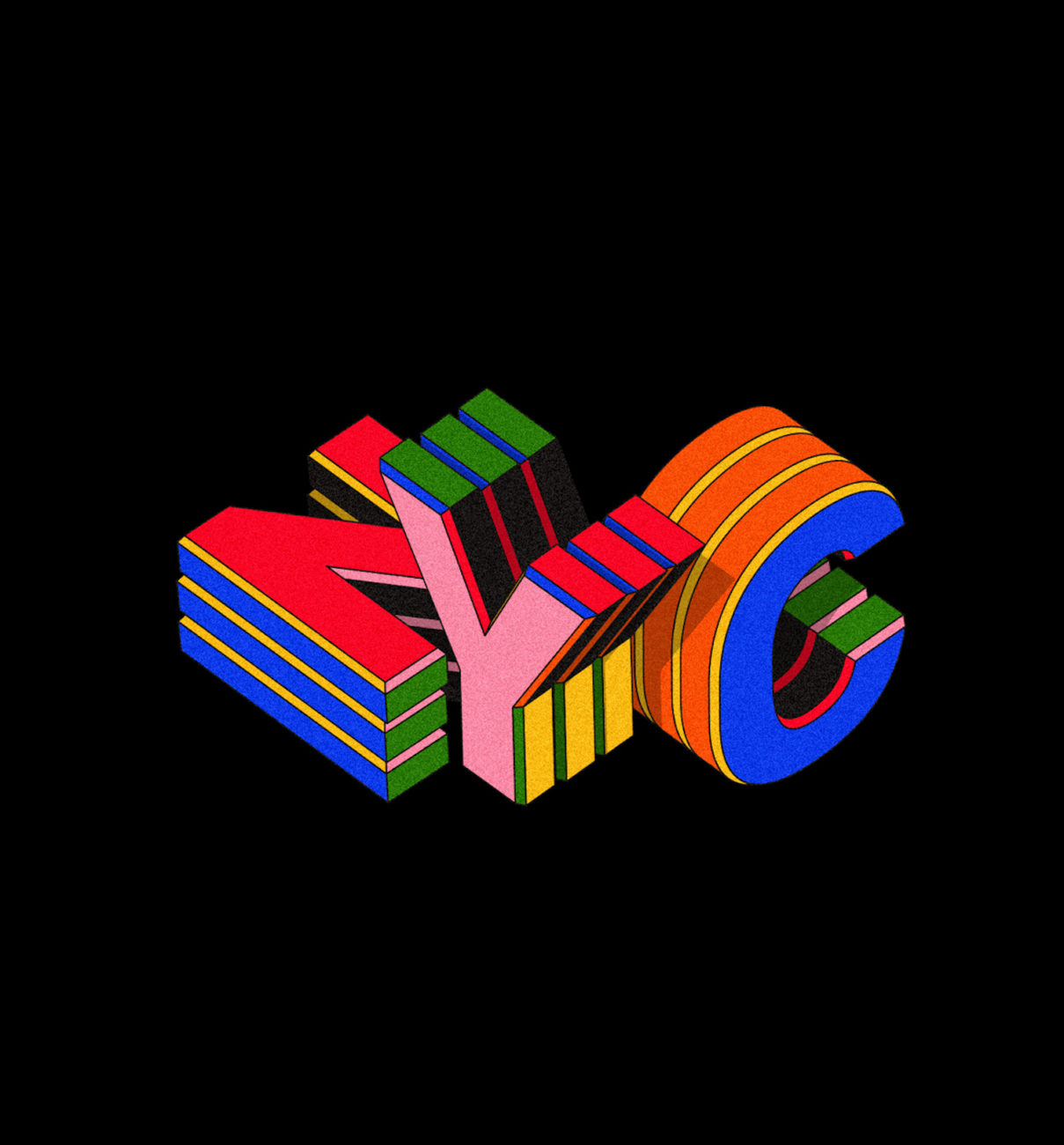
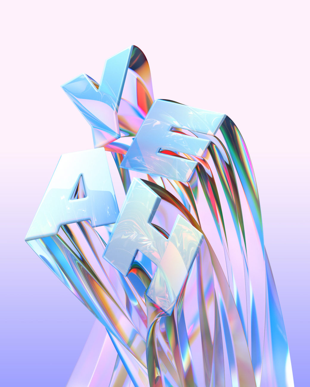
This stunning 3D Typographic piece, entitled ‘Air’, was created by the Singapore-based collaborative creative venture, Yana & Jun Design + Art. Working together they form the design studio, BÜRO UFHO and are also the founders of surrealist art studio, Kittozuto. In this piece, the duo pair popping colour contrasts with stunningly rendered light and textures; showing a wealth of mind-blowing skill and creativity, alongside some super-dynamic shape-work.
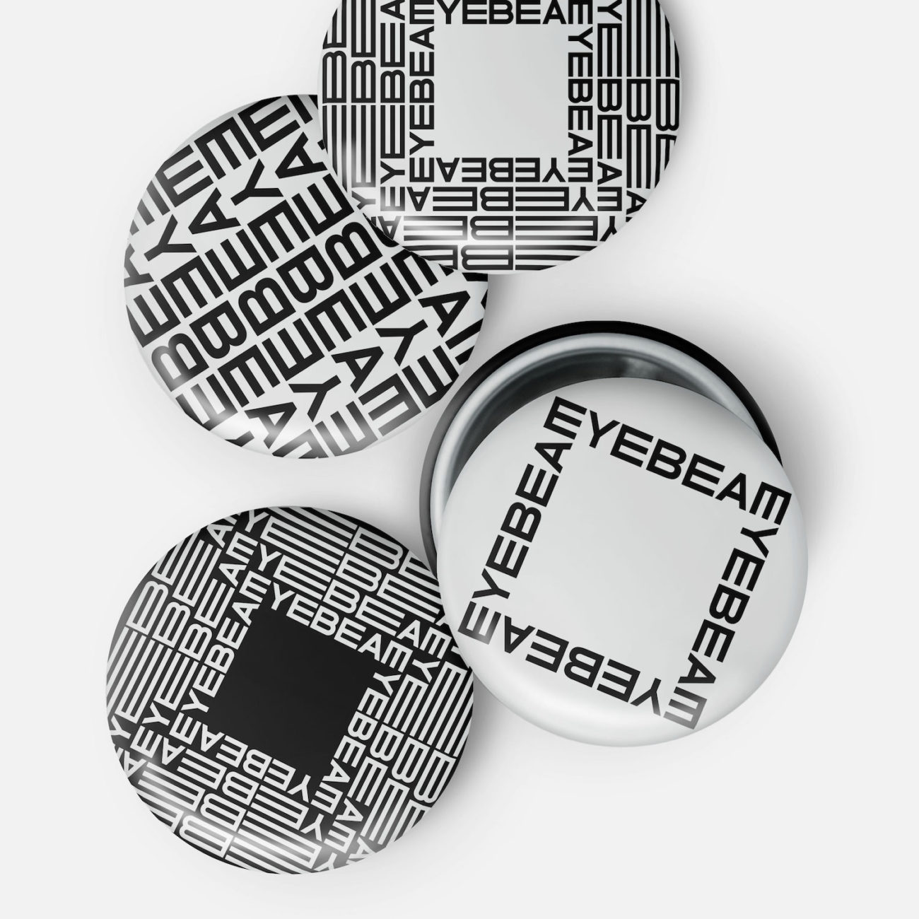
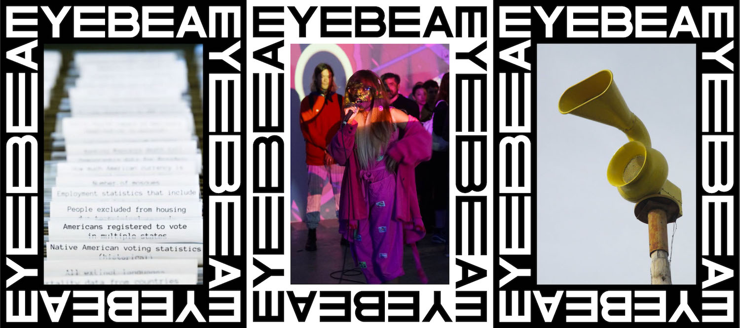
Based between New York City and London, Mother Design Studio is an independent branding and design studio. Founded in 2006, the studio’s portfolio is sharp, unique and includes a collection of stunningly hypnotic motion type. As part of their top 20, Frederik selected the studio’s new visual identity design for Eyebeam — a Brooklyn-based platform encouraging artists to engage with society’s relationship with technology — which features gorgeous motion work and experimental custom type.
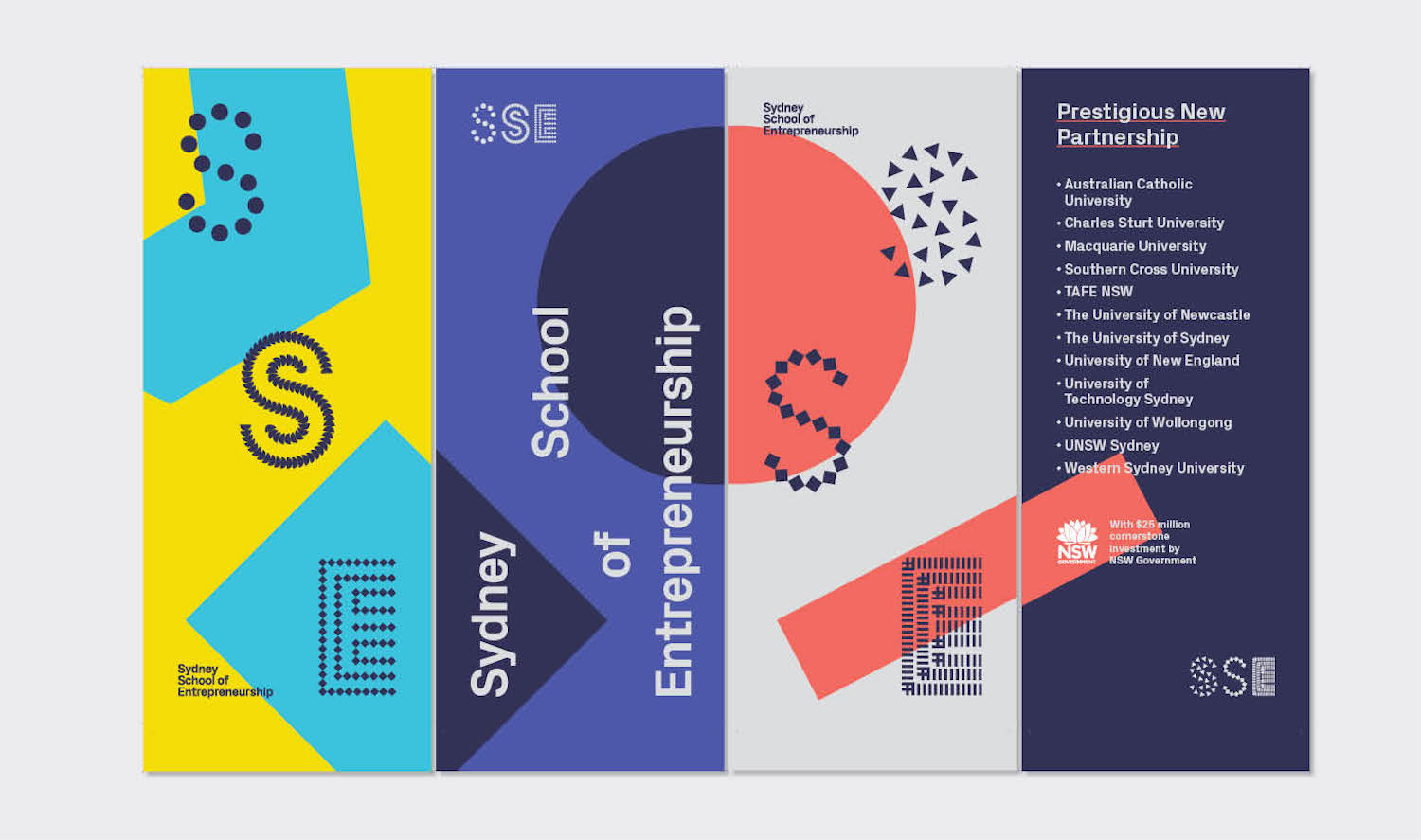
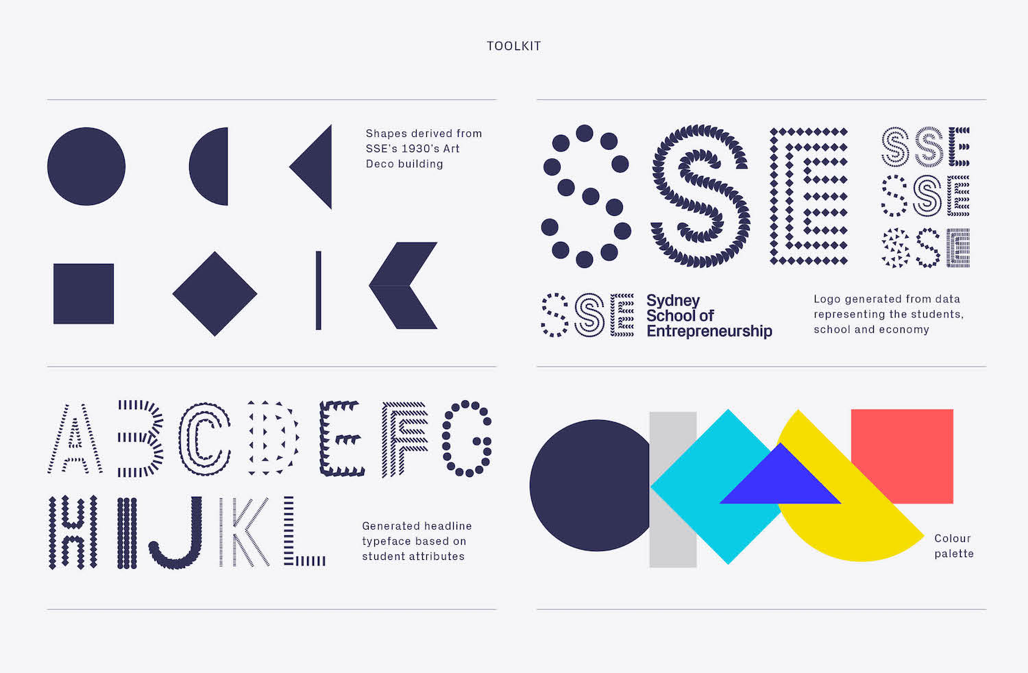
For The People | @forthepeopleau
For The People introduce themselves as ‘a brand agency focused
on getting organisations closer to people through strategy, design, storytelling and technology’. Definitely worthsome attention, the studio’s digital brand identity for Sydney School of Entrepreneurship (SSE) radiates a restless, ever-changing aesthetic; a visual identity with the ability to exist in a vibrant, ever-evolving state of flux — definitely go and check them out!
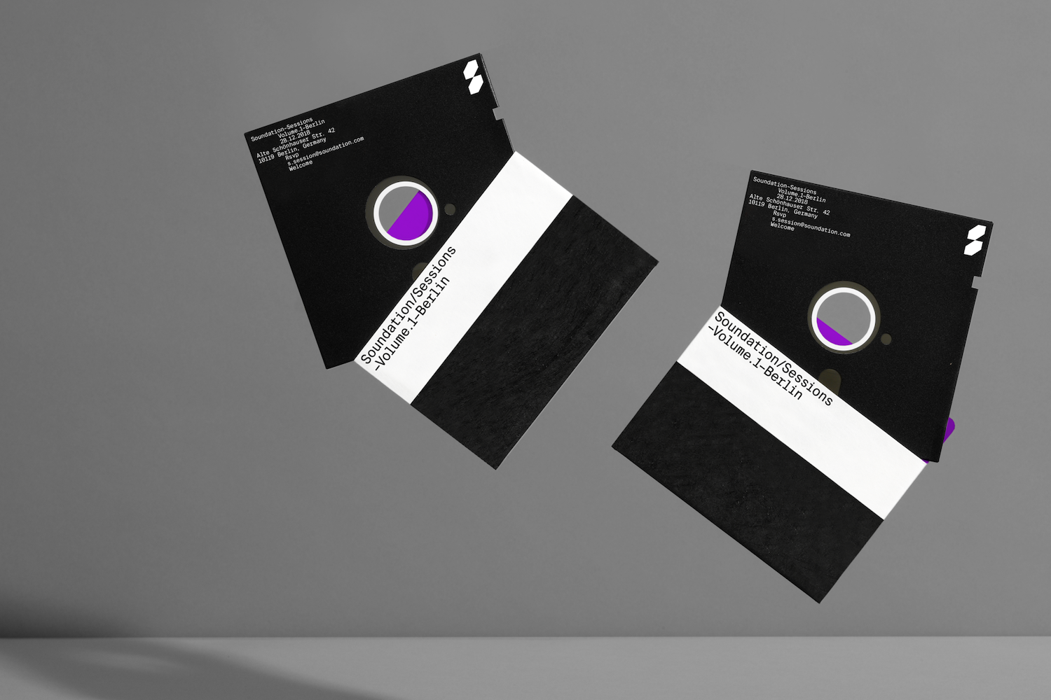
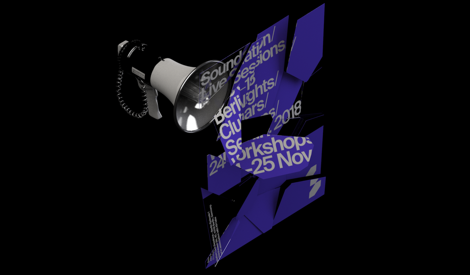
Between Stockholm and New York, Kurppa Hosk operate as an international brand agency working on transformative design, strategies, and experiences. Working for Soundation, an online music production service aimed at new-coming producers, Kurppa Hosk created this gorgeous brand new visual identity. Designed to connect common ground of passion and inspiration between Soundation and their target audience, this project is super exciting and effective.
Larssen & Amaral | @larssenamaral
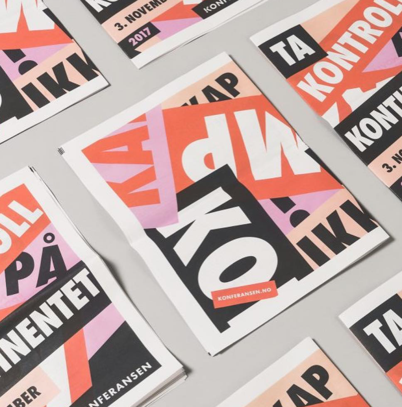
Norwegian design studio, Larssen & Amaral, make Frederik’s top 20 with their powerful identity and materials for the Norwegian annual women’s conference, @konferansen.no. The conference explores women’s issues today and aims to inspire growth and change as well as share valuable knowledge through lectures and various exchanges. Larssen & Amaral’s materials for the conference contain loud, attention-grabbing type work alongside a muted-yet-powerful femme colour palette; complemented by stark injections of heavy black. This is some really stunning work – definitely go take a look!
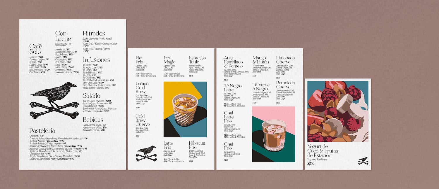
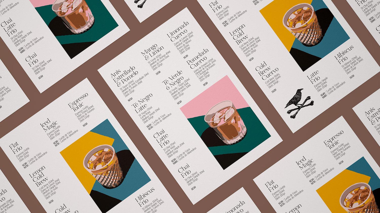
Buenos Aries-based design and animation studio, Hueso, specialise in ‘conceptualising and creating unique visual experiences spanning branding, art direction, graphic design, illustration, advertising, communication, photography and animation’. The studio’s print work for @cuervocafe features illustrations created to evoke a sensory experience of ‘taste and feeling’ and is situated alongside a minimal yet subtly ornate type treatment.
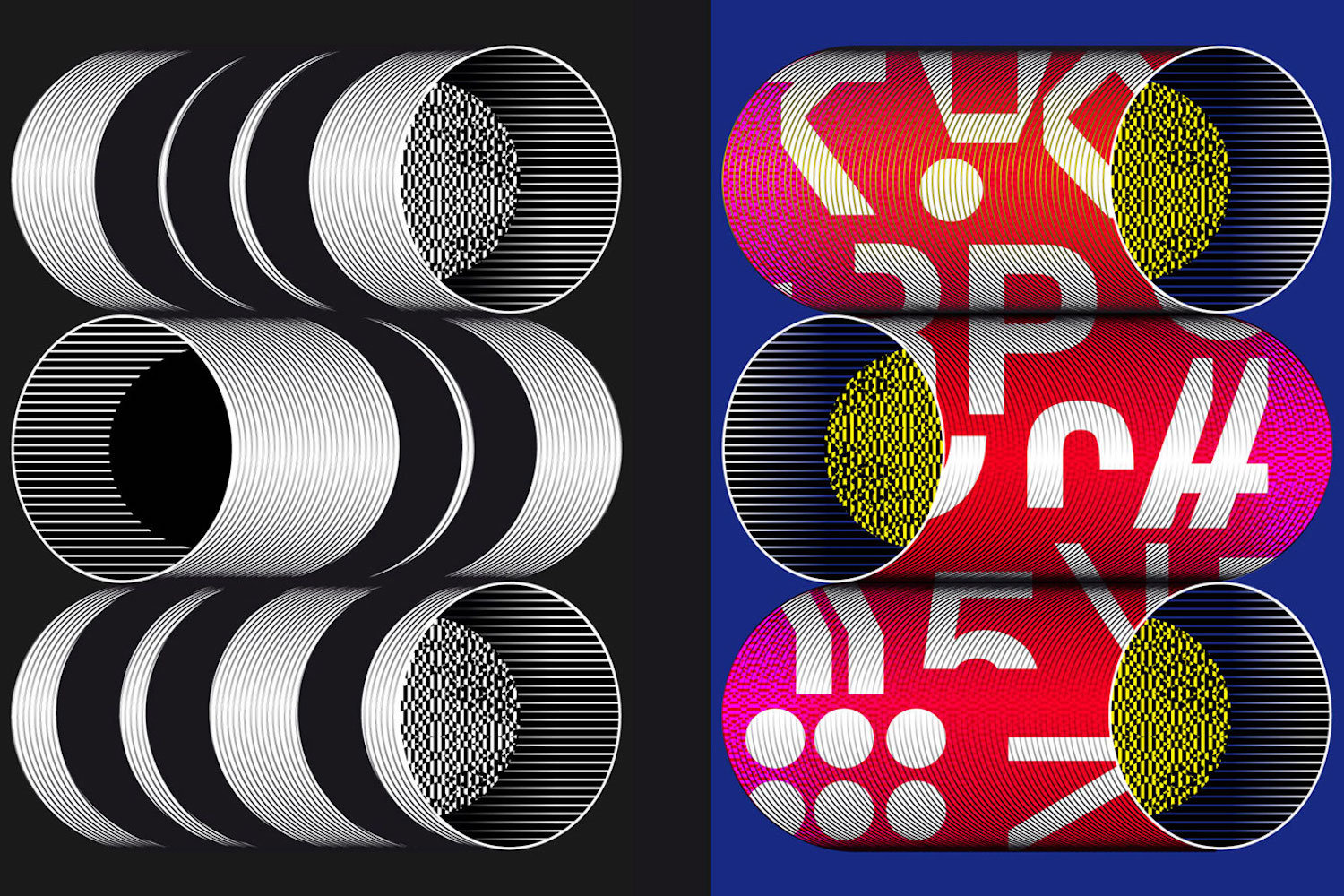
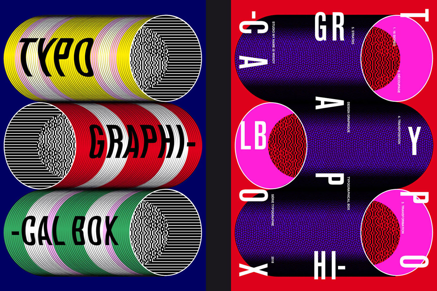
My Name is Wendy | @mynameiswendystudio
My Name is Wendy’s poster series, Typographical Box, features super graphic posters composed with highly saturated colours and intricately pattered textures. These intriguing designs feel at once measured and controlled, hypnotic and psychedelic; simultaneously harmonious and full of contrast. A creative collaboration between two graphic designers, the studio’s work is definitely worth a closer look.
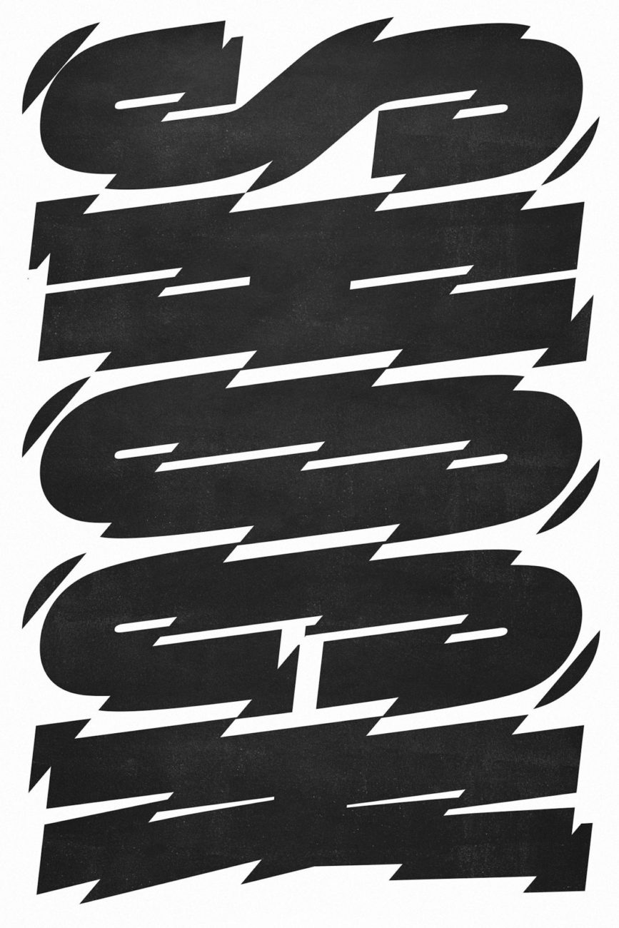
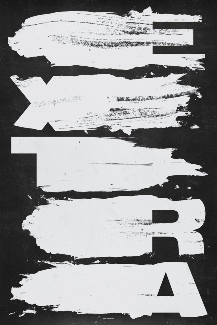
Based in Detroit, Xtian Miller is a British designer and the founder of SIGNAL A , a growing collection of expressive typographic posters created by the designer and inspired by a mixture of influences including industrial signage, street art and Swiss Modernism. SIGNAL A is full of undeniably exciting works which vibrate with emotive energy and radiate an addictively unique visual language.
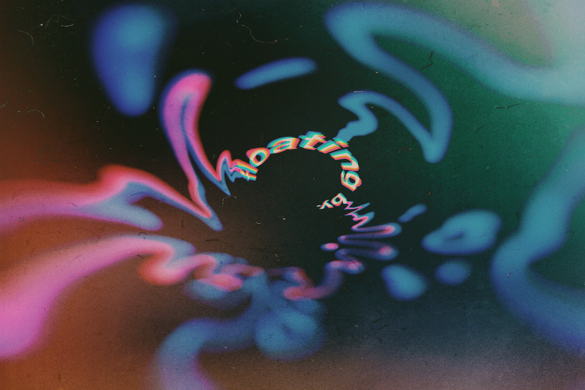
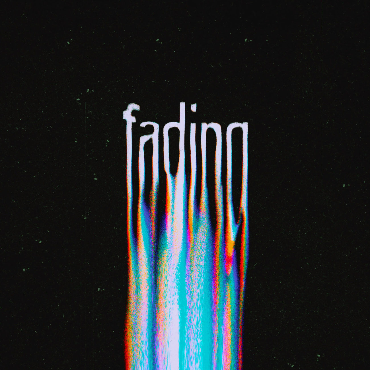
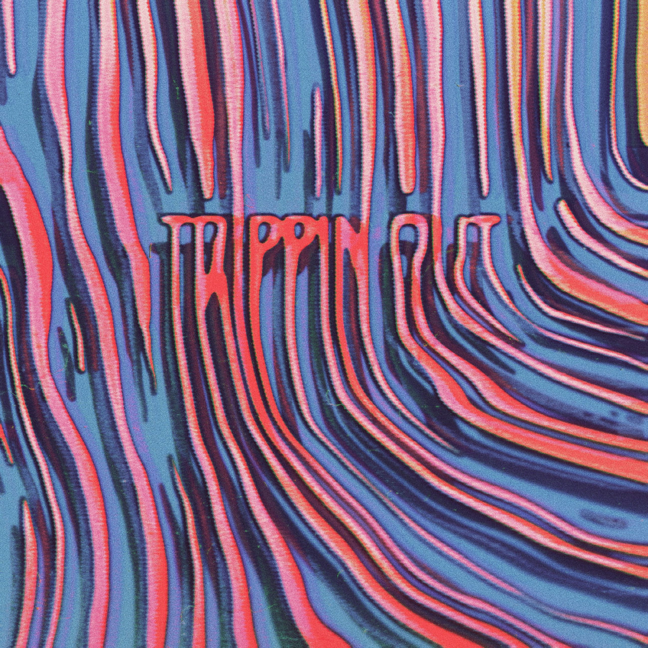
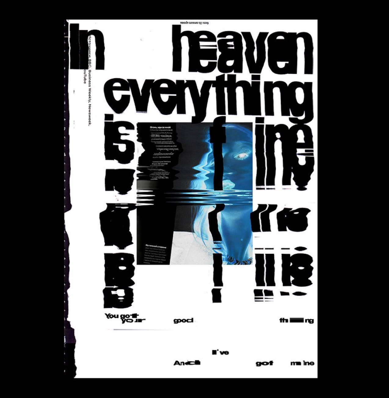
Los Angeles-based Artist and Creative Director, Mishko (Nevan Doyle) creates stunning digital type experiments which explore the visuality of words and emotions/sensation through unique, glitchy works. Intelligently rendered and incredibly powerful, these pieces (although 2D) feel pretty transformative and immersive through their charismatic and powerful presence. The artist also creates some really stunning motion type pieces in this style too, which are definitely worth checking out!
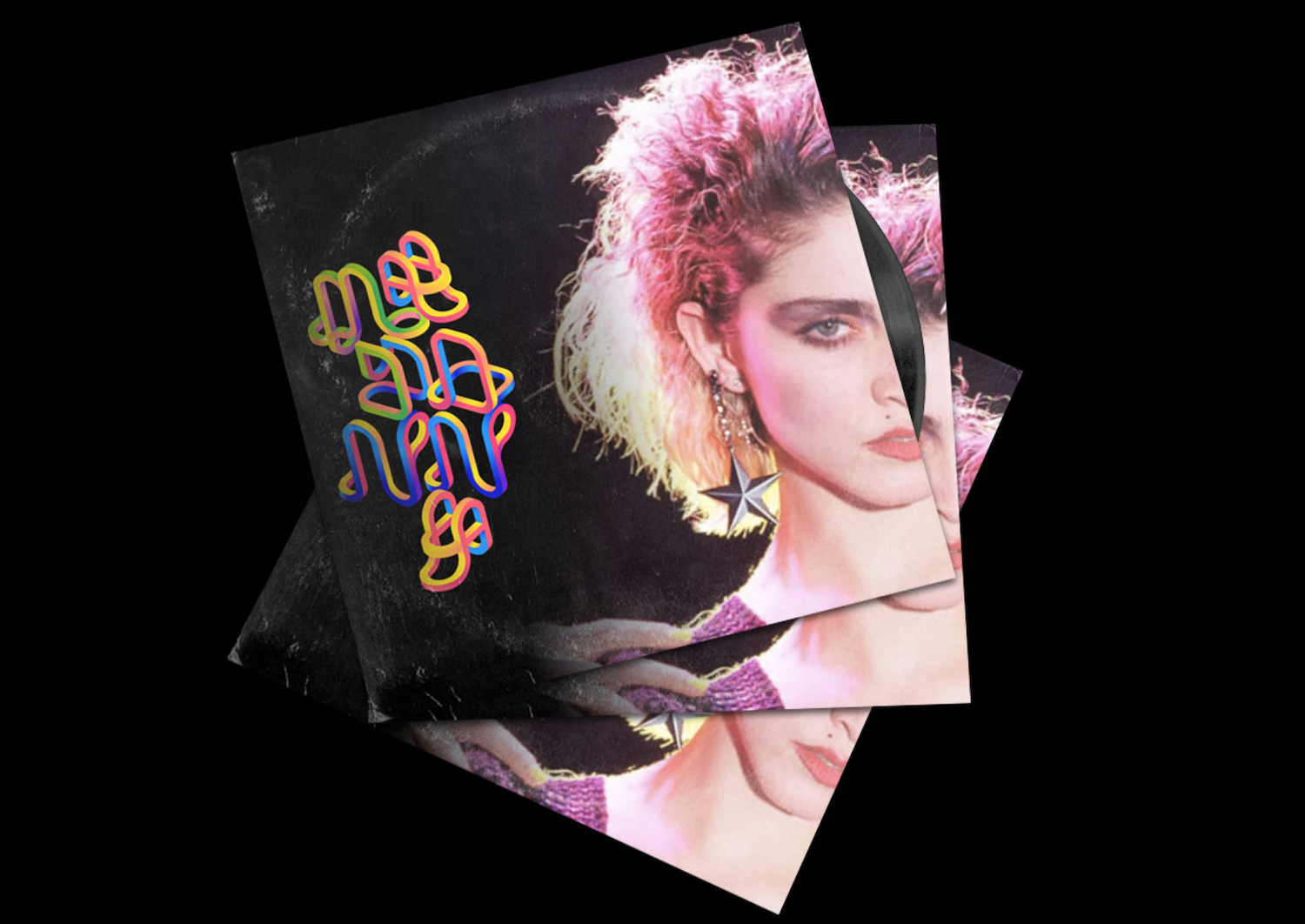
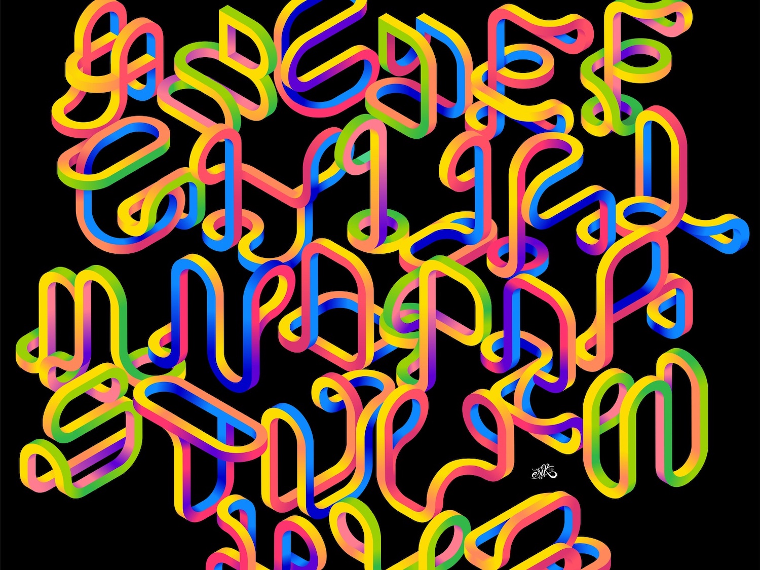
Based in Guanajuato, Mexico, Vector Illustrator and Letter Artist, Erik González’s stunning creation, Rollercoaster Type, also makes Frederik’s top 20. This incredible piece of work features letterforms which join together fluidly and tumble across the page; creating a dynamic exploration of shape and form.
Fons Hickmann M23 | @fons_hickmann_m23
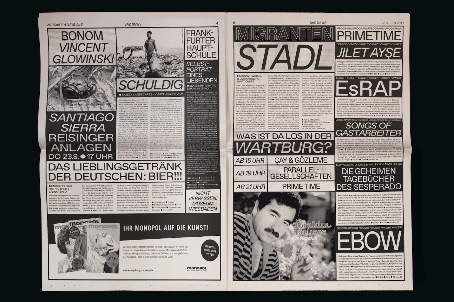
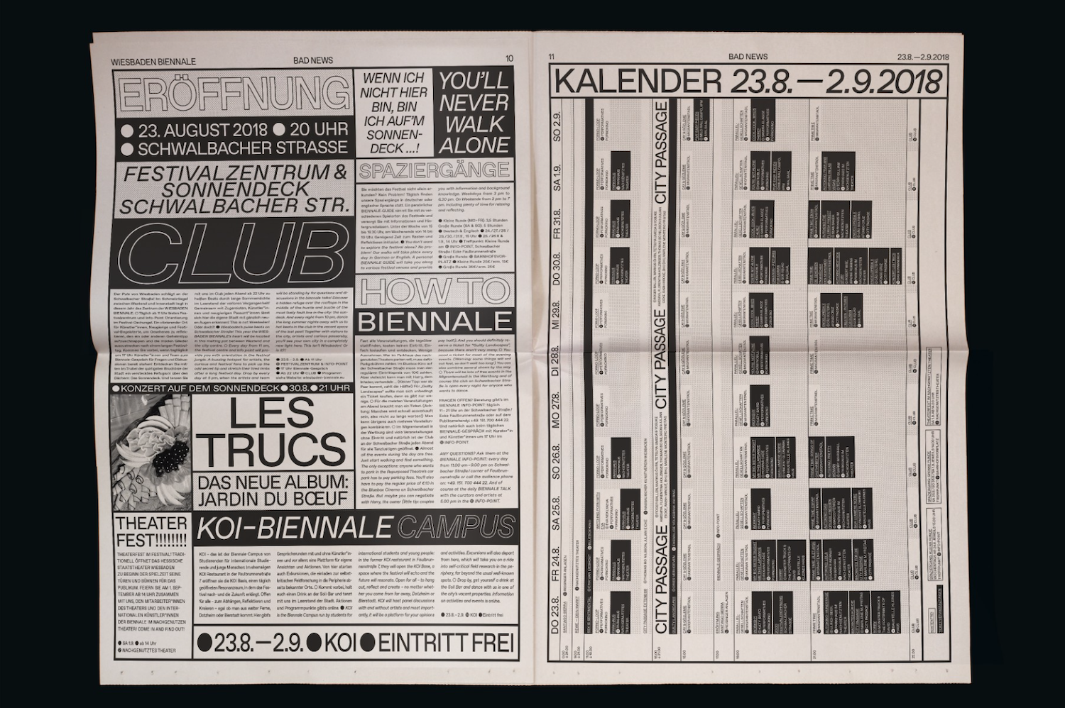
Frederik also gave Fons Hickmann M23’s newspaper type treatment for Bad News a place in their top 20. Featuring a stunning combination of delicate body text and bold sans headlines, this type treatment is super eye catching and full of exciting compositional choices. Exploring our current inundation with real/fake news, this tabloid-style newspaper design was created for the announcement of the second Wiesbaden Biennale for Performing Arts with the theme of Bad News.
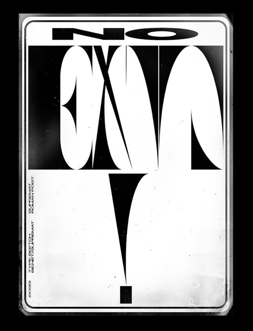
Based in Dedovsk, Russia, Supremat is a Graphic Designer who creates stunning typographic posters and prints. Using minimal colour palettes — often featuring monochrome styles with pops of red — these works really stand out for their innovative take on composition. The designer also creates fonts which are available through MyFonts.
The personal project typographic experiments of London-based South African designer, Andrew Footit, have also caught Frederik’s attention. Featuring a strong palette made up of primary and secondary colours, these bold typographic works play with space, angles and dimensions to form stunning compositions which appear almost like optical illusions.
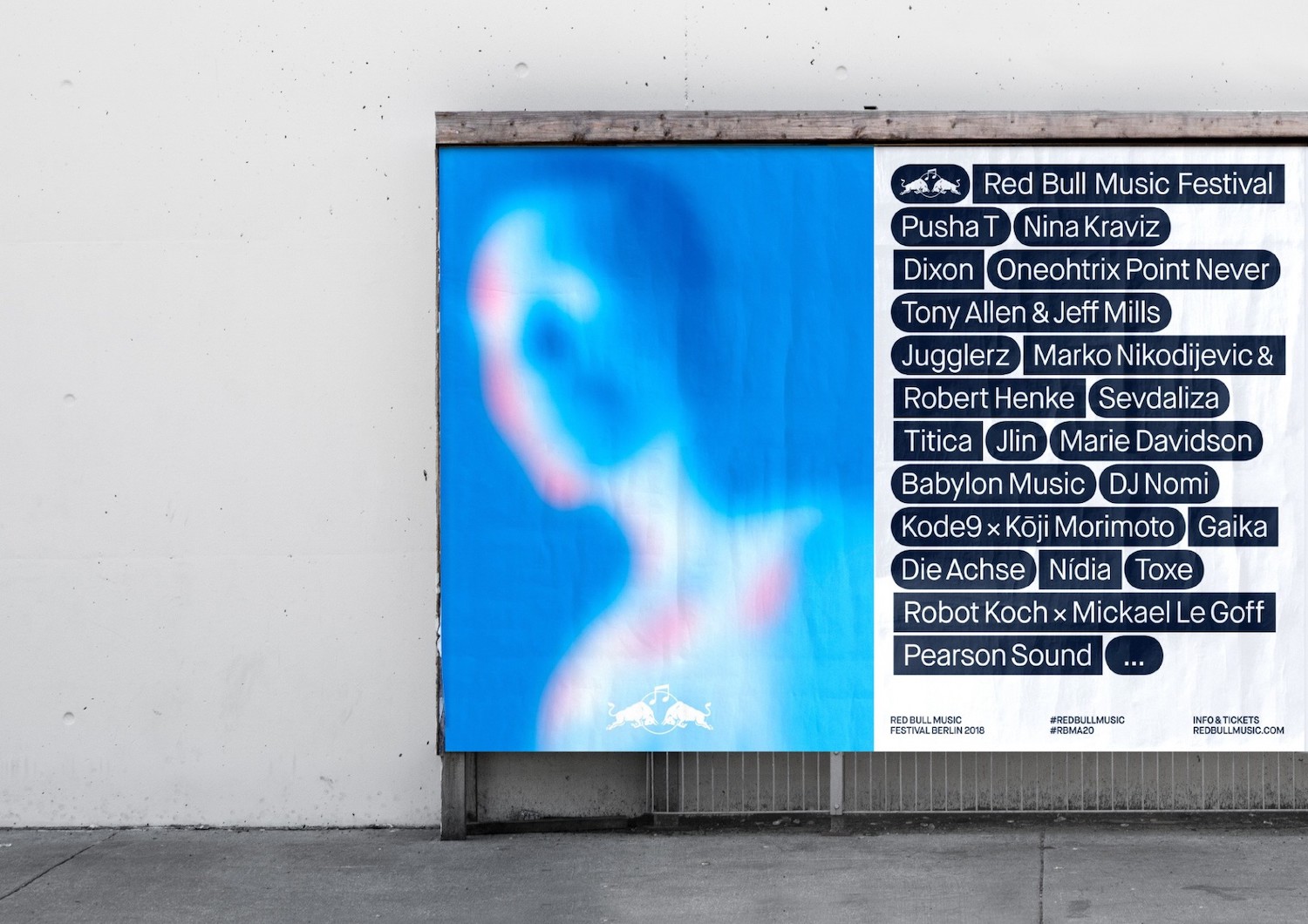
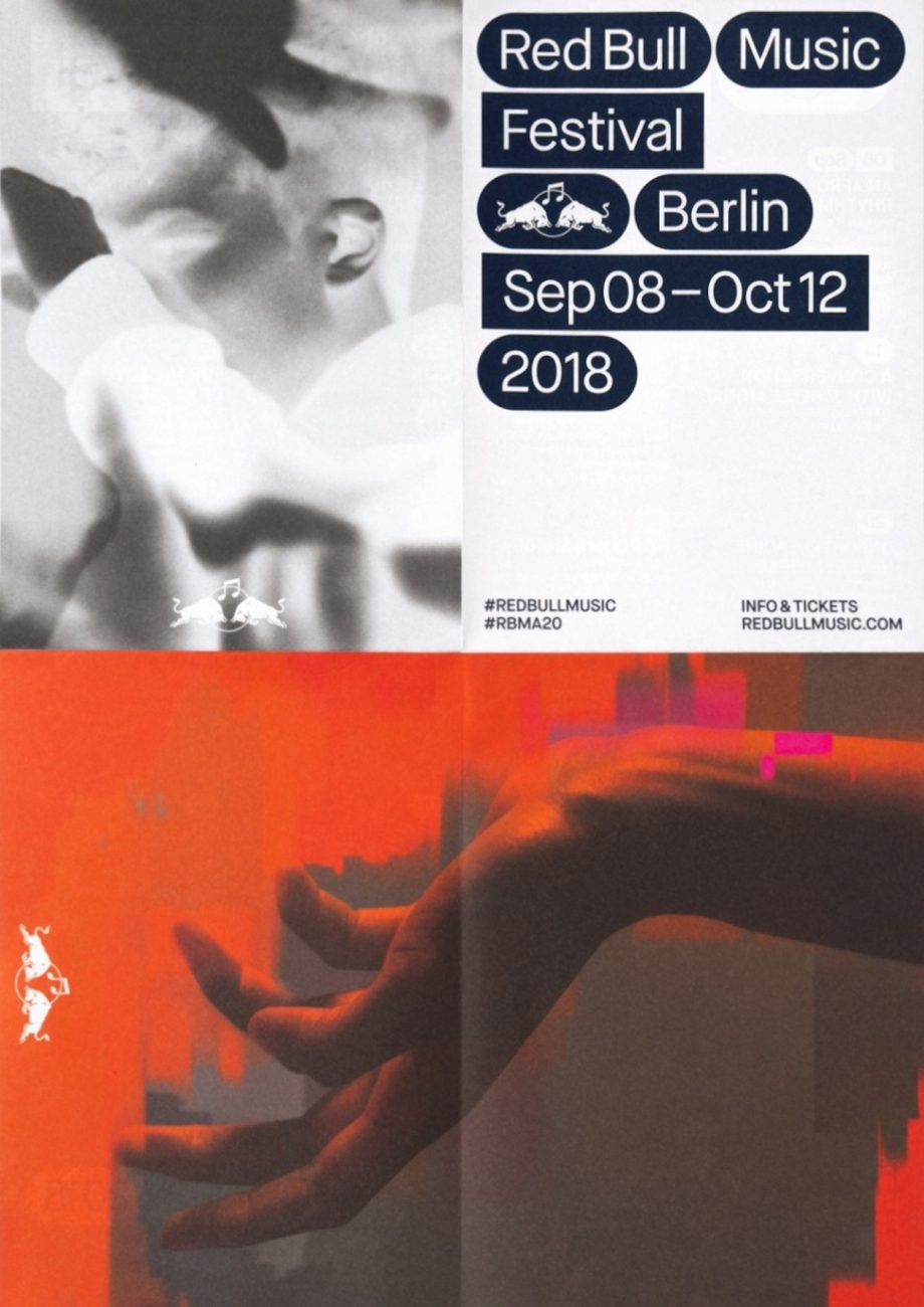
For the twenty year anniversary of the Red Bull Music Academy, international creative studio, HelloMe, created a stunning visual identity and campaign which Frederik also loved. The minimal sans type, set within rectangular and oval shapes, sits stunningly across the urban backdrop of the city and creates a direct and rhythmic aesthetic.
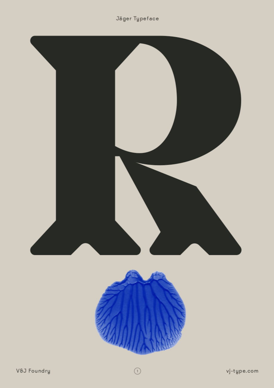
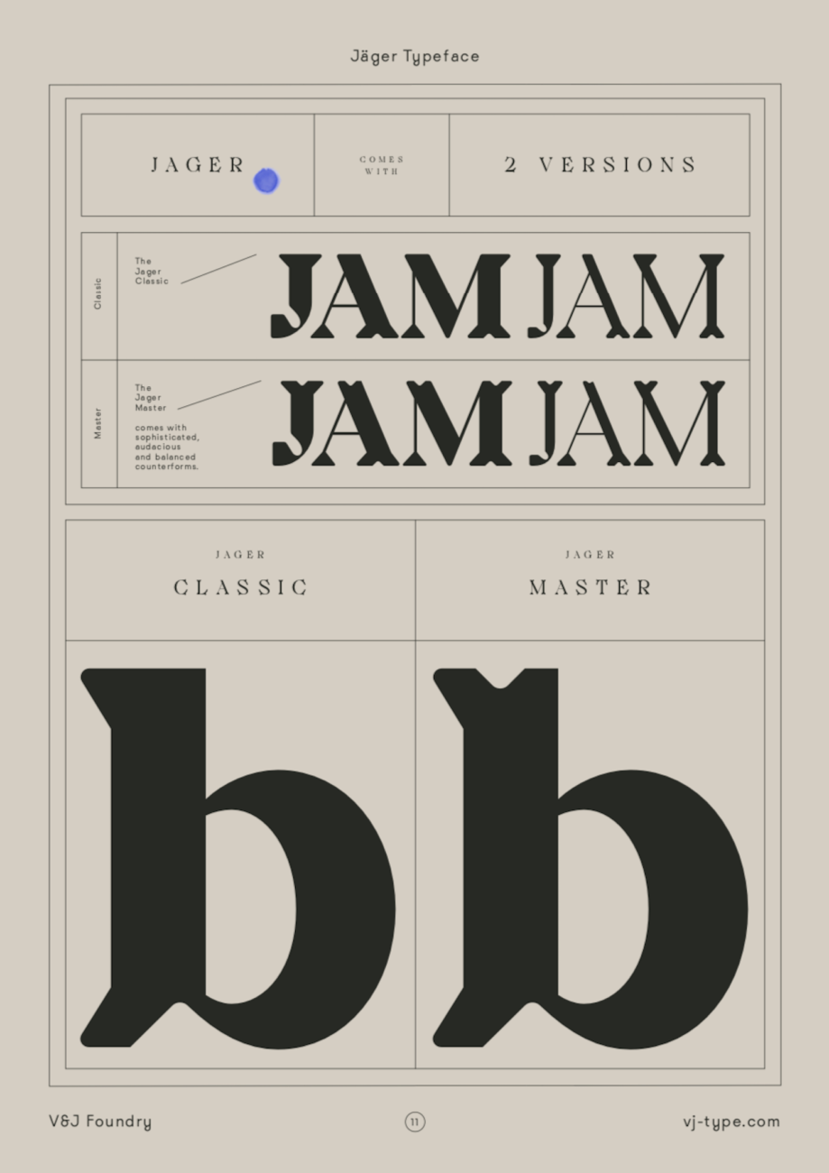
Violaine & Jérémy | @violaineetjeremy
Violaine & Jérémy also make it to the list with their latest typeface release, Jäger. Comprised of hollowed-out counter forms and gently rounded angles, this display typeface is suited also to medium length texts and pays homage to traditional craftsmanship and craft as a labour of love. The forms are reminiscent of engraving, woodcarvings, sculpture and chisel-work and the overall effect is undeniably beautiful.
Parachute Typefoundry | @parachutetypefoundry
Parachute Typefoundry, based between Athens and London, is headed by Panos Vassiliou and is the producer of a stunning range of fonts. Frederik selected their stunning release, Marlet, for their top 20. Characterised by ‘edgy elegance’, Marlet is a humanist type system with so much inspiring potential. Fluid, graceful and refined, Marlet brings presence and poise to a whole range of uses and is definitely worth a closer look.
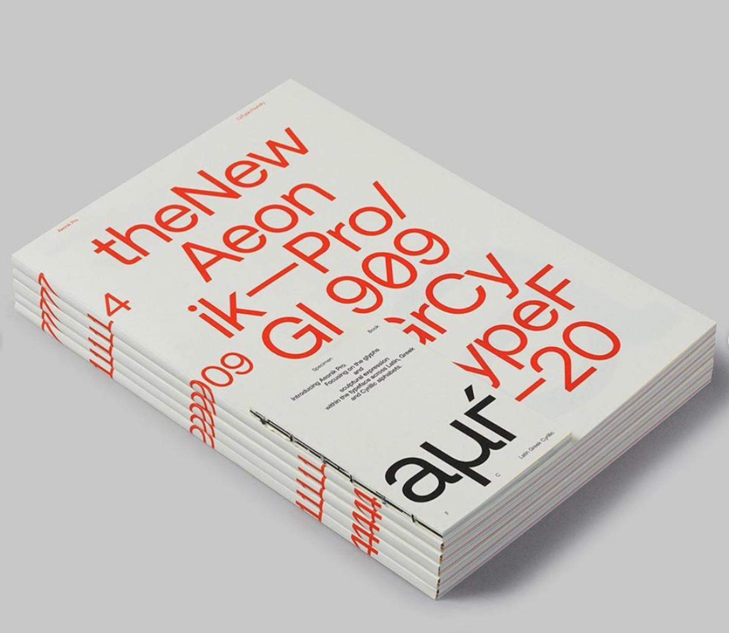
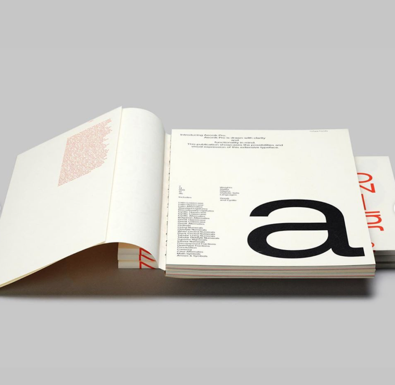
CoType Foundry | @cotypefoundry
Founded by Mark Bloom (@mashcreative) CoType Foundry is a London-based type foundry designing contemporary typefaces for both digital and print, all supporting ‘Latin Extended-A, Western European, Central European and Southeastern European languages’. Aeonik Pro, a newly refined version of their best selling family, Aeonik, is sharp and versatile. Frederik highlighted their two specimen books created for the new release, which were designed in collaboration with @semiotik_design.
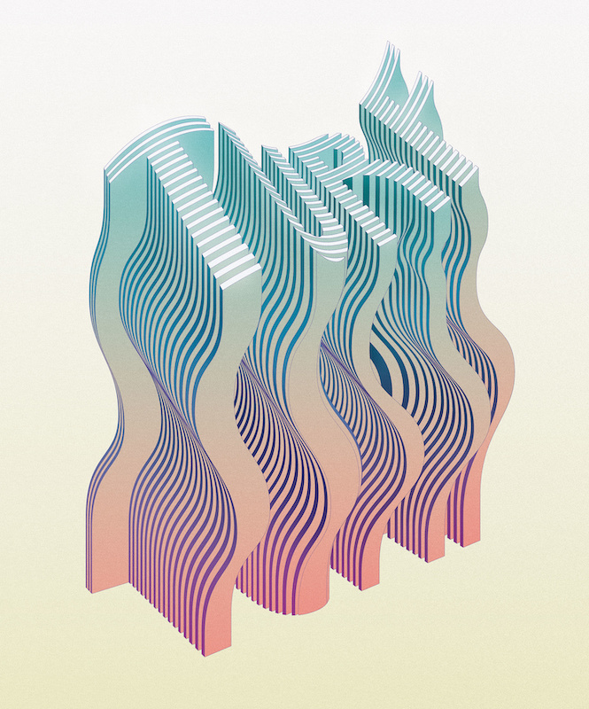
Muokkaa is the creative practice of Madrid-based art director and illustrator, Álex López. Specialising in creating expressive illustrative pieces driven by geometric shapes and a bold use of colour, Frederik particularly loved Muokkaa’s 3D type experiments. With stunningly rendered textures, colours and light, we love these 3D pieces too.
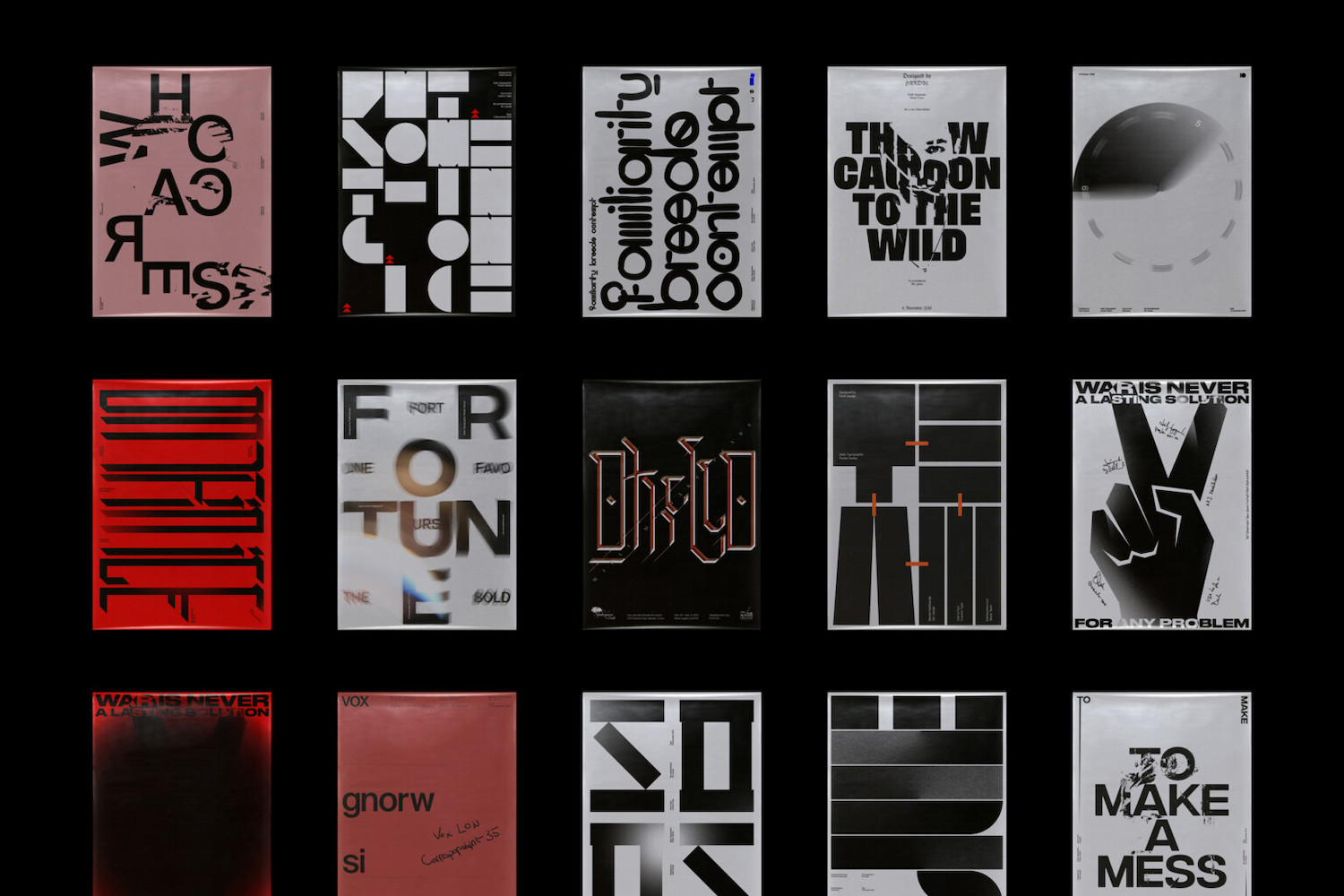
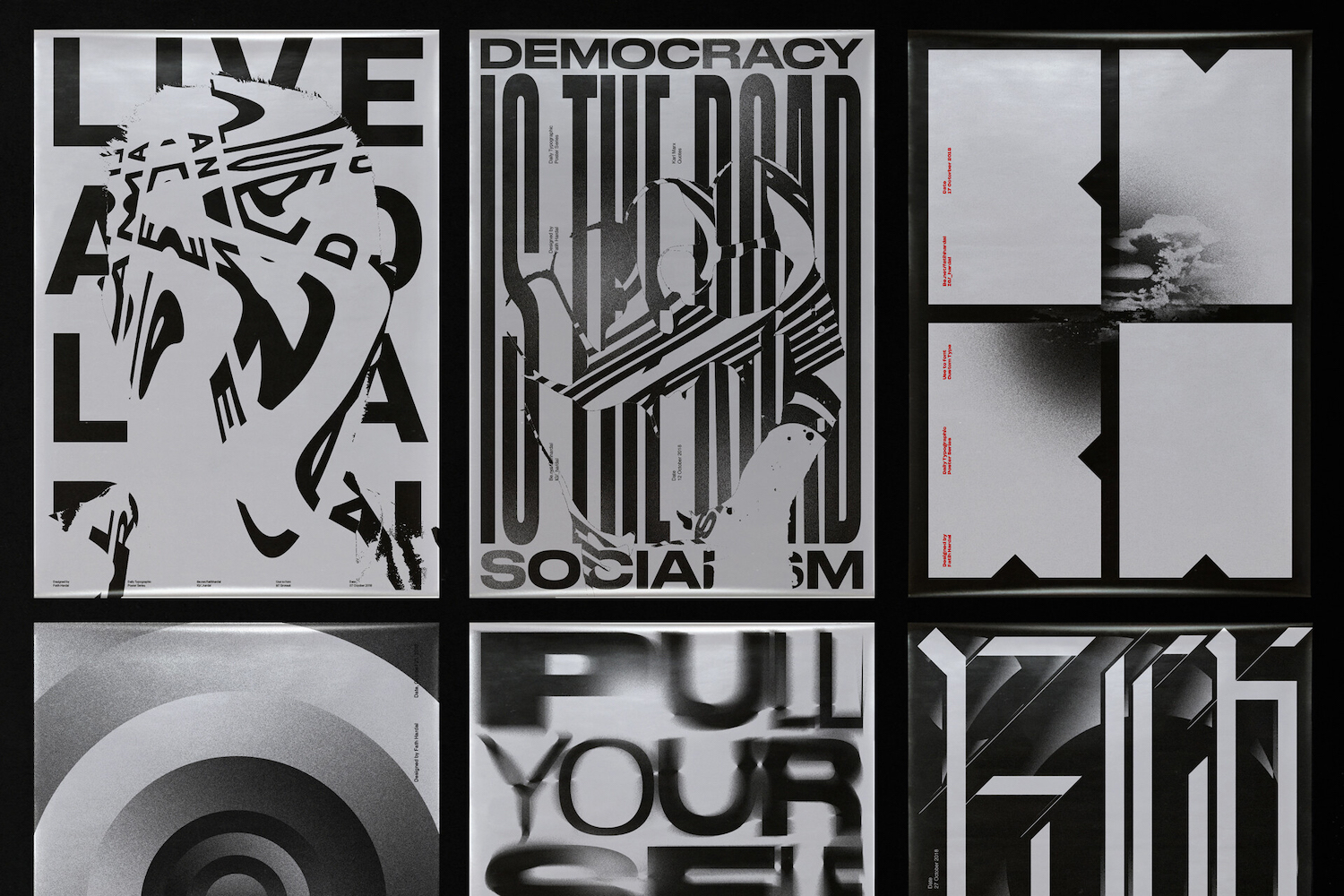
Fatih Hardal is an Istanbul-based designer and the founder of @hardalstudio. The designer’s typographic posters feature experimental and bold uses of type and often play with fracturing and distortion. We really love these pieces and think its definitely worth having a browse through the designers extensive portfolio.
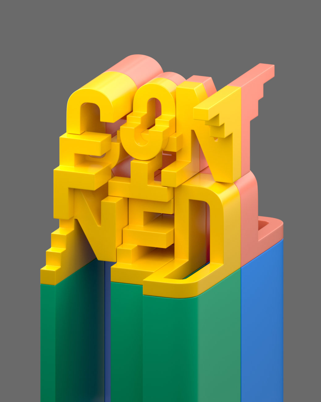
Made Up Studio | @thisismadeup
Ran by designer/illustrator Charles Williams, Made Up is a creative studio making work for magazines, advertising, brand design and animation. Made Up’s typographical editorial pieces are really vibrant and feel both tactile and mechanical; meeting a futuristic edge with a touch of 3D optical illusion-style playfulness.
Frederik, thanks for sharing @typegoodness’ top 20 — it’s been a pleasure! To see more from Frederik, visit his website and Instagram. And, of course, be sure to check out Typegoodness’ website and Instagram to see more!


