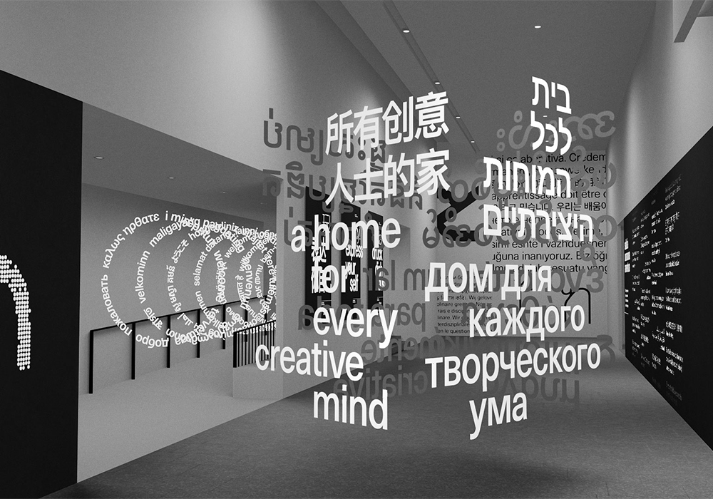
In celebration of the world’s writing systems, Brazilian Designer Filipe Peregrino (@filiperegrino) has been fusing multi-script type with augmented reality to create a one of a kind exhibition. Entitled The Languages Around Us, the exhibition highlights the diversity of typography, while the various type systems side by side help to visualise a peaceful coexistence of different cultures and languages in virtual space.
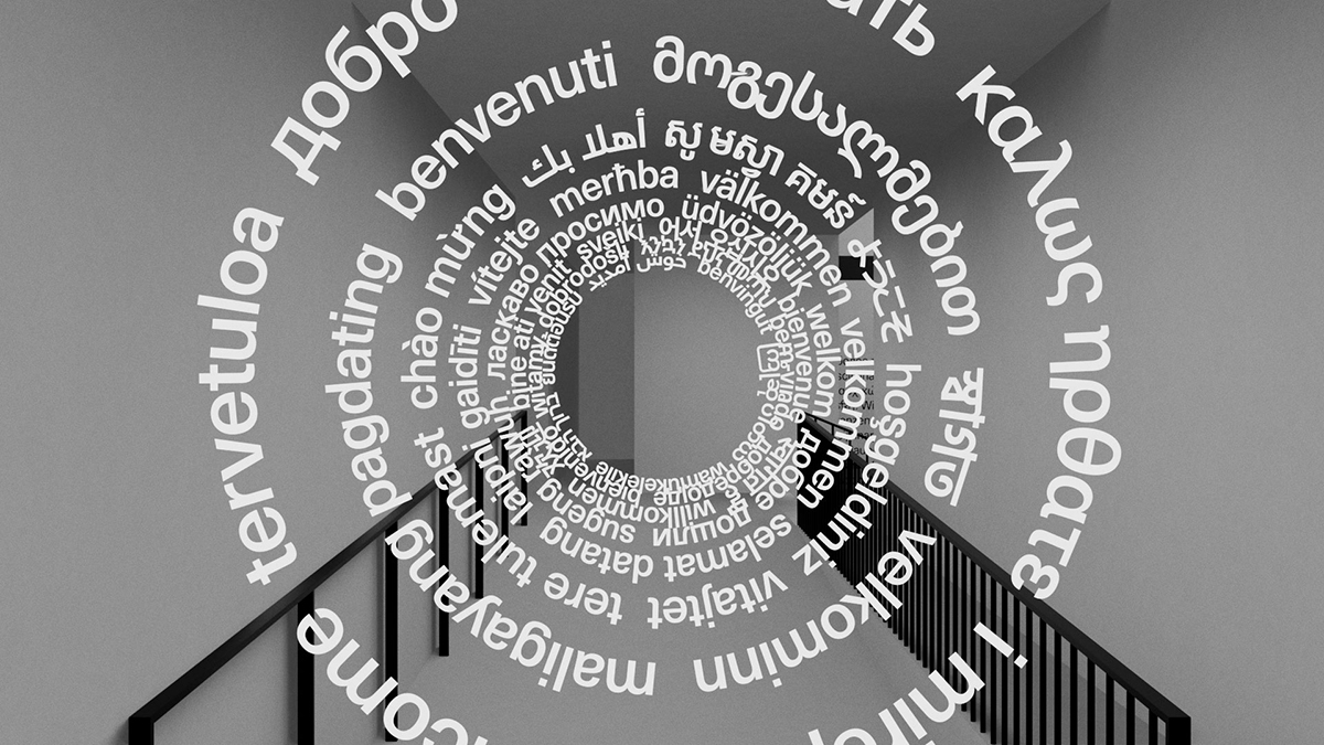
“Captivated by how design allows us to employ systematic thinking to express ideas and address problems creatively,” Filipe created The Languages Around Us to mark the culmination of his studies at London College of Communication. The exhibition is made up of a series of multilingual type installations, brought to life through AR, and embraces over forty different languages based on data collected from college student demographics in 2019. We spoke with Filipe to hear more about the motives and meaning behind the project.
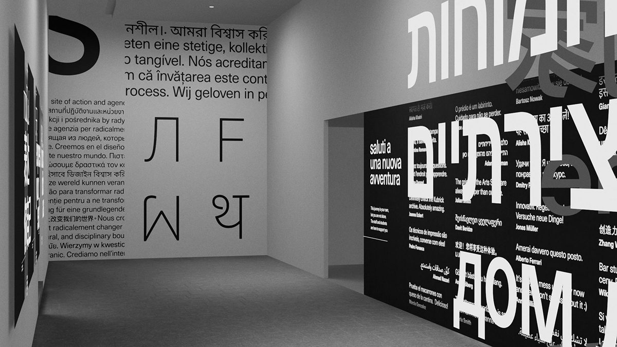
What were your aims when you started creating The Languages Around Us? How did the project come about?
The Languages Around Us was my final major project for the Design for Visual Communication postgraduate course at LCC, and it was inspired by mine and my colleagues’ experiences as international students in London.
Being so far away from home, I remember that hearing numerous languages shared around the city and college soundscapes gave me an unexpected sense of comfort. Those were spaces that embraced people from different backgrounds, so I wanted to celebrate that – and I wanted to find a way to enable the college space to truly reflect its cultural richness. I was very fortunate to find a way to merge several interests of mine in this project. Being very passionate about type – and seeing as it’s so intrinsically connected to writing systems and culture – I figured it would be the perfect means to bring this idea to life.
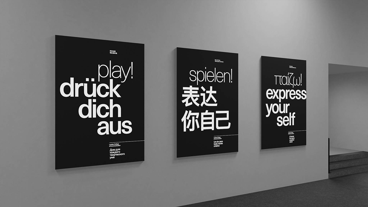
Why did you choose to use AR and how did this play into the design process?
My original idea was a bit broad – I initially considered creating physical installations as well. However, this was a project developed during a critical stage of the COVID-19 pandemic and, without access to many resources during the first lockdown, I was forced to narrow down its scope, which I soon realised wasn’t a bad thing at all.
If I wasn’t able to make it physical, I had to make it digital. I still needed the physical space to be a part of it, though, so exploring mixed/augmented reality was a way to meet these two requirements. This also meant that the audience’s role would be even more significant, since the existence of the installations would be subject to each person’s desire to manifest them using their mobile devices. On top of that, I was excited that every individual would be able to view and interact with their own instances of the exhibition, on their own terms.
Augmented reality has become much more accessible for both creators and users in recent years, so using such an interesting medium meant that these 3D virtual installations could be made dynamic, inclusive and fun through motion and interactivity.
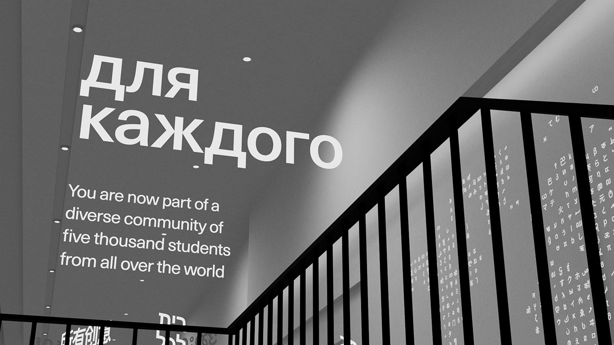
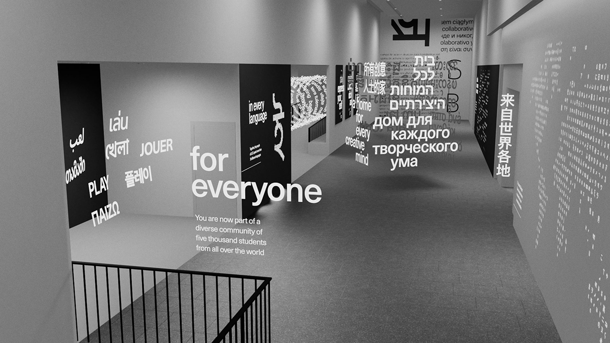
How did you go about creating the installations and how did you manage to morph between different writing systems while preserving the integrity of each script?
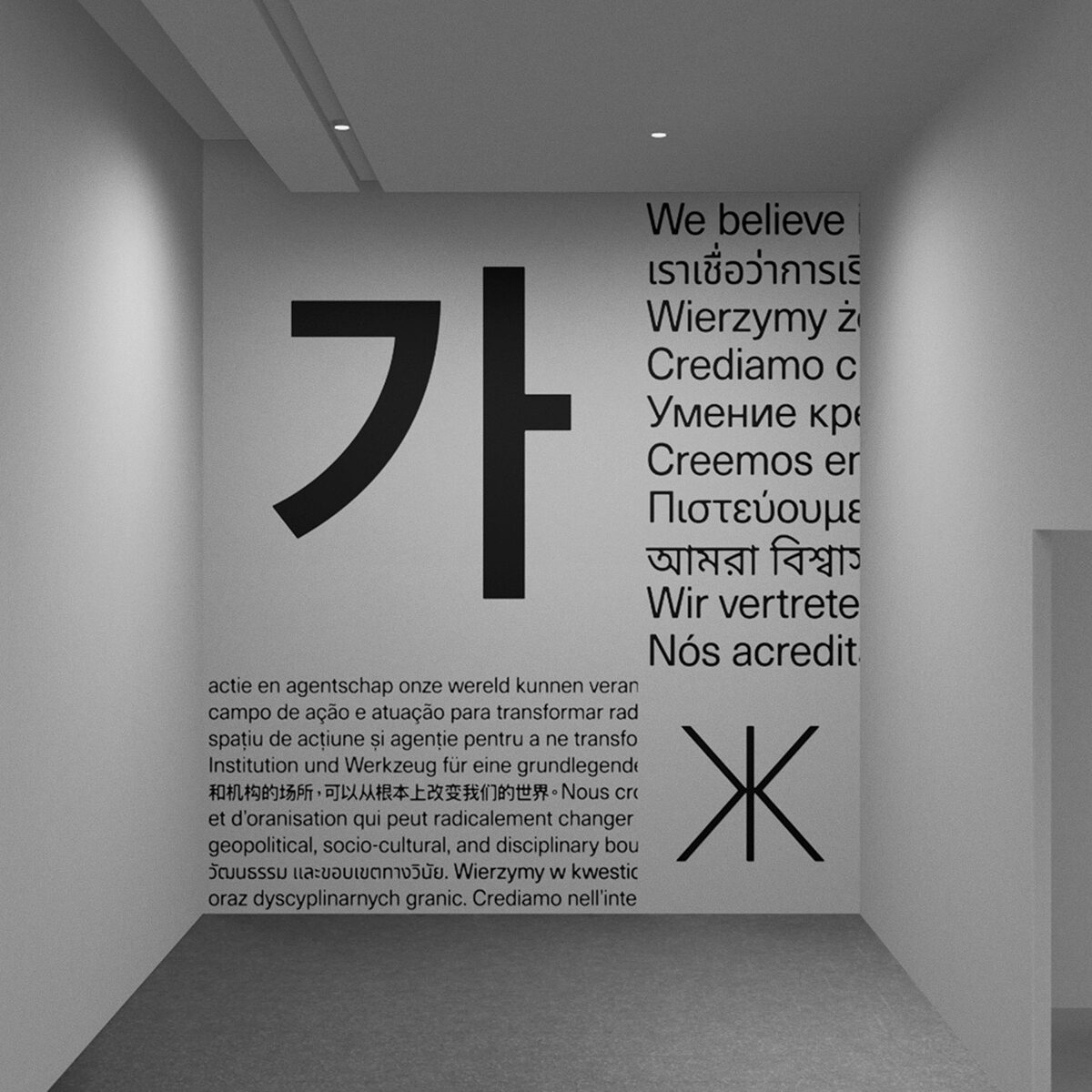
During the course of the project I did a lot of research on different writing systems. A big part of that was aimed at understanding their formal characteristics and typographic conventions. I was interested in finding out how these could live together in pages, screens and spaces without one overpowering the other – respecting each language’s peculiarities and remaining truthful to their cultural significance.
I tried to choose encouraging words that were relevant to the context in which students found themselves in. The final selection was achieved through observation, lots of testing and a generous dose of serendipity.
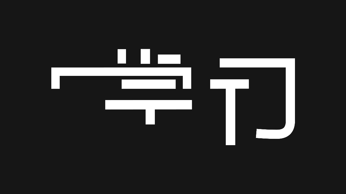
The process of morphing one word into another started by picking pairs with approximately the same number of strokes, mapping and colour-coding similar elements of their anatomy to each other, redrawing each of these individual elements separately, reassembling the words and, finally, animating the shape and position of each stroke individually to choreograph the morphing between the two different states on a timeline.
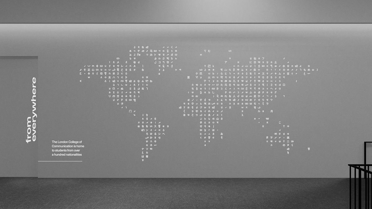
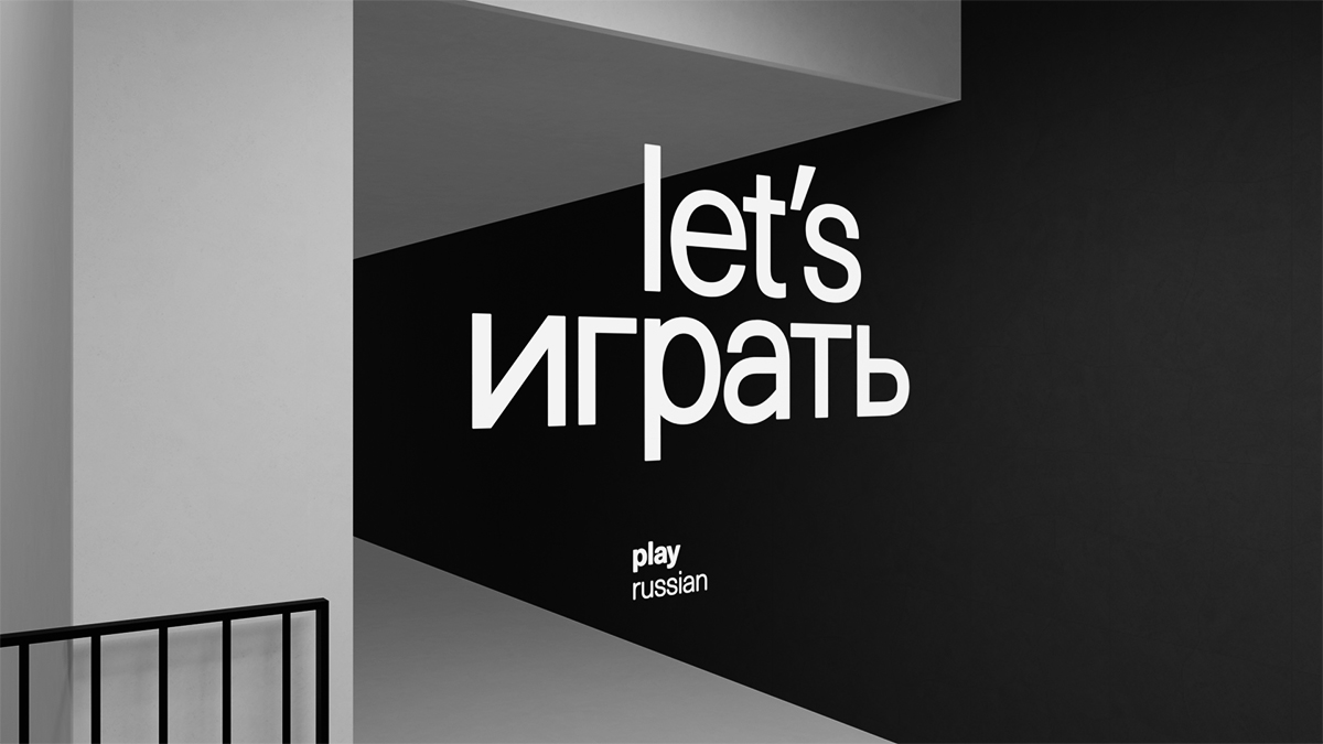
How do you think type and AR could be used in other ways in the future?
I think there is a real potential for the type + AR combo to act as a means to further dissolve cultural and geographic barriers. It can be used for designing signage and wayfinding systems, coming up with new learning devices, enabling rich cultural experiences across the globe and more. If employed in data visualisation projects, for example, it can become a powerful tool for engaging people in meaningful causes.
Personally, I would love to see innovations in these fields being used to spread knowledge and bring visibility to cultures (and languages) that are underrepresented in the world of arts and design. Augmented reality is very tightly integrated to social media nowadays – I believe there’s an opportunity to leverage that synergy and allow everyone’s voices to reach people and places they weren’t usually able to.
And lastly, how and why did you land on the typographic style you used?
For a while I considered using different type styles that could reflect more traditional characteristics of each language and culture. Two main reasons led me to give that up: firstly, there were nearly 50 different languages being used, so finding a distinct (and appropriate) style of each of them would be extremely laborious. Secondly, there was a high risk of it turning out really messy, and clarity and harmony were important to me.
What also played a big part in this decision was the fact that there aren’t many font families that cover such a massive number of writing systems but, fortunately, Google’s Noto was built with this exact purpose, and it helped me immensely.
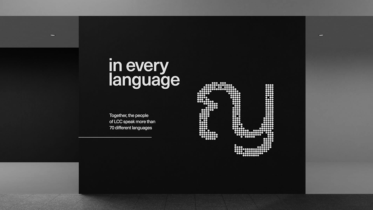
Ultimately, picking a more neutral, functional style allowed the content of the messages to truly shine. For the moment, dialing down the differences and simply having multiple writing systems occupying the same space equally, side by side, seemed like a beautiful way of promoting moments of intercultural connections and exchanges through type.
Thank you, Filipe!

