
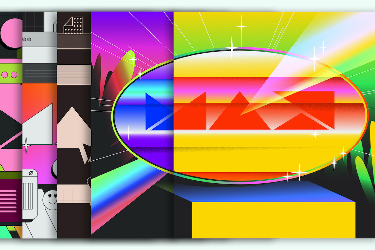
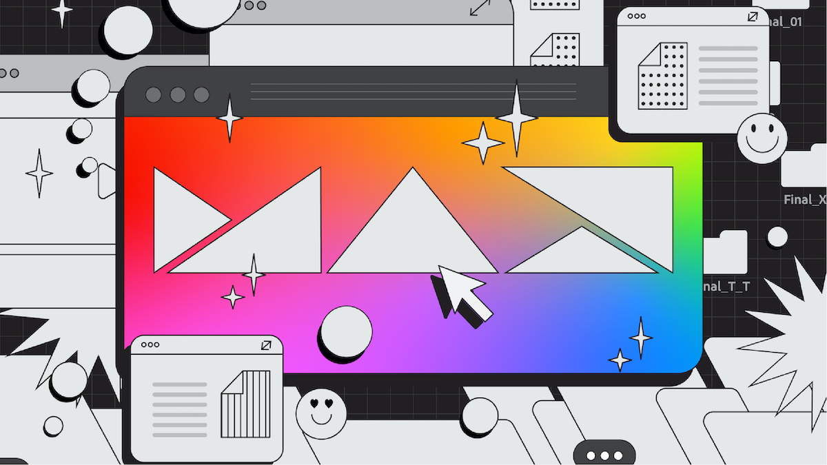
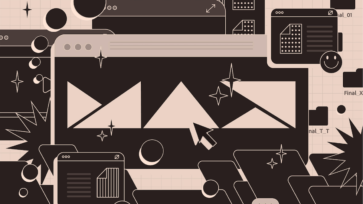
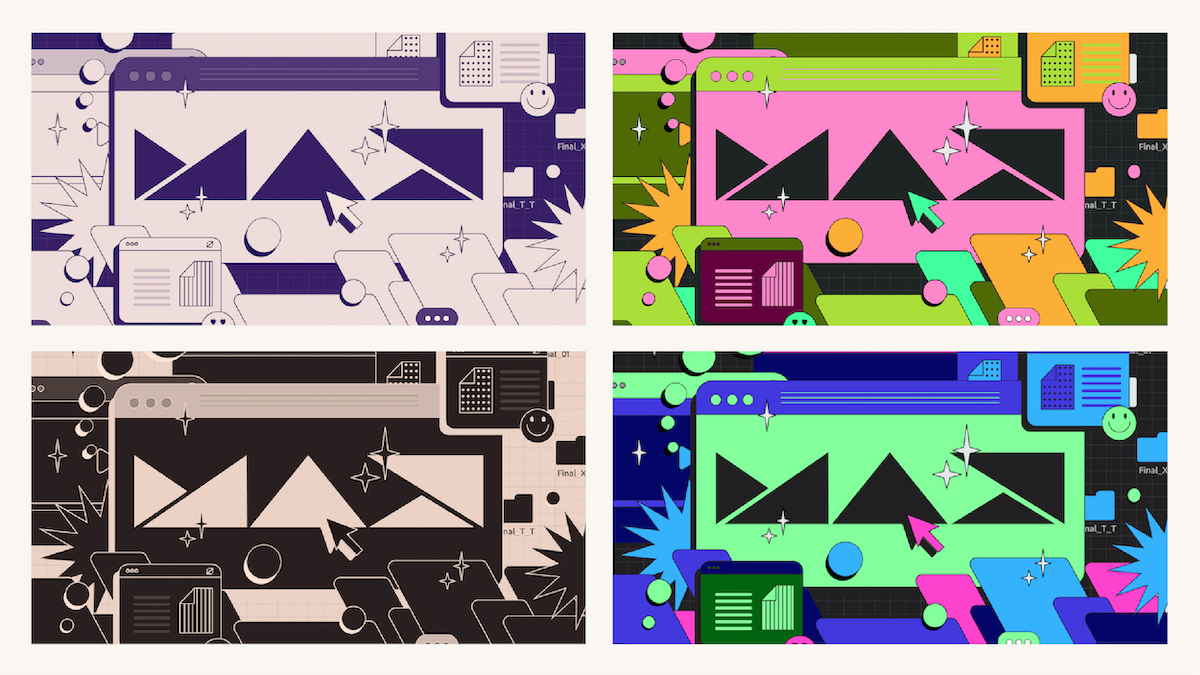
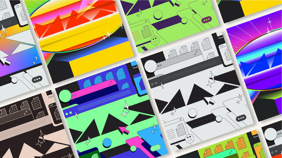
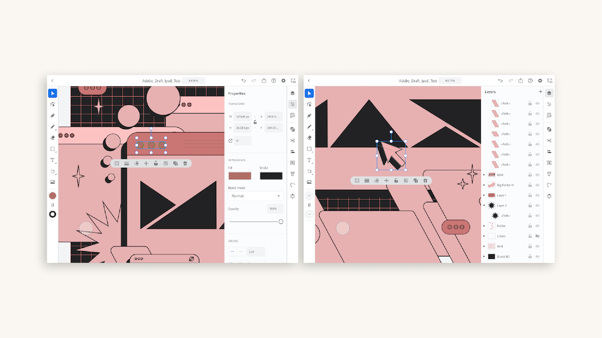
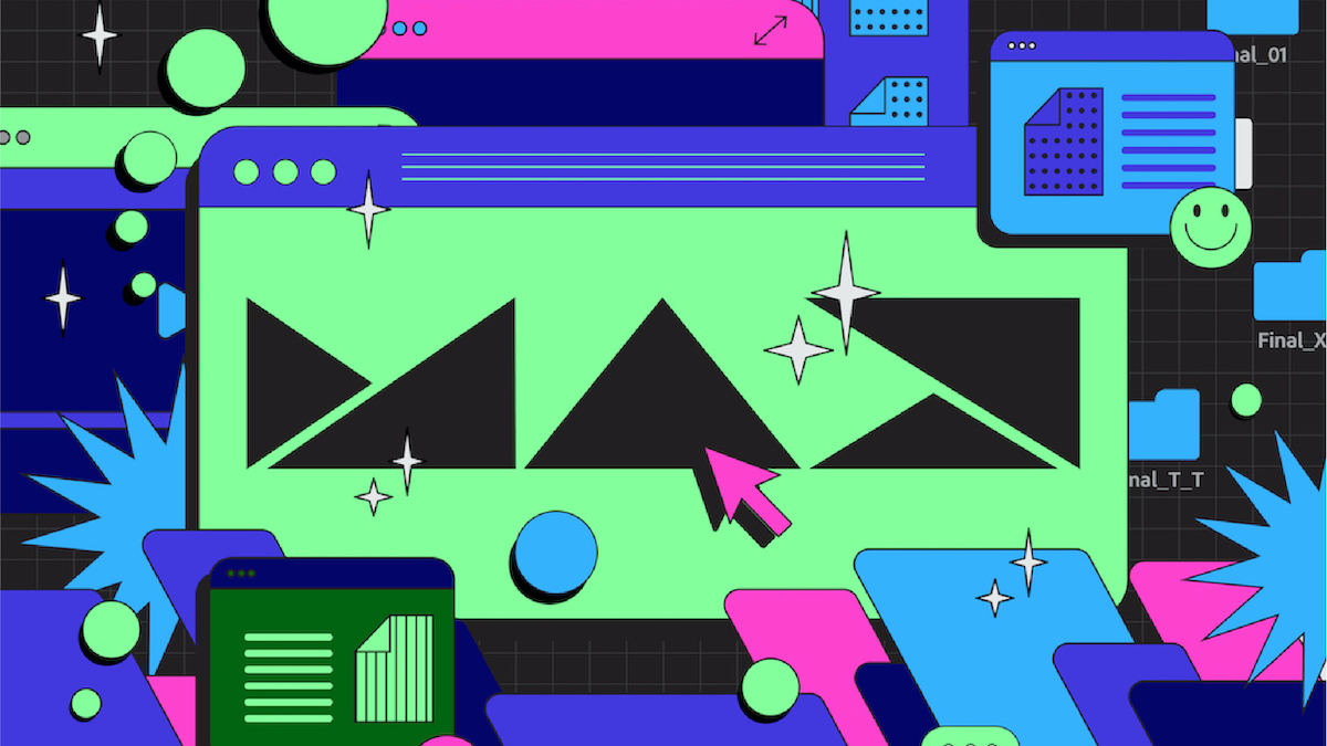
Recently we’ve been obsessed with Gydient’s (Tra Giang Nguyen – @gydient) visual assets for Adobe MAX 2020 – a virtual event held in October of this year. Originally from Vietnam and based in Hamburg, Gydient is the founder of Fustic.Studio. Working alongside Hieu Vu from her team at Fustic, she tells us she was ‘honoured to represent Vietnam’ in joining the CoCreate campaign for Adobe MAX this year; having been commissioned to design the assets surrounding the official MAX logo, using the Adobe Illustrator app on iPad and bringing them to life using After Effects. ‘In the role of an art director, I deeply understood my responsibility was to transfer the brief smoothly with innovative design’, Gydient tells us. And so, after brainstorming widely, the designers came up with two core assets for the project – Evolution and Mirage.
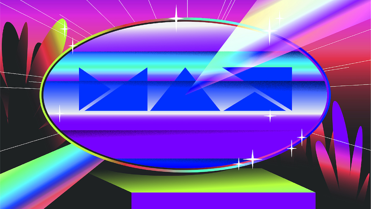
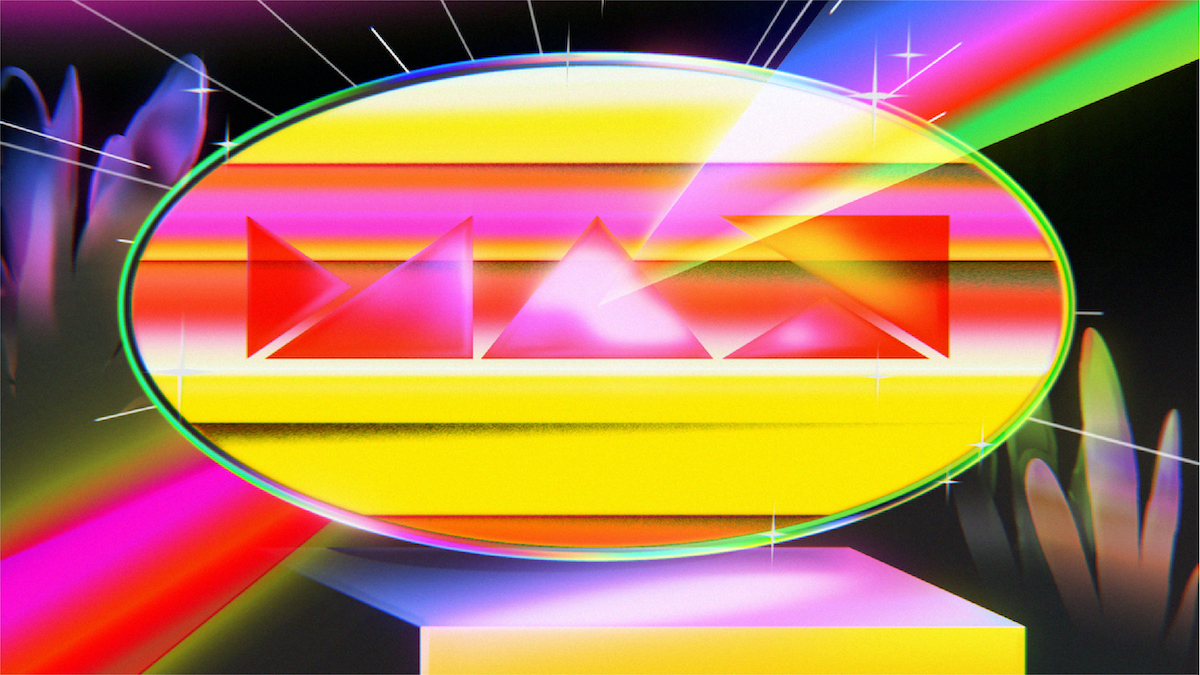
‘Adobe has always been at the forefront of digitising visual art’ Gydient tells us, ‘and we wanted to capture that using our transformative style’. Captivated by Roy Lichtenstein era-defining pop art styles, Gydient and Hieu Vu designed Evolution to incorporate these styles within flat vector design. ‘We praise Adobe MAX as the perfect connection point of art and tech and of people with people’, she continues. And so, when it came to their second core asset she tells us, ‘we wanted to celebrate this connection with an analogy of a mirage – a point where earth meets the sky, which under the right atmospheric condition, shall produce a visually tantalising optical illusion... We later elevated the composition to include a prism to further elevate the idea of meeting, connection and expansion’.
‘The most exciting part of this project is bringing my design into the animation world’, the designer continues. ‘I want to express my heartfelt thanks to my talented Hieu Vu, who did these fascinating animations. The cheerful thing between us is we can work together very smoothly with just a few minutes of discussion. All I have to do is describe my imagination briefly, and then Hieu will meet my expectation exactly – from the transitions of colours to the rhythm of movements, etc. But most of the time, it will be more outstanding than my thought, haha!’
We really love Gydient’s colour palettes in these designs too – they sit fittingly on the boarder between earthy and artificial/digitised. ‘For me, colour is all about which emotion you serve your audience’, she explains. ‘My process of choosing colour is very simple but mixed. First, I will try to look for some references of colour palettes which are close to the concept of the project. Second, I try it all out in layouts and customise it again to fit the tone of voice… My tip for choosing a colour palette is “try it out”. You never know if you don’t try. Though of course knowing the fundamental principle or colour theory is necessary.’
With this project being created through Illustrator for iPad, we wanted to know Gydient’s thoughts on the shifting availability of design tools emerging from the growth between tech and design. ‘In my point of view, technology not only changes how we design, but also how audiences approach design’ she says. ‘We could see that obvious change in 2020 under the influence of Covid-19 -when the majority of people must be separated… For example, I’m experiencing these days some virtual exhibitions and questioning how the virtual exhibitions relate to IRL exhibitions – how do the artworks & typography interact with the space and visitors in the “new dimension”?’
‘Nowadays, combining coding in type design processes has supported type designers a lot in finalising products and opening new avenues in creating variable fonts with custom axes. I hope in the future the process of designing type will not only stop at sketches on paper and digitising on computers, but also incorporate virtual reality. We do not know what form the advertising industry will appear in, but virtual reality still is a current prospect, and type designers need tools to adapt…. Paired with the swift introduction of AI and AR, this ensures a huge shift in the way we perceive creativity and communicate with each other. Whether it’s a good or a bad thing, we can’t wait to see what kind of new experience it will open up for our design practices.’
These visuals are stunning and we too cannot what to see what Gydient comes out with as the years and developments roll on. Through her work on this project, the designer adds, ‘I just want to boost the diversity and the magic of creativity. The visual art world is a world that’s continually expanding and it’s becoming more and more accessible using technology. It transcends languages and anyone can resonate with it, making our society more inviting and inclusive’.


