
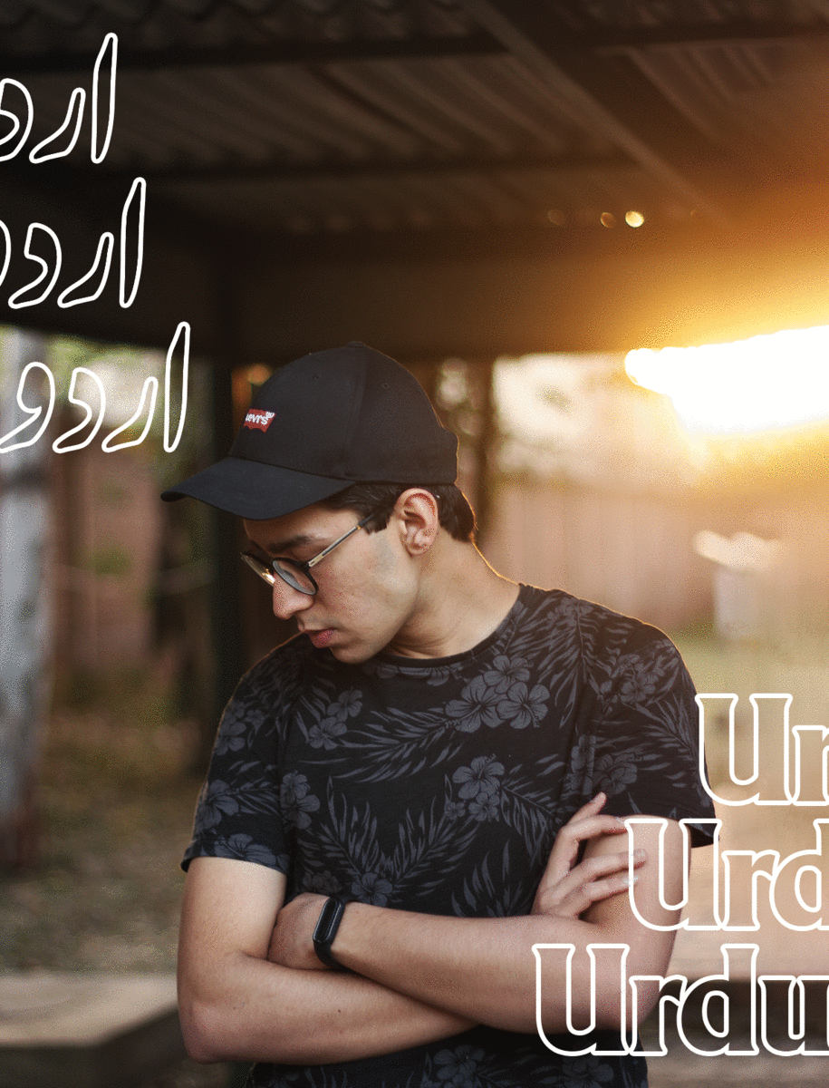
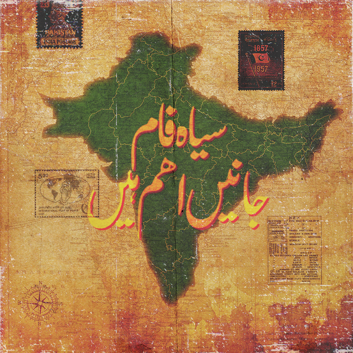
This series of typographic animations from 21 year old graphic designer Haris Mahmood (@harisism_) is not only visually powerful, but profound, considered and important. Working from Islamabad, Pakistan, Urdu is Haris’s favourite script to work in—becoming a source not only of curvature-filled beauty, but of cultural reclamation and empowerment. Working predominantly with the Urdu script, Haris says his typographic animations are usually ‘based on localised themes and Desi culture.’
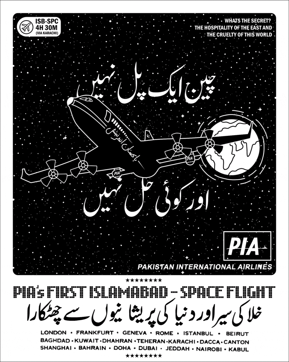
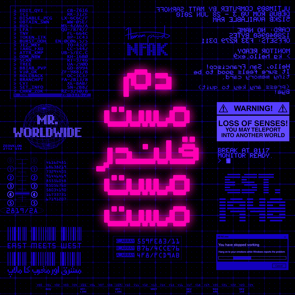
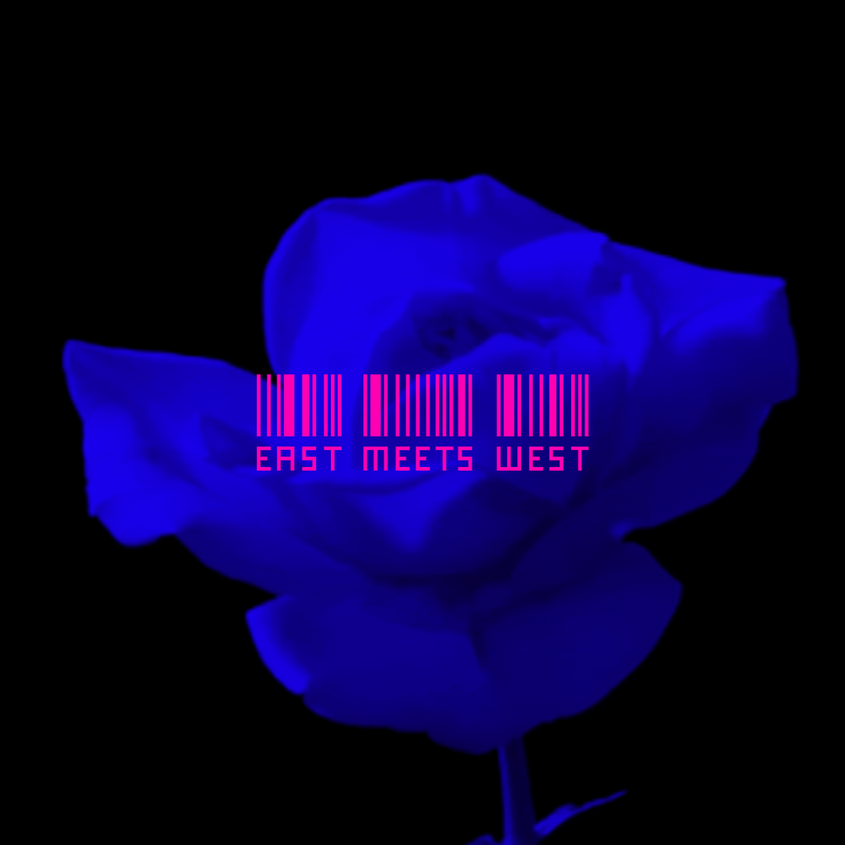
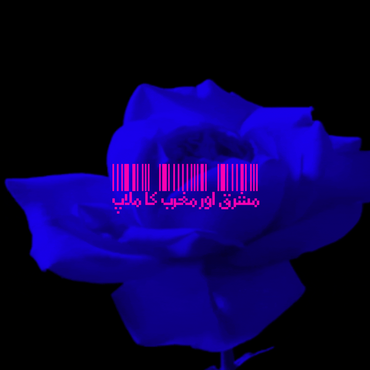
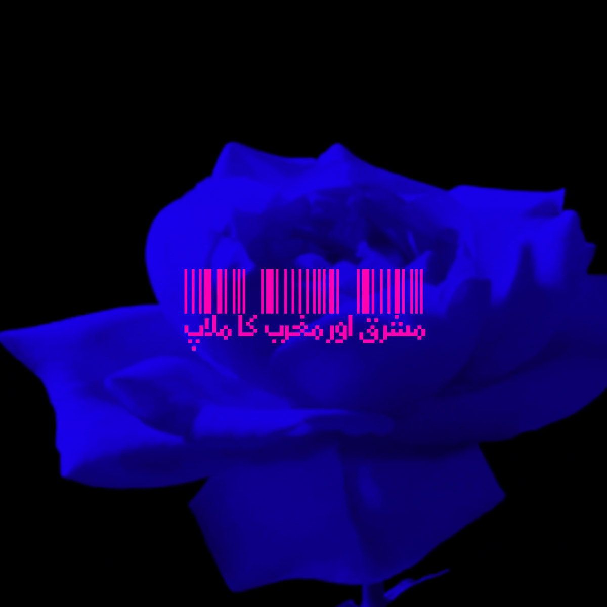
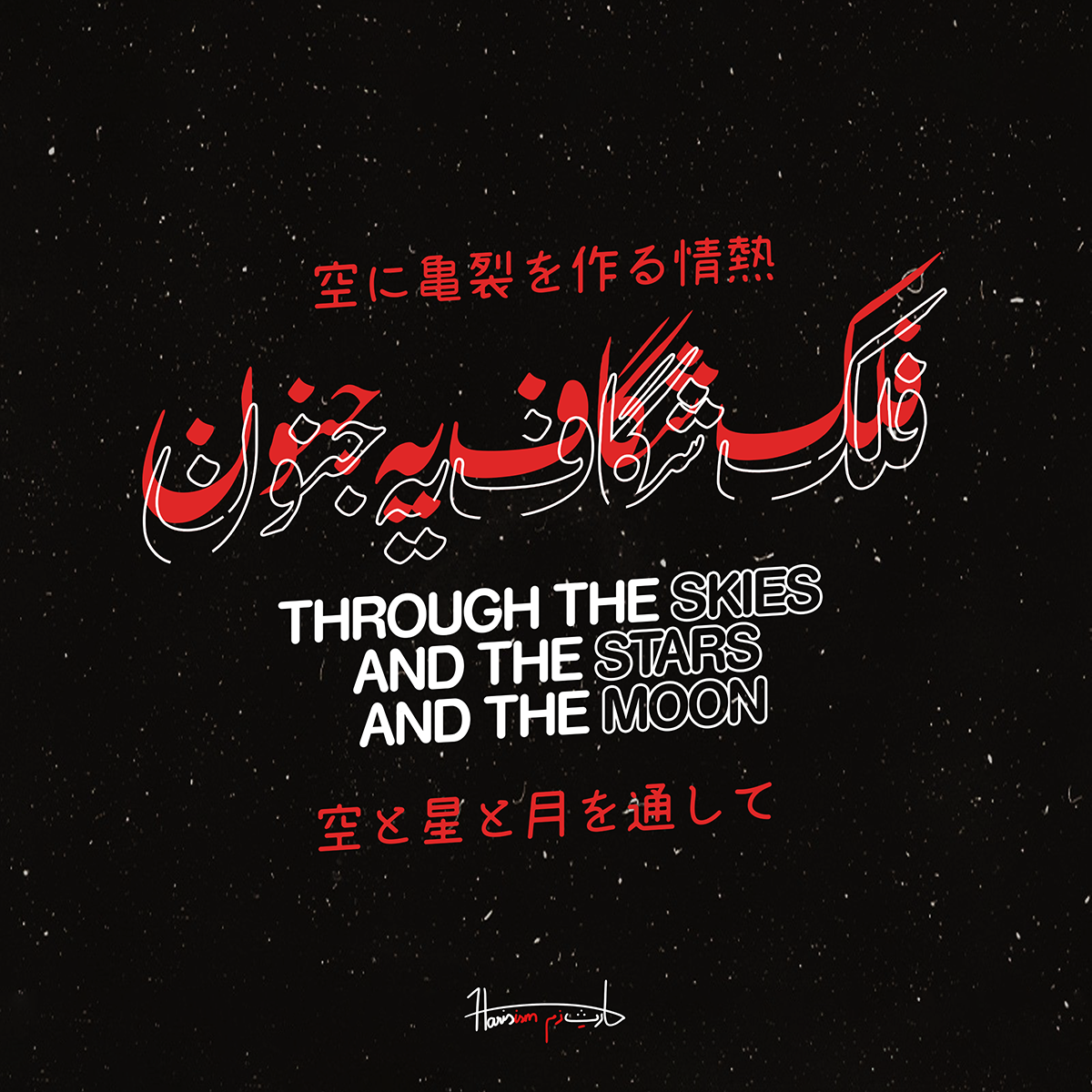
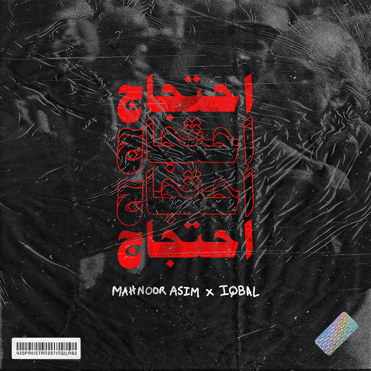
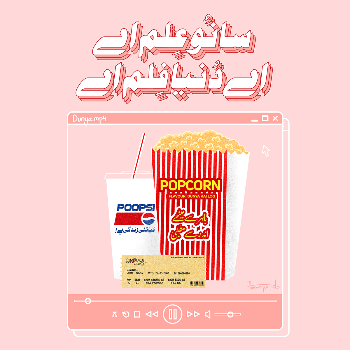
‘My works are usually inspired by the things that I observe in my life on a daily basis—things that I encounter each and every day, from the type used on clothing tags, to handwritten typography on vintage sign boards, to the fonts that we see on our phones,’ he continues. ‘At times it is an amalgamation of my sentiments associated with my land and ideas that have crept into pop culture.’ Pointing out his “NFAK x retro-scifi” design, he explains the blue-pink colour-way is inspired by one of the first Air Jordan TV advertisements, which he ‘happened to come across while watching the Netflix documentary called “The Last Dance”.’ The main bulk of the content in the animations, he adds, features ‘lyrics from Pakistani songs, ranging from the early 2000’s to modern day desi hip hop, and famous Urdu phrases.’
‘My attachment to Pakistani culture is one of the prime reasons for this and at the same time I want to show appreciation for it by using language as a medium,’ Haris continues. ‘Also, I am someone who is really fond of vintage artifacts, be it stamps, old typewriters or even discontinued currency notes. Thus, the colour schemes that I follow are usually loud because they are inspired by retro posters.’
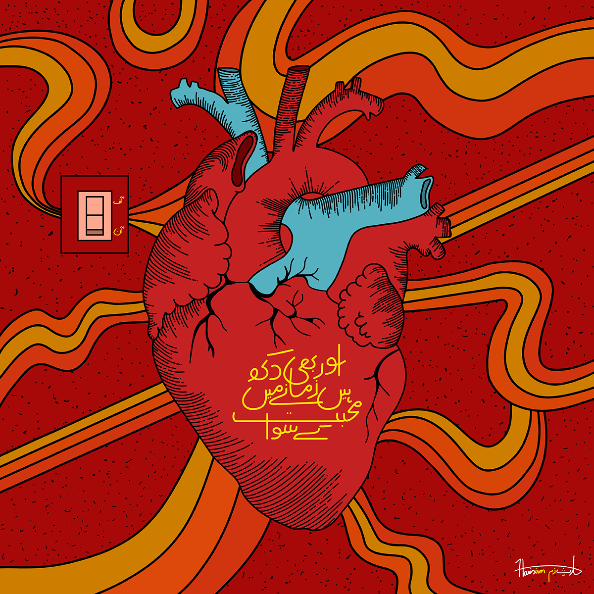
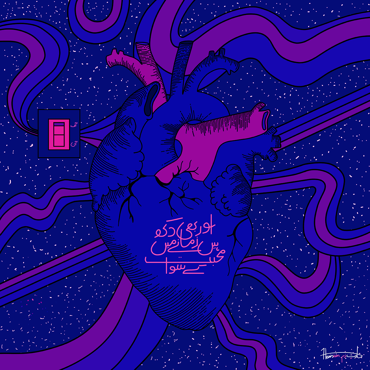
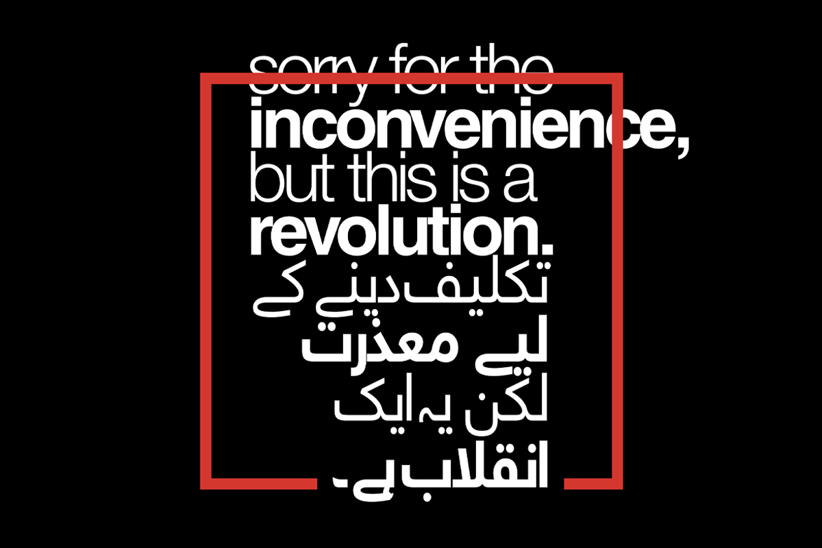
Translating his work into the realm of motion through animation is an important tool for Haris—he says it allows him to explore ‘endless possibilities’ and that for him, it feels like the most influential way to tell a story. ‘It really helps to grab the viewer’s attention, with the help of music and changing visuals. This is unlike a static design, which can never produce the same effect,’ he elaborates. ‘And besides the audience retention factor, it also gives you a longer time to express yourself, enabling you to elaborate upon your main idea with the help of different visuals in different frames.’ For this series of animations in particular, the power of enhancing storytelling through motion was a decision based on the importance of the story Haris needed to share. ‘I rarely talk about this,’ he says, ‘but to be fair, the decision to use Urdu in all of my designs in this series is a conscious attempt at decolonising myself and the people around me.’

‘In Pakistan, Urdu is a language that is fairly unpopular amongst the youth and most of the time it is even looked down upon as compared to English. The subcontinent (modern day Pakistan, India and Bangladesh), was colonised by the British for about a century, and the countries, despite being independent, continue to live in what is termed as a “colonial hangover”. The people in these countries, including me, are still subject to colonial influences which is something that doesn’t sit well with me. Hence, I decided to use local languages, specifically Urdu, with the aid of design on purpose to combat this issue and promote the language through its visual aesthetic. The employment of Desi elements and focusing on localised themes is also intentional, since I want to see the people around me and myself truly owning what is inherently ours instead of feeling ashamed of it and treating it condescendingly.’
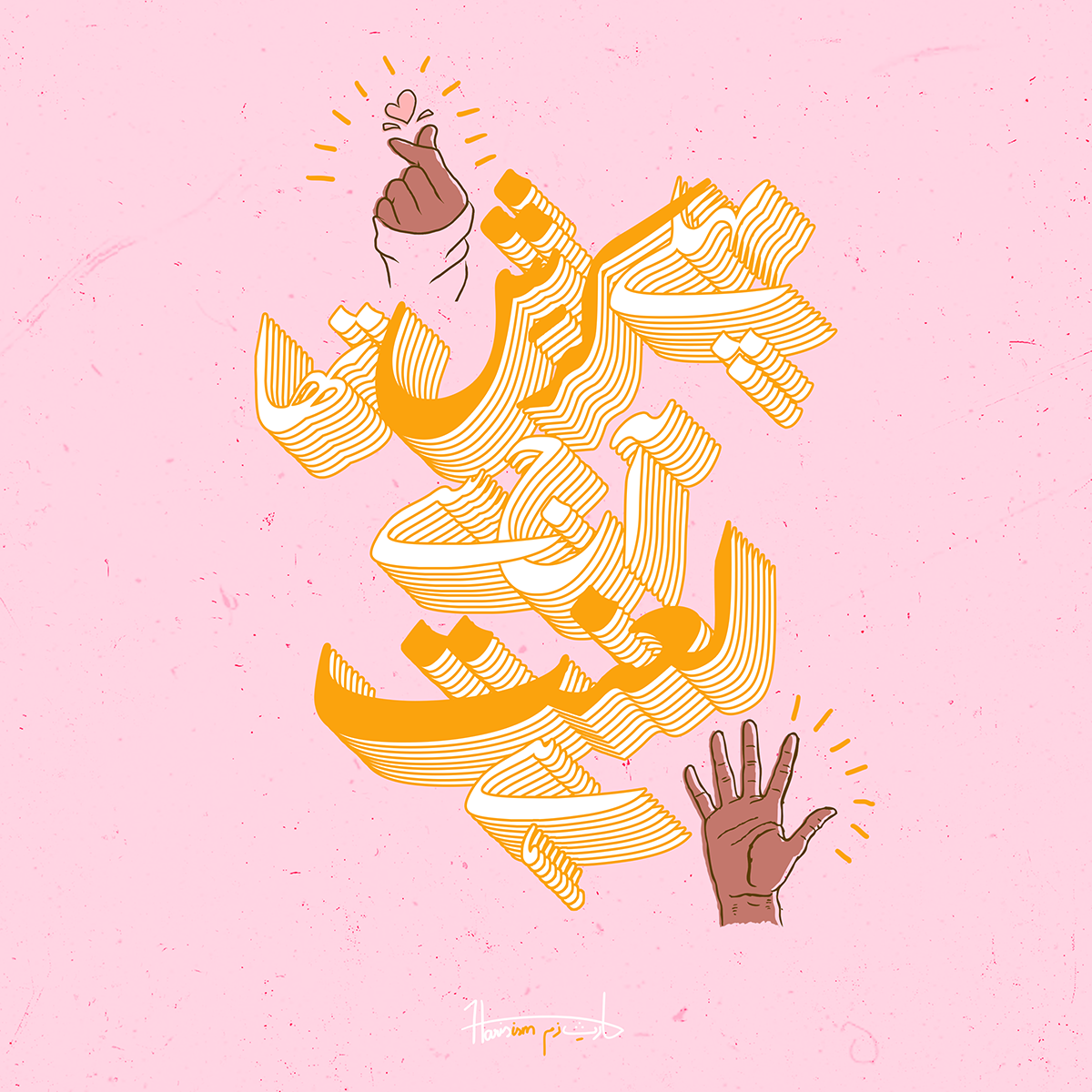
Celebrating the Urdu language is thus extremely close to Haris’s heart, and he says that the shapes and flow of the script never fail to bring him joy. ‘Hands down, my favourite thing about Urdu alphabets is the flow and curvature of the individual characters! On top of that, when they come together to form a word, it becomes even more aesthetically pleasing. Ironically, I don’t exactly know how to put it into words, but Urdu type just feels more genuine and the ideas are usually very easy to relate to for the audience. I find it more amusing and gratifying to design in the Urdu script as well, because of the connection that I have with my native tongue which is something that I don’t feel when working with other scripts.’
Thank you so much to Haris for sharing more about this stunning series. To see more from Haris, be sure to check out his Instagram and Behance.


