
In this interview, we delve into the origin and creation of OCR-X, a monospaced typeface that pays homage to the iconic OCR-A. Originally designed by American Type Founders Co., OCR-A was developed during the early era of computer optical character readers with the goal of ensuring legibility for both humans and computers. Over time, it became synonymous with the aesthetics of coding and gained a dedicated following among designers.
Here, we chat to Europe-based design studios Eurostandard and Maximage who share their initial encounter with the typeface, and what motivated them to create their own interpretation under the collaborative type foundry Maxitype. Along with detailed insights into the design process, they discuss the development of the typeface’s new selection of weights and the versatility they provide.
PT: How did you first come across OCR-A? What about it stood out to you?
MX: As teenagers in the late ’90s and early ’00s, while scrolling through the Font Book on our first PC, we were struck by the powerful letters of OCR-A. I can even say it was my first *favourite font*, and I later started using it for flyers and bootleg CD covers. When I began studying graphic design, using it in school became normal, but my modernist teachers pushed me to transition to more reputable Swiss sans-serifs. At that time, it really felt like school was taking the fun away.
EUSTD: I also remember microcomputer shops in the ’90s and ’00s using it for their storefronts. It conveyed a sense of technology, fun, and old-fashioned charm simultaneously. Even today, supermarkets and department stores use it in their signage for promotions. Graphic designers appreciate its versatility and immediate recognisability, which are positive attributes for a typeface.
PT: And from there, why did you decide to create OCR-X?
MX: A few years back, we wanted to use it again, but we were not happy with the available versions, there were missing glyphs and it didn’t look sharp on screens. One day, while having drinks with Clément (Rouzaud) and discussing our past fascination with OCR-A, we decided to create our own collaborative revival with various weights and an extended glyph set. I have to say that we managed to realise our vision quite precisely, though it took nearly two years instead of the few weeks we initially planned.
EUSTD: In the 1960s, Adrien Frutiger was commissioned to design OCR-B for the European market, an alternative of OCR-A known as the “Robot Typeface.”However, for us, OCR-B lost the magic of OCR-A’s design. So, we envisioned OCR-X as an alternative evolution and homage to OCR-A.
PT: To remain faithful to the feel of OCR-A, what were the most important factors to consider?
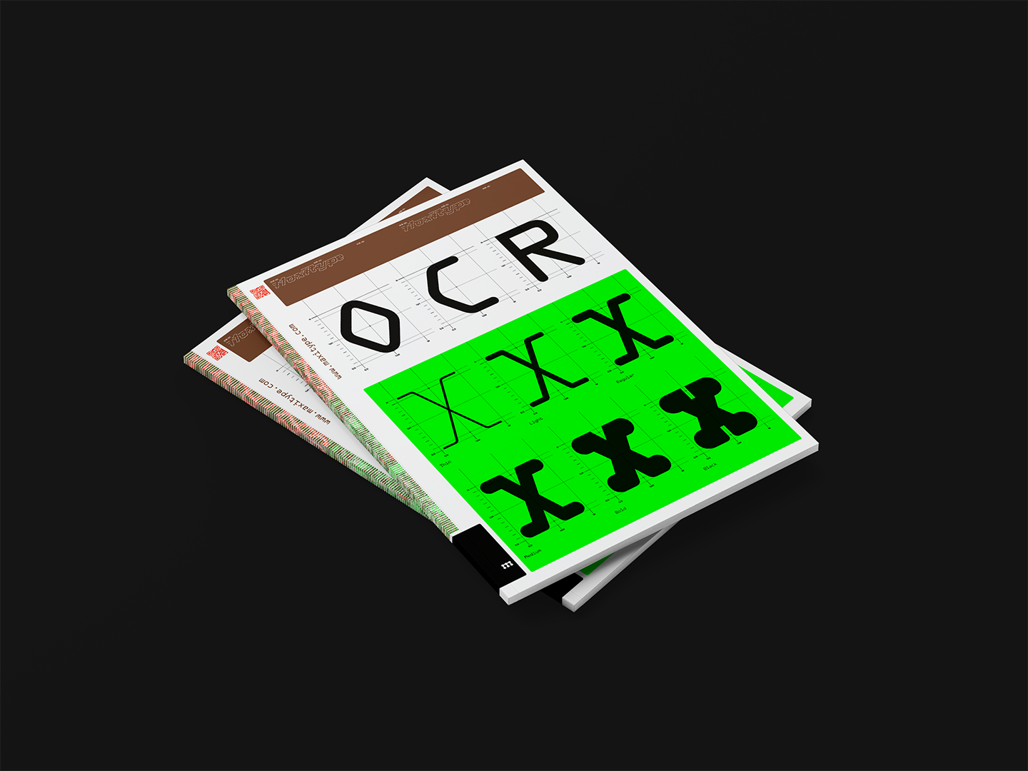
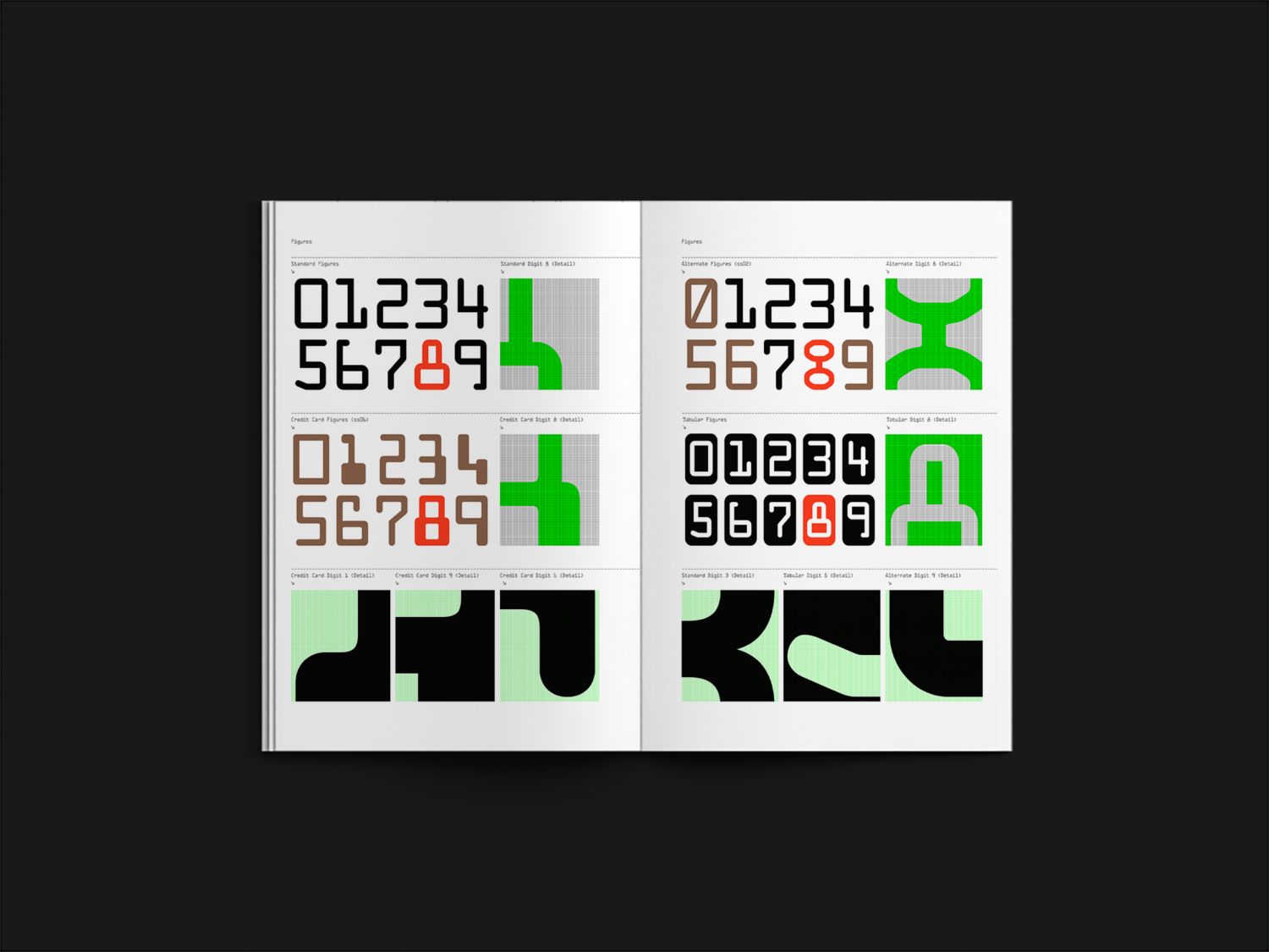
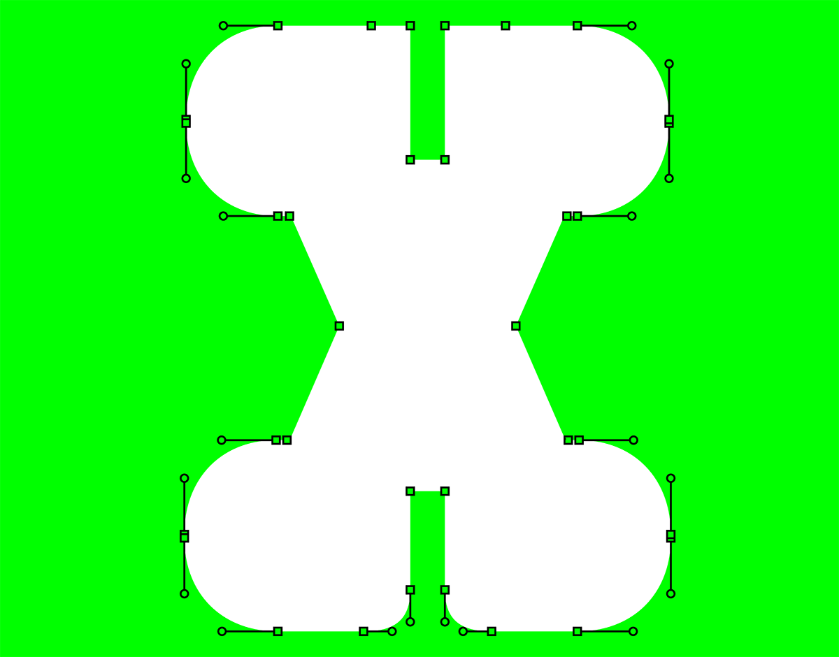
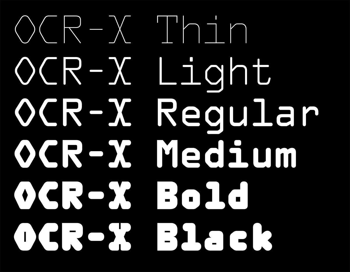
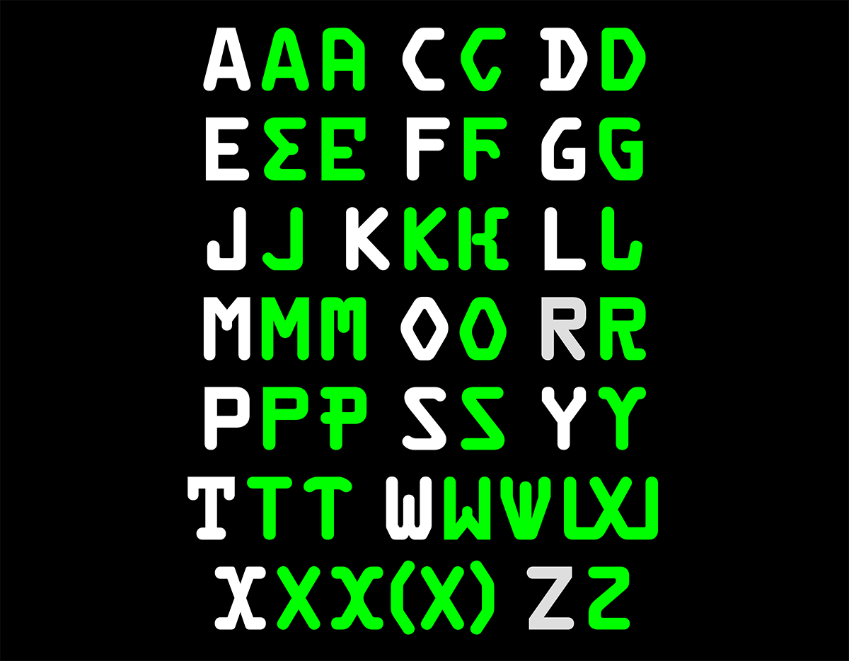
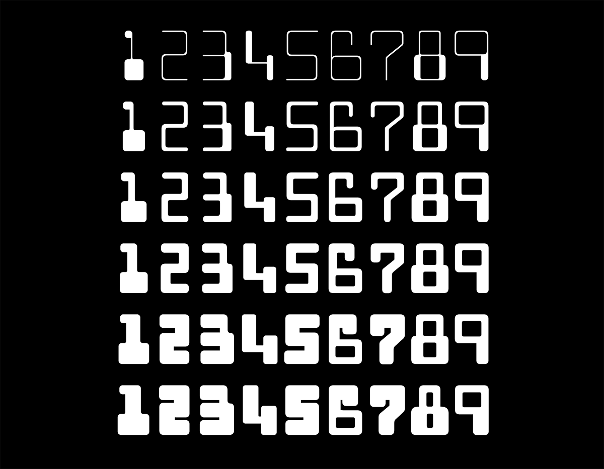
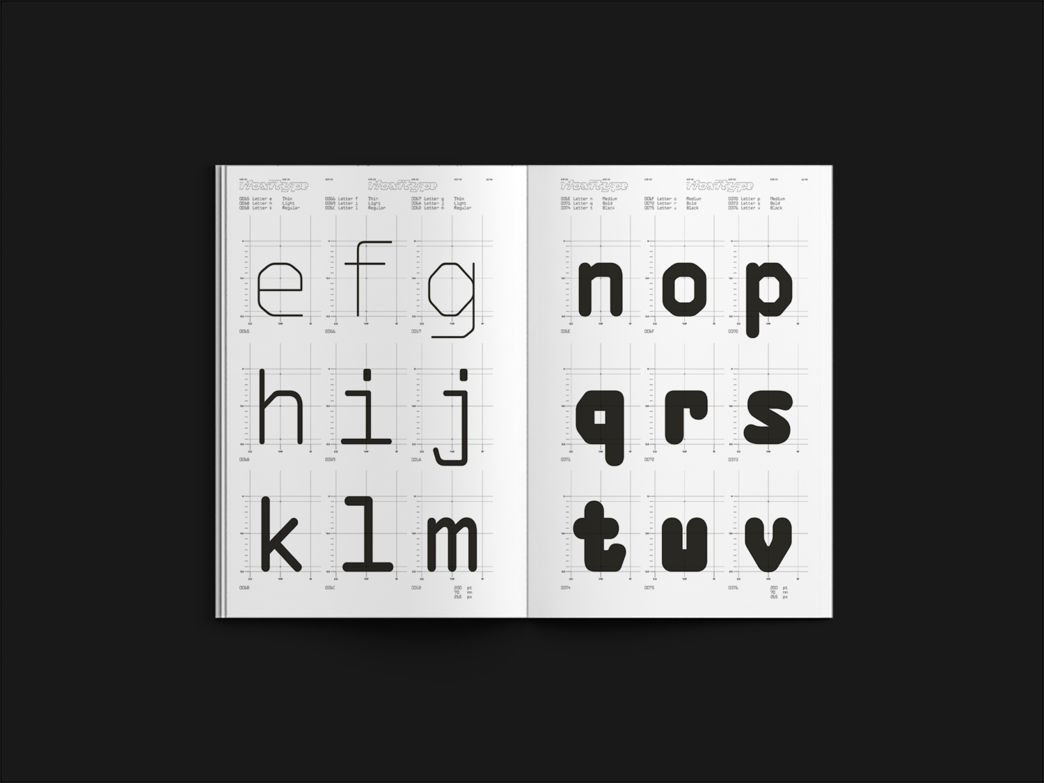
EUSTD: Our fascination with OCR-A was primarily based on its distinctive design. We later delved into the origin of its name and its functional use in optical character recognition. Our focus was mainly on preserving the design, as character recognition is more advanced with today’s tools, rendering that function unnecessary for our version of OCR-A. Thus, we aimed to respect the original typeface (regular) and its design. We started with a skeleton, allowing us to create finer weights (thin, light) and expand the range with a new, display-oriented design (medium, bold, black), suitable for posters, flyers, and logotypes. The crucial factor was maintaining the initial character set without reinterpreting the perfect shapes.
MX: Before starting the design process, we also researched a lot about the creation, distribution, and development of OCR-A. We found old technical documents from ATF (American Type Founders) and then started working on the revival. You will be able to read about it in the essay by Jonas Berthod in the OCR-X Type Specimen. The Type Specimen will also include a Desktop Licence for OCR-X Regular and other surprises.
PT: What did you want to keep the same? And what characteristics are new/unique to OCR-X?
MX: The Regular cut is like a revival of the original OCR-A, with refined details and variations, such as aligned punctuation and numerous alternative glyphs as stylistic sets. We wanted OCR-A to be easily interchangeable with OCR-X, yet more crisp, especially at small sizes. We also now have a variable version that converges through 4 masters.
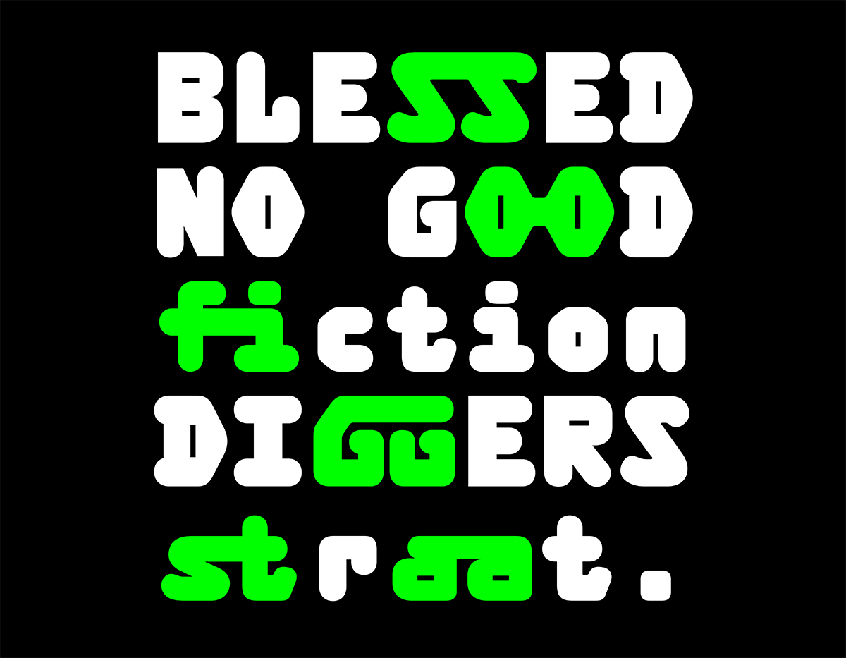
EUSTD: Despite the added display weights, OCR-A, and now OCR-X, remain perfectly legible at small sizes. This feature makes OCR-X a unique tool that combines legibility at any size with style and singularity. It’s a versatile tool suitable for any designer.
MX: Yes, surprisingly it works exceptionally well in text! Due to the unique logic of each letter, you can quickly decipher the glyphs. We’ve even had people with dyslexia tell us it’s easier for them to read OCR-X than Helvetica.
PT: How did you adjust the style to suit the new weights?
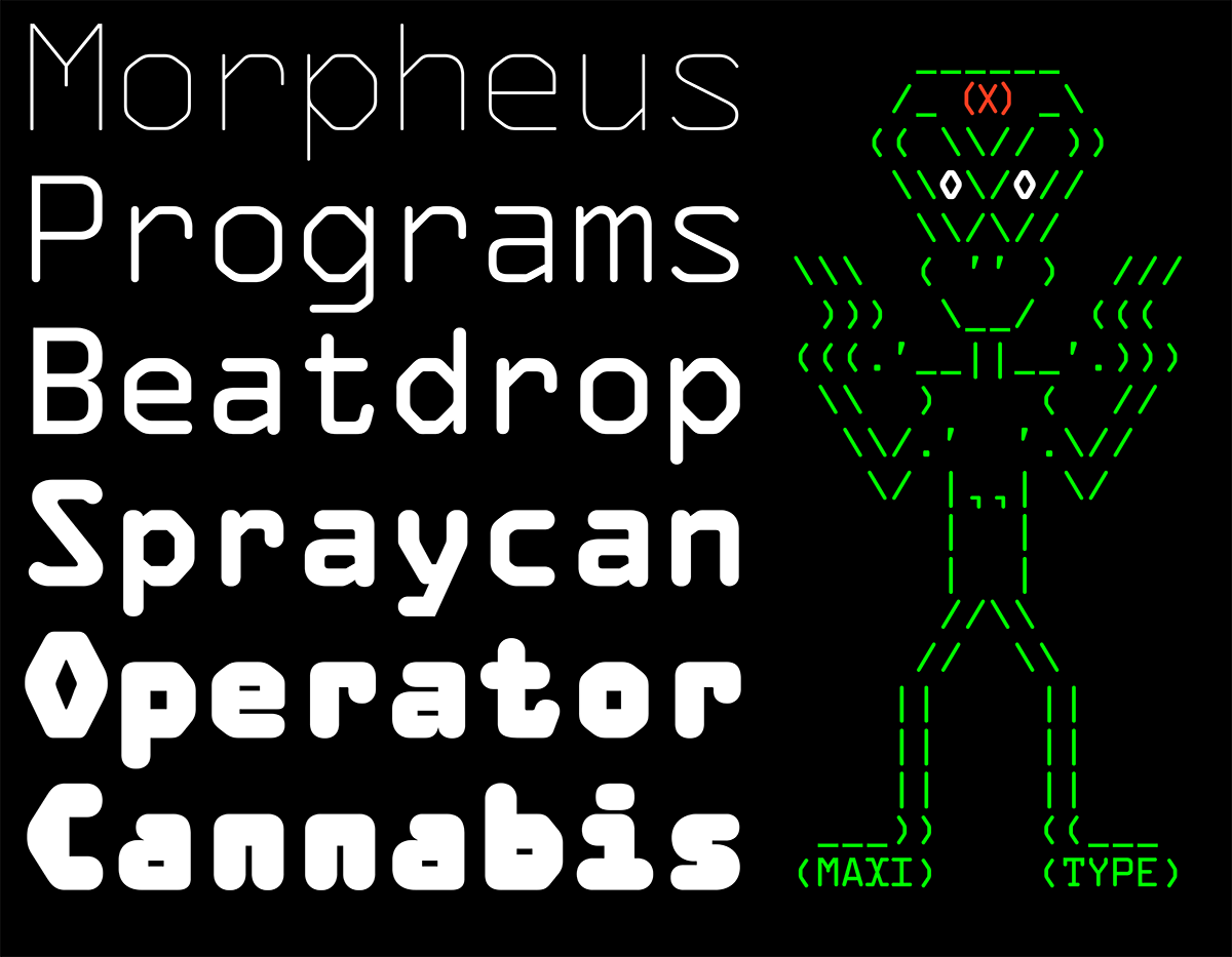
EUSTD: The Thin cut emphasises the hexagonal and geometric construction of the OCR-A system, while the Bold and Black transform into a completely new, blockier variation. The versatility across the weights allows you to use OCR-X for a wide range of applications, especially on screens.
MX: Developing the new weights was a very crucial aspect of OCR-X. We aimed for the new weights to appear more contemporary while retaining the original’s uncanny vibe.
PT: Did you have any uses/applications in mind when developing OCR-X? How would you like to see it being used?
MX: As we started using it, we noticed that OCR-X fits a wide range of applications. We’re thrilled to see OCR-X for the Swiss Design Awards’ identity, on rave flyers, posters and websites, but we also look forward to seeing it used more in branding environments, particularly in the digital realm.
EUSTD: Just as we enjoyed OCR-A across various mediums, our hope is that OCR-X will surprise us with uses and applications we haven’t even thought of.
PT: Do you think you will return to it in the future?
MX: Certainly, we already plan to introduce italics, as we have received requests for them.
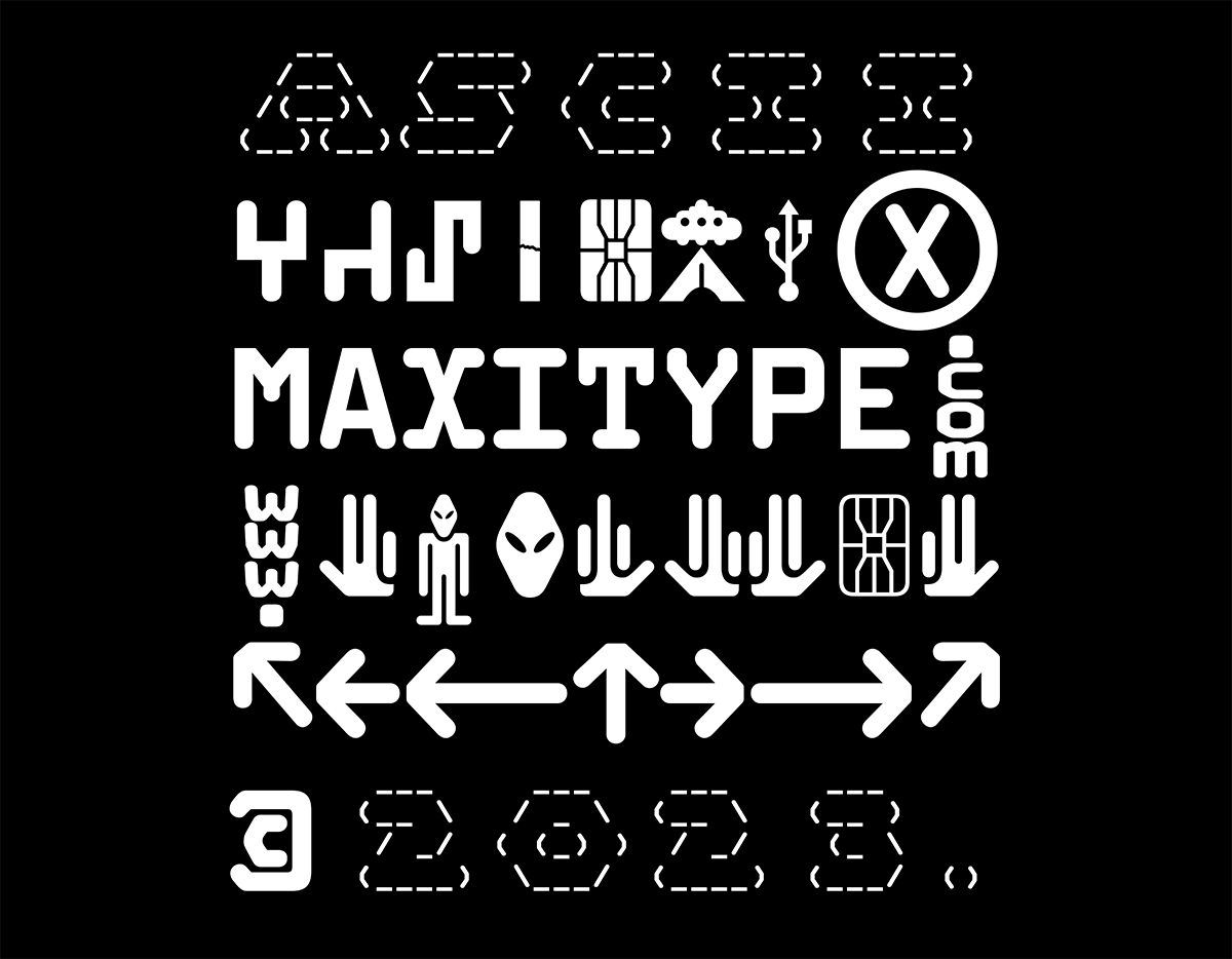
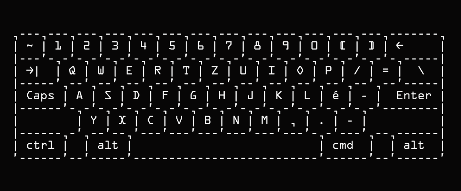
EUSTD: While creating the specimen, we spent considerable time using the typeface in an ASCII layout, allowing us to create images with text. We’re already contemplating a future project that will push these boundaries even further.
—
Thank you Maximage and Eurostandard for chatting with us!
maxitype.com
Browse more of our industry interviews or typeface design pieces.


