
“At TypeMates,” the team at the German foundry tells us, “we are just mates.”
The moniker serves as not only a name, but an ethos – of approachability, openness, and good communication – that runs throughout the company. What initially began in 2015, when pals Nils Thomsen and Jakob Runge teamed up, their foundry grew with the ambition to build typefaces collaboratively and be a ‘typographic mate’ to clients – “so people can ask us anything about typefaces,” they add. Over time, this collaborative practice has led to more and more projects with greater requirements and demands…So the TypeMates crew found some more mates!
“Lisa Fischbach joined us as managing partner precisely to support us and has been running the show ever since,” they tell us. “We all live in different cities all over Germany: Nils in the north next to Hamburg, Lisa in the west near Düsseldorf, and Jakob in the south down near Munich.” The team is rounded out with Natalie Rauch, a former graduate of the University of Reading.
“Based in Berlin, she takes care of custom and retail fonts as type designer and font developer. For her, type design pleases the exciting interplay between detail and totality.” And Laura Flethe in Münster. “She will soon start her master studies and supports us with creating visuals for new font releases and has a good sense for organising texts, graphics, and stories for public relations.”
The Type of TypeMates
Their roster of clients speaks for itself – Rossmann, the Lenbachhaus museum in Munich, and even Finland’s Ministry of Foreign Affairs – demonstrating the foundry’s reputation for high-quality bespoke work. When it comes to these projects, TypeMates explains, the management is water-tight and usually needs at least three months to become really strong. Typically one member of the team leads the creation and project management, with others contributing at later stages. “It’s like a relay race,” they say, “with each person pushing a bit of the track before a second eye takes over.”
In addition to their bespoke works, a quick peek at their website will confirm a hardworking, dedicated and enthusiastic approach towards building their own retail typefaces. It would be impossible to dissect them all in one day. But rest assured, there’s something for everyone.
“A retail font usually arises from the idea of one individual looking for an exciting visual font idea, something that adds something new to the crowd of fonts out there,” the foundry explains. “This takes a lot of time and a few steps back and forth. Often a custom font intervenes and one and a half years later the own font family is finally ready.”
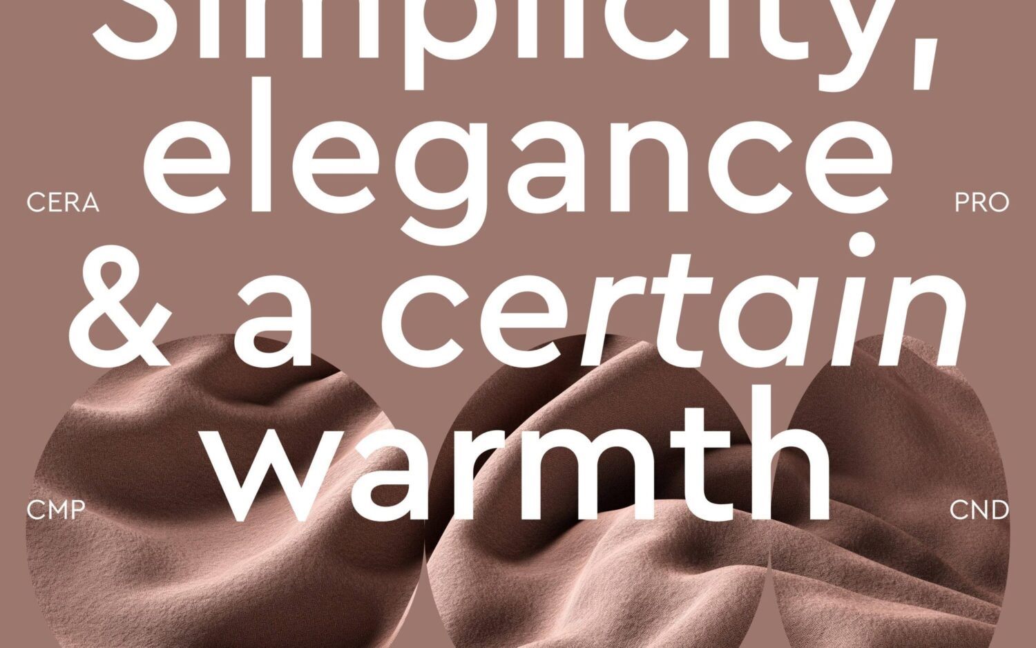
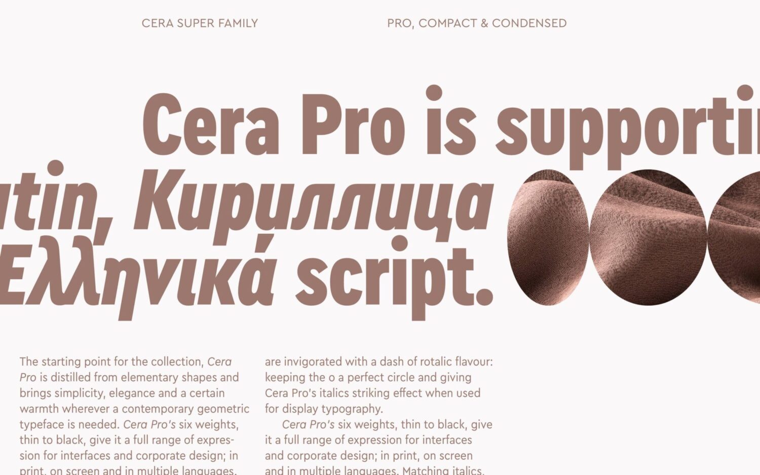
Out of their existing offering, Cera Pro, an elegant geometric typeface, is their bestseller. This is shortly followed by the bold and pragmatic Halvar and the clean and likable Rumiko.
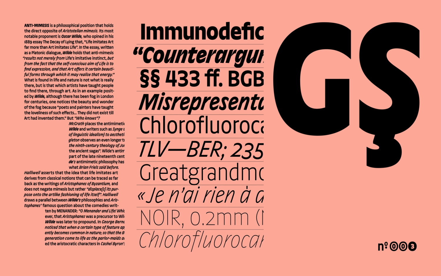
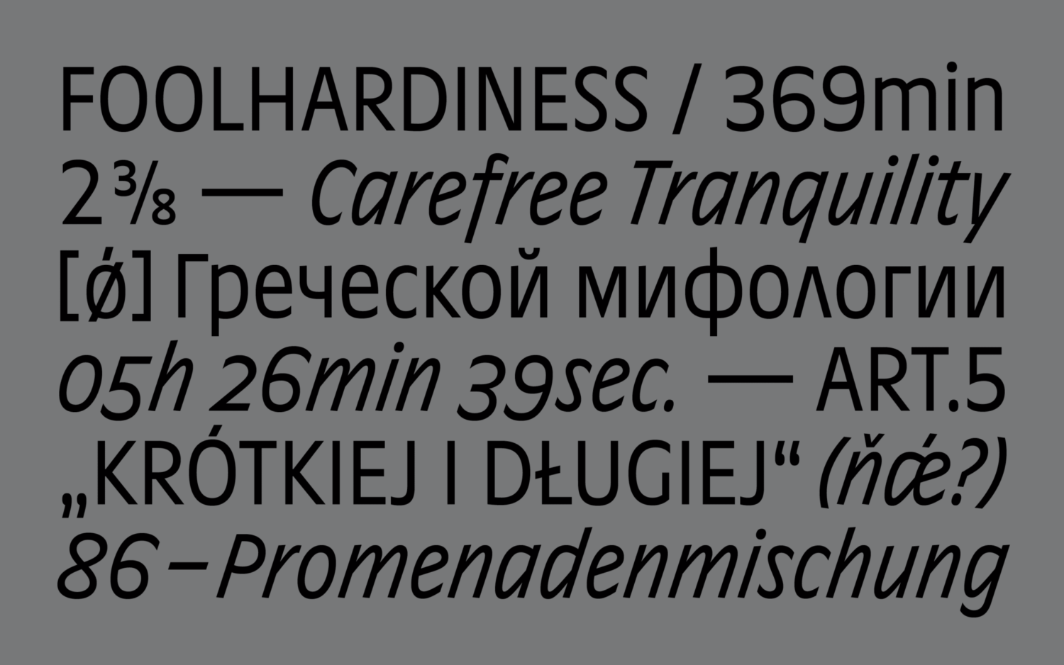
Whilst Halvar and Cera don’t have loud personalities, they each have their own versatile and unique properties. “This balance makes them shoppable products for many,” TypeMates says. “Presumably also because they are produced with high-quality craftsmanship and support Greek and Cyrillic native approval as well as Latin.”
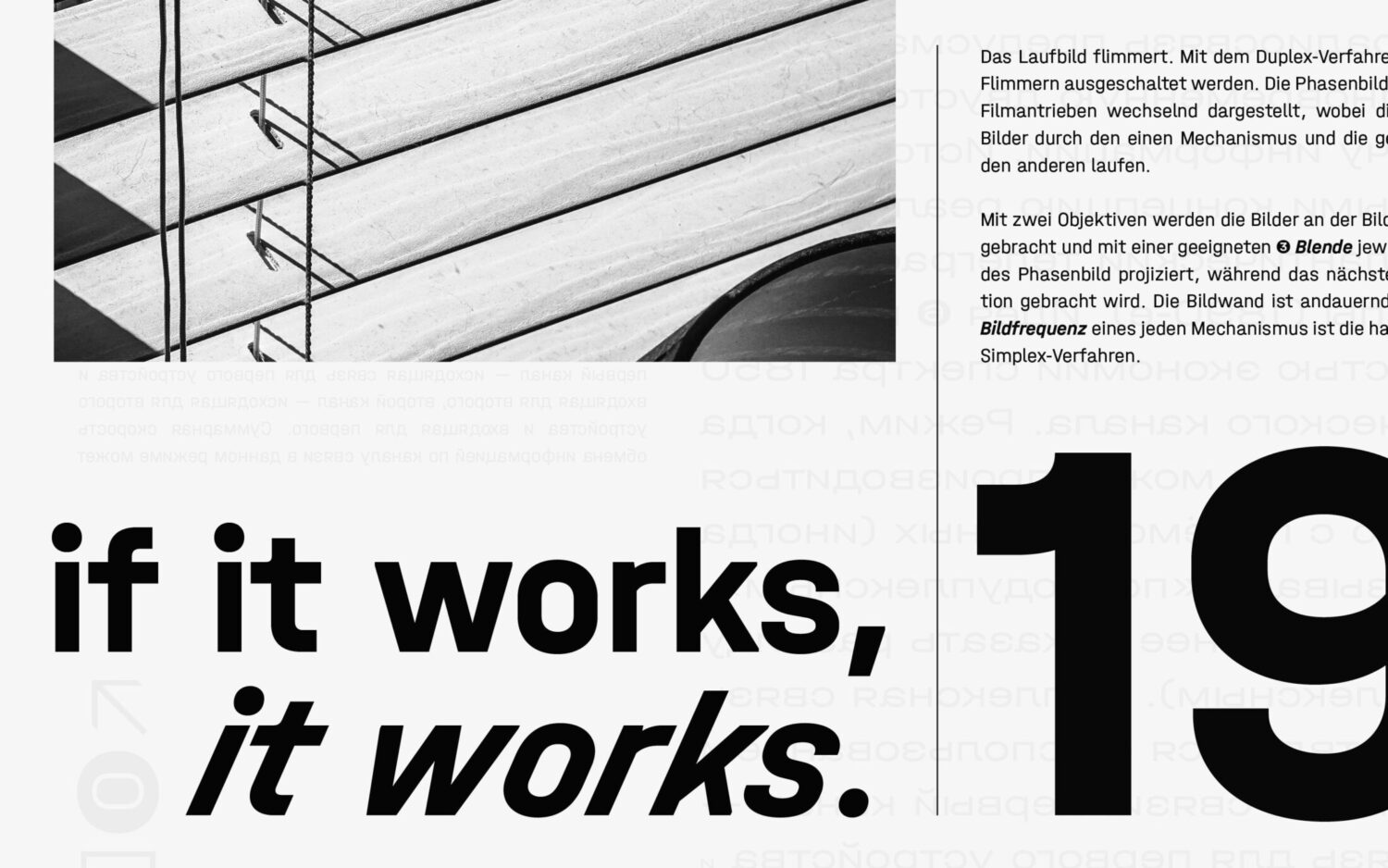
When it came to the development process of Halvar, a gigantic family offering 81 styles, it’s easy to understand why there were challenges. “It started when Jakob had a more geometric and clean approach to a playful sans drawn by Lisa. With Nils we decided to turn this into a new project and our foundry’s answer to a sans serif with an industrial flair,” they note. With three designers involved, plus an intern and consultants, they described the process as a ‘trialogue,’ with the work being passed between Mates.
“When we began talking about Halvar, we were crazy about variable fonts and wanted to be ambitious when defining a design space and finding out where a multi-axis mindset could take us. It was an intense time, but at the same time it was beautiful to see how a single letter and an entire typeface can be optimised step by step in the trialogue in such a way that it only appears constructed and simple at first glance, but is in fact supercharged with subtle feelings.”
Conversely, Rumiko Clear (part of the Rumiko family) brings a different energy. “Her strength is that she brings humanity to digital and identity projects, gives soul to the virtual, empathy to the abstract, and clarity to the complex,” TypeMates say. It’s a timely font choice, echoing the personal approach many brands are taking nowadays.
With so many fonts already in existence it’s impossible to predict how a new typeface will sell, so the foundry focuses on “what could be interesting and will add value.” For designers striving for impact in their work, Elma, Ottessa, Yuni Slab, Sombra are standout choices, created as collaborations with other designers to diversify the library and address creatives’ enduring interest in the quirky and characterful. Elma, Ottessa, and Yuni Slab were created by Philipp Neumeyer, and Sombra was designed by Paul Eslage, who has been working on visuals and motion graphics for TypeMates for the last few years.
As TypeMates explains, “It’s important to have bold typefaces like Elma, OttessaOtessa, Yuni Slab, and Sombra that demonstrate what design, in general, is all about – reinterpreting the old with new words in a refreshing and contemporary way.”
TypeMates and Trends in Type
In today’s graphic design space – fast, reactive, and market-driven – the universal approval of certain typographic styles is dictated by trends. Is this something the TypeMates team pays much attention to? Whilst they’re not devoted followers per se (“as type design is not as fast as graphic design, we wouldn’t catch up before another trend might pop up.”) they like to see what’s trending.
“Personally, Jakob likes the trend of Bold Type, which is big, loud, pound, and compact for posters.” TypeMates tell us. “Also the rise of New Retro typefaces with nostalgic, imperfect curves are super interesting, reminiscent of non-digital times. As are Raw and Real, non-linear sans loaded with mannerisms. Also, it is inspiring that Ink Traps are trending, converting, and exaggerating notorious small type improvements displayed for big.”
Future Releases
Looking ahead, we can expect to see a sharp slab serif released next, designed by a new external designer, Tom. Alongside this is a collaboration with Albert-Jan Pool and another designer, Julia, creating a superfamily of historical street signs and a modern Didone.
“Of course,” they continue, “we have our own designs in the pipeline: Nils is into a simple, technical sans with quirks, and Jakob is exploring a soft and spiky serif typeface that interpolates from headline to mico sizes. Lisa is planning an all-applicable sans, but is still in the finding phase, which means it can go pretty much anywhere. Natalie is into refining her Rumiko’s kerning once again, hopefully bringing her back to the initial starting point for the type family that was a slab serif that contained all the strong features and personality now visible in the sans.”
Two or three of these releases will happen this year, they say. So buckle up, and stay tuned! To keep up to date with TypeMates, follow them on social media, or visit their website to explore their vast offering of typefaces.
Read more features about type foundries and studios here.


