
A type designer, academic and educator, David Březina has spent the majority of the last ten years running his type foundry, Rosetta, which focuses on producing multi-script typefaces. Having recently finished his PhD on visual similarity and coherence in typeface design, David also spends time giving lectures and workshops on related subjects. Full of interesting ideas and bold perspectives, David’s writings can be found on Design Regression, a brand new journalette exploring design for reading and reading-related research. Through his years of experience and research, David questions the complex interfaces between design practices, culture, and all things reading-related in a nuanced yet accessible way.
In this conversation, we speak with David about his ideas on the world of design for multi-script type systems, and in particular, the concept of harmony when designing for multiple scripts. Interestingly, David argues the idea of harmony may actually be less important than we tend to think, and is full of fresh perspectives on type design and typographic culture today. So without further ado, welcome David…
First up, could you run us through the main differences between designing for one language versus multiple?
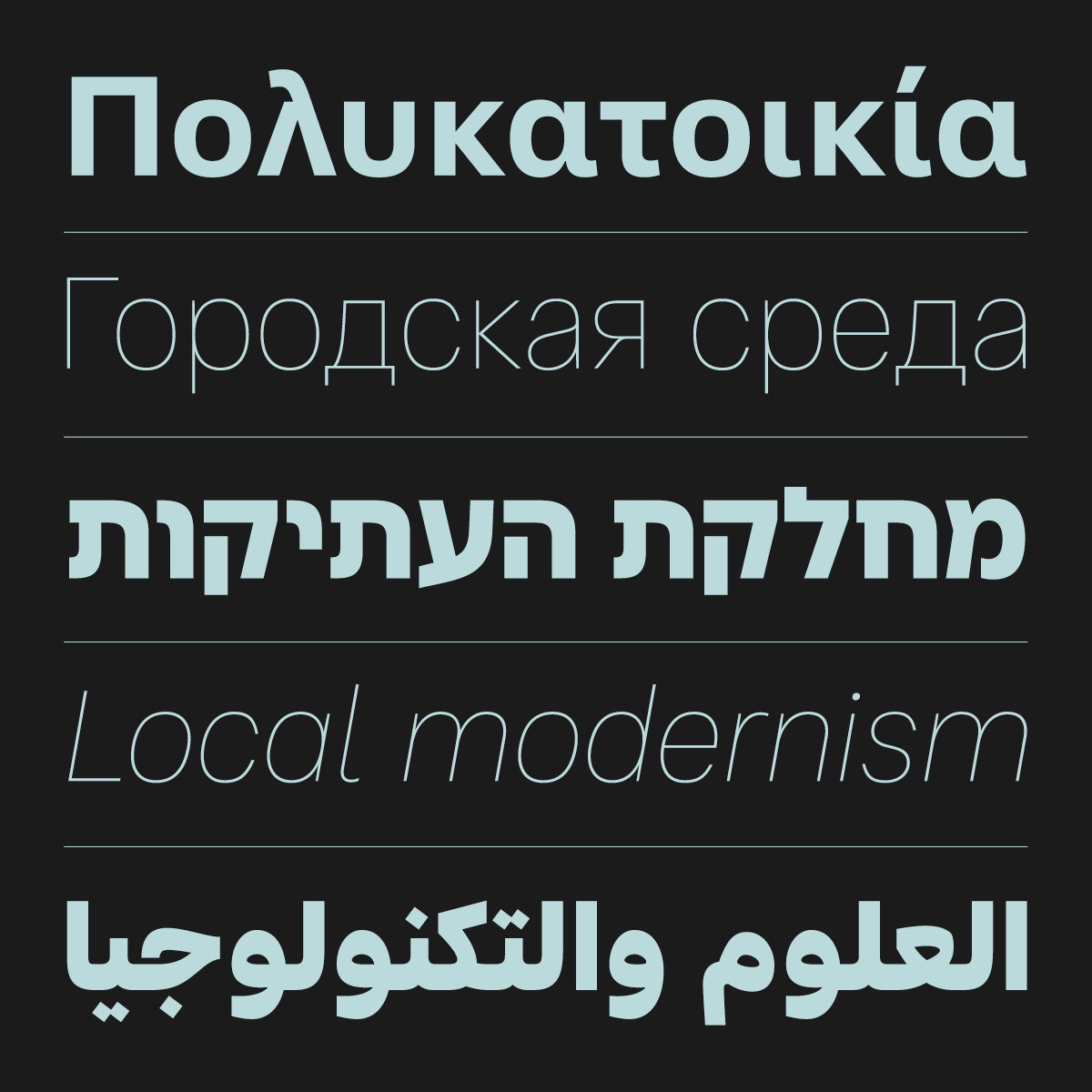
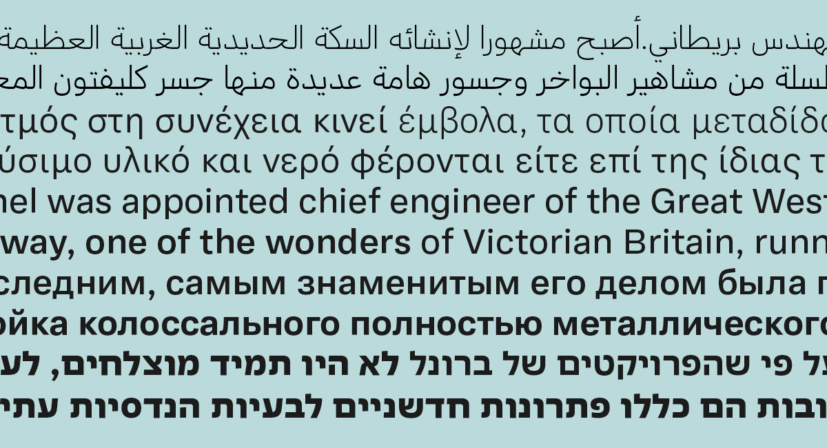
Most of the fonts that are available today are actually multilingual, but not all of them are good designs for all the languages they claim to support. There is a big difference between including some shapes for required characters, and designing those shapes well—not to mention designing them to work well together. When designing for their own language, designers might get away with relying on their instincts. This is not an option once they start working with other languages. In my opinion, design is about making informed decisions, which means that research into typographic needs of languages is a requirement.
It should be also said that instincts may not be such a reliable source of insight. After all, being able to read and write is something other than being able to design. The problem is designers tend to miss areas that require extra consideration and apply their own frame of reference, regardless the language or script being unfamiliar to them. Common examples of this for the Latin script are poor designs for Central European diacritics in West-European and US fonts, especially from the 1990s, though the quality has improved significantly since then. And the same applies on designing for other scripts, where there is even greater need for research.
Are there any scrips that are most difficult to design in for non-natives, and what would your advice be for designers are facing these hurdles?
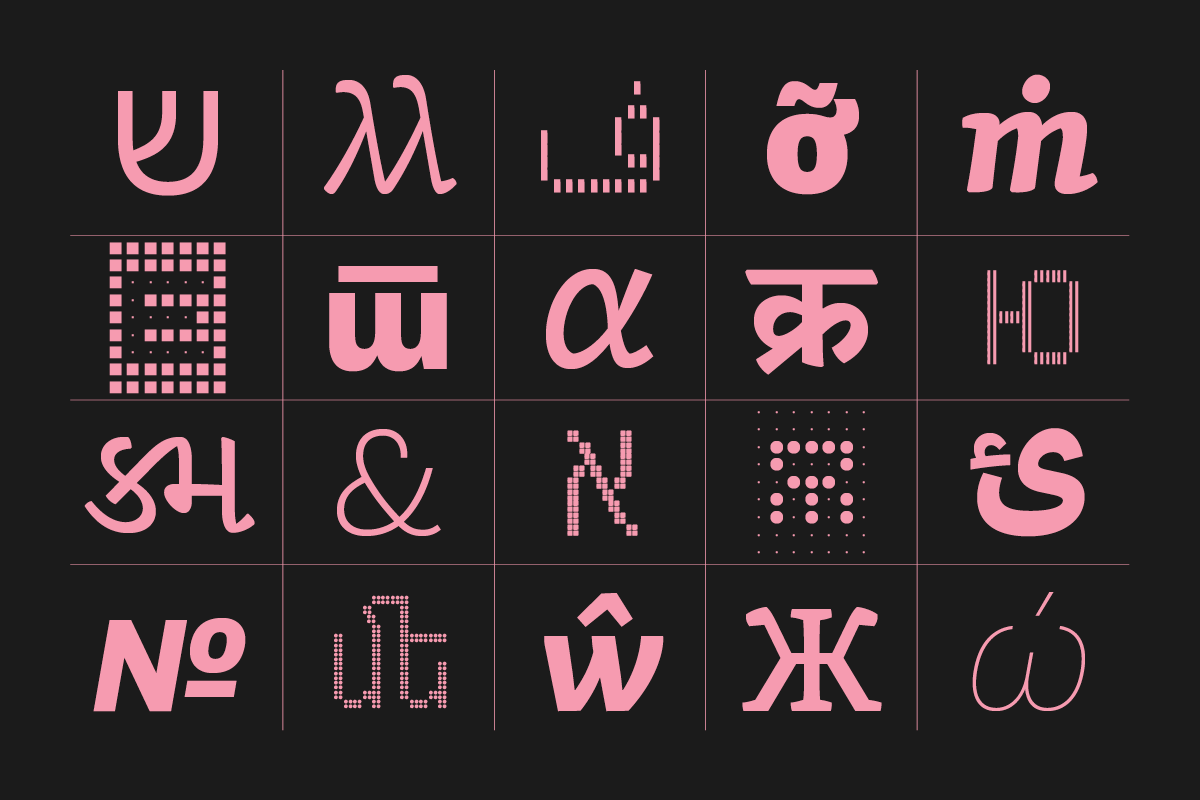
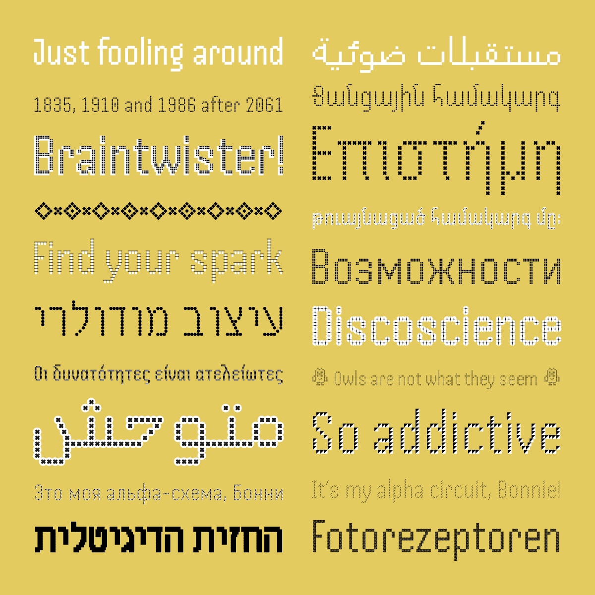
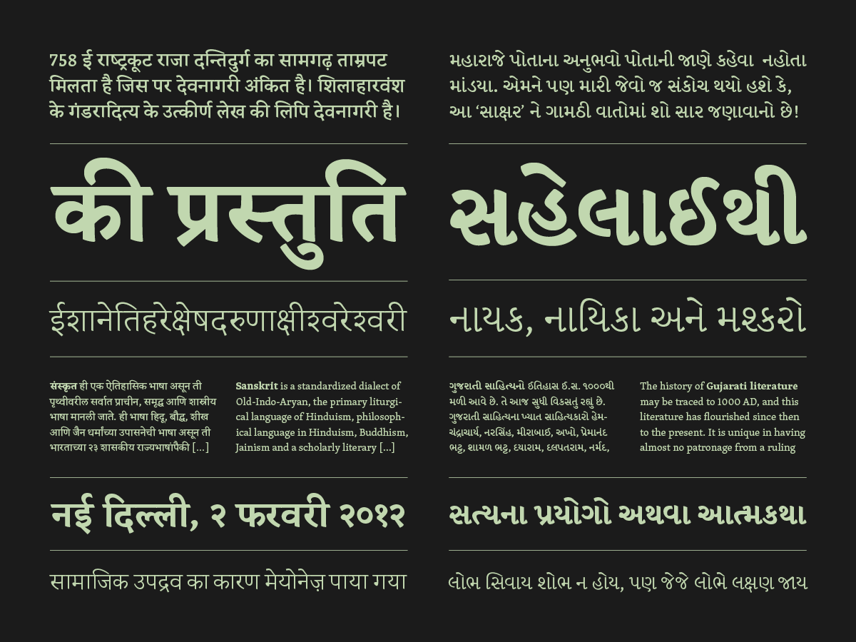
Every script has its own challenges. Chinese, Korean, and Japanese require large numbers of sometimes intricate shapes. The Naskh style of Arabic has seemingly simple shapes, but it requires a lot of planning and attention to proportion. Devanagari and other Indian syllabic scripts need hundreds of shapes, some of which are composed automatically as users type on their keyboards. This requires linguistic research and consideration of all potential combinations—and there are many.
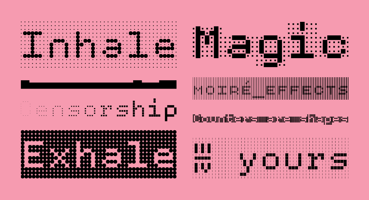
When working on a script or a language I am not competent in, my solution is to find a very good consultant to work with and do as much research as I can. And really, you need to do both. A consultant can help you only so far and shared knowledge obviously helps communication. I have underestimated this for Handjet, thinking it’s just a simple pixel font, but I think the consultants could sense they suddenly needed to work harder on someone else’s design than would be appropriate—simply because I initially did not leave enough space for research. Also, workshops focused on specific scripts are great kickstarters and eye-openers. Just remember that much more experience is needed to get good.
Generally, one should not expect to produce a great design right away. I would say I am most experienced in designing for Latin and Gujarati scripts, yet, it was only when looking at my third or fourth typeface for Gujarati that I felt that I might have an idea about what I am doing. Taking on a project with a tight deadline for a script you have never designed for before is just irresponsible, even if you have the best consultants or you can read the language. For places where I have very little experience, but want a great design, I choose collaboration. I worked like this with Titus Nemeth, Borna Izadpanah, or Vaibhav Singh. They design and I supervise/art direct. It can be a lot of fun, full of meta-design discussions. But even in this case, it helps to do your own research. How else to assess colleagues’ work and whether it fits the general design objectives?
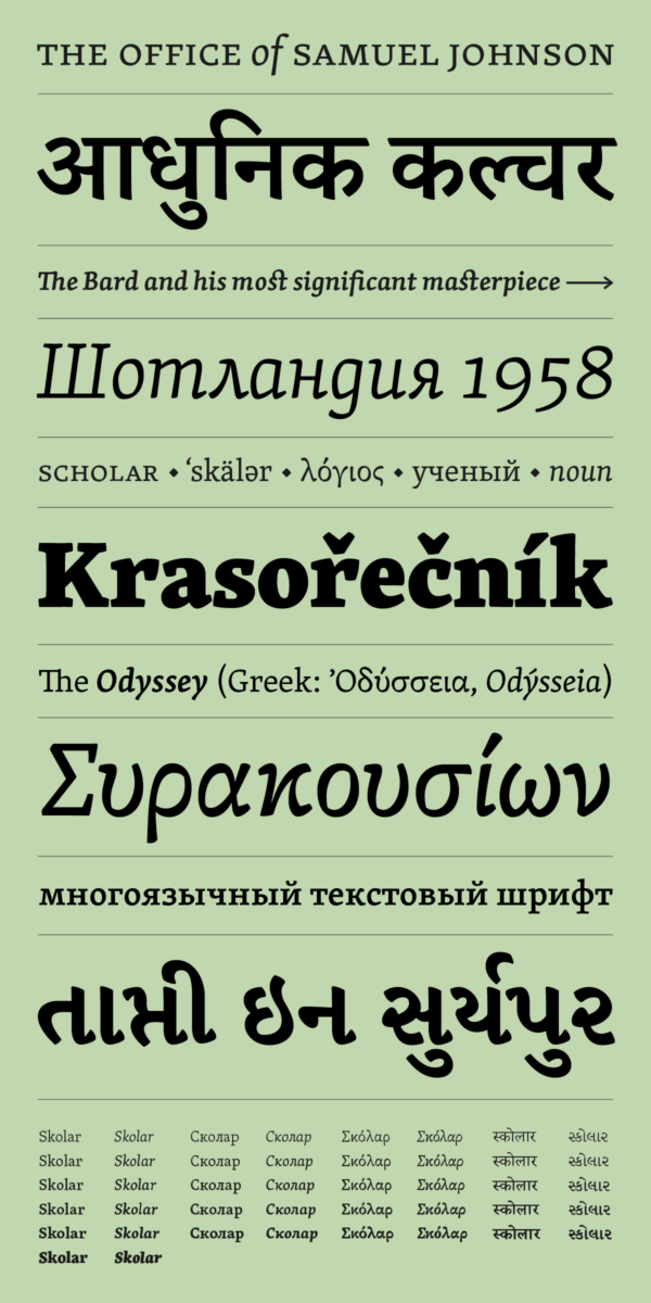
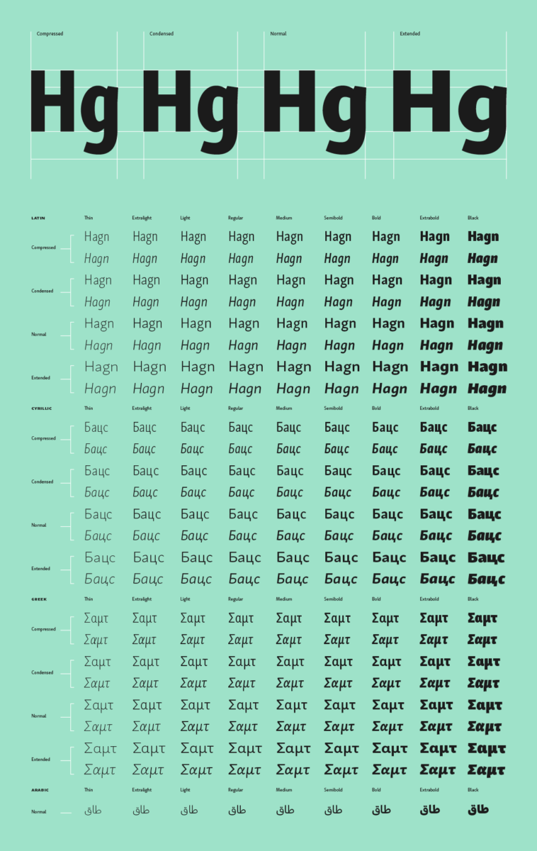
There are quite a few multi-script typefaces where the individual components feel like different typefaces (albeit with similar design principles) mashed up together. Clearly the designers did not communicate enough about the ideas and principles behind their typefaces.
How do you go about creating harmony within multi-script typefaces? Do you have any particular tips or insights which could help people?
It is worth noting that harmonised typeface design is just a convenient default to start from. What matters is whether graphic designers really need to maintain some kind of harmony in their typography. It turns out it is rarely the case.
The idea of harmony has been under scrutiny in the past few years. For me it is too nebulous. When does harmony become uniformity? How come the first term sounds so wholesome and the latter feels icky? I have accepted it as a term the industry uses (and I have used too), but there is a definite need for clarity.

In my opinion, the harmonisation process should not be mechanical—there is no one-fits-all solution. Contemporary designers tend to think in systems: grids, hierarchies, contrast, stroke theories. That is great, it helps us to organise and work faster, but the challenge is to recognise that each script we are designing for uses a different system and exists in a different cultural context. My approach is to make sure the design for each script stands on its own and only then find overlaps between the systems that can be harmonised without a major compromise. I would rather have a less harmonised design that works great in multiple scripts than a highly-harmonised (uniform) design that might look great, but works so-so even in one of those scripts.
Why is it important that typefaces have multilingual support?
The fact that the same typeface is available in multiple languages allows more graphic designers to use it and allows their clients to communicate across languages in a consistent voice if need be. Well-designed multilingual fonts should make the design of multilingual products (books, documents, websites, apps) easier. But again, they are not ultimate solutions.
And lastly, what changes would you like to see in the (type) design industry in terms of the disparities between support for various scripts?
Designers could be more considerate and avoid automatically treating languages that are unfamiliar to them as endangered, fragile species that need their help to be saved. That often comes across as patronising, naïve at best, particularly from designers based in wealthier parts of the world. There may be millions or thousands of people that are familiar with those languages! For example, Indian languages with millions of users are hardly minority languages. Thus, messianic narratives are out of place there. If designers want to be charitable, there are real minority languages that will appreciate a wider typographic palette to chose from.
On the other hand, the assumption that only native designer can design well for a language or a script is also wrong. In my opinion, the more fonts the merrier. We all can learn from each other, be it different approaches to design, cultural considerations, or technical solutions. I hope for more bridges to be built in this regard.
In terms of localisation, we need better education about these issues among UX designers and managers at global companies (from small to large). Supporting many languages should not be an afterthought. It should be an initial consideration built into any design system or software intended for the global market. There are many affordable or free tools available already.
Thank you, David! For more from David, be sure to keep up with Rosetta, and check out Design Regression for more juicy conversations on type.


