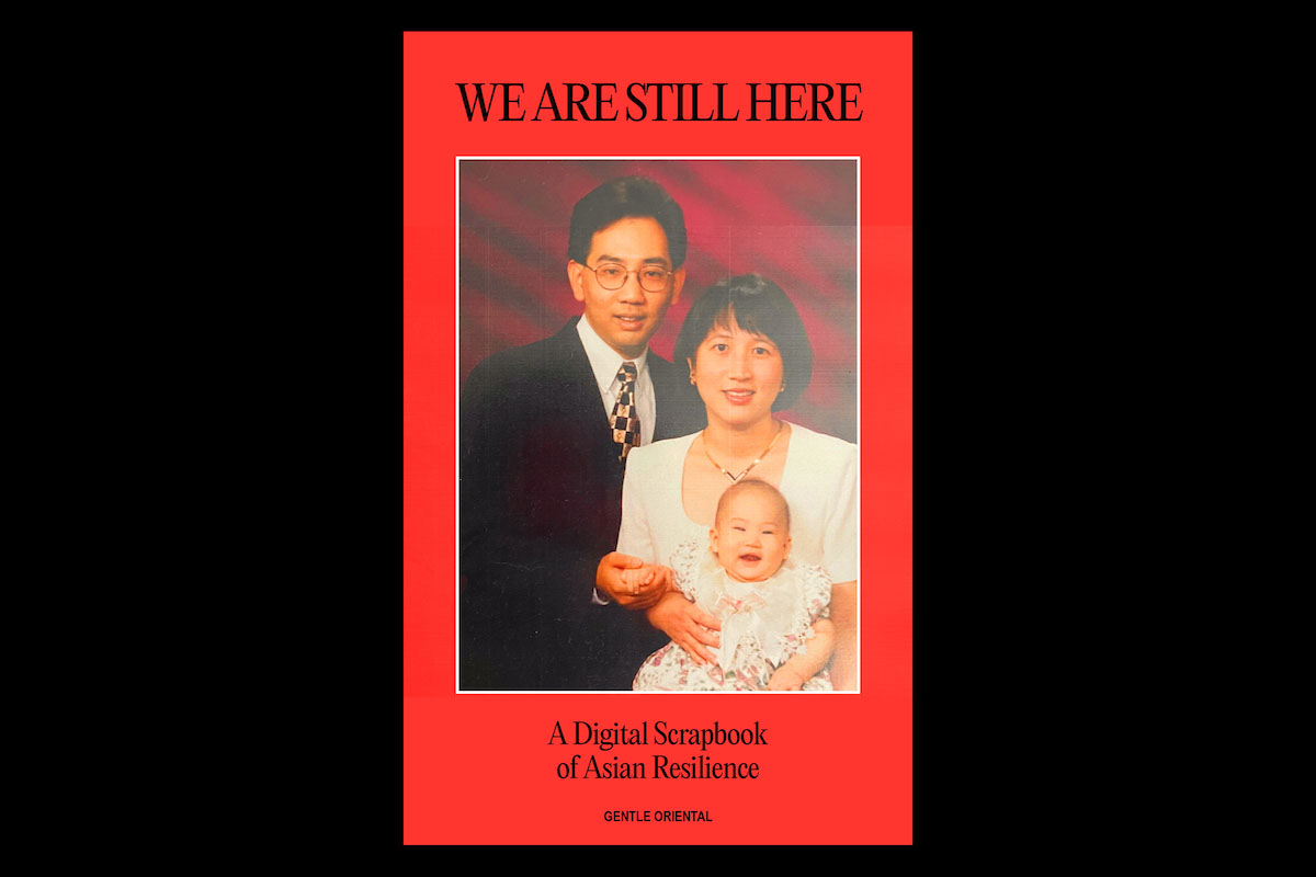
When we first encountered Gabrielle Widjaja’s (@gentle.oriental) “We Are Still Here” project, a zine built on crowdsourced content from Asian and Asian diasporic communities, we were blown away. Intended to offer a moment of pause, a balm, and a sense of collective holding and healing, it emerged in response to the Atlanta shooting on 17th March earlier this year, and came together to form, as the tagline reads, ‘A Digital Scrapbook of Asian Resilience.’
Probably better known under the pseudonym Gentle Oriental, Gabrielle is a 24 year old self described ‘jack-of-all-trades creative’ based in Brooklyn, New York. She says her work ‘seeks to explore the intersections of visual ephemera and Asian diasporic identity,’ adding, ‘My bread and butter is graphic design, but I also incorporate illustration, art direction and even tattooing into my creative practice.’ We had such a beautiful chat with Gabrielle about the story of this project, and now, we’re delighted to share it with you.
This project is extremely powerful—could you tell us a bit about how and why you initiated it?
When I woke up on the morning of Wednesday March 17th to the news of the Atlanta shooting, like many others in the Asian community, I felt a thick fog of grief heavy in the air. I wanted to engage with my community and I posted two questions on my Instagram story: the first was, “Asians, how are you feeling today?” Amongst the many answers that came in were: “Vulnerable,” “Tired,” “Helpless,” “Numb,” “Lost,” “Fearful.” As I was looking through these answers, I felt surprisingly a little better to know that we were communally grieving. At this time I was also in my childhood home visiting my parents. I thought about what they endured to bring me to the States, and for us to still be treated this way after hoping for a better life.
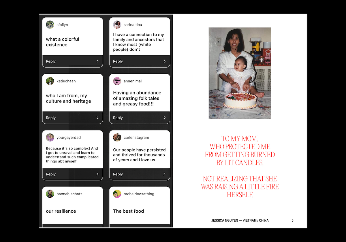
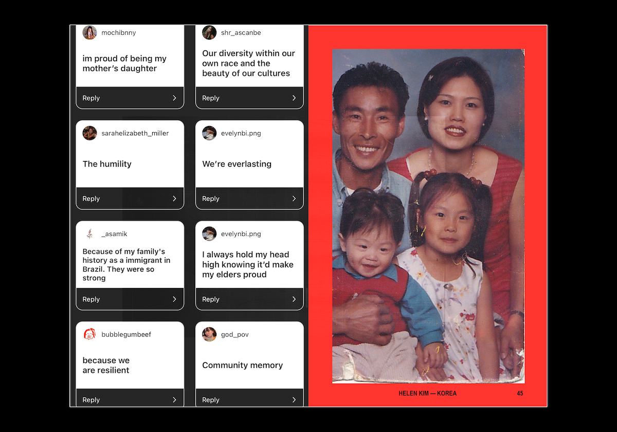
I felt a surge of courage just after looking at a photo of my own family together; the fear of being Asian suddenly melted away by a fire of indignation. I posted a new prompt to the Instagram community: “Now tell me why you’re proud to be Asian.” In a moment when it felt like the world wanted us to be afraid, as repeated in history, it felt cathartic to declare, even to myself, that throughout all the strife our community has faced, we are still here. I got even more answers to this prompt than the first. “The richness of our cultures,” “Our food,” “Our family values,” “Respect of elders,” “The neurotic commitment to being generous.” The one that made me laugh was “Pineapple cake,” because it was so simple and true. And one word kept coming up over and over: resilience.
I felt such a surge of unfettered happiness at this inundation of online community gathering, I wanted to share it and give it back to the community. I shared screenshots of the pages on pages of answers I received, but it didn’t feel impactful enough. That night as I lay awake, I had the sudden idea for a community family scrapbook, since I felt that community being family was a very salient point of Asian culture. I wanted to know more about the family stories of the people who had replied to my questions. I really quickly sent out another Instagram story: “Email me an old family photo, your ethnic origin, and why you’re proud to be Asian. Subject line: ‘WE ARE STILL HERE.’ No promises on how this will manifest.” From there, the project took on a life of its own and very quickly materialised.
And what was the response like? How did the making of the zine go from there?
Dozens and dozens of “WE ARE STILL HERE” emails started flooding my inbox that day, and I had to cut off submissions at midnight. I had my 9-5 job then and other projects to work on, but this felt more important, so I spent the next week or two working on it non-stop.
I quickly made an 8×5” InDesign document. The cover had come to me in my dreams the night before: my original family photo that had sparked this idea, and extremely simple typography: WE ARE STILL HERE. All-caps was important, because this was a declaration of resilience. I started making each page in the order the emails had slid into my inbox. I knew this would be fast making, no time for deliberation, and on each spread I was able to play with the design and come up with different typographic and design patterns as I went along.
What role do you think typography takes in documenting & transcribing people’s inner worlds, and what’s your approach to translating this in an authentic and meaningful way?
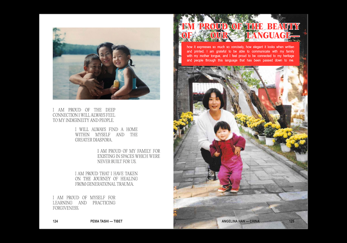
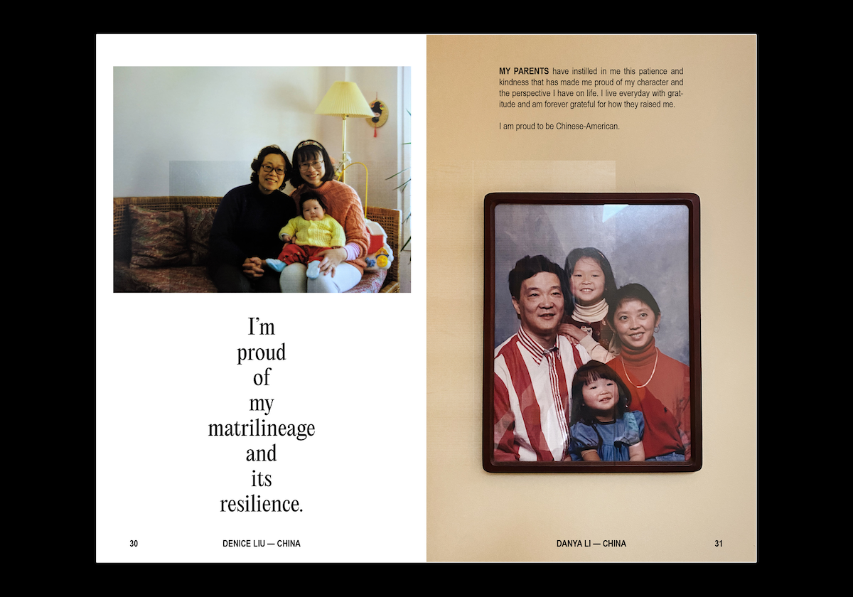
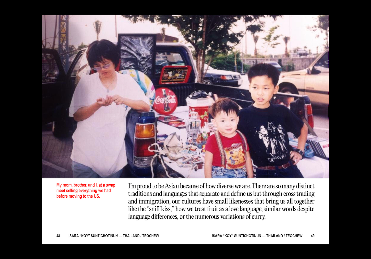
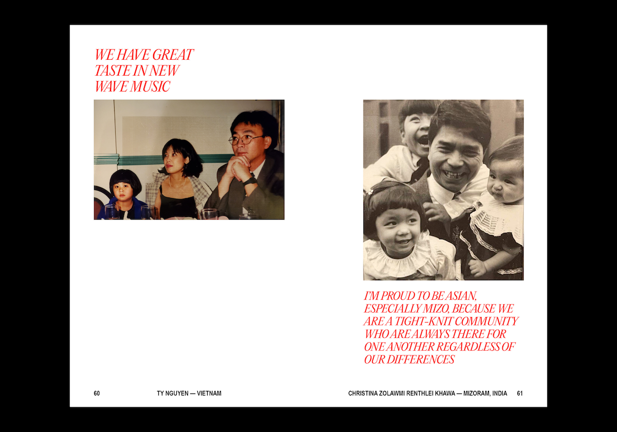
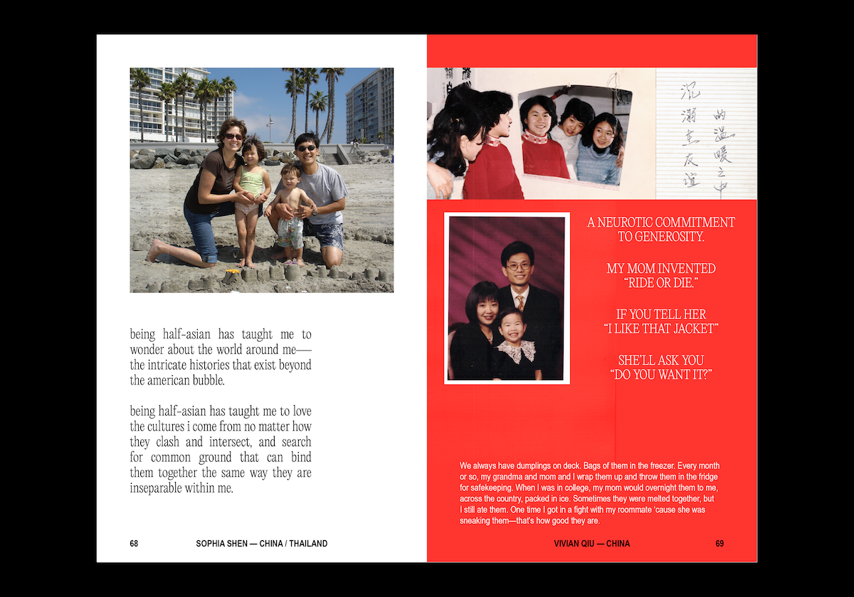
I think the typeface you choose can give the words so much character and depth. I chose Editorial New by Pangram Pangram (and even emailed them whether I could use the typeface for this book, to which they kindly agreed!) as I knew I wanted to have a serif with a slightly archival, old school look. Something about Editorial New—especially in all-caps with the ultralight weight—feels very Asian Karaoke Subtitles to me; almost embodying the strokes of Asian characters across many languages. I also chose Arial Narrow, which I have been using a lot for body copy, because it felt very vintage too—specifically with the first few words capitalised and bolded. I wanted this book to feel archival, to bring forth the essence of a scrapbook.
Scrapbooks aren’t meant to be the most well-designed objects. They are imbued with memory and nostalgia through their haphazard scribblings and scotch-taped photos. I wanted to recreate that feeling without being too literal, especially considering I was working with peoples’ very real old family photos that had most certainly escaped the dusty boxes of their garages. When the design or typographic choice is able to successfully relay the voice the content conveys, it strengthens the message and paints an entire picture, feeling, that couldn’t be captured purely by the words. I wouldn’t even say this was my best typographic work ever, but it never needed to be.
Beautifully put. So why did you choose to create a zine format and how did this affect your type/design decisions?
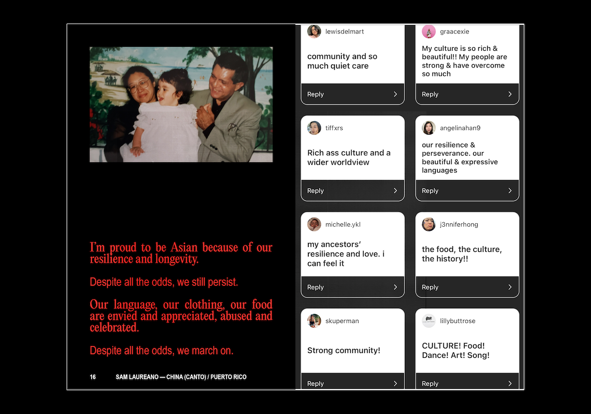
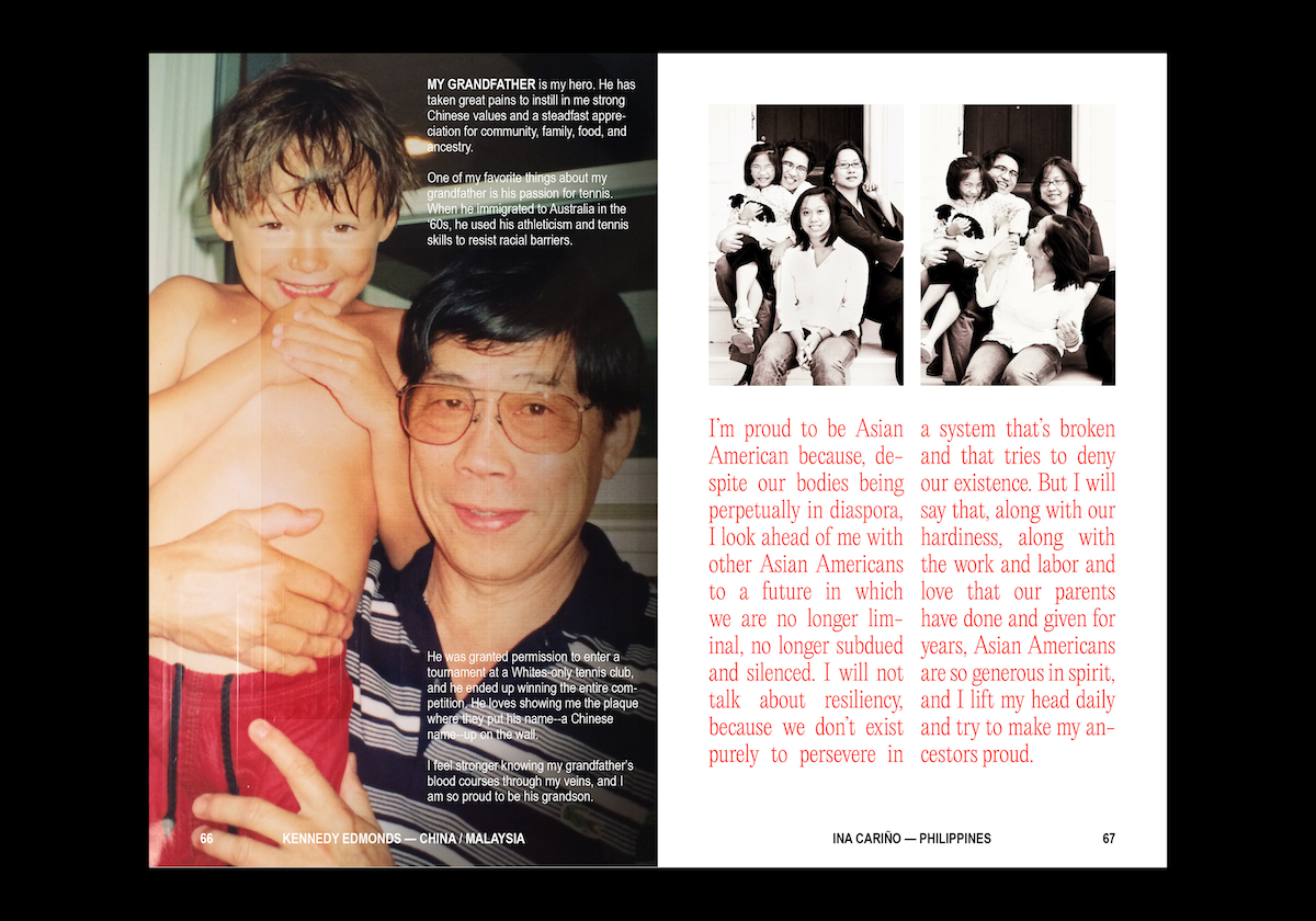
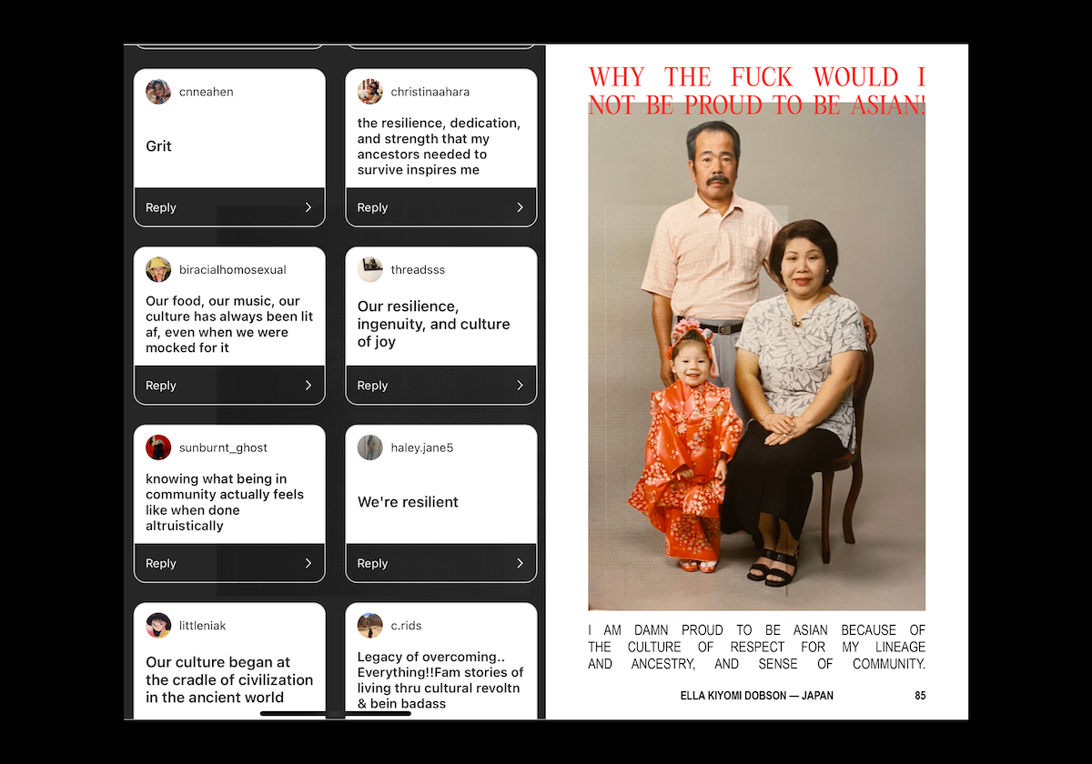
The zine format felt like an obvious choice to me, since I was working with crowd-sourced content and I didn’t think each page had to be exactly the same. Though I will say the art direction realised itself through the very making process. Because this was a project of urgency, I let my first design instincts fully take over. I threw down a grid haphazardly. I chose one colour, red, because it is lucky across Asian cultures, and our veins run lucky-red with the blood of our ancestors. I tried to utilise black, white and red in a variety of ways across each spread. When I went back to review my work after each spread was made, I noticed I’d subconsciously created design patterns as I moved page by page.
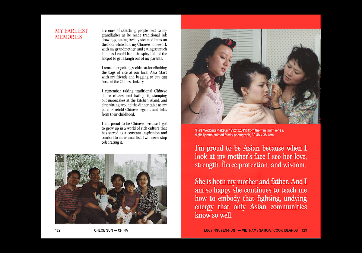
Because this zine (book) was created with the intention of inclusivity, (I specifically put a call out to invite adopted Asians, mixed Asians, South and South-east Asians), I purposely did not include any Asian glyphs (except where specified within someone’s submitted content). If I included one I would have to include them all, basically. But by primarily using English, this speaks to a diversity of diasporic identities without having to employ the use of other language characters sets.
I think the strangest thing I ever did for this book was use justified all-caps type that spanned entire boxes. It sure made for some weird spacing, but I was’t concerned because they made the composition of some pages extremely strong, and gave them weighted character. Even though the order of the pages is completely random and unplanned due to the order of the submissions, somehow the book developed its own natural rhythm and pause through my use of white (and black) space. I even had screenshots of my original Instagram stories, “Now tell me why you’re proud to be Asian,” interspersed between spreads to create moments showing quick fire response, so there were more light-hearted parts alongside intentional, heavier submissions.
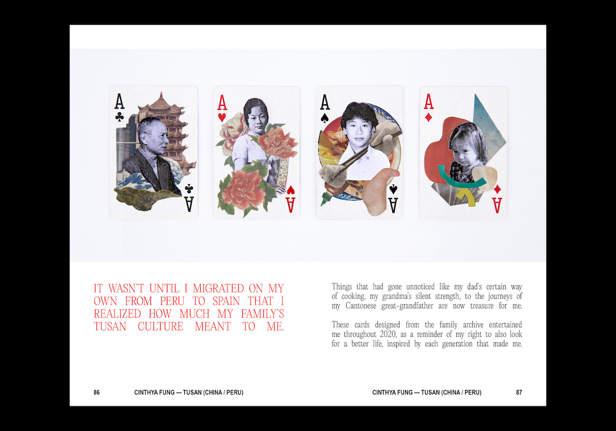
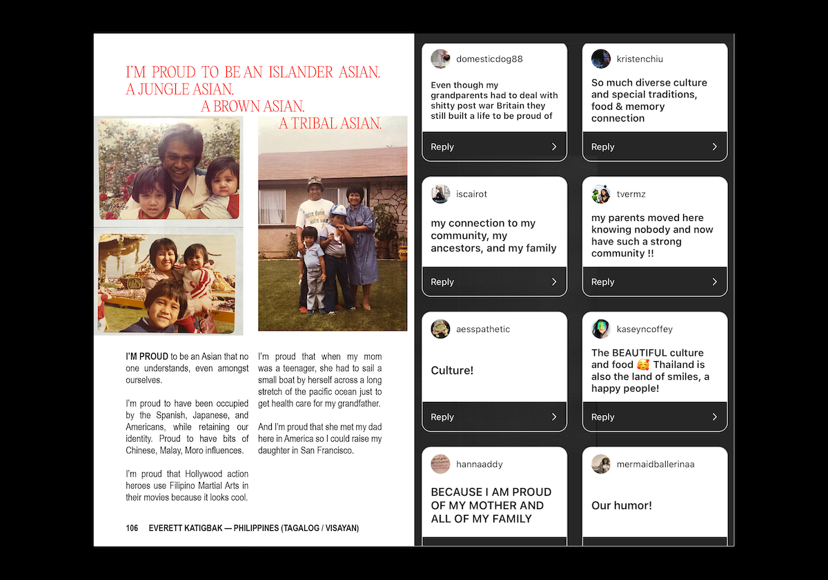
A designer’s dream, honestly, is to have a breadth of content to paint with. Such was the case with this project, because the submitted content dictated the design and made a lot of decisions for me. Some photos were grainy (I had to make them smaller), and some were so beautiful I couldn’t bear to NOT have them full-bleed. There were pictures with light glare in them because they were iPhone snaps of glossy photographs, and some scans even showed the wrinkled, matted edges that exposed the life of the photograph. Some submitted stories were a few poignant words—one sentence full of life—and some were paragraphs that painted entire episodes of life and love, which I was desperate to fit into a single page (few of them even took an entire spread).
To be honest, this book designed itself in many ways. I just listened and guided the content into the shape it wanted to take.
And is there anything else you’d like to share about it?
So initially I’d said I would cherry pick responses, but the more responses I received I felt I could not possibly cut any—they were all so uniquely beautiful, different, and similar at the same time. In the end, I included all 130-something responses to create a whopping 140 page book, and I’m currently working on printing the book for distribution, all proceeds will go to a relevant charity (TBD). The response was overwhelmingly positive, and I hope I was successful in creating something that would give everyone in my community the boost of serotonin they needed after a difficult week (month, lifetime). This book does not critically address any of the serious issues underlying the attacks, but it was meant to be a moment of emotional pause and healing.
Thank you so much, Gabrielle.
For more on WE ARE STILL HERE and Gentle Oriental, keep up with Gabrielle on socials. WE ARE STILL HERE is available for preorder now, with 50% of proceeds going to Red Canary Song, a grassroots collective for asian and migrant sex workers.

