Azza Alameddine shares her approach to designing multilingual type systems with distinctive personalities.
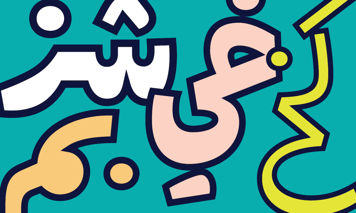
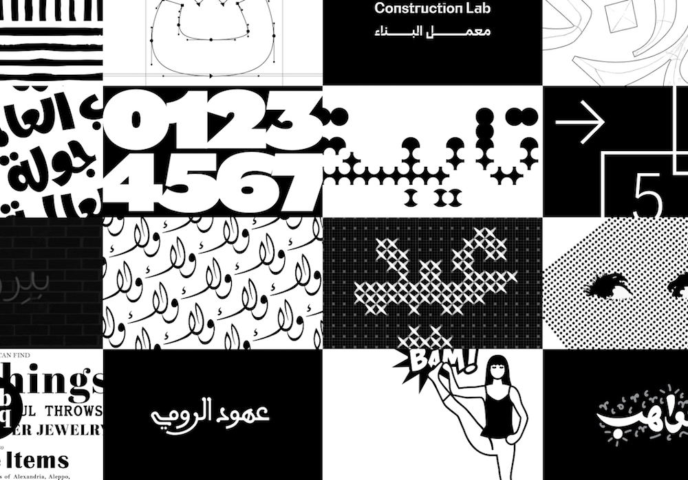
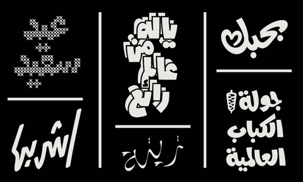
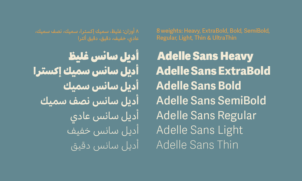
The work of Azza Alameddine, a freelance graphic and type designer who specialises in branding, lettering and Arabic typefaces, combines an experimental, curious approach to letterforms with a desire to explore and expand the possibilities of Arabic typography. Having worked as a graphic designer since 2007, she branched into type design in 2012. Throughout her type design career, she has worked on high calibre multilingual type projects such as Adelle Sans Arabic, alongside an array of logotype and branding work.
Azza and I dig into the process behind translating the character of a typeface across multiple scrips, exploring visual and functional factors and more.
ZLM: Hey, Azza. Firstly, can you tell me about the work you’re doing to bring more awareness to graphic and type designers in the Middle East?
AA: In the Middle East, the branding and typography fields have inherited many of their aesthetics from the West. In my design work, I try to detach from that and dig more into the Arab graphic culture. It’s not an easy task because of the lack of resources, and because I am unconsciously looking at western aesthetics every day, but the idea is to open up young graphic designers’ eyes to our history…I am not the only one to do it, you can feel an awakening lately in many Arab designers who are looking deeper into their rich design heritage.
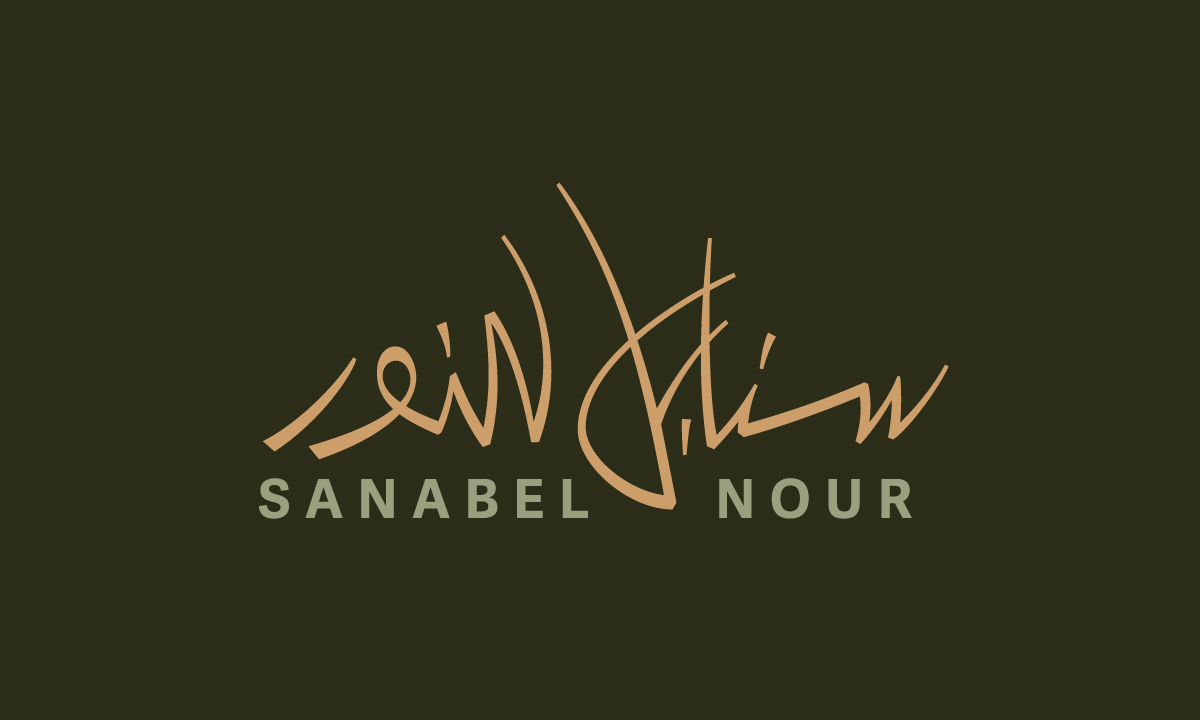
ZLM: Why is it important to translate the character or personality of a typeface when you are designing a multilingual type system, or adapting an existing typeface to extend the language support?
AA: You have to think that a brand should emanate the same feeling whether it is communicating in English or Arabic. The typeface of a brand is very often its identity and should therefore convey the same feeling in any language. Imagine you meet someone and realise later that they have multiple personalities depending on the language they speak. You would think they are crazy, no? It’s the same with typefaces and brands. Our minds are less confused when they see a typeface with a single identity made out of similar or homogeneous elements.
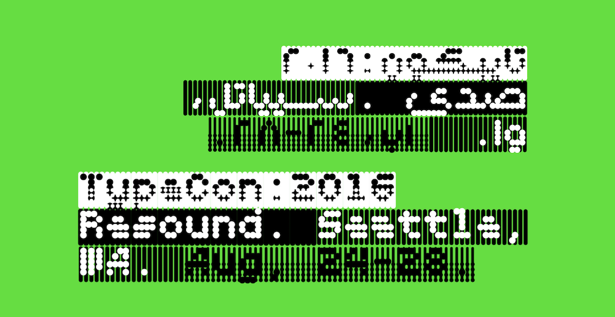
ZLM: That’s a great way of putting it…So, can you break down the steps you take when you are designing a new version of a font in a different script?
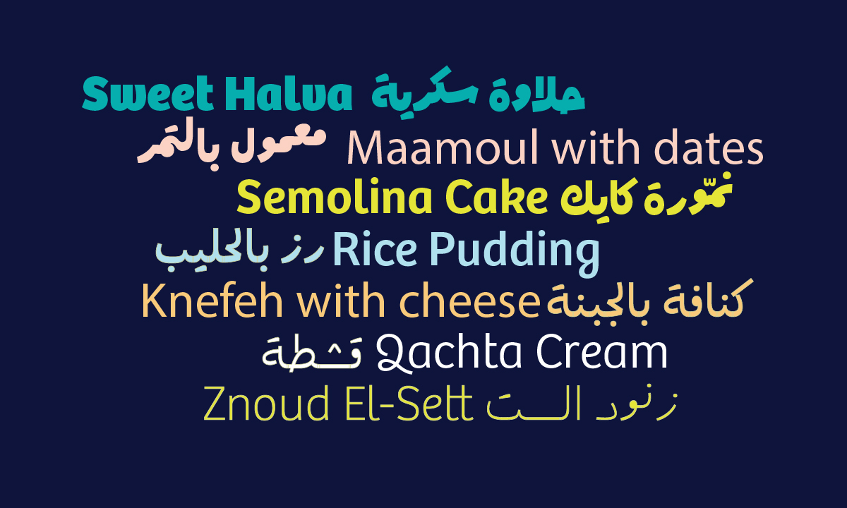
AA: First, I look at the functionality of the original typeface. If the typeface is meant for reading, its Arabic counterpart should be designed for reading too. If it’s a display typeface, it should be matched with one that functions as a display etc… you get the point. This is the most important and difficult step because it is when you have to decide the calligraphic style of the Arabic script. Then, the next step is to match the size, weight and lastly, the features of the original typeface. I call this functional versus visual matching.
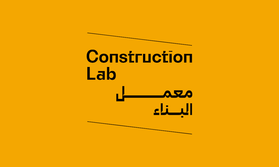
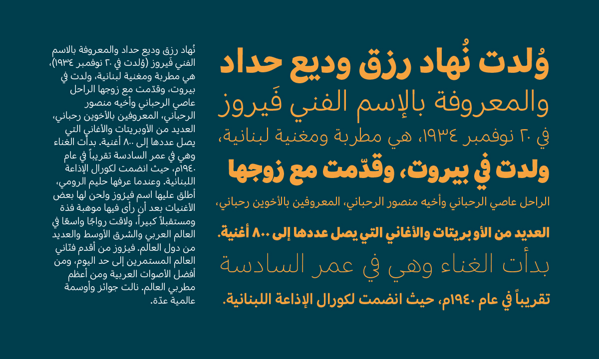
ZLM: What method do you use to understand and translate the personality of a typeface across scripts?
AA: In my work, the starting point is usually a Latin typeface. So I usually look at the connection between the stems and the rounded shapes, the radius of the rounded shapes…The italics and the diacritics can also be helpful in making some design decisions for the Arabic script.
ZLM: Is this a skill that you think more designers should look to develop?
AA: The first part of the matching process, which consists of choosing the corresponding calligraphic style, is not really a skill, it’s a methodology. The choice can vary from one designer to the other but the options are not that varied. The design of the features however is definitely a skill. This is where each designer can have a different interpretation depending on their experience and personal aesthetics.
ZLM: Thank you, Azza!
You can keep up with Azza over on socials, or explore her fascinating work and writings on her website and Medium.

