TYEPONE Issue 01 interviewee Daniela Retana shares the latest goings-on at her font foundry, newglyph. Including new fonts, the ICRC, and The Ocean Cleanup, here’s what she’s been up to.
Since we last spoke back in 2020, Daniela Retana has been developing newglyph’s font library as the director of custom fonts, continuing to push the foundry’s philanthropic work, nurturing her personal creative projects and doing some freelance writing. There was a lot of exciting stuff still in development back then, and now, the foundry’s font library has grown into a beautiful and diverse collection. I got back in touch with Daniela for a catch up on where she’s been…
ZLM: Hey, Daniela! Before we dive in, how are you?
DR: All is well, I really can’t complain. My personal projects and newglyph continue to blossom, and I couldn’t be happier. I’m still freelance writing and I have some new projects in the works that I will tell you about throughout this interview.
ZLM: What’s been going on lately for you at newglyph?
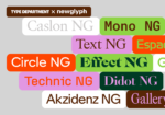
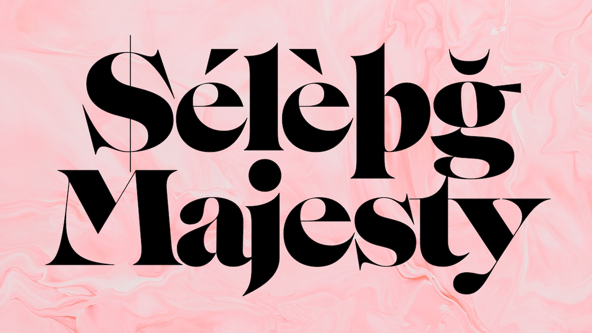
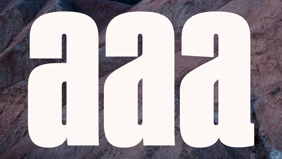
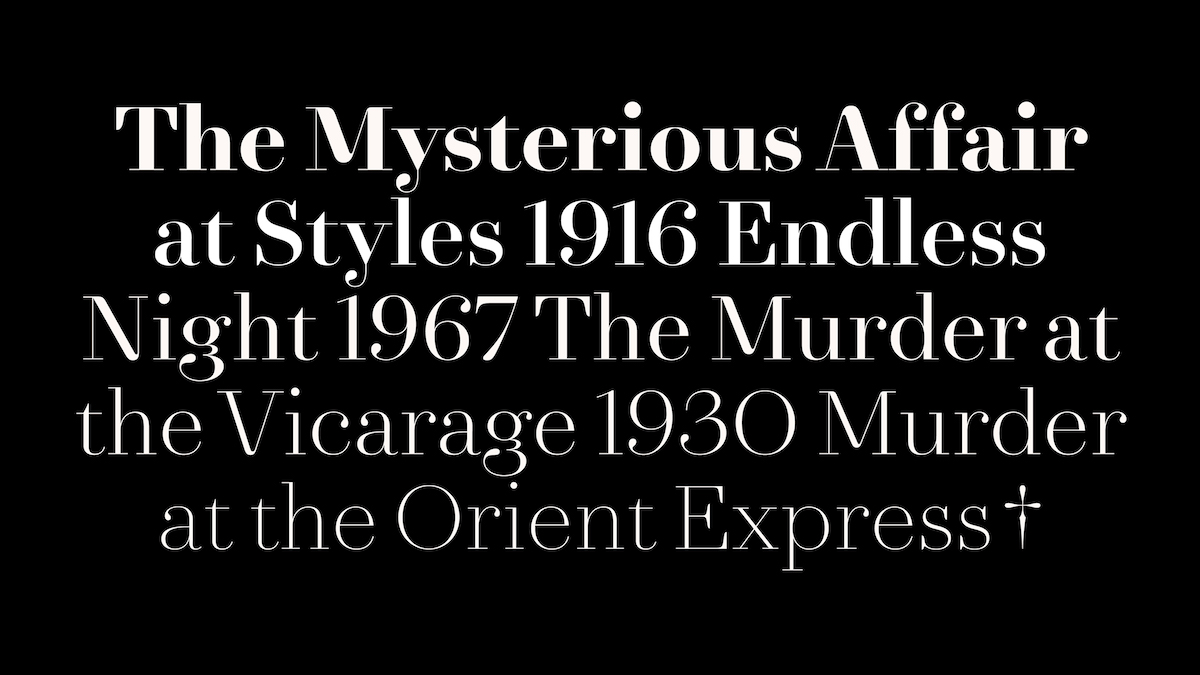
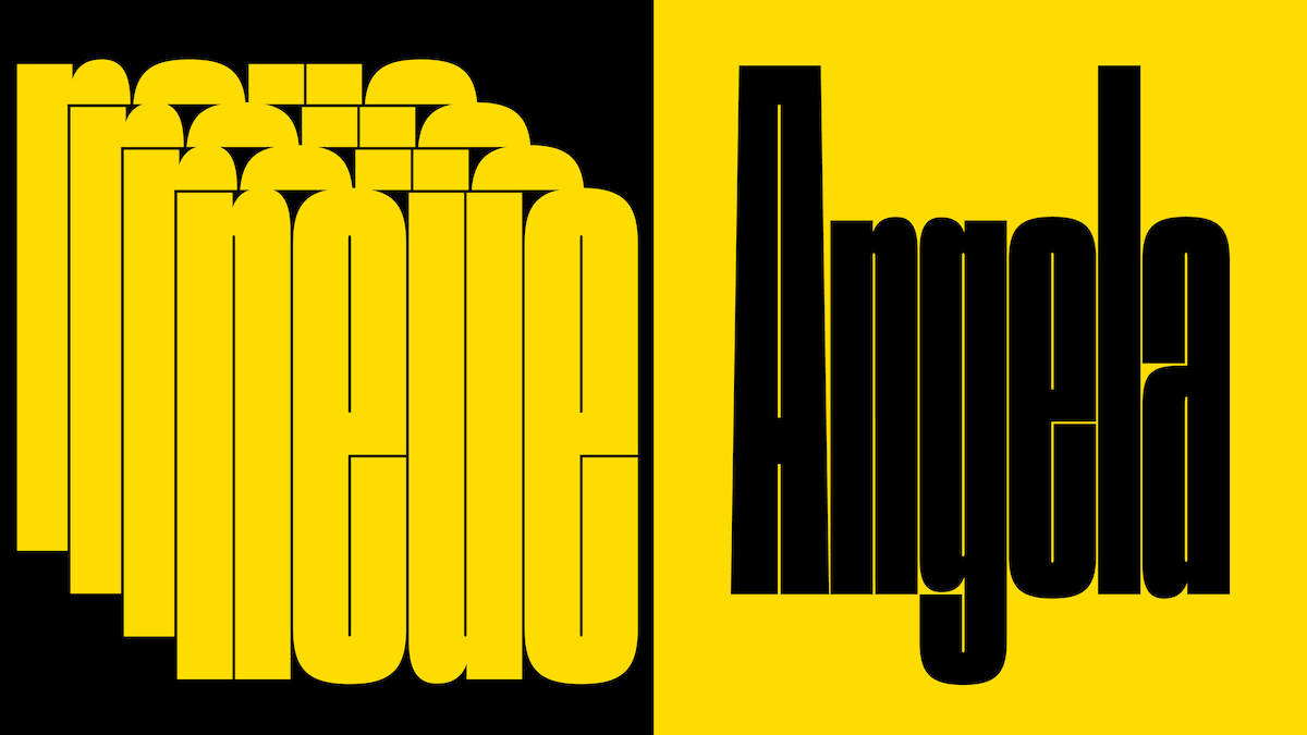
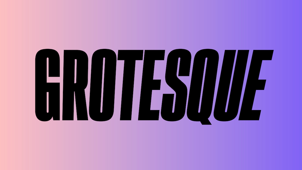
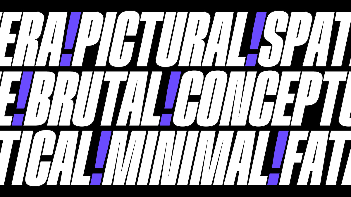
DR: Since we last spoke, we’ve made some new releases and added a few fonts to our catalogue. Angela is an ultra condensed display typeface, available in one weight, black. Agatha is a cocktail of experimentation in four parts: a sprinkle of neoclassicism, a dash of 19th century Didot, and a good dose of Amazonia Typeface.
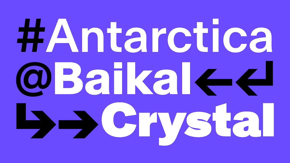
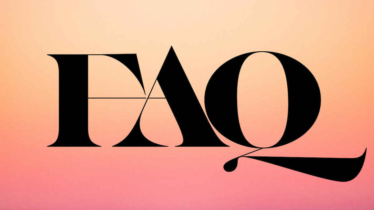
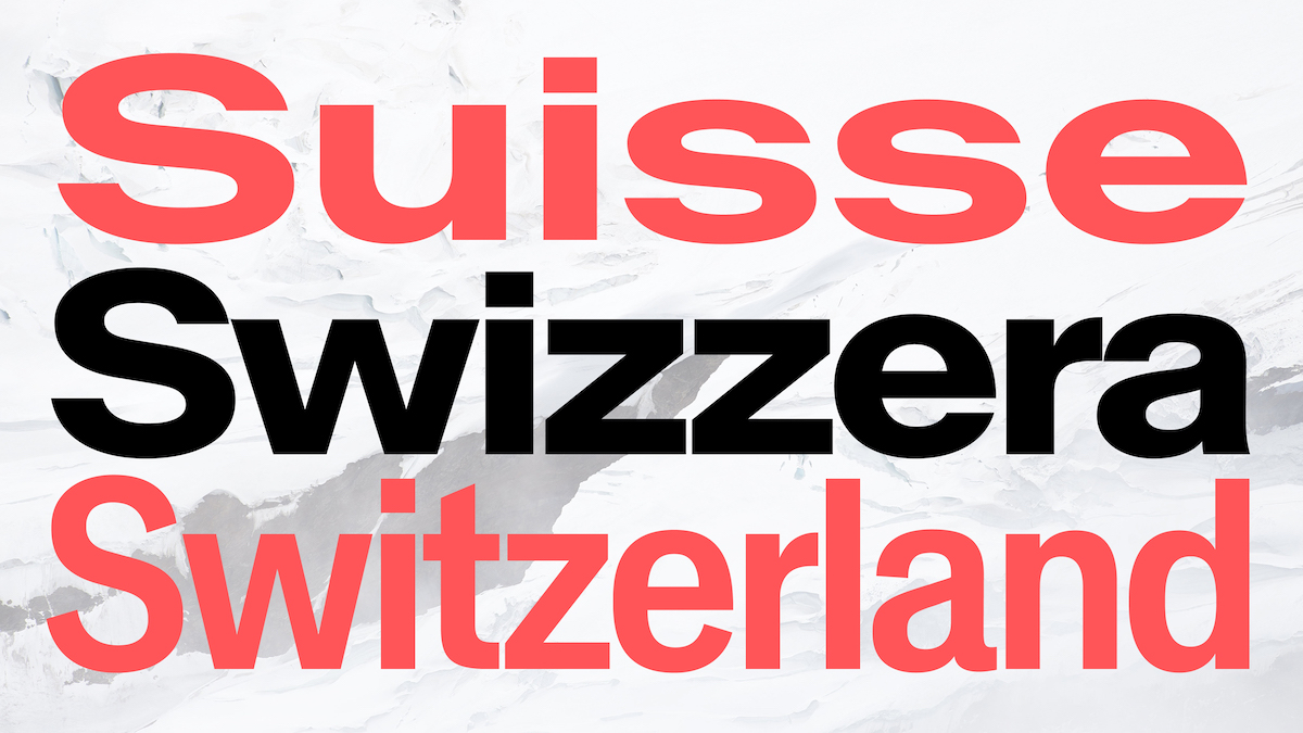
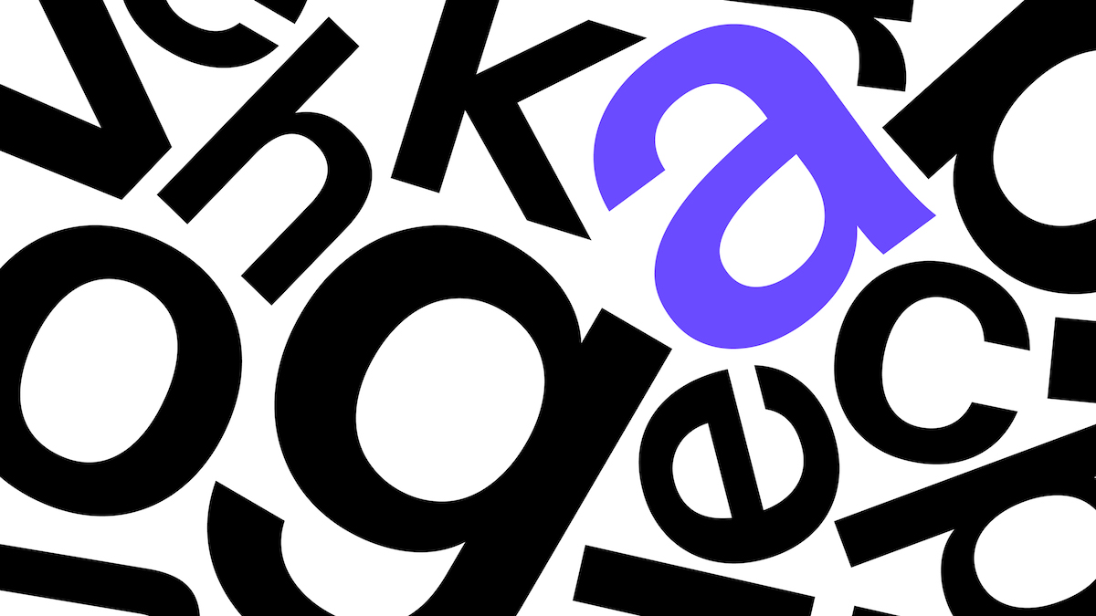
Africa Cliff was added to the Africa Collection, this font’s construction follows in the footsteps of nineteenth-century print style typefaces with romantic sensibilities. This typeface takes inspiration from display fonts like Caslon and calligraphic lettering. This can be seen in the blooming ampersand and uppercase Q which, with its organic aesthetic, creates a beautiful contrast to the sharp peeked terminals in the uppercase E, F, Z, and lowercase f and z. Baikal and Crystal were also released last year—these two fonts are an addition to our grotesk collection.
ZLM: Sounds great. What are your hopes for 2022? What direction do you want to take the foundry in?
DR: I hope the company continues to grow so we can keep producing and providing innovative fonts. But also be able to develop more artistic and experimental projects, we can’t wait to be able to dedicate more time to these types of projects. But right now we are building our Classic Collection. This immense project was undertaken with the desire to import the classic genres into the future with our vision of variable font technology and design.
ZLM: Can you tell us about your Easy License? There’s been lots of interesting innovation around font licensing recently—tell us about the thought behind yours.
DR: It’s simple, our license was designed to fit our global customers’ communication needs. It’s all packaged in one license. When you purchase a font from us, your licence grants you the right to use the font on a multitude of communication platforms, which include desktops, websites, apps, electronic publications, broadcasting, videos, films, merchandising and social media. We offer free updates when you purchase a font license, as well as free trials and student discounts to help the next generation of designers.
ZLM: How has newglyph been continuing to develop its philanthropic work?
DR: I’m happy to say that we’re still continuing with our philanthropic work. Thanks to our customers we’re able to continue supporting ICRC, The Ocean CleanUp and Enfants du Monde. It’s a good feeling to be able to share this news with you, last year Enfants du Monde was able to provide school supplies to 125 children in Burkina Faso. The Ocean Cleanup project continues to clean up the Great Pacific Garbage Patch, and of course, the ICRC continues to provide aid to people caught in war zones.
And I’d also like to thank you for your continued support of Newglyph and myself, it’s platforms like this that give me the opportunity to talk about our philanthropic work and make people aware of what we’re doing.
ZLM: That’s amazing to hear. So, do you have any recent or upcoming exciting projects you can share with us?
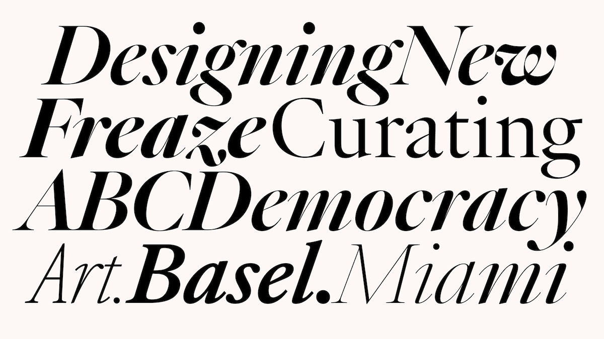
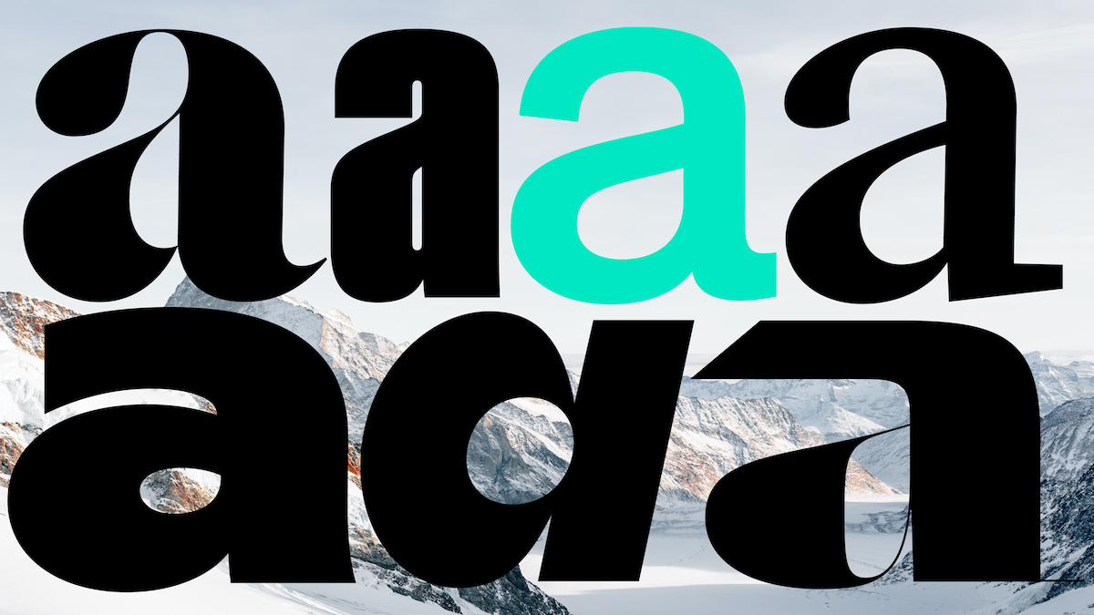
DR: We have another big release planned this year. Ian Party has been a type design beast in the past few months, and thanks to him we’re about to release yet another major update, this time to our Atacama font. This font goes from text to headline, and from sans to serif and back again, and it will also include italics. The real challenge was to make the transitions between all the styles coherent without a break in the fluidity of the variable. You will also find this is a Garalde that corresponds to a standard text font with a design space capable of transitioning between condensed and extended, and black to light, which can all be found within the same variable font. Aesthetically speaking, the really interesting thing about this font is all the design capabilities that are found within the centre of the variable design space transitions, the design possibilities seem endless.
We also plan to release more weights to our Angela font. And another project being undertaken this year is the design of a Romain Du Roi style constructed font like Din, with extreme variable possibilities.
On a more personal note, I’m happy to announce I will be teaching at the Institute of Technology and Design (ITD, @td.institute), located in Monterrey and Mexico City. This project and school are led by Santiago Orozco of Typemade. The aim of this school is to promote new ways of thinking, adapting to technological changes and having a vision to solve problems through design. There are two main tracks, Technology and Design, and the courses will fall into these two categories and over several topics—Type Design, Type Production, Calligraphy, Lettering, Editorial Design, Editorial Production, PM, Communication Strategy, Programming, Algorithms, Oriented Object Programming, Data Structures, Software Engineering, UX Design, UI Design, Design Thinking, Future Studies, Future Design, Branding, Music Production, I/O Production.
ZLM: What major milestones or achievements have come up for yourself and the foundry in the last year?
A fulfilling achievement for us is seeing so many great projects with our fonts in use. To know that people appreciate what we’re doing is the real reward, at the end of the day. It’s encouraging, and it gives me the strength to continue building this company with the vision of what a type design company should be, and could be for the future.
ZLM: Thank you so much, Daniela!
As always, it’s a pleasure to hear from Daniela about all the great stuff going on at newglyph. You can stay up to date with newglyph‘s latest font drops on Instagram, or follow Daniela to hear from her personally. To stay posted on the Institute of Technology and Design (ITD) school opening and program, you can head to Instagram, Twitter, and the ITD website.


