
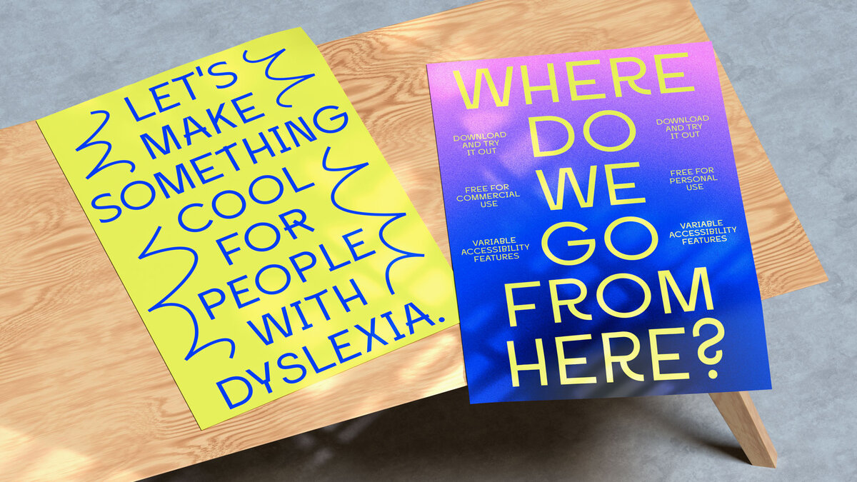
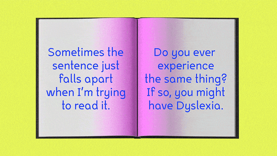
When it comes to design, we always value accessibility. However, it’s not always the case that someone who is diagnosed with dyslexia finds it easy to read the same typefaces our eyes are accustomed to. As a solution, Inconstant Regular – a dyslexia-friendly font – was created.
The font was created as part of the campaign “There’s Nothing Comic About Dyslexia”, together with Dyslexia Scotland and Innocean Berlin, and executed by the graphic designer Norway-born and New York-based, Daniel Brokstad.
“I was approached by Innocean Berlin as they were looking to create a campaign and font for dyslexia. Right away I thought it was both a good cause and an interesting design challenge, as I have never done any design specifically for people with dyslexia”, tells us Brokstad.
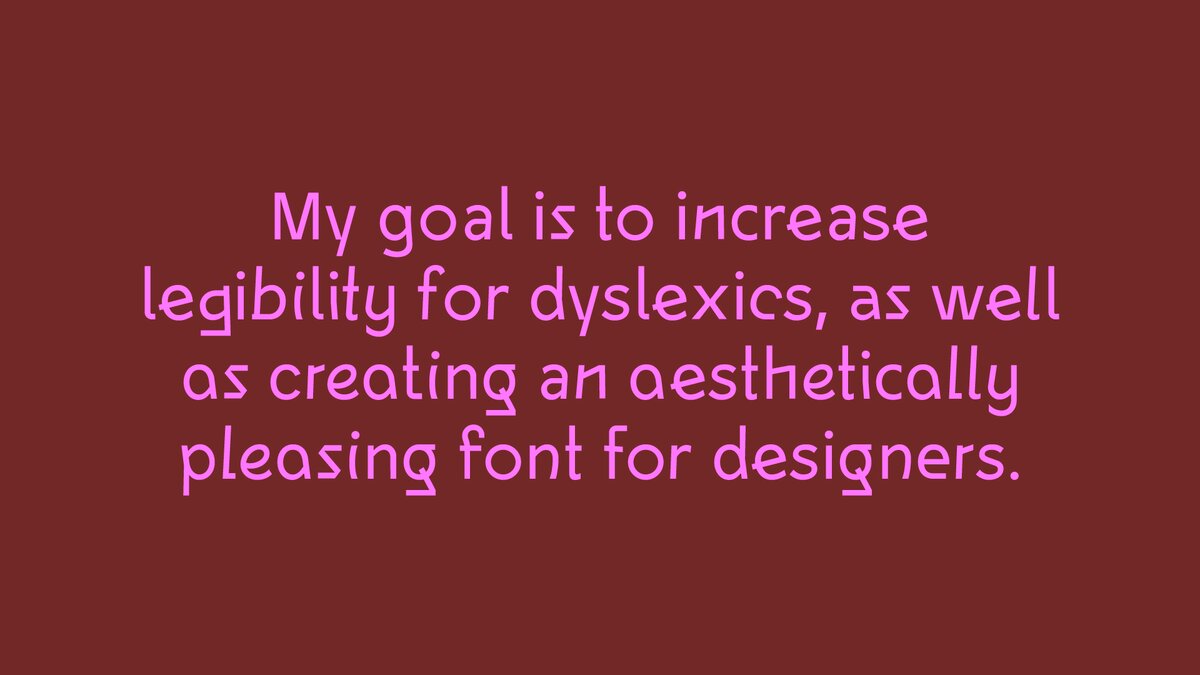
“Fairly early in the process, I wanted this to strike a balance between dyslexia-legibility and designer-usability. To be a font that would actually be used by designers, therefore having the biggest reach and also the highest chance of helping people with dyslexia – beyond just installing it on their own computer”, he continues. “It serves as an example of how a font can be created with design inclusivity in mind while still keeping its design usability.”
The project’s key goal was accessibility, not just through its design, but its position in the font marketplace. To reach that goal, the font is available for free – for both commercial and personal usage. “Releasing the font for free is an extension of this wish for a broader reach. Because dyslexia can be a whole range of different difficulties related to reading, there is no one-shoe-fits-all”, explained Daniel.
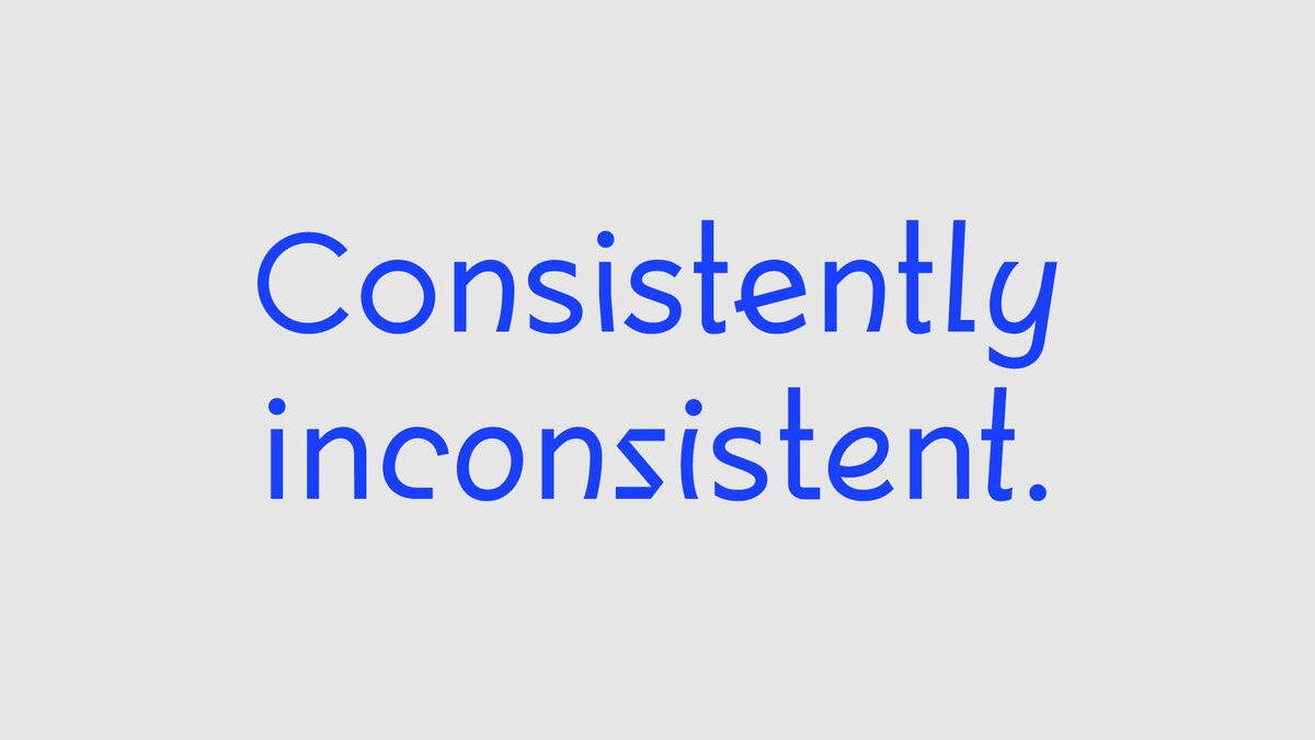
Consistently-inconsistent-not-so-regular Sans Serif
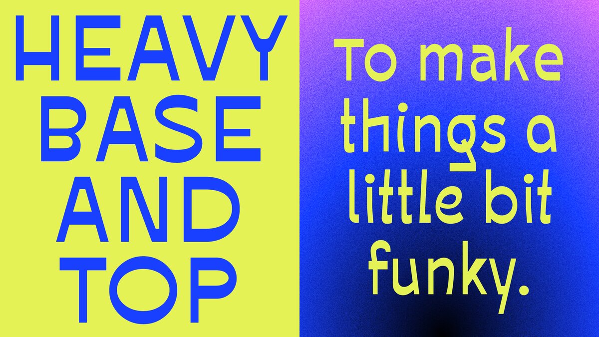
There are the 3 stylistic sets that can be used by themselves or cycled as contextual alternates. It’s also possible to play around with it by adjusting six variable accessibility features.
“You can adjust the ascender & descender heights, top and base thickness, x-height, and dot weights. This flexibility was also created so we didn’t sacrifice too much of the design aesthetic or legibility for people who don’t want these design additions implemented.”
The starting point of inspiration was to co-exist with the campaign “There’s Nothing Comic About Dyslexia”, which aimed to talk about how many people with dyslexia find it easier to read fonts like Comic Sans in comparison to other more structured and modular fonts.
“The irregularity of the glyphs helps the letters stand out from one another”, comments Daniel. “So the question was, how would this translate into a Sans Serif? How could we make more designers use a dyslexia-friendly font? Through some exploration and research, we landed on the concept of “consistently inconsistent”. We decided to add 3 stylistic sets as contextual alternatives that could cycle for additional irregularity, or simply be used by themselves for whichever set has the best legibility for them.”
The consistency part is how each of the sets has its own rules, the Regular set being the standard base with upright characters, Stylistic Set 1 being more geometric and having exaggerated stem overlaps, and Stylistic Set 2 being more curved and with slanted stems.
With the newly released Inconstant Regular out there to be downloaded for free, Daniel hopes to see other designers putting it to good use. “Would love to see what people will come up with. I also hope this project can inspire others to design fonts with dyslexia in mind. There are different ways to tackle the same issue – regardless if the entire font is built around it, or simply accessibility features that are created to accommodate dyslexia. Both are helpful.”
You can keep up with Daniel’s work on his website, and download Inconstante Regular for free as well. Read more about the project There’s Nothing Comic About Dyslexia on their page.
Credits:
Type Design & Creative Direction: Daniel Brokstad
Junior Design: János Hunor Vári & Nika Belskaia
Technical Specification
Family name: Inconstant
Sub families: Regular, Ascender 25, Ascender 50, Ascender 75, Ascender 100, Base 25, Base 50, Base 75, Base 100, Descender 25, Descender 50, Descender 75, Descender 100, Dot 25, Dot 50, Dot 75, Dot 100, Top 25, Top 50, Top 75, Top 100.
Format: OpenType OTF
Widths: 1
Font Styles: 5
Version: Version 1.001
Glyph count: 888OT Features: aalt calt ccmp locl subs sinf sups frac ordn case liga ss01 ss02
Supported Languages: Western Europe, Vietnamese, Central/Eastern Europe, Baltic, Turkish, Romanian
The license of all Font Software sold directly through this website is a Commercial Desktop License for installation on up to five (5) units. Not to be resold.


