
As an Italian design boutique operating for twenty-five years in the field of graphic design, branding, and visual communication – we’re delighted to introduce the typographic project Hypetype by Kidstudio.
Through their process, they began to discover how much they loved to create a balance between design and the written word to communicate their ideas. Eventually, they caught themselves adding typography so much on a daily basis, they realized they had a strong urge to create their own version of sophisticated typefaces with a very strong identity.
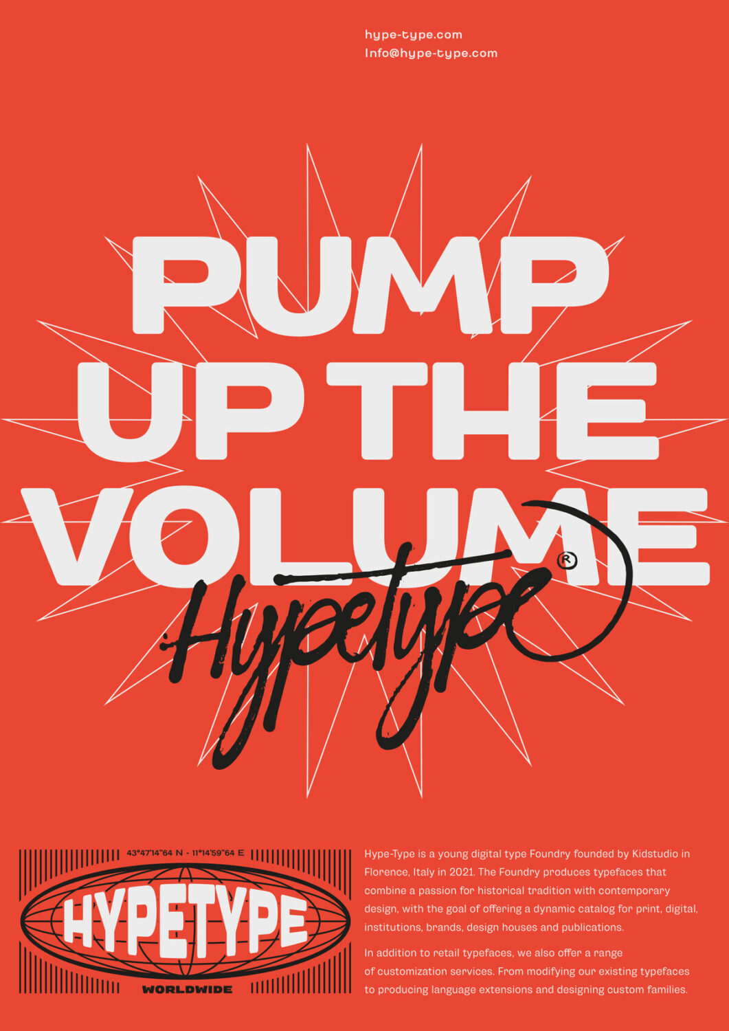
With that urge, the Studio came up with the project Hypetype – your local typefaces dealer. The project portrays typeface design as a foundational building block for what you would design. So far, with three typefaces available, – Arcadia Grotesk, Pavla Prospekt, and Fera Text – it is easy to understand how that name would come to mind.
“Given that [type and] typography is the basis of our work, one can’t not love it or be passionate about it” says Marco Innocenti, from Kidstudio, when asked about the name idea. “In short, one cannot avoid going into the hype. So, we decided to start producing it; hence also the name Hype-Type – A typography that makes Hype.”
“The team is made up of various professional figures, from the type designers who take care of the production of the fonts to the creatives who take care of testing and presentations, up to the art directors who manage the image, the research, and verification part”, tells us Hypetype.
The Typefaces: Arcadia, Pavla, and Fera Text
Each of the three available typefaces, Arcadia Grotesk, Pavla Prospekt, and Fera Text, were inspired by different places in the world in different eras – all in a meaningful mix of knowledge of each typical language root while bringing up the commonly known leadership of it in a very hype-way.
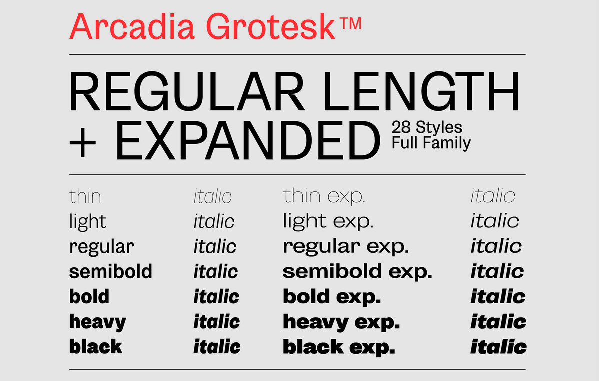
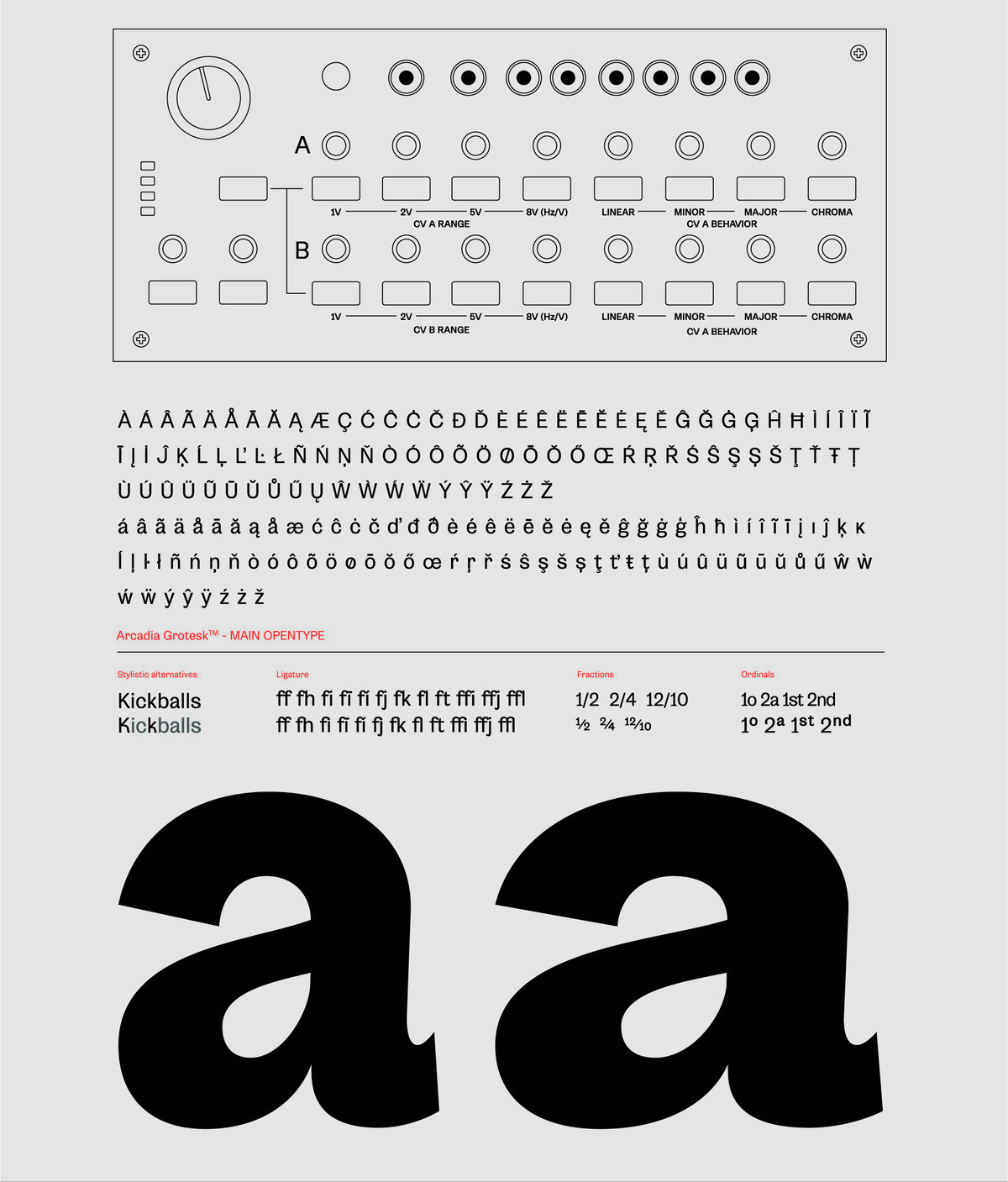
Arcadia Grotesk is inspired by the classic forms of grotesque letters, both of the European (in particular the Swiss school) and American tradition, modernizing itself with its shorter ascenders and descendants to obtain more compact blocks of text and with its most contemporary forms, which are dynamic and more flexible than classic grotesques fonts.
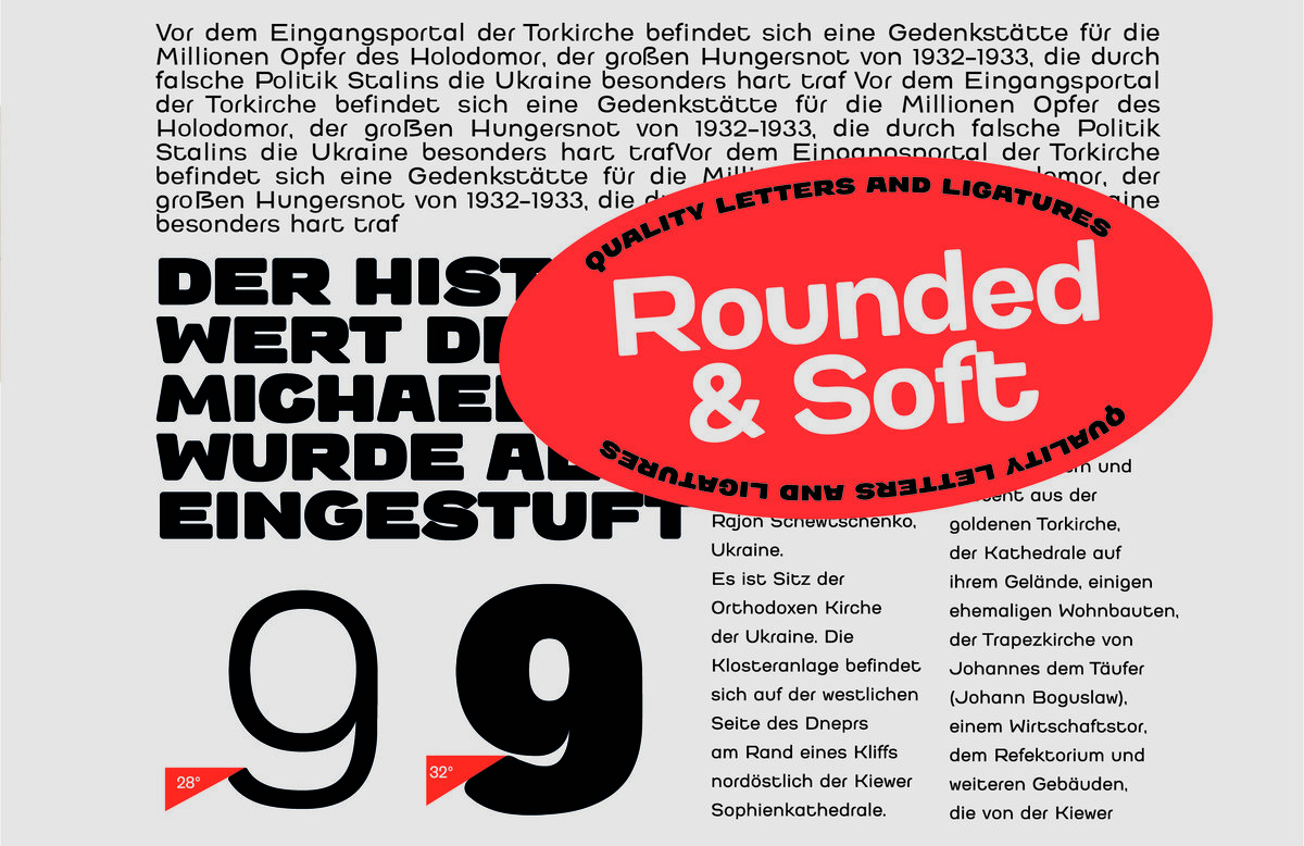
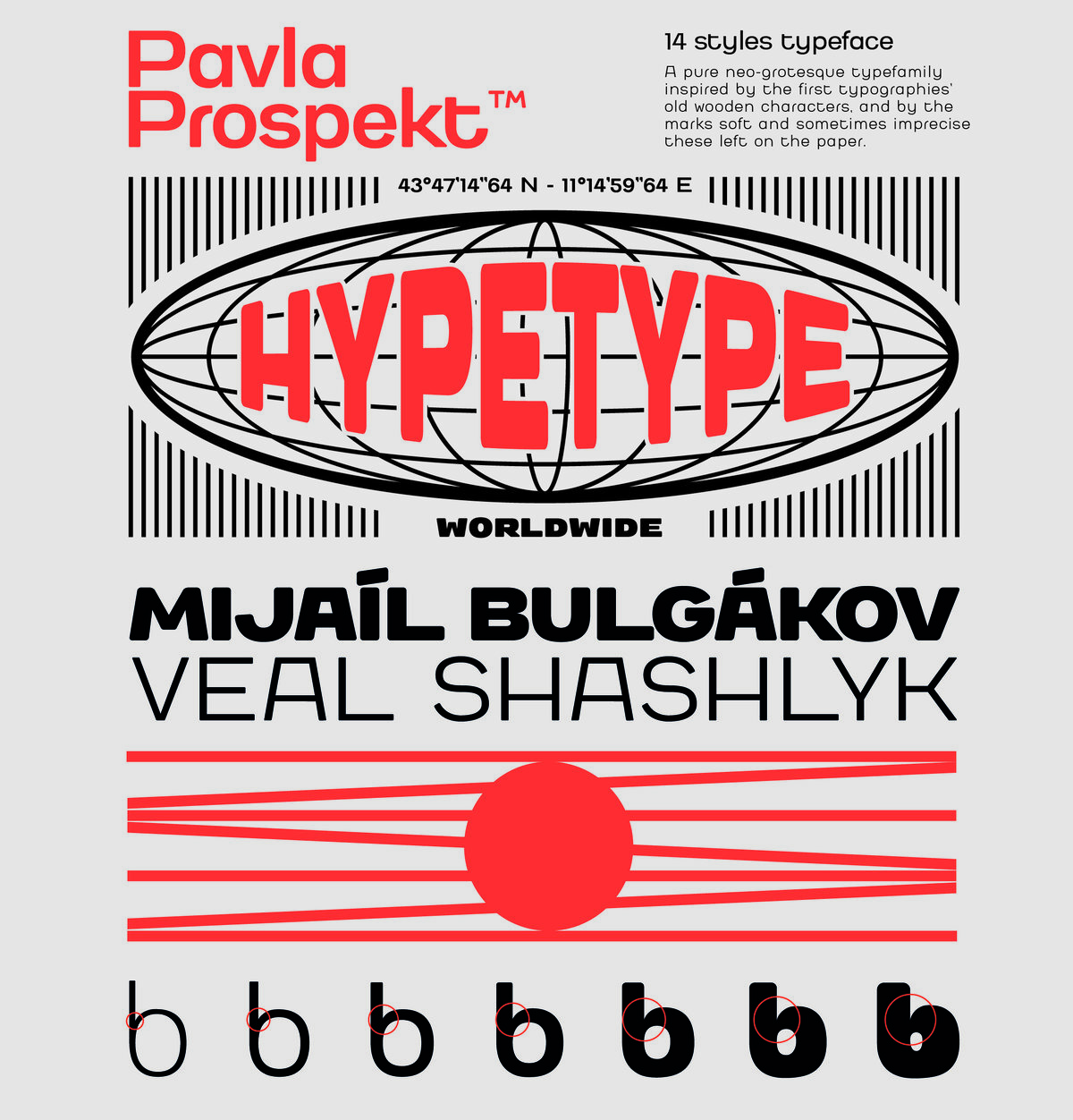
Pavla Prospekt is a pure neo-Grotesque typeface family, inspired by ancient wooden typefaces and the soft and sometimes imprecise marks they left on the paper. All typographic elements are influenced by the shape of the letters of the Cyrillic alphabet. This reference gives the letters unusual but characteristic proportions. What was also very influential is the visual effect of the diffusion of the ink imprinted on the paper, which gives softness to the shapes whilst the proportions of bold and thin fonts are visually balanced to ensure a more modern feel.
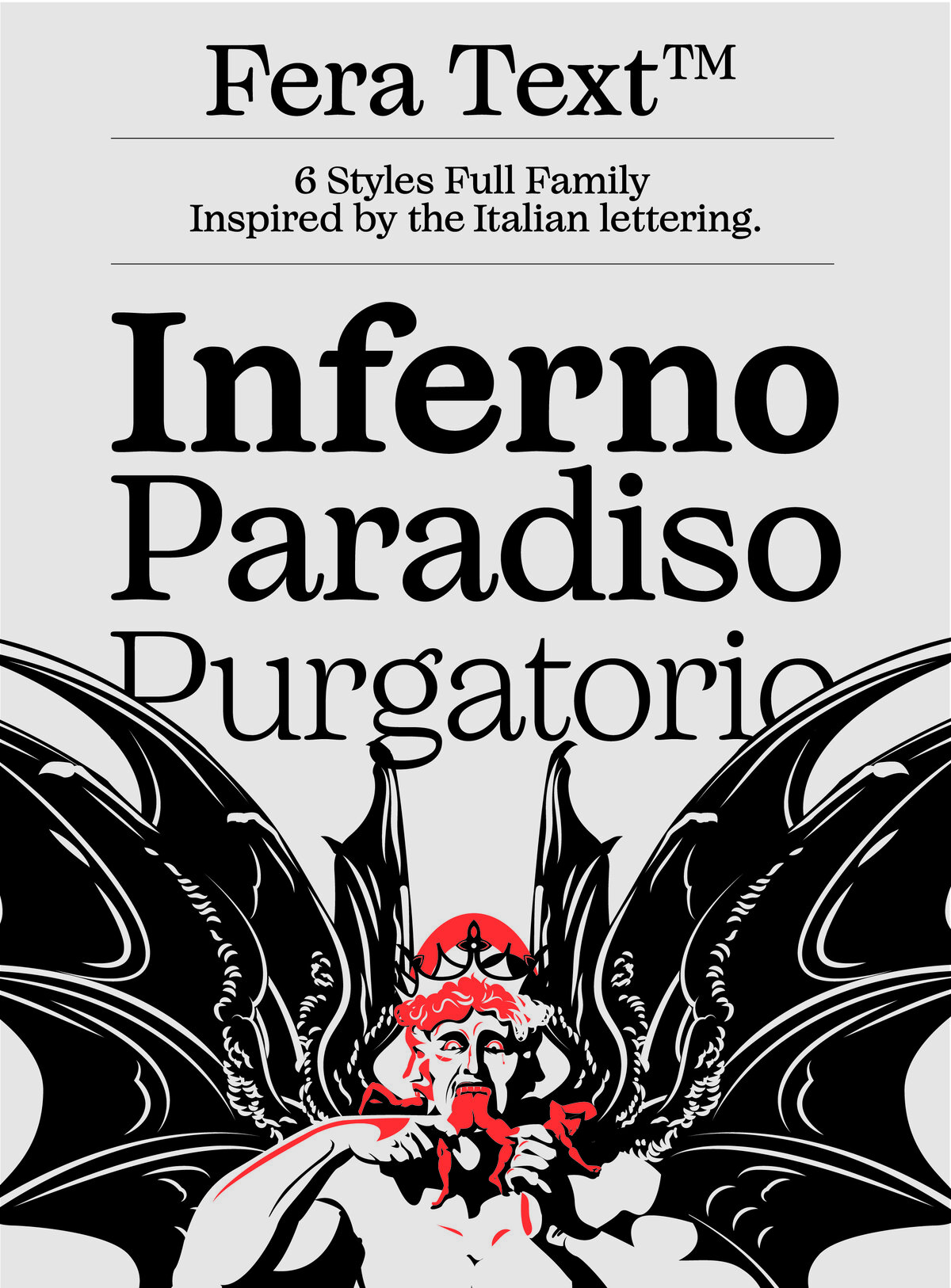
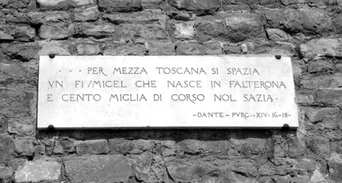
Fera Text is a transitional graceful font inspired by the tradition of Italian lettering, in particular the typographic tradition of the municipality of Florence and its streets. The shape of the letters, contrasts, crossings, stems, and droplets are the result of careful research conducted on Dante’s roads, redesigned in a contemporary key. All elements are designed to be elegant and easy to read, even in a long block of text.
As for what we can expect for the next Hypetype releases, they guarantee they’re already working on the next font family to be released in the coming months. “We’re looking forward to expanding our catalog with new collaborations and initiatives”, affirms Marco.
Follow up with the next releases from Hypetype on their website. You can also keep up with other work from Kidstudio on their website page or Instagram.


