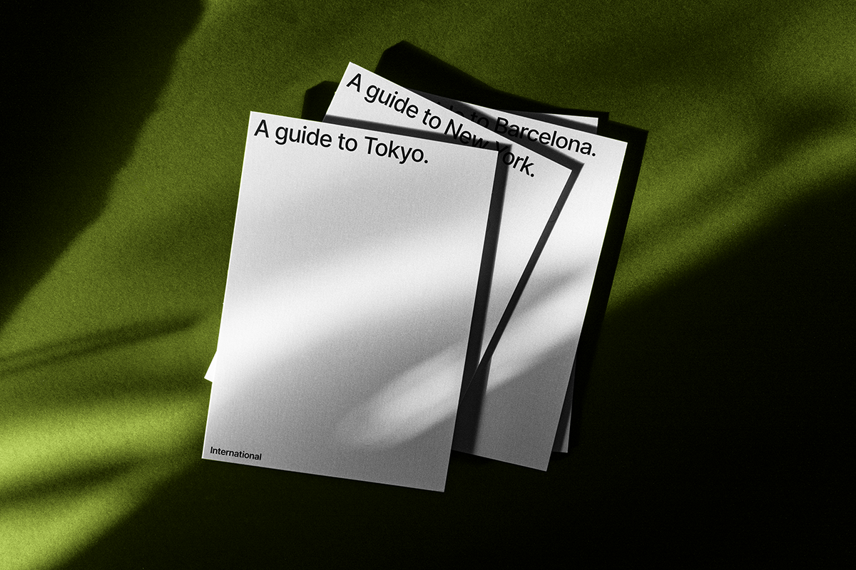
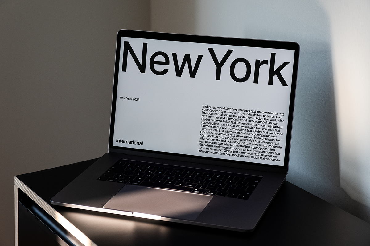
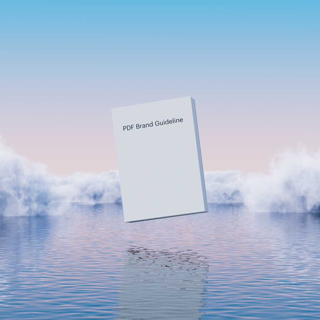
With ease in mind for both designer and client, Brandpad flexibly allows for brand identities to evolve and grow with all its parties shifting needs. Valuing function and simplicity, yet adaptable and variable – Brandpad offers designers an opportunity to embrace an entirely digital cloud-based guideline – innovating as they do. There’s a light at the end of the tunnel that allows us to move swiftly away from the static, formulaic, and often stagnant PDF’s that haunt our filing systems. Brandpad offers a new solution that creates a reliable backbone for brand identities – ultimately freeing time for better design.
Offering elegance and a respectful simplicity across Brandpad’s new campaign, the typeface Graphik also lends itself to the overarching concept and encompassing ideas of the brand itself. Communicating with regards to its predecessor of brand guidelines – the PDF – Graphik’s modest yet curvaceous character plays its part beautifully, as it welcomes a new era. Paired with the ethereal visuals that nod to the heavens, Graphik grounds the campaign’s messaging and centres its thoughtful communication.
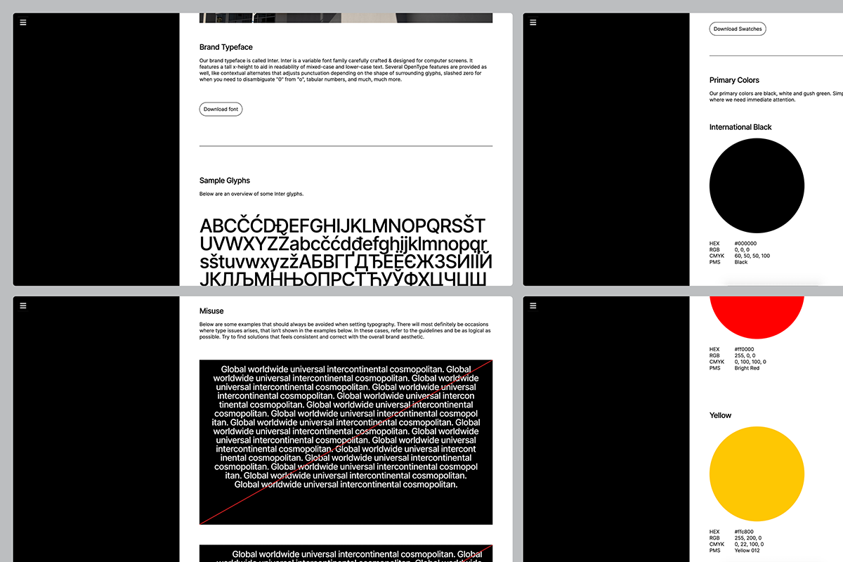
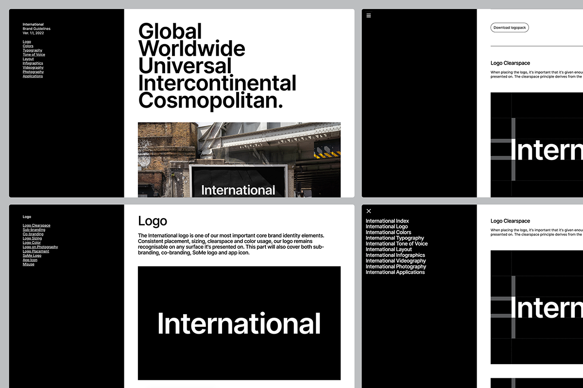
Graphik may appear as an unassuming sans serif, however, that’s far from the truth. Its influences stretch back across the 20th century and it is these varying contexts that Graphik owes it to. From the hand lettering on Swiss Modern posters to the lesser embraced simplicity of the European sans serif, and to the heavier weight of the family based on Paul Renner’s Plak – a large-sized woodtype; it is clear to see that variability is at the roots of Graphik’s origins. Utilised as the core brand typeface for Brandpad, it perfectly speaks to its rich history from where it came. It’s an implementation across the brand that makes room for flexibility; allowing for colour, shape, and anything in between to work alongside.
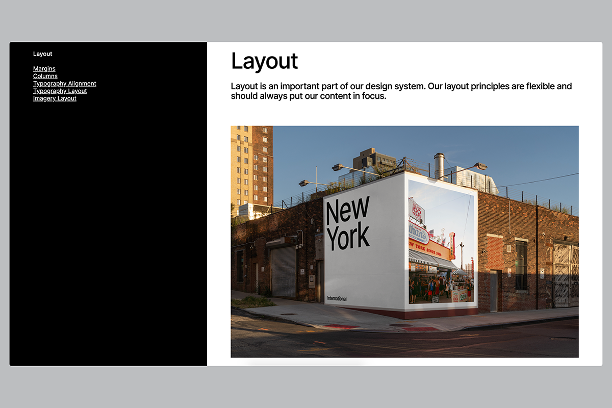
Brandpad – by design – grants a customisable approach to delivering guidelines for font and type use. With the ease of the user at the forefront of Brandpad, it’s a people-first approach that allows for custom fonts to be uploaded and take centre stage. Designed in consideration of how the guidelines are to be used in practice, Brandpad includes a downloadable font family feature for straightforward use. For further peace of mind, Brandpad runs on a continuous loop of updates, refreshments, and live synchronisation – yet another benefit to how a cloud-based guideline streamlines impact. Overall it is designed to make life easier for all involved, leading the way in alleviating the hindrances that no longer serve us with the current standard brand guidelines.
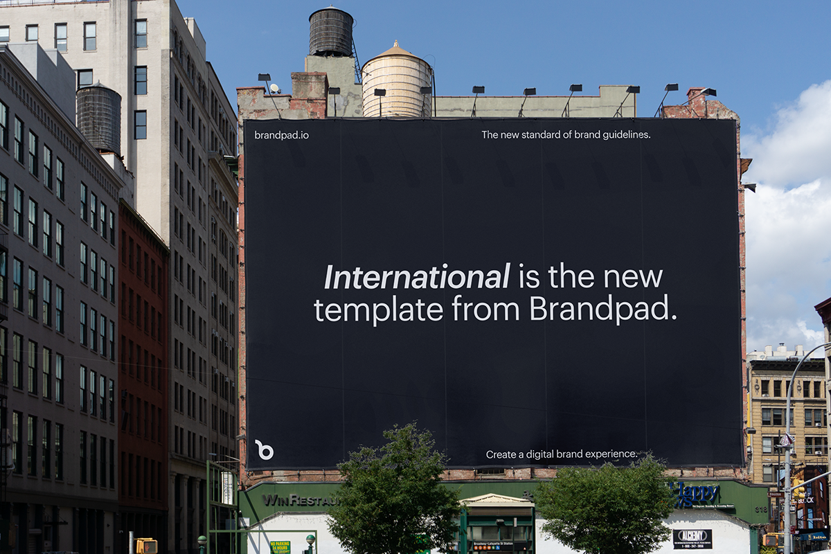
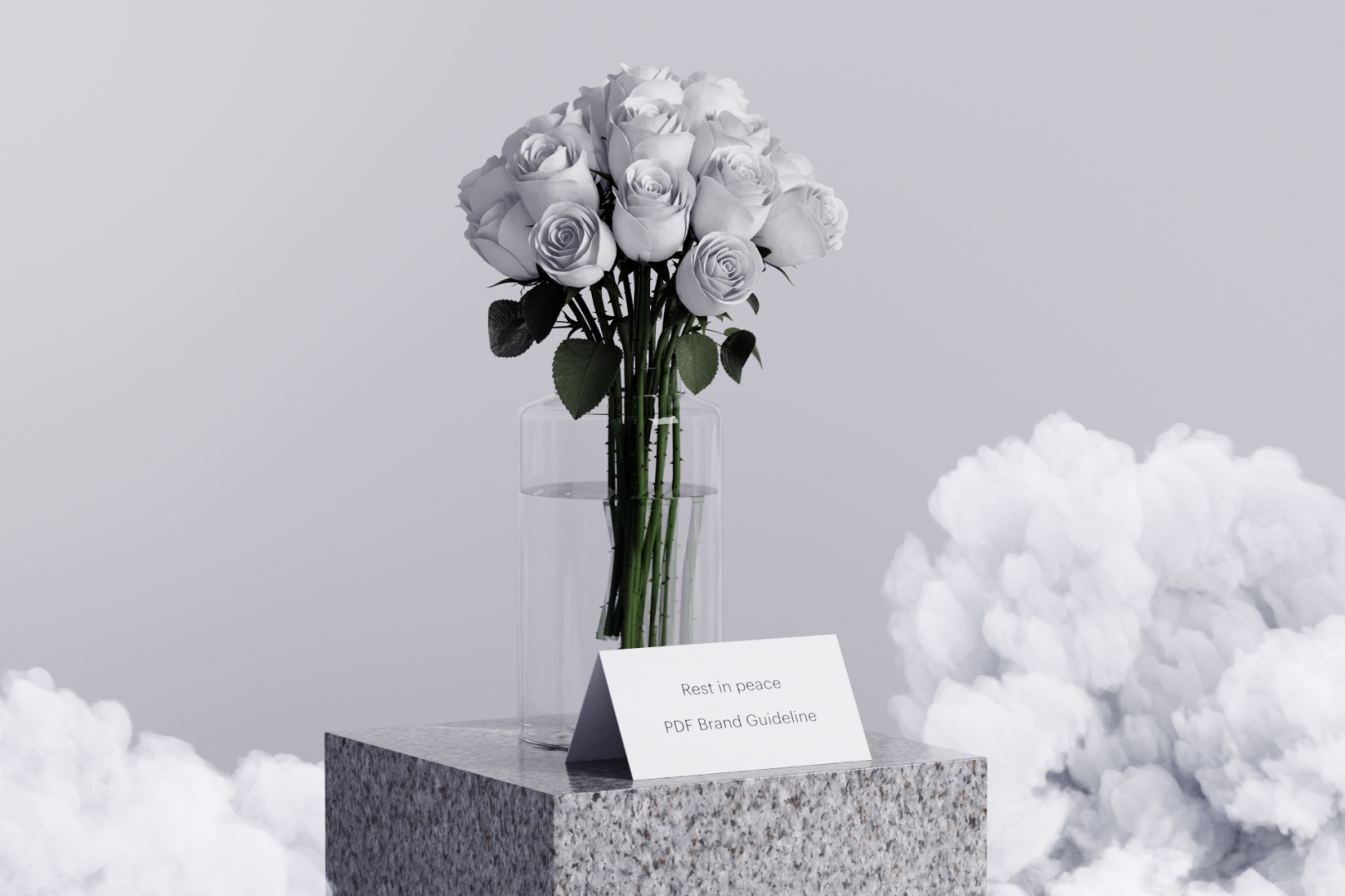
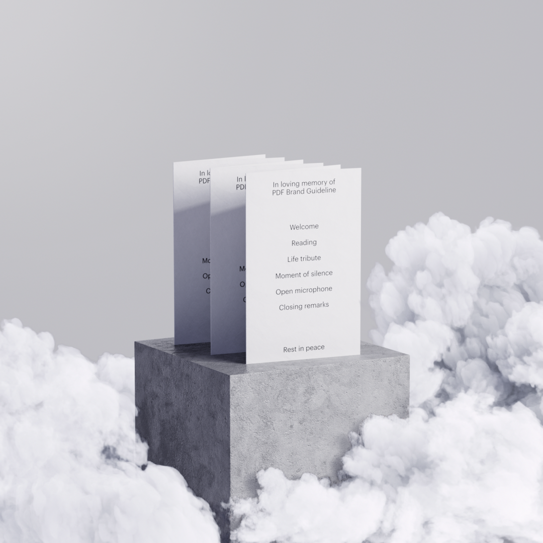
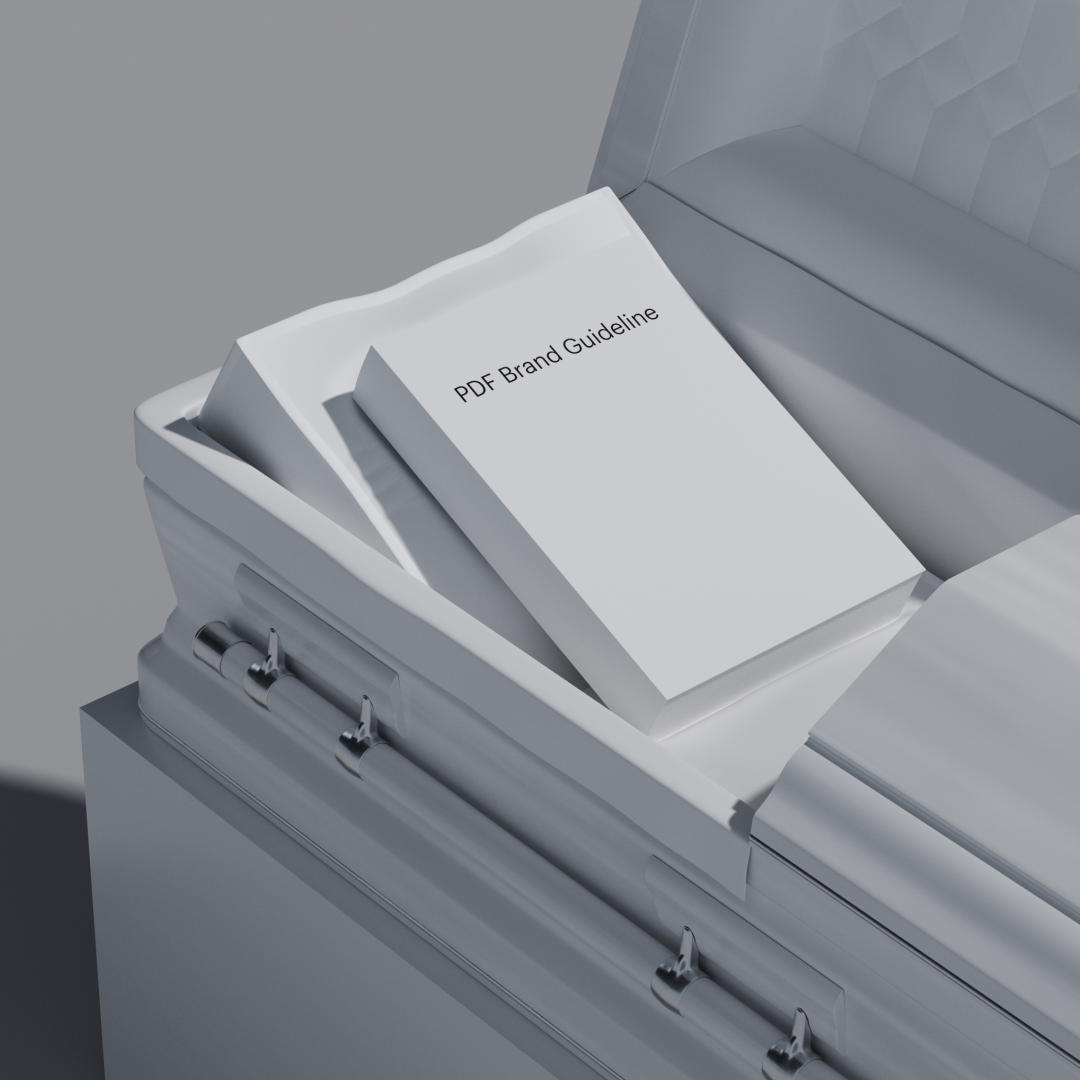
Laying the static brand guidelines to rest, means letting new systems flourish and allowing better working practices to be adopted. Brandpad rallies around the idea that brand guidelines’ need a digital home to thrive as the PDF is long behind us. That’s a fitting opinion, considering the transformative opportunities a cloud-based guideline can offer both designers and clients, for the growth and development of a visual identity. By recognising its home is a digital one, it has the potential to open up further creative possibilities and enrich collaborations across teams.
As we look to decentralising design systems, advancing typographic variability, and hyper-physical digital worlds — Brandpad could be the antidote to distilling the complex. With Brandpad at the helm, who knows what the future of brands might look like and the new world, they’ll shape?
Ready to innovate the way you construct your brand identities? Head over to Brandpad and sign up to their services for FREE!