
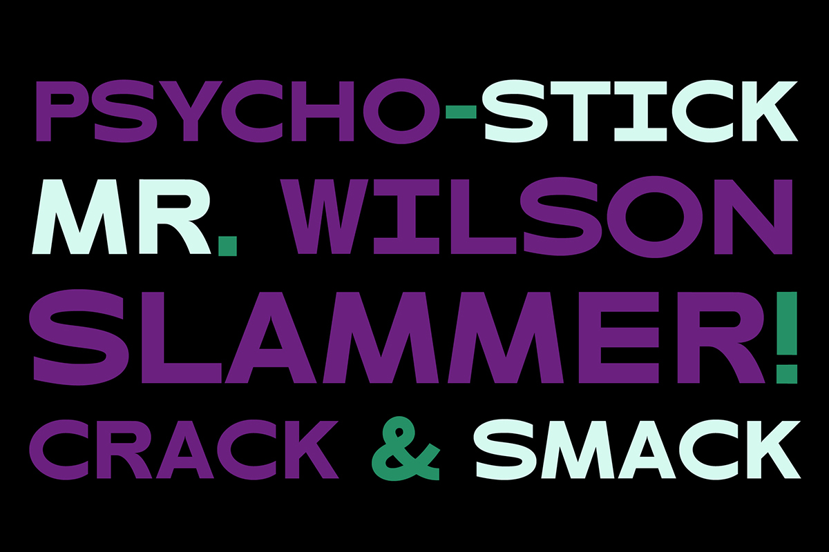
Created by Amsterdam-based multidisciplinary designer, Maarten van Maanen, LITIGE is a powerful, high impact sans serif typeface with unique, ecstatic energy and bag-fulls of character.
Developed from the initial sketches for a logo for Dutch band, Kraak & Smaak, LITIGE was born from a resonance with their ‘solid and funky‘ sound, integrating humanist qualities into elastic, movement filled letterforms and taking on a life of its own.
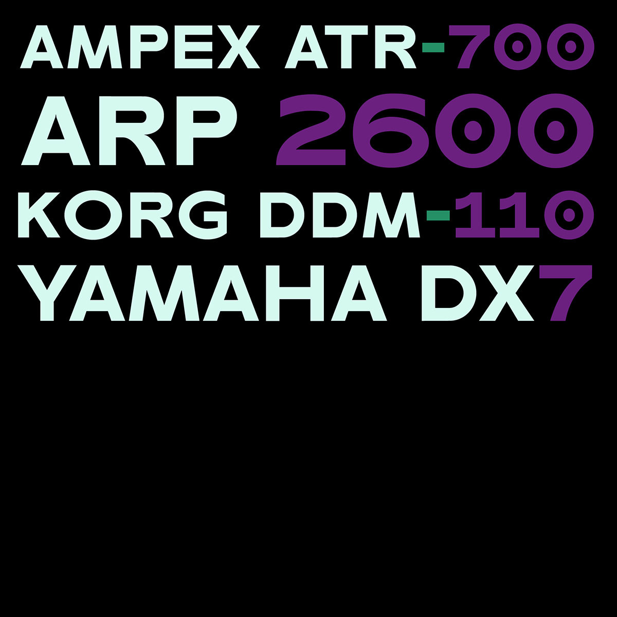
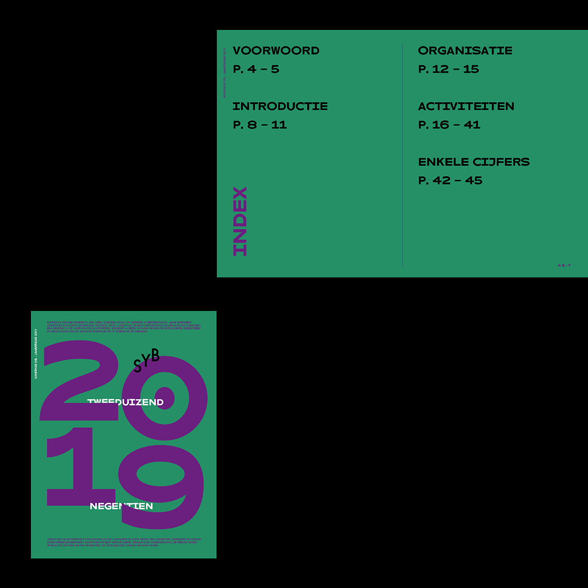
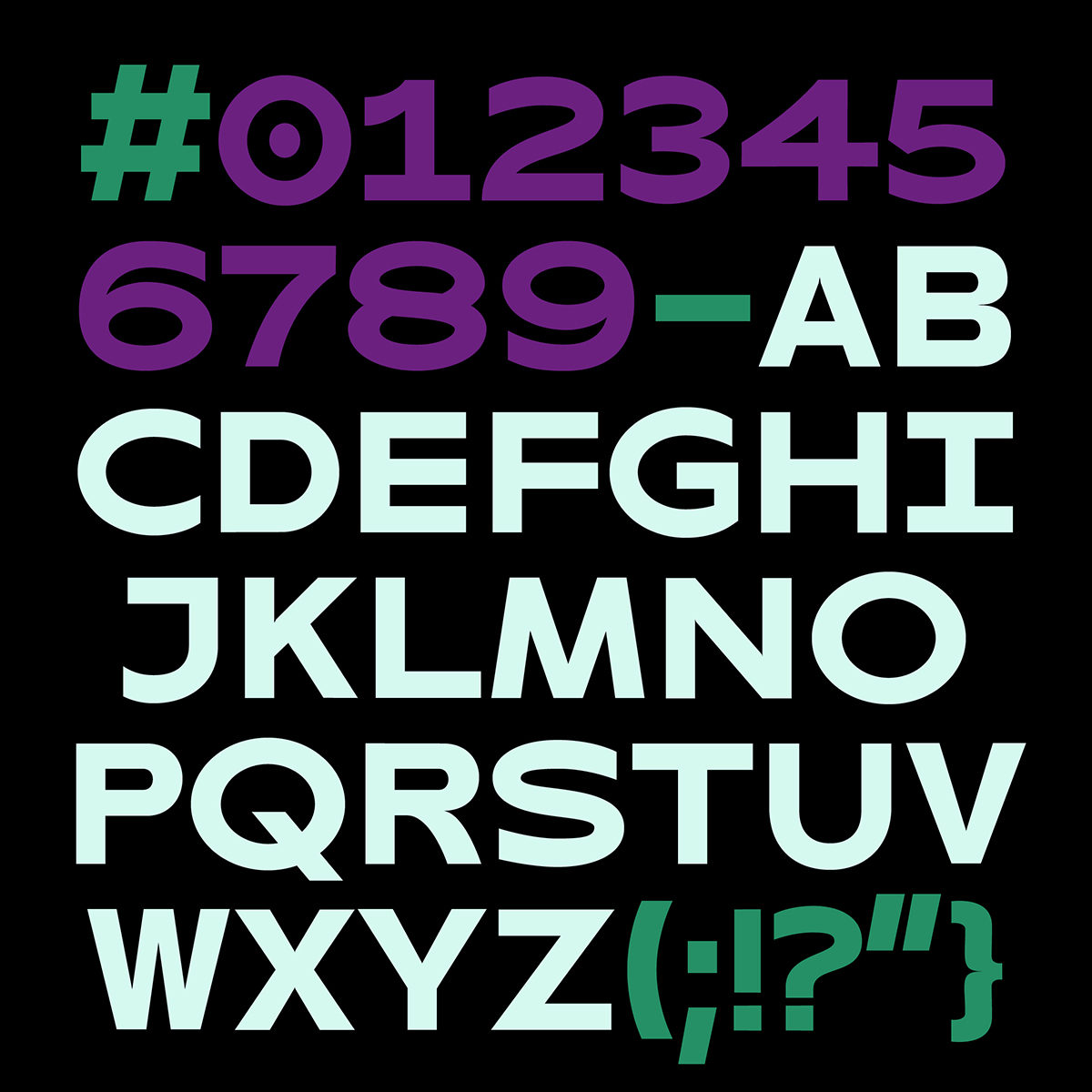
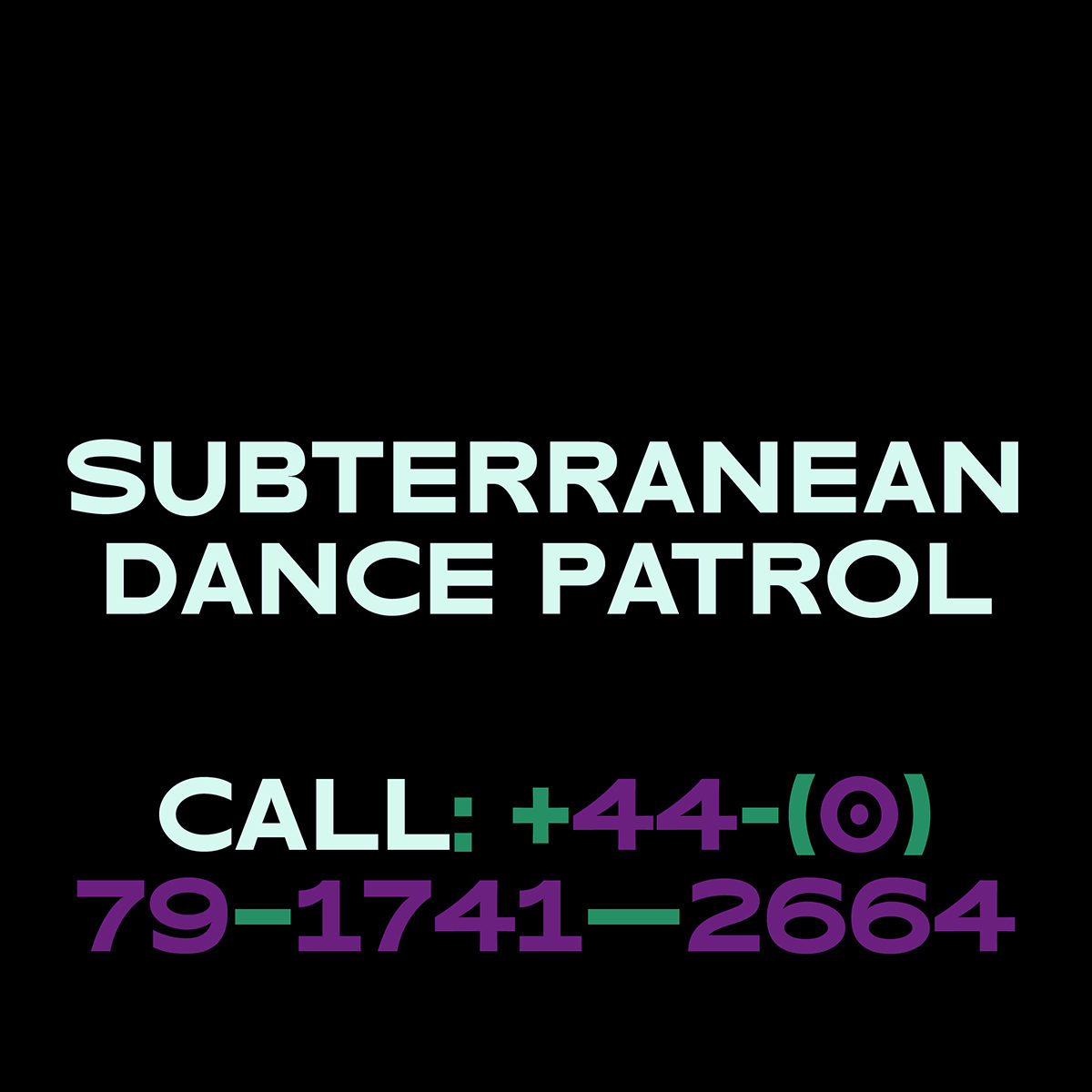
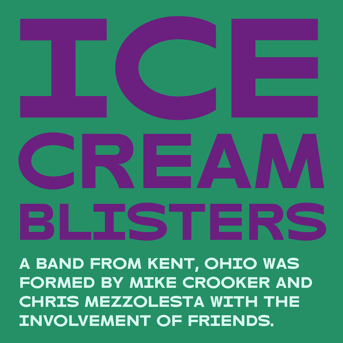
With its contemporary feel and no-nonsense attitude, the curved shapes lend a moderate amount of contrast, whilst the grounded roots create a familiar-yet-unique atmosphere. With its stand-out appearance, LITIGE would work well for strong, attention-grabbing headlines; but is equally as suited to be used for some finer details in the smaller weights.
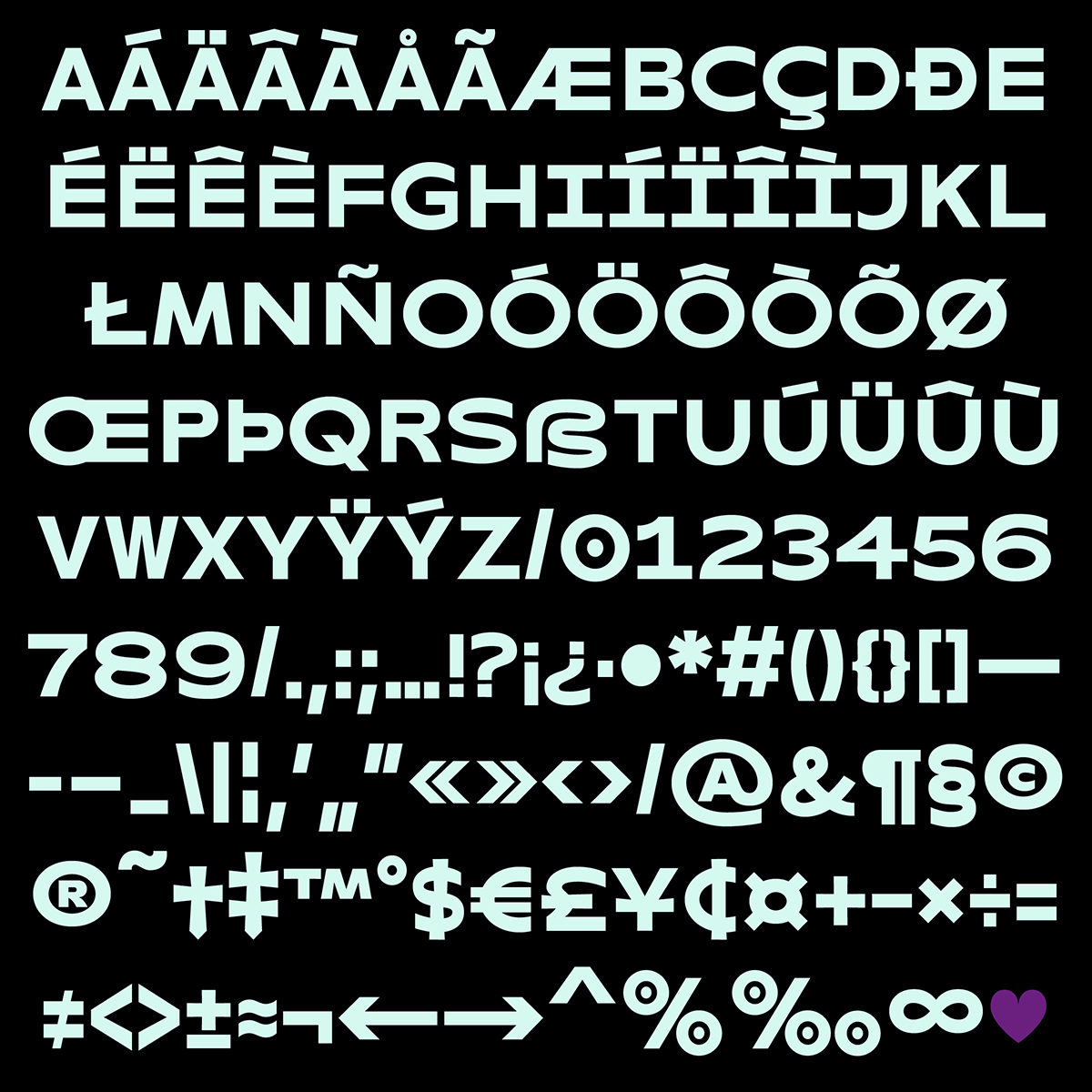
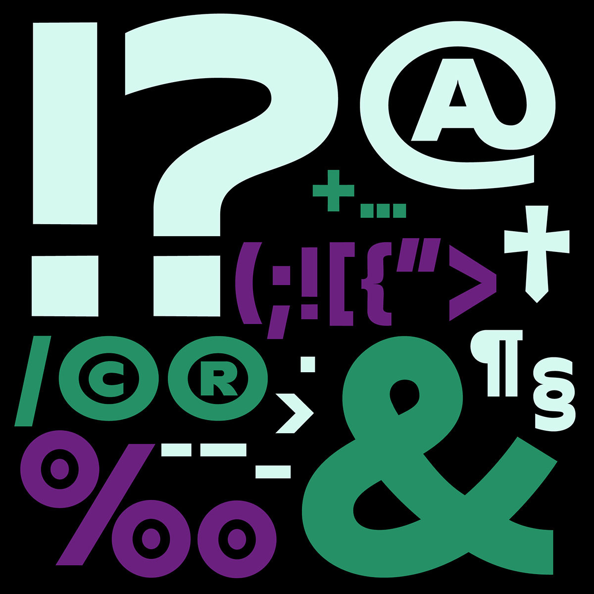
With 199 glyphs and Open Type features including upper case, lower case, punctuation marks and symbols, this versatile typeface is one exciting new addition! Head over to Type Department to find out more.


