
After studying Design at Berghs School of Communication in Stockholm, Graphic Designer, Combrisi tells us he felt doors opening everywhere… So it seemed, the ability to access the kind of work he’d been dreaming of felt possible. However, soon craving the space to create more freely, the designer decided to start an Instagram account to make space for artistic exploration, alongside his work as a graphic designer. Drawn in by his exploration of chrome textures and 3D type, we spoke with Combrisi to find out more.
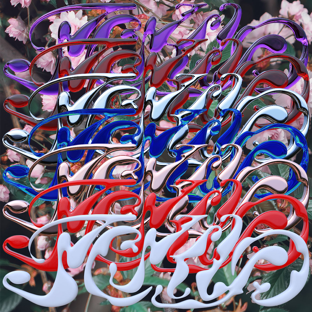
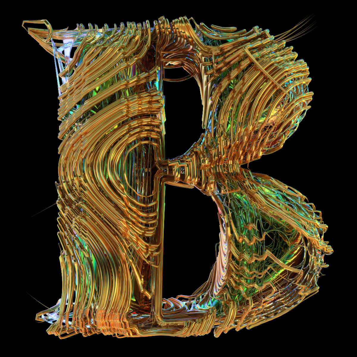
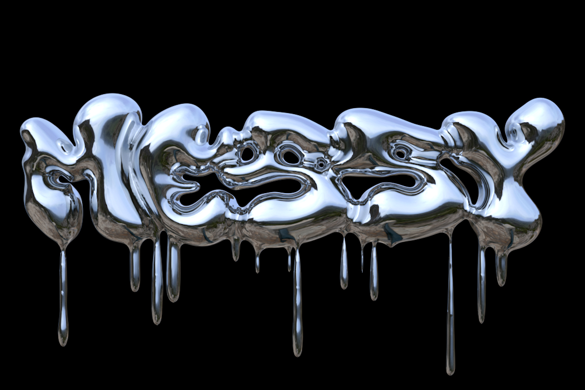
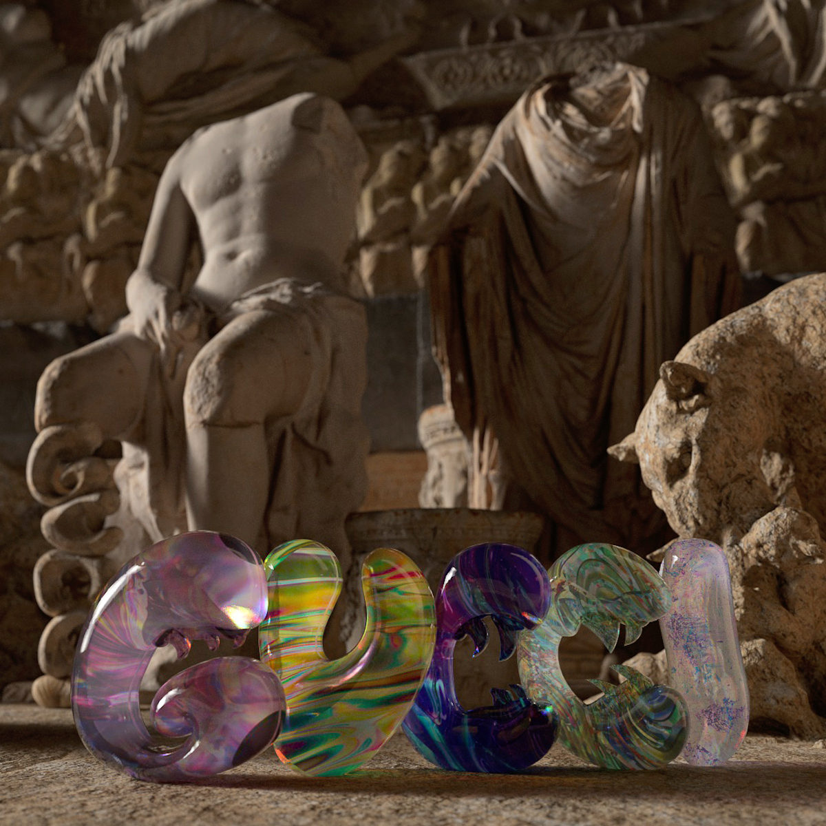
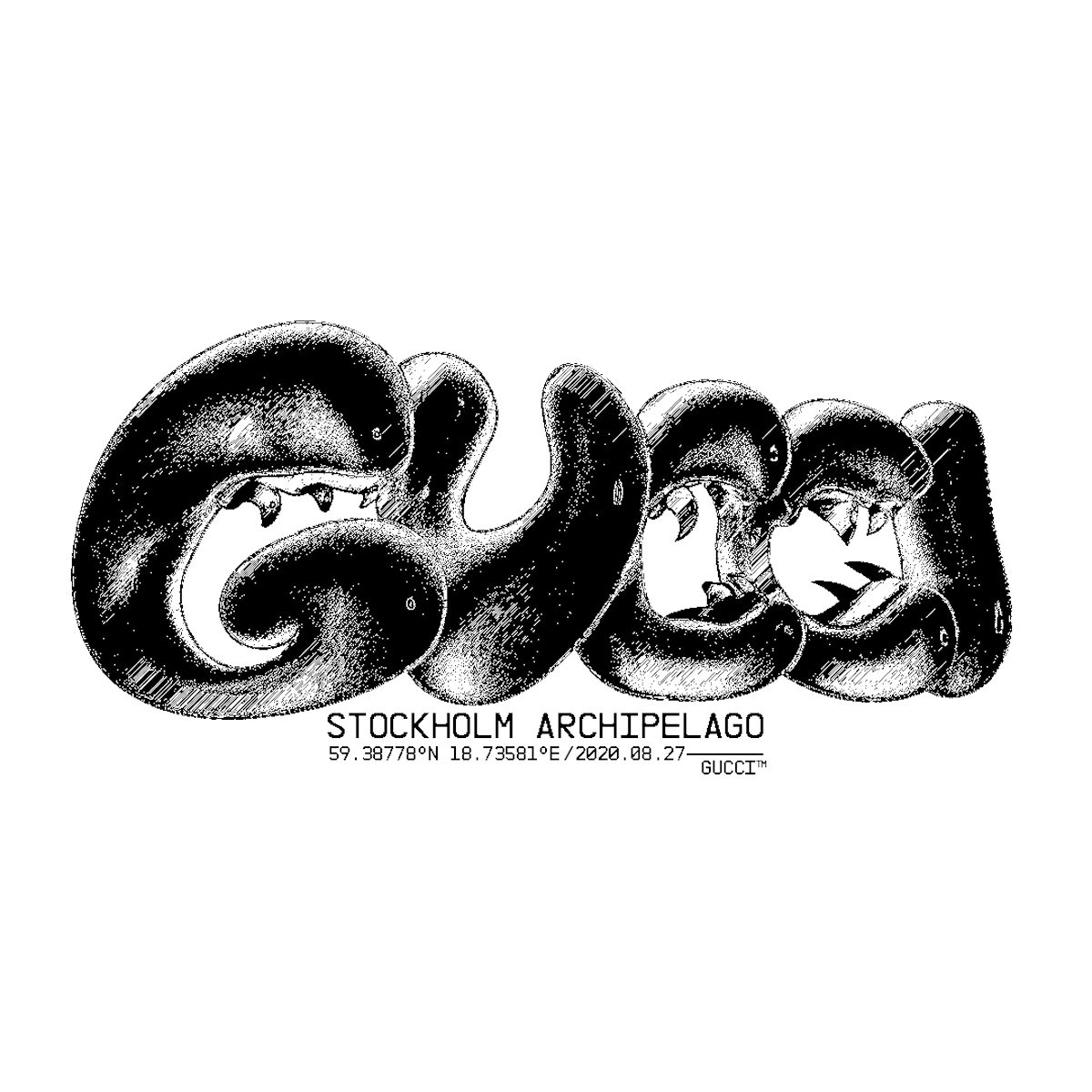
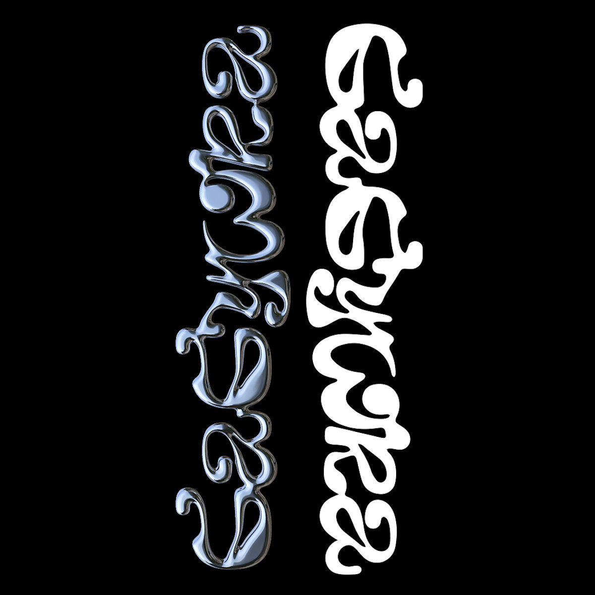
Combrisi’s multidisciplinary practice explores crossovers of visual effects, type, motion type and graphic design, with a recognisable graffiti and Hiphop inspired visual language. We felt compelled by the designer’s unique rendering of aqueous, viscous textures and organically entwining shapes… ‘Usually when I worked with big clients, I’d see a pattern where they said they want to be challenged, but a lot of the time they really just want the same thing as everyone else, and the designs tend to start looking alike’, the designer explains. ‘That’s why I started feeling the urge to express my creativity and why I eventually started my Instagram account… And also not forgetting my passion for Hip hop and graffiti is my profound love – that is always with me’.
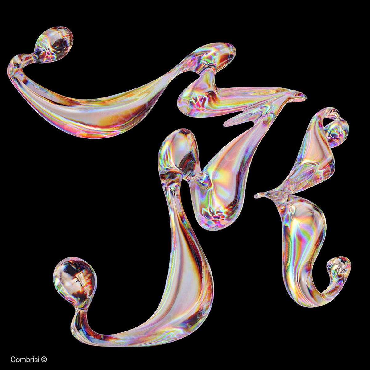
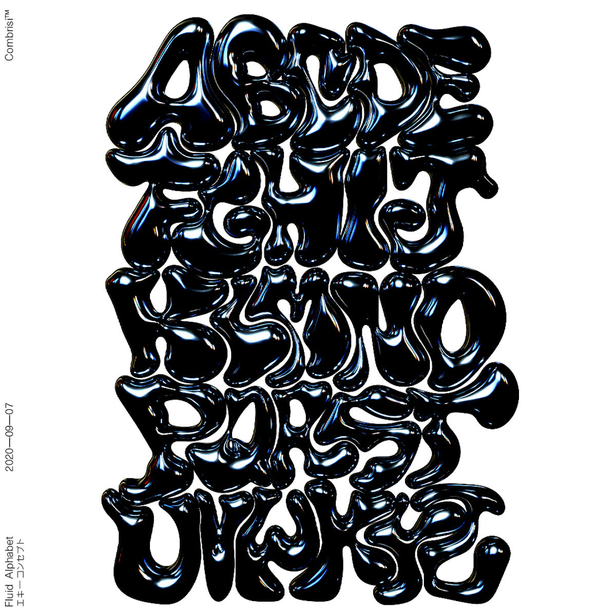
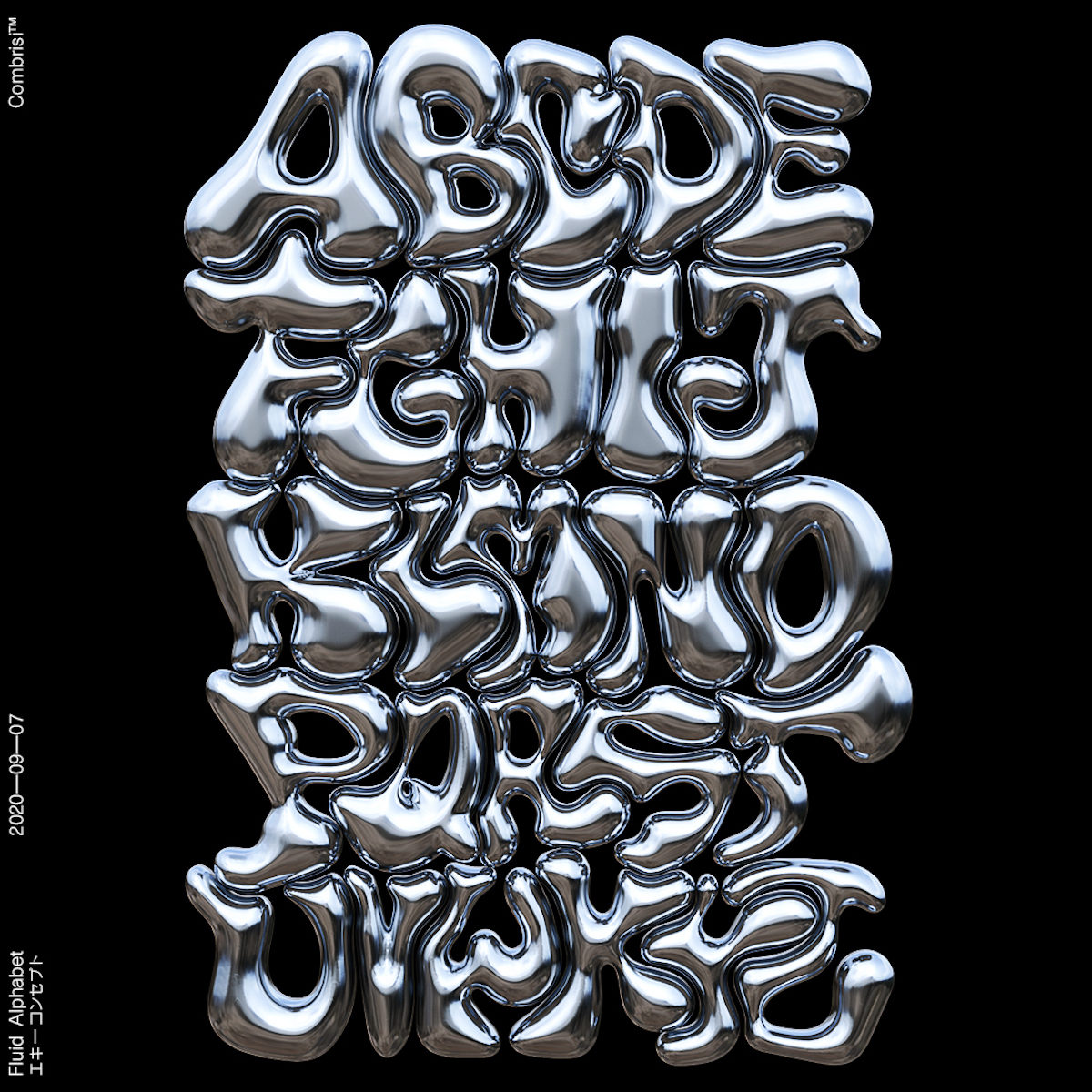
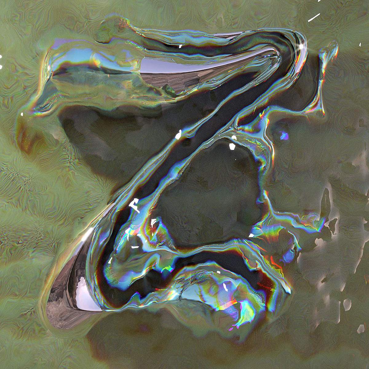
Looking over Combrisi’s work, influences from Hiphop and graffiti stand out for sure; especially in the style and shapes of the type. However, another standout element is the creative’s impeccable ability to integrate the shapes and textures of nature into an established visual language. And a lot of the time, especially in the designer’s motion pieces, it’s on a microscopic level. Nebulous textures and colours evoke the shapes of life — like microorganisms growing; duplicating and mutating.
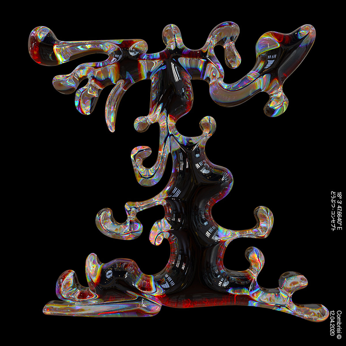
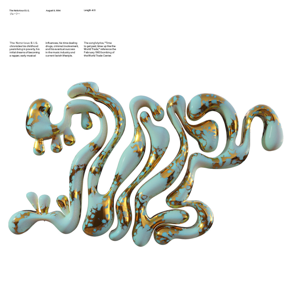
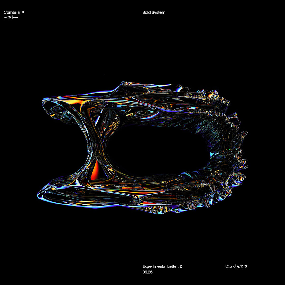
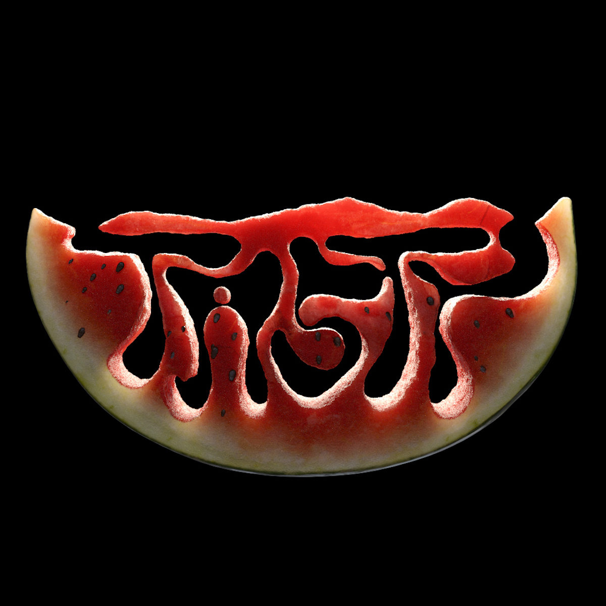
‘I’m interested in creating organic designs and I get inspired by nature’, Combrisi expands. ‘My typography is not about looking perfect with straight angles, it’s more about how to do something new and unique, or something that has never been done before. With that said, there’s always a lot of thought and many hours spent behind each project I post on Instagram… The fruit series with lemon and the watermelon was a big challenge. I did that project with my brother and it was a long process working out how to combine the typography with the fruits’.
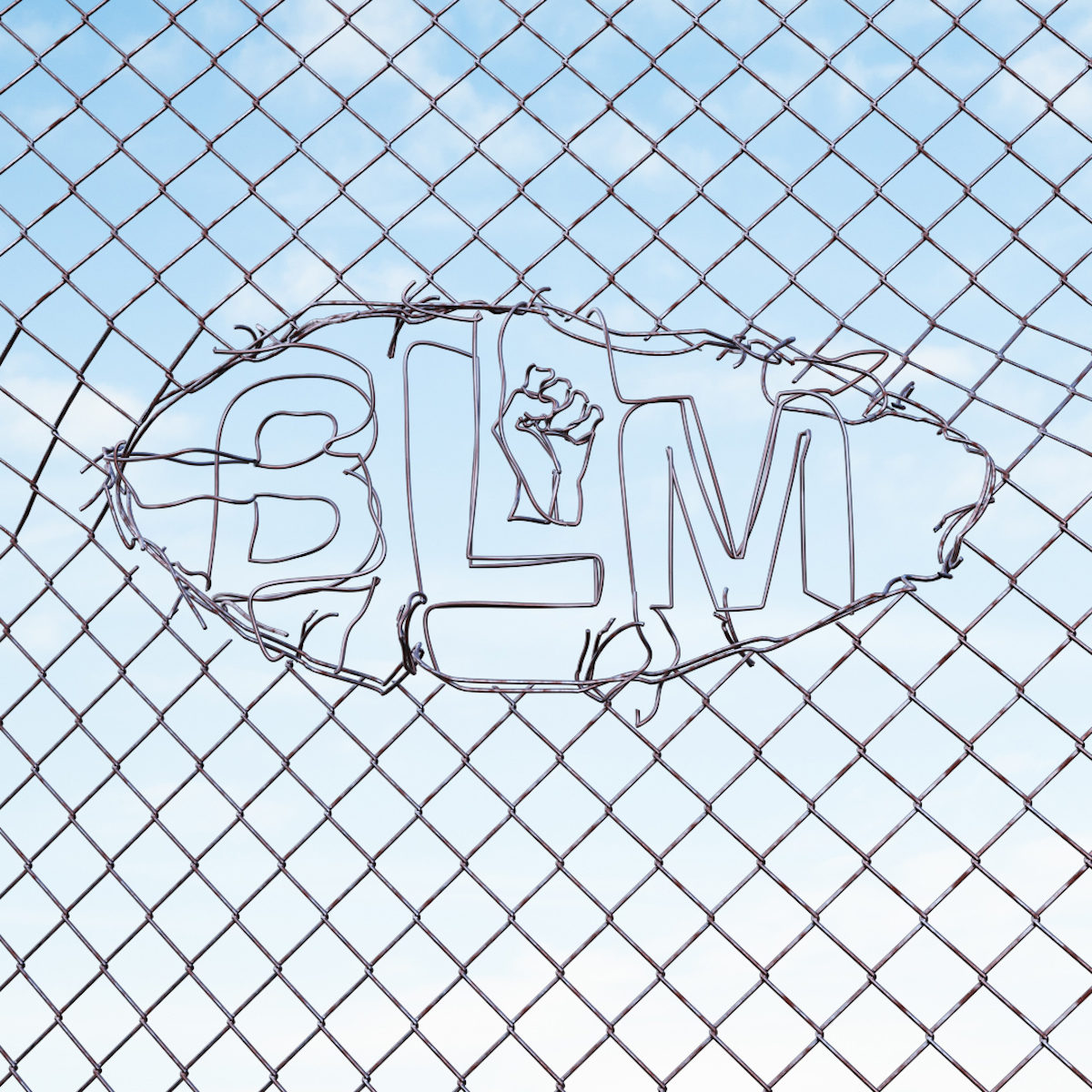
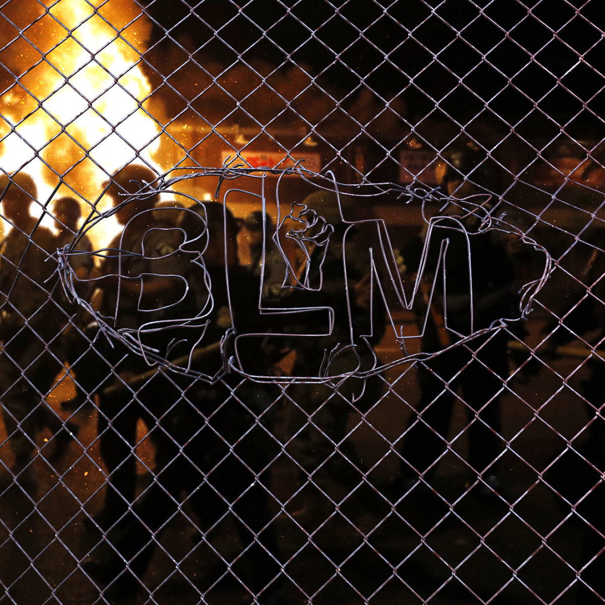
The artist also wanted to draw attention to a piece he created with the intention of honouring lives lost to police brutality and in solidarity with Black Lives Matter. ‘The Black Lives Matter image is one of those images that I’m proud to have created… I made it out of solidarity and frustration. Many people started to decentralise the actual issue of Black people being hurt and oppressed by speaking about looting and fires instead… It made me happy that a lot of people reused and shared this image’.
Discussing life in the design industry, the designer tells us, ‘It’s definitely a dream to be able to work as a graphic designer. The only truly negative aspect is the elitism which constantly finds something to look down on… A tip I have for all designers is to have courage to experiment and to try not to care about which box you might be put in… I hope to inspire others to share their work even if there’s no real purpose behind it. Break the rules and do things differently than you’re used to. You’ll learn a lot along the way’.

Thank you so much to Combrisi for chatting with us today! To see more from the artist, check out his Instagram.


