
The Berlin-based multidisciplinary creative studio works on the European Month of Photography and creates a timeless design language.
Graphic design trends, like any other, can be fleeting. But Studio Last isn’t trying to cater to any type of hype. The Berlin-based multidisciplinary creative studio, founded by Matthias Last, embodies a sophisticated and daring spirit. Their design language is minimal, modern, and playful, and despite using traditional design methods, experimentation remains their forte. Federica Habara, Studio Last’s graphic designer, describes their approach as “elegant and edgy.”
“We play with design, but it’s more important to surprise than go crazy from the beginning. It’s also for functionality. Even if it’s a magazine, you want to develop things and have something strange or beautiful develop on the way,” explains Matthias Last. “We want to take you in and have that door open. If we go too crazy, the doors can close for many other people. We want to show something new, but people need to go through the door first.”
To reach a wider audience, diversifying imagery choices through design is also essential. Despite the ease of developing a design language around specific types of photography, aesthetics, or styles, effective design is inclusive and can accommodate imagery from all cultures. The studio’s vision stretches beyond the age-old debate of old versus young; instead, they focus on creating designs that embrace and work seamlessly with diverse imagery, moving beyond euro-centric aesthetics. Many designs opt for a uniform aesthetic over inclusivity, however, Studio Last prioritises design that accommodates and complements differences.
Rather than merely being aesthetically pleasing, their work creates an experience that encourages audiences to stay on the websites, magazines, or any other media they create. Each design is considered an extension of the written word – the focal point is text, but images guide the way, working together as a symbiotic unit. In a word, Studio Last’s philosophy is storytelling. Rather than relying on shock value and hollow work, they prioritise creating a substantive design. This philosophy extends to all aspects of their design, whether for the web, print, album covers, 3D, or anything in between.
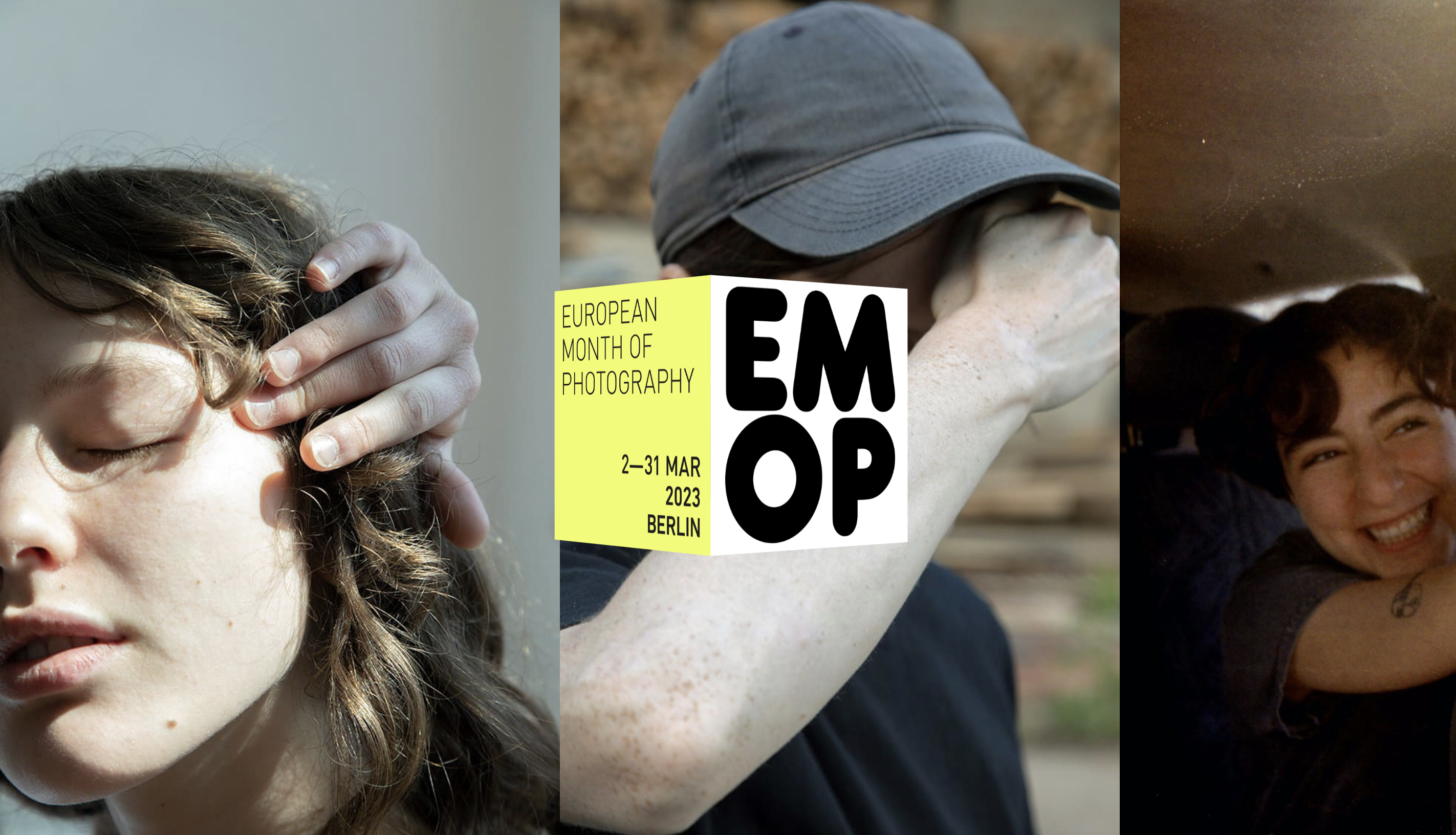
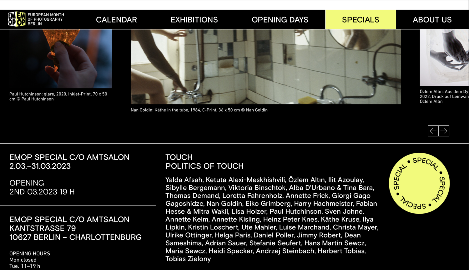
The trick is to play with subtlety and tease the audience into seeing the big picture. And that’s exactly how they played it out with their recent project, European Month of Photography – Germany’s largest photography festival. For the festival’s 10th edition, which occurred earlier this year in March, Studio Last designed a digital calendar that was functional and fun.
The challenge of creating a cohesive language between design and the multiplicity of photographs is almost certain with a festival as large as EMOP. But it’s all about working with the images in small adjustments, with both the colour palette and typography choices. In Matthias Last’s words, the goal was to achieve “an accessible, aesthetic, and readable website and calendar.”
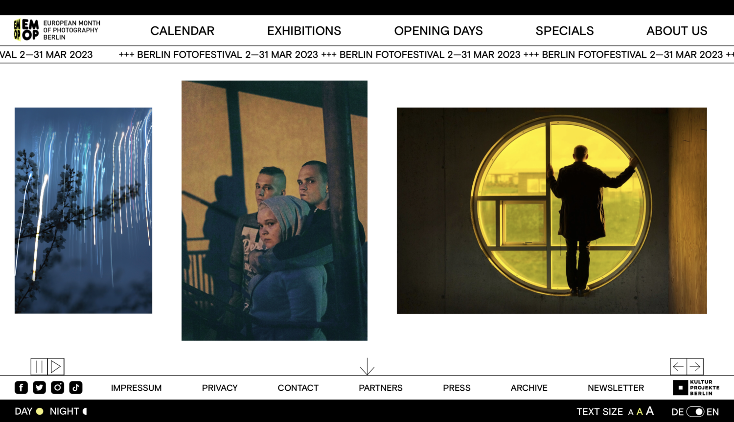
A dense exhibition schedule, such as EMOP’s, requires a clearly communicated calendar, which is why the studio selected a sans-serif typeface for a more “behaved” appearance. Although inherently simple, a sans-serif typeface “contributes to a more harmonious and effective distribution of weight between photographic content and textual elements,” Federica Habara mentions.
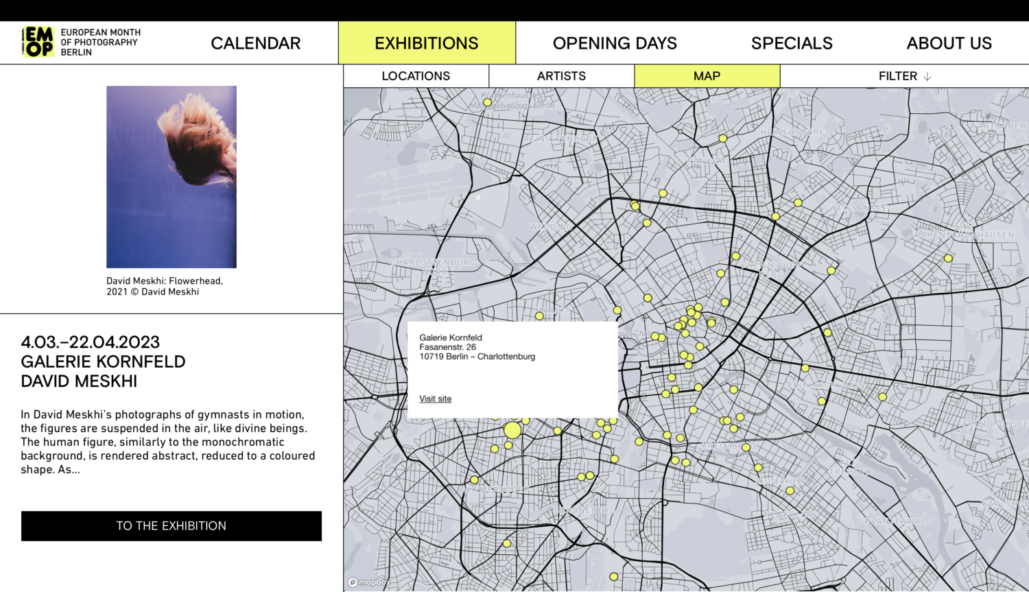
If you look at EMOP’s website, you’ll notice that it’s clean and has a rigid structure at its core. Yellow, however, appears all throughout the platform and evokes summer, while the rotating cube and the side swirling circles of information adds that playfulness the duo referred to. “We created this dynamic point of view where combined everything through a yellow cube,” shares Federica Habara. “When you go over a picture, there is a small emission with the yellow square that appears and showcases the text. So even if when the photos are different, they still cooperated with each other.”
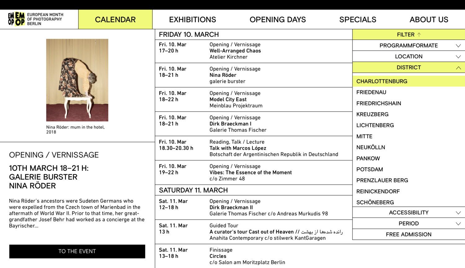
Not to mention, the packed calendar was the priority. The big question was, how can you bring a refreshing spin to a calendar?
“Normally, calendars are really ugly, and we wanted to have more modality and create something more playful where not everything is strict. Of course, you need strict rules with the layouts, but you also need to go out of it,” says Matthias Last. “We had a lot of texts and a lot of information, but our target was to share that information in a playful way that doesn’t need any effort to read, but you can be curious.”
EMOP’s typography choice, Basis Grotesque, illustrates that such strict rules can be dynamically applied. More often than not, they favour conservative fonts such as Favorit Extended, Helveesti Spikes by ABC Dinamo, or the Serif Babe by Charlotte Rohde. “We select a font based on our intended communication, brand identity, and overall the Studio purpose: The design harmonization between contemporary and classic styles,” adds Federica Habara.
Although Studio Last has worked for a variety of clients, their work still carries a distinct personality. Dimension manipulation plays a unique role in their work, whether it’s physical dimensions of designs or subconscious dimensions to how the eye wanders naturally. By finding modernity in the familiar, their designs connect with their audience on multiple levels. “Our aim is to bring a bit of contemporary edge without going too crazy,” shares Matthias Last. “Even big clients nowadays want something surprising, something new, and something edgy with the classics.”
Thank you Matthias for your insights into this project.
Follow Studio Last on Instagram, or check out their website.
Browse more graphic design and typography features here.


