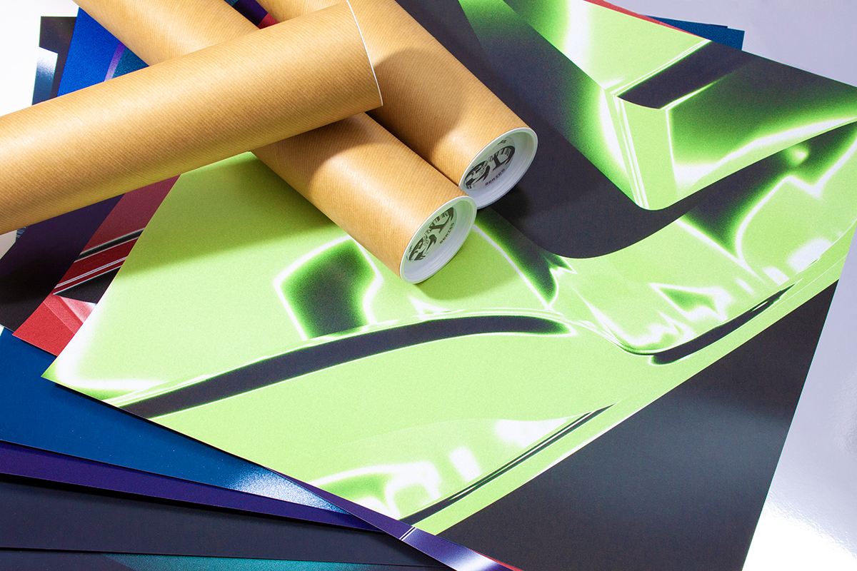
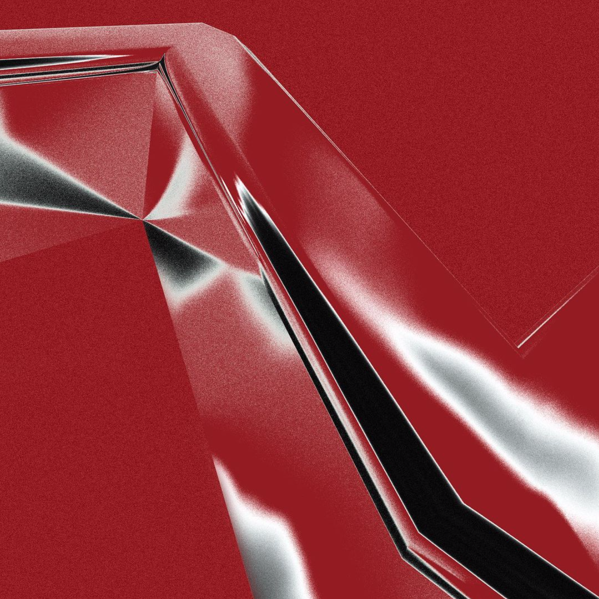
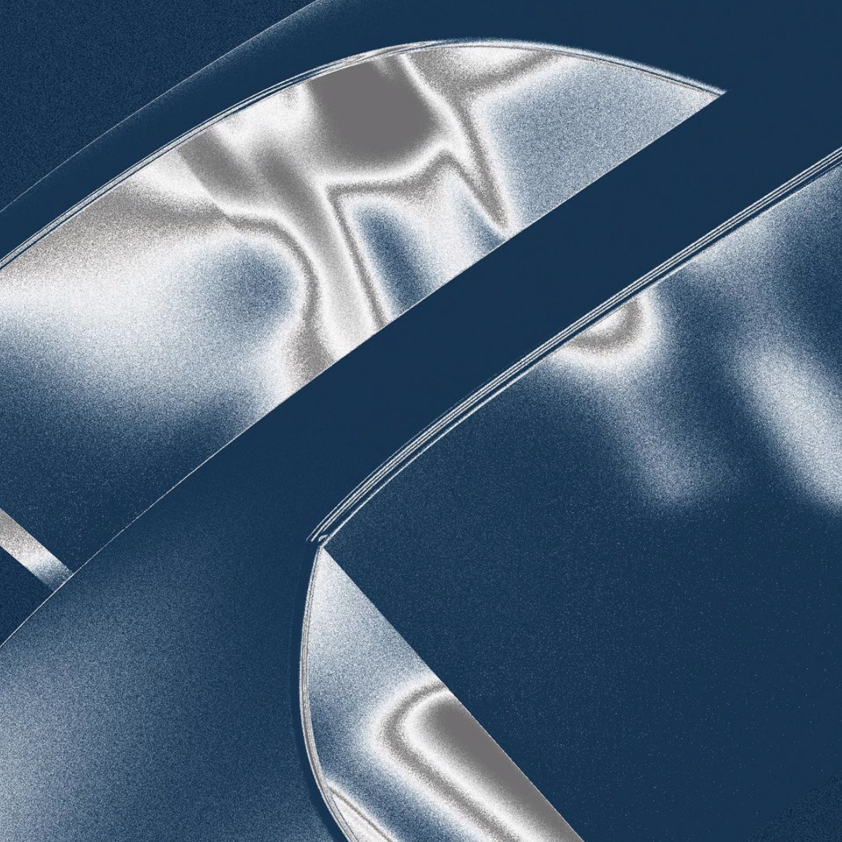
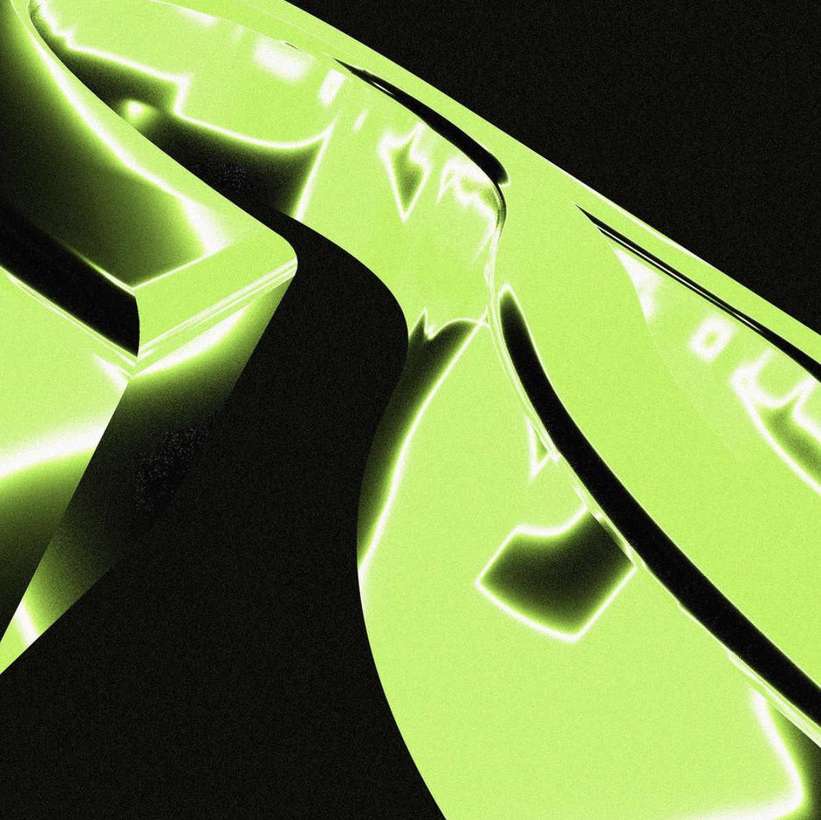
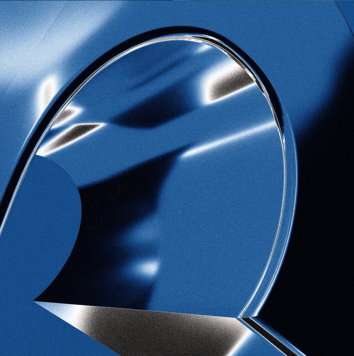
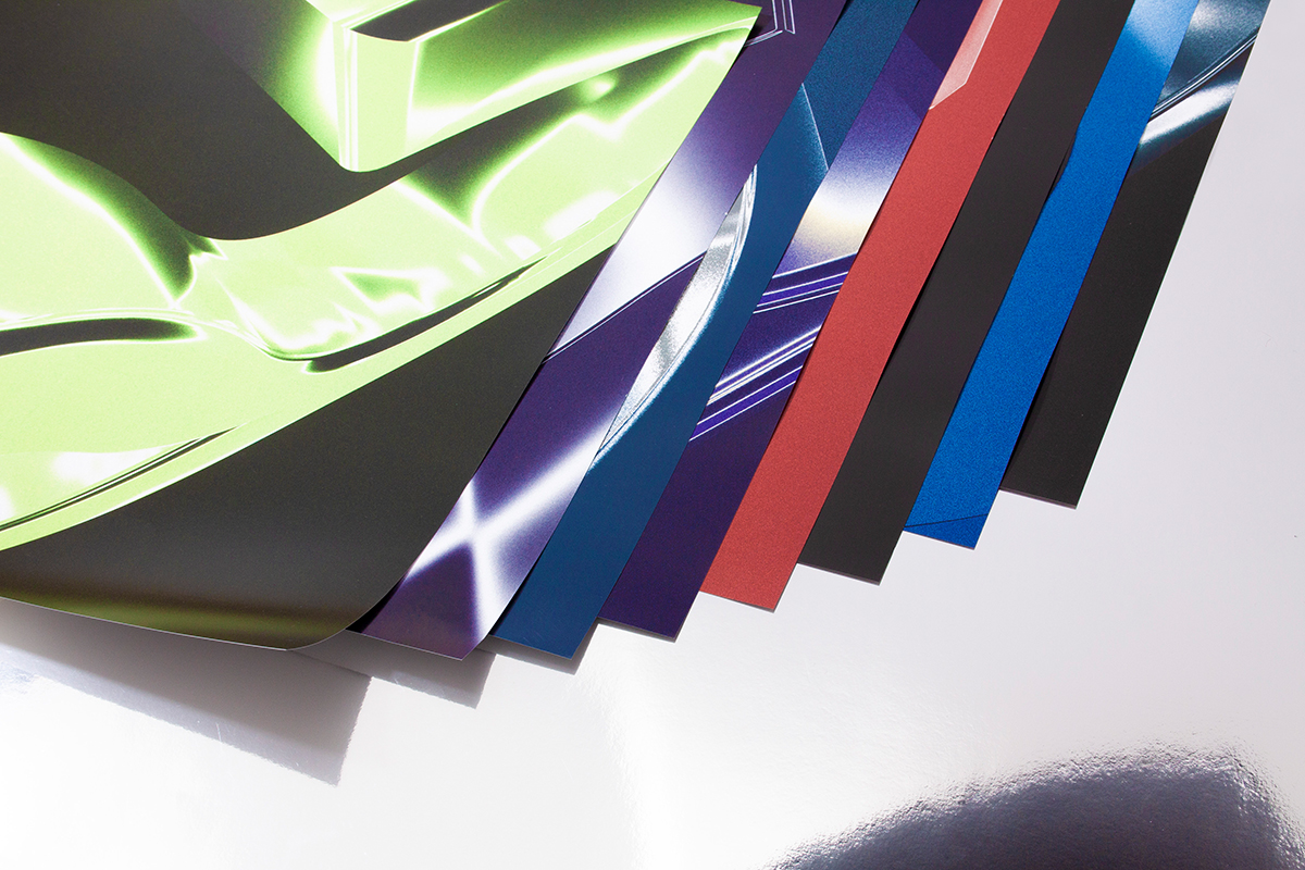
Recognising the qualities the third dimension can bring, New Letters have been working on a 3D series to enhance and reshape the way their typefaces make an impression on their audience. In this innovative series, each of their typefaces is assigned its own colour coding, and is framed as a 3D composition which offers a new angle on its character and form.
The German type foundry and design studio, founded by Armin Brenner and Markus John, focuses on typography and graphic design at the intersection of cultural and commercial projects. Their offerings span a range of classical typefaces and bespoke commissioned fonts, all created with a close eye for detail and a modern approach—allowing their timeless type to establish itself beautifully in a contemporary context.
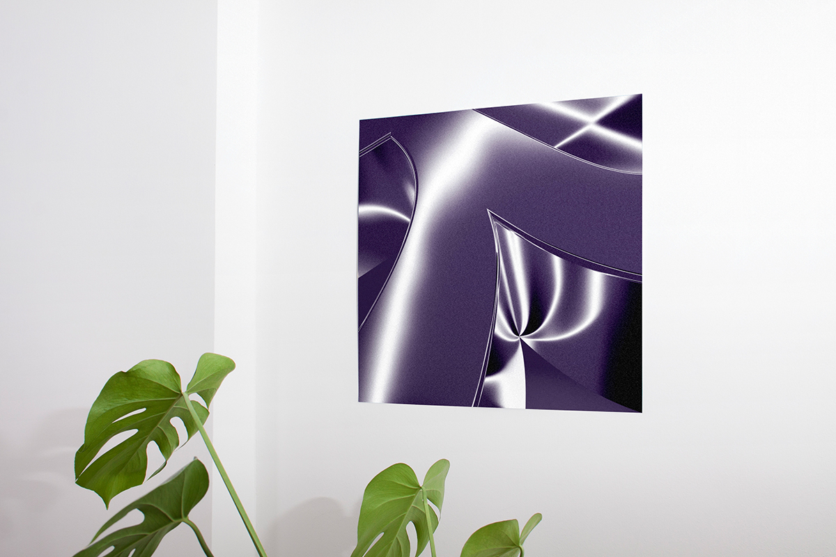
The 3D series offers a new lens to experience their typefaces through, coming in the form of 3D compositions presenting unusual angles and perspectives to highlight the individuality of each typeface. ‘Every typeface has a unique character shaped out through characteristic features’, they say, ‘we were particularly interested in examining these features by using unusual perspectives and angles’. Filtered through grainy textures and gentle gradients to create sensory, haptic visuals, they explain that ‘every 3D print uses a different angle and has a specific detail in focus’. Using each typeface’s colours, the prints of the 3D series offer an up-close-and-personal study of the nuances and character of each typeface.
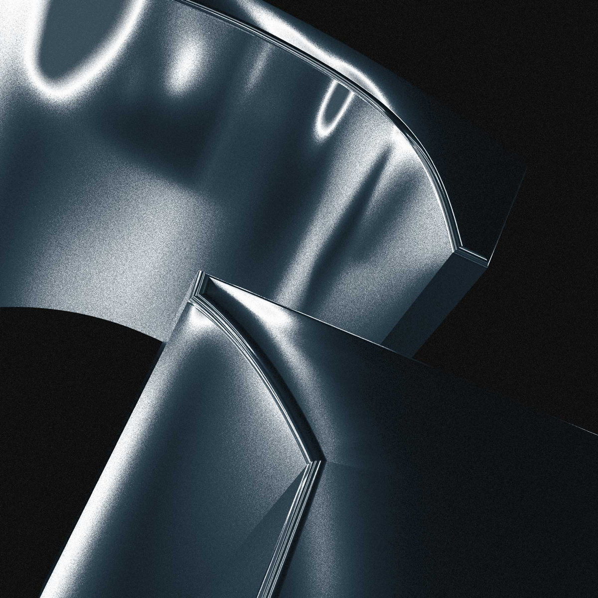
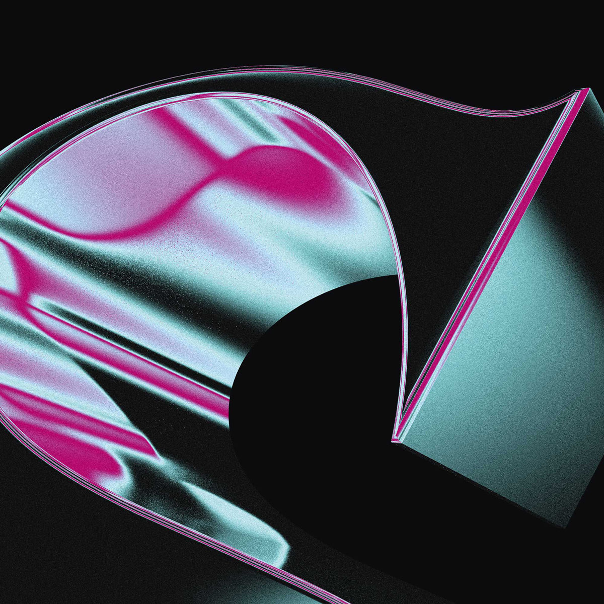
‘We are used to looking at typefaces in a 2 dimensional way’, New Letters continue. ‘With our 3D series, we wanted to create a new visual experience to interact with them and make them more tangible. Our 3D series is about the curves and the expression of our typefaces, and the series is also about redefining the usual view for discovering new visual aspects of them.’ Explaining that for them, the visualisation of the third dimension offers a space to ‘experience the individual features in a new, more tangible way’, they add that ‘through reflections, depth and structure, the typefaces become an object to which we can build a new kind of visual relationship’.
In terms of its potential in typographic pursuits, the studio believe the third dimension is still somewhat untapped, adding that in the future, they’re hoping to see a wave of new takes on 3D letterforms; perhaps with more creative work with different textures and effects, like chrome. Onwards for 2021, New Letters will soon be releasing their latest typeface Kjell, which is inspired by a tarot card system, and they’ve also got a new variable typeface on the way called Laif—so there’s a lot of exciting stuff to look out for. ‘Our website will get a facelift with some smart new features too’, they add, ‘so stay tuned!’
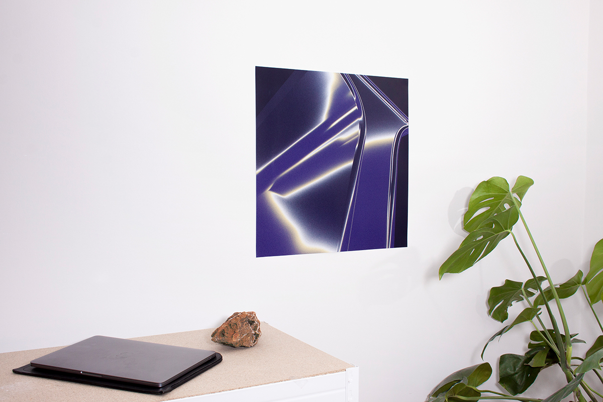
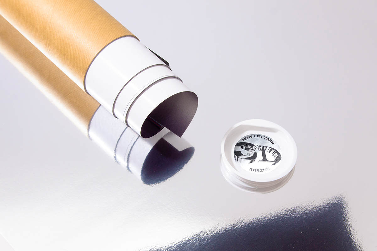
Prints from New Letters’ stunning 3D series are available through their online store.

