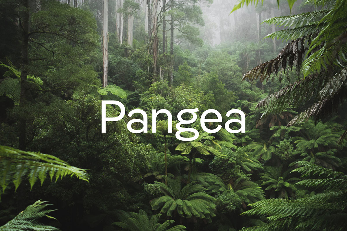
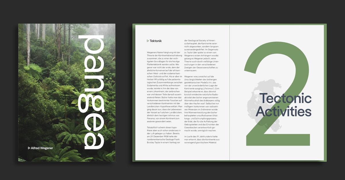
For Christoph Koeberlin, creating Pangea grew as a project in response one pivotal question: how can a typeface improve the world? He wanted to prove, to designers and the public alike, that those in the (type) design industry have the power to positively influence the environment and actively work towards a more sustainable world. Dropping with Fontwerk last Summer – and quickly becoming one of the hottest releases of 2020 – it’s no wonder there was huge demand for Pangea’s accompanying Italics. And now, they’re here – making the already massively successful typeface even more friendly, unifying and accommodating.
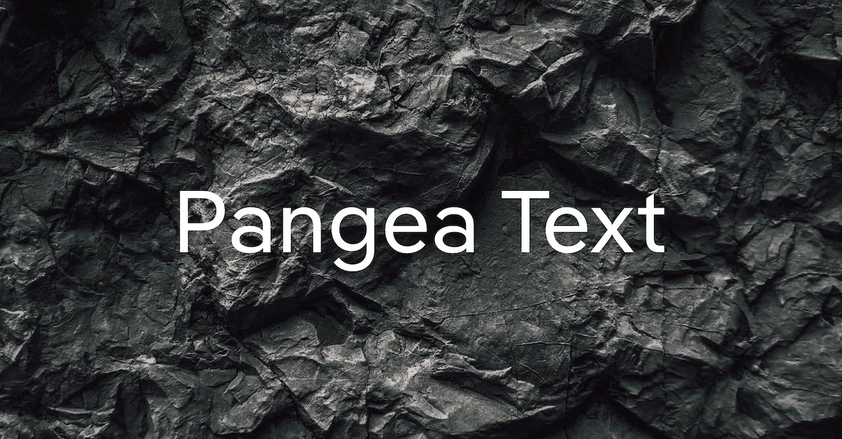
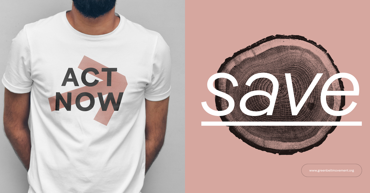
With support from Tanya George and Gabriel Richter, all five weights of Pangea and Pangea Text will now come accompanied by their matching Italics. And, as Ivo Gabrowitsch of Fontwerk tells us, ‘At the same time the typeface has undergone further aesthetic, technical and linguistic fine-tuning, which was undertaken by many colleagues across the globe including Gergő Kókai, Andreas Frohloff, Ilya Ruderman, Irene Vlachou, Donny Trương, Igino Marini and Azza Alameddine.’
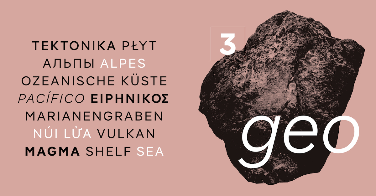
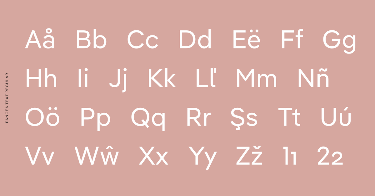
In fact, Pangea is not only a typeface that fights for sustainability on material level, but also on a social, human level too. It is designed to bridge borders and unify communications across scripts and languages, coming with extensive, meticulous and continually expanding language support, built with the contributions of collaborators across the globe.
‘Pangea really is the result of international cooperation and one of the few typefaces that can stake a claim for trying to improve the world,’ Ivo adds – and this statement couldn’t be more true. For a start, one of the ways Christoph has ensured that Pangea embodies its eco-conscious values is by donating 25% of his income from Pangea to the preservation of the rainforest, and to large-scale reforestation projects involving the local population. ‘With every font license you purchase,’ Ivo explains, ‘you are helping to preserve one of the most important factors in slowing down climate change.’
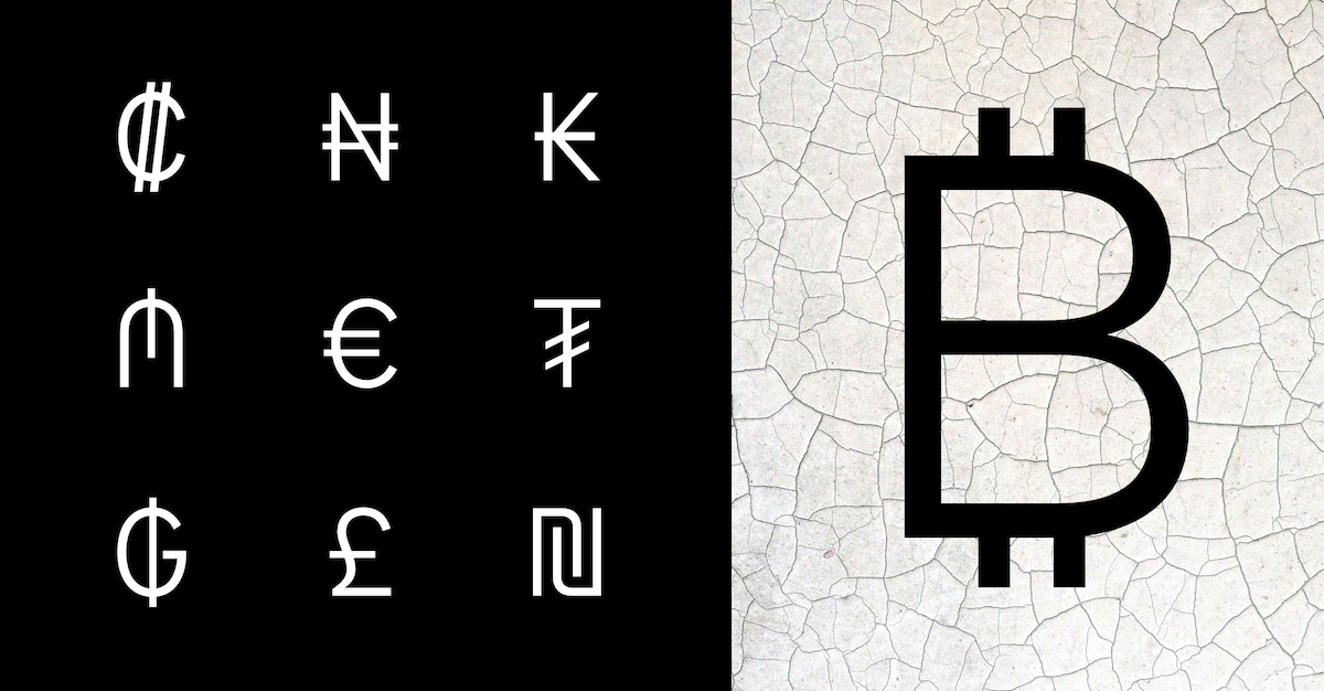
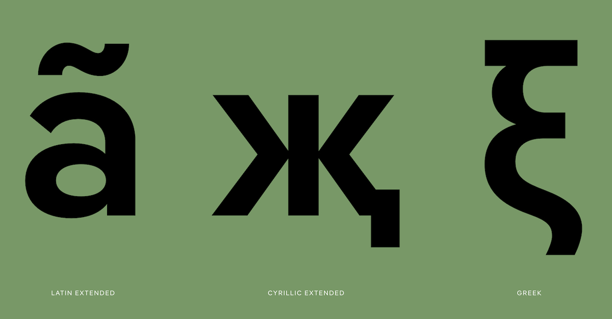
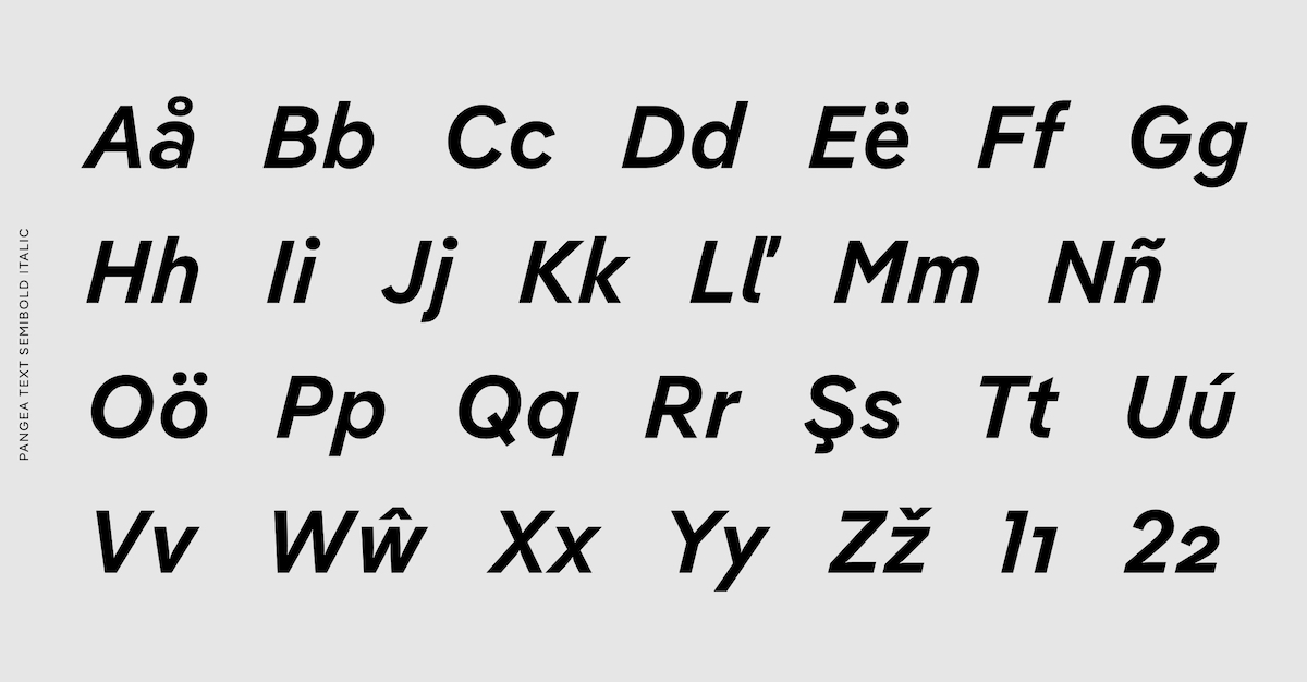
In addition, the name ‘Pangea’ itself is emblematic not only of ‘the big (common) picture, but of global cooperation,’ Ivo continues. ‘While Gergő Kókai from Hungary supported him in the design of the upright characters, [Christoph] brought Tanya George from India and the Japan-based Gabriel Richter on board to work on the italics. He consulted with Irene Vlachou from Greece, Ilya Ruderman from Russia and Donny Trương from the USA to ensure the quality of the Greek, Cyrillic and Vietnamese characters. The spacing and the kerning of the font would not have been possible without Igino Marini from Italy and his superior iKern technology. A broad foreign language extension seems obligatory for this omni-cultural approach, and in fact, in addition to the Extended Latin, Extended Cyrillic, Greek and Vietnamese that are already included, Arabic is currently in the making, with Hebrew and other languages to follow.’
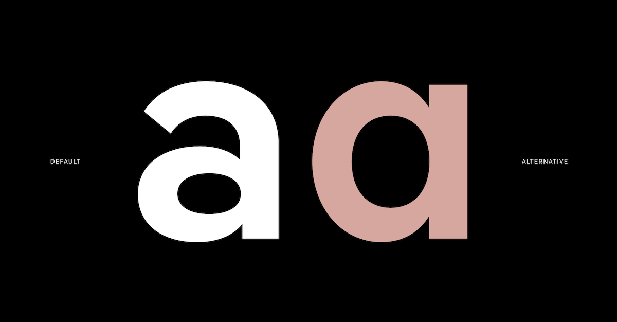
Due to its refined space-saving – the typeface is more condensed than a normal geometric sans – Pangea also works to save paper and screen capacity. ‘Another outstanding trait is the consequence between the compactness and closeness, while diagonal terminals and round dots make for a friendly appearance,’ Ivo notes. ‘Christoph successfully manages the balancing act between narrow grotesque typefaces and geometric ones. This approach is also demonstrated not only in the rather large x-height as well as the barely open forms, but also in the unusual “spectacle-g”, double-story “a”, and “l” with foot. The more common single-story “g” and “a” as well as the straight “l” are, of course, accessible as OpenType alternatives.’
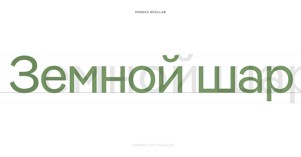
Accompanied by Pangea Text – which, due to Christoph’s expertise and a top-class font engineer, harmonises beautifully with the rest of the family – this typeface’s broad superfamily also comes with a variable font file; allowing for open, fluid exchanges between weights and styles. ‘This version allows a smooth and infinite adjustment of font weights from Light to Bold, of ascenders and descenders, of the characters’ openness, of spacing, of the angle of the slope, and of ink traps as well as the seamless switching between alternates,’ Ivo elaborates. ‘Nine axes raise the bar in this area. As with all other Fontwerk fonts that are already available as variable fonts, the Pangea variable versions are included in the super family package at no additional cost, and can be tested free of charge as subsetted Trial Fonts.’
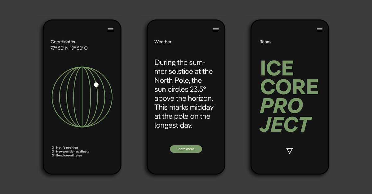
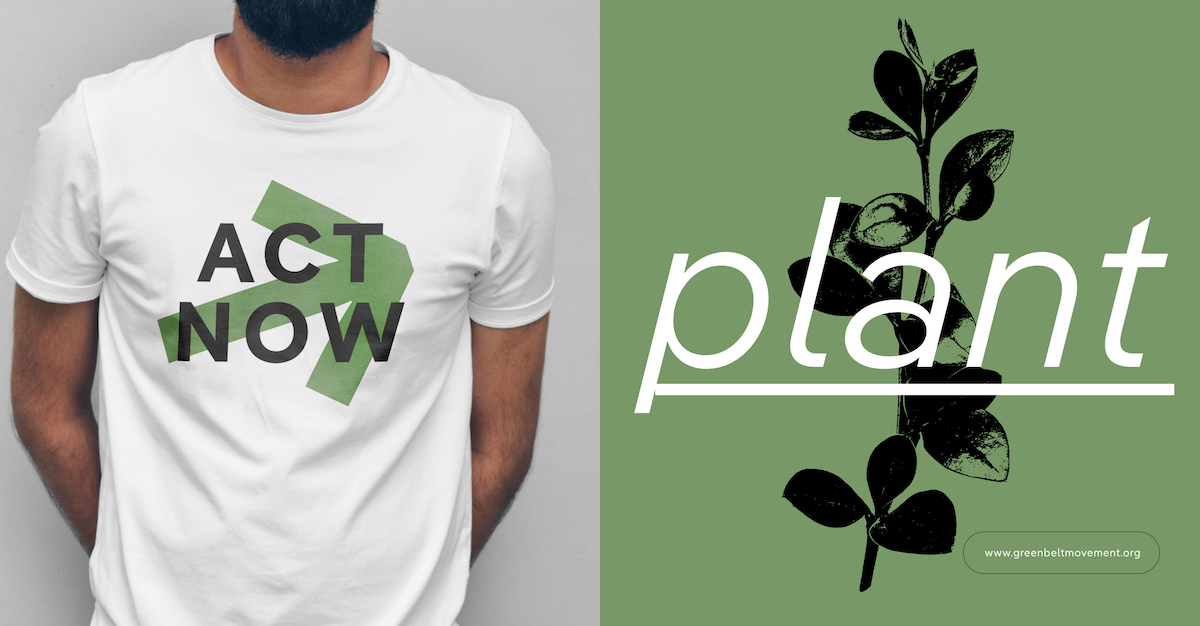
It’s been such a pleasure to learn more about the story of this truly revolutionary body of work, and it seems clear that Pangea is one to keep an eye on for future expansions and developments. To explore Pangea further, be sure to head over to Fontwerk.

