
ALT.tf’s website just got a HUGE new update! Equipped with a number of fantastic features, you can also find a healthy new font release in collaboration with London-based type designer Giulia Boggio (she/they).
While there’s been a measured amount of progress over the last few years, finding typefaces designed by under-represented creatives can be — a challenge for a design studio or freelancer. Thanks to initiatives such as Sharp Type’s Malee Scholarship founded by Co-Founder Chantra Lee Montoya-Pimolwatana in 2019, this gap is beginning to close. And ALT.tf, informed by You Creative Media’s previous brand, Femme Type, is here to join the ranks of creating a more diverse type design landscape for designers and brands alike.
Born with the purpose of partnering with type designers from backgrounds under-represented within the industry, ALT.tf, a UK-based type foundry, is dedicated to providing a versatile catalogue of fonts that directly tackles the diverse imbalance of font choice for brands and designers within the graphic design industry— giving brands and designers the tools to not only ignite their design solutions but also to be an equal facilitator of change. By collaborating with a global range of typographic talent, ALT.tf develops typefaces that are not only meticulously crafted and optimised, but are definitely unique and versatile.
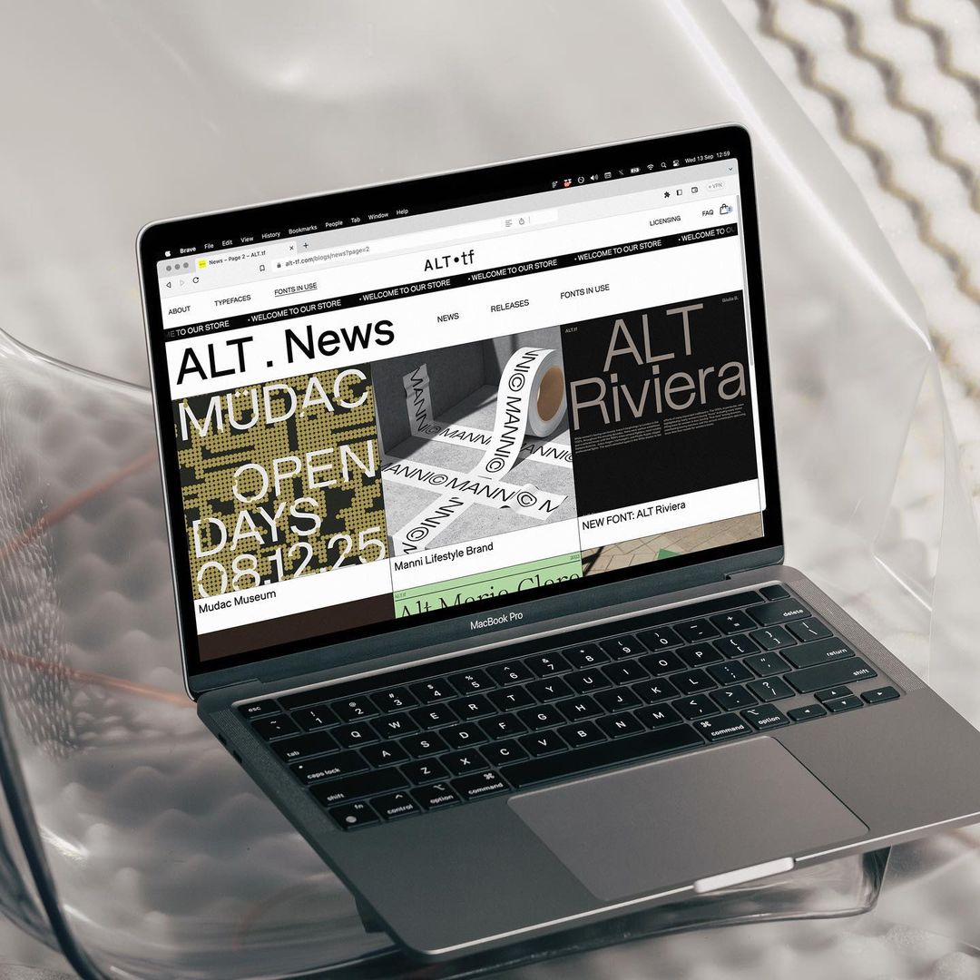
After its first font release in collaboration with Philipina type designer Alli Cuanan (@gtfoalli), and following a period of rigorous development, the foundry is celebrating the launch of ALT.tf 2.0 — their brand new website and identity.
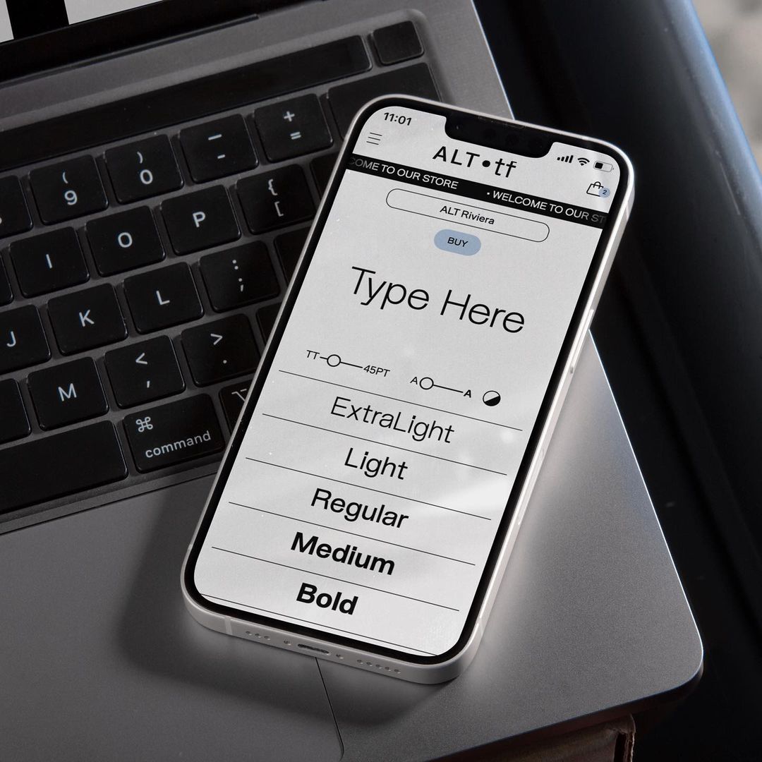
Equipped with a number of new features including a new layout, custom font tester, glyph highlighter, case study section (where they write about the brands and creatives who use their fonts), and an updated licensing structure, the site in general, has a refreshed look, operating as a solid building block to continue the foundry’s key objective.
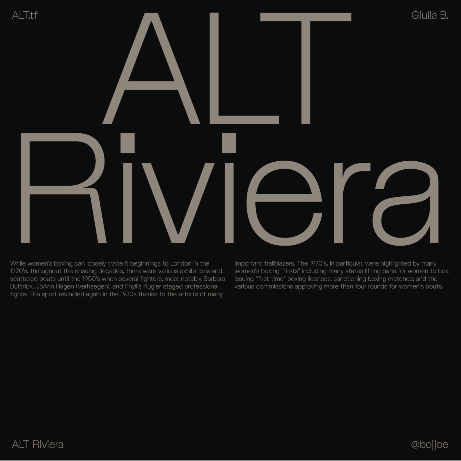
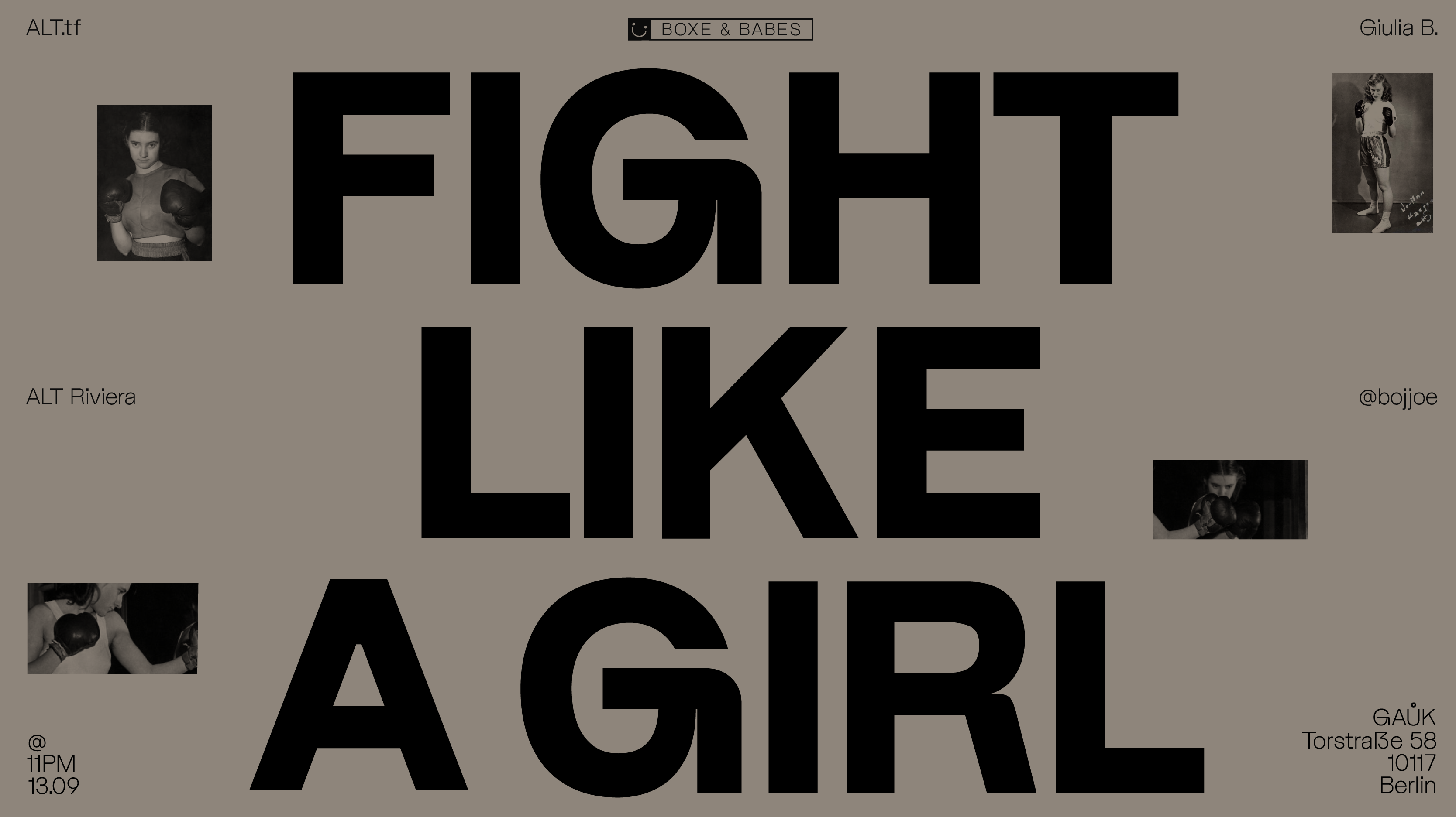
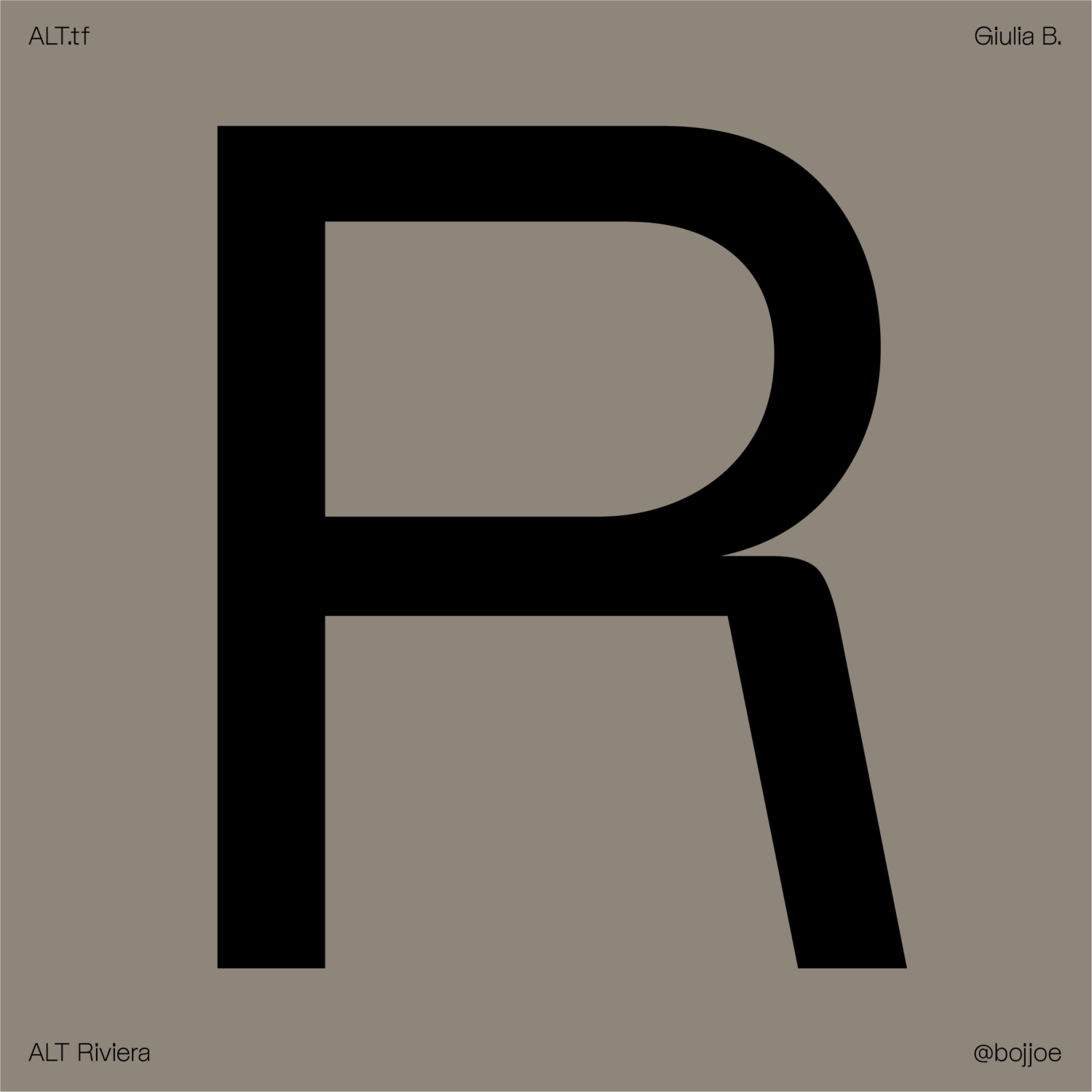
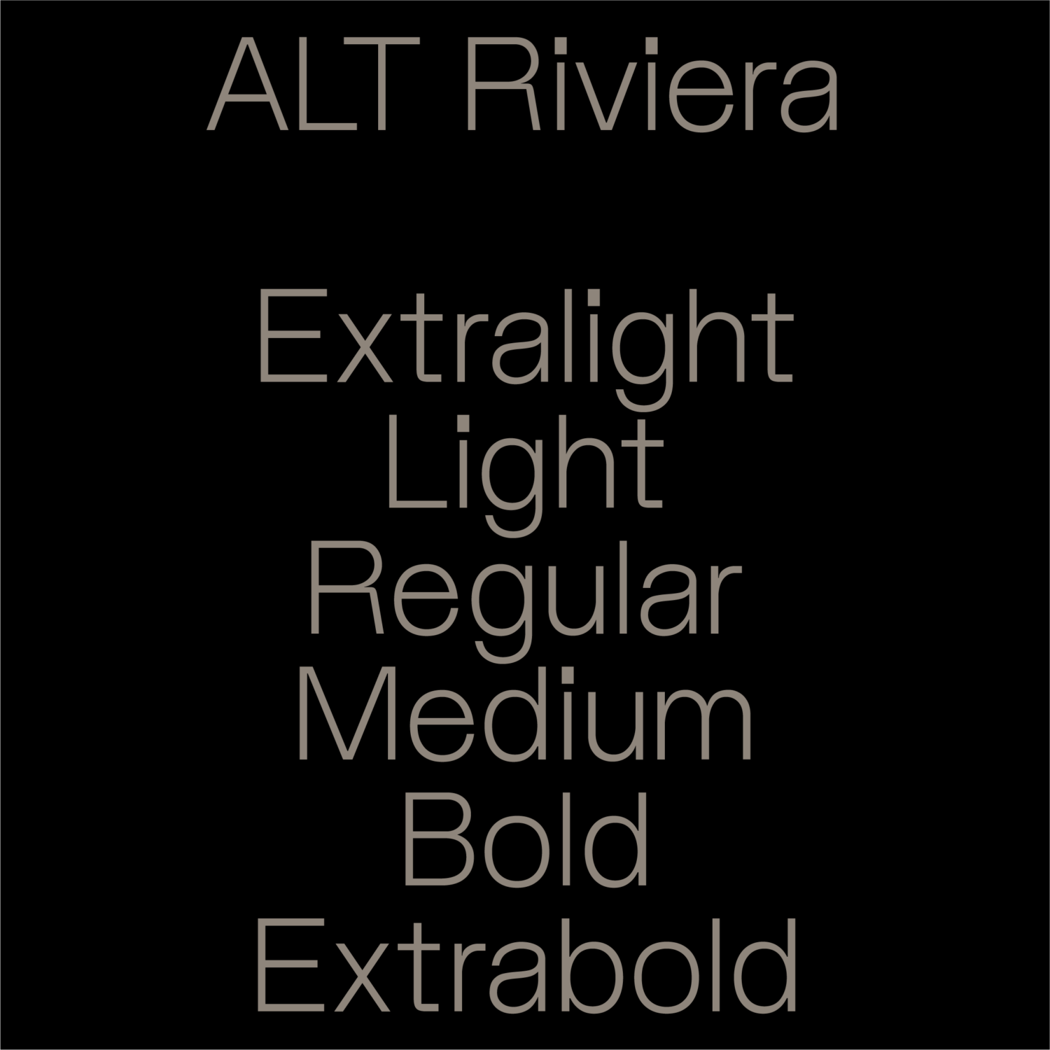
Introducing ALT Riviera
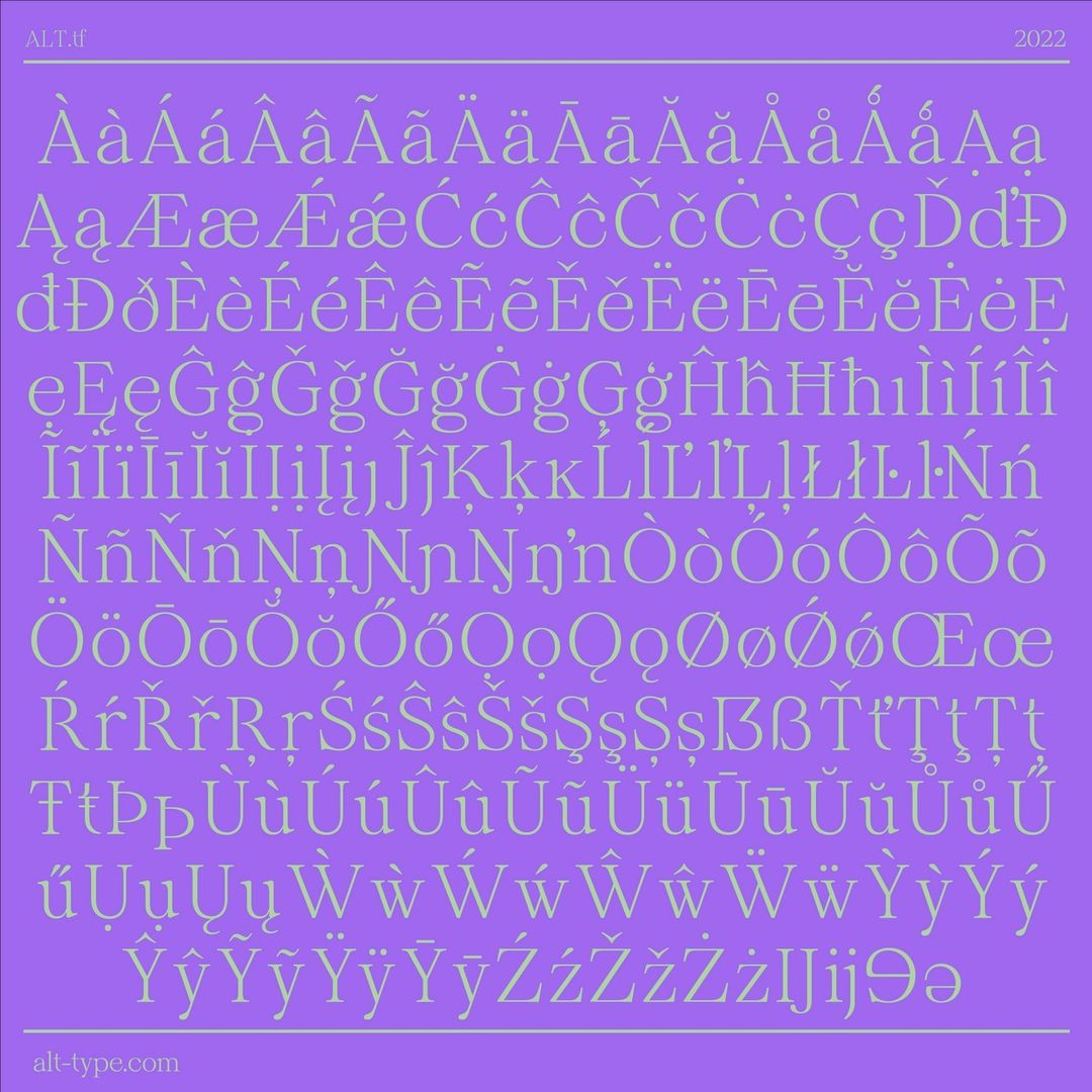
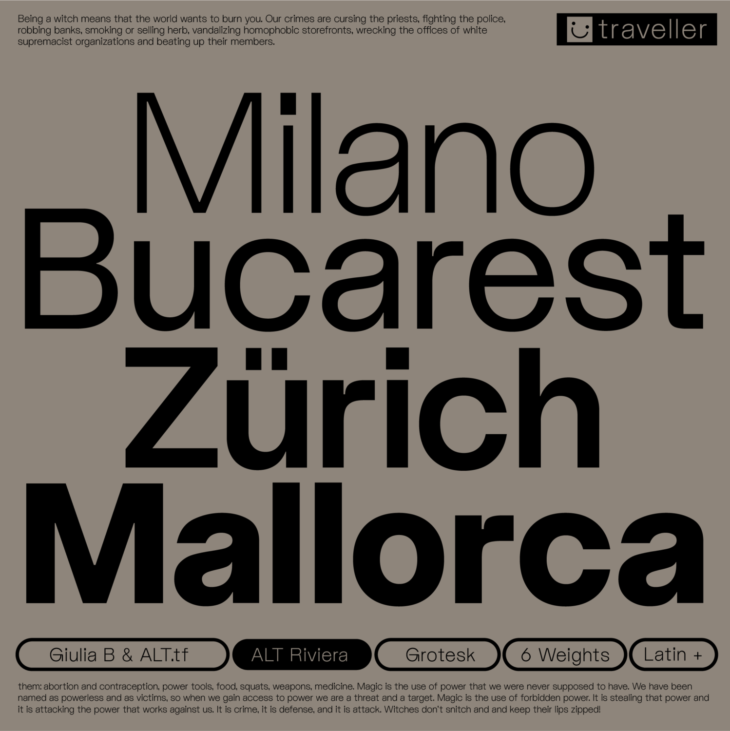
To mark the occasion, we are pleased to reveal the newest ALT typeface: ALT Riviera, designed by London-based designer Giulia Boggio (she/they). With three Gs in their own name, Boggio naturally gravitates towards the letter as a starting point. As she explains, Riviera began with a ‘G’ she developed for her previous typeface Bastardo. “I was exploring with the round edge and I liked it, but it didn’t fit in the Bastardo system,” she reflects, “so I just developed a whole font around it.”
Like two of their previous typefaces Bastardo and Fabio (the latter of which is ALT.tf 2.0’s leading brand typeface), ALT Riviera leans into the lighthearted and geometric aesthetics of grotesques. “I think I’m going to have to accept that I’m a quirky Grotesk type of designer,” she admits. “Am I on a mission to develop the quirky grotesque of my dreams? Don’t laugh, but I’m working on another one already which was also born off an alt G. It’s a curse. Someone needs to send help or commission me a serif before I go crazy.” Saying that she is enamoured with ALT Riviera’s distinct personality. “It’s got a playfulness that I love,” she says. “It’s like.. Bastardo lives in Berlin while ALT Riviera lives in Brighton. Each weight has its own slight change of feel – I love the almost too big titles on the thinner weights as it gives it a can’t-take-me-too-seriously feel.”
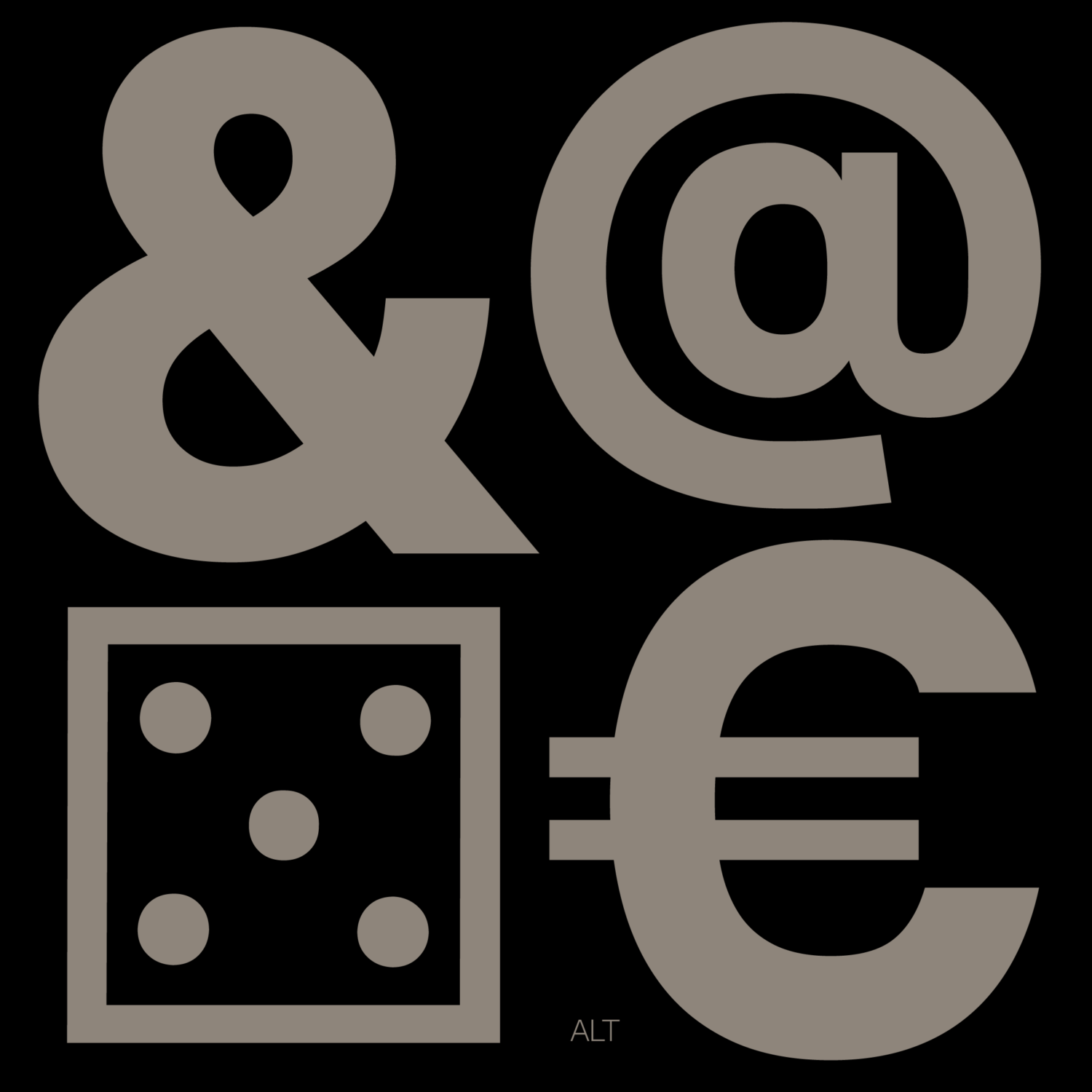
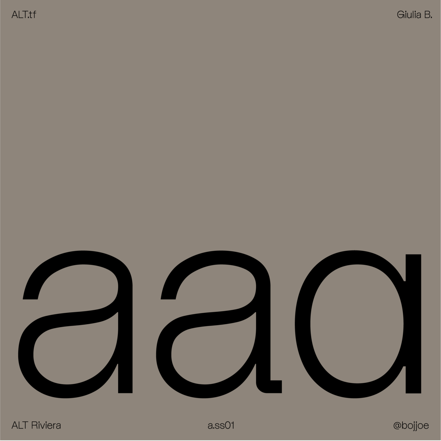
Developing the typeface’s quirks early on played a major part in establishing the personality and essence of the design system she was working on. “Even before finalising the specific letterforms of the typeface, I had already incorporated elements such as dice and smileys,” she reveals. “This approach may seem unconventional, but I firmly believe that these elements hold significance within the universe of this particular typeface. By integrating these playful and expressive symbols, I aim to infuse the design with a sense of character and add an extra layer of meaning to the overall visual expression.” Likewise, Boggio describes ALT Riviera’s question marks as “odd, weirdly shaped and obnoxious.” For the designer, delighted with the glyph’s silly and distinctive nature, there was simply no need to include a “normal” version.
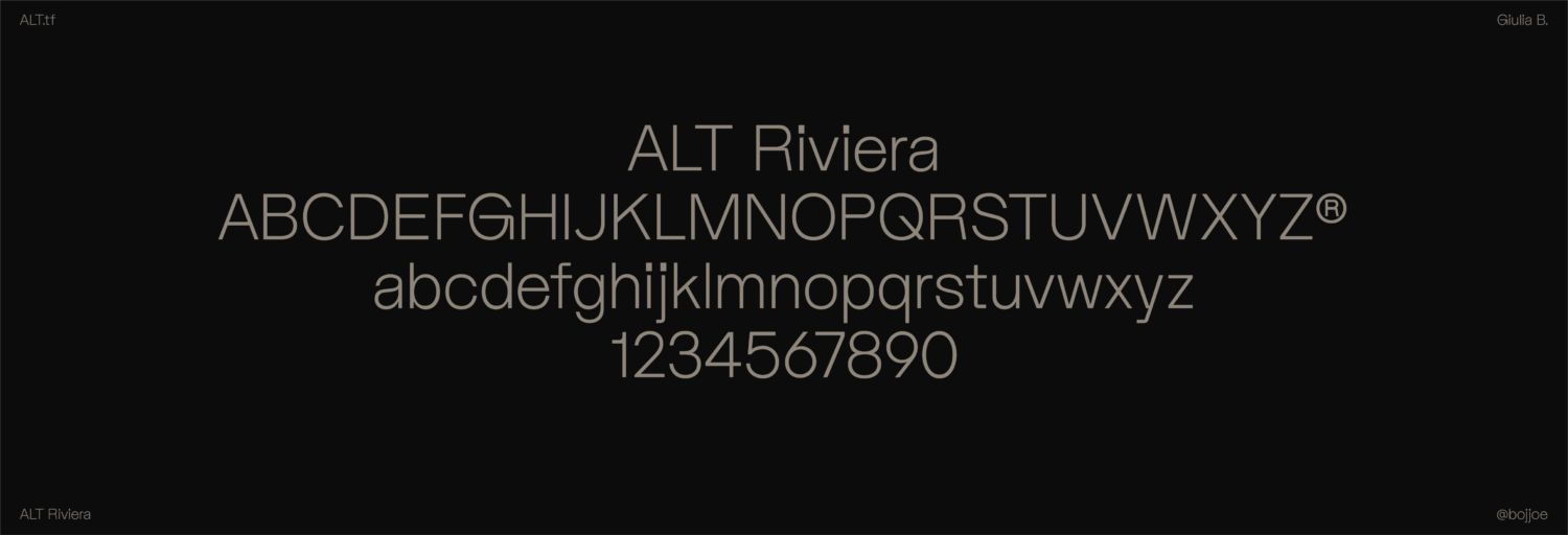
ALT Riviera is also a typeface of contrasts, with Boggio pitting ‘hard’ against ‘soft’ forms. In particular, she emphasises the hard shoulders of R, G, and f. “It’s really satisfying to me to look at the contrast between sharp and soft,” she says, “it’s like they’re fighting initially but no one can win so they end up making it work.” At a more extreme level, her condensed typeface Galgo playfully leans into this, too.”
“The matter is material and shapes, probably rooted in the same corner of me that makes me obsessed with brutalist architecture, weird chairs and glass bricks. It taps into a deeper part of my creative sensibilities, a part that longs for the delicate balance between opposing forces. It’s an exploration of visual tension and a celebration of the unexpected harmony that can arise from the coexistence of seemingly disparate elements.”
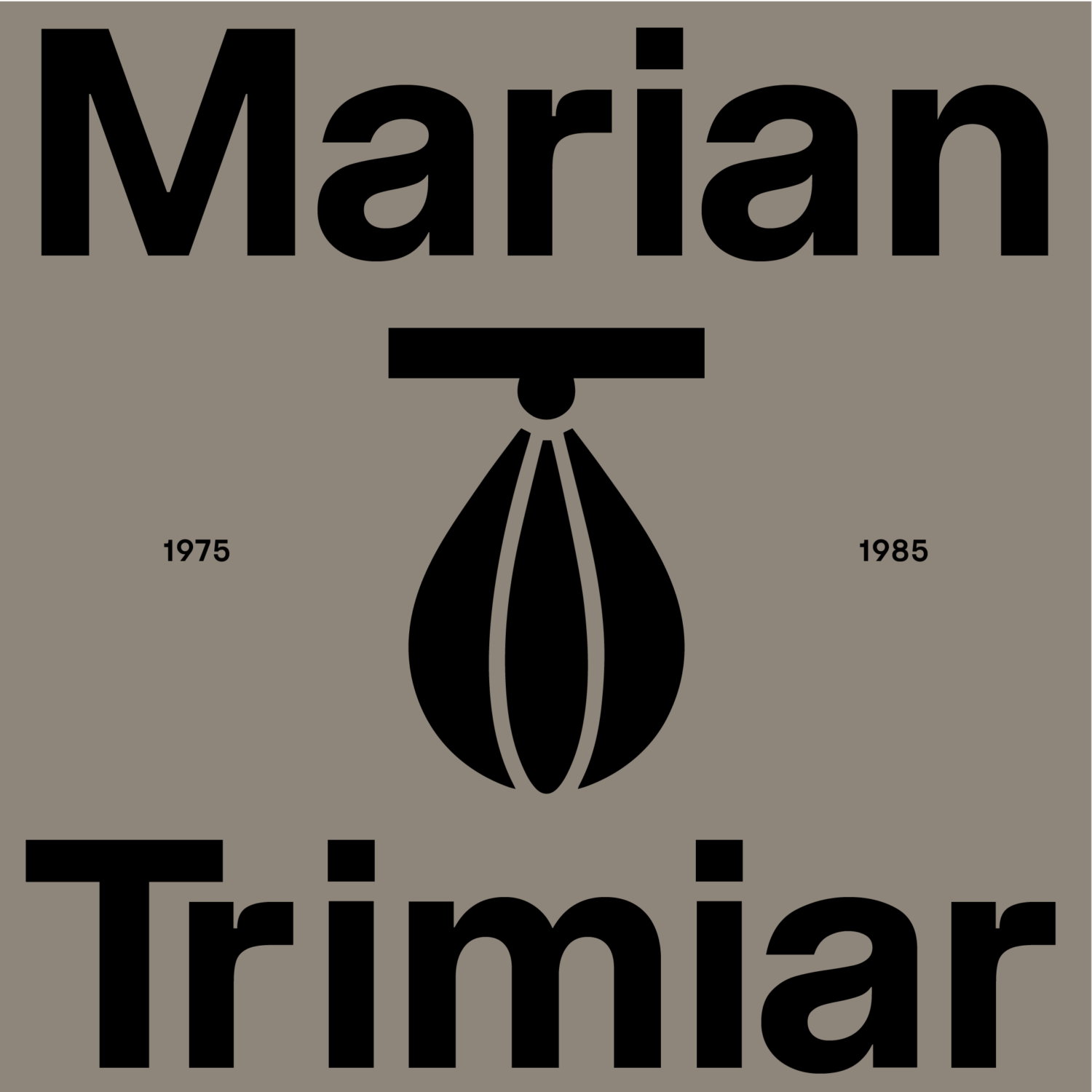
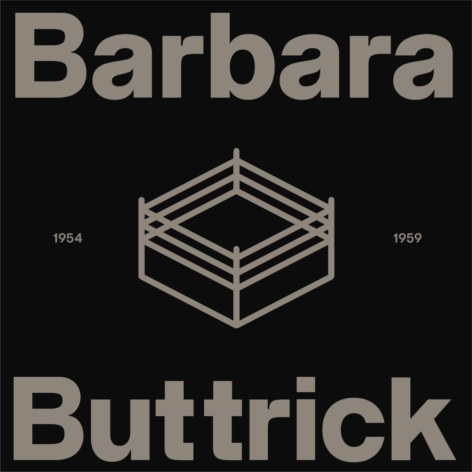
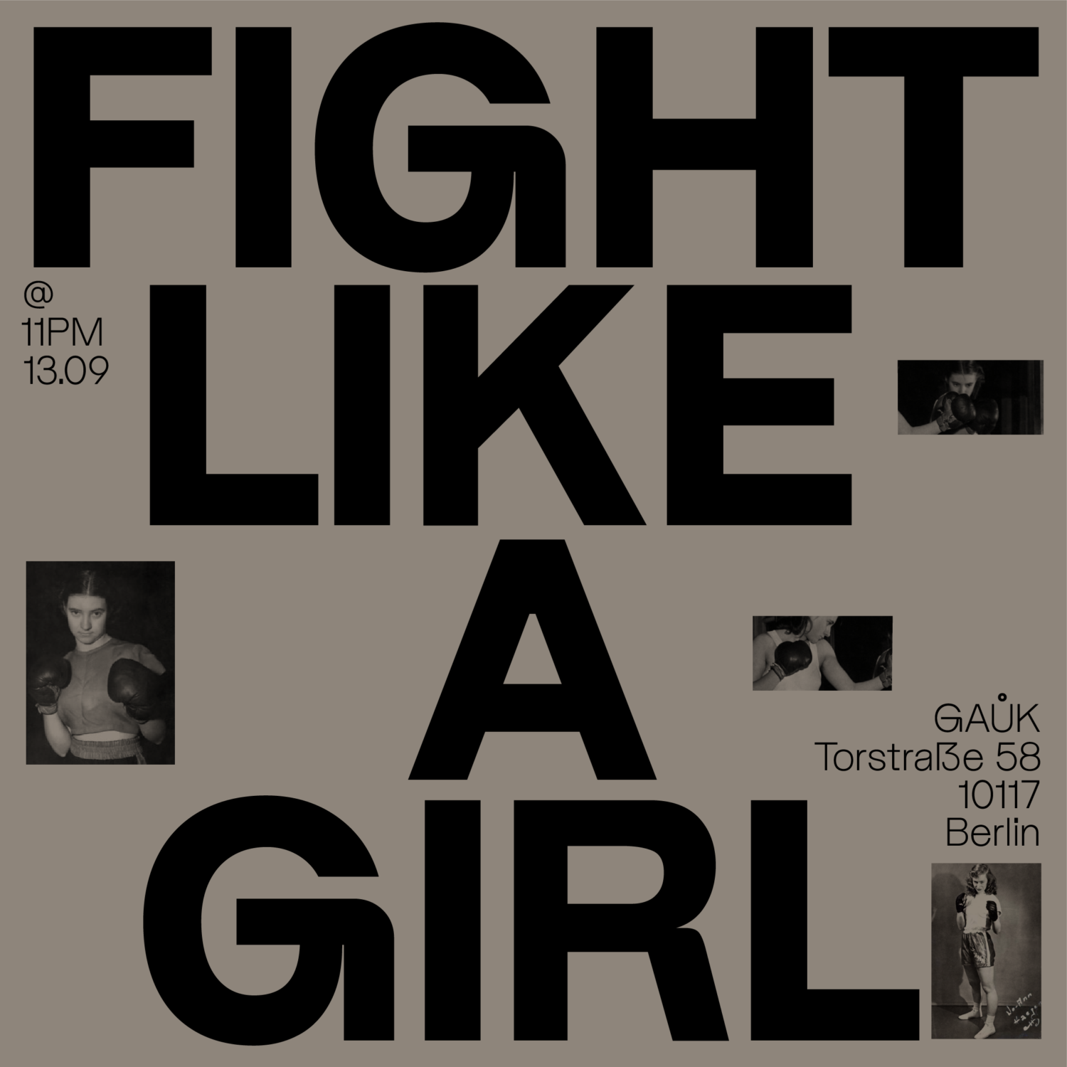
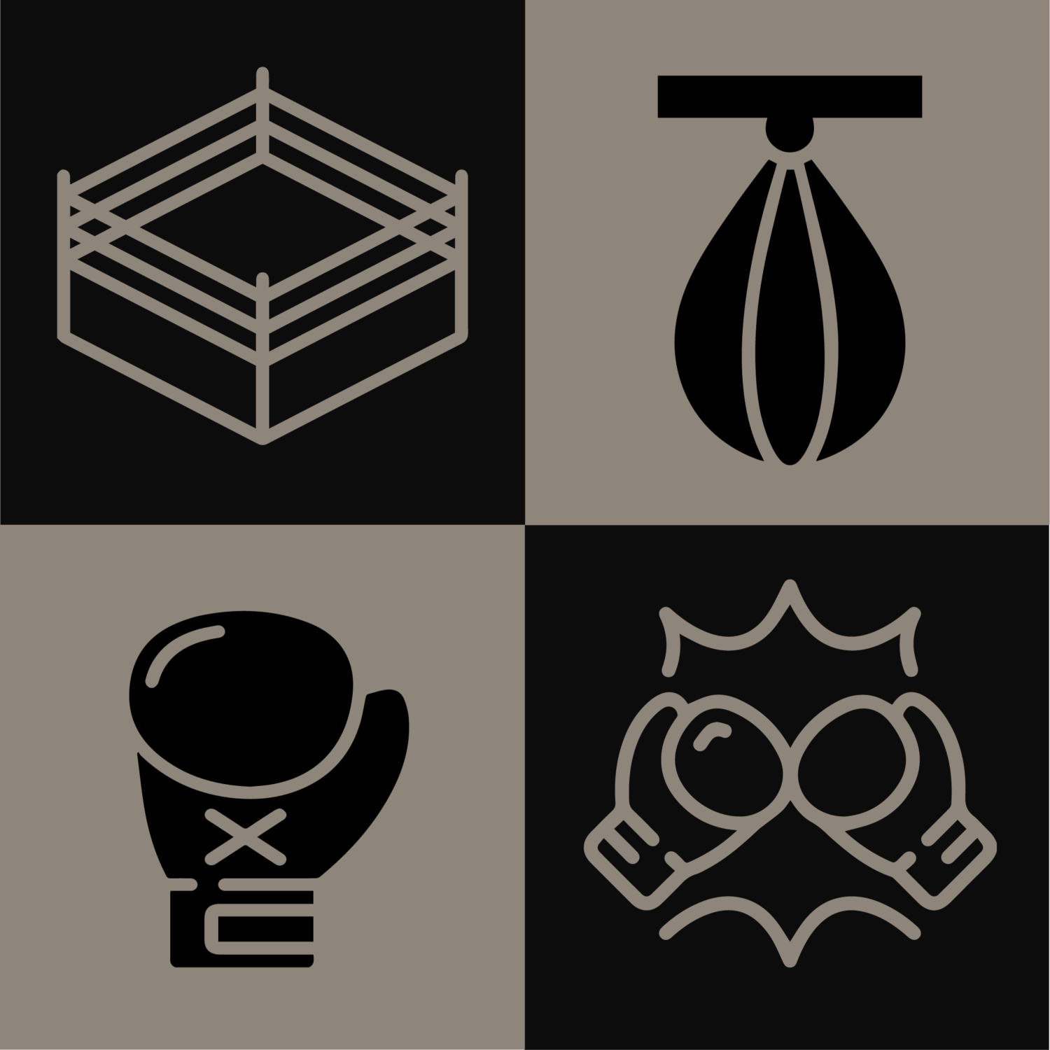
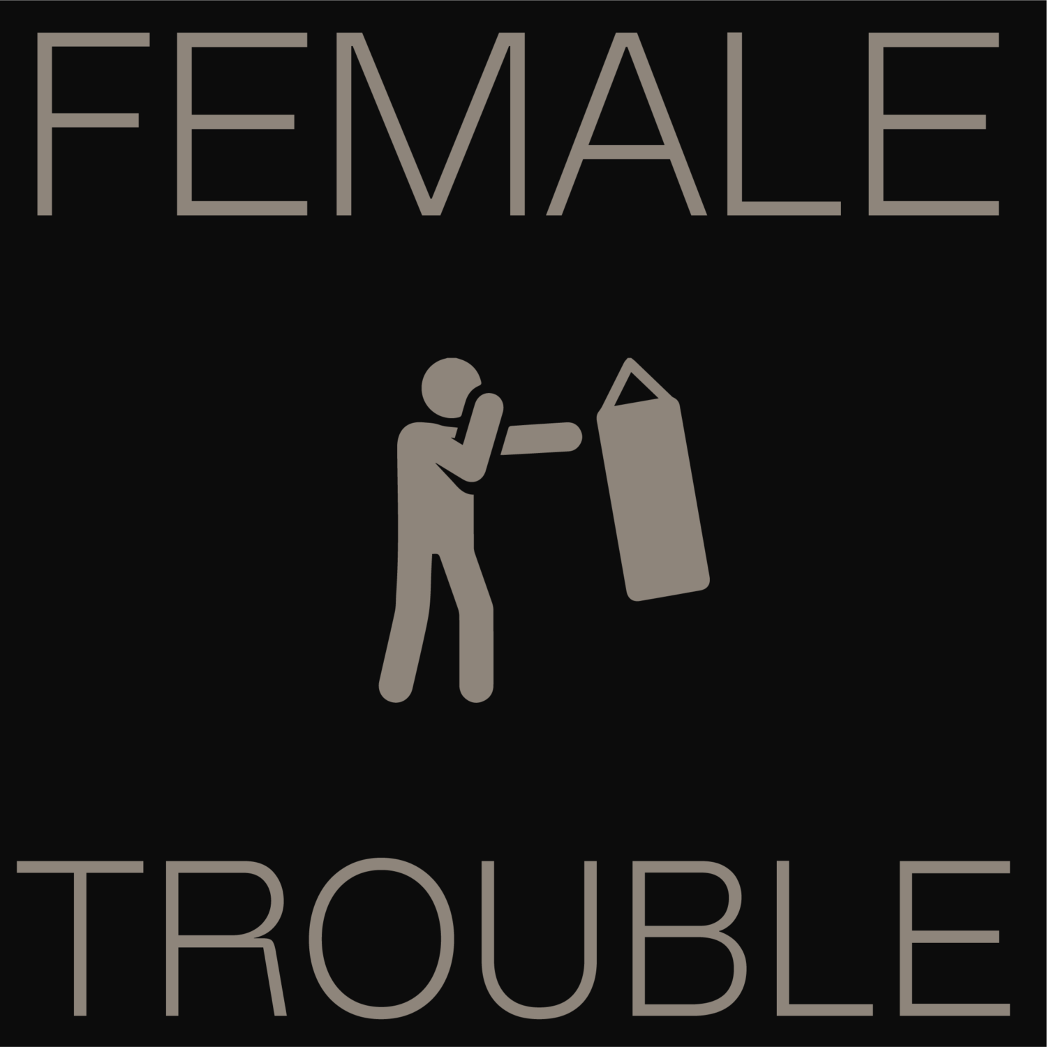
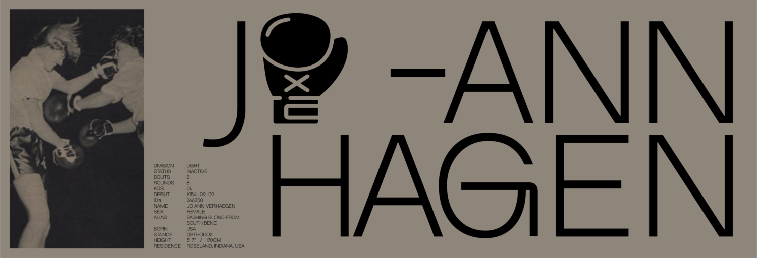
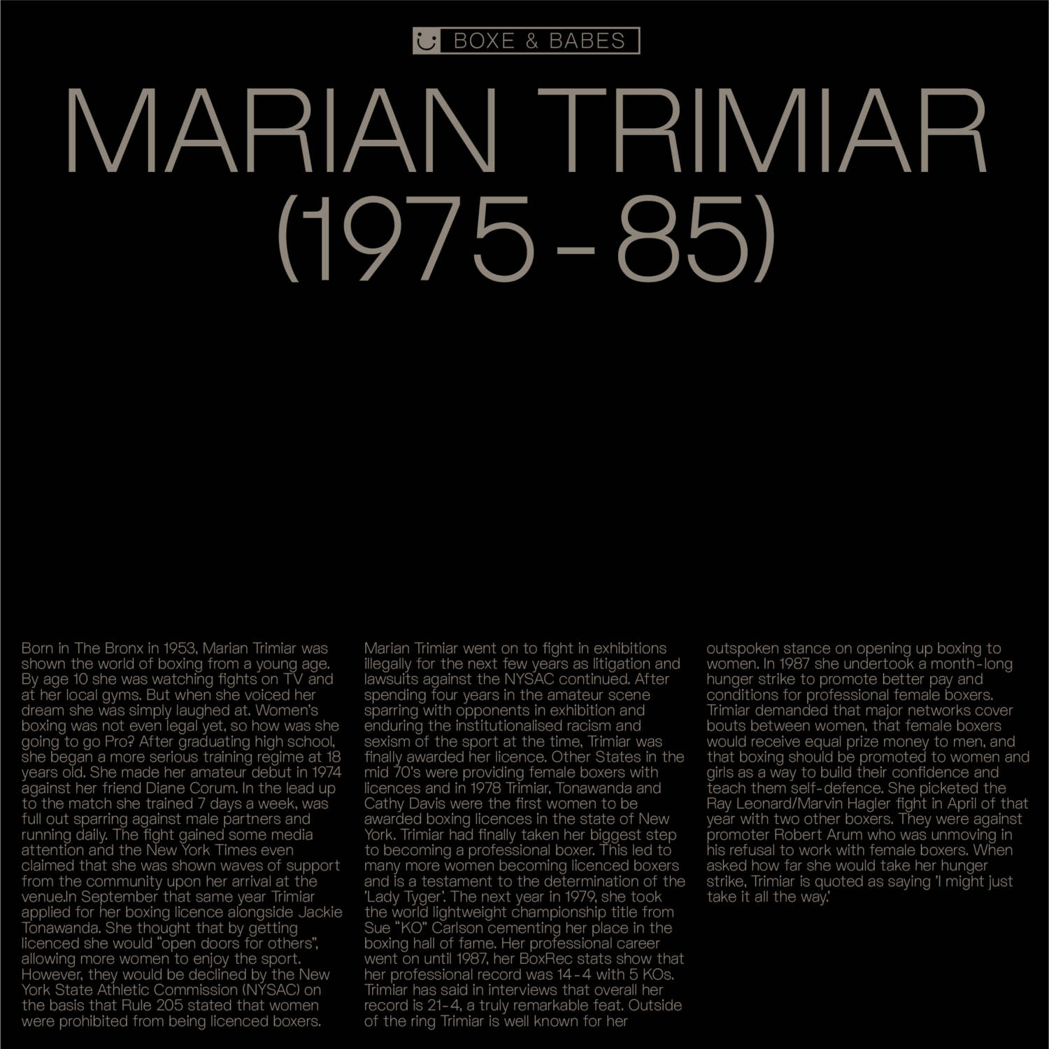
Returning to the theme of ‘fighting’ (whether that be fighting deadlines or conflicting contrasts) and the tension between hard and soft, Boggio was drawn towards the spectacle of boxing to showcase the range of type fonts. Explaining the reasoning behind the ‘Boxes and Babes’ assets, “I love boxing as a form of punching while dancing, it has a magic to it, it’s somehow both strong and delicate,” they note. “I’ve always been deeply fascinated by this sport and the artistry it entails. There’s raw energy and grace that coexist in the boxing ring. Sometimes the specimen topics/images are really just chrome tags I had open that week. But I liked the idea of merging the iterations of softness and hardness. It was a creative experiment to see how opposing qualities could harmoniously come together and complement each other.”
Development and hurdles
The typeface was developed over a long and impossible-to-define stretch of time as Boggio juggled and jumped between projects. “The regular and thin weights were actually almost completed quite some time ago,” she says. “However, as is often the case with creative endeavours, I hit a bit of a slump. For months on end, I found myself not thinking about the project at all. Inspiration took an extended vacation, leaving me feeling a bit stuck.”
“The irregularity in my workflow, coupled with the natural ebb and flow of creative energy, contributed to the extended timeline. But through it all, I remained dedicated and determined to bring this project to life, even if it meant navigating through periods of intense work and moments of temporary creative hibernation.” Following a chat with ALT.tf’s founder Amber Weaver, Boggio’s spark was reignited and the motivation reemerged.
Future focus
Looking to the future, can we expect to see the family broaden? “I don’t see myself expanding this anytime soon, no,” Boggio replies. “I’m more of a reworker than an expander – perfectionist mindset, I suppose. But never say never.” She’s enthusiastic about widening the language support and moving away from Latin-only scripts. It’s a project for the future, she thinks when a collaboration between multi-lingual designers can take place. “It would be a bit of a statement on the power of typography to bridge cultures, facilitate communication, and foster a deeper understanding and appreciation for the beauty and intricacies of different languages,” she concludes.
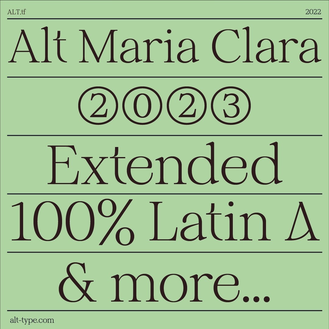
Be sure to stay tuned for more collaborations and releases! You can check out ALT.tf’s new site and test out ALT Riviera, along with ALT.tf’s debut typeface ALT MariaClara designed by Phillipina type designer Alli Cunanan below.
https://alt-tf.com/
Read more foundry and font release features here.


