It can be hard sometimes to source simple, actionable tips about type design, especially as a young type designer when there’s so much to learn.
Today, we’re delighted to welcome CoType Foundry founder Mark Bloom, who will be sharing 5 important tips about type design that you can apply to your practice.

So, over to Mark…
1. Put in your 10,000 hours.
I have a saying – “Put in your 10,000 hours! No one is a great designer from day one, it takes time, hard work and dedication.”
The 10,000 hour rule was popularised by Malcolm Gladwell’s blockbuster book Outliers, and goes something like this: it takes 10,000 hours of intensive practice to achieve mastery of complex skills and materials, like playing the violin or getting as good as Bill Gates at computer programming.
I built my graphic design business by diligently putting in the hours. I’m currently working on doing the same with my type design business – learning by trial and error, asking for advice, learning from peers, watching and reading tutorials and, when in doubt, hiring external help. There is still so much I don’t know but like most things in life, the more you practice, the better you get! One of the most important things I’ve learnt during my 23 year career is to surround myself with people who complement my skill; the products that come from such collaborations are by far the most rewarding. CoType consists of three people at the moment, with me as the creative head and two colleagues who deal with the more technical and legal aspects of running the foundry.
Case in Point
My first typeface to be commercially released was called RM Regular and looking back at it now, it was far from perfect! Over the years I have learnt more about type design and continued to hone my craft, so much so that when I launched CoType Foundry, I decided to release a completely redrawn version of my RM Regular, aptly named RM Neue.
Each one of my typefaces has come with its own unique challenge. Sometimes these will be small and easy to solve whilst others may take more time and some serious head scratching. Thankfully these days there are plenty of resources for getting advice and tips.
Don’t expect to be great from day one, work hard, be willing to learn and trust the process. Eventually it WILL pay-off.
2. Know your audience.
It might seem obvious, but having a clear direction in mind from the get-go will help your type project run smoothly. Much like with any design project, it’s good to have a brief to refer too. You can write your own by asking yourself some basic questions, like:
- Is it a serif or a sans-serif?
- Text or display type?
- Quirky or more conventional?
In this instance, lets say you’ve decided on a fairly quirky sans serif, you can then delve a little deeper by asking the following:
- Is it Grotesque, Neo-Grotesque, Humanist or Geometric?
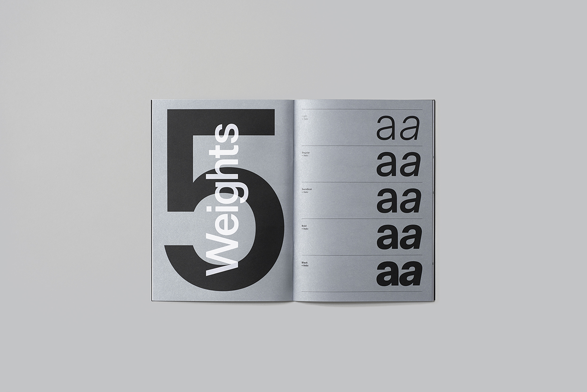
- Does it have multiple weights?
- Condensed, standard, extended or multiple widths?
- What language support does it have? Latin, Greek, Cyrillic, etc.?
And then lastly, you can ask yourself: what will make my typeface uniquely different to others that are already out there?
Answering the above will give you the fundamental building books to start working on your new font/typeface.
Case in Point:
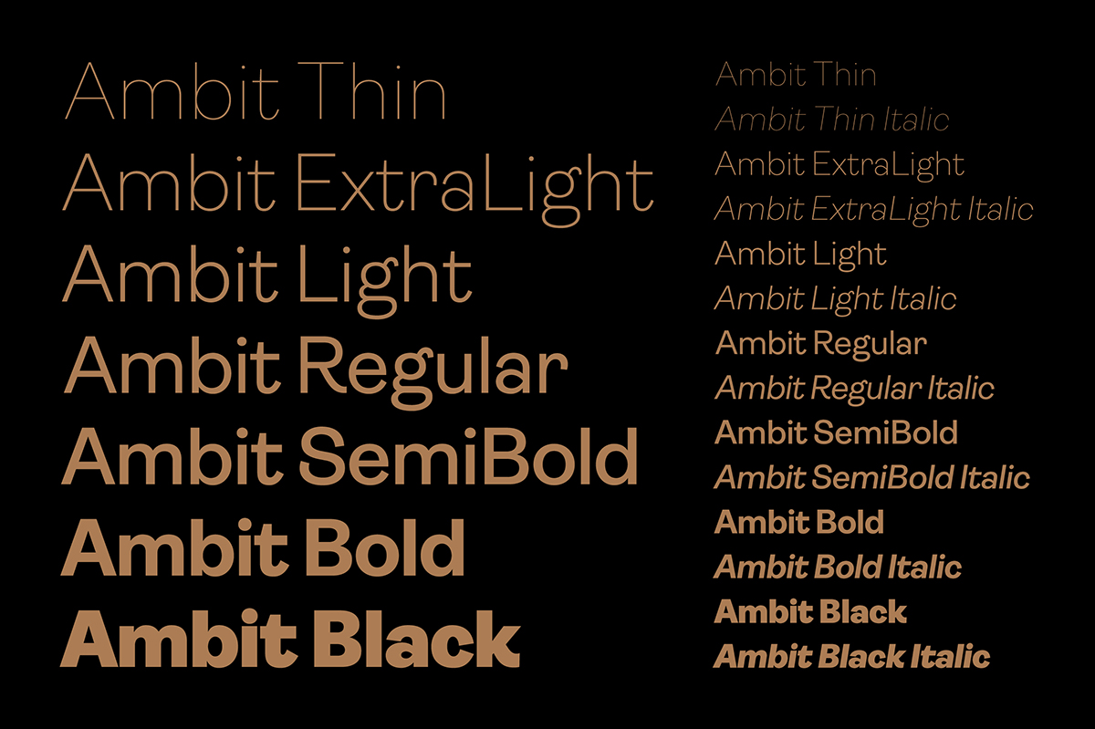
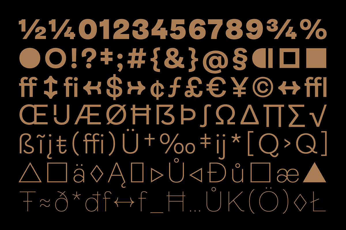
With the typefaces we’ve already released, each one has come from seeing what I believe to be a gap in the market – something needed that is missing. An example of this is with Ambit, an eccentric and unique sans serif font inspired by early grotesques, adapted for the 21st century.
Ambit was the third sans-serif I designed after the release of RM Neue and Aeonik, both of which were fairly workhorse like. Ambit, in contrast, was designed to be quirky and full of character – the mischievous younger brother of Aeonik, if you will.
Through the process I learned that it’s important to try and find the right balance for your typeface; with Ambit we wanted to design a sans that was fun, quirky and memorable. Its most striking details are the curly f and r, as well as the c/C and s/S, which seem to curl in onto themselves, giving this type family a very distinctive look. Also noteworthy are the looped double-storey a and the R and K, which feature curly legs.
3. “Learn the rules like a pro, so you can break them like an artist” – Pablo Picasso.
You can start defining the fundamental style of any typeface with control characters, typically this is the letter n and o in lowercase and the H and O in uppercase.
The n and o are important because they assign the x-height, stroke thickness, and basic proportions of the lowercase. Letters like b/d/g/h/k/l/m/n/p/q/r/u take direct cues from the n and o details, curvatures, potential serifs, and contrast. The capital H and O choices inform the whole group of B/D/E/F/H/J/L/M/N/P/R/T/U. Once I’m happy with these letters I will then move on to draw the more complicated letters such as s/S.
With that said, the usual set of letters I start designing spells out “Hamburgefonstiv”. In this commonly used test word, there are round letters, straight letters, ascenders, descenders, and enough different types of letters to help build the character of the font family.
Sometimes individual letters can look good on their own, but this does not guarantee they will look good when set together in words. I will often change characters on the fly in Glyphs after testing random words. After all, a typeface is a system of symbols that needs to work together in a predictable manner, showing good rhythm and texture within words, sentences, and paragraphs.
Case in Point:
Rules are meant to be broken, right? It would seem starting with the n/o and H/O is fairly standard within the type world, but I don’t always get a good sense for the design starting with those letters first.
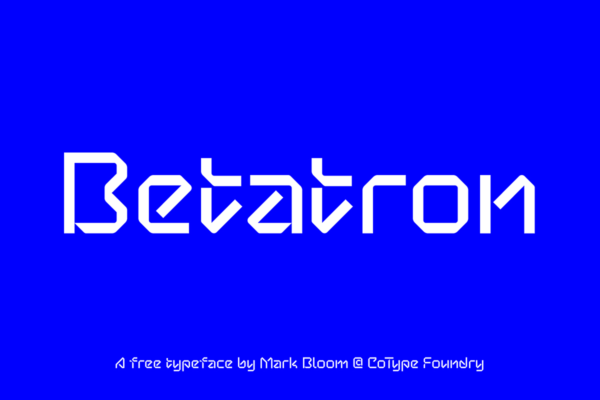
I often like to work on type experiments for fun which I will post to my Instagram. Several months ago I had an idea for an interesting lowercase a which was inspired by sci-fi movies – I guess I approached it more like a logo design than as a typeface design in this case. After I drew the a and was happy with it, I then decided to work on the letters b through to j, which I then posted to my feed.
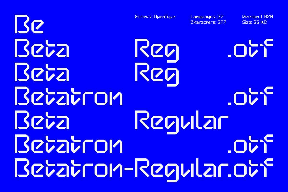
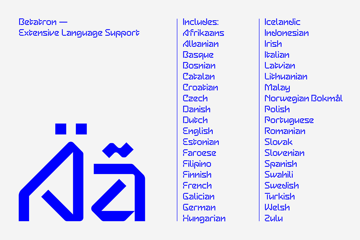
The response was overwhelmingly positive and actually made me decide to continue working on the remaining letters, including uppercase. Since most of the lowercase letters I drew shared similar widths, it actually made it quite easy to plan out the rest of the typeface in the more conventional manor – this being the n/o and H/O. My typeface Betatron was the result of this type experiment, and is now available to download.
4. More is more… sometimes!
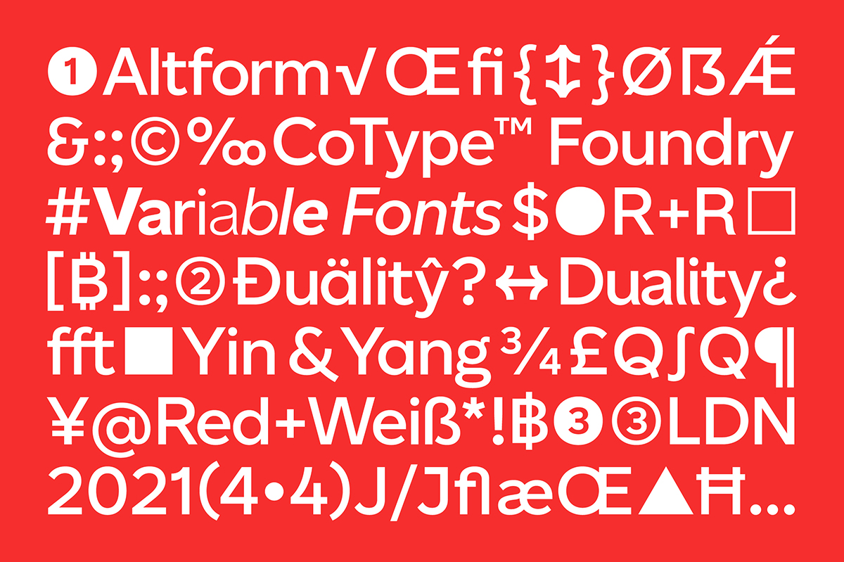
Nearly all of our typefaces feature unique features, ranging from stylistic sets to extended language support. A typeface not only has to look good but should be functional, too.
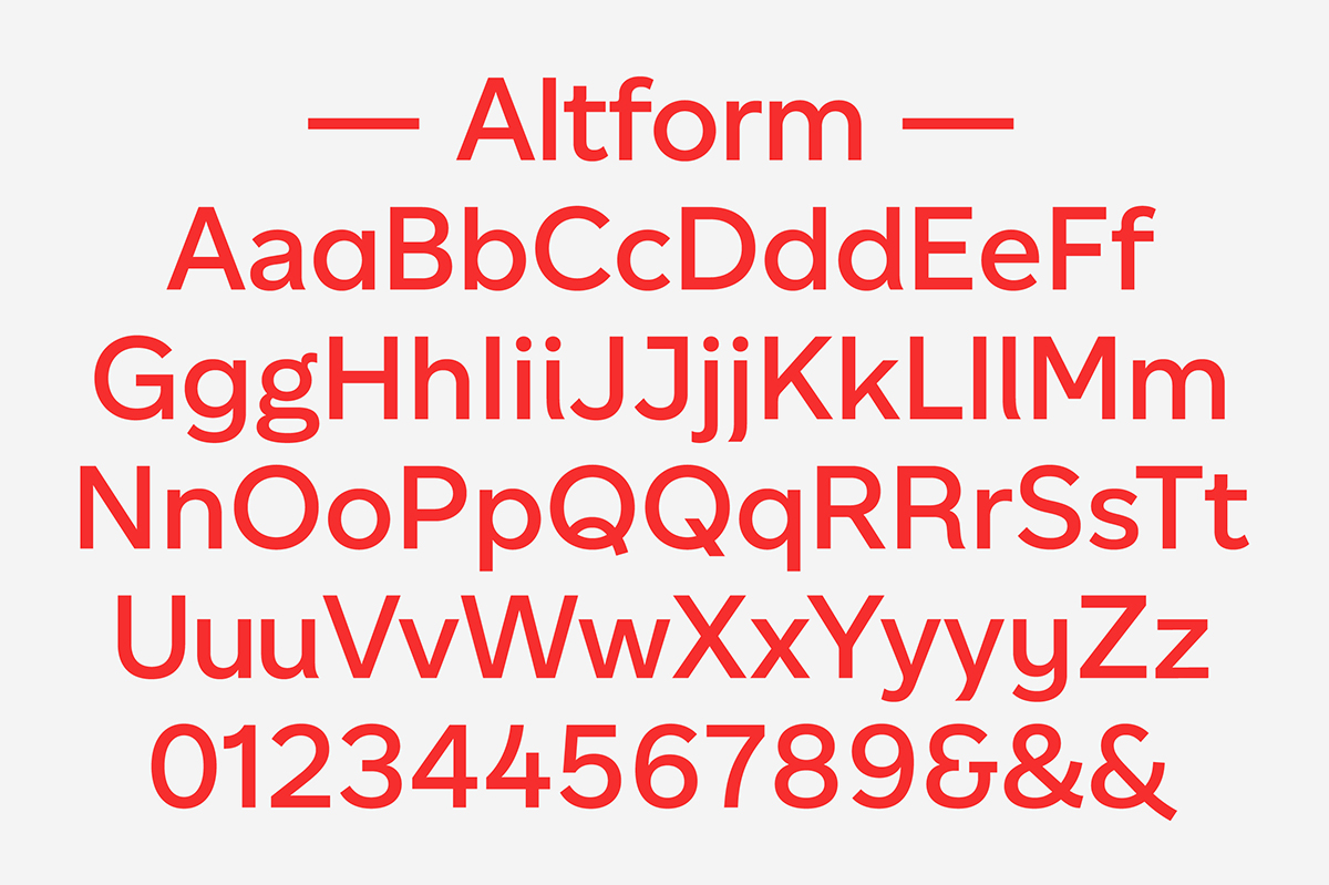
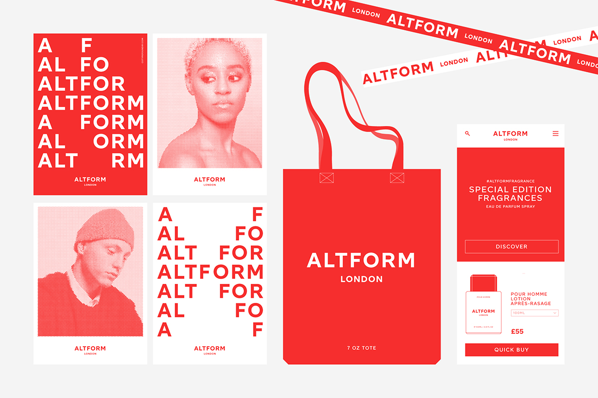
Think about how you want your typeface to be used and who will be using it. Our typeface Altform, for example, is a deceptively simple sans serif with an alternate personality.
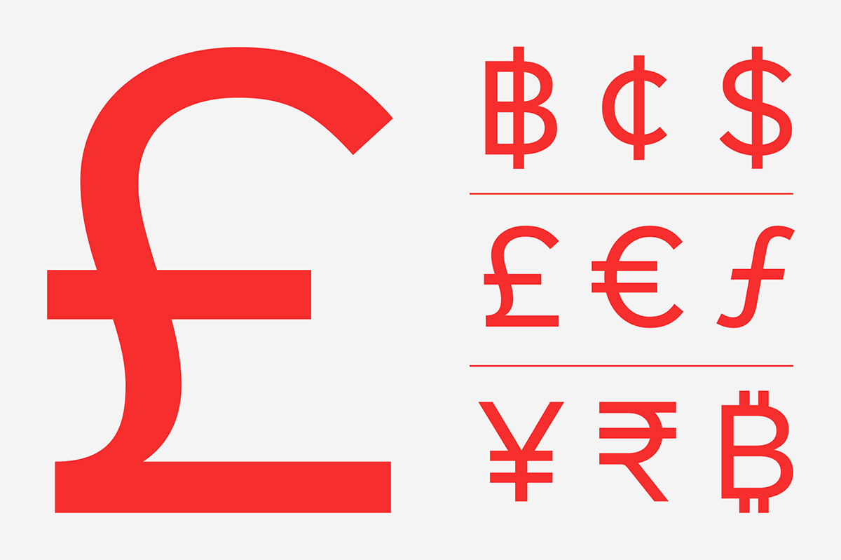
One of Altform‘s stylistic alternates features a “wind-blown” d, i, j, l, u, and y, which feature a slight curvature in the stems and infuse the typeface with a dynamic quality. To complete the kit, Altform comes with a full set of weight-matched arrows, circled numerals, and geometric symbols. It might seem like overkill for some, but coming from a graphic design background, I enjoy having extra choices in my favourite typefaces – that way I can use them over and over again, achieving a tailored look for every project. I want to offer this possibility to my customers as well.
Case in Point:
Often the look of one letter might make or break the project, so we like to include plenty of alternates which allow the designer to customise the look of the typeface. With Aeonik, for example, we included 3 different a’s: a traditional double-storey with tail, a double-storey without a tail and a single-storey a with matching alternate y. I cannot tell you how many times we have been asked to swap out default characters for particular alternates over the years. This lets me know that designers appreciate the variety in the fonts we offer.
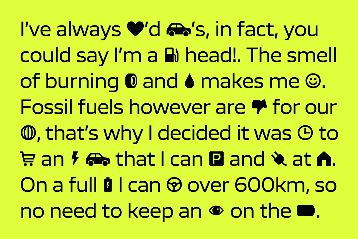
Typefaces can also include fun characters or symbols. Our next typeface release Scandium is a contemporary sans with open shapes and a technical vibe, inspired by the needs of the automotive industry.
The Scandium family includes a large set of icons, from web UI (hamburger menu, checkout cart, user profile) to digital media players (play, pause, stop, shuffle), from electric vehicles (charging icon, battery, warning sign) to navigation systems (directional arrows, location pins). To top it off, we included a fun set of emojis (smiley, heart, and poo) that can inject some fun into any design.
5. Master your marketing.
So you’ve designed the next big thing – great! But how are you going to let the world know about it?
I’m a firm believer in the power of social media and design blog exposure, but building up a strong Instagram following takes time and hard work.

Case in Point:
I post to my Instagram at least twice a week and try to vary my content as much as possible. In addition to this, I take time to launch each new typeface with a bang. This typically includes producing a specimen book and a launch animation.
For the release of Orbikular, for example, I commissioned Matt Willey – editorial designer extraordinaire and Pentagram Partner – to design a newspaper specimen to showcase the typeface. Since the typeface is intended for editorial design use, it made sense to show it in this environment. Preparing content for Instagram takes time, so I try to set aside at least one or two days every month to work solely on producing content. I try to curate my feed so that it’s always interesting and not too repetitive; this will typically include anything from fonts in-use to special features within a typeface.
Lastly, I find using a scheduling app such as later.com really useful, since it allows me to preload content and set which day and time I want to post it. It also features a handy preview feature that allows you to see how the preloaded content will look on your feed.
Thank you, Mark! You can test & buy CoType Foundry‘s fonts on their website now, and discover more about Orbikular on our blog.