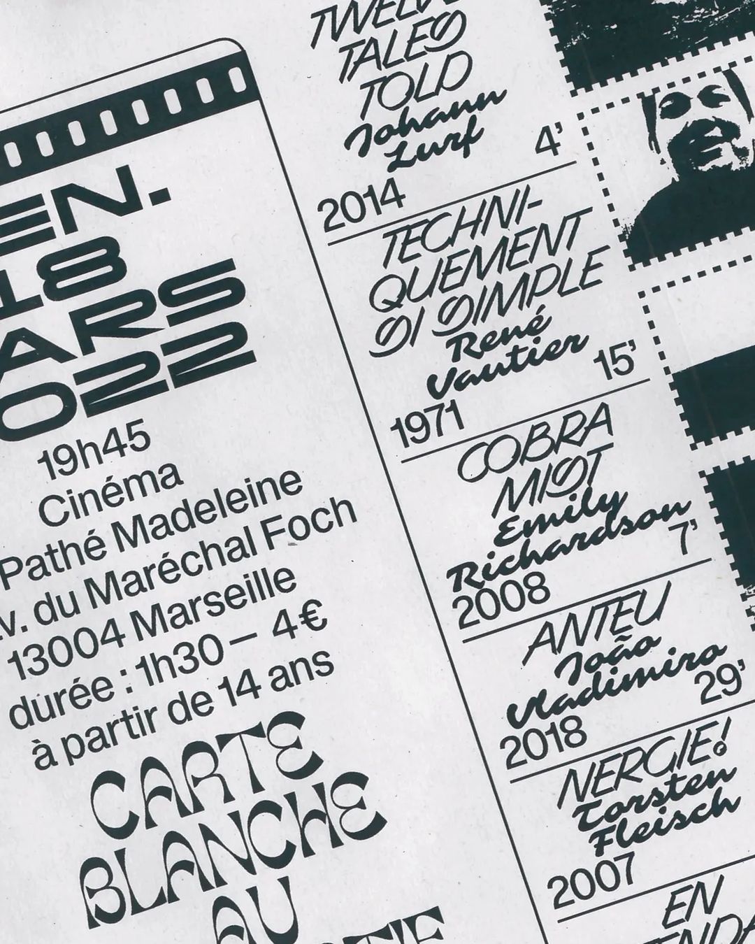
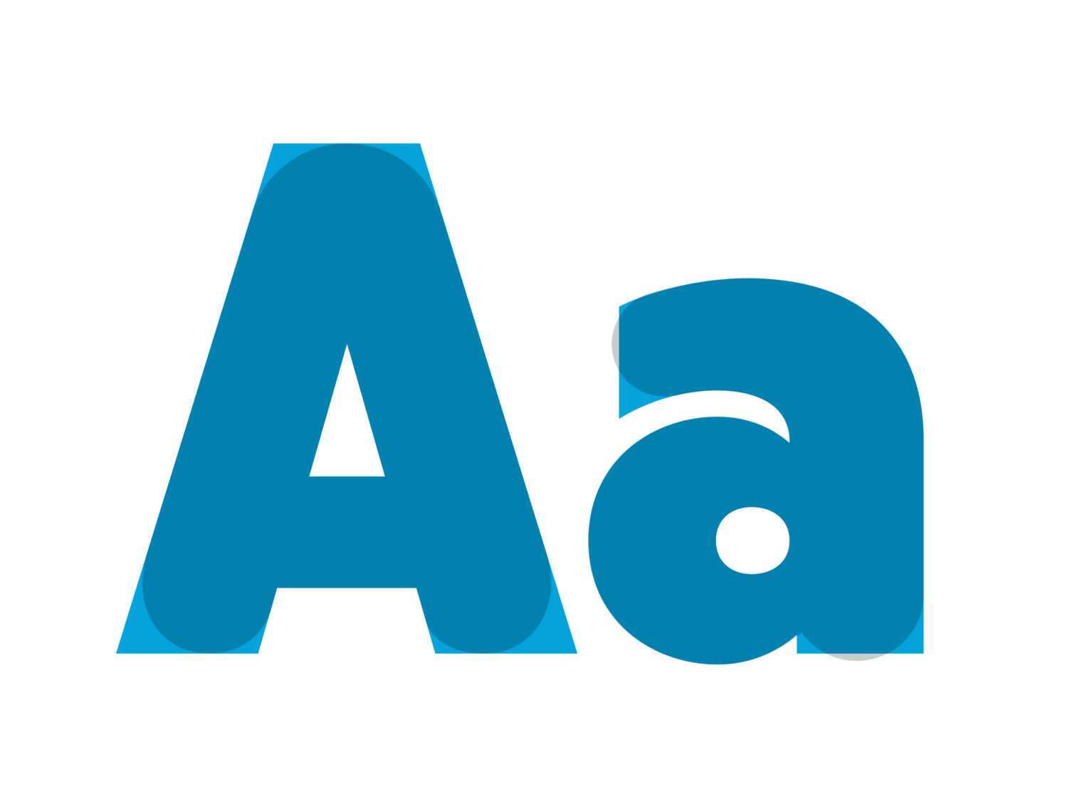
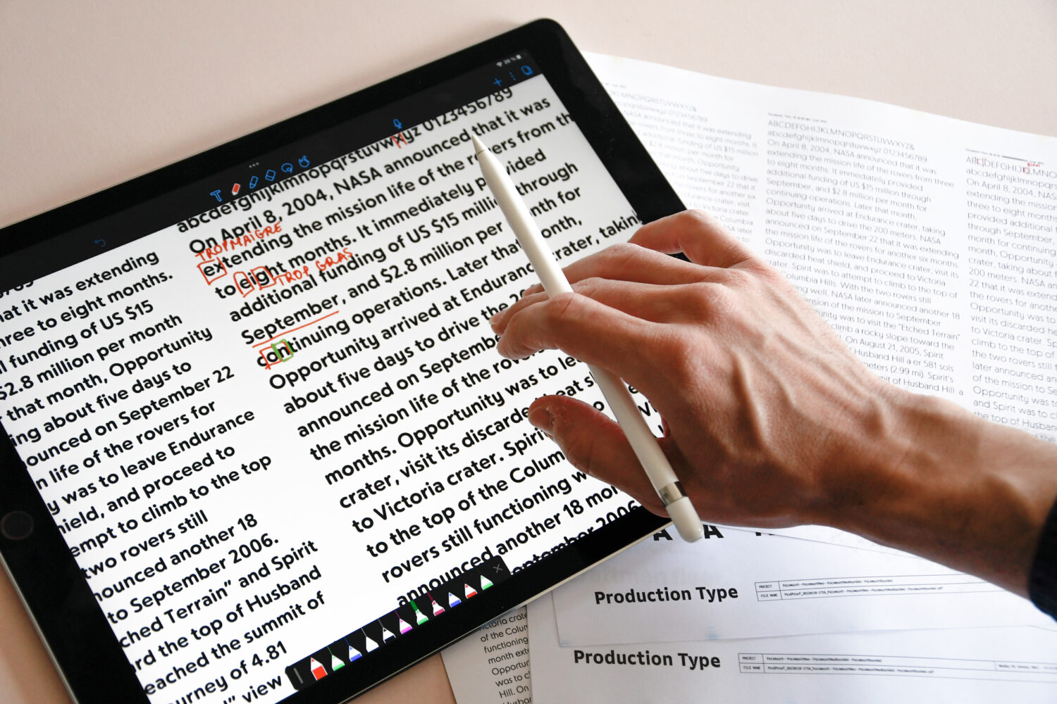
Production Type has an exciting stack of new fonts on the way from the likes of Hélène Marian, Chi Long Trieu and Max Esnée. We spoke to all three to discover what’s in store.
But first, let’s introduce our designers. Hélène Marian lives in Paris, France. Her time is occupied by letters—laying them out, designing and tracing them. PVC Express will be the latest addition to the PVC family, a long-standing collaboration between Hélène and Production Type, with support from Hugues Gentile. Chi Long Trieu is the creative director of Office for Typography, a graphic design studio he co-founded with his brother in 2016. His upcoming font, Paramount, is a development of a 2018 visual identity for a luxury French pastry shop. Max Esnée, the creator of the upcoming font Gamuth, is a French freelance designer who focuses on type design, mixed in with a bit of graphic and web design.
Up first, we have Hélène…
PVC Express | Hélène Marian
T1: Tell us about this typeface. Where did the idea begin and what have been your influences?
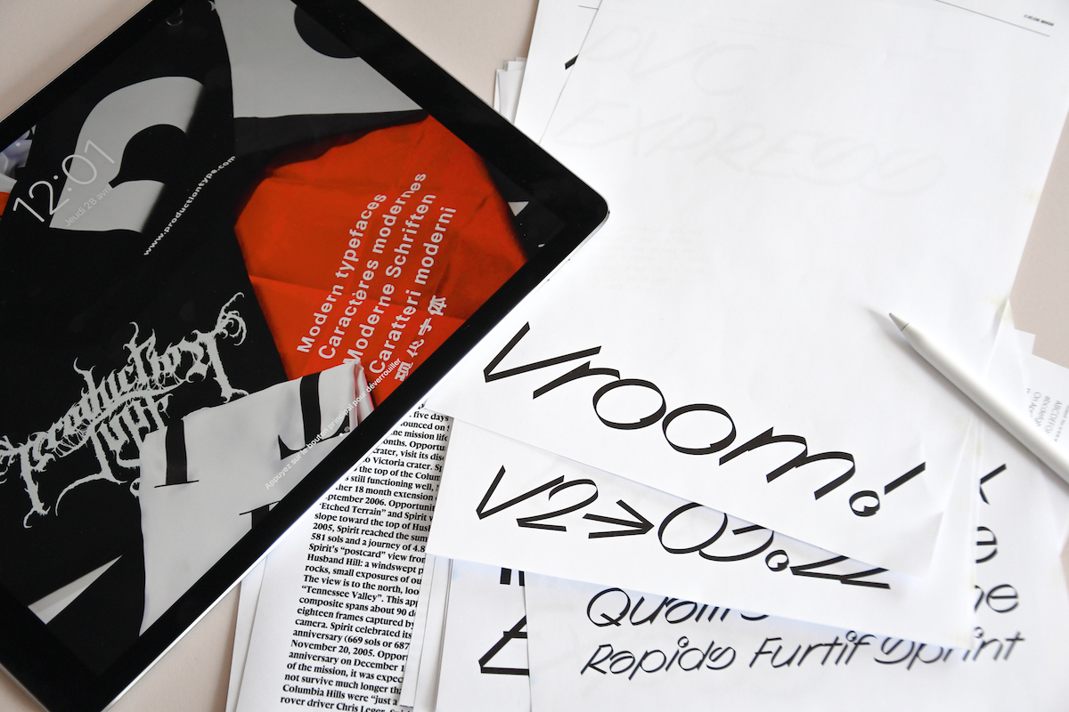
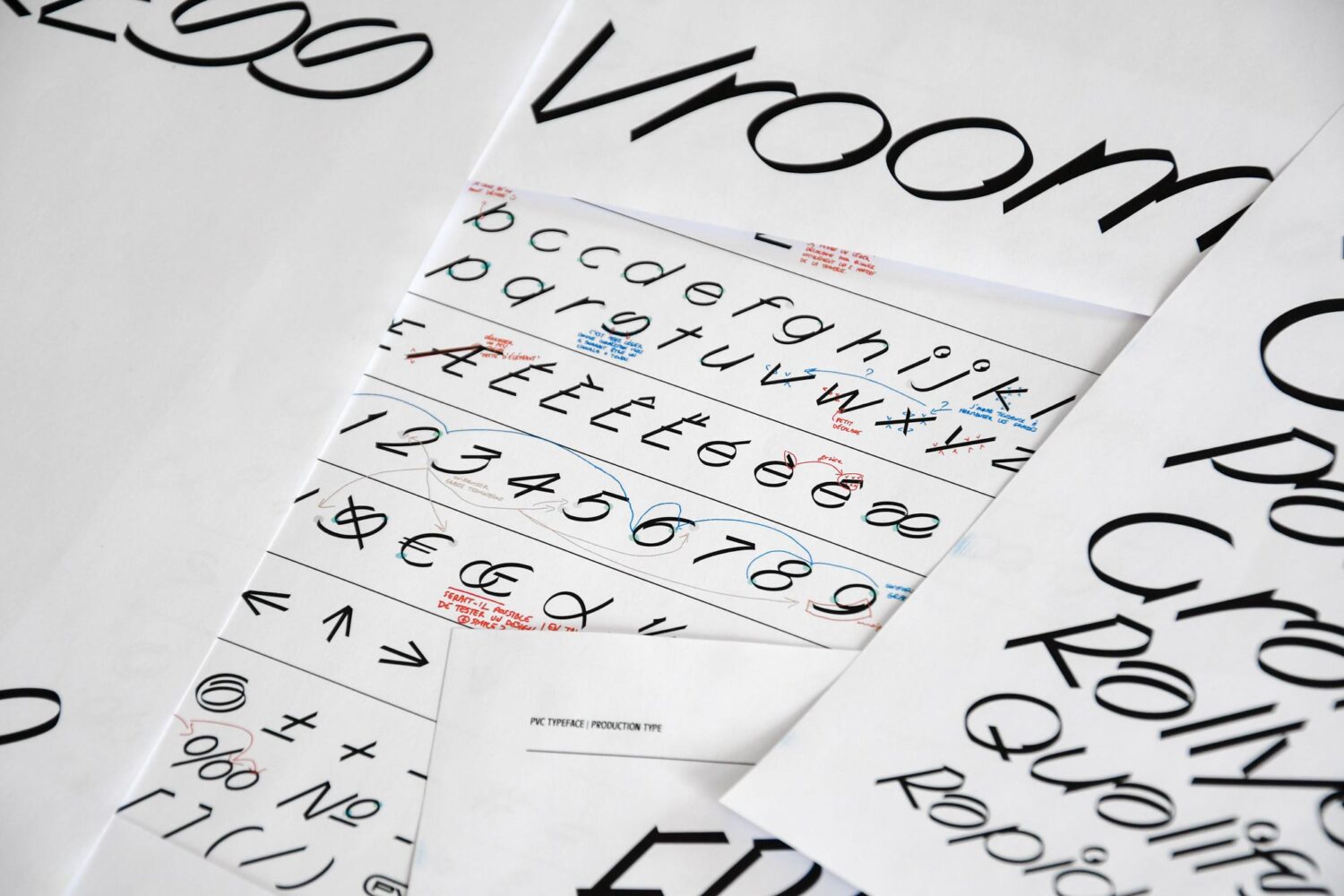
HM: PVC Express is the upcoming additional style to my PVC project (the latest one being PVC Dynasty), published by the foundry Production Type. While “Express” means fast in French, it is also slang for a coffee at the counter. It is drawn from fast and casual handwriting. More precisely, it is a synthesized rereading of my writing with a marker.
T1: Tell us about Express’s aesthetic and features.
HM: The whole style has been designed with the same momentum, rhythm, and circular dynamic that moves from one letter to another at full speed. It results in concrete letter structures, such as the “a”, rolling over itself, or the “s”, and its increased sinuosity to not break the movement. I also have to say Express seems super nice to me, like a cool hotheaded friend that bikes too fast but without ever hurting anyone.
PVC Express has been designed to match the other PVC styles and is set on the same x-height. It may well be the most expressive and hand-like style of the PVC family. I tried to convey the crazy energy of fast handwriting while keeping the actual gesturality to a minimum. Strokes are quite dry while carrying the hand’s dynamic.
T1: When is the PVC Express going to be released and what would be your dream in-use setting?
HM: The typeface is not quite finished, so a release date is in sight but not quite set yet. As for my dream in-use setting, I guess that the greatest one is always the unexpected one. It is an incredible feeling to encounter uses you would never have imagined for your typeface.
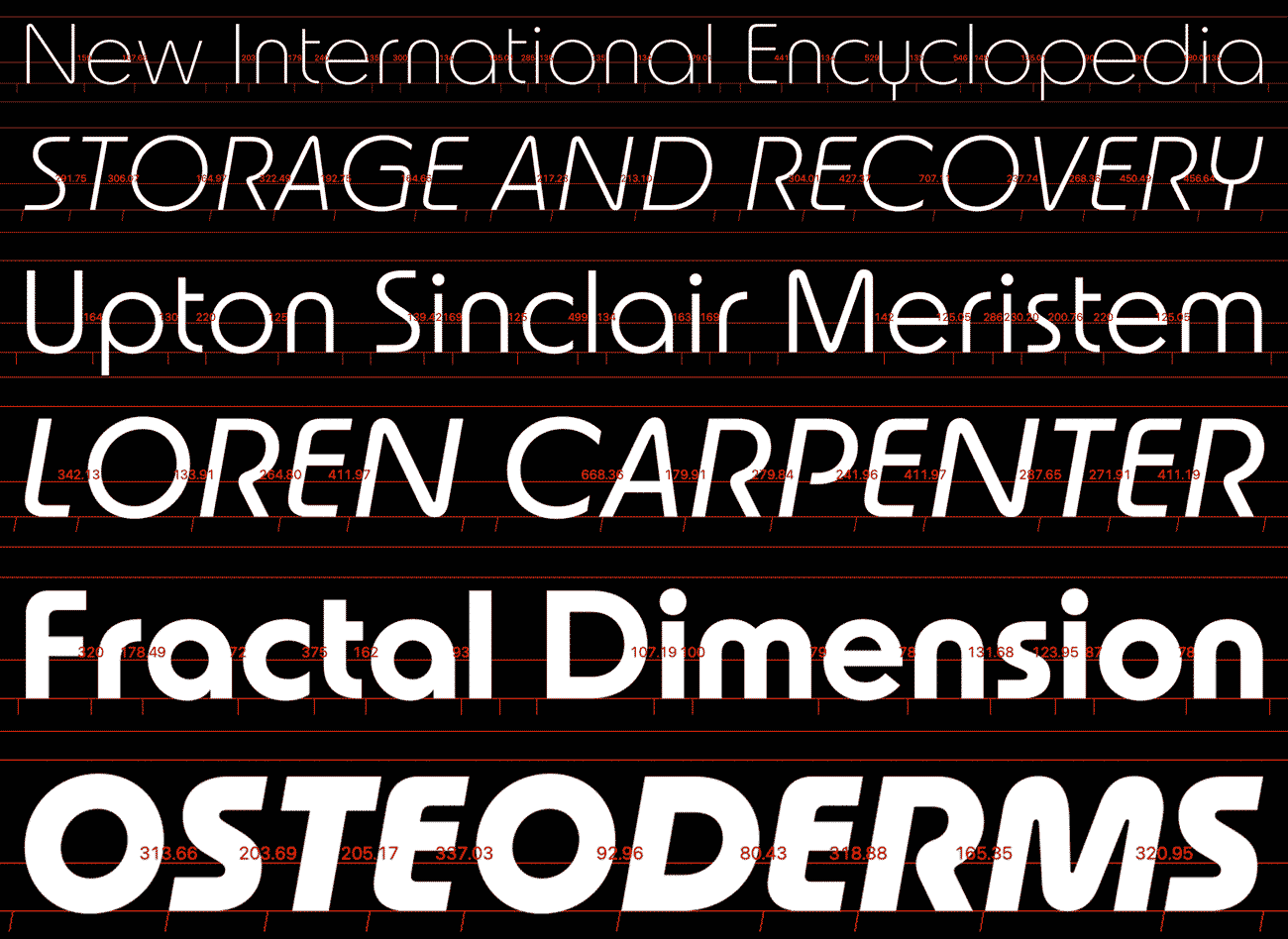
Paramount | Chi Long Trieu
T1: Tell us about this Paramount—what influences led you to this font?
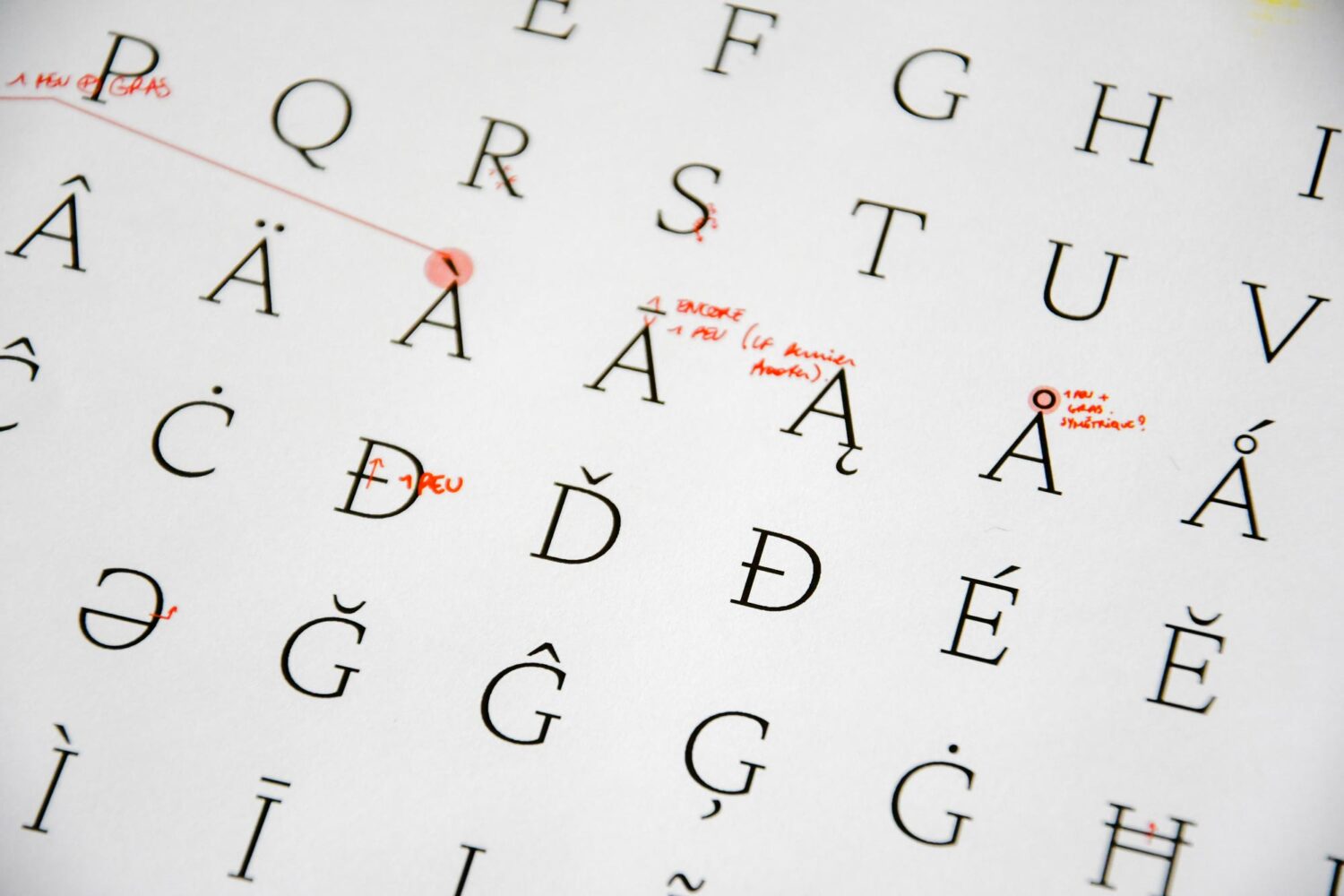
CLT: The first version of the typeface was created in 2018 as part of the visual identity of “Jun,” a French luxurious pastry shop that opened the same year in Shanghai. We wanted to create an elegant yet sophisticated typeface that would reminisce French (culinary) heritage without looking vintage or too posh. I always found the Art Deco period (the 1920s and ’30s) interesting, especially the work of A.M. Cassandre and his use of geometry in letterings: there, the letter O is a perfect circle, one would get a C by cutting this O vertically, the X is made of two crossbars, the E of two squares, etc. Everything is geometry. When two shapes are mixed, the circularity will take over like in the prominent bowls of the letters R, P, or in some variations of the letter S.
Although being hand-drawn, the letters are actually “built.” When put next to each other, their specific construction would give them a unique rhythm. This is what I tried to encapsulate in all versions of Paramount. Creating equally striking lowercases based on the uppercases’ rhythm was interesting, and it definitely helped set the tone for the typeface as a whole. Revisiting Art Deco’s distinctive geometry while keeping a contemporary feel is not an easy task. The most challenging part was probably to find the right balance between too “tasty” and too “boring.” But looking back at the first version of the typeface, it wasn’t too bad.
T1: What gap in the market does Paramount fill?
CLT: Thanks to its versatility, Paramount is a fantastic tool for any graphic designer looking for a typeface that can do the work. Like any other great geometric typeface, Paramount will look great in big, tightly spaced, or loosely tracked. For the more reckless, setting longer body copy will be equally exciting than rewarding. Paramount can be a good fit for any brand that wants to look more approachable while maintaining a certain grace. Industries like Healthcare Tech, Shared mobility, EdTech, Delivery Services, Food Services or Arts, Entertainment, and Recreation (to name a few) will find a perfect companion in Paramount.
T1: Can you describe Paramount as a whole? How would you describe its personality and style?
CLT: Paramount is composed of 4 families: Paramount, Paramount Rounded, Paramount Neo, and Paramount Neo Rounded. Each family has six weights with matching italics for a total of 48 styles. It is an ambitious and extensive exploration of the geometric genre as a whole project. Although the four families have different names, they share exact measurements and weights, so they can be used individually as well as mixed and matched together. The various stylistic sets add a little bit of spice to the already exciting typographic playground. Even if the rounded versions came later in the process, circular endings do not only diversify the whole project but are also honouring the typeface’s very geometric nature. As of the Neo style, type connoisseurs will get the reference to Peignot’s rounded angles or Herbert Bayer’s constructivist letterings, while others will think of it as a tribute to Sci-Fi movie titles from the 70s-80s. It is actually all of that.
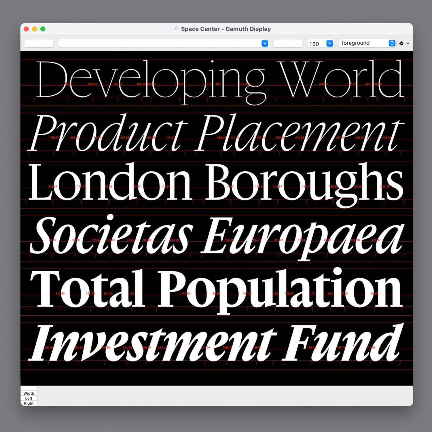
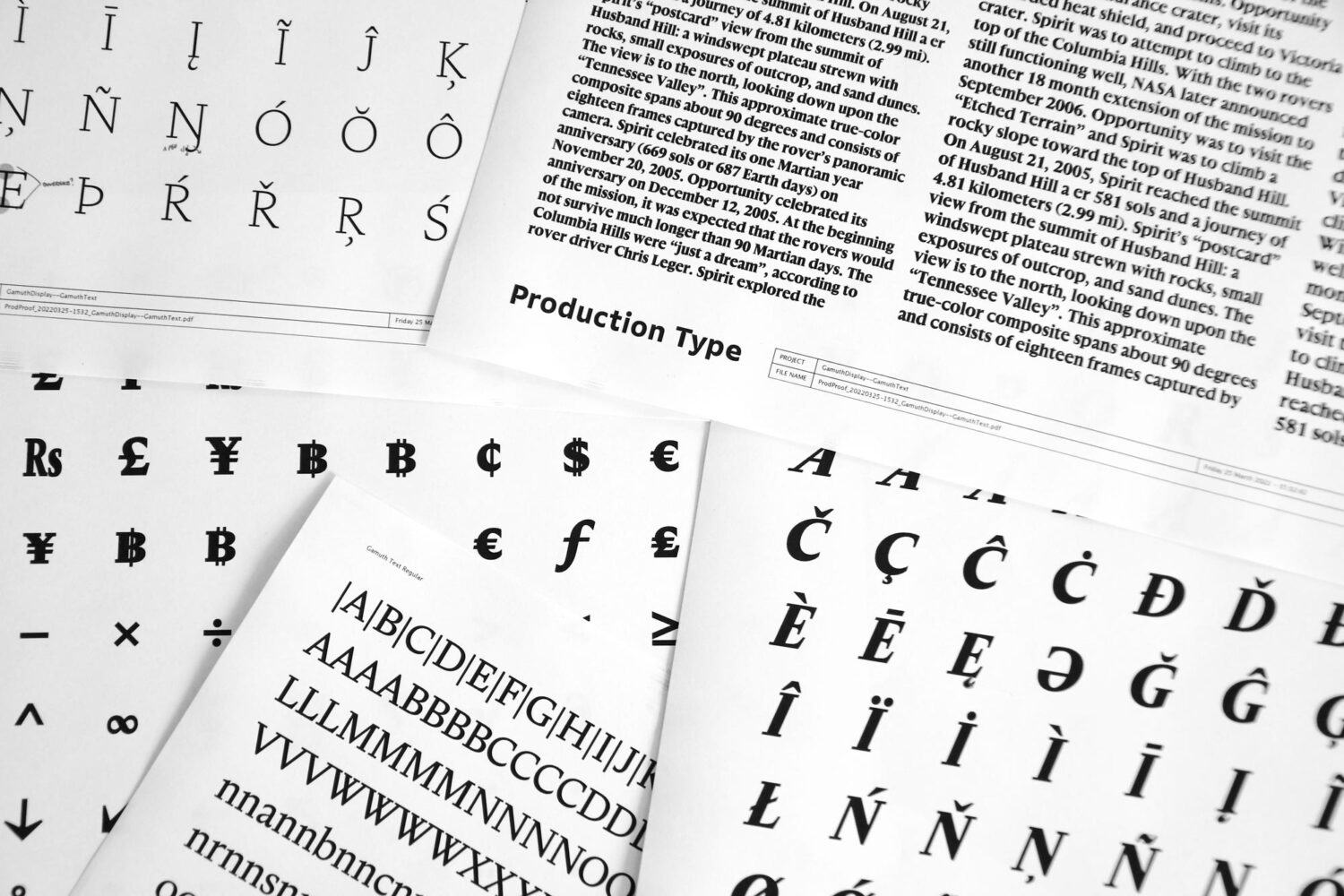
Gamuth | Max Esnée
T1: Where did the idea for Gamuth begin and what have been your influences?
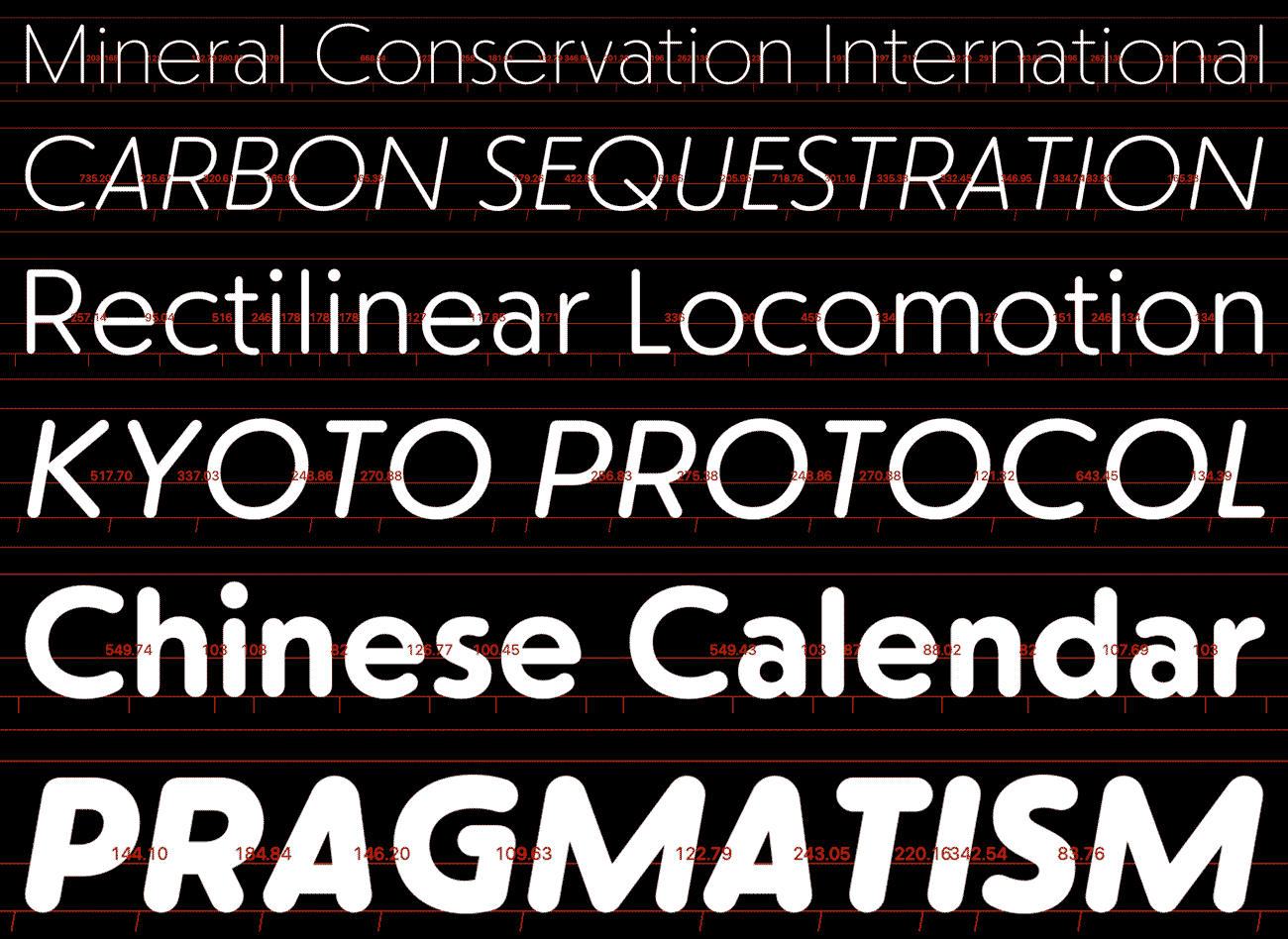
ME: Gamuth is a rather large type family, initially conceived as a type system for online newspapers. It is split into three related but independent styles, each made for a specific function: text, headlines, and user interface. It started as my diploma project at EsadType Amiens, and included support for the Latin and Hebrew scripts.
I had done a lot of web design and development prior to this work. Consequently, I was interested in exploring typography for the web, but that wasn’t specific enough as a starting point. Online newspapers are a vast and rich subject to survey, where type plays a huge role. In newspapers, one finds lengthy running texts, complex hierarchies of headlines, sections, categories, and secondary information like captions, navigation helpers, etc. I tried to look at many different newspaper websites and understand how they were using typography and how the constraints differ from print, especially in the use of space. This groundwork informed the structure of the type family, and essential early design choices such as the typeface’s vertical proportions.
T1: What gap or need in the market are you looking to fill with this typeface?
ME: Having initially focused on the complex needs of newspapers, I tried to create a practical and flexible system. Combined with an extensive range of weights, the family is suitable for numerous applications. I also wanted to show that versatility or practicality did not imply a bland design. Resorting to specialized sub-families (not linked by interpolation) allowed me to make more substantial stylistic choices for each style. The challenge was putting a lot of variety and contrast in the family while still making it work.
T1: What defines Gamuth’s look?
ME: The family comprises three distinct subfamilies: Text, Display, and Sans, each with weights ranging from ExtraLight to Black, with matching italics. Text and Display are serif designs, classified as transitional or baroque style. I wanted to take advantage of the increasing quality and resolutions of screens to replicate the rich and lively texture of the 17th- and 18th-century typefaces, looking specifically at punch cutters like Jean Jannon or Joan Michaël Fleischman. While these references edified the overall feel of the family, I avoided direct borrowing of historical details and instead played with sharper outlines and geometric shapes.
Gamuth Display exacerbates those stylistic choices. It has higher contrast than Gamuth Text and much more compact proportions, with a very big x-height and short descenders. It is made to give a solid graphical impact and allows for tight settings of headlines that are often seen on newspaper homepages.
Gamuth Sans is very different in style. It is a humanist sans-serif design with oblique terminals, much inspired by calligraphy and brush lettering. Gamuth Sans is designed to be used in user interfaces (such as menu items and buttons) and in information design: charts, tables, etc. It is optimized to be legible and economical in small sizes. Gamuth Sans is a duplexed family, where every weight occupies the same width: a convenient feature for user interface and information design. One can toggle the importance of an element in a navigation menu or a table without breaking the layout by reflowing the text.
If you want to discover PVC Express, Paramount and Gamuth as soon as they drop, keep an eye out on Production Type. Thank you to our interviewees, Hélène, Chi-Long and Max, and to the team at Production Type.