In charming and humourous self-deprecation, Mat Voyce (@matvoyce) introduces himself as a ‘non-award winning Graphic and Motion Designer.’ However, there is no doubt that his stunning design portfolio speaks for itself. It is an accomplished, energetic and playful body of work; injected with an added layer of motion and an evidently deep understanding of space and composition. Making work for the likes of Disney+, GIPHY and Honda, Mat’s recent typographic works have gained him some very well-deserved hype. So, we decided to have a chat to discuss his latest projects.
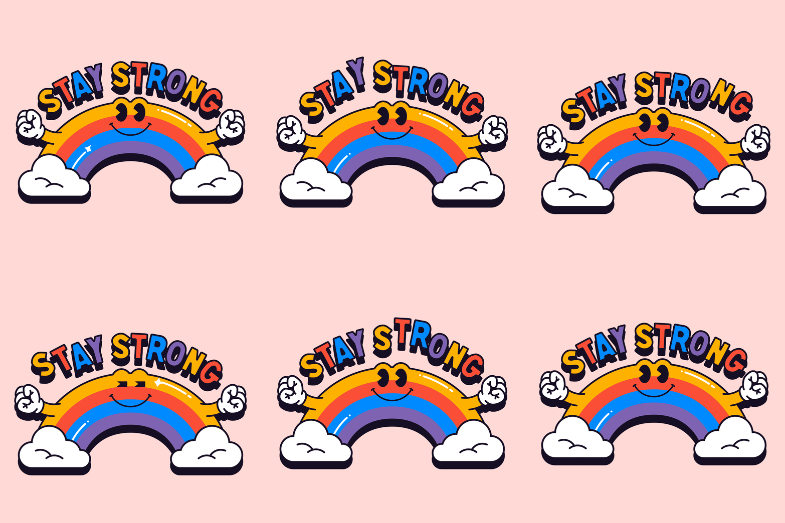
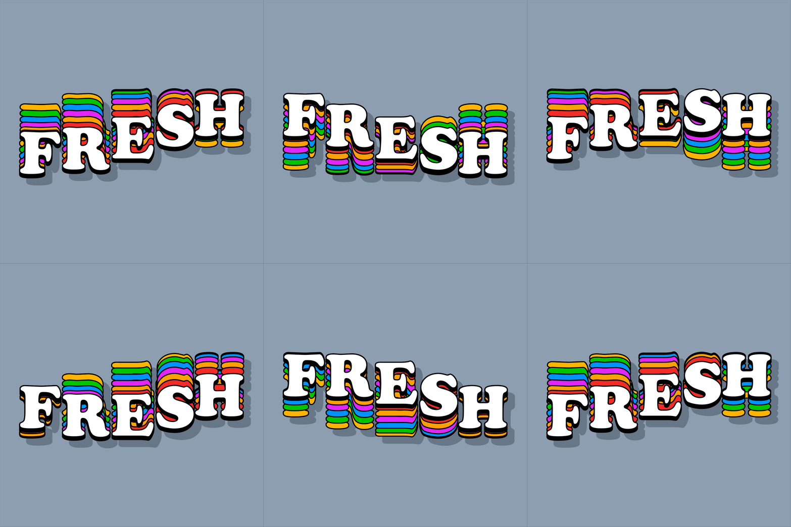
Based in the North of England, Mat lives and works in Central Leeds and likes his design work to interlace through an amalgamation of mediums; combining illustration, typography and short, looping animations. ‘By day,’ he explains, ‘I work at Analogue (@madebyanalogue) with a team of talented designers and by night, I experiment with typography – tackling stretching type and animated stickers.’ It’s these personal explorations of type which have led Mat into his most recent type-based projects for such an impressive bunch of clients.
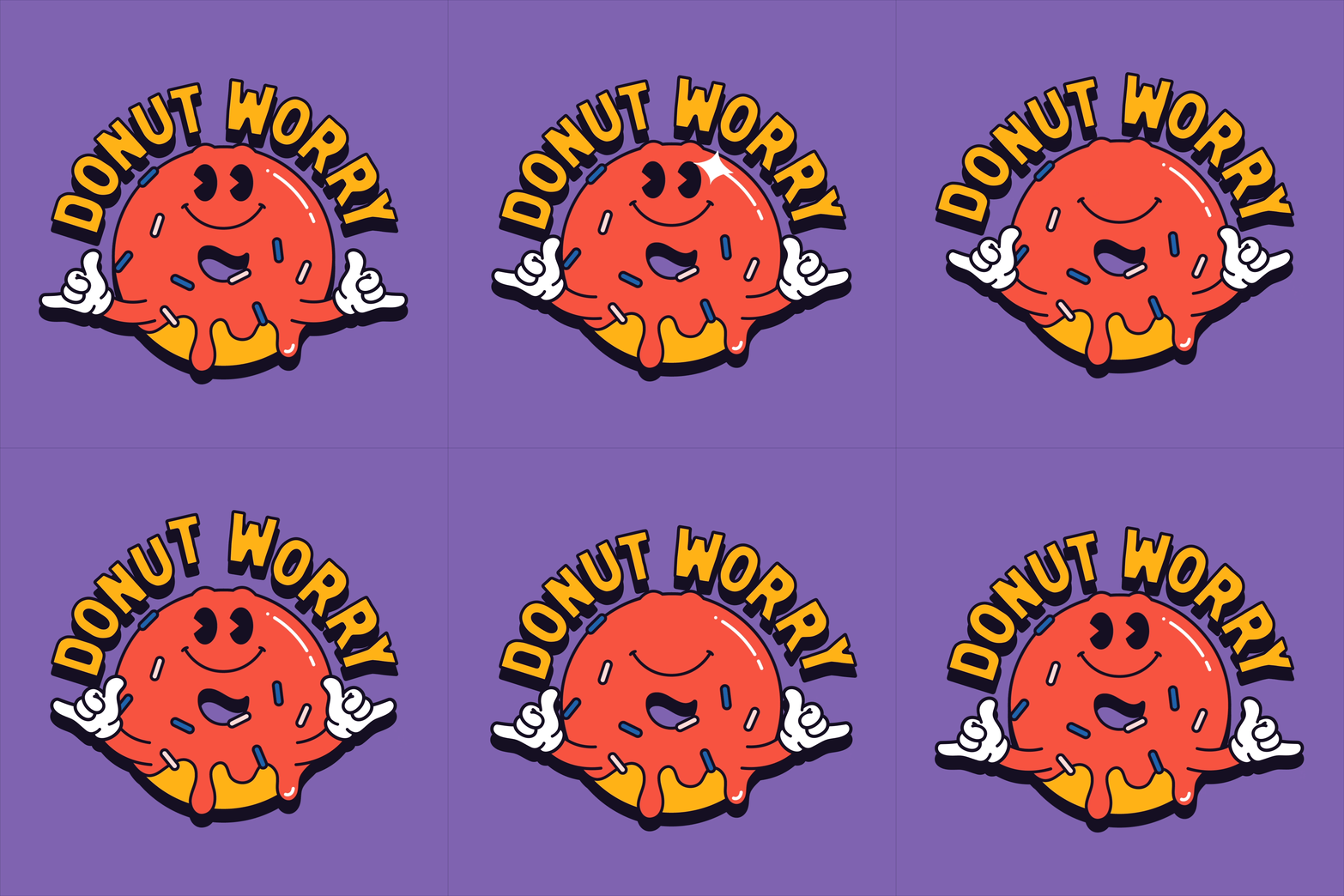

‘I have a strong passion and drive for creating type that is full of character – a joy to see and interact with,’ Mat explains, ‘… but sometimes designs can become a bit static in feeling. I like to give font and type designs a little bit of character. I find it really helps to bring it off screen or page and immerse the viewer.’ In our opinion, it’s easy to see the way this approach becomes embodied in Mat’s designs. His animated works for Disney+ vibrate with bright, excitable energy; complimented by buoyant colour palettes.
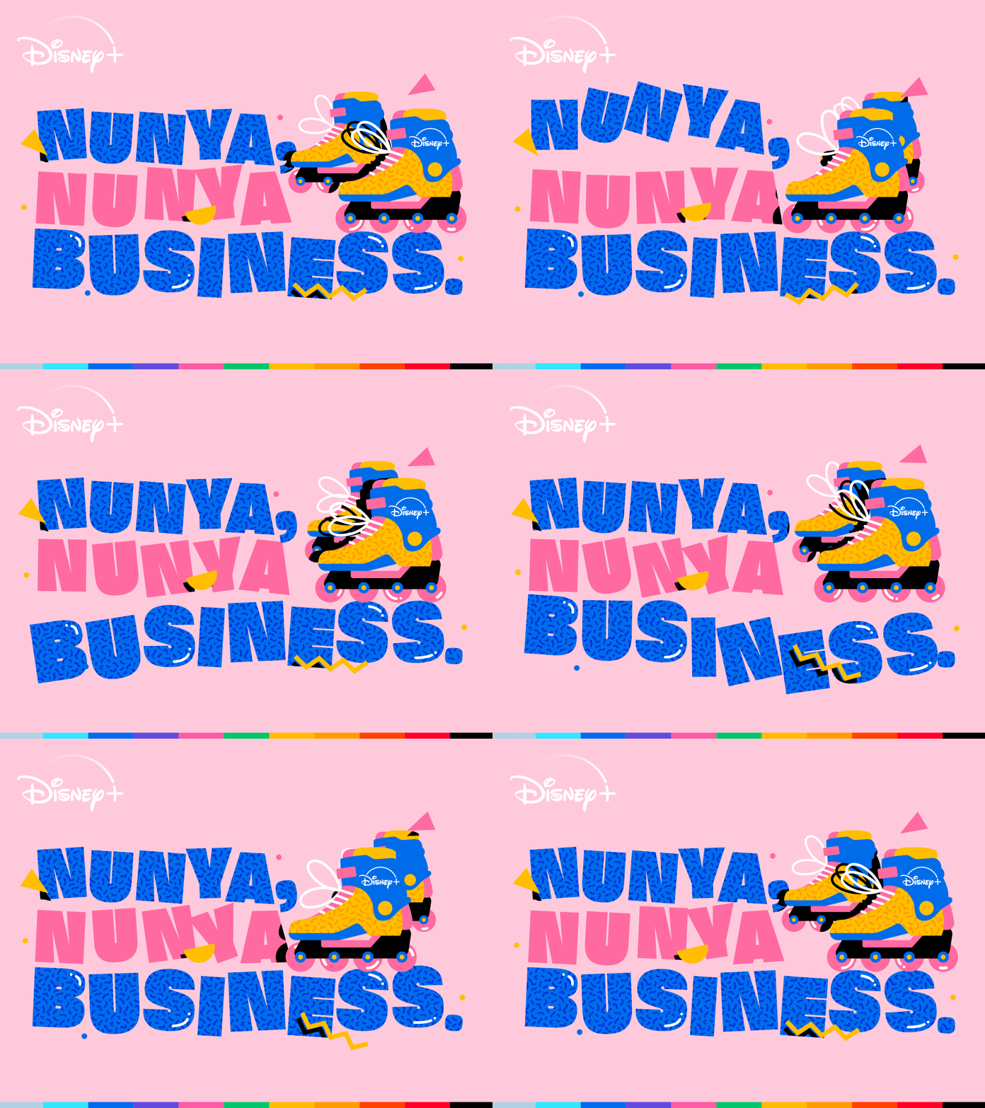
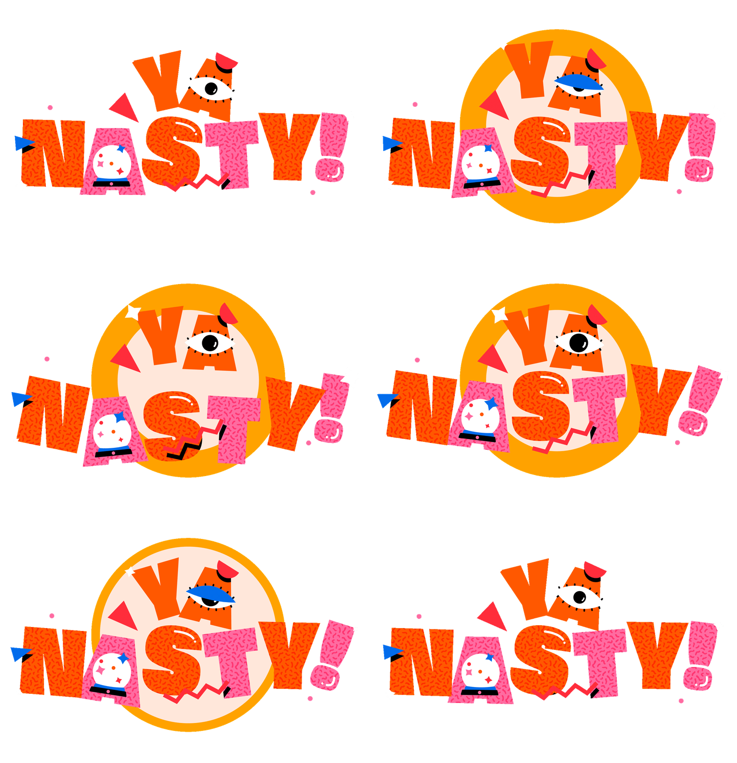
The brief for Disney+ was to create, illustrate and animate 20 character-filled stickers to be released as part of their Throwbacks campaign. Each sticker, to be based on a selection of their classic shows such as Darkwing, X-Men and Doug, was commissioned to be filled with 90’s nostalgia and the playful, shape-based patterns of the cartoony presence of 90’s television. ‘Using my take on character illustration and applying my style of typography animation,’ Mat recalls, ‘I came up with a character filled sticker for all of the classic properties… each celebrated the show or film it was based on in visually beautiful way.’
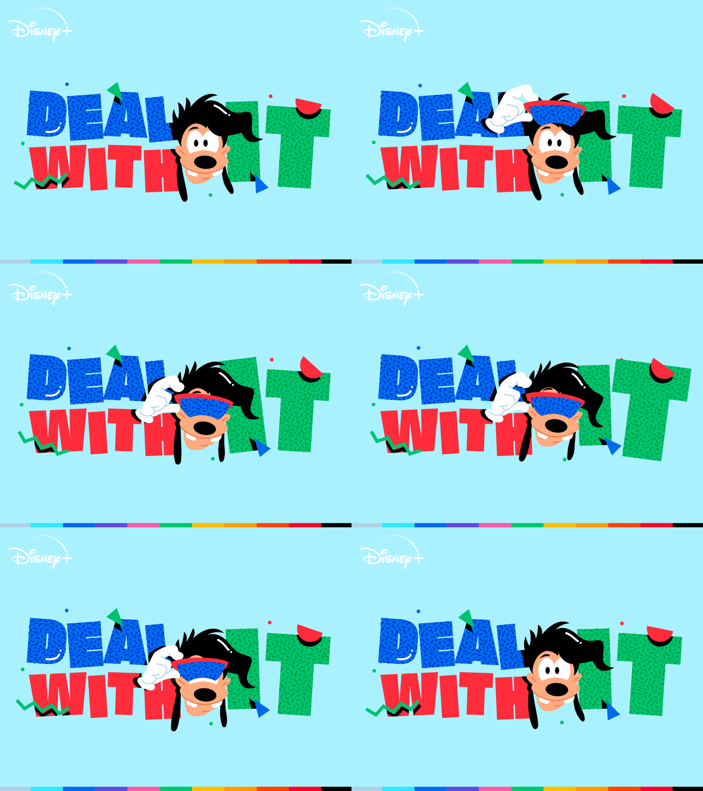
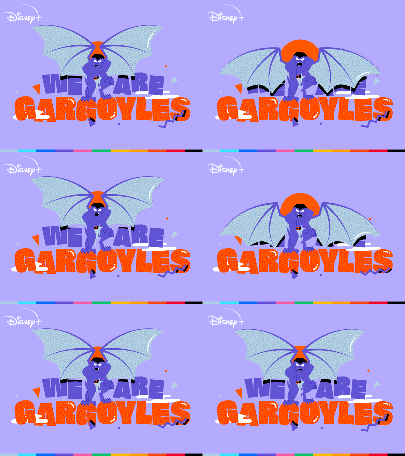
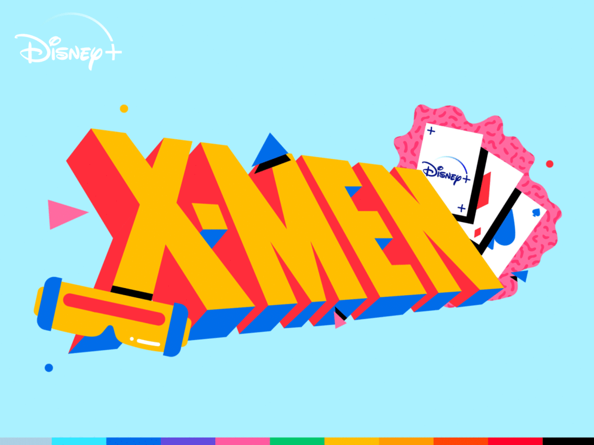
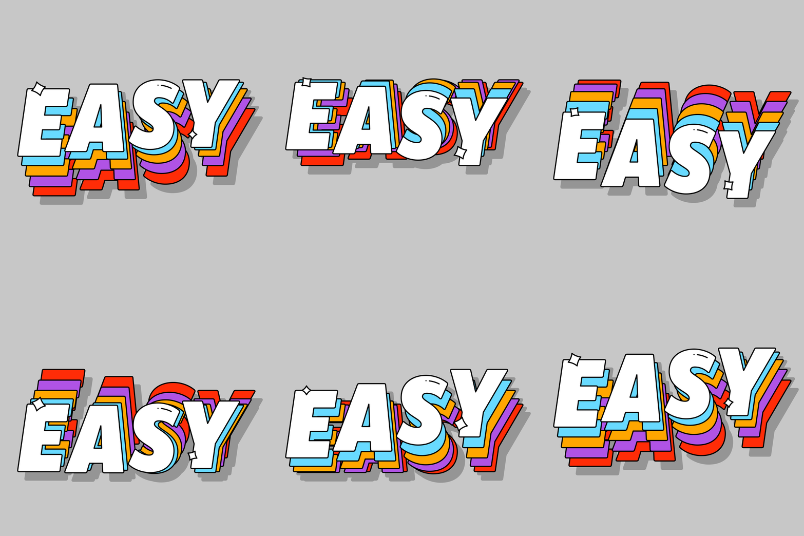
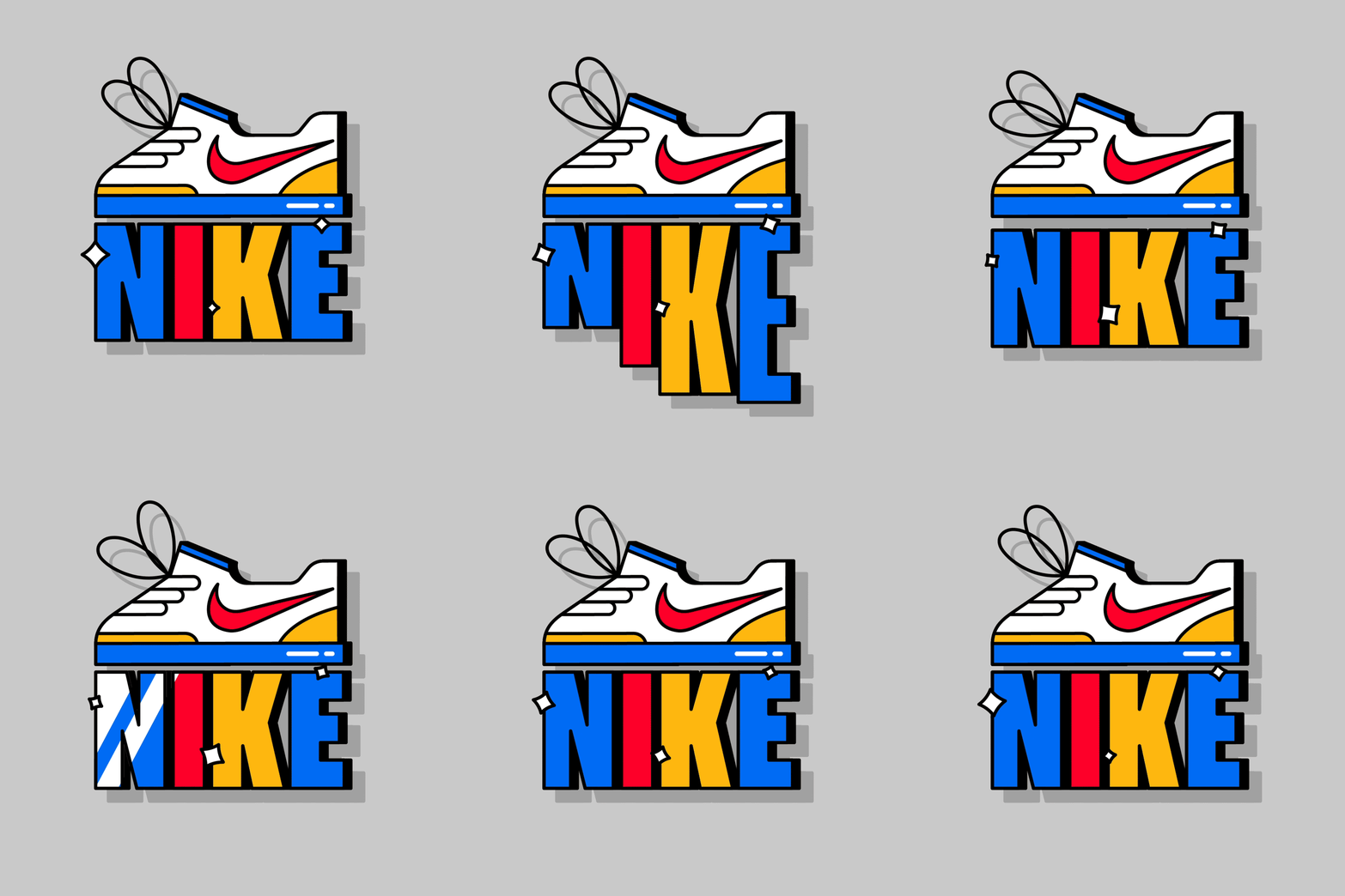
The typography features heavy – sometimes three-dimensional – and always powerfully bold designs in a simple Sans Display; reminiscent of the 90’s grainy, brightly coloured, and deliberately semi-naive aesthetic. You can view the full set by searching ‘Disney Plus Throwbacks’ on Twitter, Instagram and Snapchat. However, we especially love Mat’s recent personal explorations which play with stretching kinetic type. This relatively recent endeavour, Mat tells us, is entitled Must Reads (WIP) and has seen him combining his love for graphic design and typography books with animated type.
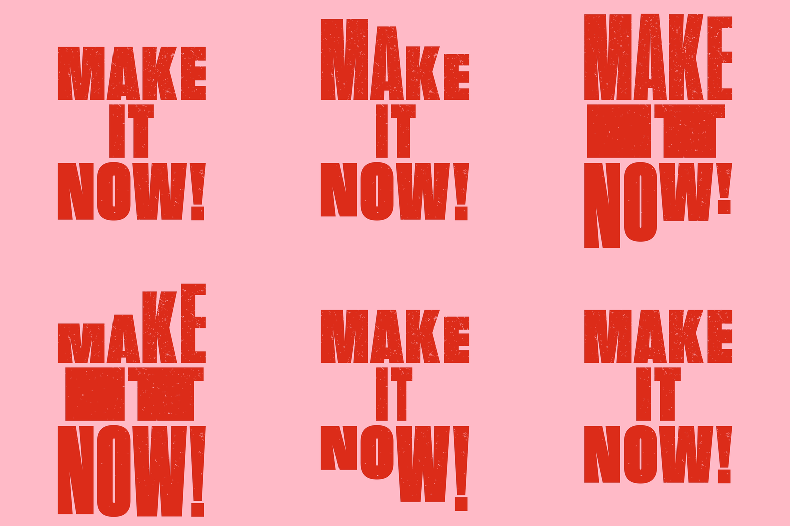
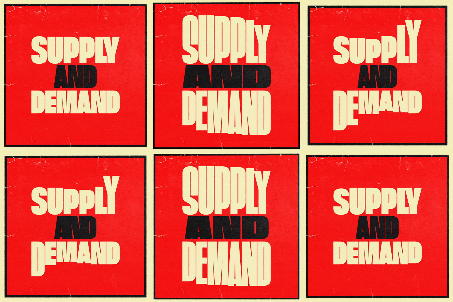
‘Taking some of my favourite books from my desk,’ he elaborates, ‘I have started to illustrate and animate the book titles dedicated to my favourite and most influential designers – and with the likes of Anthony Burrill, Kate Moross, Jon Contino and Shepard Fairy on the bookshelf already, there are plenty more to tackle in the coming weeks.’ These designs are filled with so much presence, the type feels almost cinematic in its own right – successfully highlighting the fascinating potential of type to create distinct visual impacts, and imbuing each playful piece with palpable tension, bounce and life.
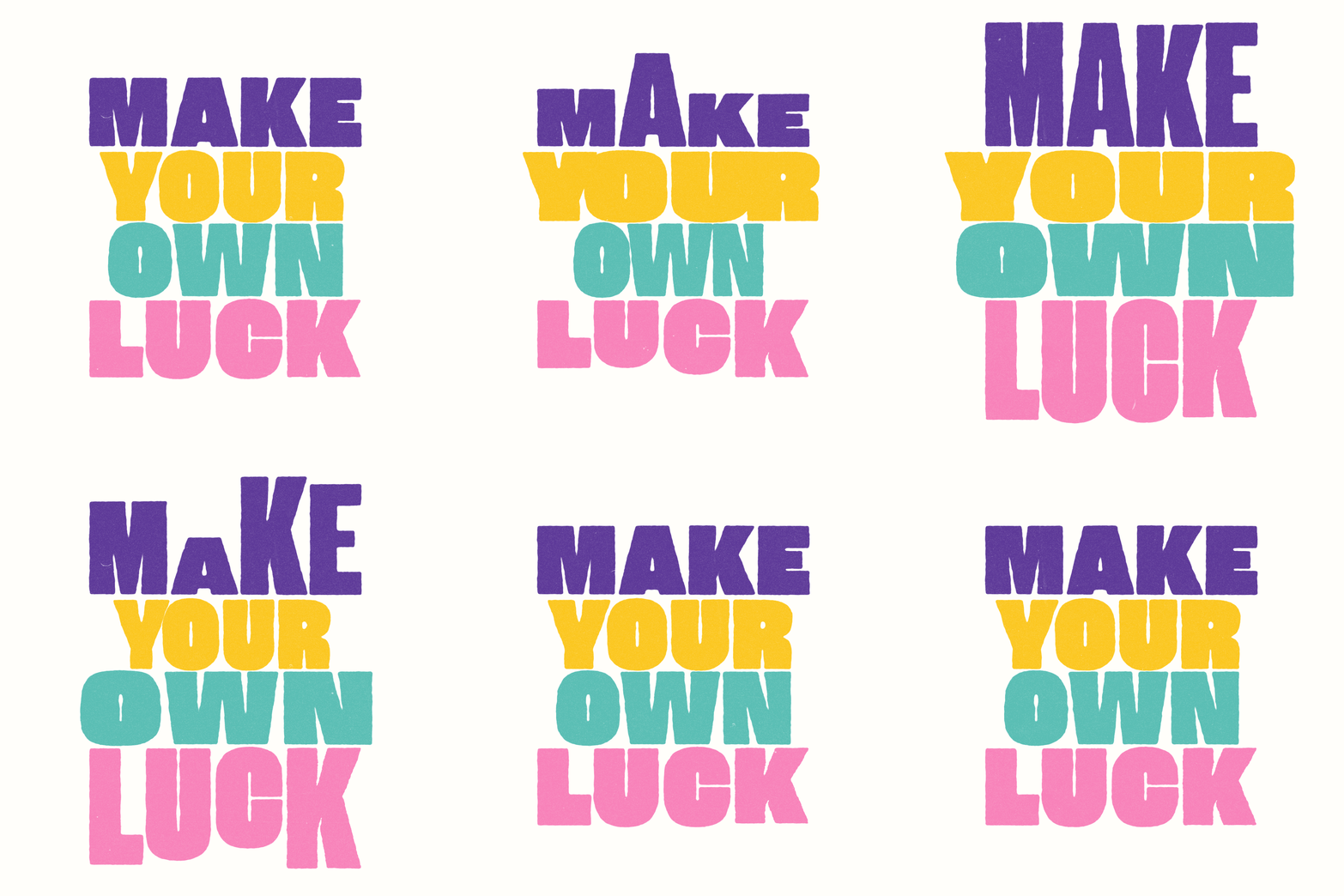
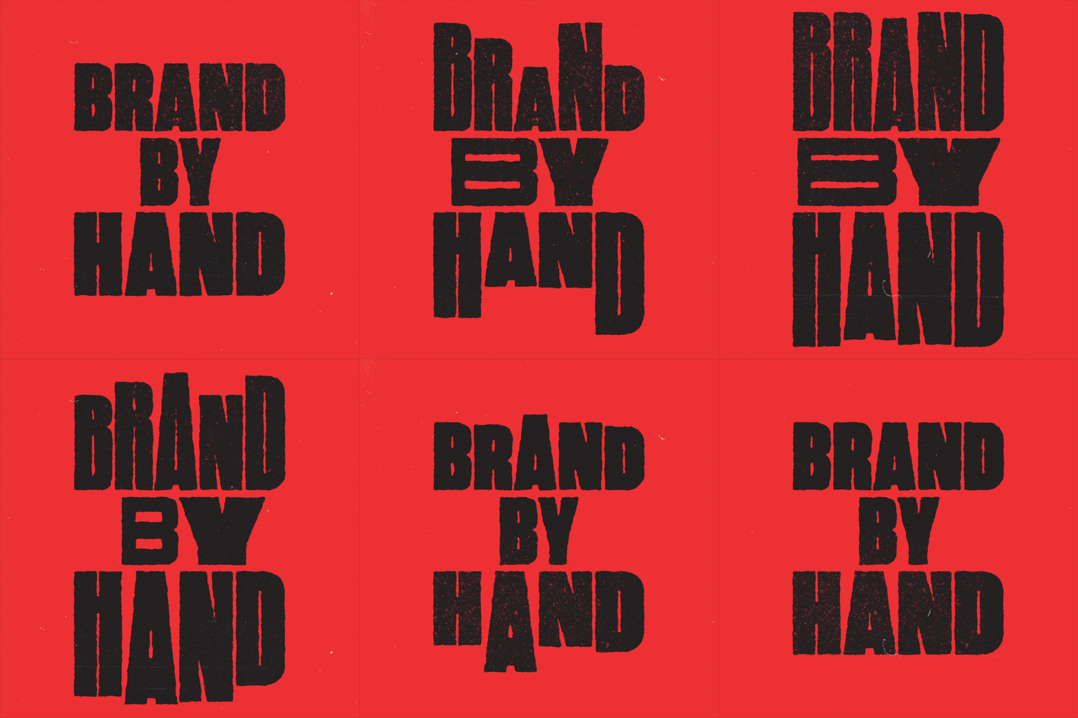
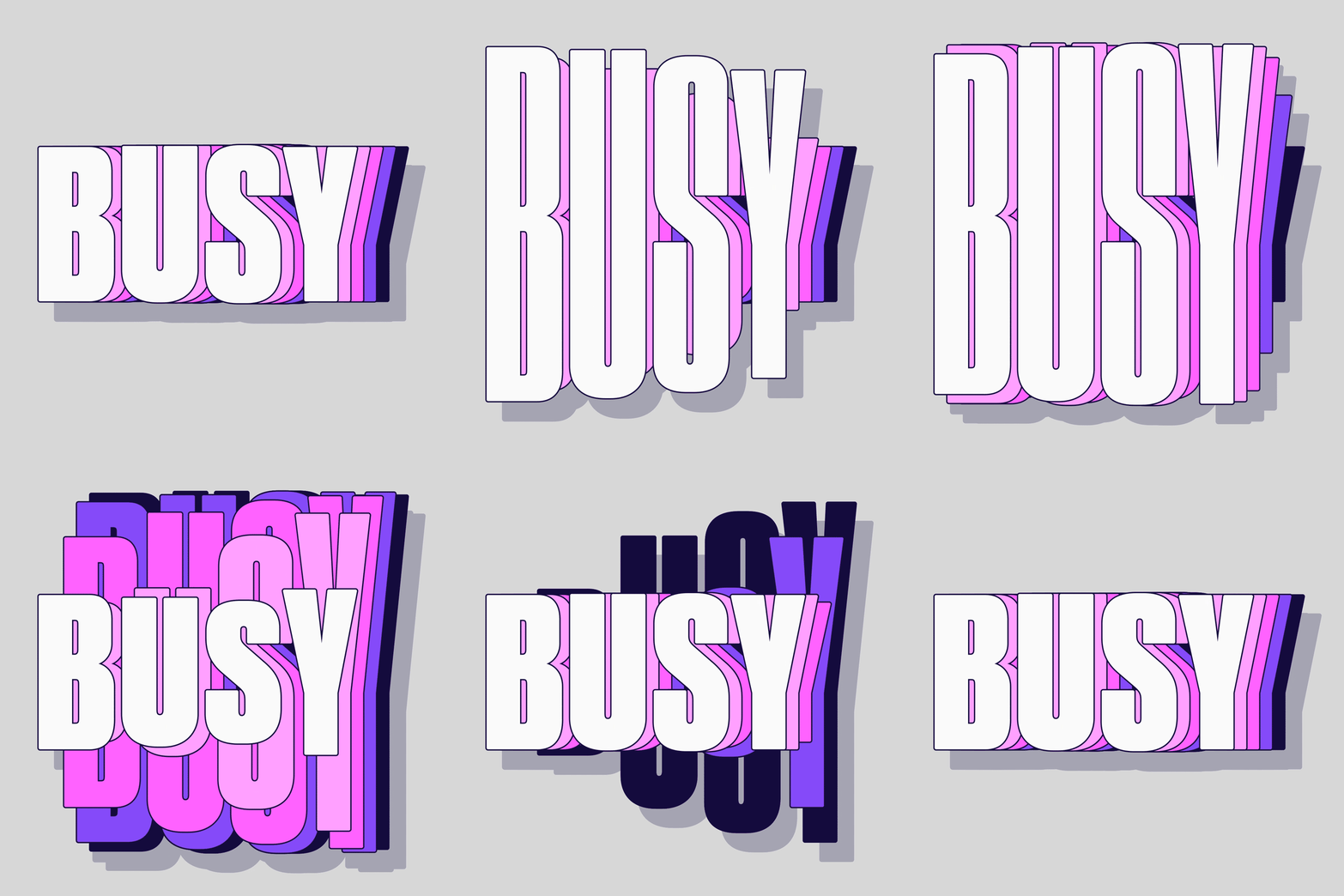
Other projects to look out for on Mat’s Instagram and Behance pages include his Type Scraps collections, in which he gathers all of his personal type experiments each month – including tests and accidents! We love Mat’s celebration of process and his candid display of these pieces, which often lead him on to more spontaneous work which he translates into animated stickers and uploads to GIPHY. Overall, Mat’s work is super energetic and vibrant. It’s been such a pleasure gain a deeper insight into his works and process – thanks, Mat!

