
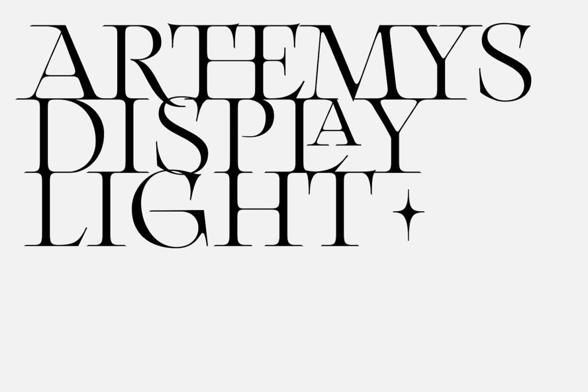
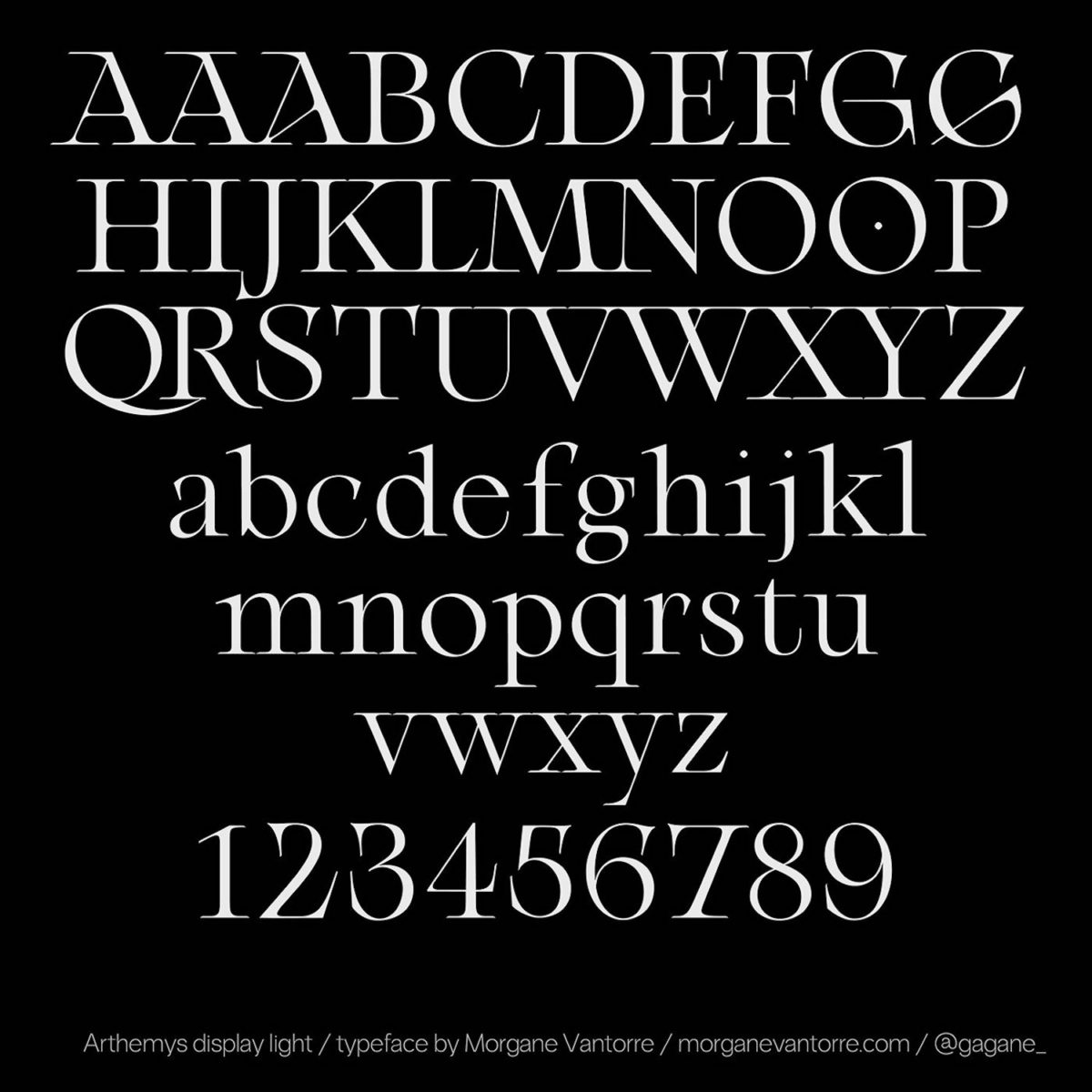
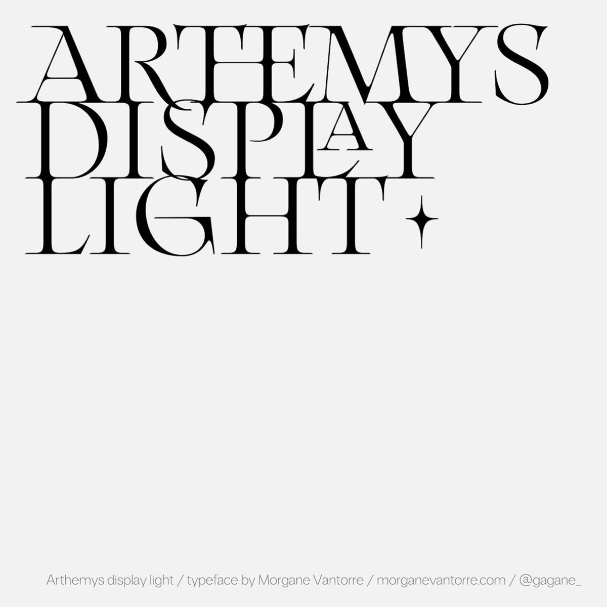
Newley released on Type Department, the stunningly elegant Arthemys Display Light is the first exploration of Glyph software coming from Paris-based graphic and type designer, Morgane Vantorre (@gagane_). A serif typeface intended for display purposes, Arthemys showcases a refined and ultra-creative approach to type design. Adopting an almost celestial aesthetic, this venture feels deeply engrained with Vantorre’s gorgeous sensitivity to detail and meticulousness as a designer.
The typeface was born out of ideas stemming from 18th century aesthetic sensibilities and the ways they can be extracted from the engraved lettering works and cartographies of the time. In particular, Vantorre was heavily influenced by the type specimens of Nicolas Gando. In bringing these influences into contemporary design, Vantorre creates a beautifully sensitive strand of connection between vastly different times; both visually and in terms of different media and technologies.
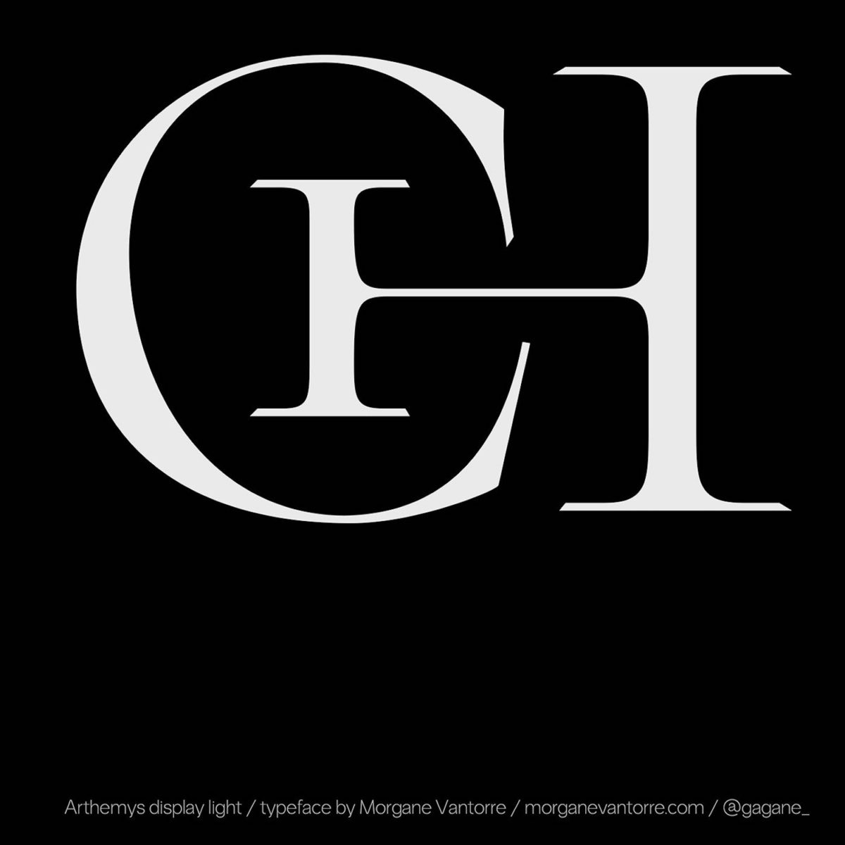
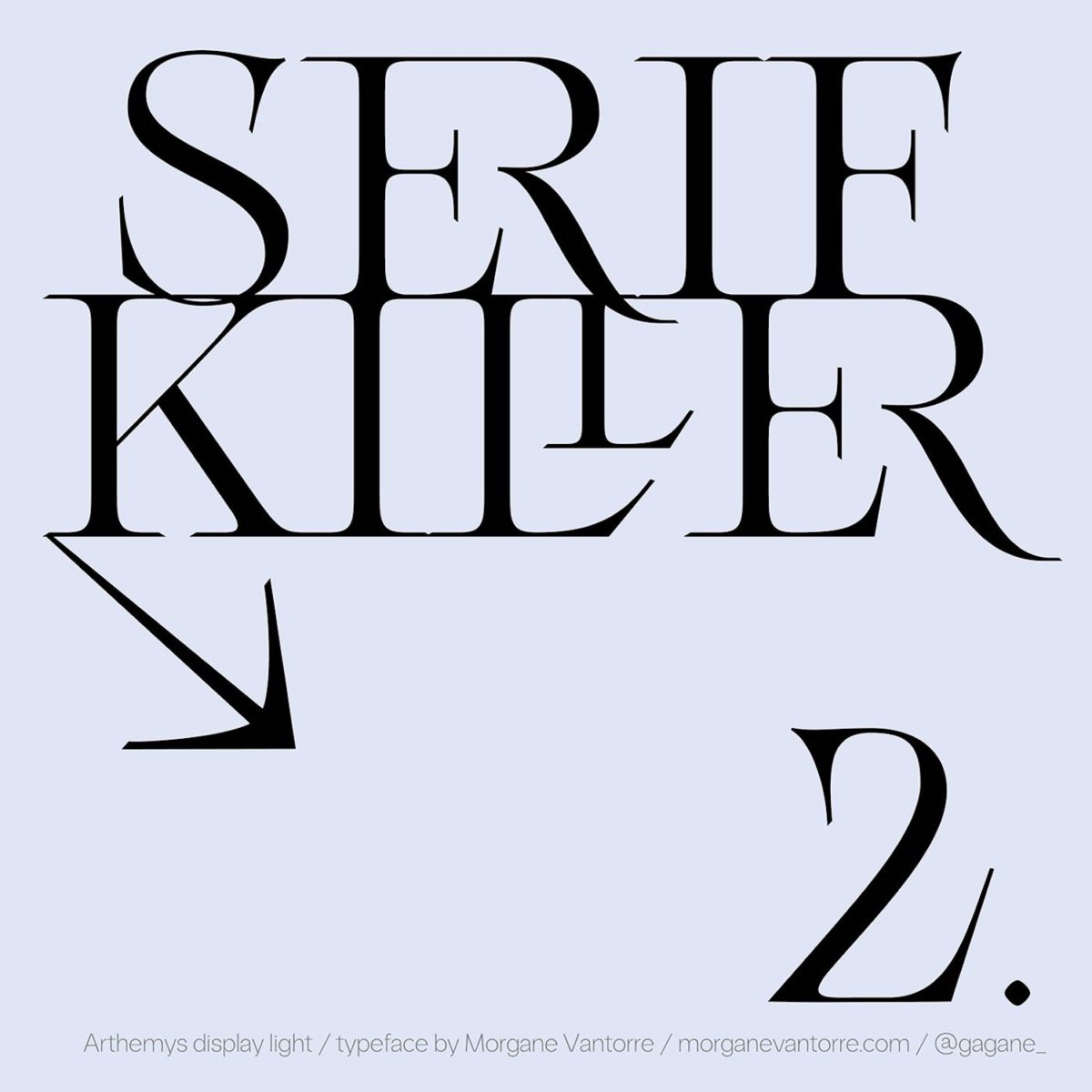
In terms of shape and aesthetics, Arthemys strikes a delicate chord between realms of sharp, graphic geometry and ultra-ornate, fine and highly decorative detail. The far-reaching, almost invasive serifs are angular and penetrating; creating both a delicate and organic presence of beauty whilst packing a bold and undeniably charismatic punch.
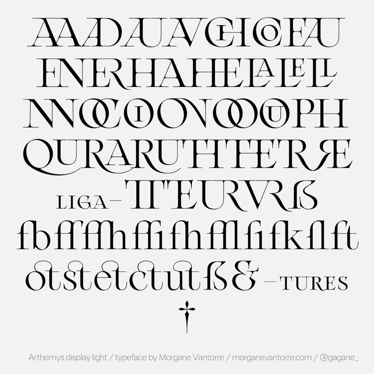
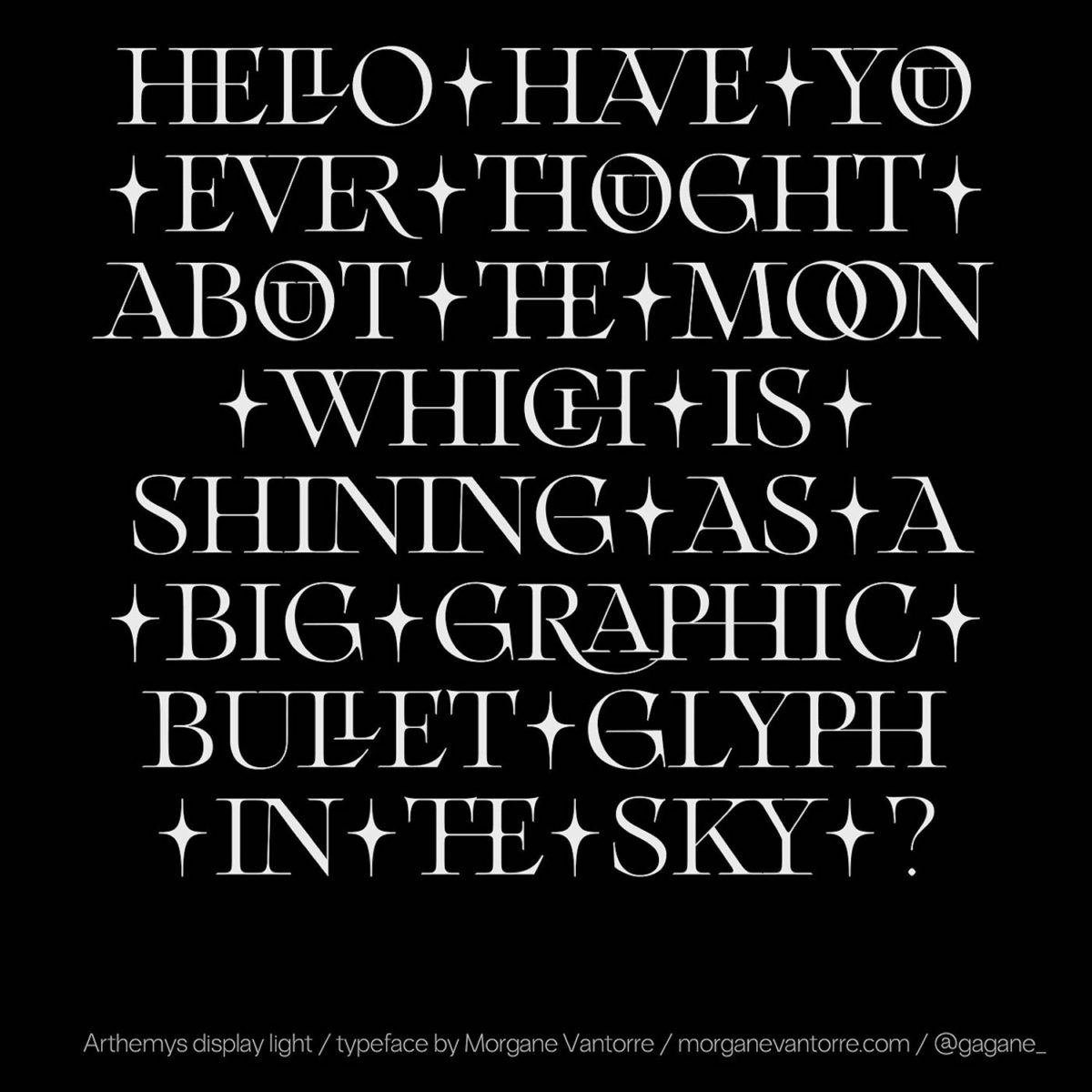
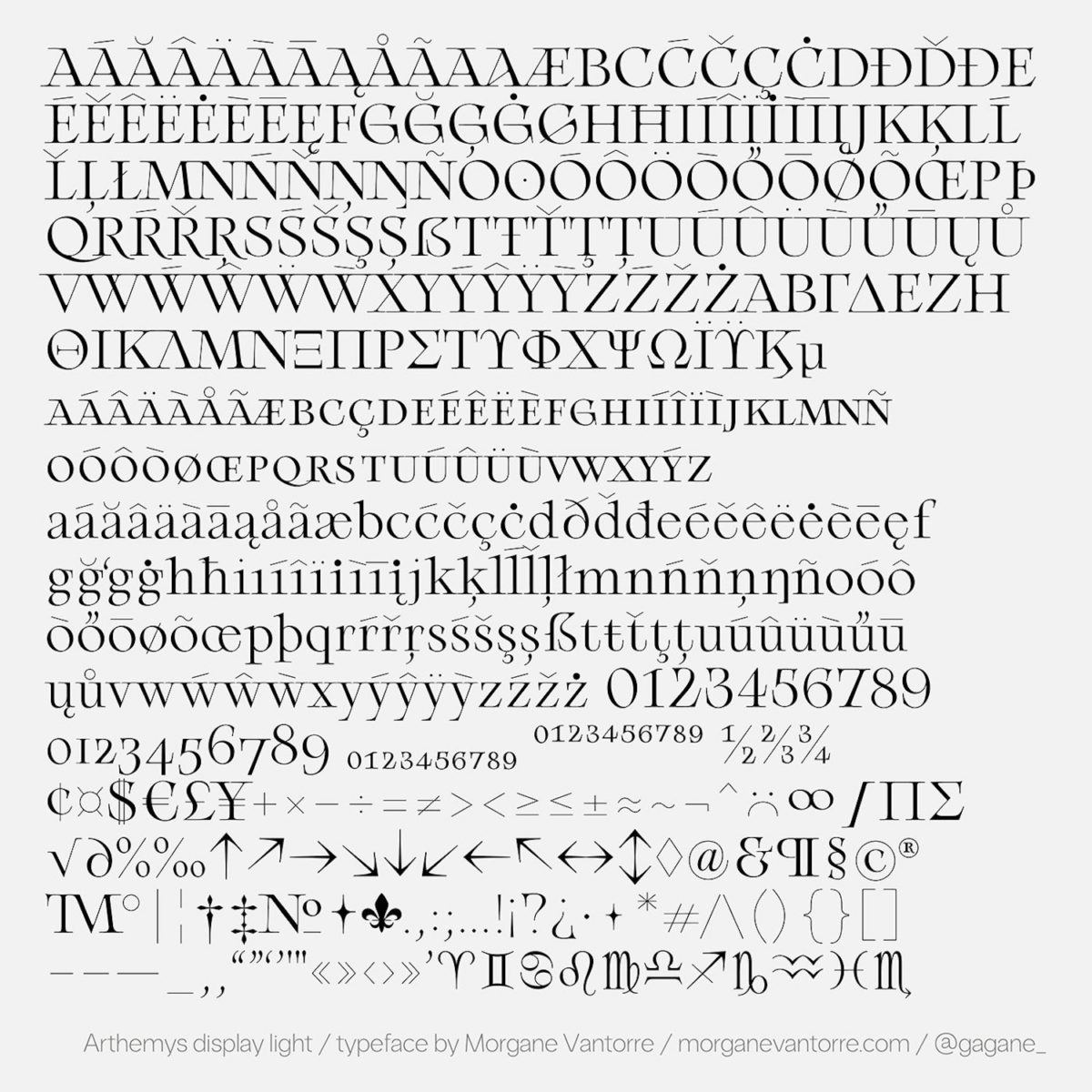
One of our favourite features of Arthemys is the incredible variation of glyphs. Including a number of stunning and unusual ligatures, as well as an extended Latin character set, Vantorre fosters a wide scope of aesthetic possibility when it comes to the typeface in-use. Equally, the sensitive kerning allows for gentle overlaps between serifs and descenders, connoting an intricate and organic atmosphere akin to ancient calligraphic works and engravings. As Vantorre comments herself, her inclusion of various ligatures ‘enables readers not only to read, but to gaze at the words written.’
The depth of research and visual eye behind Arthemys is extremely impressive. It is clear that the visual success of the typeface emerges from Vantorre’s ability to bring together strands of physical practice with design theory and history, to produce a deeply considered body of work; allowing Arthemys to stand alone not only as a typographic venture, but as an integral experience of art and design. As a young designer, there is no doubt Vantorre has a remarkable aptitude for marrying thoughtful rigour with creativity. With this resulting in such exciting and impressive work, we truly hope Arthemys is only the beginning.


