
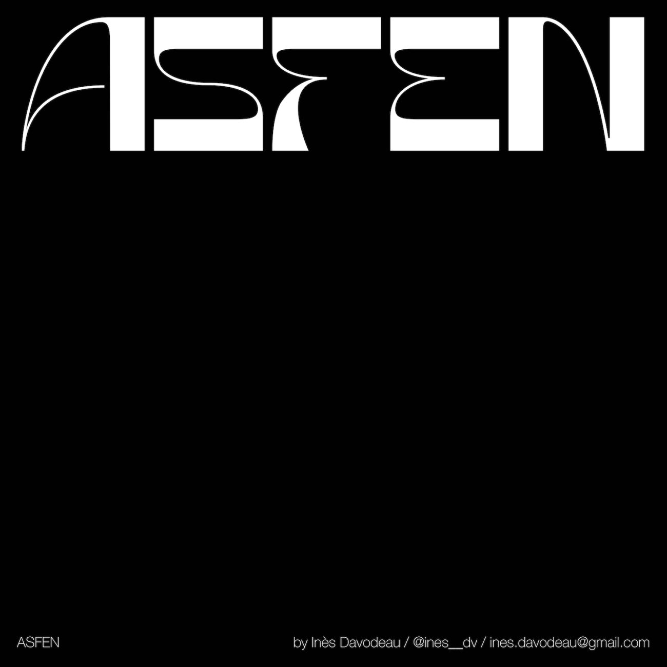
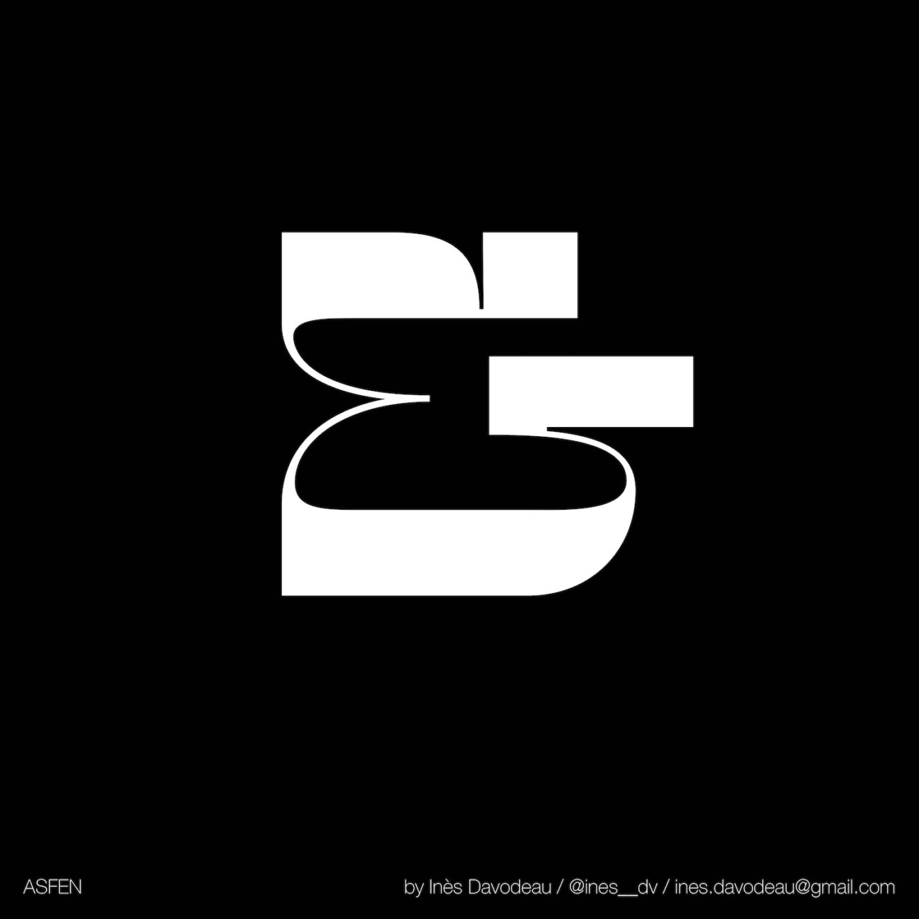
Asfen Display, the new experimental display typeface from French Graphic and Type Designer, Inès Davodeau (@ines__dv) is an exploration of the relationship between different bodies — both human and machine. The typeface is now available on Type Department, and it’s truly one of the most exciting new typefaces out there; not only visually (though of course, it is visually stunning) but also conceptually.
Inès began studying Graphic Design four years ago and is now in the final year of her Art Direction MA. Within her design practice generally, it seems she likes to let the work lead the way; ‘I don’t really have a method, strictly speaking,’ she explains, ‘I believe each project has its own method. Sometimes the first idea is the right one, sometimes it’s a longer process.’ And with Asfen, the leading idea was undeniably an inspiring one: exploring the relationship between human and machine — and visually constructing this relationship within the glyphs by merging human/machine energies into hybrids, through expressive, cyborg glyphs.
Inès recalls, ‘Asfen was born during a workshop which consisted of making a poster for an exhibition at the Palais de Tokyo in France. This exhibition, named “Do machines have dreams?”, highlighted works made by machines created by artists. The exhibition brought a reflection on the relationship between the artist and his machine, as well as the place of the artist within his works… We had to create a typography for a poster, as well as a visual which expressed this idea.’
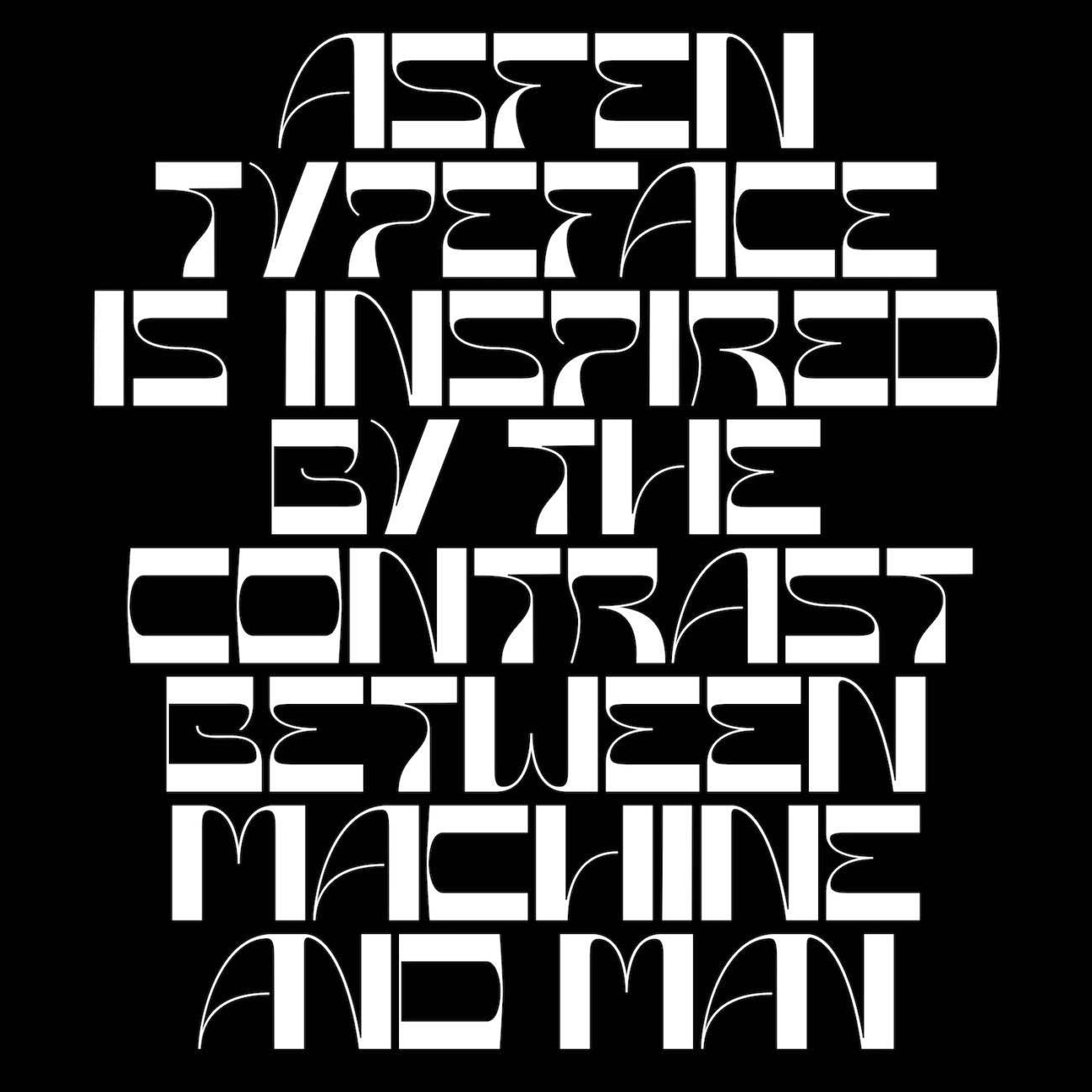
This being the birth of Asfen, Inès eloquently highlights the way the visual direction of the typeface grew to embody these ideas; ‘Through this typeface, the sensitive, dreamy and poetic characteristics of the human and his art is contrasted with the massive, brutal and rigid attributes of the machine.’
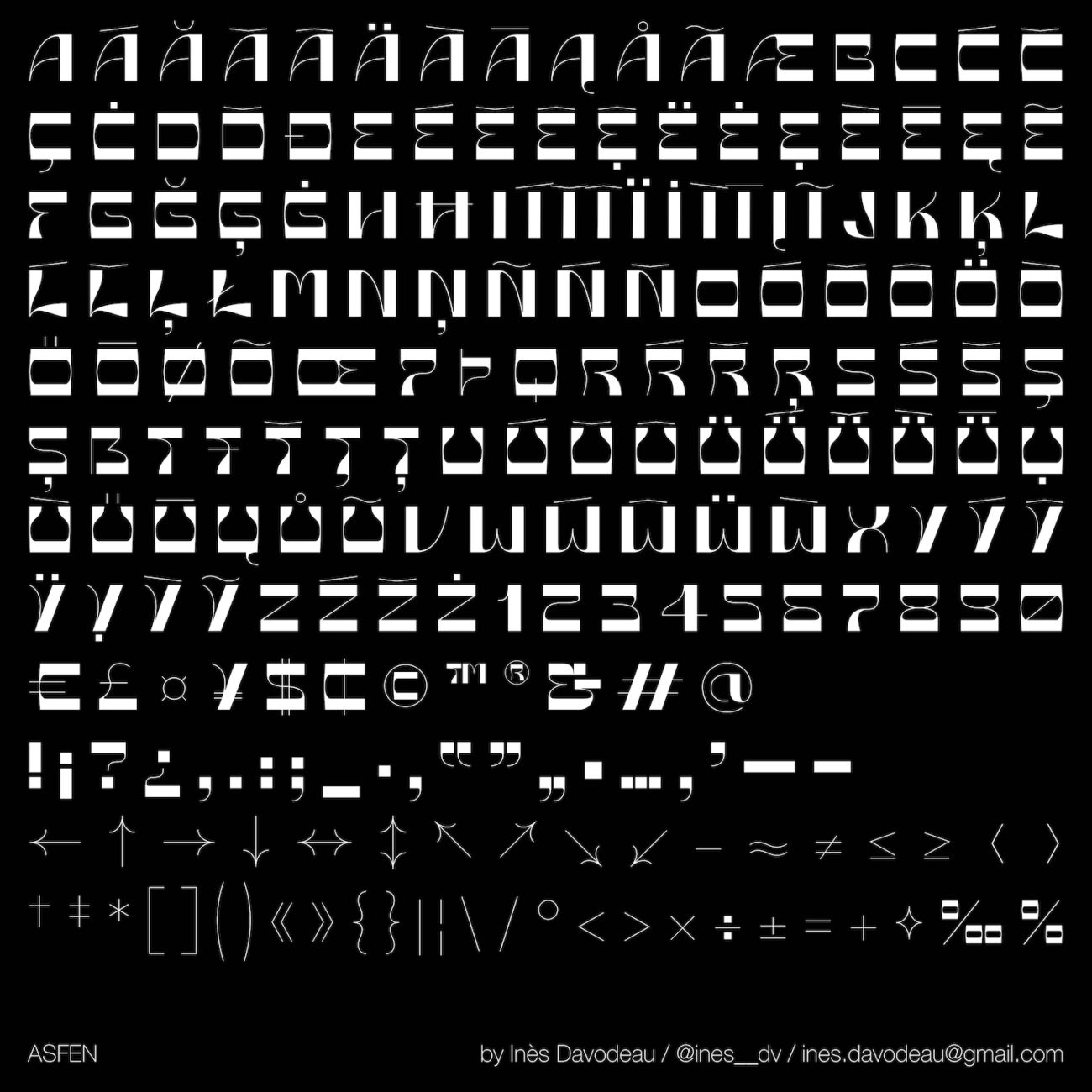
These emotive aesthetics and explorative themes were deeply embedded in the thought behind Asfen’s design process. ‘To express the idea,’ Inès shares, ‘I focussed on creating a strong contrast in the letter itself, by drawing downstrokes and upstrokes very marked. Downstrokes are very massive, they make the letter sit giving it a heavy and rigid appearance. Conversely, upstrokes are very thin and much less rigid, they refer to the fragile and sensitive nature of humans. The contrast of the letters is reversed to highlight the fact that this is the machine that become the artist.’
Despite the fascinating conceptual grounding of Asfen, Inès notes that she doesn’t like to get too caught up in abstract concepts, and that distilling clarity into her ideas and designs is majorly important to her. As Inès continues, ‘I avoid the abstract concepts because I think we lose the meaning with them, and they don’t really allow a real materialisation of the idea. One day, my professor of editorial design, Anaïs Bourdet, told me that design should make people feel smart. I think that sums up my mind perfectly when I create. I really like to go into the details of my creations to bring a touch of surprise, a better understanding of the concept from the point of view of the spectator and that they say «oh yeah I get it!» this is really true in editorial design. Today, when I have a new project, I avoid looking too much on Instagram or Pinterest because I find that we easily lose our creativity with this number of images that keeps flowing.’
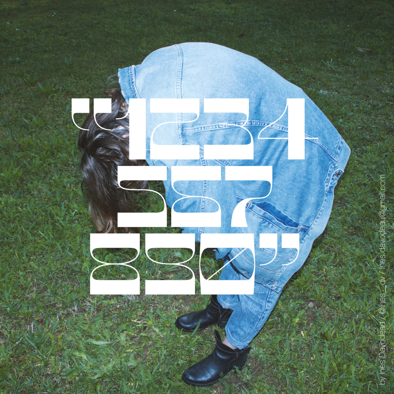
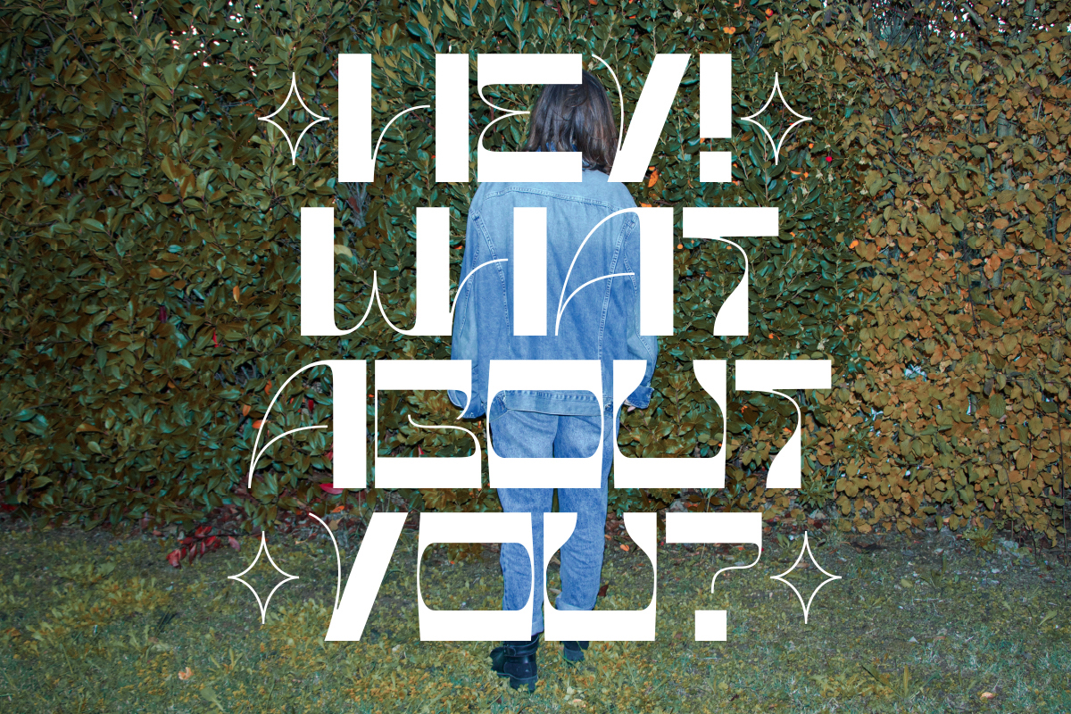
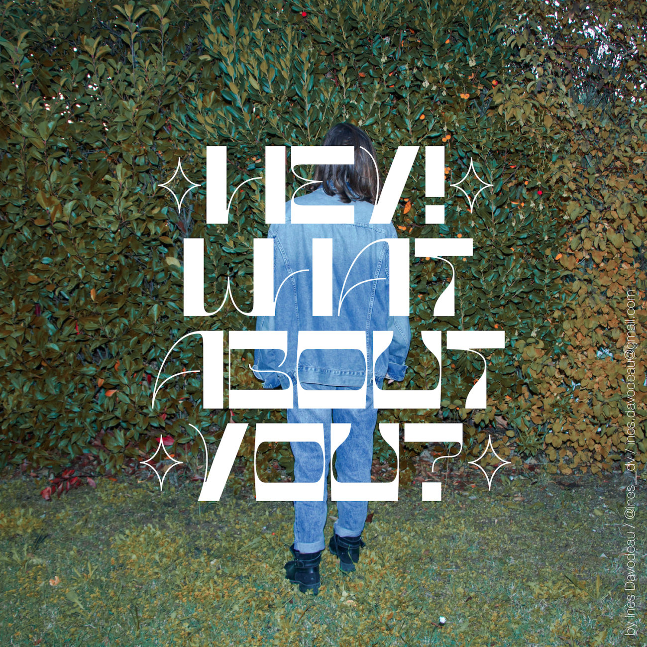
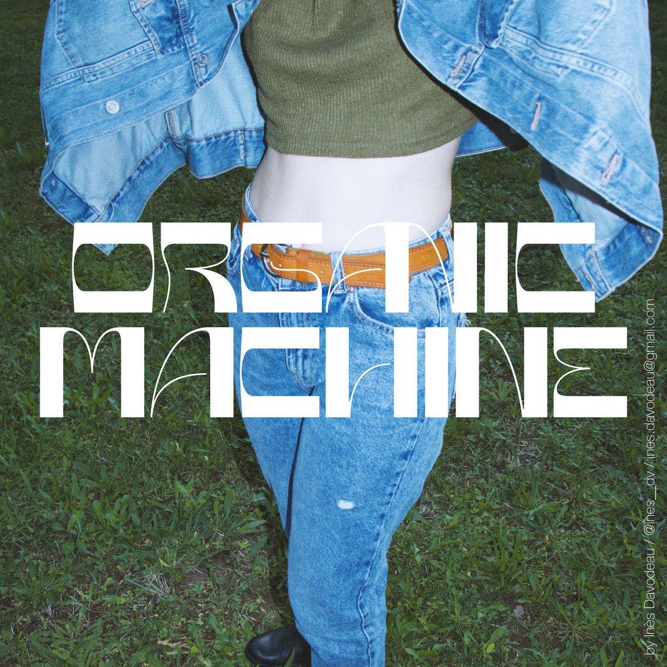
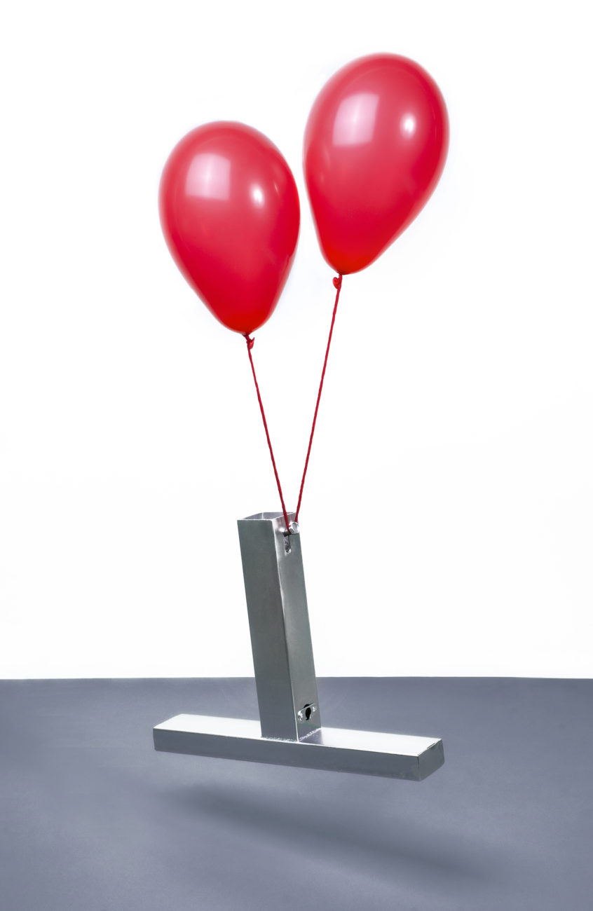
Inès also kindly shared with us an additional photography visual, created by herself and Clotilde Guillou, which she feels captures the essence of the concepts behind Asfen; adding that she finds it interesting to draw this cross-disciplinary parallel between Asfen and photography.
Finally, Inès tells us, ‘My aesthetic has changed a lot since I started — fortunately! I don’t know if I already have my own aesthetic, necessarily… I like to do such and such but I don’t make it a necessity for each project. My tastes are constantly questioned and I think we have to progress and advance in the way we see and understand design. I prefer to go instinctively. And as long as it fits the client and myself — there is no problem.’
Thank you so much to Inès for chatting to us about Asfen! To see more of Inès’ work, check out her website and Instagram. To see more about Asfen, and to explore purchasing options, go to Type Department.


