There’s a whole range of newly released fonts/typefaces on Type Department at the moment – and we’re excited about it. So, here’s our round up on some of our favourite new releases…
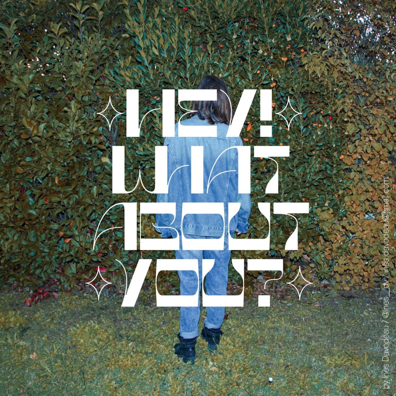
Asfen Display | Inès Davodeau | @ines__dv
French Graphic Designer, Inès Davodeau is the creator of this gorgeous new release, Asfen Display. The designer is passionate about editorial design, and after recently discovering her love for typography, she brings us this stunning display typeface. Suitable for titles and headlines, Asfen explores the relationship between human and machine; delivered in ‘cyborg letters,’ which use contrasting stroke weights and organic, elegant hairlines alongside tight, rigid kerning to embody the contrasts of these relations.
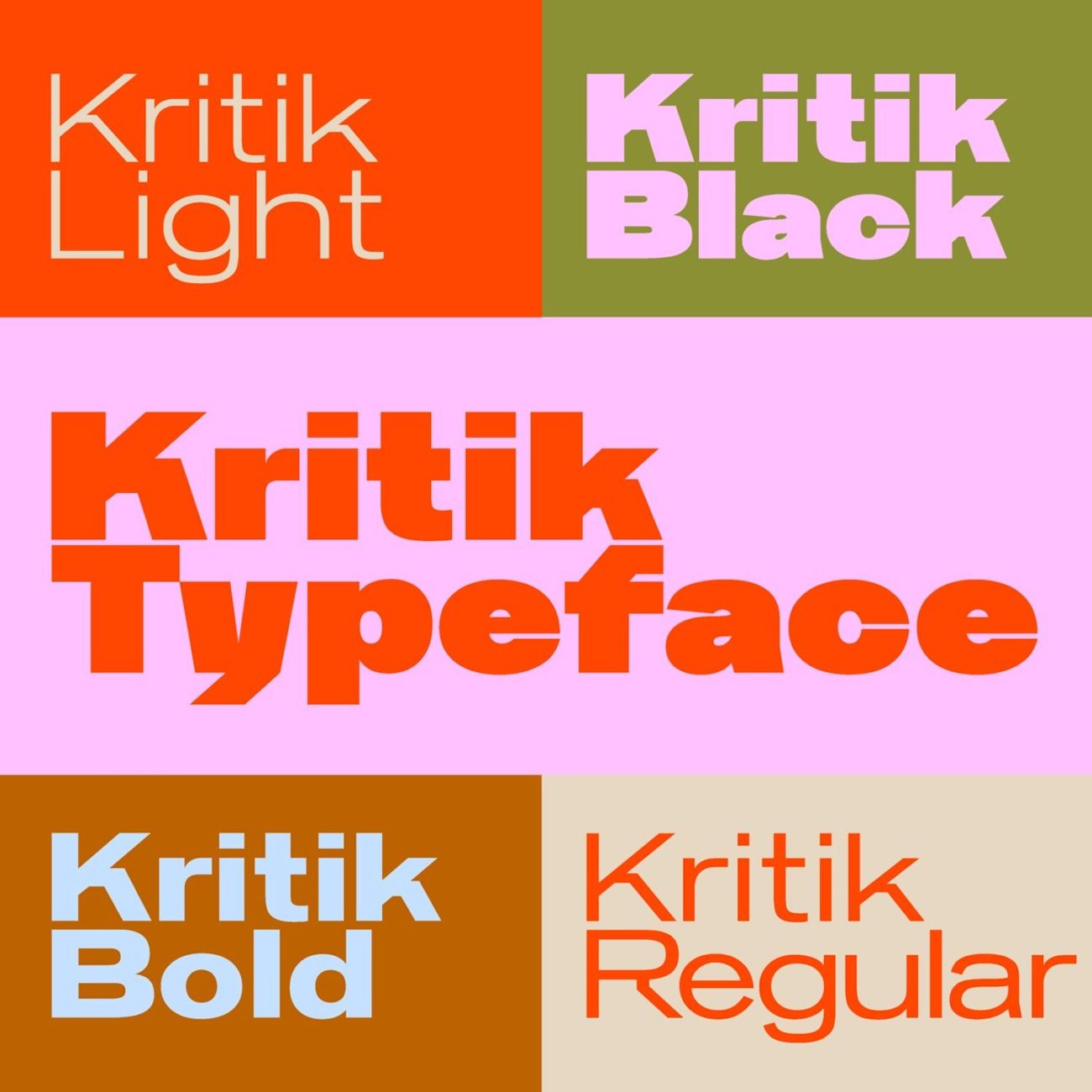
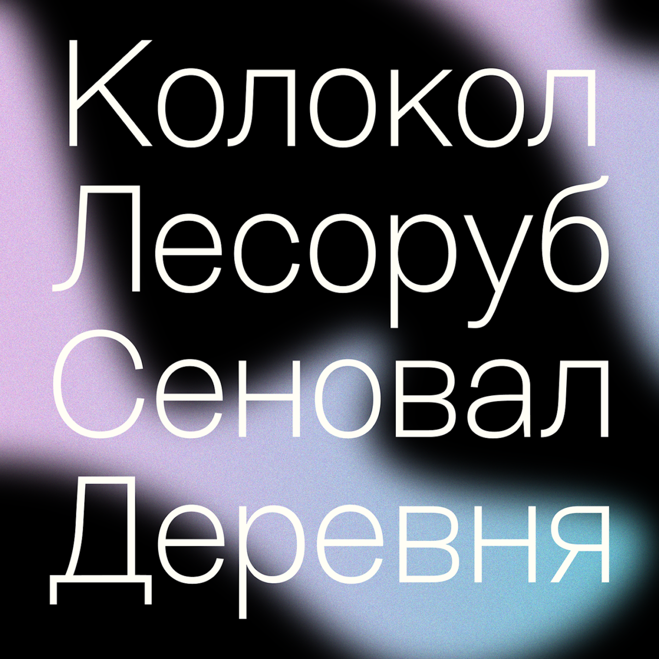
Kritik | Daniel Stuhlpfarrer | @dnl_stu
Based in Berlin, Daniel Stuhlpfarrer is an Austrian Graphic and Type Designer. Originally made for an architecture magazine, Kritik has developed over time into an expansive and versatile type family consisting of 7 weights. The bold, sans-serif type family has slightly exaggerated bowls and counters and unusual, angular touches on the ascenders and descenders. Designed to visually touch on the building blocks of scaffolding; the typeface is suitable for a range of purposes, and includes a stunning array of arching, architectural ligatures – definitely worth a look!
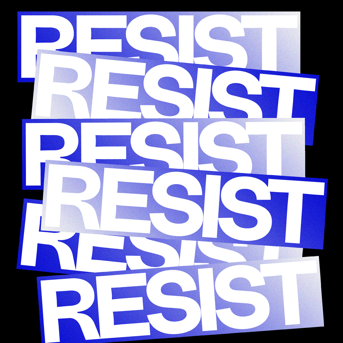
Resist Sans Text + Resist Sans Display | Eugene Tantsurin | @groteskly.yours
Type Designer, Photographer and founder of independent type foundry, Groteskly Yours, Eugene Tantsurin brings us Resist Sans Text and Resist Sans Display – both available separately through Type Department. As the designer eloquently puts it, ‘Resist Sans is a free-spirited neo-grotesque that embodies both the innate desire for revolt and tendency towards uniformity.’ Both the Text and Display styles share the fascinating mix of neo-grotesque minimalism with usual, subtle tentative qualities; rendered through the delicately spacious kerning. A nudge against conformity is celebrated in the Display style through the elongating of ascenders, whilst the text style features intimately careful ink traps.
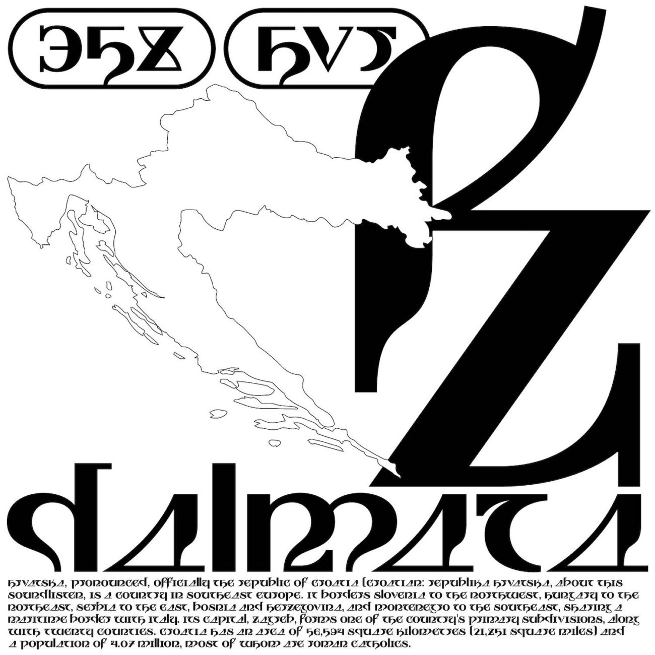
Dalmata | Stefan Mader | @stefan.mader
Freelance Graphic Designer, Stefan Mader, brings us this stunning, experimental display typeface. Consciously playing with aesthetics, language, history and culture, Dalmata’s name comes from the southern part of Croatia — Dalmatia. The fascinating structure of the glyphs draws form the brutalist architecture and war memorials which are present in the region. Drawing an aesethtic which presents a ‘kind of contemporary witness to the often dark past, but with a focus on the positive and the new,’ this display typeface comes with 170 glyphs — including 15 special characters and 14 ligatures — and would work beautifully for titling and large typographic uses.
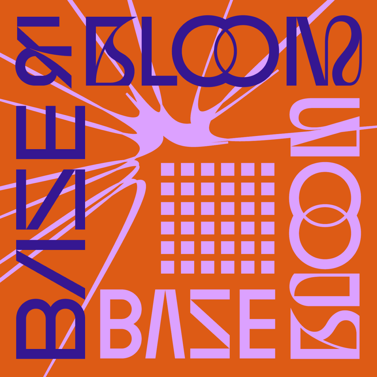
Base & Bloom | Naum Type | @naumtype
Naum Type’s latest release on Type Department comes in the form of Base & Bloom; an experimental, hypnotic and stunningly original display typeface. Naum aims to deliver fonts which are ‘innovative, authentic and practical,’ and there’s no doubt they’ve succeeded with Base & Bloom. Fusing geometric modern sans with high-contrast flourish didone, Base & Bloom was designed in response to the rising interest in modern, experimental serif display’s and the seeming lack-there-of of sans equivalents. Incorporating flourishes into the main, structural body of the glyphs means Base & Bloom by no means feels merely ‘decorated’ with flourishes, rather, they are integral to the functional typeface itself. With up to 11 alternatives for each letter, Base & Bloom is suited to masses of different uses; from posted and album covers, to headlines and editorial design.
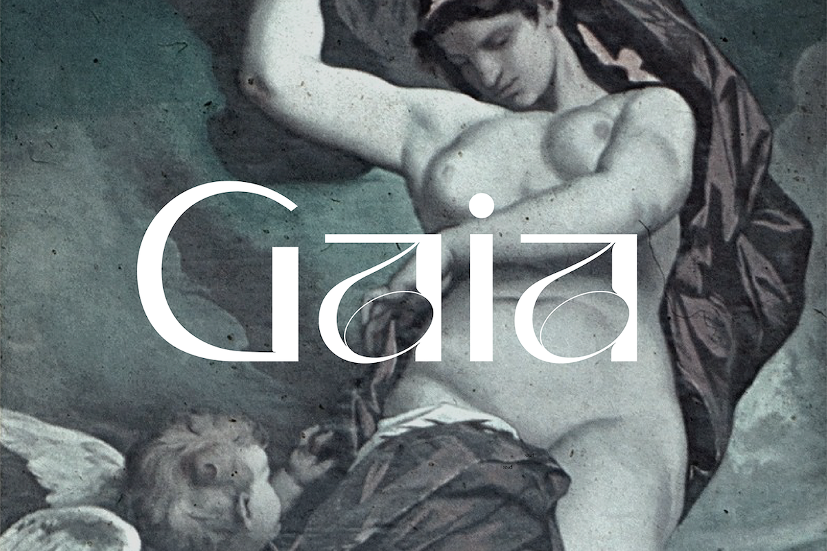
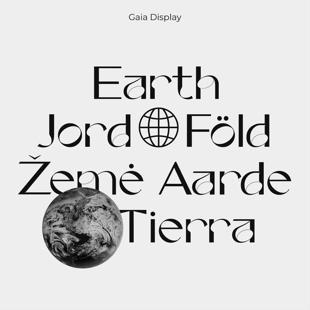
Gaia Display | Nora Kaszanyi | @nora_kaszanyi
Experimental sans serif display typeface, Gaia, ‘is the personification of the Earth and one of the Greek primordial deities,’ as the designer, Nora Kaszanyi, puts it, adding ‘she is the ancestral mother of all life: the primal Mother Earth goddess.’ Filled with strong, arching, feminine shapes, accented with sharp corners fine, elegant ink traps, the ornamentation on the counters is unbelievably beautiful. Stunning and sublime, Gaia is full of quirks like the titled axis of the counters in the ‘o’ and ‘e,’ and is best suited for short to medium length texts and headlines.
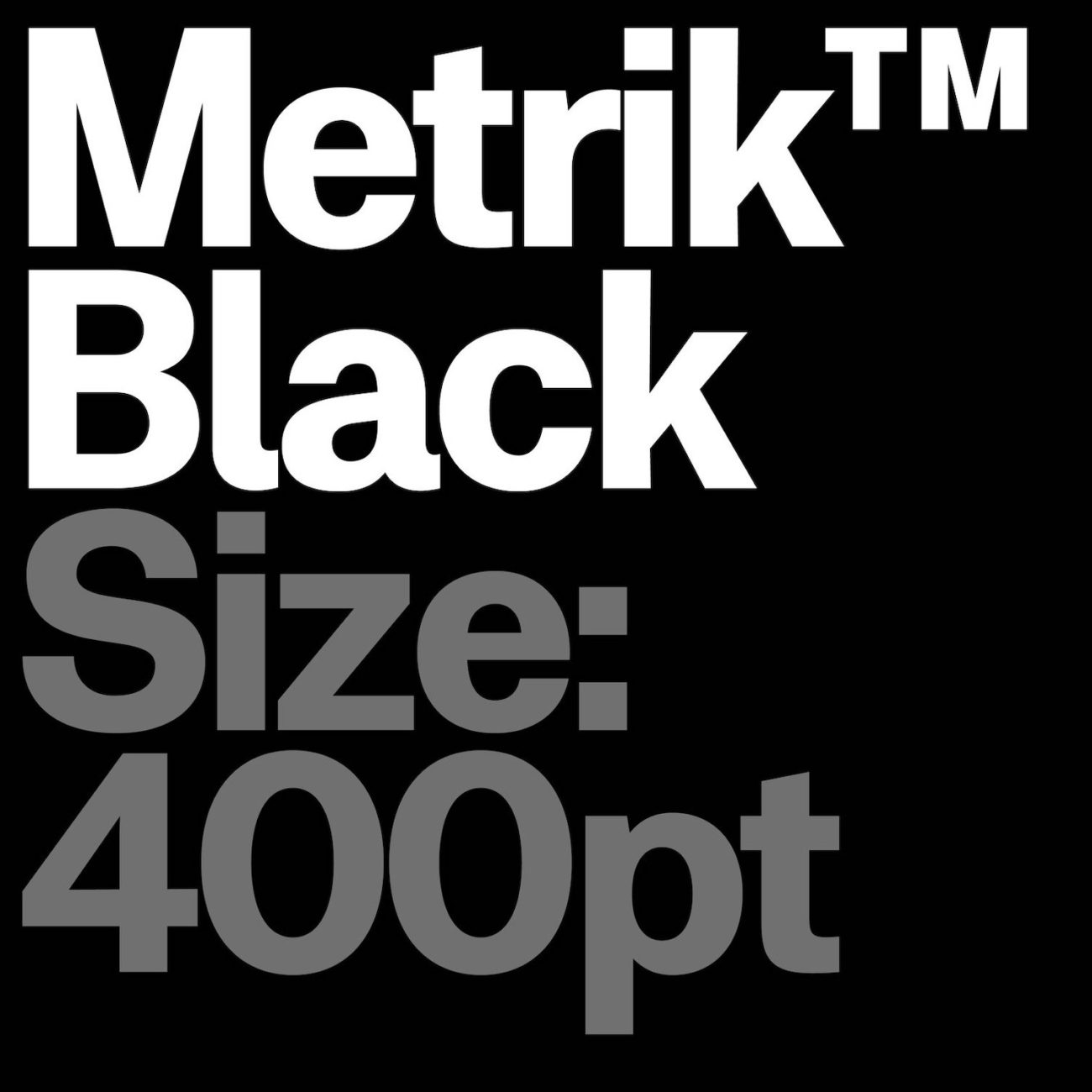
Metrik | MyType Foundry | @mytype.foundry
Metrik is typeface which strives for intelligently crafted versatility and functionality. Created by MyType Foundry, the subtle grotesque has 5 different weights, and aims to provide flexibility for the user; presenting us with a contemporary sans serif with some humanist qualities. Though minimal, Metrik’s true strength lies in its substance, quality and attention to detail. Rooted in Swiss tradition, Metrik an once draws on years of functional craft, whilst cultivating its own personality. With a total of 352 glyphs, and accommodation of four languages, Metrik is a grounded, well-crafted typeface with masses of versatility.
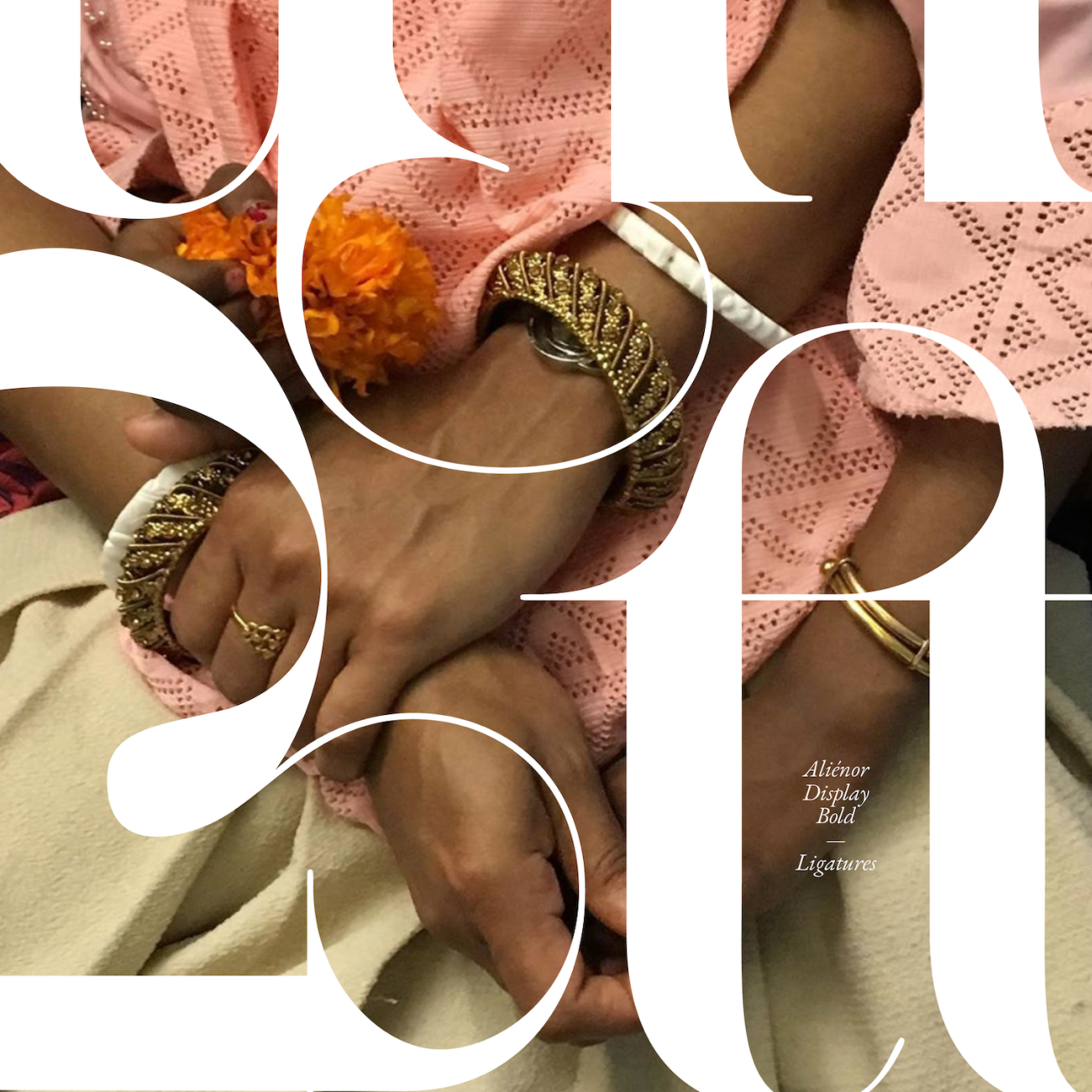
Aliénor Display | Lou Rainaldo & Daytona Mess | @lou_rnld & @daytonamess.png
Since its release, we haven’t been able to get enough of Aliénor Display. Designed by Lou Rainaldo and Daytona Mess, his serif display typeface is filled intricate detail and exciting shapes, whilst remaining elegant and refined. The connection of stems and serifs gives it an unusual, sophisticated shape, whilst the wide, exaggerated counters and contrasting glyph widths accentuate the typeface’s rhythmic qualities. With numerous alternatives and ligatures, the designers have created Aliénor Display to compose just as elegantly in all caps, meaning its use would work stunningly as headlines or in sophisticated editorials.
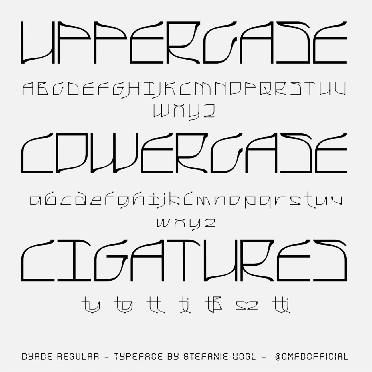
Dyade | Stefanie Vogl | @omfdofficial
Created by Berlin-based graphic and type designer, Stefanie Vogl, Dyade is an innovative take on an experimental display font; created for the future and inspired by the past. A modern interpretation of Art Nouveau fonts, Dyade is full of sloping curvatures and ornamented with eccentric ascenders and descenders. Whilst the body of the letters within the x-height is cubic and grid-like, there are floating, organic shapes which extend from the glyphs and create a contrasting feeling of old meeting new. The font works best for headlines and titling.
All available on Type Department. Go, go go!