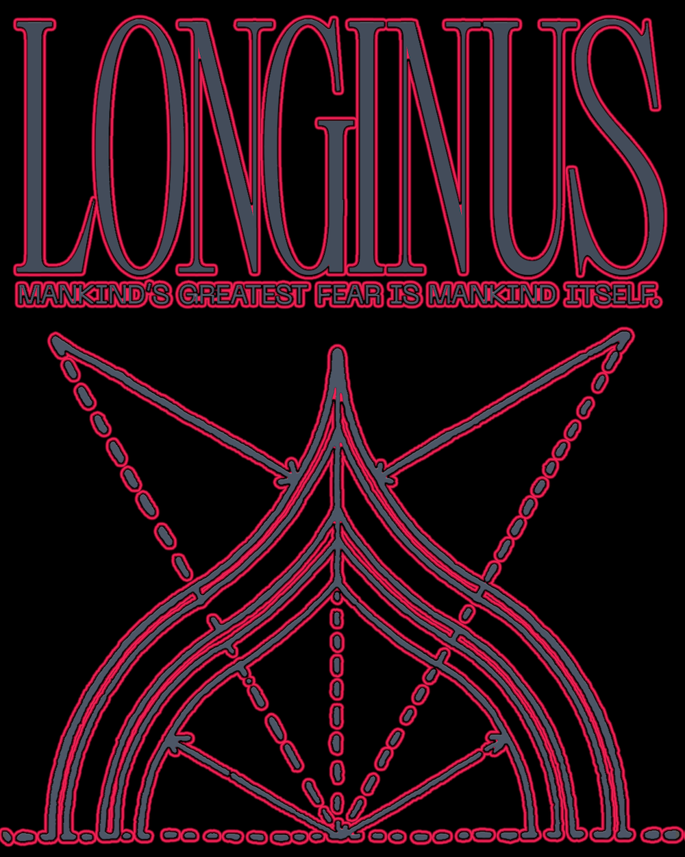
Doménico Barreto is an independent designer based Lima, Perú, known for blending his passion for typography with cinema and music, interpreting the aesthetics of visual cultures that inspire him and reworking his findings into type designs. Leading him to stay away from conventional forms—you won’t find him working with the likes of Helvetica or Garamond—his latest typeface, Longinus, draws on ideas from the world of his favourite Japanese anime series, Neon Genesis Evangelion.
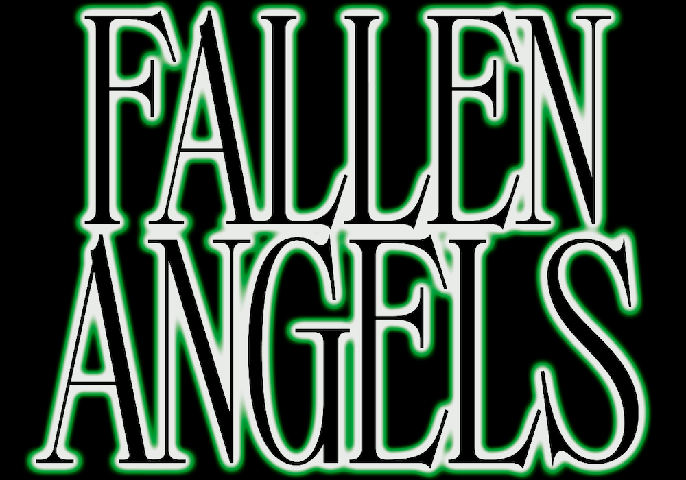
The genesis of Longinus sprung from the first work Doménico created whilst immersed in the world of the series. Evangelion, or more affectionately Eva, is a bold sans serif that mixes inspiration from the fictional world of its namesake with formal references to the likes of Wim Crouwel. (If you want to check Eva out, a collection of Doménico’s typefaces, including Eva, can be found on Type Department.)
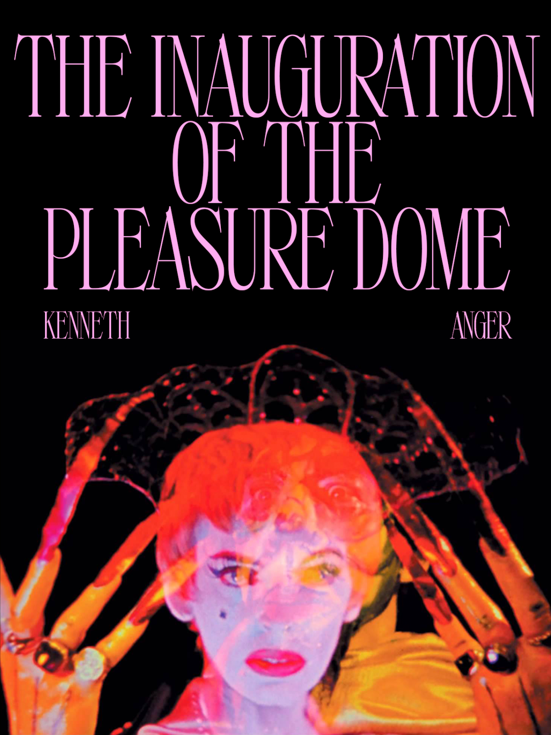
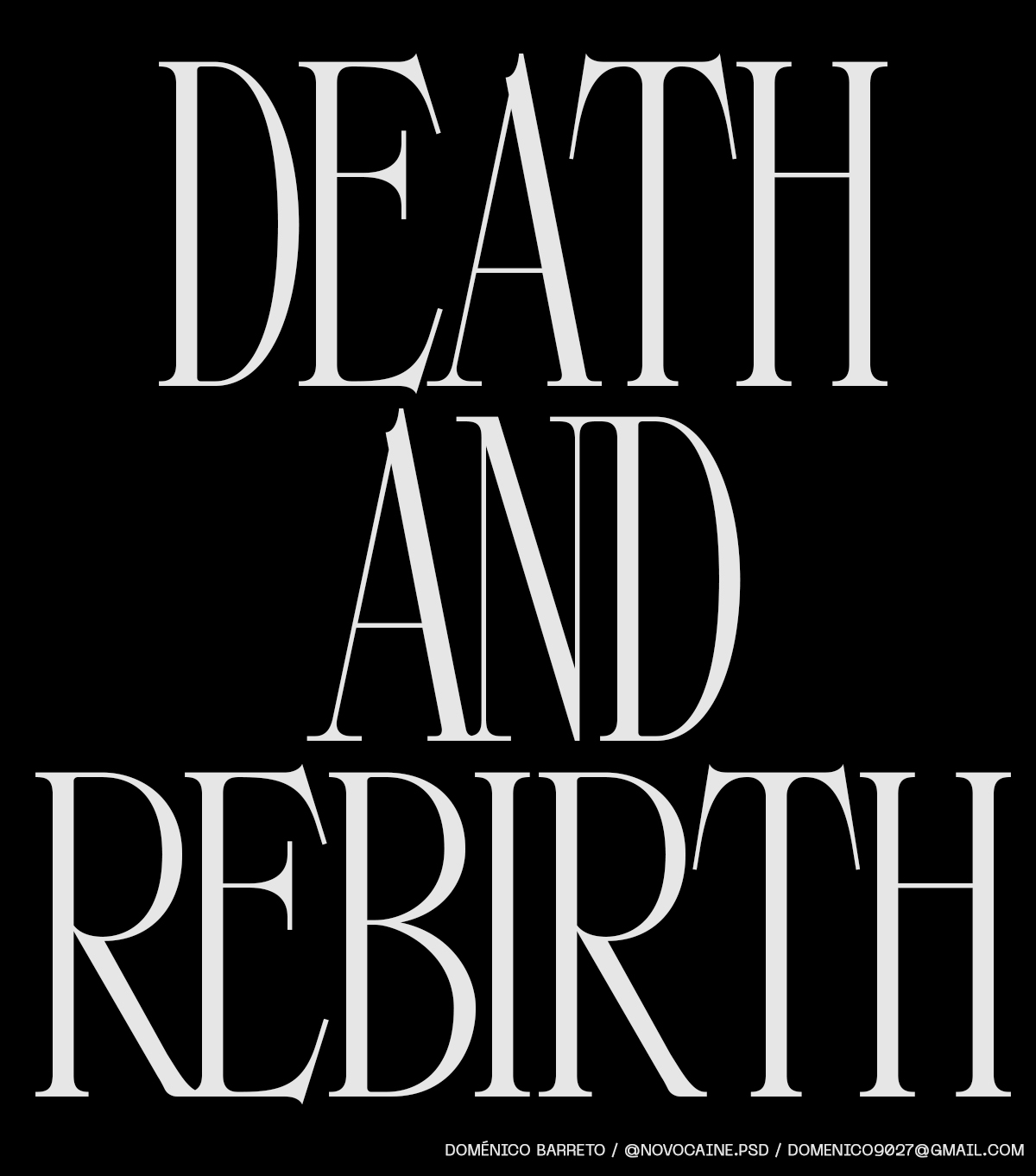
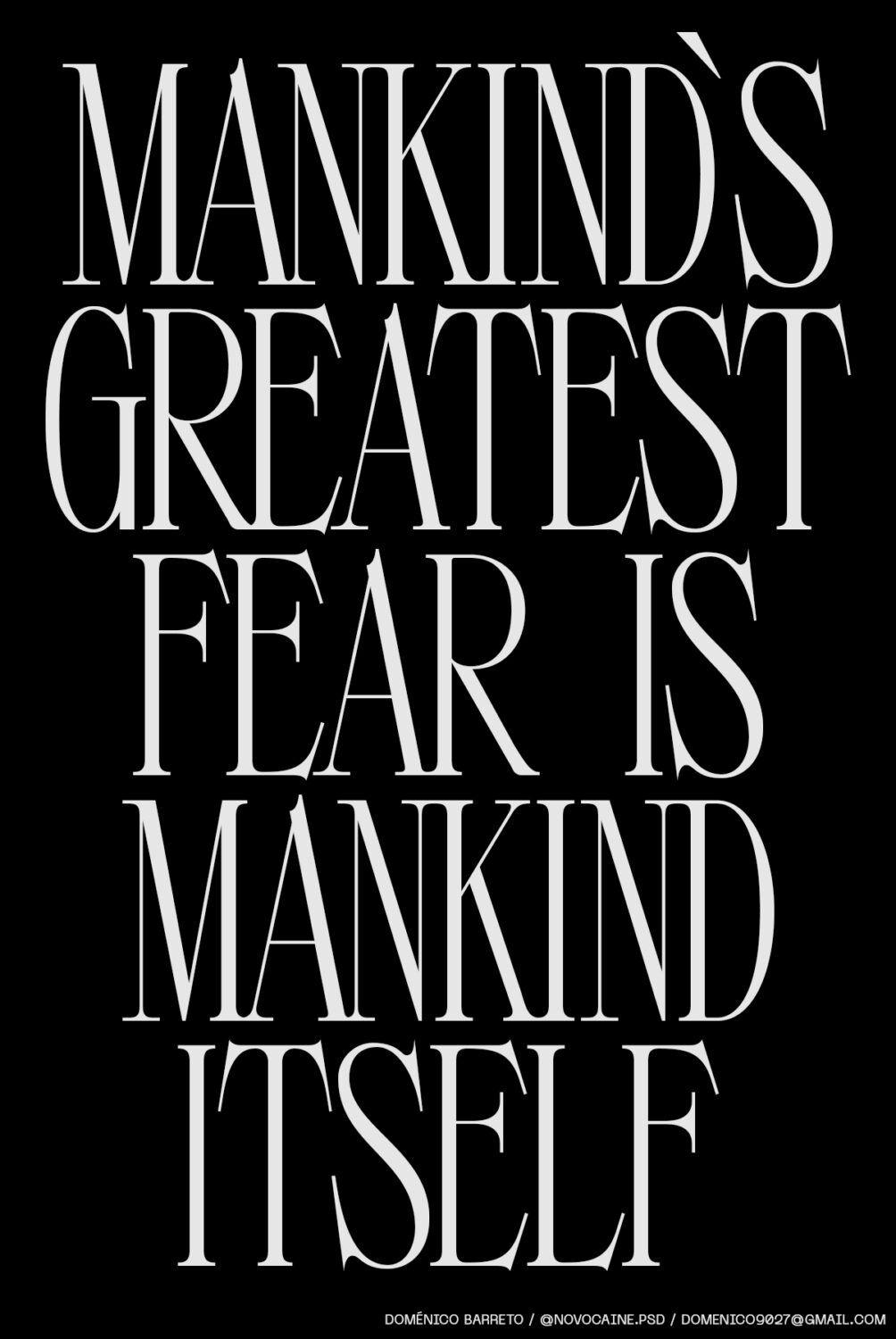
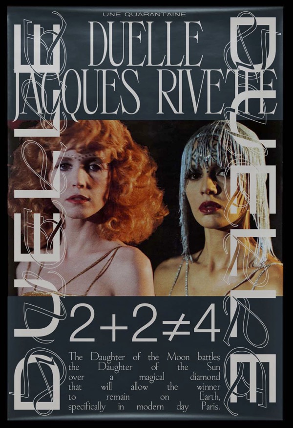
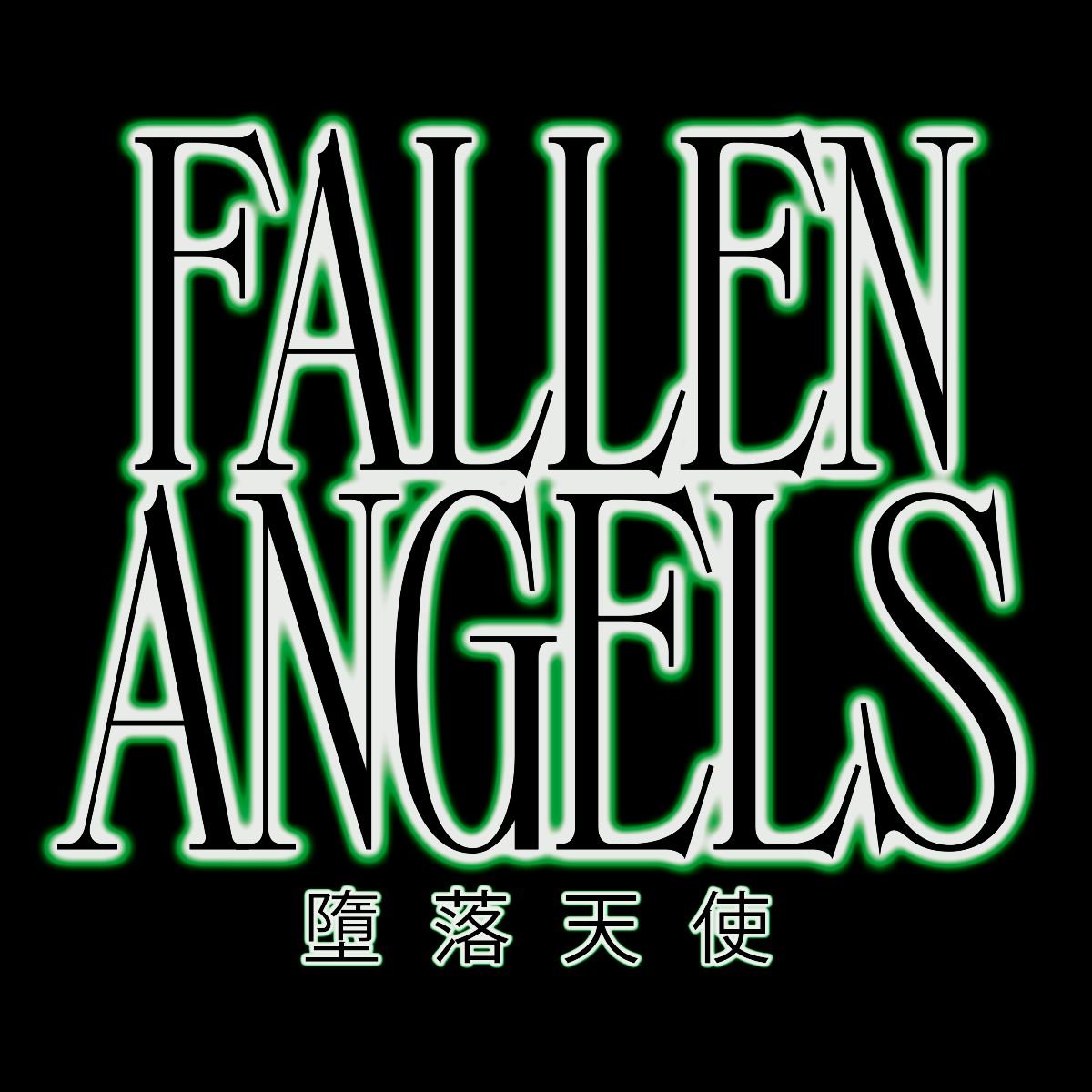
Of Longinus, Doméncio says, “I wanted to create an impactful and modern serif type inspired by the anime, staying away from common serif fonts. Some aesthetic features are the width of the glyphs and the tight kerning, which makes the type very dramatic…combined with the aggressiveness of the serifs and their angles, it creates a serif font with its own personality.”
In the works since 2020, Longinus came up as a serif counterpart to Evangelion’s bold sans forms, “but at that time the idea was very vague,” Doménico notes.
“My first approach to creating some glyphs was in January 2021. I made the word Longinus just to leave that project on hold for a couple of months…The process started in April and I had to do a lot of research because it was my first serif font. I had to make sure the glyphs matched the concept. The whole process was using Illustrator for the sketches and the glyphs, and Fontlab to build up the font and all the details. While I was working on the project I decided to rewatch the anime which became the main source of inspiration until the end.”
When I asked Doménico about whether he might consider expanding the typeface in the future, he offered, “Not really, but who knows? If I decided to do so I would probably focus on lowercase characters and a condensed version. What I would like to expand right now is my catalog on serif fonts. Since Longinus is the only serif I’ve made, I would like to try something new in that direction.” With three WIP fonts marinating at the moment, there’s a lot coming up on Doménico’s horizons—to stay in the loop with his new releases, he says to keep an eye on his Instagram, @novocaine.psd.
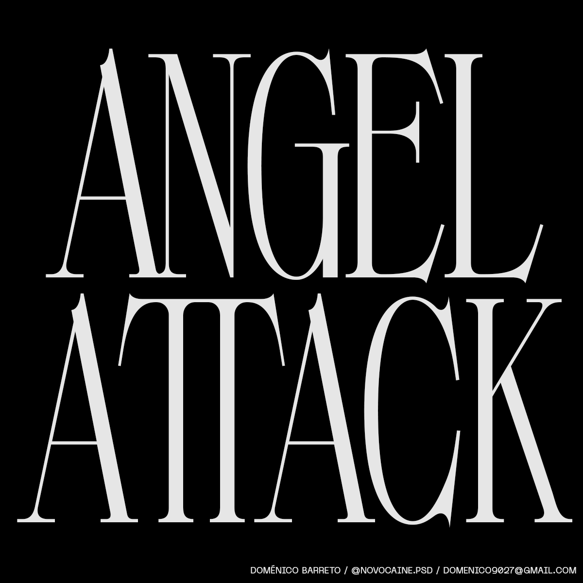
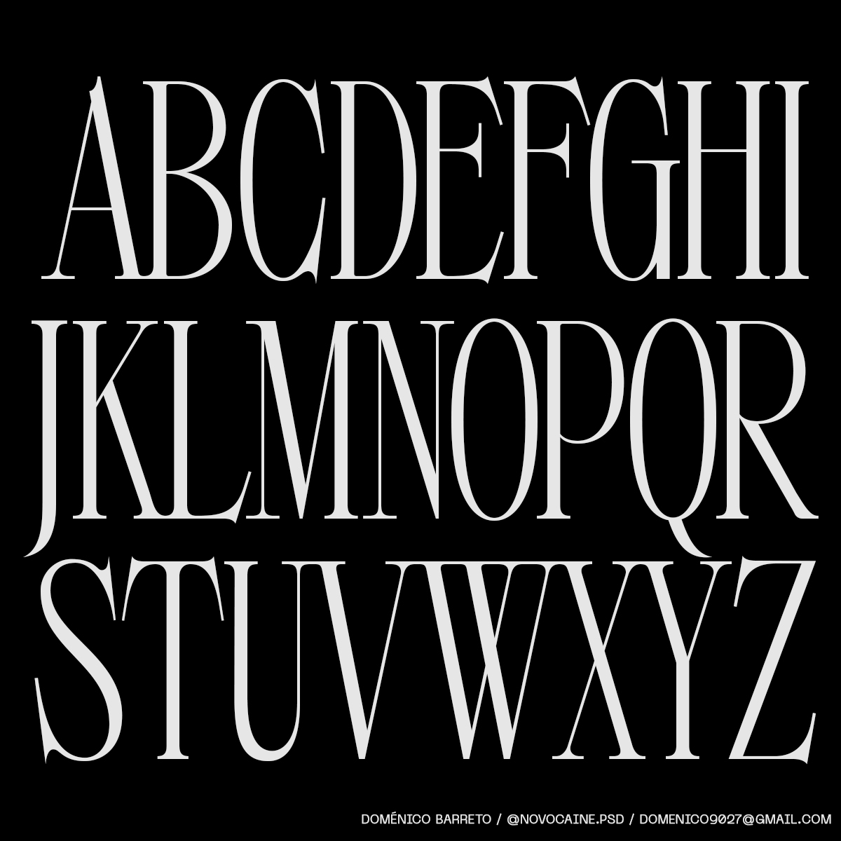
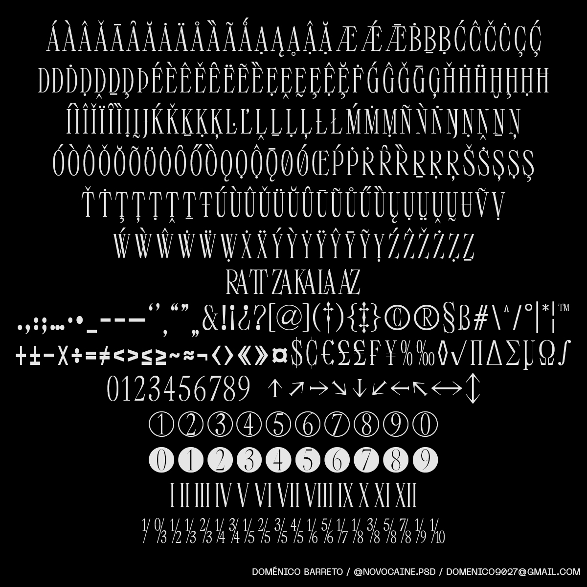
Longinus works really well in all display settings, but it’s most at home in logos and headlines because of its particular features and readability. It contains 463 glyphs in total, including Latin, Cyrillic, diacritics, ligatures, symbols, punctuation, 3 sets of numbers, Roman numerals, fractions, and arrows. Find Longinus on Type Department.