
Want to learn how to choose the best font for your web page, how to create killer font pairings, or how to maximise the power of type in your UX/UI design? You’re in the right place.
Working out how to choose the best font for your web page is hugely beneficial, whether you’re designing for a client or for yourself. It’s what creates a clear experience for the user while striking the right tone of voice, and whether you get it right or wrong will have a huge impact on how people engage with it. So, whether you’re looking to elevate your career through an eye-catching personal portfolio or develop an impressive solution for a client, your font selection is up there with the things you need to get right.
Today, we welcome Tofu Design‘s Daniel Tan, who will be guiding you through everything you need to know about how to choose the best font for your web page. After co-founding the studio with his partner three years ago, Daniel now focuses on helping companies of all sizes “realise their story or mission through design.” A self-taught designer, Daniel’s main expertise surround UI/UX and interaction design, but the studio also creates intelligent and varied solutions in branding and graphic design settings. From revealing why type is so important in UX/UI, to breaking down the steps you need to take to choose the best font for your web page, Daniel offers his expertise to put you on the right path.
Hi Daniel! Firstly, why are fonts important for creating successful web page designs and UX design? What do they do for a brand — whether that’s a personal brand or a brand of a larger company?
This is a really interesting question because I’ve always felt like typography doesn’t get the credit it deserves. Fonts are integral to UI/UX because they take up at least 70-80% of the design. I look at it as the backbone of the page and it can make or break it – conveying both the emotion of the copy and the look & feel of the site. It is the vehicle for carrying the actual and subconscious message to position the brand. Whatever feeling we are trying to exude, whether it’s playful, professional, premium, etc., we can do that with just the font. A font can say so much just by manipulating its weight, kerning, line height, etc., – and that’s what I think is so magical about it.
Additionally, the font is the visual representation the brand’s tone of voice. You can say the same thing with varying fonts and automatically, it will be read differently and most definitely, feel different too.
What things to do you need to consider while selecting a font or font pairing for a web page in different scenarios?
Before starting any projects, there are 3 core things I usually consider:
- What’s the brand’s voice? Is it professional? Casual? Playful? Calm?
- Who are the audience? This will determine legibility, font size, etc.
- What’s the purpose of the site? Is it a blog? eCommerce? Corporate site?
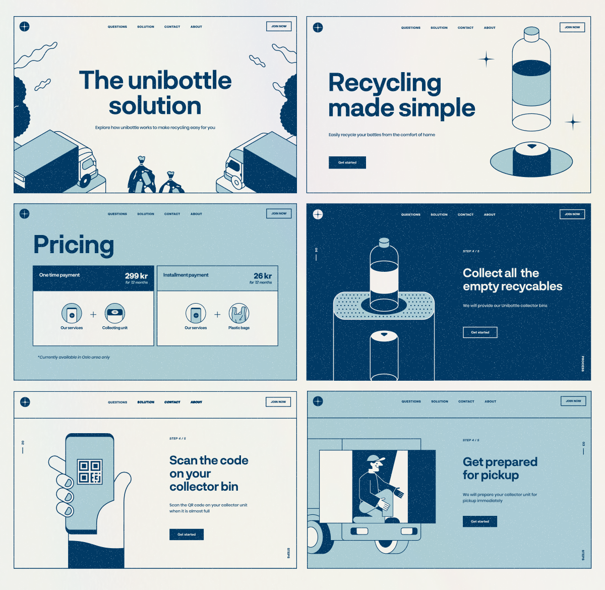
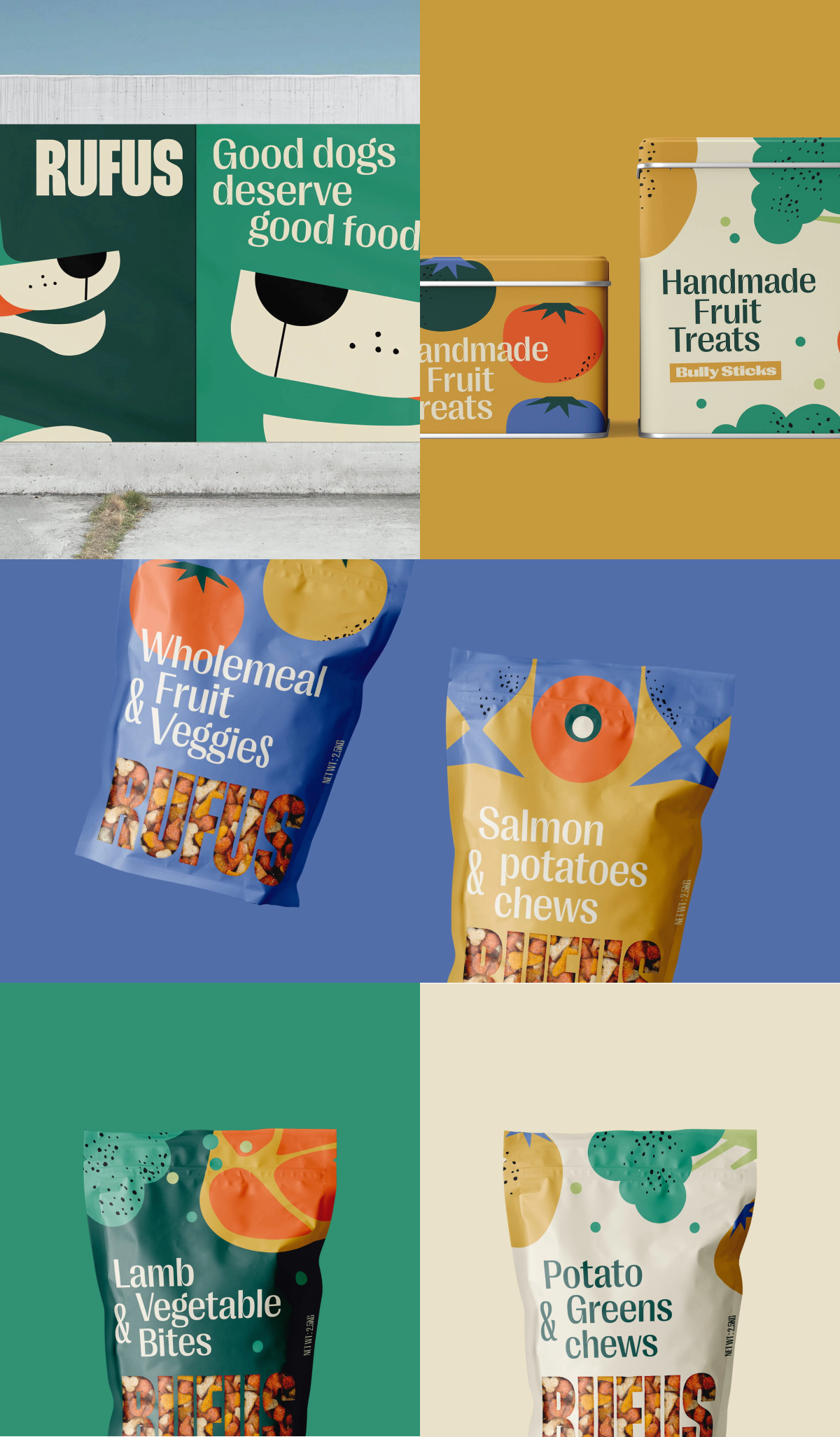
For example, when I did Unibottle’s landing page, I had to consider who they were and what they were trying to say. Unibottle are a startup based in Oslo, Norway, with a vision to innovate the Scandinavian recycling system, and it was important to them that the simplicity of their system was conveyed. Their current market is also catered to young adults living in the city. With all that in mind, I went with Neurial Grotesk for its bold yet friendly feel; it’s easy to read, it’s fuss-free, and it’s incredibly easy to use and scale. I also liked that the font family was quite big so I had a lot of options without any font pairing.
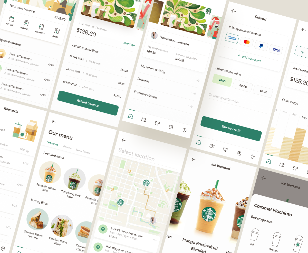
For our self-initiated Starbucks redesign project, the first thing I established was that it should feel polished and elegant. Then, I had to consider the vast amount of people that could potentially use the app. On top of that, the purpose of the app was to ensure people were guided to the right place to make their purchase; so, I chose GT Walsheim Pro here because I concluded that typography, in this particular case, isn’t ornamental but rather functional.

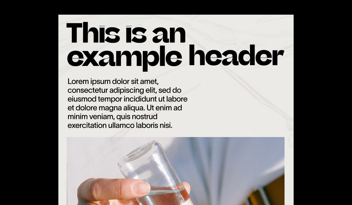
Separately, if it was a print or graphic design work, I would approach the typography very differently from UI/UX. Print work allows for more artistic creativity and having more long-form text also means choosing fonts that are easier to read in a block of text. I particularly like this pairing between Queens and Neue Montreal (pictured above), because it has a femininity to it while also being incredibly dynamic.
Are there any kinds of font parings you think are particularly successful in particular environments?
Yes. So, for print or packaging, I tend to gravitate to more artistic and expressive fonts because they should be eye-catching and exciting. Of course legibility is still a priority, but there’s more room to play here versus UI/UX.
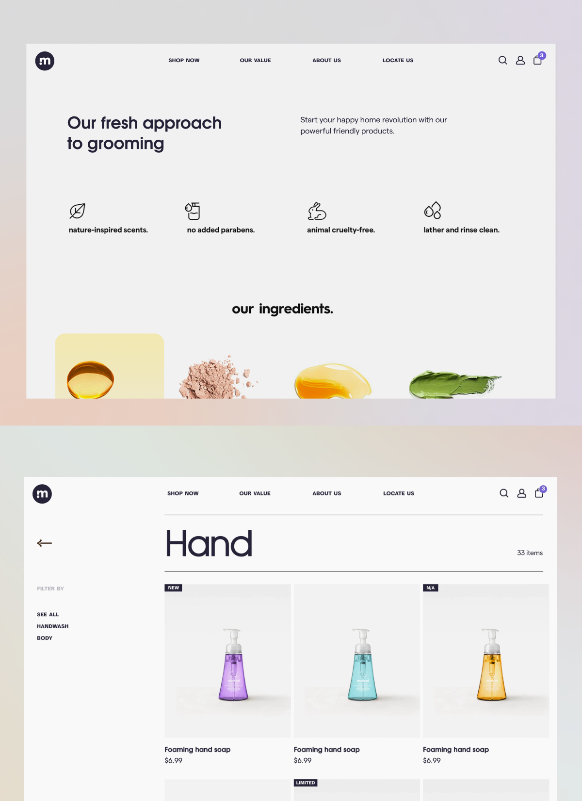
Typically for UI/UX, I tend to prefer to use one large font family and utilise its weights to create variations. In the Method redesign (pictured above), for example, I’ve completely utilised Evolventa to communicate Method’s brand and to allow the eCommerce to be smooth and frictionless from point A-B. I love that restriction because not only does it create a harmonious design, it is also incredibly fuss-free. In the digital space, more often than not, the site/app people use serve a purpose and typography is there to guide; so, it’s incredibly important that function comes first before aesthetics.
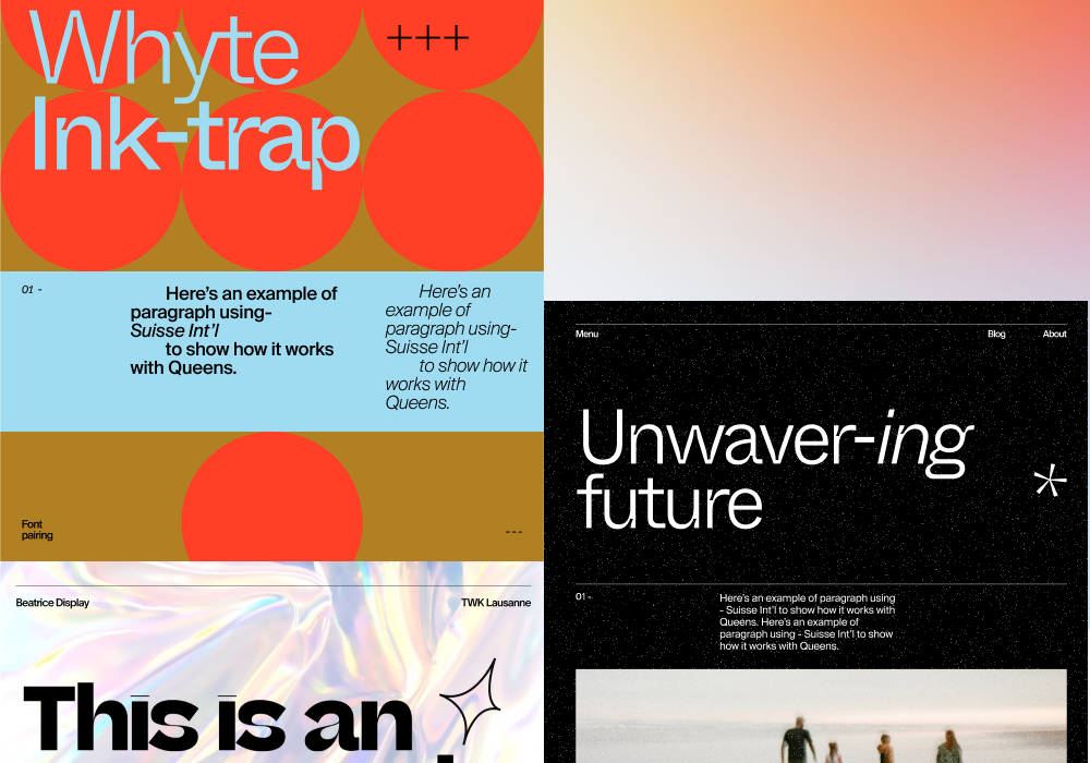
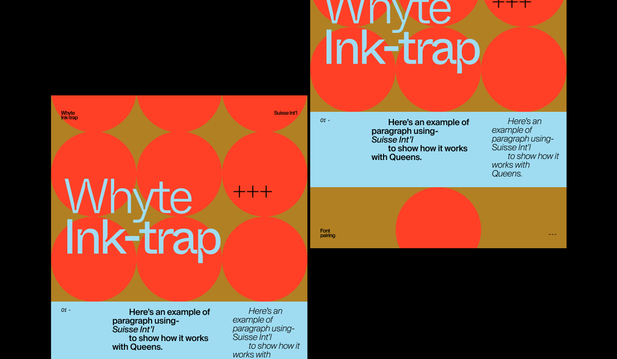
If a certain brand calls for a font that has more character in the web space, Whyte Ink-trap + Suisse Int’l makes a great pair especially if you are in the lifestyle industry. The slightly unconventional curves of Whyte Ink-trap with Suisse Int’l’s no-bullsh*t demeanour means you can have it all: function and form.
And lastly, do you have any ‘do’s and don’ts’ or top tips for people selecting a font for their web page (whether it’s for personal or client work)?
- A major ‘do’ is to, first and foremost, know your content. This is so important because depending on how long the text is, the font needs to accommodate accordingly.
- Going back to my point earlier about using one font only without pairing, a tip based on Material design is that the larger the font, the thinner it can go; the smaller the font, the bolder it can go. This logic is to maintain the readability and balance of the page regardless of the size. This also helps to create variations and hierarchy without introducing a new font.
- Try to imagine the font as an extension of the brand’s experience and consider how it looks throughout different mediums if possible. The font should encapsulate the identity of the brand in the audience’s eyes.
- The font must be easy to read, easy to use, and easy to adapt.
- There are many technical rule of thumb and guidelines but ultimately, trust your eye and intuition.
Thank you, Daniel!


