
In a nutshell, Future Fonts is an experimental platform for in-progress fonts. It connects designers buying fonts more directly with the ones making them, making it a unique platform for foundries to fund a long creative process, grow their audience, and get feedback on their fonts. In our first year, Future Fonts helped release an explosion of new fonts from an independent community of both emerging type designers, and well-established foundries worldwide. To commemorate the special first year we created HyperText.

HyperText is a snapshot of Future Fonts releases from 2018 to 2019. We partnered with our fellow Portland designers FISK to make something that is part type specimen, and part art piece. It primarily exists as an interactive website, and then, as oversized newsprint too. The goal being to push the limits of absurdity, sensory overload, and playfulness, while showcasing the 69 fonts released in our first year.

The prefix “hyper” represents a heightened tempo and the overall energy of HyperText. It refers to HyperText Markup Language (HTML), the code for building websites and internet infrastructure. It also references the quick, ephemeral nature of the in-progress fonts released on Future Fonts. The title “HyperText” nods to hyper-modernism and how accelerated technology and culture is affecting specifically the type world. Future Fonts, in its quicker, in-progress font releases and global community of independent foundries, is trying to be a positive product in this new era in type design.
“Being designers ourselves, we wanted to focus on today’s more rebellious and playful esthetics, and make fonts central to the artwork. We made HyperText in hopes of getting more people excited about fonts, and inspire them to think about fonts in new ways.” adds Future Fonts’ co-founder Travis Kochel.

FISK was the perfect partner for HyperText v0.1. FISK’s work blurs the line between art and design. In addition to being a studio that uses fonts as energetic, bold elements, FISK is also an art gallery that brings together designers, musicians and artists through art shows and events. They understand and share many of Future Fonts’ values, especially in regards to community, independence, and creative risk-taking. “It is an extremely ambitious and atypical challenge for us to showcase 69 fonts within a single project. To ground the project we explored overlooked cultures with an abundance of type and utilitarian forms of graphic design,” says Bijan Berahimi, principle designer at FISK.
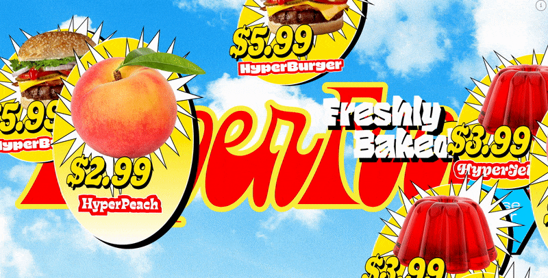
HyperText focuses on three distinct visual vernaculars: HyperFood; HyperAge; and HyperWeb. HyperFood references typography found in consumer fast-food culture, finding inspiration from drive-throughs, overwhelming menus, bootleg eastern interpretations of western food, and aggressive sales lingo. Some featured Future Fonts that epitomize the energy of this spread include Gooper, by Bay-Area designer Very Cool Studio, Dunkel Sans, by South Korean type designer Minjoo Ham, and Funkford, by Aussie designer Dave Coleman.

The HyperAge theme is inspired by new age-y, chakra and yoga worlds. A few of the psychedelic Future Fonts featured in this spread include Nostra, by French designer Lucas Descroix, Spindle, by Armenian and Colorado designer Gor Jihanian, and Eckmannpsych, by Bay-Area designer James Edmondson of Oh No Type Co. James is also one of Future Fonts’ initial founders and designed the logo as well as instrumental in shaping the Future Fonts community.

While HyperWeb is an environment inspired by early, chaotic internet websites, that reference designs and layouts that are messy and unpredictable. Think Geocities and MySpace layouts, throwback animated gifs, old-school screensavers, banner ads, and popup windows. Also, the snarky font reviews featured in this theme were a group effort collected online from designers of Future Fonts as well as from supportive community members on our social channels.


In the HyperAge theme, breathing exercises and movement were the perfect metaphor to showcase variable fonts from the Future Fonts collection. Variable fonts are a new technology that gives graphic designers more power to personalize the letterforms in a font. It can be useful when creating logotypes, pairing type with illustration styles, expanding headline options, and many other ways a designer might need to tweak the font so it is a little more unique or precise. For example, below is an animation of the letter “A” from the font Cheee by Oh No Type. Instead of being limited to a few static styles, variable fonts provide many more in between options. It is a new font feature worth sharing, and really easy to start using in popular design apps like Adobe Illustrator, InDesign, Photoshop, Sketch, CSS, with many more being supported soon.

On the HyperText website, a helpful feature worth mentioning is the font inspector. Activated by a small “i” in the upper right corner of the website, it allows people to identify each font amongst the visual chaos and links out so users can learn more about the font and designer.

The entire HyperText experience initially materialized as a Future Fonts art show and launch party at the FISK gallery. For the first two weeks, the website could only be experienced in real life at the gallery, and was promoted with the slogan “URL IRL”. A “URL” is the address of a webpage, and “IRL” is an acronym for “in real life”. Highlighting the novelty that a website could only be used in person at a gallery.

Interactive spreads of the website were projected on a large wall as people navigated the themes from a laptop on a plywood pedestal in the middle of the gallery. Another wall was covered from top to bottom with spreads from HyperText reinterpreted as print, and a grid of all the Future Fonts and foundry names from the first year. The overall effect was an immersive font and design experience to bring together the design community.
In addition to the exhibit, there were oversized art newsprints with posters of the spreads, and limited edition tie dye and white long sleeve shirts. DJ Jester debuted her set, while donated Baerlic beer, and locally made kombucha and rosé helped raise money for the Amazon fire through Amazon Watch. To help make it bigger and better, Dropbox Design generously donated to the party and helped bring together a larger design community across multiple disciplines.


In conclusion, our one-year commemorative project is more than a type specimen. It is an art piece made with our friends at FISK and also a celebration that brings together a design community that supports the creation of new fonts and independent creative work.
Words by Lizy Gershenzon – Co-Founder of Future Fonts


