
Amber: Hi Mark, so can you tell us more about yourself?
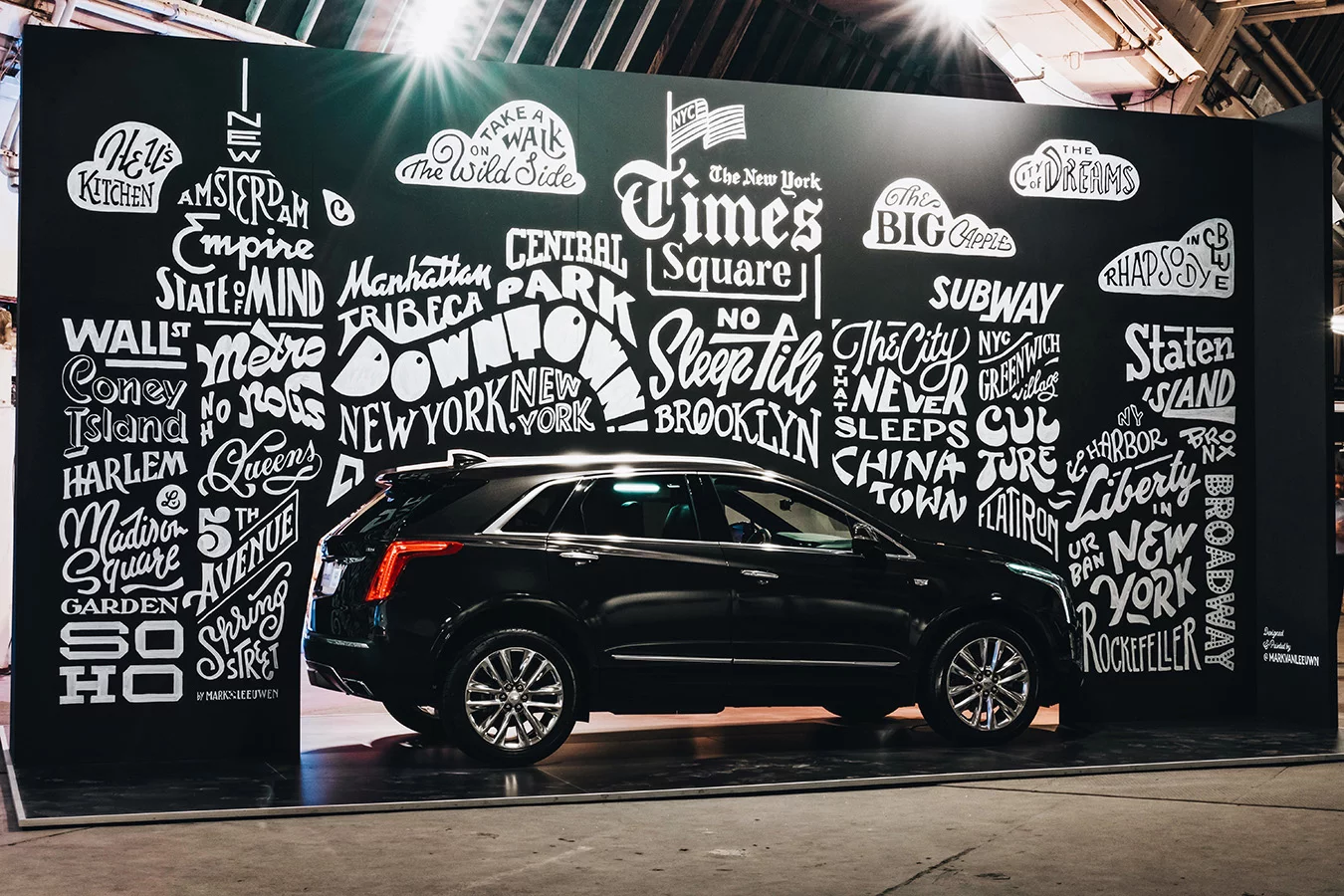
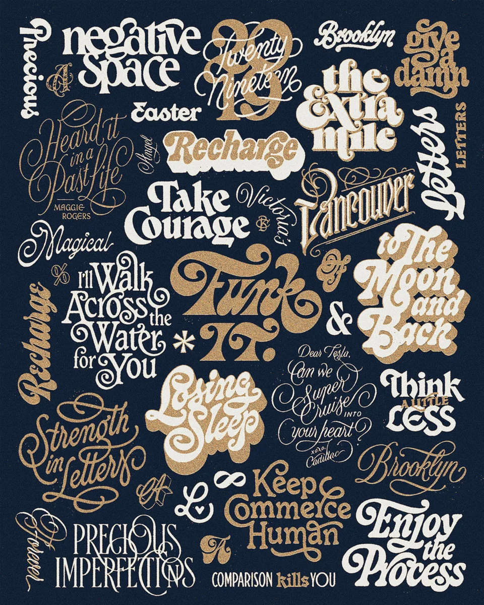
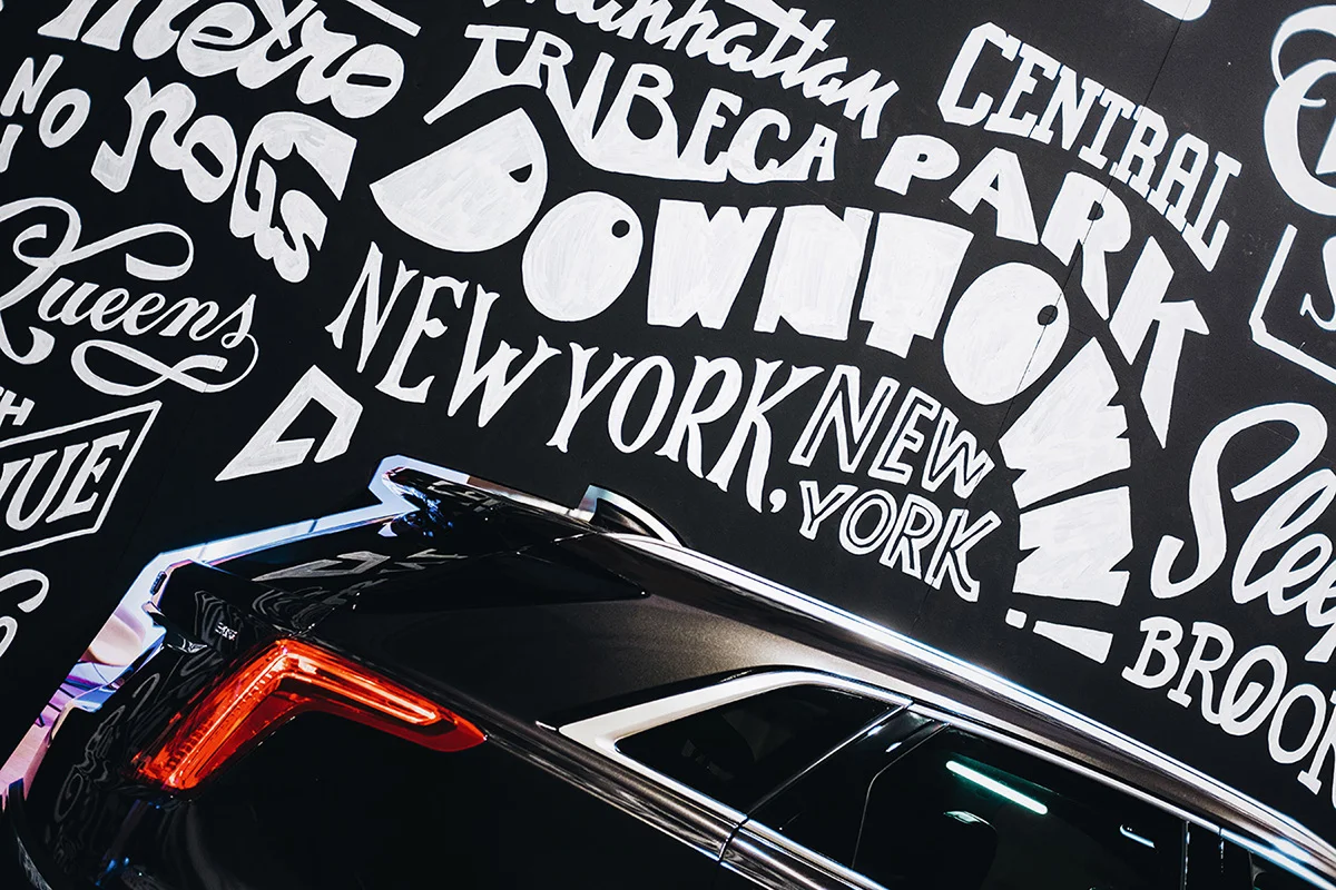
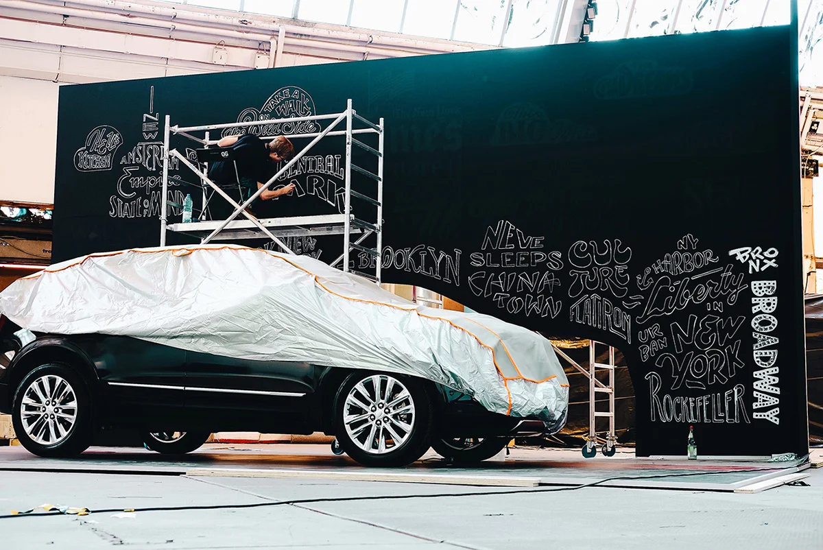
Mark: Sure. I’m an Italian/Dutch lettering artist and type designer based in Berlin, Germany. My journey as a letterer started around six years ago when I first discovered a passion for letterforms and typography. As I started exploring the world of hand lettering and posting my work online, what started as just a hobby, over the course of a few years blossomed into something bigger. After high school, in 2017 I moved out to Berlin to study graphic and type design, which also gave me the opportunity to properly start freelancing on the side. Since then I’ve been lucky enough and honoured to have work with clients like Etsy, Cadillac, KFC, Harper Collins or Jägermeister among others, designing logotypes, lettering pieces for labels, book covers, campaigns or murals.
A: Nice, so where do you get your inspiration from?
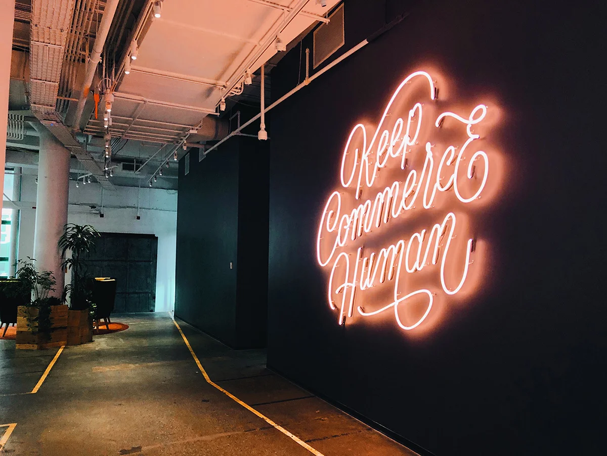
M: When I first started out, as cliché as it may sound, I used to get inspired by the lettering work I was seeing online, and wanting to put my own spin on it. I also use a variety of books about type and lettering, ever since I moved to the big city, though, I learned that you can get your inspiration literally anywhere and from anything, the trick is to just keep your eyes open and look around. Type is everywhere, and cities are a goldmine for it. Neon signs at corner shops, posters on the side of the road, old book stores or record stores, train station signs… you name it! It’s become a habit now, whenever I walk around town, to actively look for interesting type treatments and details. I simply take a picture of them so I can use them as references or inspiration for my own work.
A: How do you create your lettering graphics?
M: I used to use very few materials to create my lettering pieces: just a pencil, and a piece of paper. I’d start out with rough sketches, refine those as I went on, to then scan the final drawing and bring it to the computer to vectorise it if necessary. Essentially this still is my process today, the only difference being that I do all of the drawings digitally, using an iPad. I made the switch a little over a year ago and I haven’t looked back since, purely because it makes the process so much smoother and faster from start to finish.
A: What’s your favourite piece of work you’ve done throughout your career
M: My personal favourite project would have to be a mural I designed and painted in Munich, Germany in 2018. It was the first time I’d ever painted a large scale piece, let alone an 8x4m mural! It was a challenging but amazing experience, and I was pleasantly surprised with the end result. It holds a special place in my heart, for being what I consider the first big milestone in my career, but at the same time for having given me the opportunity to step out of my comfort zone and try myself at something I hadn’t done before.
A: What is the most challenging thing about creating your lettering pieces?
M: Lettering is all about making type (whether it be a single letter, word or phrase) come alive and convey a certain message. To do this I look for ways to make the letterforms more expressive, for example, to add flourishes, decorations, alter the baseline… etc. Working with those additional elements and parameters opens the design space immensely, but can also be overwhelming and harm the result. One of the biggest challenges I face is trying to find the balance between expressivity and effectiveness — essentially being the middle man between the artist and the designer. The design needs to be full of character and feel “custom”, while being legible, well constructed and successfully conveying the right message.
A: And finally, any exciting plans for the future?
M: Throughout the last year I’ve started to really get into the world type design, and my plan moving forward is to explore this field, alongside lettering. The shift from lettering to type design might seem counter-intuitive, but I’m excited by the prospect of taking lettering pieces and trying to expand them and make them work as fully-fledged typefaces.
Check out more of Mark’s work here — markvanleeuwen.co


