
“I like to f*ck with it” — Giulia Boggio on creativity, type, visual language and more.
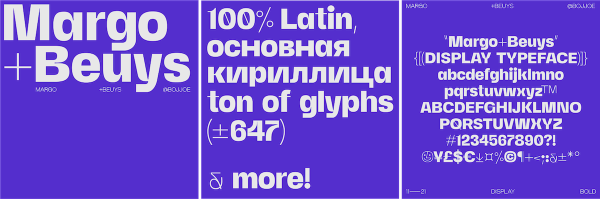
I recently had the pleasure of catching up with Giulia Boggio (@bojjoe), the creator of fonts including Margo+Beuys, Rigatoni and Fabio XM and a multi-talented mind who, despite their incredible portfolio, only started dabbling in type during lockdown. She is open, honest and generous as she lets us into her world, serving up your daily dose of type inspo alongside some great food for thought – a joy to speak with, and I’m sure you’ll feel the same.
ZLM: Hey Giulia…before we jump into the deep end, what does a typical day in your life look like right now?
GB: Hey! My “work” days are pretty normal and unglamorous. Wake up around 9 AM, have my potentially dangerous amount of coffee, take my meds and sit at the kitchen table with my laptop. Music on, water bottle sitting hopelessly next to me hoping I’ll finally learn to stay hydrated, all ready to go. One thing that I had to learn was that in order to have a hectic work schedule I have to calendarize all of it. ALL. Too much stuff going on in my head to also remember things.
I rarely feel like I am having a hard day as I keep switching between work projects, personal stuff, house tasks, facebook marketplace-ing… I think I figured out how to trick myself into being always quite motivated to do the work & this to me means that what my day looks like depends only on how my brain works. And this was such a liberating thing to realise.
ZLM: So, why type? What drew you in?
GB: Type is something I’ve appreciated from a distance for quite a while but never dabbed in until lockdown. At some point I was living with full-time working friends, my work at the studio was dry & so I had to figure out how to stay busy as I felt quite lost and bored. I am always challenging myself & I am rarely NOT working on something, so a long period of stillness was not exactly something my brain resonated with.
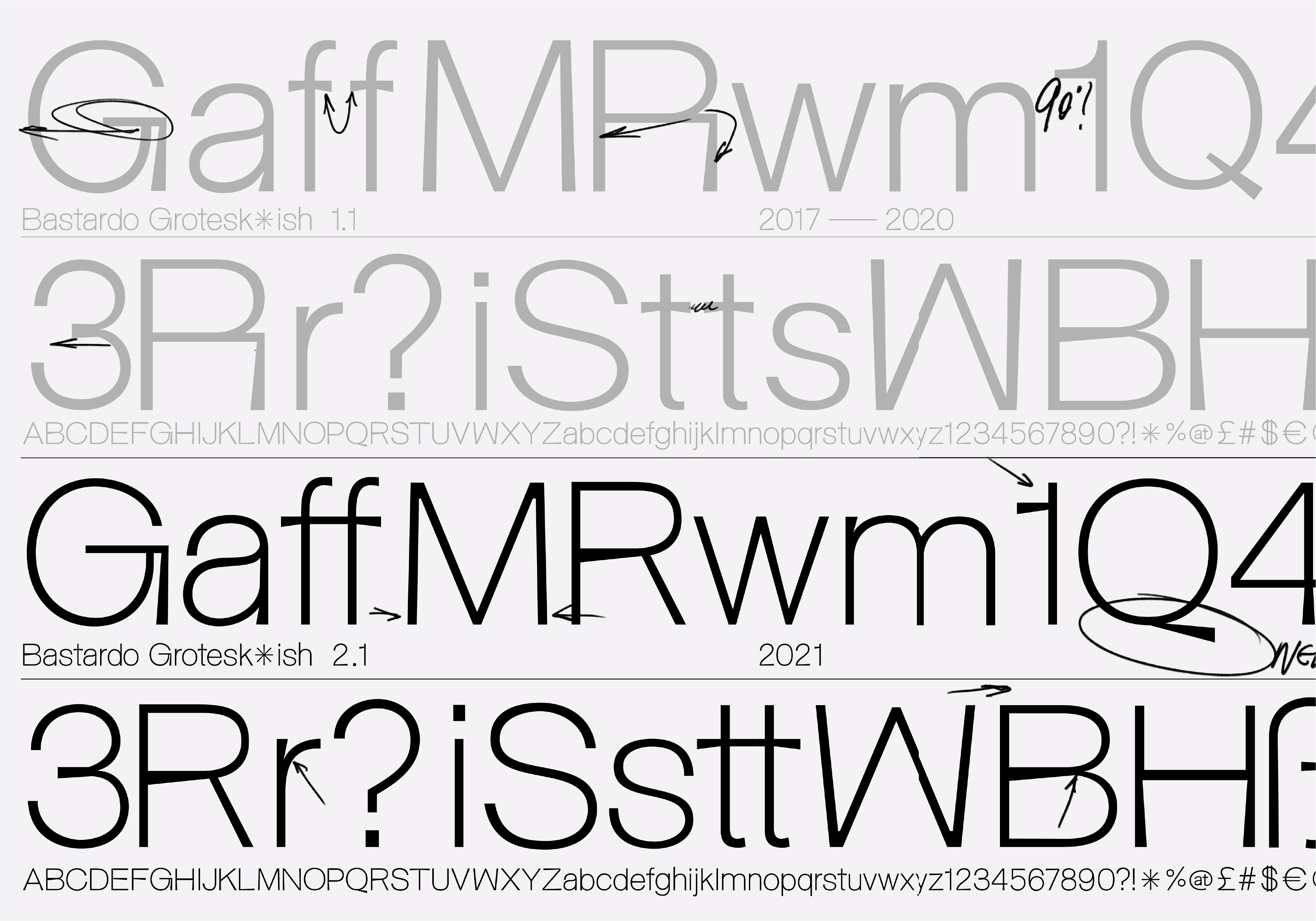
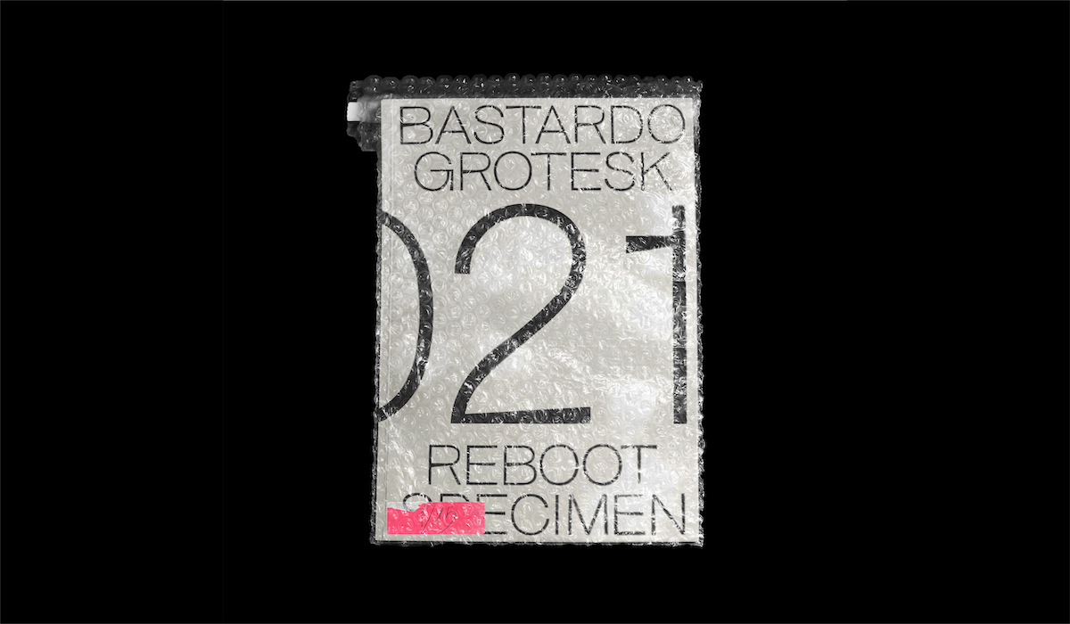
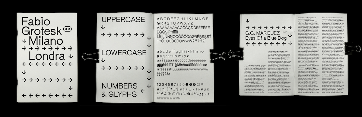
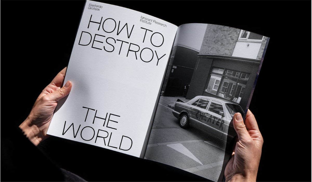
So I picked up an old uni project where we designed custom characters and I taught myself to use software to turn it into a typeface. That’s where the first version of Bastardo came out, and it’s also the reason it’s called Bastardo Grotesk*ish, as I really had no idea of what I was doing before I started. I recently released a v2 and it’s so exciting to see the growth in quality and sensibility in the span of a year.
I also honestly love the idea that a typeface is inherently existing to be paired with design, and the idea of watching the typeface be interpreted by other designers was thrilling. My friend Gemma keeps laughing at me adding new hyphens to my job description but I think that’s hilariously really what drew me in: something new to learn.
ZLM: I guess I’m talking about fonts, but also aesthetically in general, do you feel like you have a ‘style,’ per se, or a certain visual language?
I think this is the hardest one for me as I think of this as an ever-changing feature. I love to think of my aesthetic as not giving away much about what others define me as. There’s some playfulness, some hardness, never too much of a rigid structure, a lot of contrast, and if there’s colour it’s very likely punchy. I think I always fought the idea of gendering in design. That some groups will create or receive a specific type of design, what we expect something to look like based on the information we have about the target or the designers. I like to fuck with it.
ZLM: Yeah, I love that. What do you think about the idea of ‘style,’ then, as a whole? I think there’s a tendency in people who work visually to feel like you have to find your ‘style’, ‘visual language’, ‘creative voice’, or whatever you want to call it, but I don’t know if I think that’s necessary or conducive to enjoying your work…What do you think?
GB: I agree, there’s a lot of pressure to both find your style and your path and honestly…I am not sure this is the only way to be happy/successful/accomplished. It feels like you need a clear definition of who you are to feel happy and satisfied. And I’m not super keen on hard definitions so I’ve been really sceptical of this notion of a final form to aspire to. It makes it sound like you’ll find your style and that’s it, you’re sorted, nothing more needs to happen. And this is so far from true.
I think it’s important to find your personal voice as a designer and your ethics more than a visual language – learning your boundaries and what type of process works for you, where you thrive and how to recreate these circumstances on any project. I think when I was younger I focused so much on the look of my works and not much on the ethics and process, which actually opened so many doors when I finally embraced it. For example, I am currently feeling very accomplished by art directing a project that is virtually the opposite of what “my style” would be, and I am really enjoying it ’cause it led me to “unlocking” some skills and learning new things about myself.
ZLM: That’s such an interesting perspective. So true. Do you find that other interests of yours play into the way you design type, like, can things change based on what you’re into?
GB: I think my visual taste and interests span so wide that it becomes almost impossible/a shame to not pick and mix. See, I love furniture and interiors for example, and I think that plays a huge role in the relationship between shapes and weight I apply in type. I have also worked as a tattoo artist for the past 5 years, which exposed me to so many different styles and aesthetics.
I think visual exposure tends to be limited when using social media etc, as we mostly end up seeing what we like, especially if our interest is quite specific, which is a double-edged sword. With working in a more “mixed bag” environment, want it or not, you’ll see so much that’s so different that I think opens up your view a lot.
ZLM: How do you explore different ways of working? Do you have any exercises to help you get out of your head, etc.?
GB: Oh god, I am always in my head!! I’m a neurotic being, but I noticed I could thrive on this energy so I’m kinda learning how to make it work. My two ways of working are either completely stuck or complete tunnel vision. I rarely see the in-betweens.
Music is a huge part of my work process, I rarely work without something playing as it helps me stay focused.
Again I also always have at least 2-3 things going on, so I try to switch to the next task when I feel frustration coming. Sometimes I need a walkie to clear out my head. And, this probably has no scientific backing, but someone on insta posted about wearing shoes at home to stay focused and feel like you’re in work/outside mode, so I’ve been trying that.
Apart from this, I feel extremely unqualified to give work advice.
ZLM: They’re great tips, though! So, what have been your favourite projects to date, and what are you working on right now?
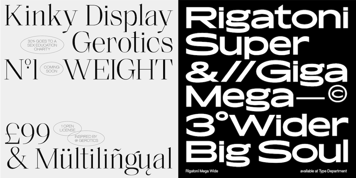
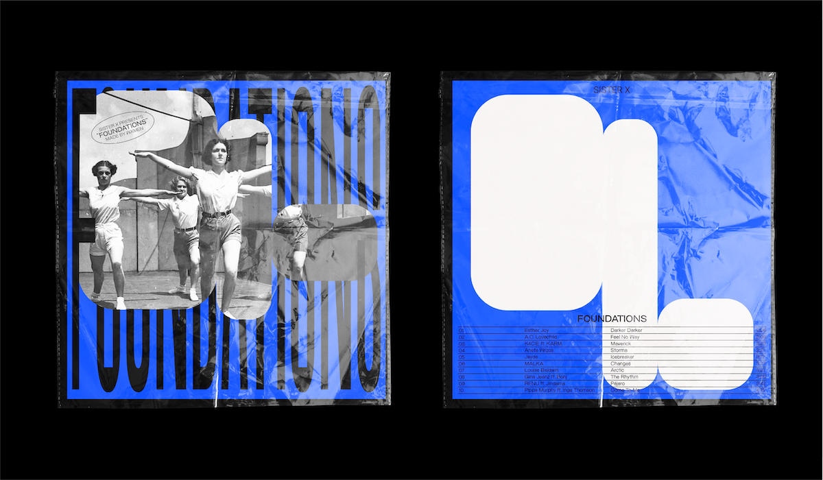
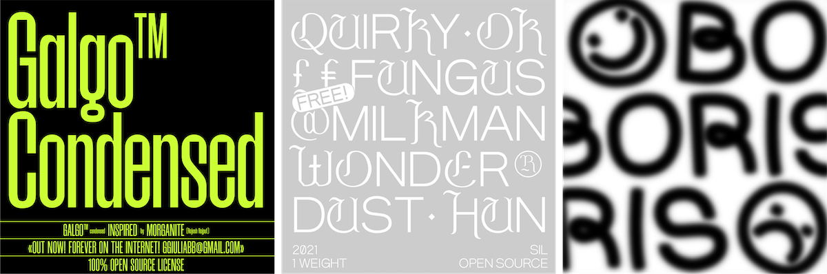
GB: I always think my fave project is the next one as you always gather new skills and tricks. I recently worked on an album cover for Sister X, a collective of female and non-binary producers, which was really fun as I got to explore this idea of how we communicate female-led projects. I also got to finally use Galgo as the main typeface for a project. I am absolutely obsessed with open source stuff as I think that’s just the purest form of the internet.
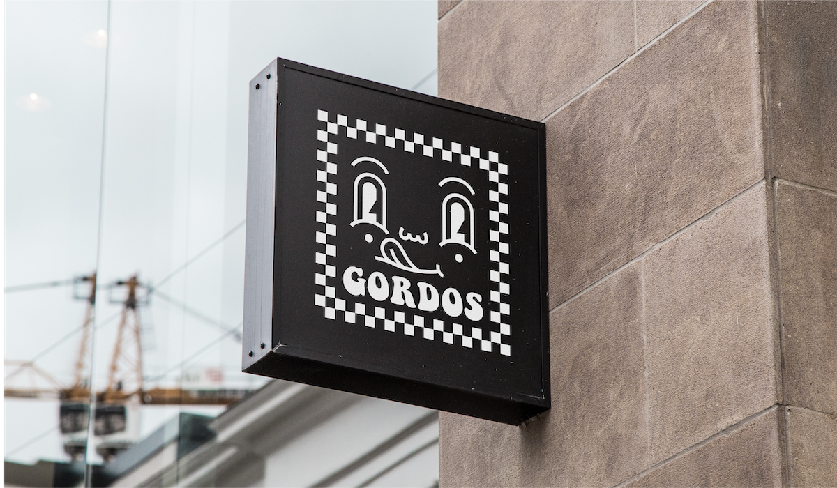
Another fun one was rebranding a pizzeria here in London, and it was quite surreal because the owner is the same person I worked for as a waitress when I first moved to London (at the time it was a Turkish restaurant). I absolutely love these somehow symbolic things happening; full circle sort of thing. I think it’s fundamental to always see the roots and never only judge ourselves on the now.
Currently, I am working on a custom typeface for Gerotics, who is a friend and muse. It’s a serif-display typeface that we’ll probably release at some point this year, and a third of profits will be going to a sexual health charity.
ZLM: Amazing stuff! Lastly, what’s bringing you joy right now? What inspires you, and also, just because it’s always interesting to hear, do you have a favourite glyph to draw?
GB: I live in London so I must say THE SUN! I feel so much more creative and inspired on a sunny day. Everything has more taste and feels sharper. Jokes aside, I get inspired by anything, it can be the shape of a spoon or a building. Complete equality.
This week I’ve been creatively inspired by a fruit bowl I saw online, an artwork by Oliver Murdock that I just got and Bosco’s eyebrows. I am also getting a lot of joy out of our flat and making it nice by aggressively thrifting. Working on my art collection by trading skills with people is quite cute too: a little while ago I traded some typefaces for an incredible piece by Tobias Bolliger.
And – capital G with no hesitation! I have a solid 3 of those in my name, and it’s one I often found a bit underappreciated.
ZLM: Thank you so much, Giulia!


