Firstly, could you tell us a bit about yourself and your work, as well as how you got to where you are today?
I am Li Zhiqian (@colourphilosophy) from Shanghai. I am a designer working on many fronts. I studied Industrial Design in an Architecture School and in my decade-and-a-half professional career, I have designed interiors, furniture, various products, books, graphics, and fonts. I have also worked extensively with installation and exhibition, while writing and translating on the side. In short, I see myself as a design-oriented researcher, curator and writer.
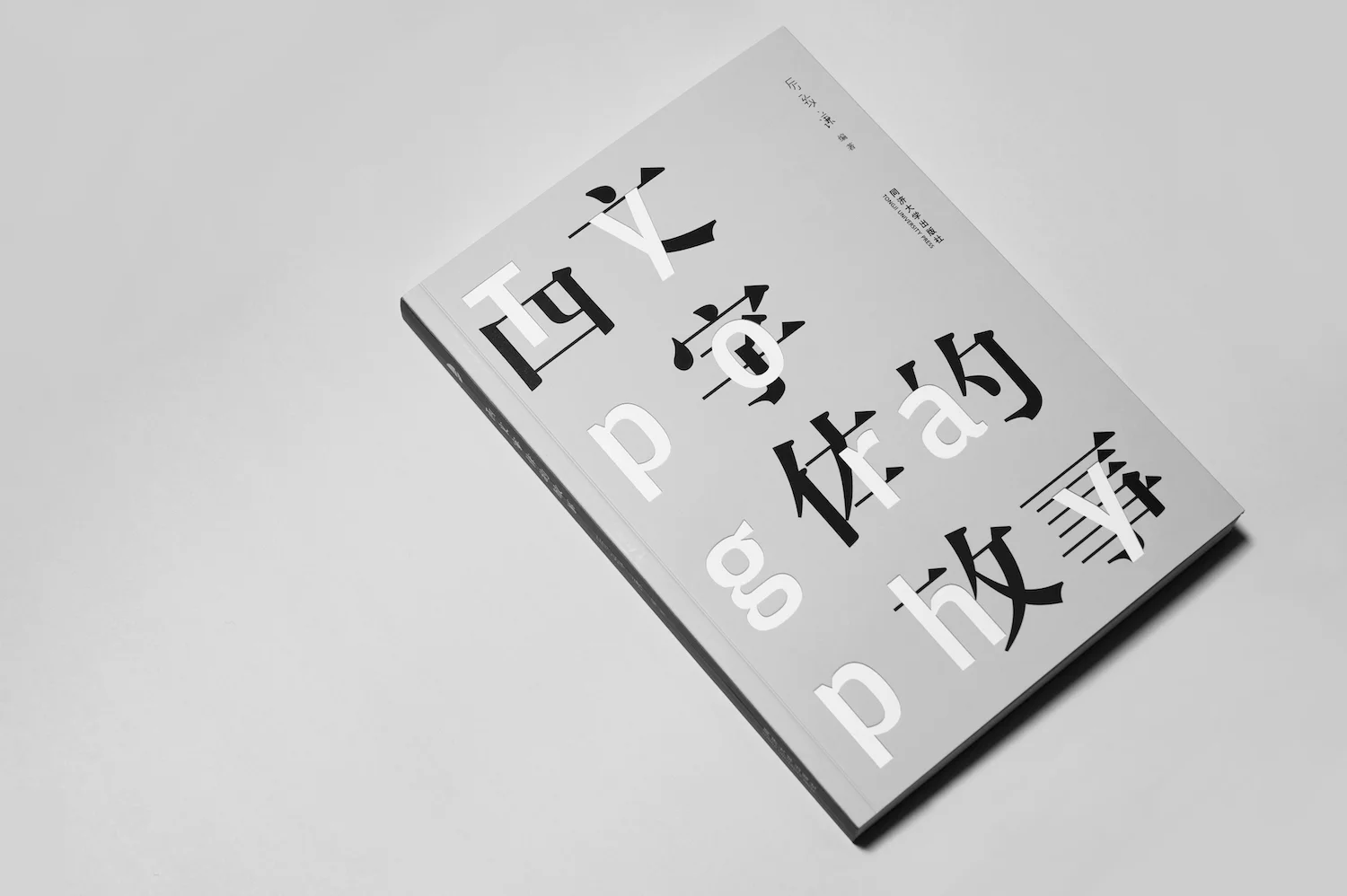
My broad interests in design include type and typography. I came to the field by accident when I discovered the beauty and diversity of typefaces in school. Since then, I have voraciously read and then written about the Latin typeface, soon becoming a major contributor to TypeisBeautiful (now TheType, probably the one and only Chinese-language media specialised in type). My essays eventually boiled down to a book titled Stories of Western Typefaces, published in 2013. More recently, I have translated two other books, The Art of Calligraphy and Never Use Futura.
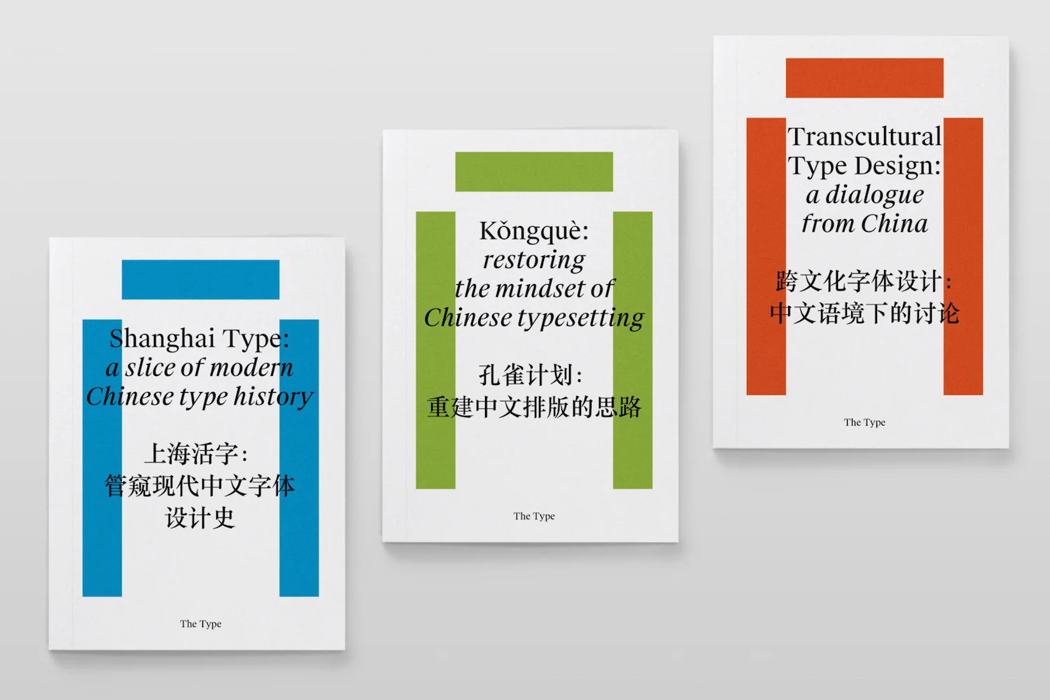
You’re a co-founder of 3type.cn, a multilingual and multi script type foundry. Can you tell us a bit more about 3type’s ethos and how it all began?
3type was conceived in late 2017, by type designer Zheng Chuyang, me and another friend of ours. The motive was to set up a foundry distinctive from what currently are in China, larger, heavier businesses that take advantage of China’s inexpensive labour but nevertheless dominate the market. We want to offer fresh, creative, forward-looking solutions to the market, by focusing on type, culture and research. We aim to enhance productivity by upgrading tools and methodologies, so as to cheapen the cost of Chinese font-making, and designers can really spend more on forming new ideas and designs. I think 3type’s mission in this field is to create new business models so that the industry goes further, and to promote the general public’s awareness, usage and education of type and typography.
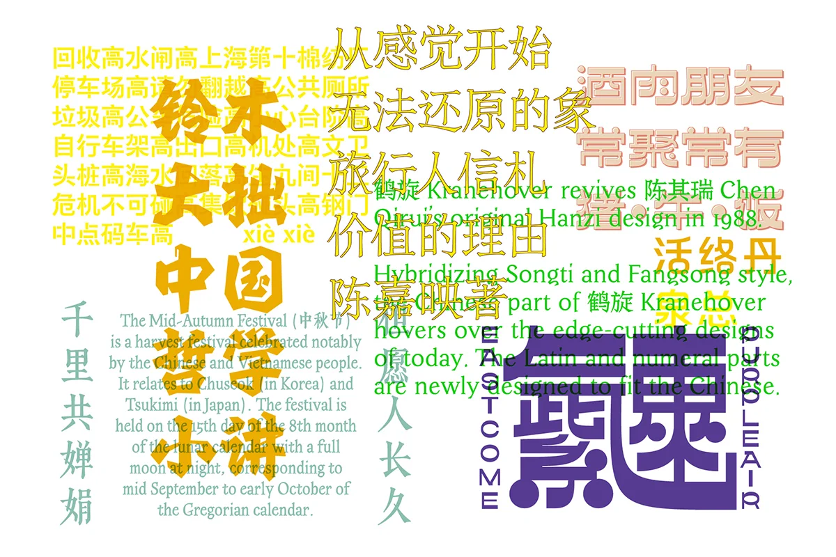
3 can mean ‘multi-’, as the Taoist saying goes, three gives rise to everything, and thus also the name. The “multi-“ theme also resonates with our members coming from a variety of backgrounds, which gives us a unique place among foundries in China. We also don’t want to just concentrate on Chinese or Hanzi. 3type is maybe the first foundry in China with a specific agenda on multi-script typefaces. As China becomes unmistakably more and more international, there is a global demand for the Chinese counterparts of existing visual identities, so as China’s own brands setting eyes on overseas market. On the other hand, despite common stereotypes, China is in fact a multi-ethnic, multi-lingual, multi-script country. And apart from Mandarin-speaking majority, various groups in China speak other dialects and languages and use other scripts at the same time. Mongolian, Uyghur, Tibetan and other ethnic groups also aspire to use more modern and better-quality typefaces. There are no such markets here today, but there should be.
We are a strong advocate for cross-cultural exchange and understanding. And we hope by linking type and culture, and by going both global and local, there will be more and more interesting types for all of us. It is a long and not so easy path.
3type seems extremely research driven and strives to promote ‘cross cultural exchanges, development of new design concepts, type matching theories and practices, and type-related research and education.’ Can you expand a bit on the role you feel type has (or could have) to play in shaping culture, communication and cultural exchanges?
To build something really meaningful, research always has to come ahead. Typeface plays a crucial role across writing cultures that contain enough of sophistication to express ideas, feelings and philosophies. Type styles are representative of the visual voices of a language/script and arguably the culture behind. Cultures influence visual styles, and vice versa. It’s a mutual process.
Misunderstanding of typefaces could cause problems in cross-culture scenes. I have recently done an interview with Vogue Business on international luxury brands’ often-failed localising efforts in China, particularly their struggles with the Chinese type style. This is typical. Visual resemblance doesn’t always translate to cultural appropriateness. Do your research.
But it’s also true that misuses could lead to the fashioning of new styles or subcultures. In this case, proper research into the ins and outs of a typeface or a style category is important. It has to be an educated, intended design that can explain itself cross-culturally.
A product needs consummate craft and deliberate ideas. A typeface is the same product. There are at least over 7000 complicated glyphs in a standard Chinese font. To develop a Chinese-included typeface means enormous labour; it doesn’t make sense for a small foundry like us. We have to choose a research-driven strategy, by enhancing the efficiency and diving deep in design. We will show a few cases in point this and next year.
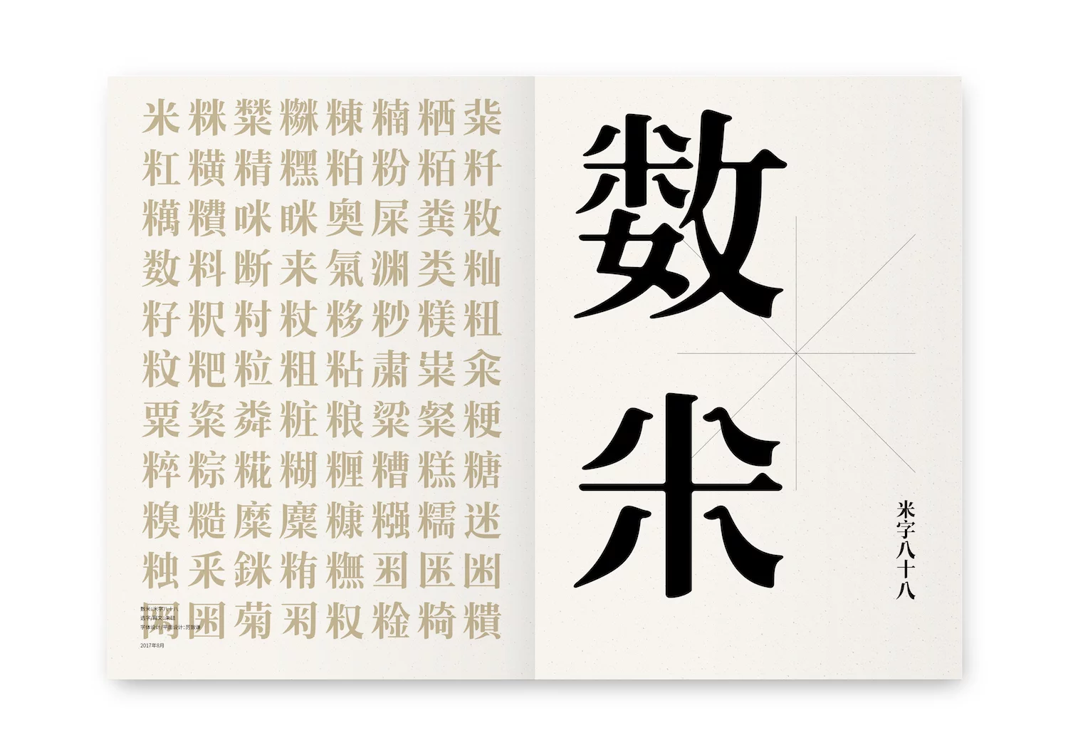
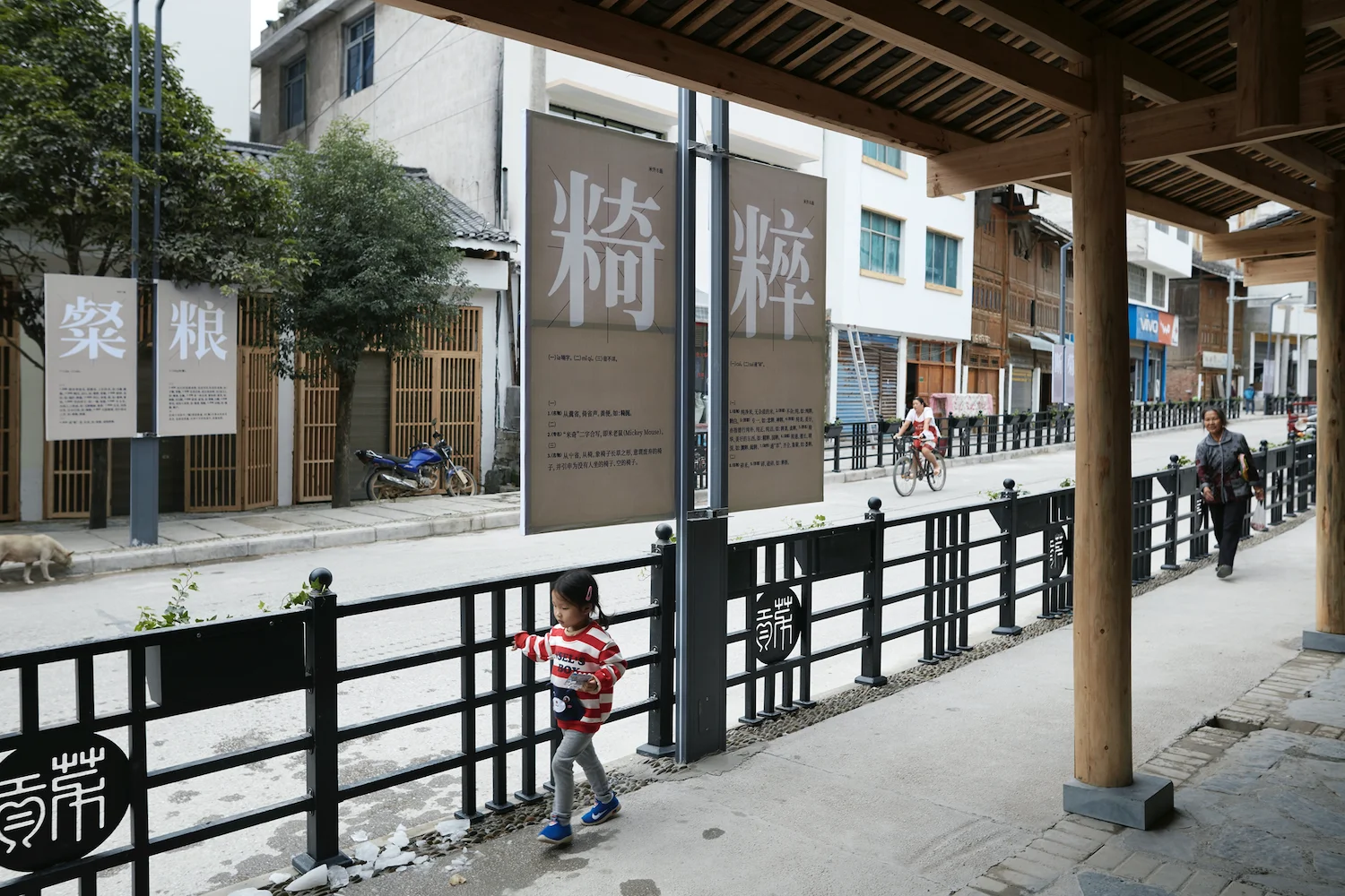
You’re also the initiator of the Shanghai Type Project. Could you tell us about this project a little more, its aims and intentions and how it came about?
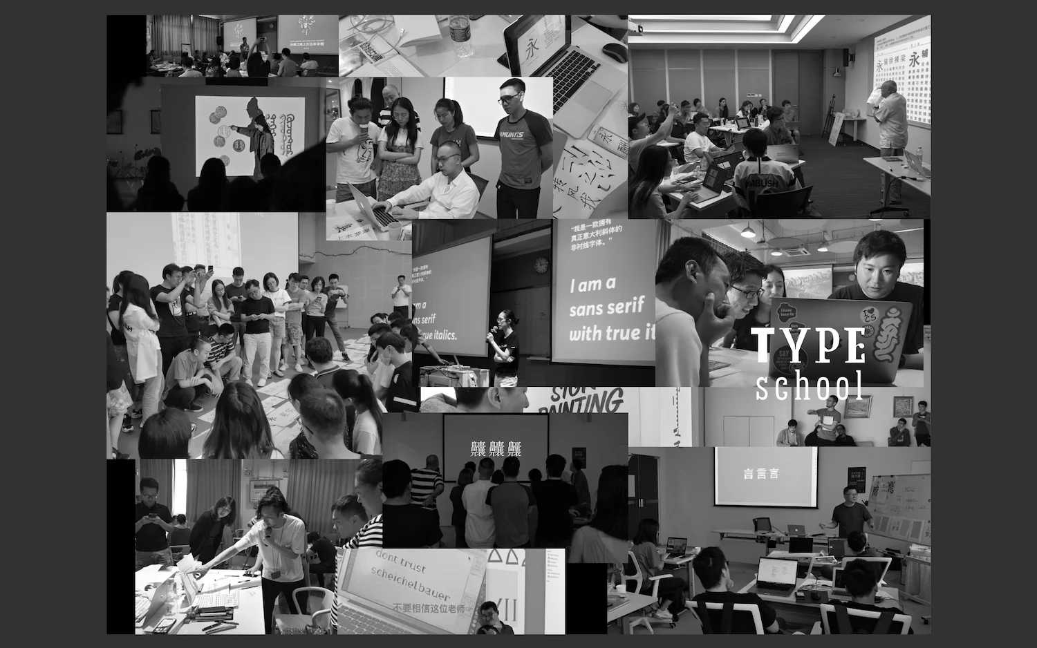
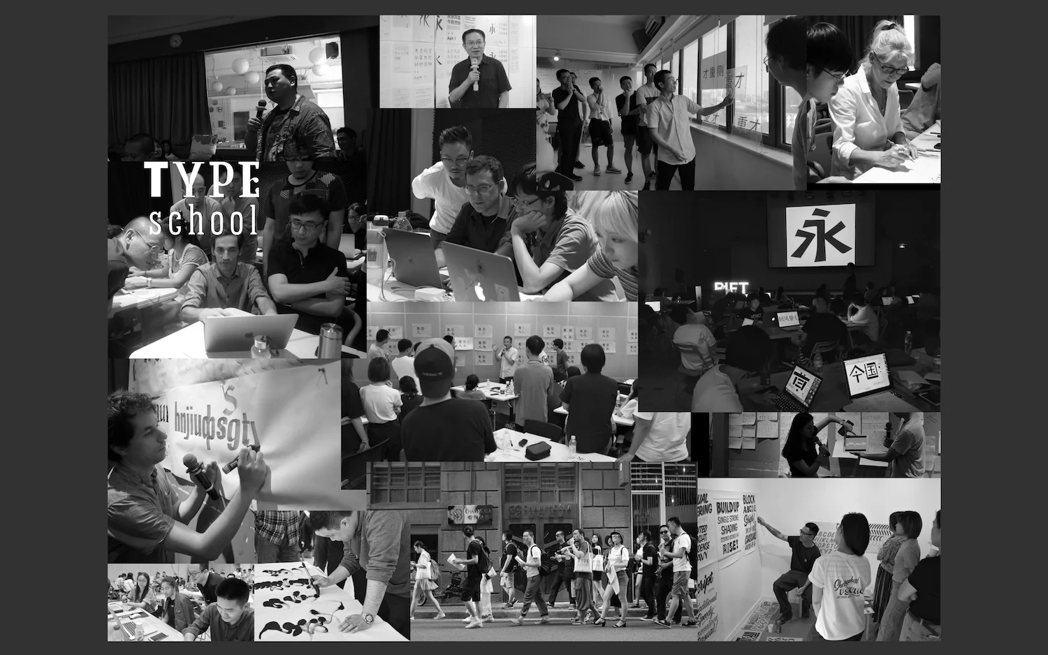
The Shanghai Type Project started in 2010, when a Chinese type retiree/veteran in Shanghai reached out to me to speak about his working experience. Soon enough, I decided to initiate the project, beginning with documenting oral histories and collecting material evidences.
Now, ten years later, we have interviewed many older-generation Chinese type designers and their family members, engraving and casting technicians, foundry owners, businessmen, researchers and critics, etc. We’ve also visited older foundries, type companies and historical printing houses. One of the project members even went to the last matrix factory in Shanghai and joined as an apprentice for a month.
We’ve collected recordings, photos, documents and manuscripts from our interviewees. We are now building a wiki-style online archive that should be online in a year or two.
Movable metal type making and printing technology were introduced into China by missionaries in the 19th century. It was in Shanghai that it became localised and industrialised successfully. Type design as a profession also started here in Shanghai from 1960. Today, anyone who wants to learn Chinese Hanzi design has very little material to start with. Design schools don’t teach either its history or know-hows. Shanghai Type Project’s intention is to reveal the long ignored part of history and learn from the Chinese type-making pioneers. I believe only in this way could we build the Chinese type and typography as a subject in study.
As an individual, your approach to design seems pretty multidisciplinary. Do your practices and projects overlap and feed into each other, or do you feel that they’re more separate? How does this impact your work and practice?
My research and projects feed into each other. When I started out first as a freelance, I didn’t have many projects to work on. I knew I was ignorant of and inexperienced with design. So I started to learn whatever I was interested in and tried to work on different fields of design. The wonderful result of experiences on different fields of design is that my perspective becomes “polygonal”. After working this way for over a decade, it has in effect become my style.
How would you describe your creative processes in your different design works? Where do you make your work and what tools/processes do you tend to use?
I normally start from conceiving concepts and then try to objectify them in details. I really like what one of my favourite architects, Tado Ando, once told about his work. He said he grabbed an idea of how the architecture should be designed on site just within few seconds. But he needed weeks and months and years to finish the design. I sometimes have the same feeling. I make my work in my head rather quickly. Tools are not important at this point and they can be picked up whenever needed.
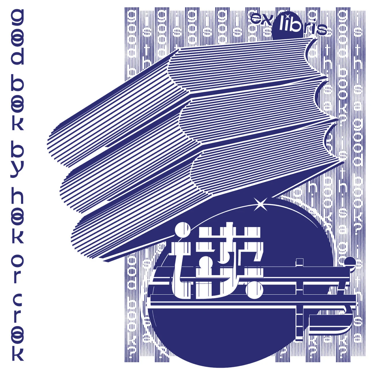
We loved the designs you recently posted on Instagram for the Ex Libris Book. Could you tell us a little more about this project; how it came about and what your process was like creating the type and illustration?
We are heading to an art book fair in Ordos (ᠣᠷᠳᠤᠰ) in inner-Mongolia. The Ex-Libris series is actually part of our exhibiting projects there. People can actually stamp them on books they purchase at the fair, mimicking how ex-libris were used historically. We have now decided to include an ex-libris mark for each and every 3type font.
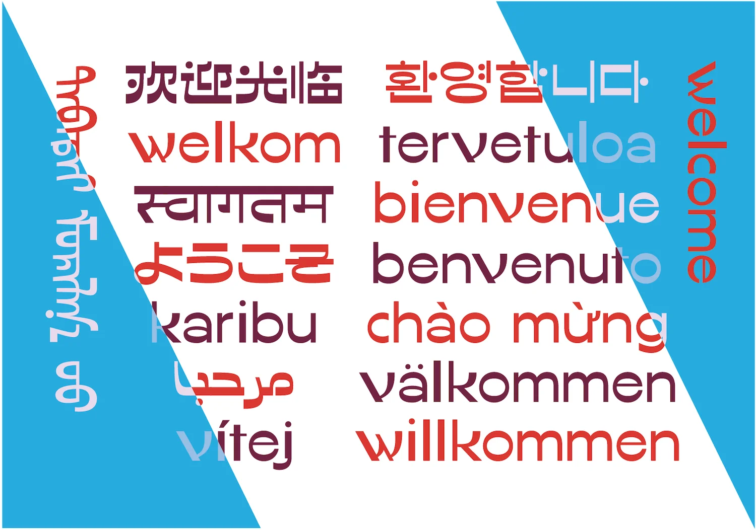
What are your favourite, or most challenging, aspects of working with multilingual/multi-script type? How important is promoting multilingual design, to you?
The most challenging and enchanting aspects of working with multi-script type design is the translation and balance in design. I need to learn about different scripts. How is it written and what does different styles mean in their cultural context? Multi-script design is not an exception in China but a must-have. There are many English words being used in Chinese’s daily life. For example: Wi-Fi, NBA, CPU, 4G/5G, App… For a Chinese type designer, working well with the Latin design in a Chinese font should really a prerequisite, let alone with other scripts.
What projects are you working on at the moment, or in the near future, which we should look out for? What are you most excited about creatively at the moment?
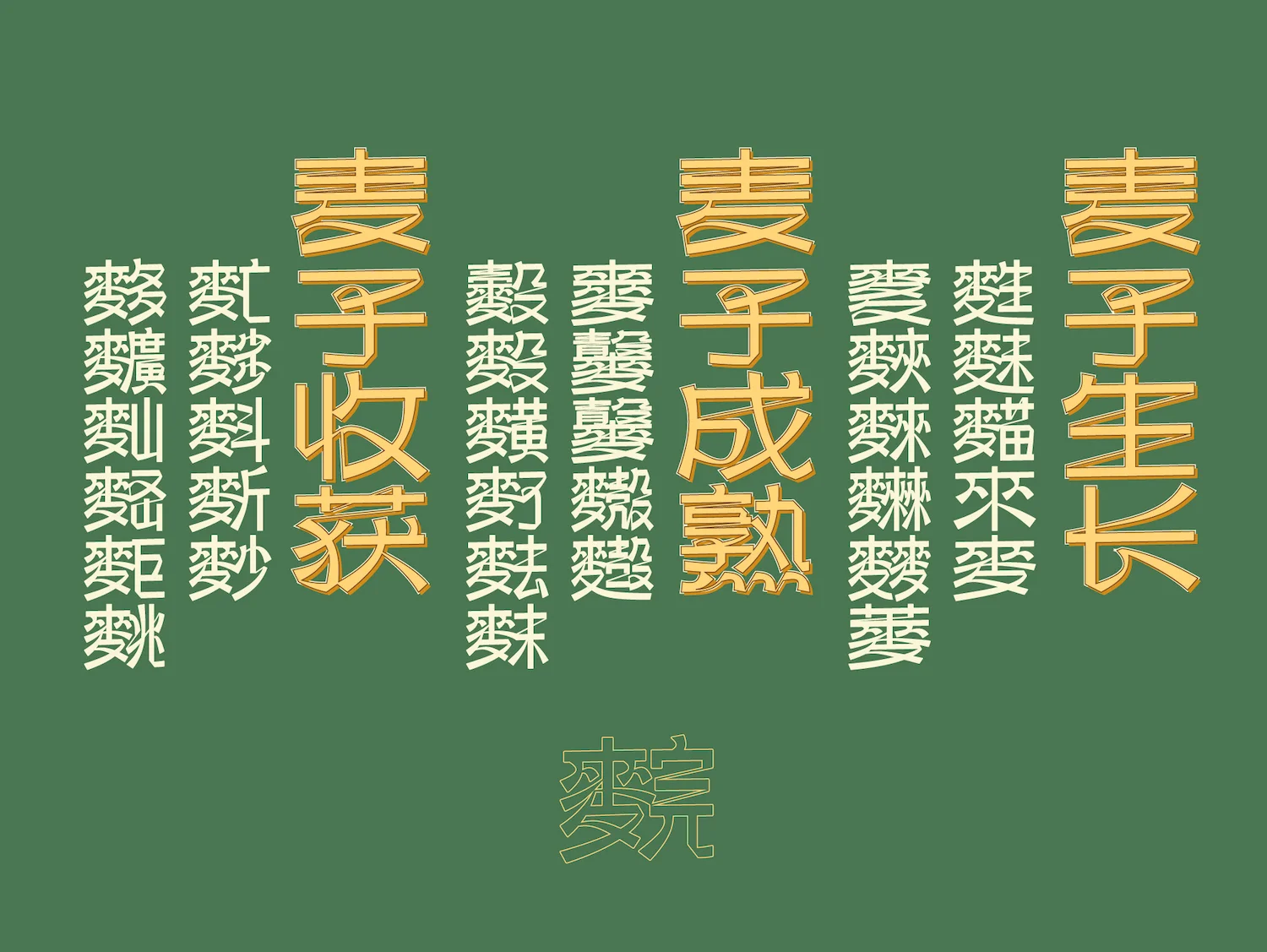
I am always working on many projects at the same time. Now with my work at 3type, I spend most of my time on type-related projects. I am currently working on a poetry book, an art project revolving around Chinese characters with the 麦 (wheat) semantic component, a type installation at Shanghai French embassy’s garden, a rebranding project, Shanghai Type research and finally, a Chinese reverse-contrast typeface. You can follow my instagram to see my latest and spontaneous work. Now working as a designer for almost 15 years, I am much less obsessed with trivial decision-makings but more focusing on developing essential concepts. It makes me feel great.
And, lastly, what advice would you give to multidisciplinary and type designers starting out in their careers?
To draw a form is easy but to understand a form is difficult. Form not only follows function but influenced by diverse culture. There are way more things to learn to become a good designer other than design itself.