The Netherlands-based type design studio Typotheque published recently two new Latin Typefaces: Rapida and Rapidissima. Originally created by the Italian Type Designer, Michelangelo Nigra, the idea of separating Rapida from Rapidissima is to investigate how italic, a system of cursive styles, became not just the counterpart to the Roman, but a separate entity – with its tone of voice, claiming its own space.
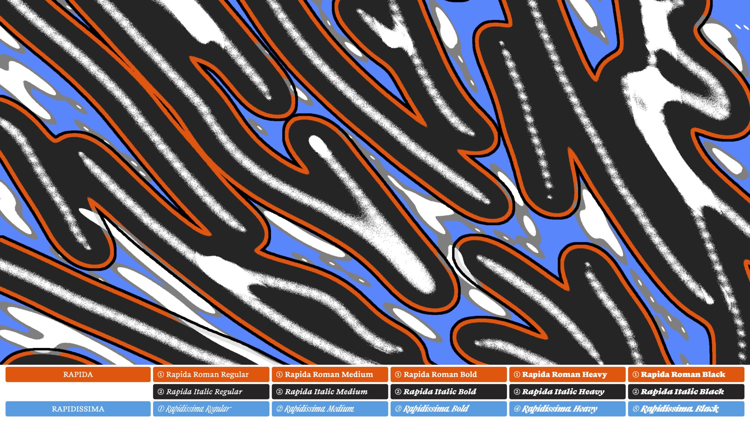
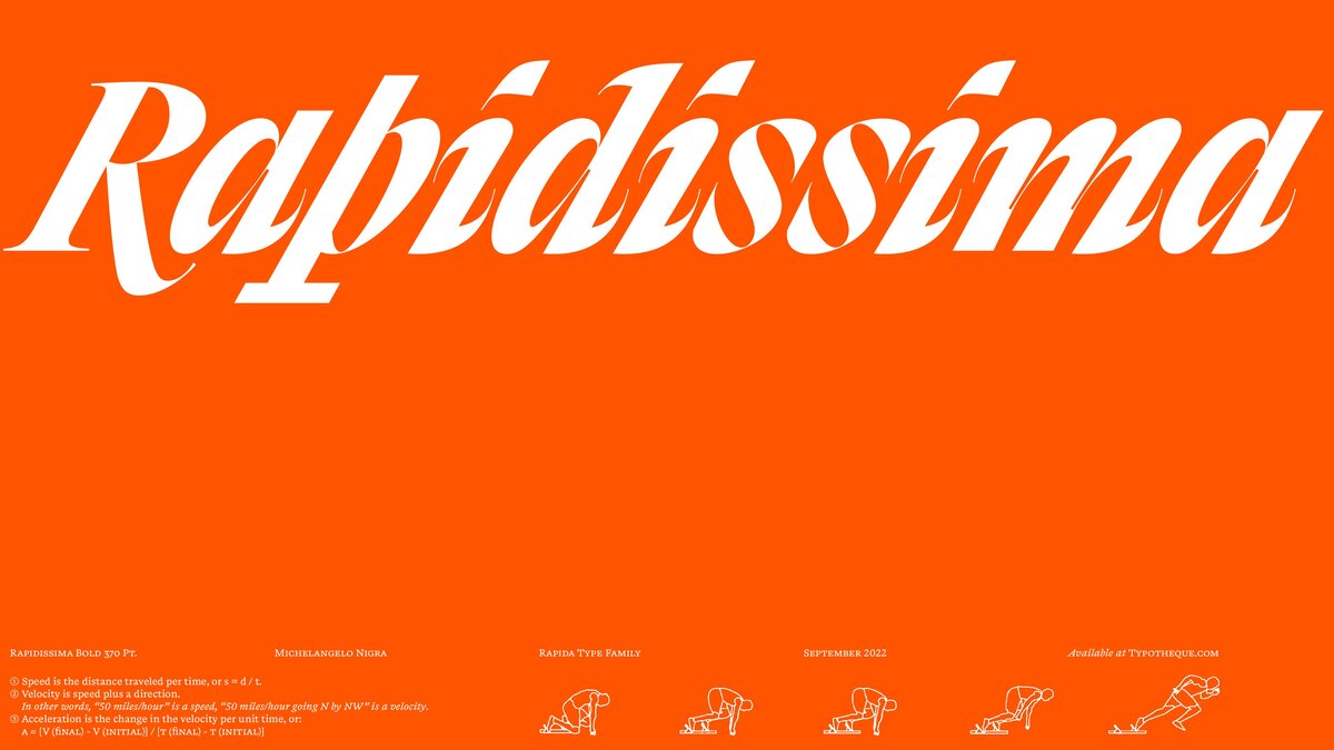
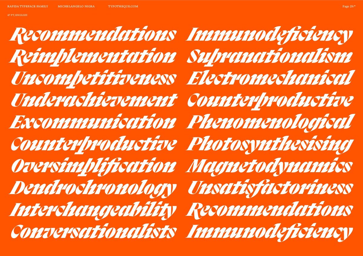
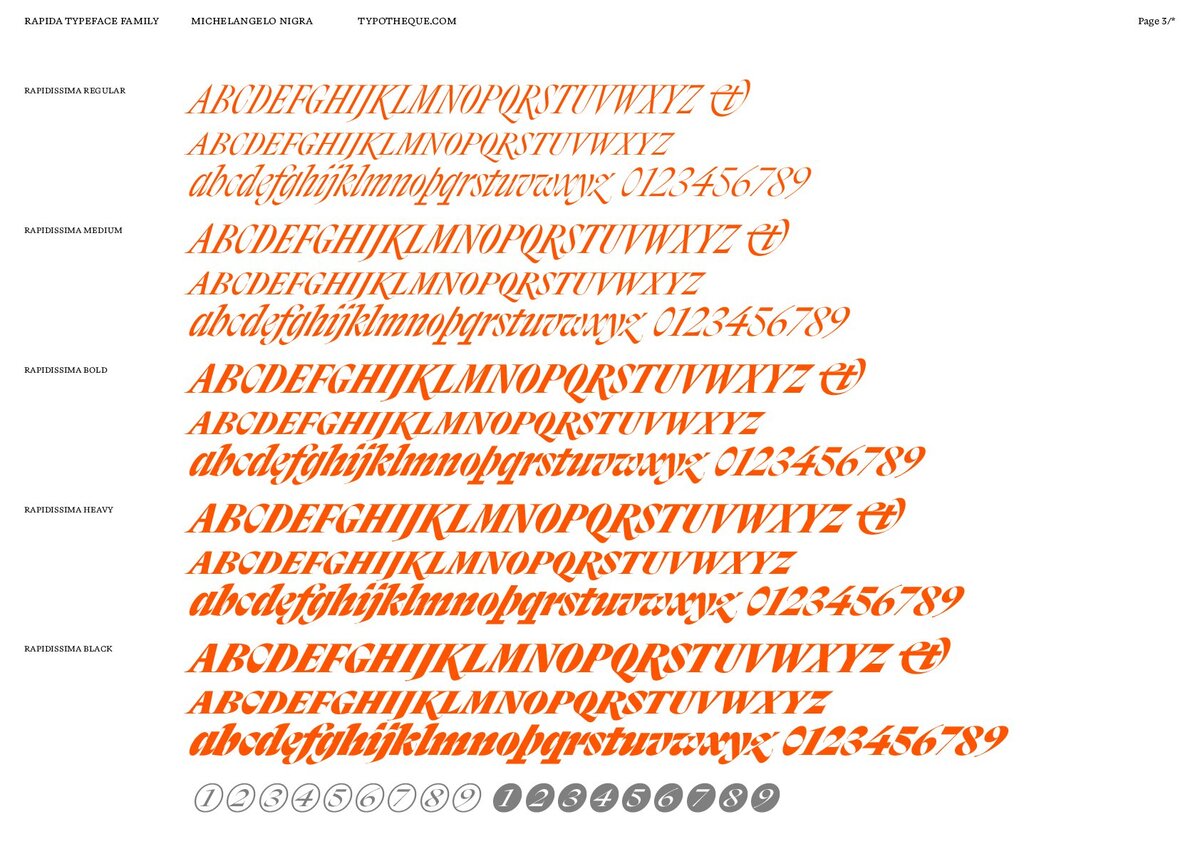
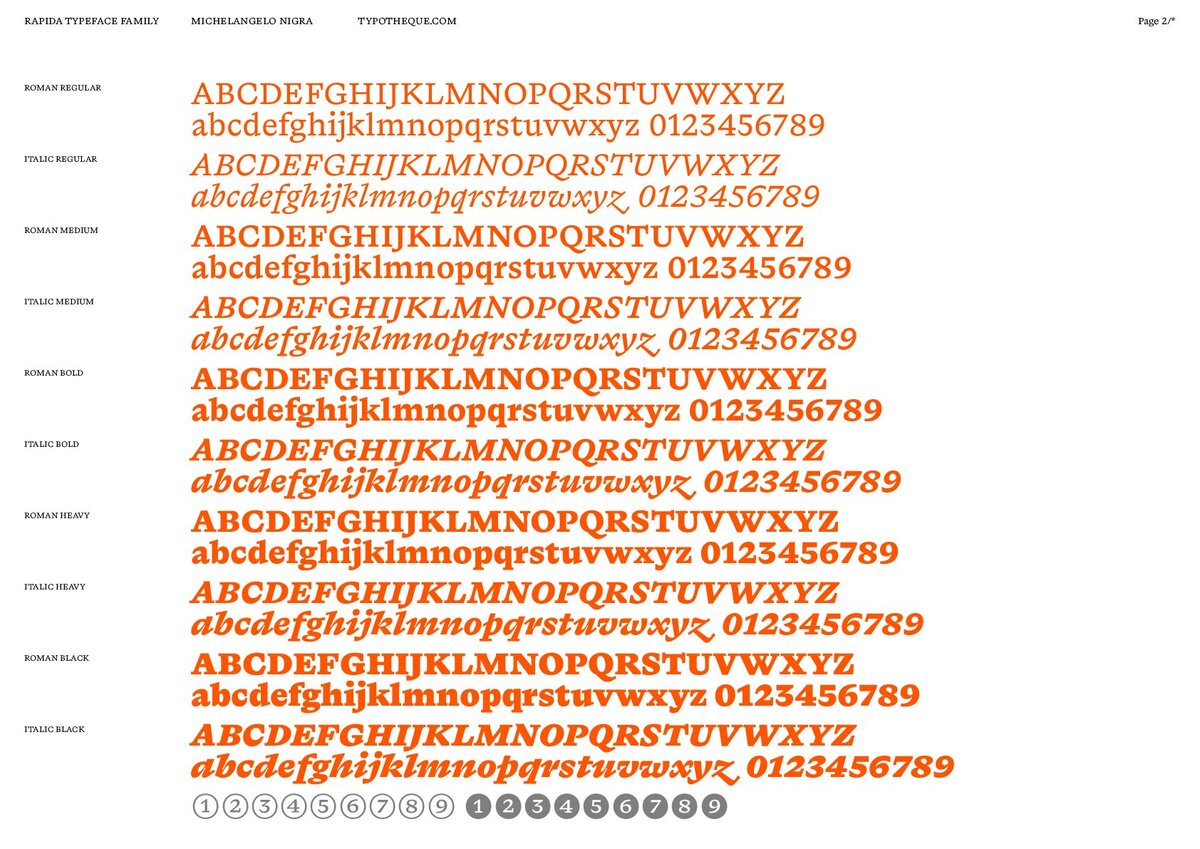
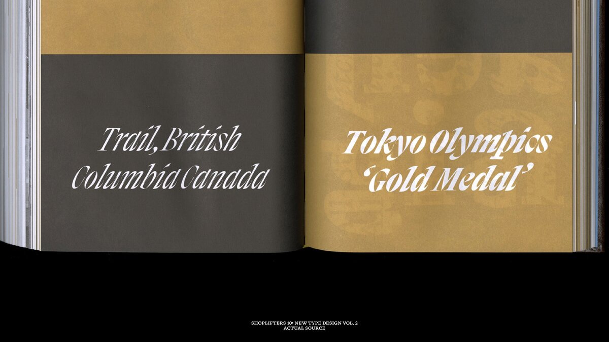
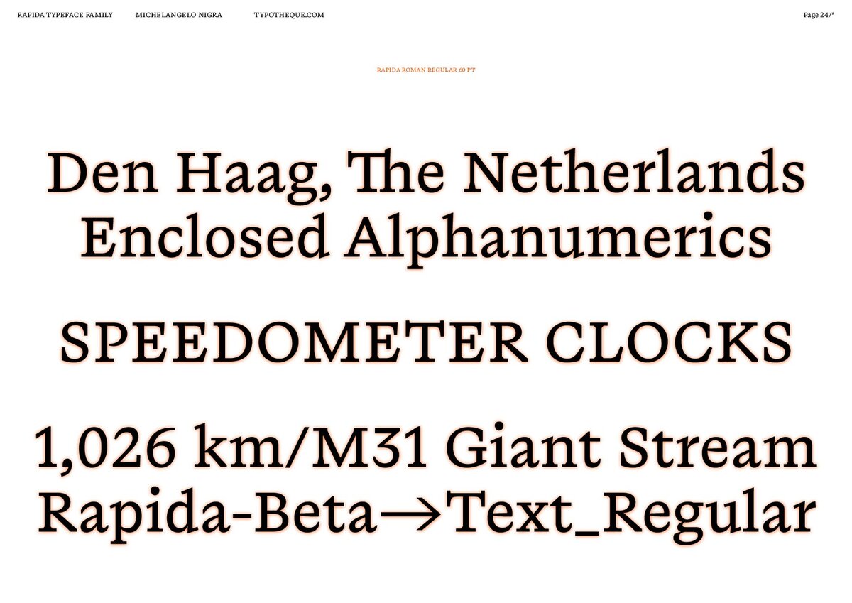
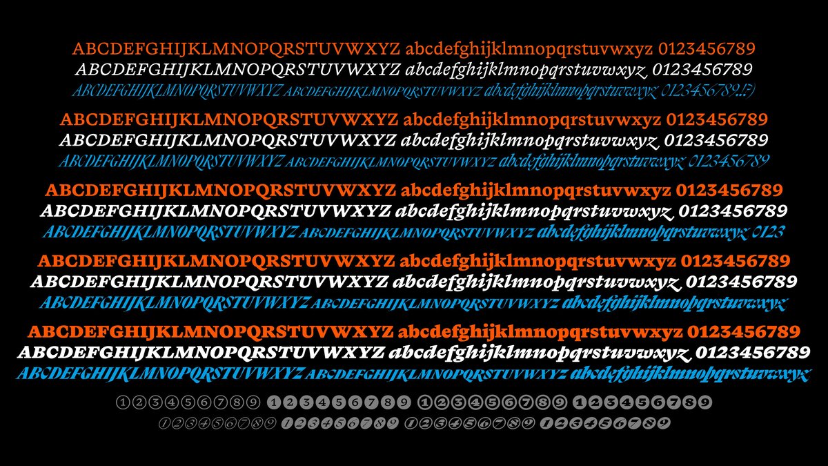
While Rapida is described as a serif typeface family for continuous text setting, distinguished by how it both follows historical conventions and introduces unusual abrupt detailing, Rapidissima presents an extreme visual rendering of the idea of speed on an italic-only display group of fonts.
Both typefaces started as a result of Nigra’s research for his master’s degree final thesis project at the Type & Media master’s course at the Royal Academy of Art (KABK), The Hague. Typotheque’s founder, Peter Bilak, taught the class where Nigra was working to develop Rapida and Rapidissima – and they continue to work together to this day on the font’s improvement.
“I always look for new expressions within type, and Rapida was exploring the notion of speed, coming with multiple italics, to create highly energetic and dynamic typeface”, tells Peter, “that’s why we decided to publish this unique typeface family.”
Whilst carrying out research for Rapida, Nigra came across a study by Gerard P. van Galen: Handwriting: Issues for a psychomotor theory. In his article, the author describes various aspects of handwriting, defining parameters that can be interpreted as visual and non-visual.
Following this lead, Nigra identified parameters that informed his typeface design: linear and angular velocity, acceleration and speed, temporal and force amplitude, pressure, and feelings, and finally, purpose. These parameters helped to move abstract ideas into the visual realm, defining the shapes of letters, and leading to the notion that Rapidissima could be treated as a standalone typeface.
Typotheque explains Rapidissima as not just a project about italic, but a personal exploration of design, where the cursive styles are an integral part of the typeface family. The italic plays an important role as a language feature, typographic element, and design object: here it is a language feature because it carries semantic meaning.
“Type works like a voice, and well-chosen typeface can make the message more effective, just as some voices can be more articulate and effective than others”, says Peter.
More than a Type Library
In 2009 Typotheque was ahead of its time, being the first commercial type foundry to license its entire type library for use on the web.
“The typography on screens was very different to type in print. Before 2009, all websites used one of the 8 fonts available already on your computer. So while in print, newspaper, magazines, and brands cared about their visual expression, on screen they accepted to use Times New Roman or Helvetica”, explains Peter.
“There have been attempts to come up with a technical solution, but they were never adopted. In 2009 several things changed, and we could react to the technological changes to rethink also font licensing and offer a solution to offer for the first time commercial fonts in your browser.”
What started as a one-person project over 20 years ago, is now a company of eight, one thing they always had as the essence was to develop a very inclusive way to work with languages and world-writing scripts, that allowed them to make a difference for local communities, and multilingual communication.
“Just because some languages are spoken by a smaller number of people, it doesn’t mean they should be ignored. The smaller languages are often marginalized and more vulnerable, as they need to coexist next to the dominant ones”, continues Peter.
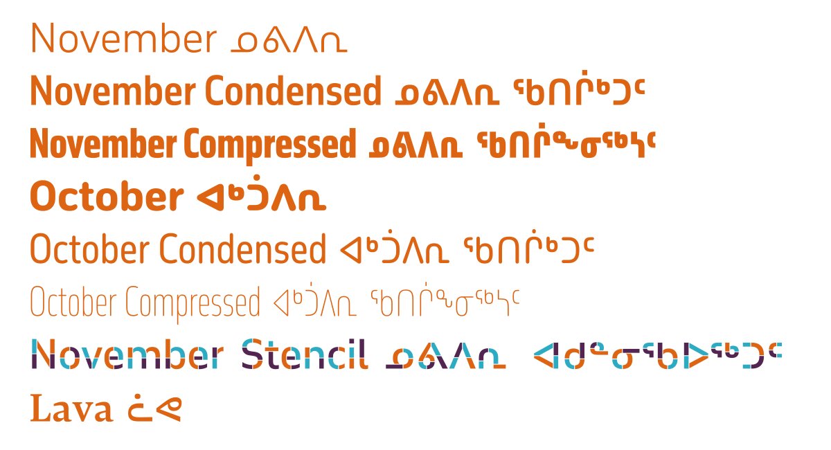
To name one of their extensive research for the minority languages font development, in early 2022 Typotheque launched a series of Unified Canadian Syllabics fonts that support Indigenous language revitalization and preservation efforts in North America – a process you can watch in full detail on their short documentary, The Syllabics Project.
Kevin King, a type designer at Typotheque, researched the Unified Canadian Syllabics in preparation for designing future Syllabics fonts. Kevin identified that the Nattilik community in Nunavut, the northernmost territory of Canada, was missing 12 syllabic characters from the Unicode Standard, which means that the Nattilingmiutut text could not be written down. Kevin worked with Nilaulaaq, Janet Tamalik, Attima and Elisabeth Hadlari, and elders of the Nattilik community to prepare a Unicode proposal to encode the missing characters. Only after the acceptance of the proposal by the Unicode Technical Committee could fully functional fonts for the Canadian Syllabics be designed – a process that took two years.
Then & Now
Following the premise to produce the design on a more fundamental level, you will see an enormous scope of all creative related projects embracing type now such as “The Q”, an open-ended game-like system; Francis Gradient, where Francis can change widths contextually; Balkan, a dual script typeface that transliterates and translates Croatian Latin into Serbian Cyrillic and vice versa; and more.
“When one works in fashion, or industrial design, one needs to think of trends, fashions, next quarter, and coming seasons. In type, we work on long-term solutions. We have worked for 8 years on the new signage for the Paris metro, which will be completed only in 2030. Our most successful typefaces are often those which have been out there for a long time”, tells Peter. “For example, Fedra Sans is very popular and fresh looking, but I designed it over 20 years ago. Type has a potential to outlive the maker.”
On the scope of keeping the designer’s interest in various areas of design, Typotheque is willing to continue exploring typography applied in publishing, performance art, writing, and many other objects.
Learn more about Typotheque and all they can offer on their website. Follow up with them on Instagram as well to be up to date with new releases and projects.