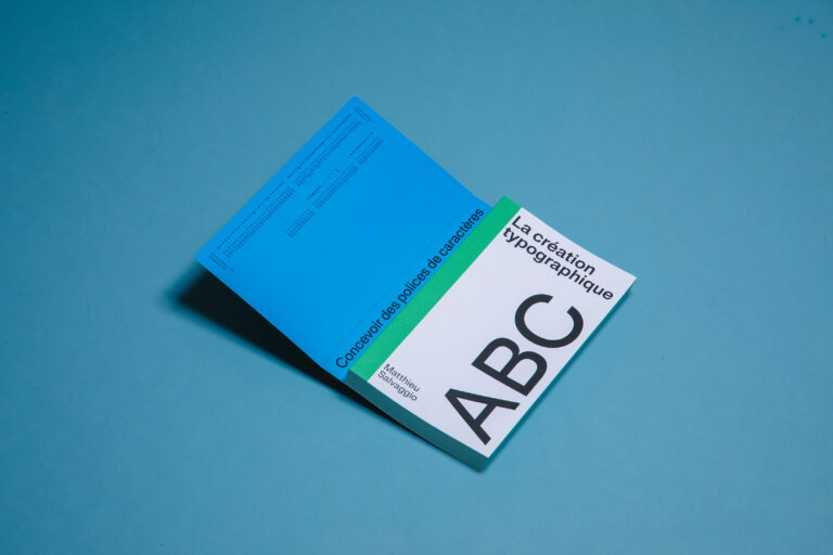
Founded in late 2018 by type designer, Henning Skibbe, Hamburg-based foundry, Character Type (@character.type) operates through a rich understanding of the requirements of typography in complex documents and systems, across many different facets.
Acquired through over a decade’s worth of previous experience in type design, Henning’s knowledgeability and expertise allow Character Type to design and produce work for a wide range of needs; building extensive typeface families and systems with care and deep respect for their historical and technological groundings. The foundry’s typefaces are consistently unique and functional; created as tools to aid typography and branding needs for small and international brands. With so many years of experience in the industry, their type systems are vast and expensive. So, we spoke to Henning, the founder, about the process and intentions behind Character Type’s multi-tool typeface system, NewsSans.
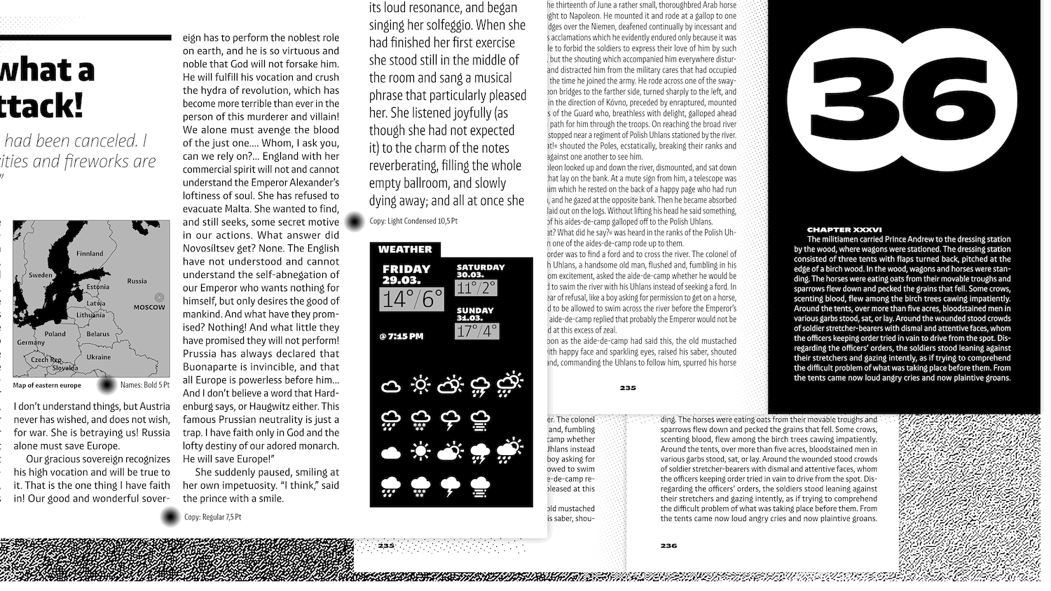

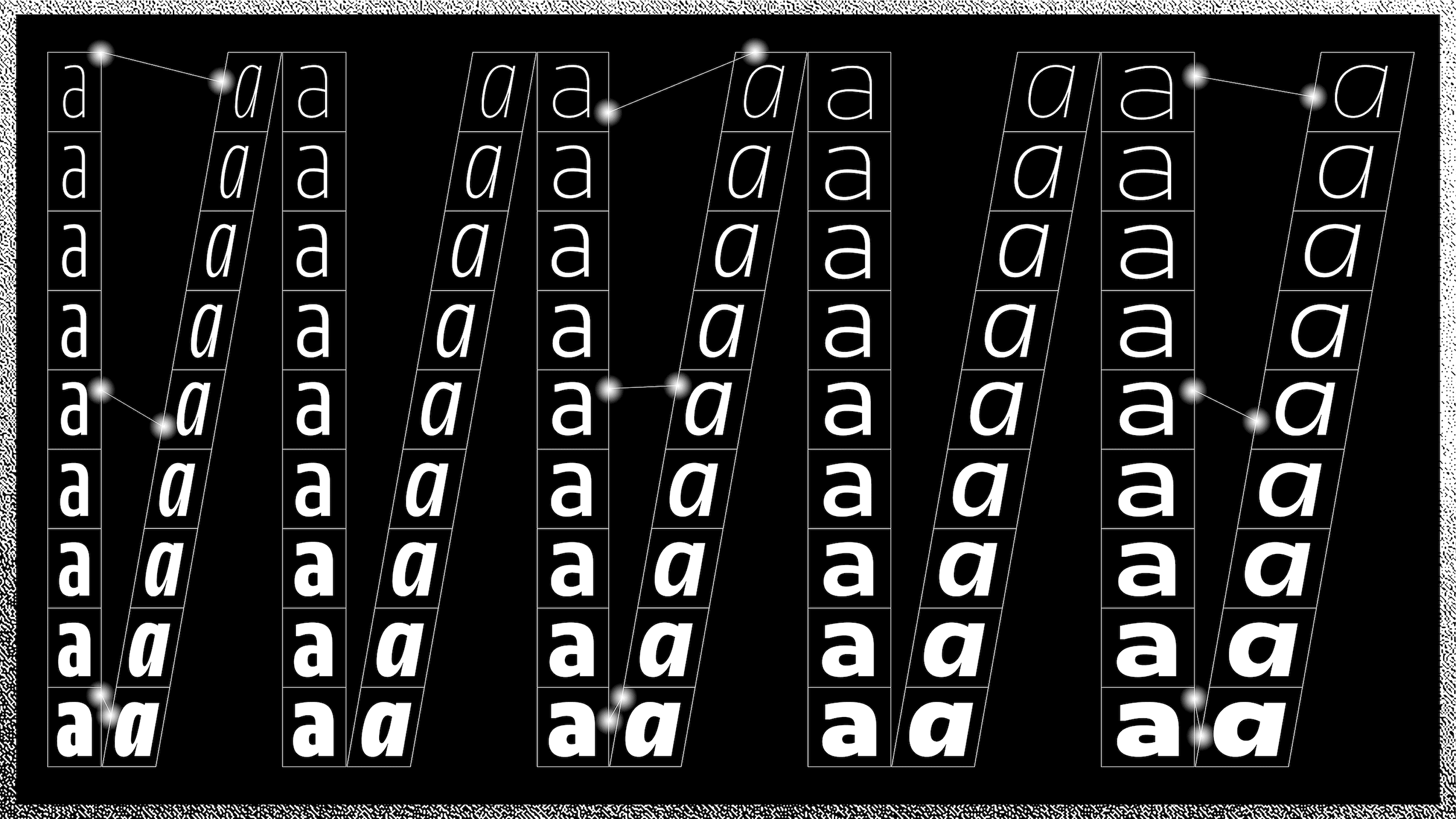
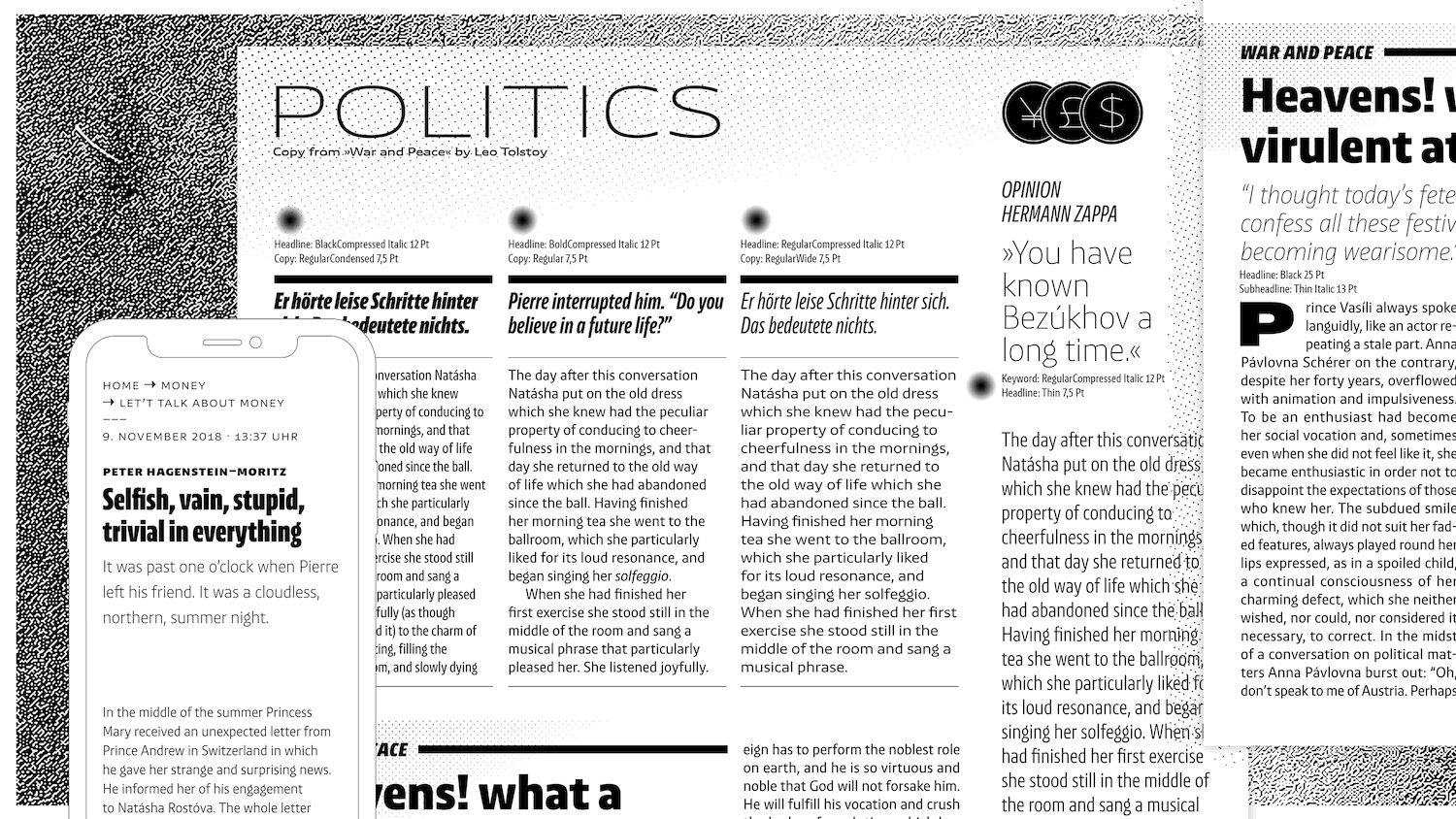
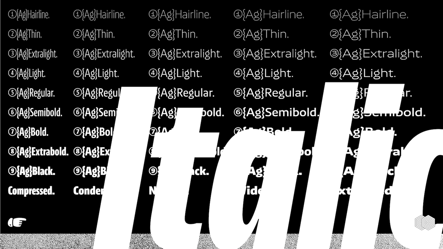
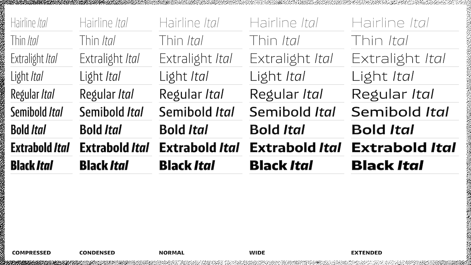
Incorporating no fewer than 90 styles, Henning tells us NewsSans ‘was designed to allow a maximum range of visual shades when creating a typographic look, effortlessly ranging from loud and expressive, to subtle and reserved.’ The versatility of the family is evident right away, with its personality changing seamlessly between styles and weights; all whilst maintaining a feeling of consistency and integrity.
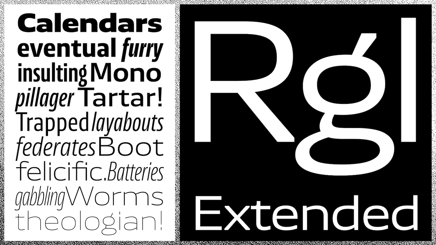
‘The large x-height combined with short ascenders and descenders allows for tight and efficient layouts,’ Henning continues,‘NewsSans’ strokes link humanist curves with ‘American Grotesque’ details and solid square stems. The system contains nine weights from hairline to black, and five widths from compressed to extended, each accompanied by a proper italic.’
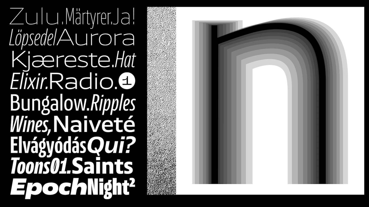
The family was intended to be as accommodating and extensive as possible, allowing for vast variety and flexibility across a plethora of typographic contexts. In this sense, NewsSans’ process was laborious; ‘In total,’ Henning tells us, ‘nine masters were hand-drawn to achieve the style bandwidth, from compressed to extended and hairline to black.’ The clean-cut terminals and functional qualities of NewsSans are met with a gentle, organic touch, or as Henning articulates, ‘The typeface has a sturdy and strong look, countered by loose and lively humanistic curves.’
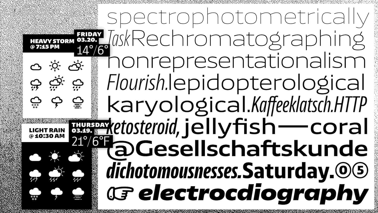
Although intended for editorial and corporate design, no ink traps were used in NewsSans. Instead, Henning tells us, ‘the letters have straight stem endings and the stems finish in square angles,’ which appear to create space for further contrast between the organic/sharp shapes. Additionally, the founder adds, ‘All outward pointed corners were removed across the typeface. This becomes more visible in the heavier weights and is almost invisible in the hairline weights. These cuts open up space between letters while at the same time creating spaces within a glyph.’
NewsSans is a vast and versatile typeface family with an impressive breadth of editorial and corporate branding possibilities. The versatility is integral to the typeface’s sense of shifting character; and, in use, offers the opportunity for heightened visual control and the ability to tightly and efficiently curate bespoke typographic stories and personalities across so many different purposes. All of this means that NewsSans feels truly characteristic of Character Type’s output – a great place to start exploring their work, aesthetics and ethos!
Thank you to Henning and Character Type foundry! You can find more of their work on their website and Instagram.