4 new typefaces from Zetafonts have just landed in Type Department’s collection—here’s everything you need to know.
Founded in 2001 by Francesco Canovaro, Debora Manetti and Cosimo Lorenzo Pancini, Zetafonts is known for its high quality, finely crafted and innovative fonts. With the mission of providing powerful design tools for graphic designers, art directors and brand managers, the guys at Zetafonts offer custom font design services and branding consultancy for commercial and institutional clients worldwide. The foundry are also involved in the promotion of type design culture through the organisation of educational initiatives, talks and courses supporting the TypeCampus project. Read on to hear more about Zetafonts’ new typefaces joining Type Department’s collection.
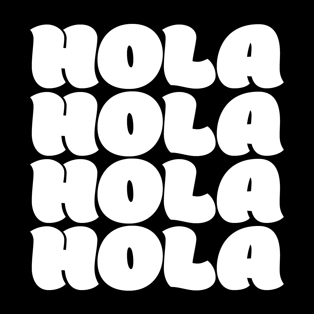


Holden is a new typeface family which investigates texture and extreme weight range in contemporary type design. Its curvy shapes, inspired by pointed brush aesthetics, are developed in six different weights, from the lightly contrasted thin to the fluid and rhythmic fat. The typeface’s lightest weights are mostly designed for text usage, while the heavier weights work best at display sizes, where the extreme shapes and tight counter-spaces are better appreciated. Holden aims to fill the space between display and text typeface, with a range of variants to allow maximum expression in display use and great legibility in long texts, both on the web and at small sizes. Holden is designed for editorial or packaging use, where a contrasting range of weights and variants is required to fight monotony while keeping branding consistent.
All Holden fonts include full Open Type features with stylistic alternates, small caps, discretionary ligatures, positional number forms, swash forms (in italics) and full language coverage for 200+ languages using Latin. An array of extra decorative dingbats are included to complement your design with pointing manicules and fleurons (also called “horticultural dingbats” by Robert Bringhurst in The Elements of Typographic Style).

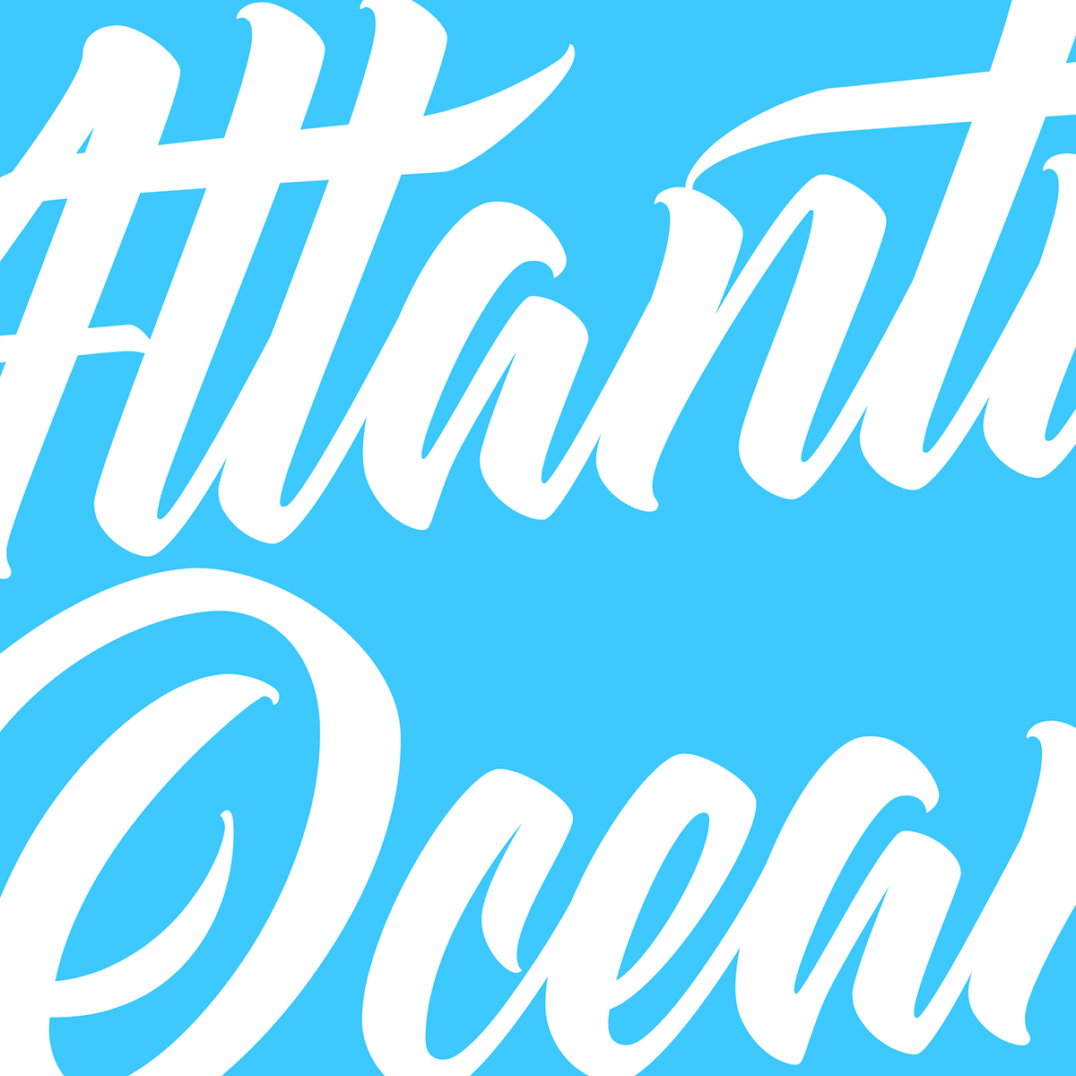


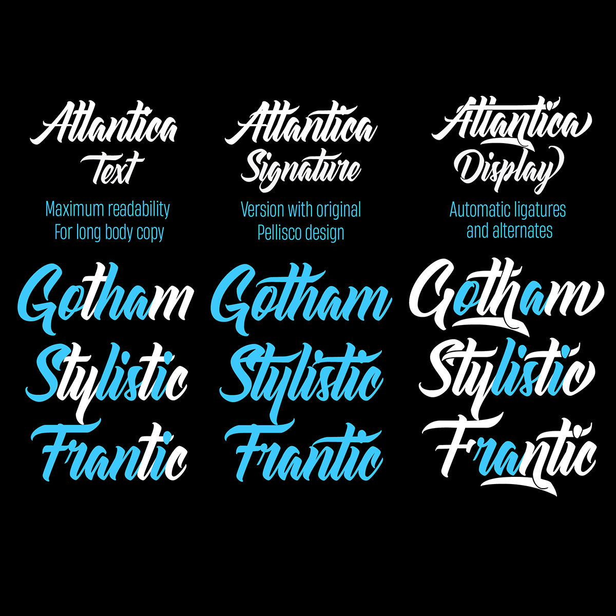

Atlantica is the third typeface in Zetafonts’ Signature series, offering typefaces handmade by world-famous lettering artists, designers and illustrators. This contemporary cursive brushscript typeface family was designed by Pellisco with Cosimo Lorenzo Pancini for Zetafonts, and comes in three variants. Atlantica Signature offers all the original letters designed by Pellisco, with alternates available as glyphs, and is mostly suited for display use. For text usage, Atlantica Text offers better readability by adopting a more restrained lowercase “t,” and giving some small adjustments to the typeface. Finally, Atlantica Display offers a flamboyant logo typeface version; with multiple automatic ligatures making extreme use of open type substitutions, Atlantica Display transforms every text in a lettering work of art.
Atlantica includes amazing Open Type features such as standard ligatures, alternate forms and swashes and full language coverage for 180+ languages using the Latin alphabet.
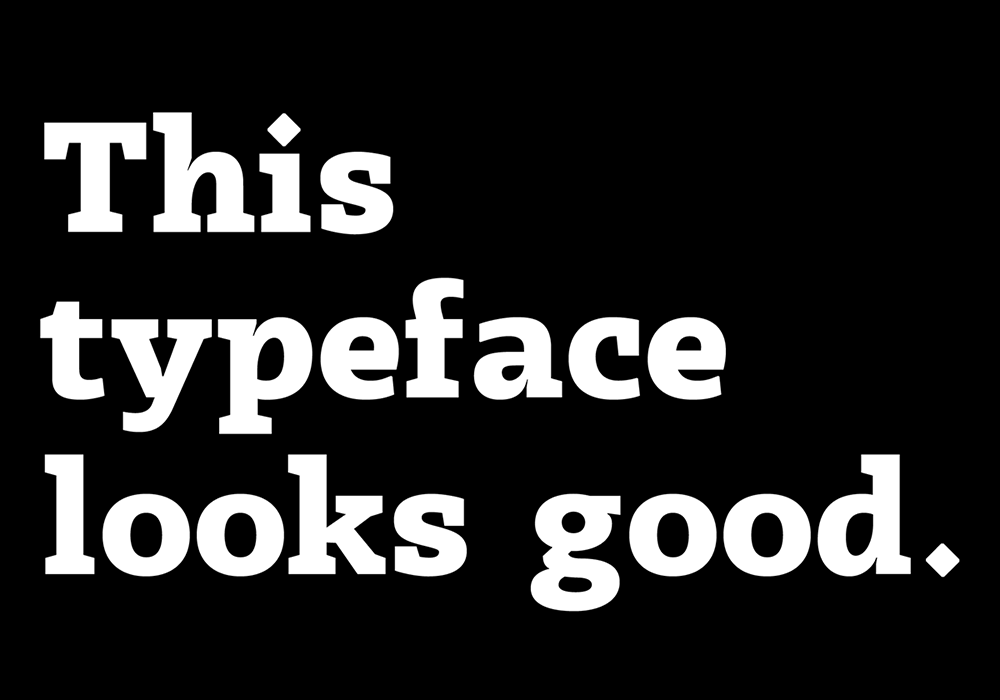
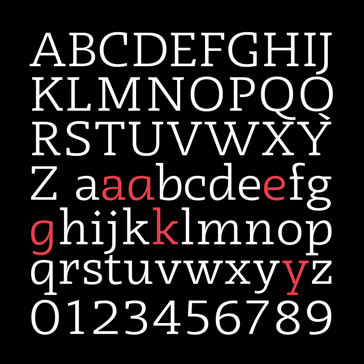


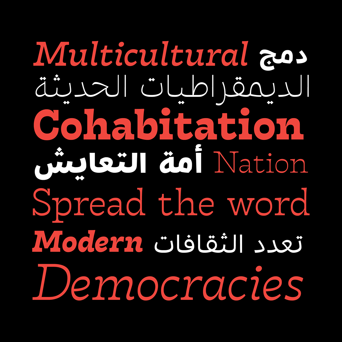
Tarif is a a new typeface family inspired by the multicultural utopia of Convivencia—the peaceful coexistence of Muslims, Christians and Jews in tenth century Andalusia that played an important role in bringing the classics of Greek philosophy merged with Muslim culture and aesthetics to Europe. Tarif is a slab serif typeface with a humanist skeleton and inverted contrast, subtly mixing Latin zest, calligraphic details, extreme inktraps with a postmodern unorthodox reinvention of traditional grotesque letter shapes. The exuberant design, perfect for titling, logo and display use, is complemented by a wide range of seven weights allowing for solid editorial use and great readability in body text. Matching italics have been designed with the help of Cosimo Lorenzo Pancini, while Rania Azmi has collaborated on the design of the Arabic version of Tarif, where the humanist shapes and inverted contrast of the Latin letters find a natural connection with modern Arabic letterforms.
Tarif comes with full language coverage for 200+ languages using the Latin, Cyrillic and Arabic alphabets. As buoyant as it is reliable, the typeface also includes a wide array of Open Type features (alternates, ligatures, positional numerals, case sensitive punctuation) to create a smooth design process, and multi-script projects as exciting as a surf ride in the sunny Tarifa.
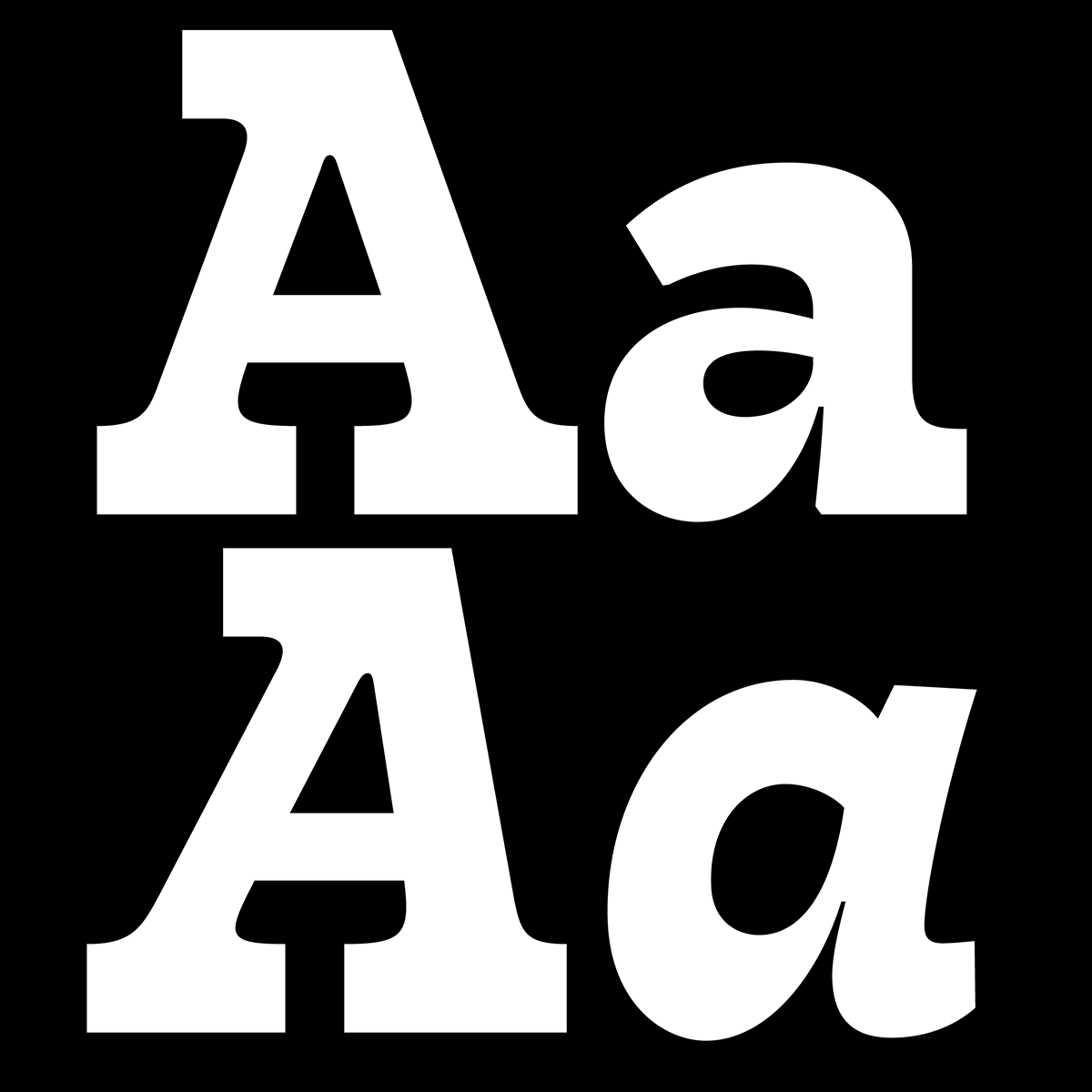


Radcliffe is a new typeface family designed as a reinvention of traditional Clarendon design in search of a “contemporary classic” typeface look. Tailor made for elegance, Radcliffe features the strong bracketed serifs, vertical stress, and a little contrast of Clarendon, refined with a humanist touch and a calligraphic approach, obvious in the italics. Primarily intended as a display typeface with a wide range of finely-tuned weights for editorial and logo-design uses, Radcliffe is complemented by Radcliffe Text, developed in five weights with a taller x-height and slightly condensed proportions, allowing for maximum readability in long texts on the web, and at small size.
The family also includes two weights of Radcliffe Casual, designed with slight reverse contrast aesthetics, perfect for your Country Club activities. All Radcliffe fonts include full Open Type features with stylistic alternates, discretionary ligatures, positional number forms, swash forms (in italics) and full language coverage of 200+ languages using Latin and Cyrillic alphabets.
You can check out Zetafonts‘ new typefaces and full collection on Type Department (now with 60% off until 30th September!) and keep up on socials to hear about their latest activities. Big thanks to Zetafonts for sharing more with us today!


