We’ve loved seeing type playing a huge, defining role in tons of branding and visual identities this year. With the abundance of incredible work, we decided to create a roundup of some of our favourite typographic branding & visual identity highlights built around bold typographic elements from this year…
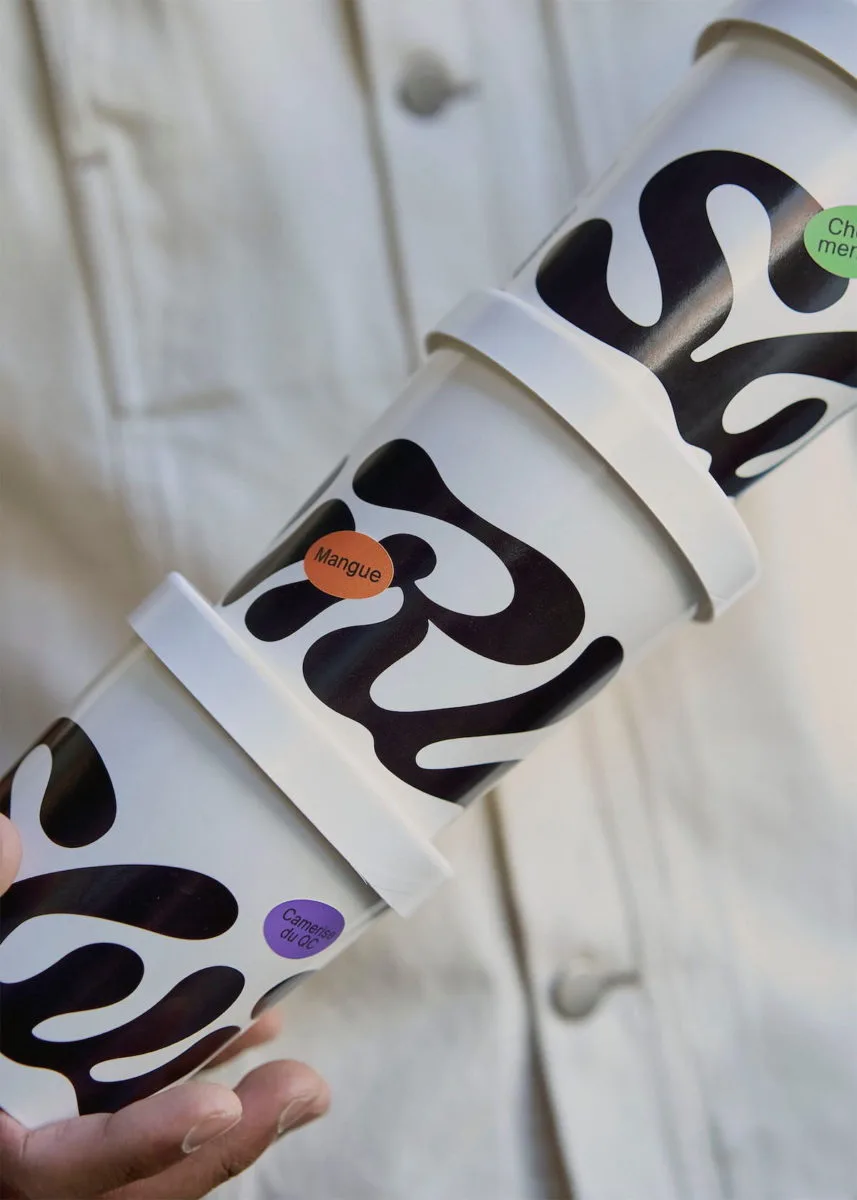

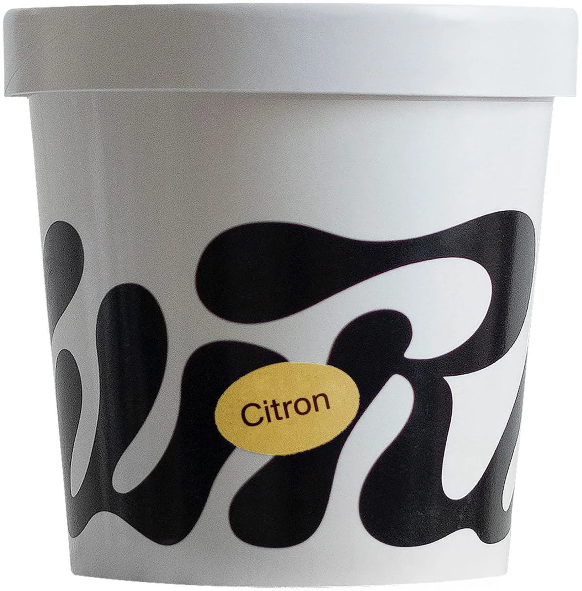
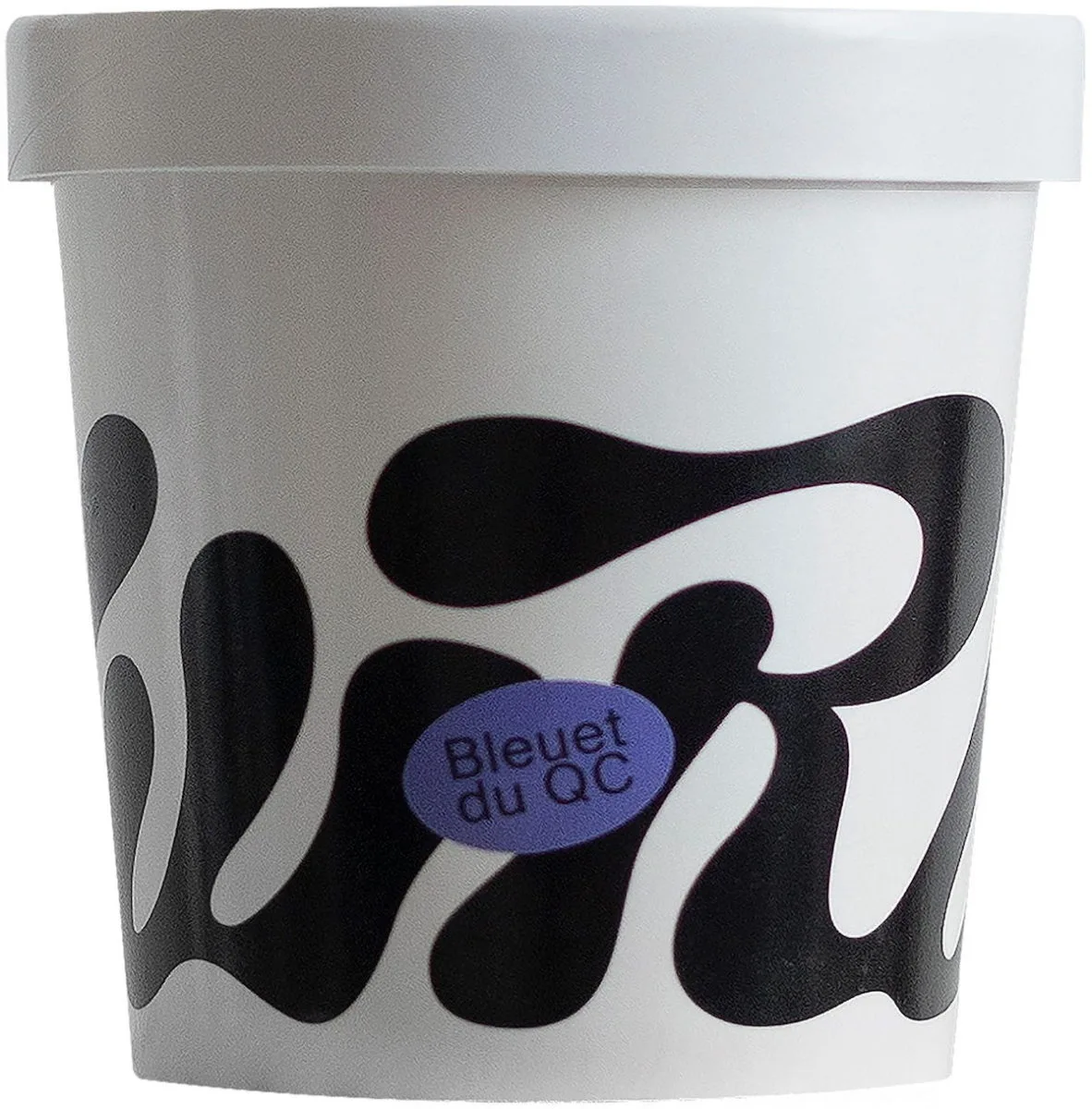
Wedge for Swirl Ice Cream
Independent design studio Wedge created this incredible typographic branding for Montreal-based vegan ice cream company Swirl. After falling in love with Wedge’s graphic pint wrap solution, Swirl decided to integrate it into the rest of their branding identity – and it’s easy to see why!
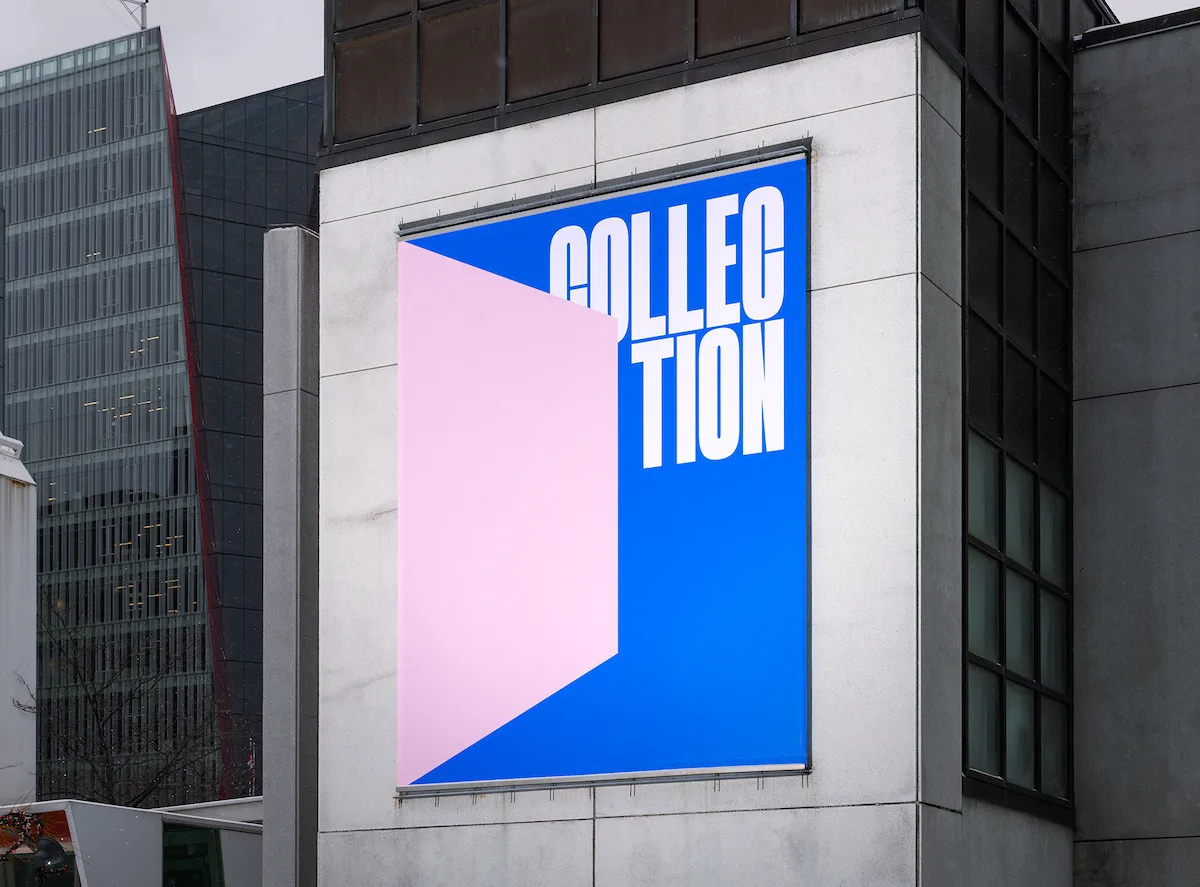
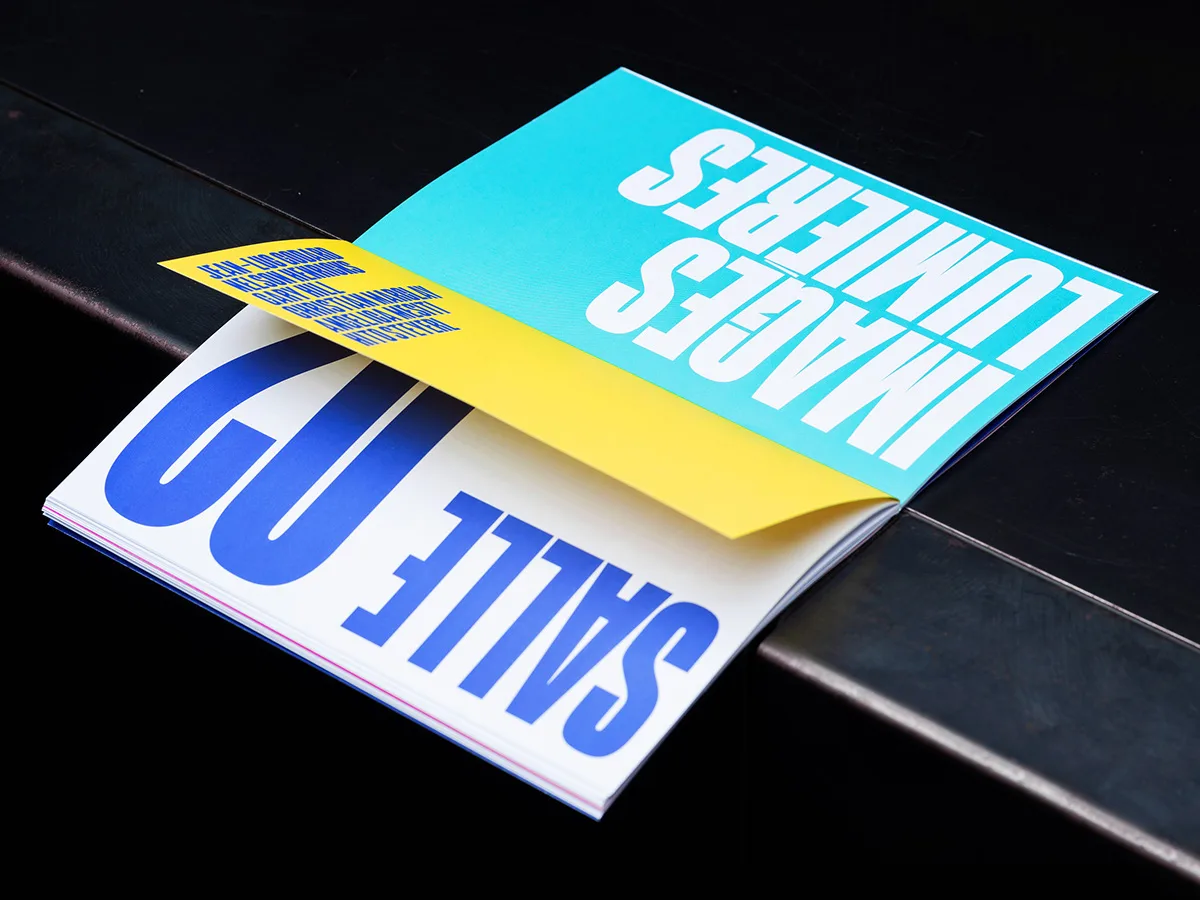
CASERNE for Musée d’art contemporain de Montréal
CASERNE were selected by Montreal Museum of Contemporary Art (MAC) to create the visual identity and campaign for the exhibition of its permanent collection, including a curation of works which had not yet ever been released to the public. The branding and design company created a stunning, bold, typography-led identity using graphic shapes to reflect the museum opening their doors on their vast and varied collection.
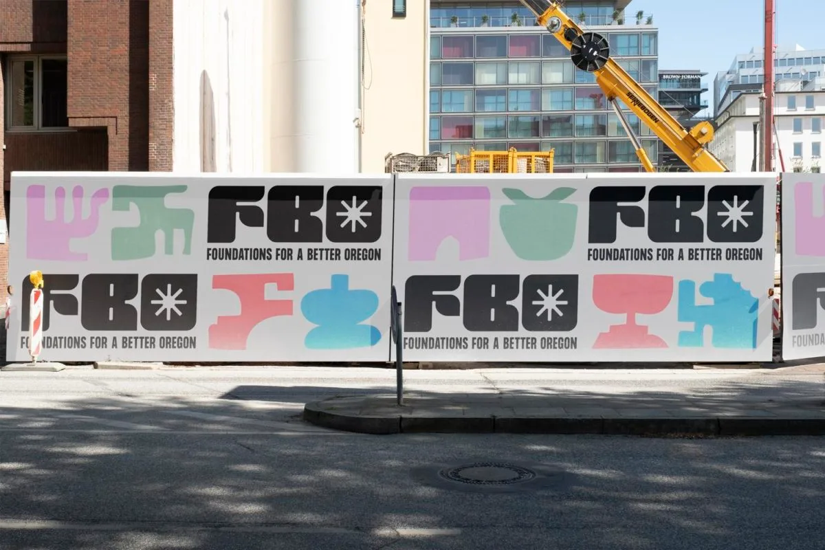
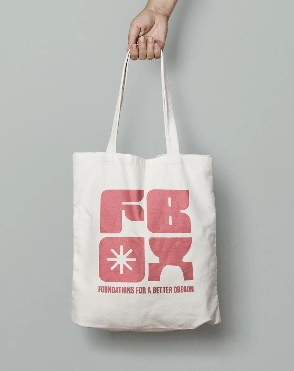
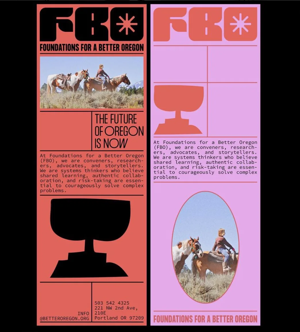
House of Gül for Foundations for a Better Oregon
House of Gül created the entire branding identity for Foundations for a Better Oregon – an organisation supporting the children of Oregon’s community to ‘learn, thrive and grow’ by bridging ‘community, policymakers, and philanthropy’. The creative studio, founded by Ali Gödil, created this incredible brand identity with strong shapes and organic, gentle curves, to offer a sense of strength and cohesion.
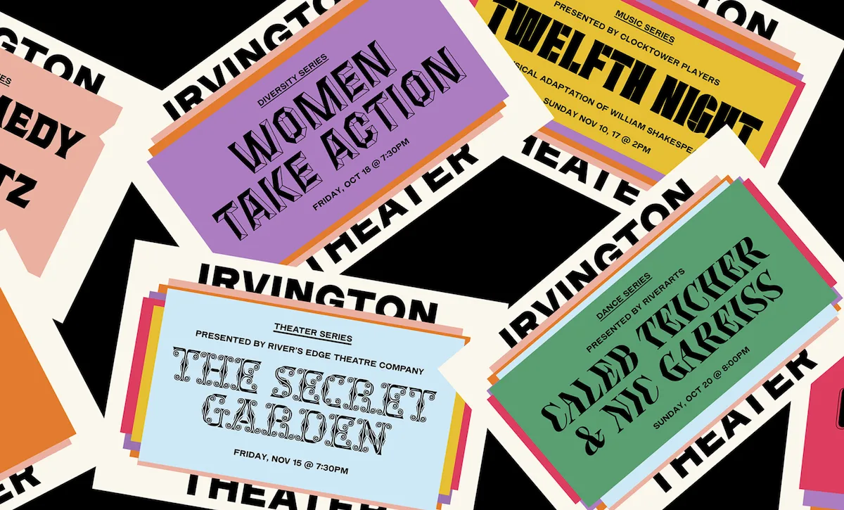
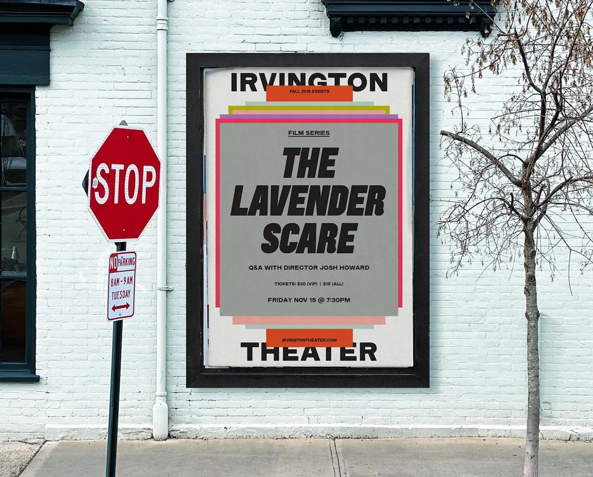
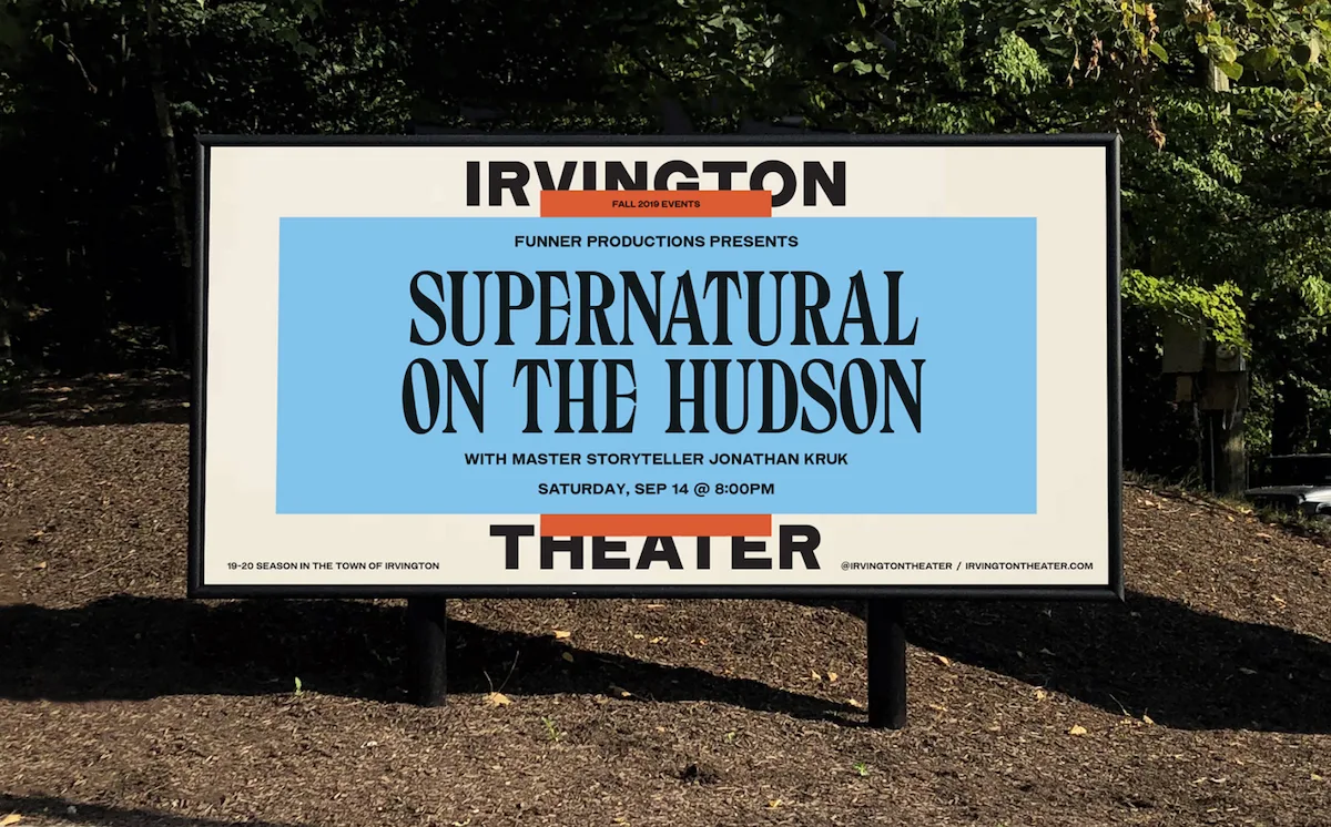
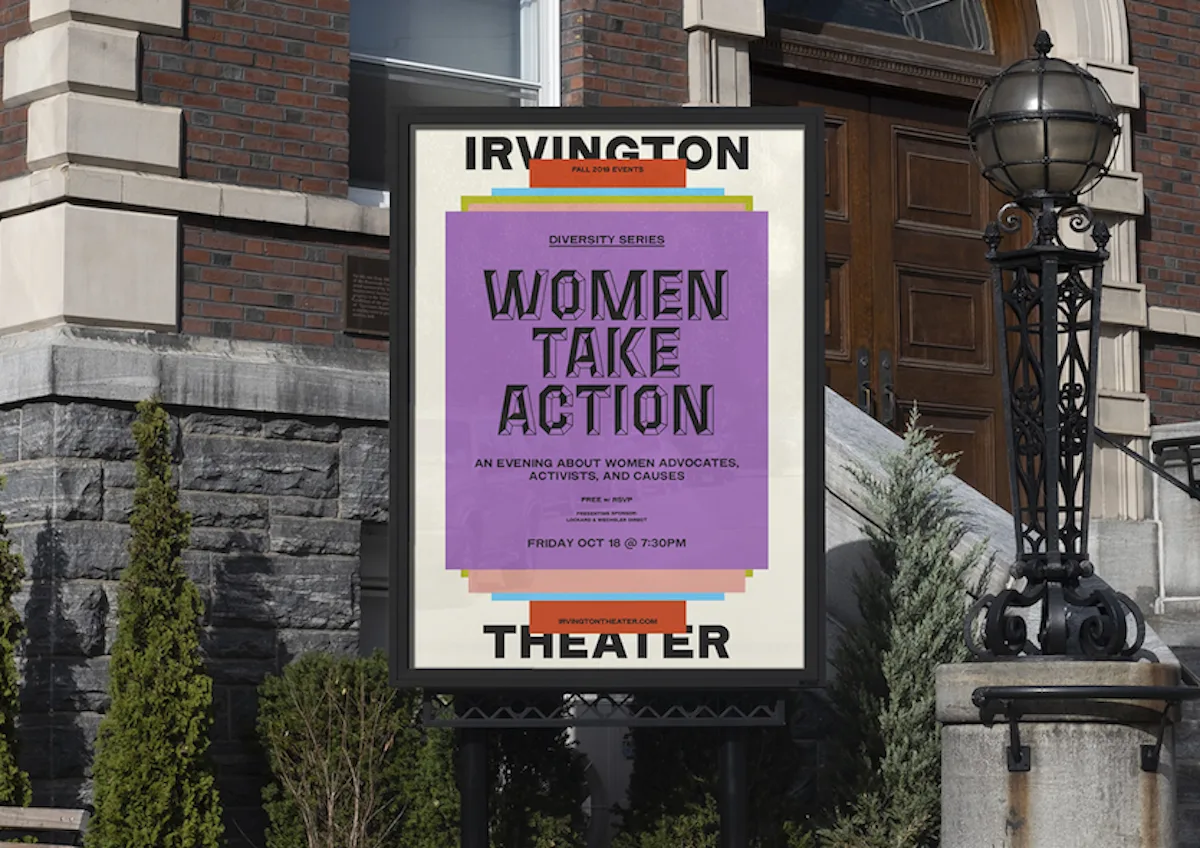
Pràctica for Irvington Theatre
We love this new branding identity created by Barcelona/New York-based design studio Práctica, for Irvington Theatre. Located in the Hudson Rivertowns in New York and having first opened its doors in 1902, the theatre needed a new identity to revitalise their brand, draw attention to the wealth of events produced by the theatre and their arts partners, and bring the theatre firmly into the present day. Including a logo with a custom drawn typeface, Práctica have definitely delivered.
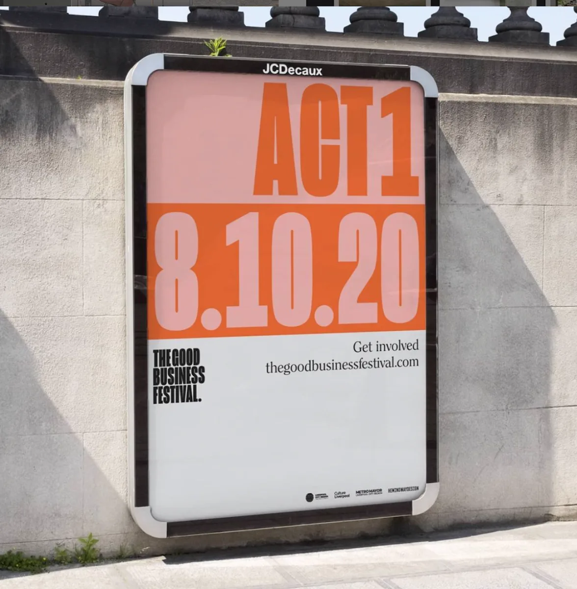
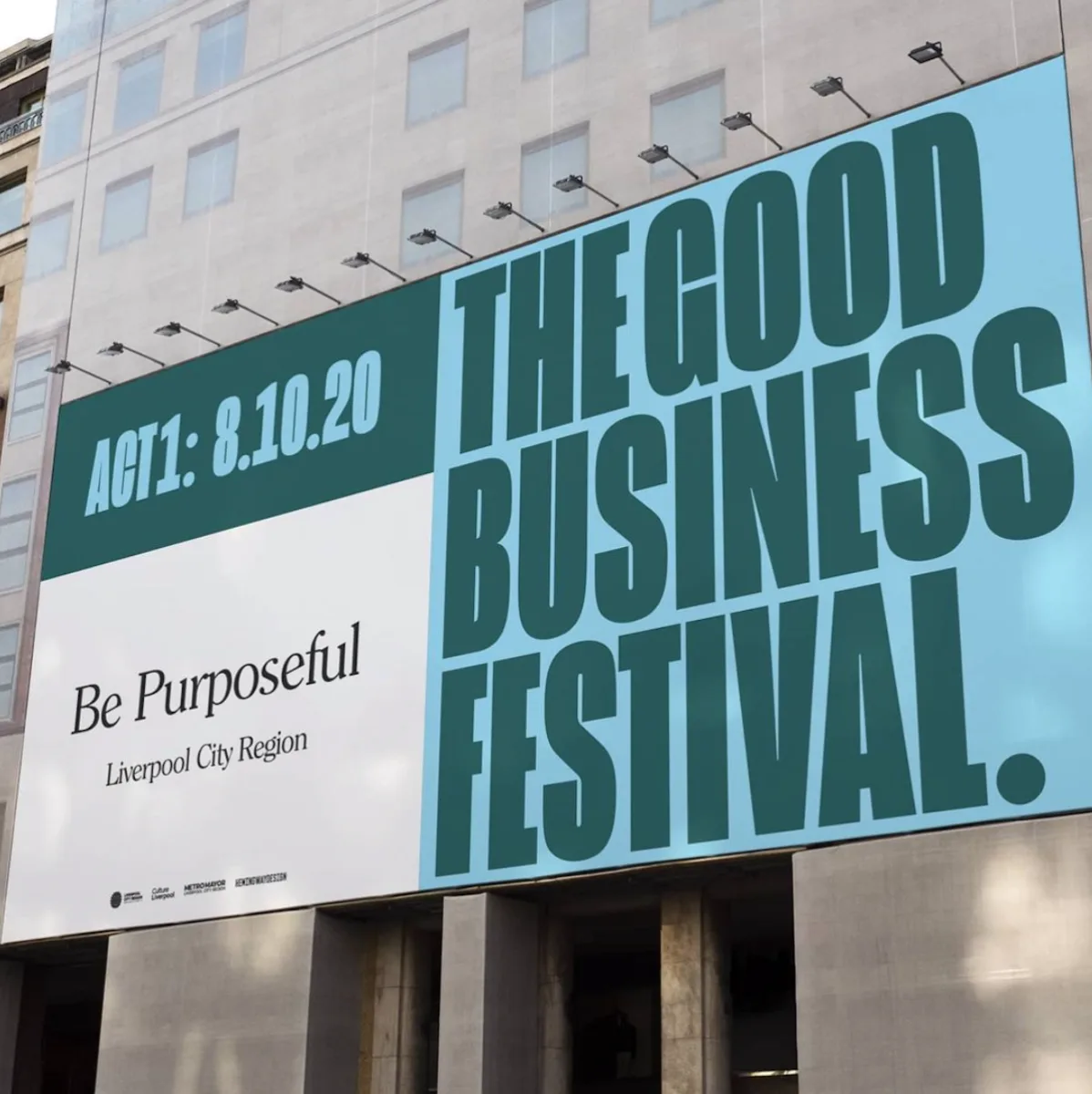
Hemingway Design for The Good Business Festival
Lastly, Hemingway Design’s visual identity for the The Good Business Festival has got to make the list. The bold, straightforward aesthetic stands strong throughout the identity and speaks volumes about the incredible mission behind The Good Business Festival, which seeks to reimagine work environments and encourage purpose-driven models in business.


