
Like music, Rio de Janeiro-based (although currently remote) type design studio Plau believe that type has the power to spark conversations, bring people together and move ideas forward. This conviction sits fittingly with their recent work for Brazilian TV channel, Canal Brasil. Looking to upgrade their visual presence and appeal to a wider audience, Canal Brasil tasked branding agency Tátil Design to create the strategy and design for their updated look. When – with diversity and malleability at the core of the strategy – it became apparent that variable font technology needed to be a key component, Plau were pulled in to deliver at variable custom font under the direction of Tátil.
Comprising of a core team of eight designers with varied back stories and skills, Plau have worked with huge clients, including Rede Globo (Brazil’s largest media company), Staples, and Valve (one of the world’s largest video game platforms). They continue to push type forward through teaching workshops and designing type, brand identities and fonts for ‘people and the brands they love.’ We spoke to Plau to dig deep into their experience of creating this eclectic custom variable font – the challenges and adaptations along the way – and to discuss what brands are looking for in custom font design today.
Hi! Tell us about the Canal Brasil project. How did it come about and what was the client looking for in their new identity?
Canal Brasil’s project begins with Brazilian branding agency Tátil Design. They were working on strategy and repositioning the brand from a cult channel to a more accessible and popular entertainment source. The 22 year old channel was perceived as high-brow and/or confused with other educational channels, like TV Brasil.
Canal Brasil wanted to broaden the audience and become the go to entertainment channel for everything related to Brazilian Culture.
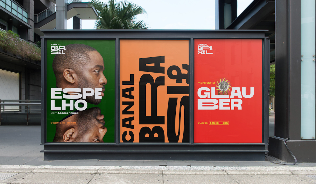
Can you run us through the concepts and ideas behind the custom font?
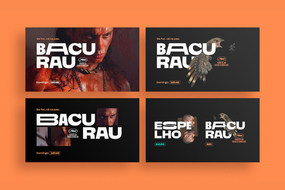
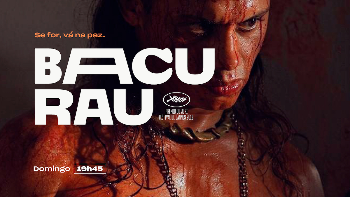
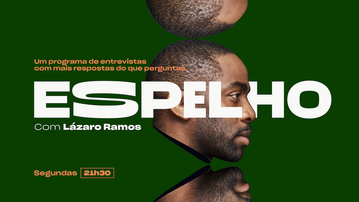
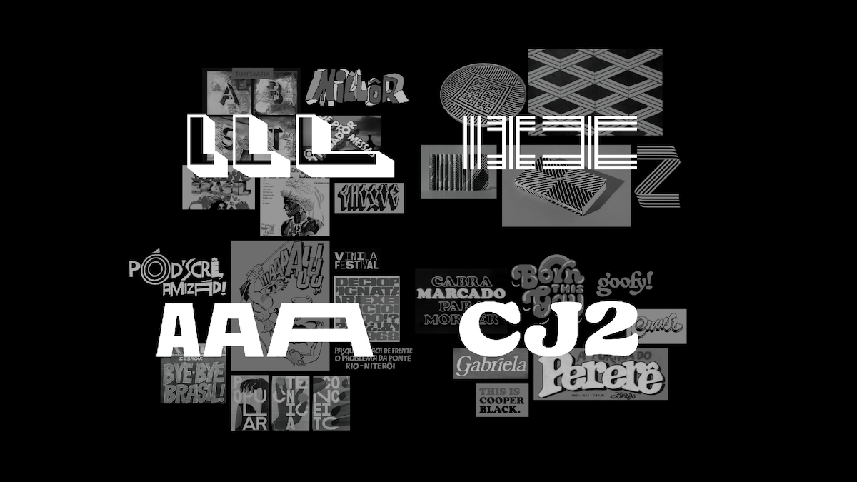
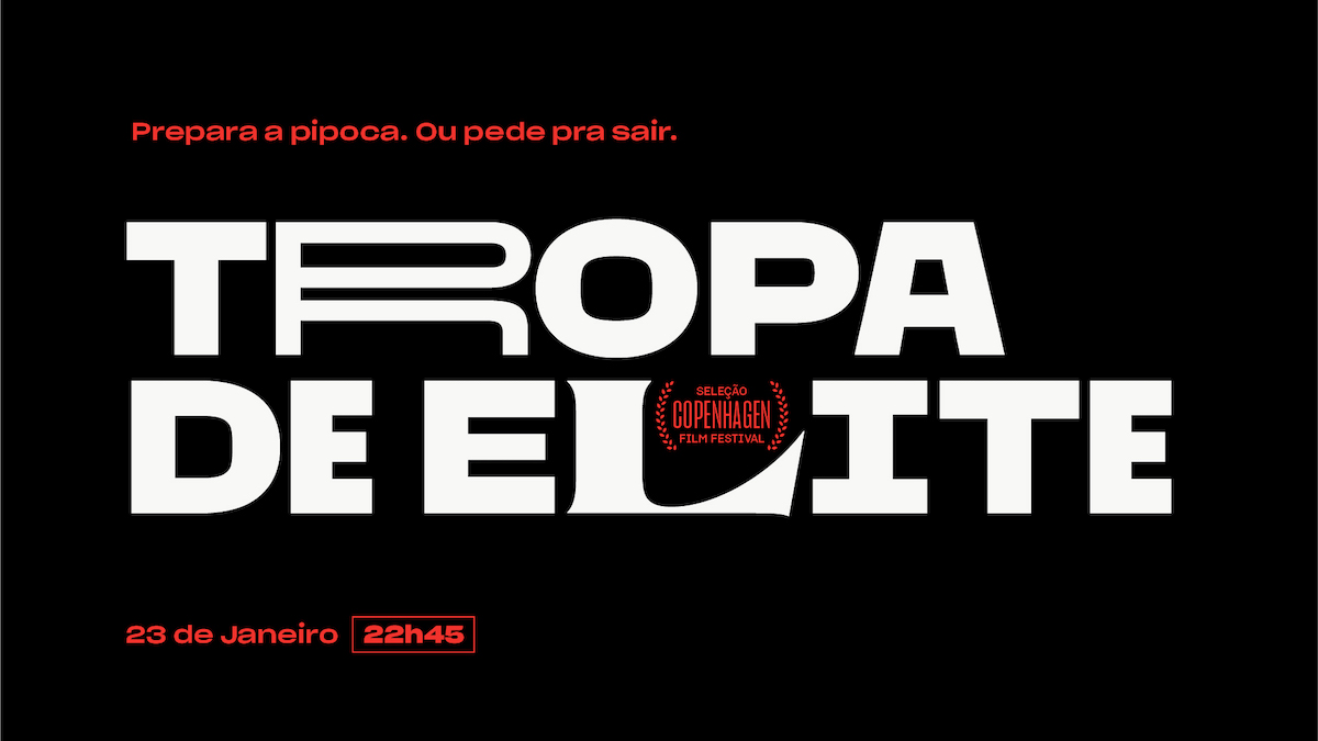
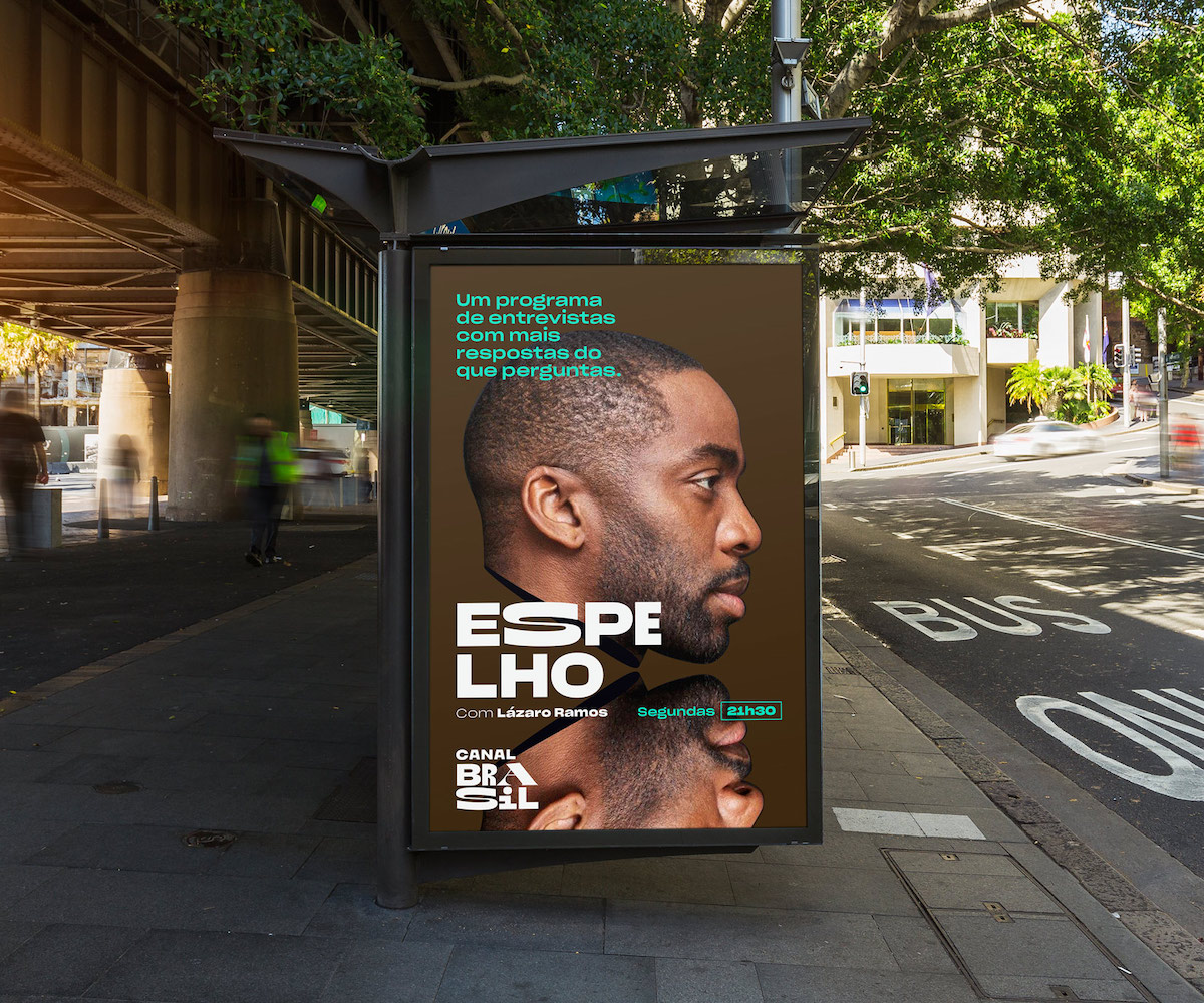
The visual (or typographical) identity created by Tátil and its head of design, Daniel Escudeiro, highlighted Brazil’s cultural diversity. After lots of deep research in Brazilian culture and rich design experimentation, the result was a flexible motion-based language that needed one major resource: variable fonts. That’s when we came on the scene to help them out. Type combination was the goal from the very beginning, but having to manage multiple typeface licenses and create rules for the mix and match of each proved a hard task. Making a typeface from scratch was a good project and business decision.
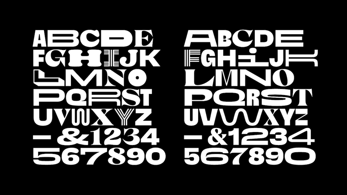
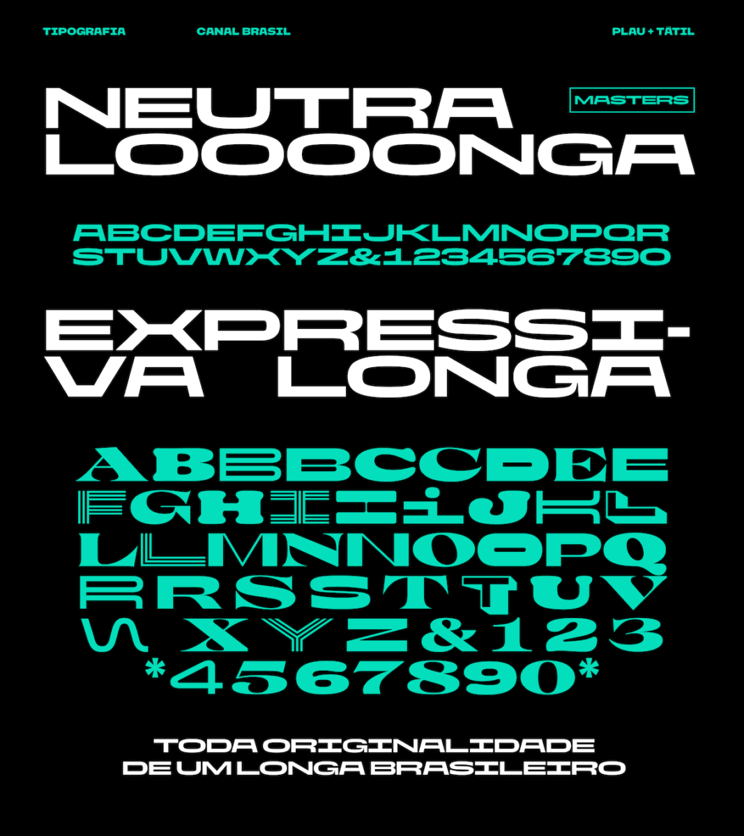
Tátil developed a very strong concept and visual language as well, so our job consisted of expanding the approved language in a variable font with two styles (Neutral and Expressive) and three widths (Condensed, Regular and Extended). They gave us very precise direction, but there was room to help them define certain styles that were not finished pieces yet.
We also developed numbers, diacritics, punctuation and special characters that weren’t really done before we entered the project. The highlight of the process was the “real exchange” between the two studios in the search for the ideal balance that represented the diversity of our people without losing brand perception, and also the freedom the client gave both of us to do our best work.
Can you tell us about the physical process of creating the font. Were there any specific challenges or breakthrough moments?
We had a 3 month delivery scheduled that we split into beta stages. We had to move fast and prototype small experiments so that we could exchange information with the motion team working on non-variable supporting Adobe After Effects.
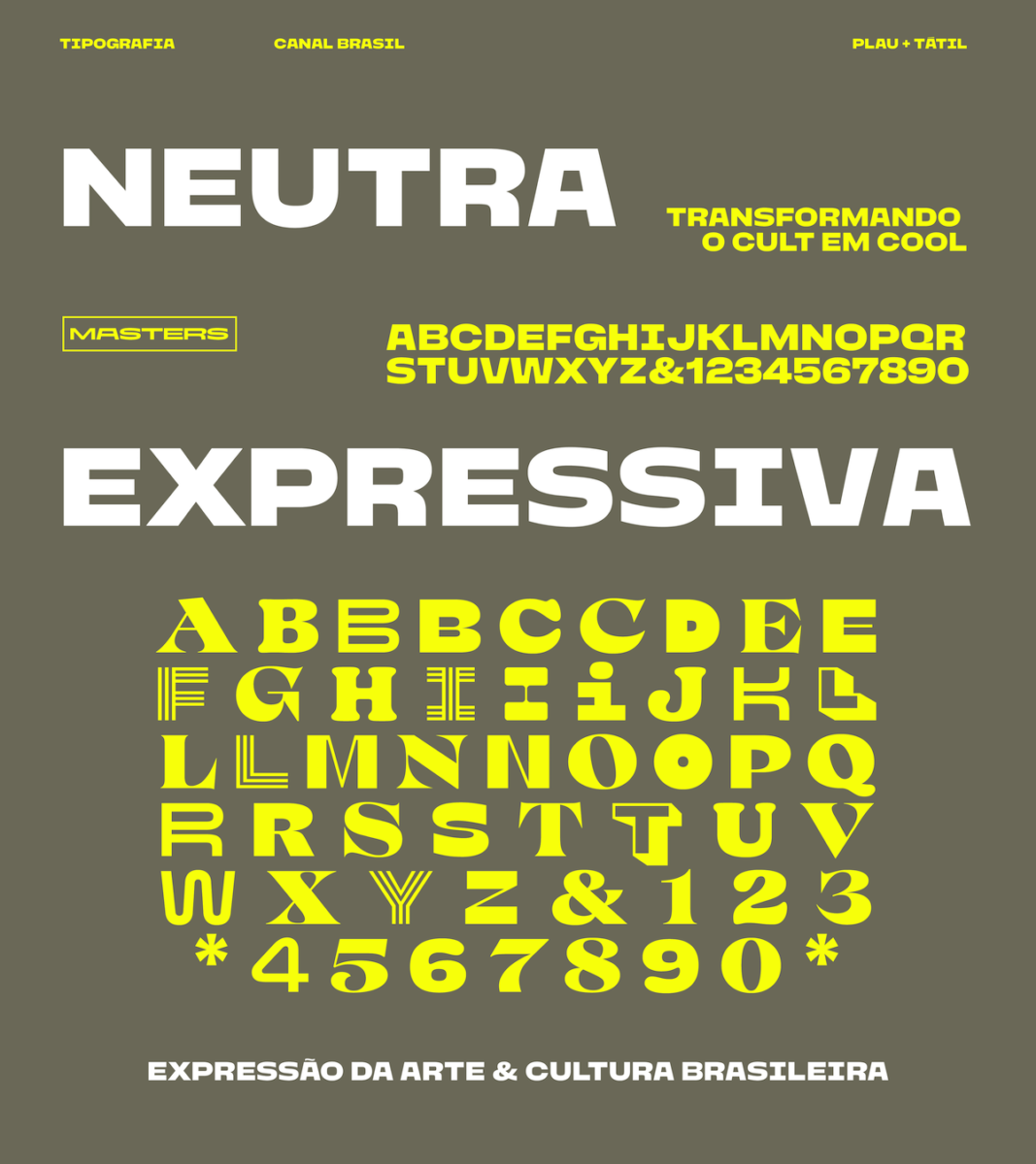
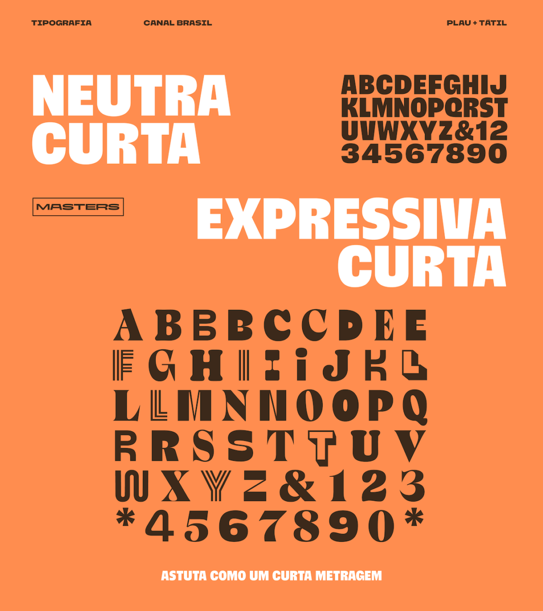
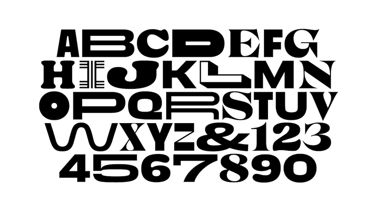
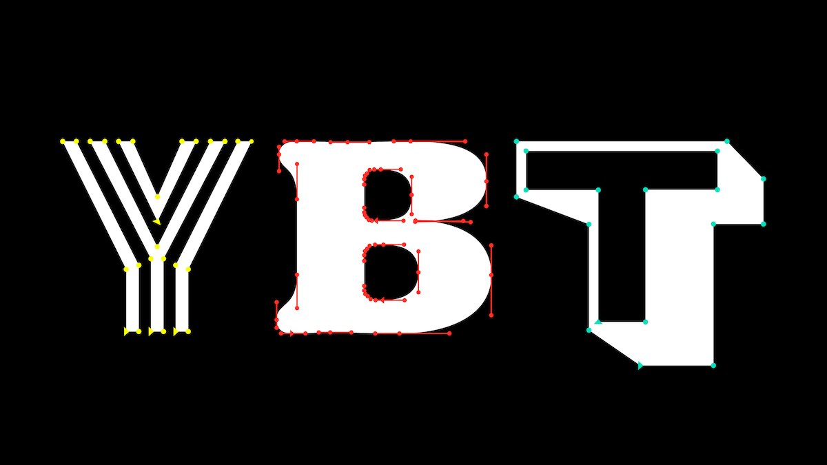
The typefaces we design usually start on paper. As soon as the concept is set we take it to GlyphsApp and shape small sets of words that will be discussed and submitted to the agency and client for approval as Betas. In the case of Canal Brasil, in addition to the conceptual challenge of finding a graphic unit using a wide variety of typographic styles, the most arduous task we performed was to make one of the biggest attributes of the identity work well: the smooth motion between styles. In order to make it happen, we had to draw each letter with the same number of points – be it a neutral grotesque or a Latin serif with flair. For example, the letter ‘I’ has 60 points, whereas a standard letter ‘I’ is composed of only four.
Handover to the client, considering the little support for variable fonts in non-design (and even some design) software was probably the single most challenging aspect on the client side. They even had to write custom software to speed the workflow of animation. But doing so without variability would be probably three times as hard, as it would throw the smooth flow animation responsibility onto the animators.
And lastly, from your perspective, what do you think clients are looking for when it comes to creating a custom font, and how do you go about creating with your clients’ needs in mind?
Nowadays we can say that clients or agencies come to us to design custom fonts for three main reasons. The first one is certainly originality and differentiation. With increasingly faster and multichannel communication, whoever is perceived more immaterially ends up taking some advantage. The second is the storytelling of the brand purpose that a tailor-made font can deliver. Each visual message of the brand – however simple it is – can carry a part of the brand strategy. And the last reason has been that of economy. And economy in several ways, such as financial (a custom project can cost much less than a large-scale licensing of a retail font), and time, since the license to use tends to be much more flexible and truly specific to each client’s needs.
Thank you, Plau!
Credits:
Rebranding ––– Tátil + Globosat
Custom Typography ––– Plau
Creative Direction ––– Tátil (Daniel Escudeiro)
Type Design & Production: Plau ––– Carlos Mignot · Rodrigo Saiani
Graphic Design: Ana Laura Ferraz · Carlos Mignot · Rodrigo Saiani
Motion
Leon Vilhena / Globosat
Sound Design


