
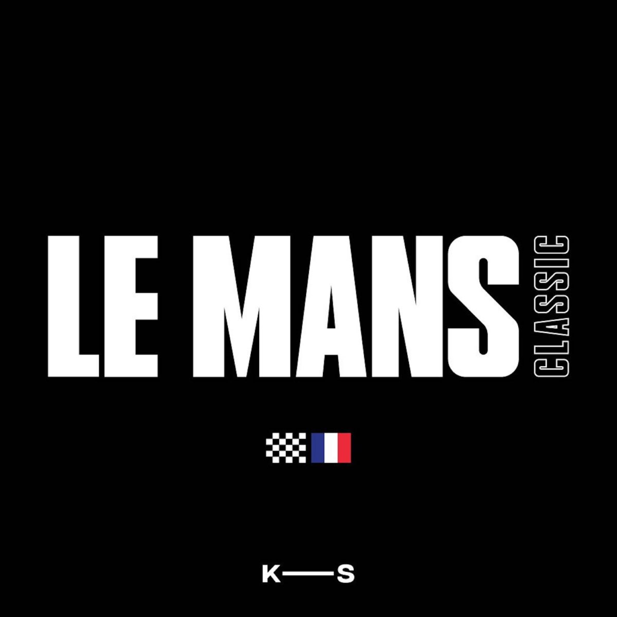
Founded by the Dutch born Australian designer Jake Keijzers, Kazer Studio (@kazerstudio) takes its name from a simpler pronunciation of the designer’s last name. A Creative Design studio focussing on Type Design and Brand Identity, Kazer Studio’s fonts Le Mans and Fluro are available on Type Department; the former inspired vintage motorsport racing, the latter a modern, minimal Sans Serif hybrid. And, newly released, Studio Kazer’s display font, Hologram, is now available on Type Department.
‘After studying Industrial Design at University, I quickly unearthed the aspects of design I liked and disliked,’ recalls the founder, ‘and I found I was super interested in the digital and 3D modelling aspects.’ Keijzer’s decisive approach and masterful grasp of draughtsmanship, appearing to shine through from his cross-disciplinary background, feels present in all of Kazer Studio’s output to date. ‘Having the ability to sketch up a vector in Adobe Illustrator, and to bring my ideas to life in next-to- no time, fascinated me,’ he continues, ‘so, naturally, I wanted to learn more and began (and still continue) to self-teach through watching YouTube videos.’
As type design has been Keijzer’s most recent venture into a new visual facet, he reflects upon his expanding knowledge, explaining to us, ‘I had never understood the complexities and amount of work which needed to be put into font design until I tried it myself… It was so rewarding to complete it and see the letters I’d designed appear as I typed – and it was quite a bonus to earn some money from it, too!’
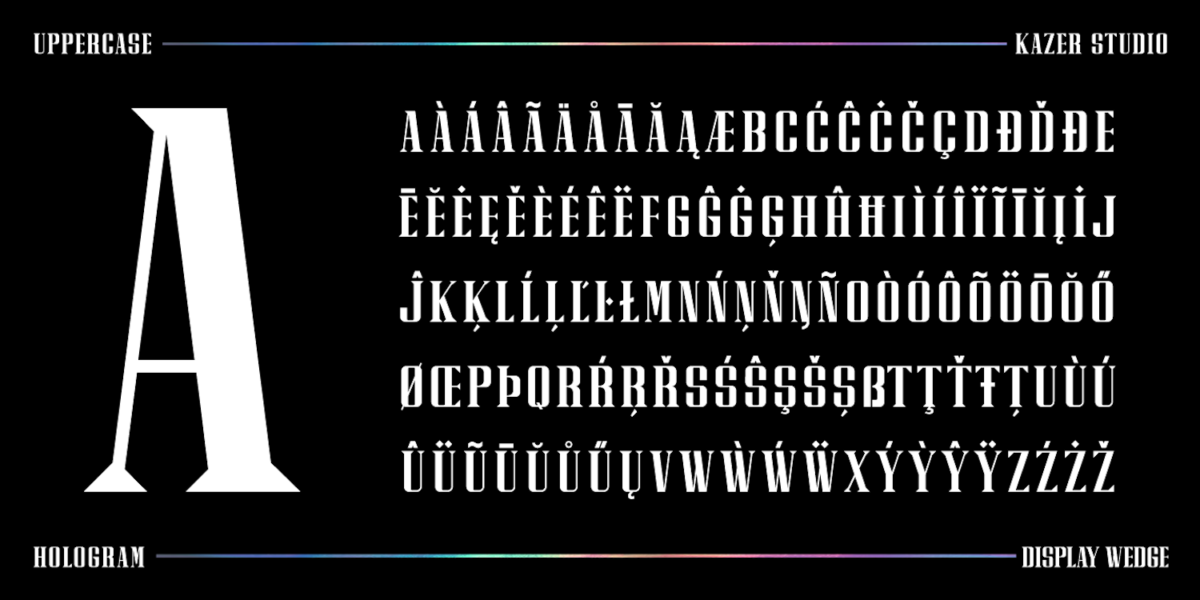
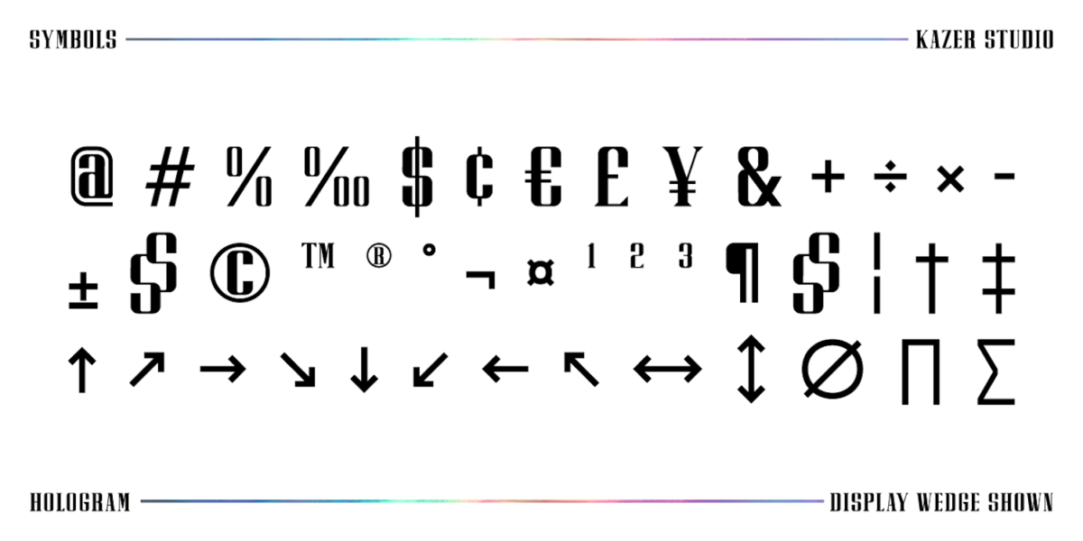
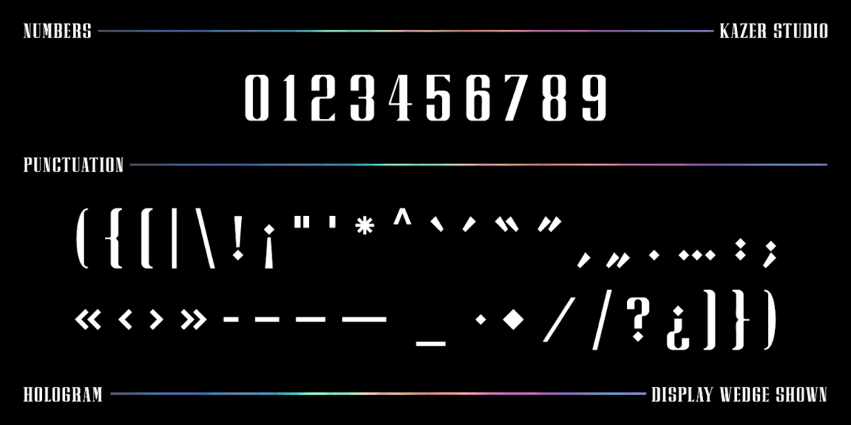
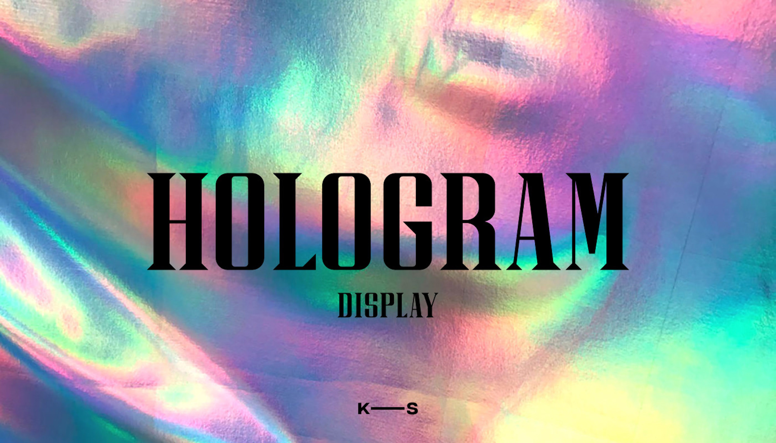
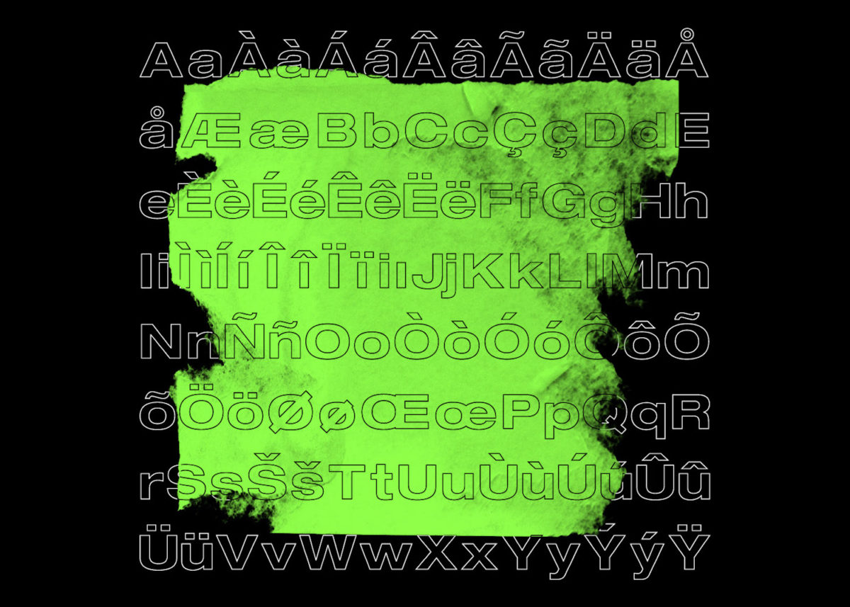
Kazer Studio’s newest release, Hologram, is a display font inspired by knitting together the future and the past. The font was produced specifically with larger display purposes in mind, and comes in three distinctive and polished styles: Display Sans, Display Serif and Display Wedge. Each style contains over 350 glyphs and offers support for up to 26 languages. With the option for specialised spacing and kerning, the display is super versatile and makes an undeniably bold statement.
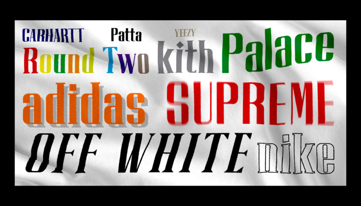
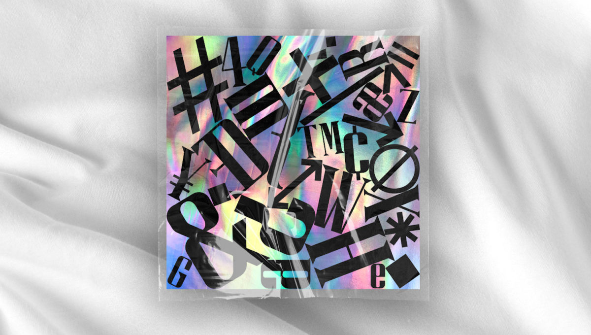

The Sans style is the cleanest of the three, whilst the the Serif features the most definitive structure; including predominantly horizontal serifs at the ends of character strokes alongside the odd vertical detail. We particularly love the Display Wedge style, which features thick and thin triangular serifs at the ends of character strokes – tying together a futuristic visual dimension with a streamlined, classic feel. The future of Kazer Studio looks to be pretty exciting, with plans to delve into the release of Variable fonts as well as lots of new Brand Identity projects.


