
Since its formation in 2009, MuirMcNeil (@muirmcneil) has been occupied with the exploration of systematic/algorithmic methods in visual design; experimenting broadly across moving image, graphic design and, of course, type. Founded by Paul McNeil and Hamish Muir – both of whom have impressive and expansive backgrounds in type/graphic design – the foundry takes an innovative and unique approach to creating their own visual language, allowing method and process to pave the way.
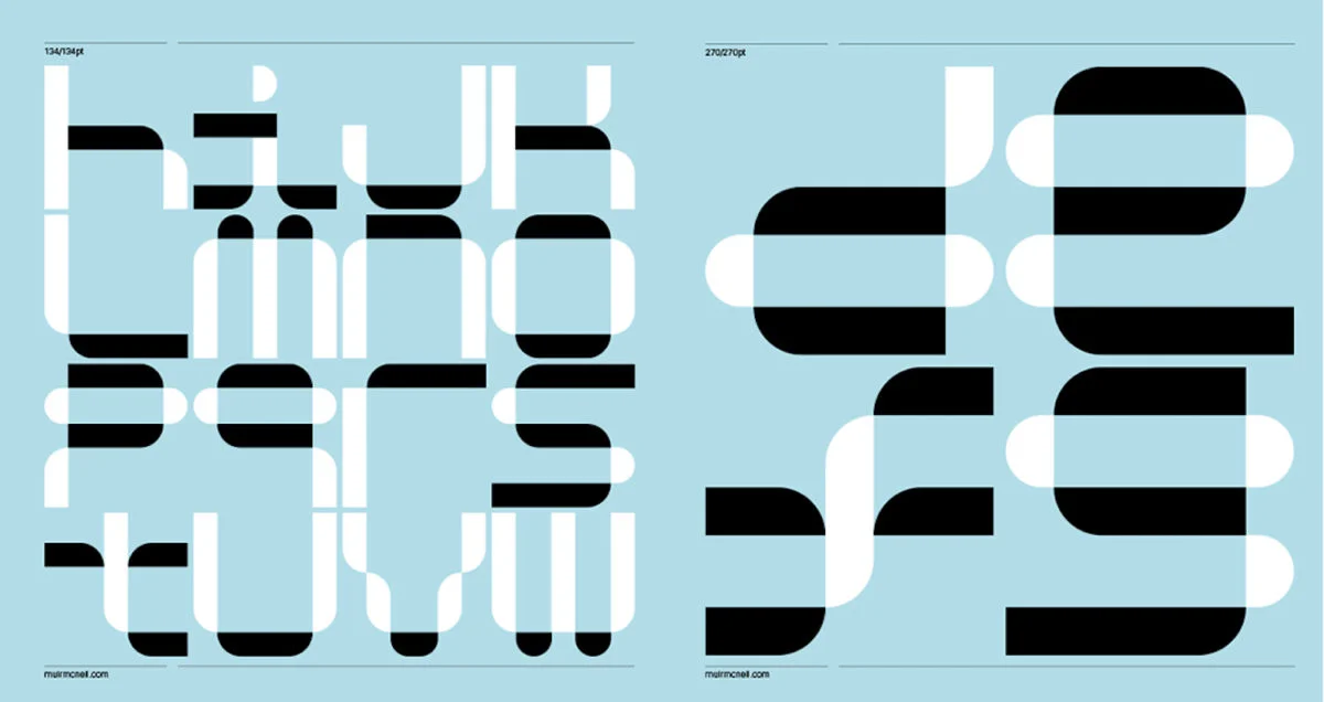
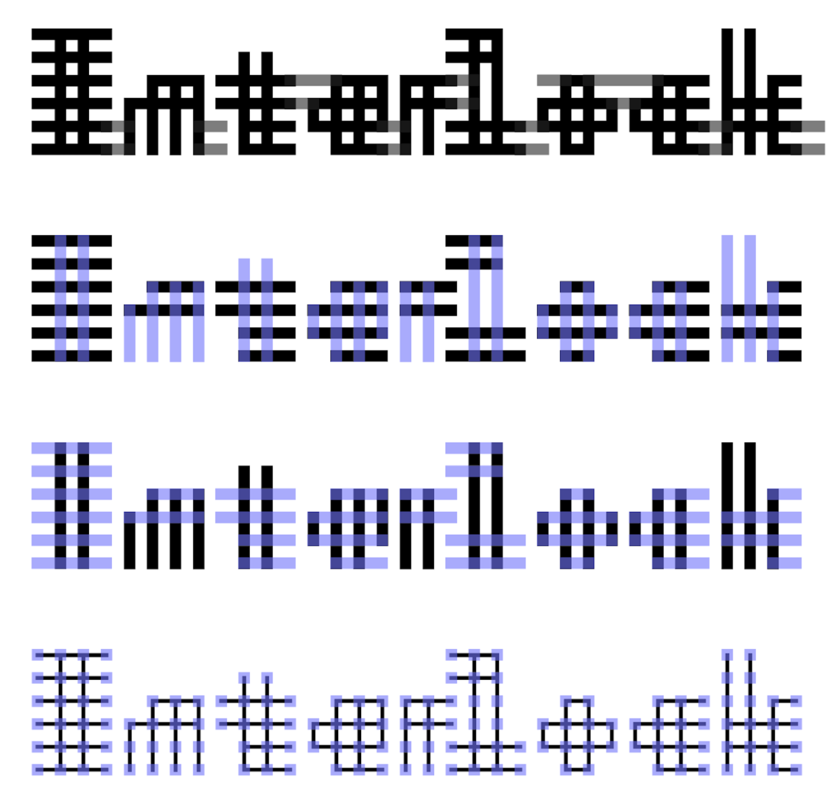
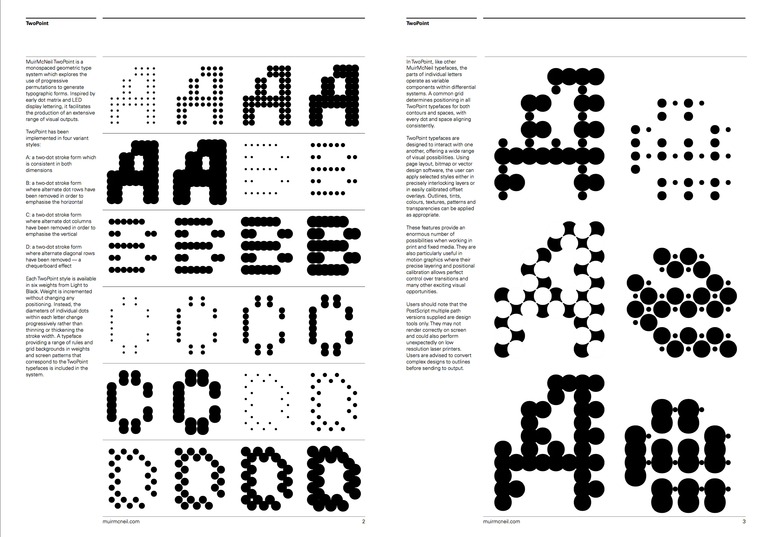
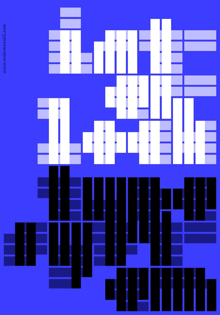
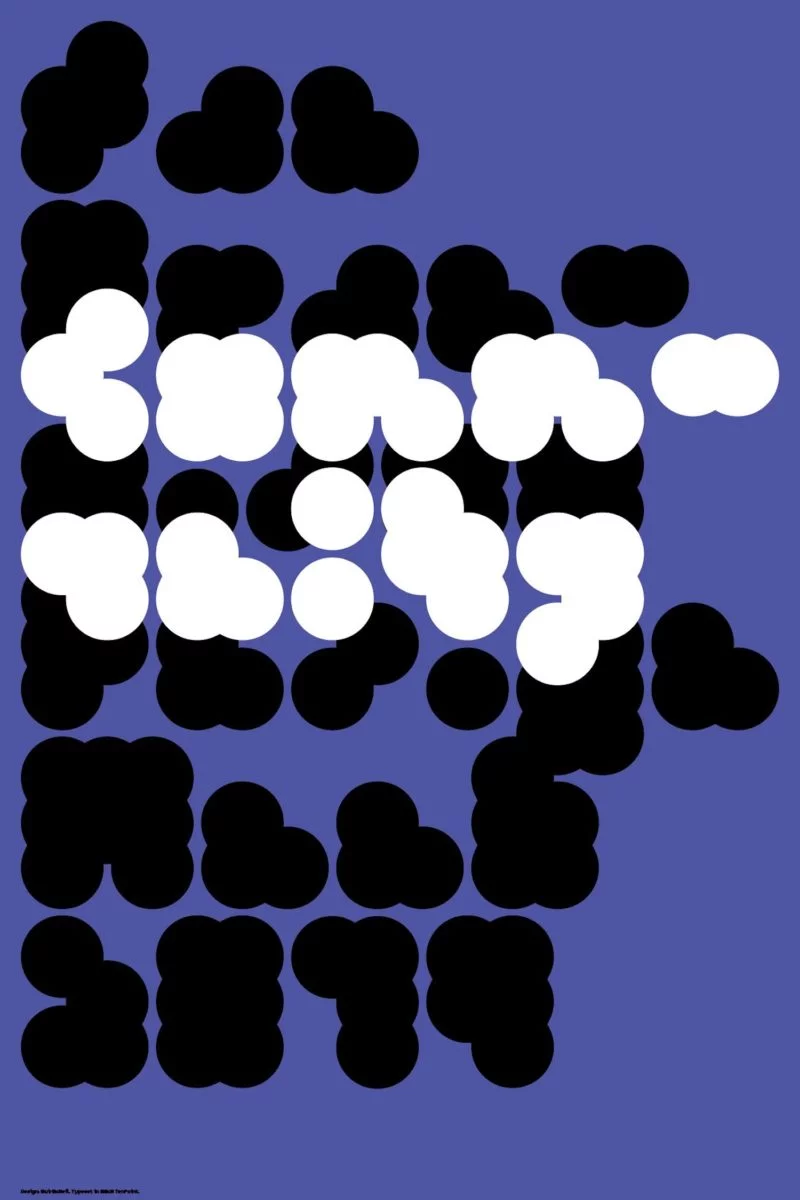
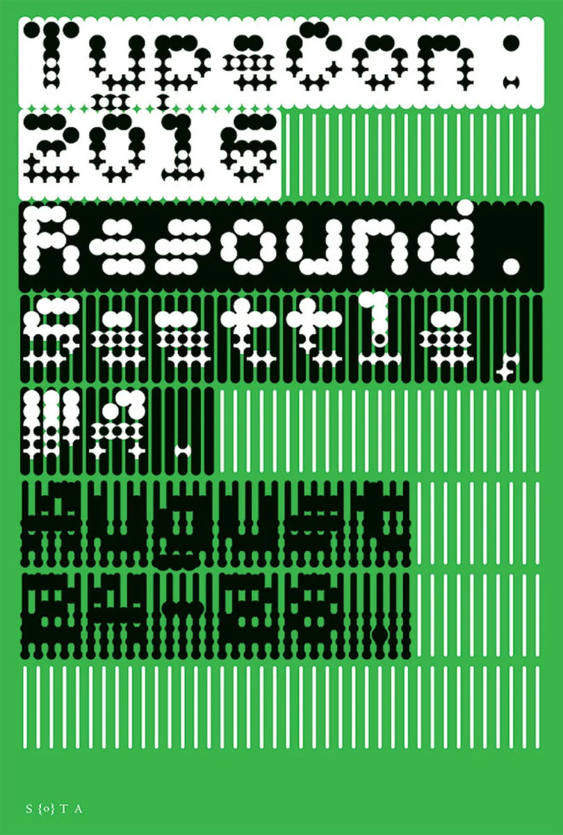
MuirMcNeil’s recent explorations include Interlock and TwoBar Mono. Both experimental type systems, Interlock is a geometric bitmap type system which is built around a set of four background grid typefaces (each corresponding to Interlock’s styles and weights) whilst TwoBar Mono is a mono-linear, monospaced type system in nine weights.
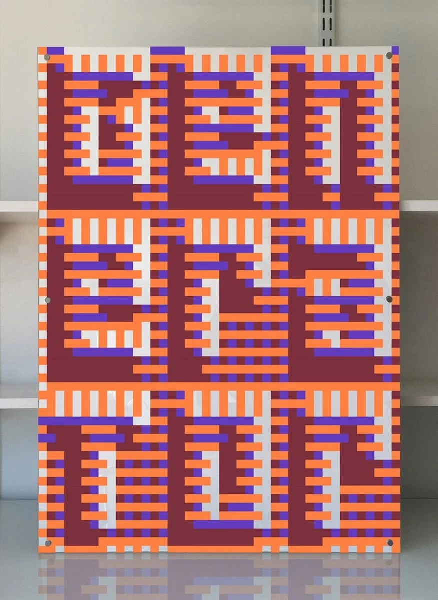
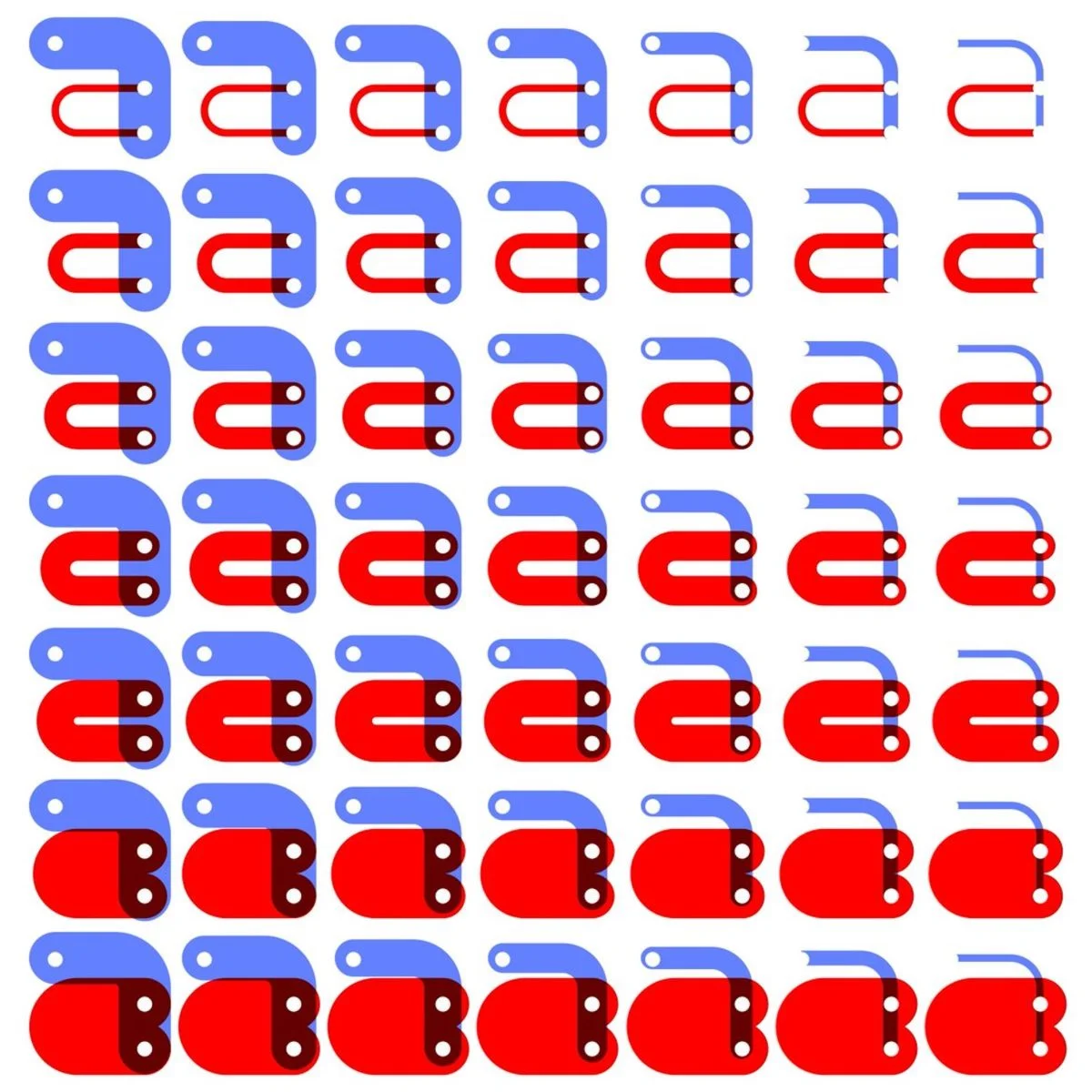
We particularly love Interlock, which behaves differently to traditional typefaces and results in the fascinating construction of tonal, textual letterforms and glyphs which interact in truly unique ways. Whereas traditional typefaces are built around binaries of form and counter-form – or positive and negative space – Interlock plays with incremental intersections within each form. The glyphs layer and conjoin in precise ways to highlight the facets of letterforms which are usually glossed over, or rendered less visible; promoting a strikingly new and experimental way of viewing typographic design.
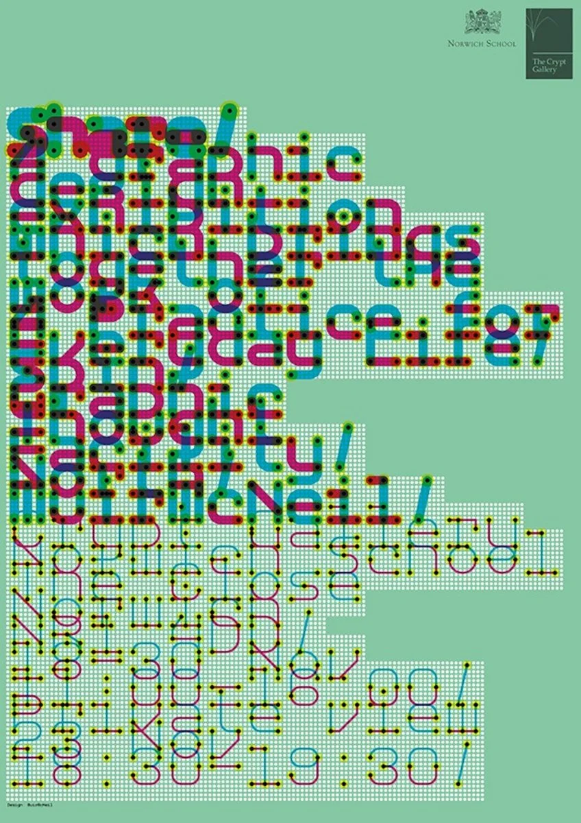
Their experimental type systems can be seen put to work in astonishingly inspiring ways. The Unity of Form poster, developed for the San Francisco Design Week 2019 exhibition and charity auction, ‘CommUNITY,’ makes a reverent visual and conceptual statement. Playing with the idea of unity in shape and from, the poster utilises MuirMcNeil’s TenPoint modular type system, and is constructed using one singular form which is layered and arranged repetitively to create the letterforms; stripping back type design to the simplest of forms and bringing a feeling of collectivity and wholeness between the glyphs.
MuirMcNiel’s success feels routed in their ability to render type design which encourages the eye to see something else – or something beyond – the visual outcomes of their work. Through Interlock they create a tangible response to theoretical design concepts, and question the ways we see, approach and interact with typographic design. The fundamental rigour behind their various type systems creates a plethora of fascinating works which push the boundaries of type design, and visually entertains and opens questions surrounding the ways we process, distill and clarify information on a border scale.


