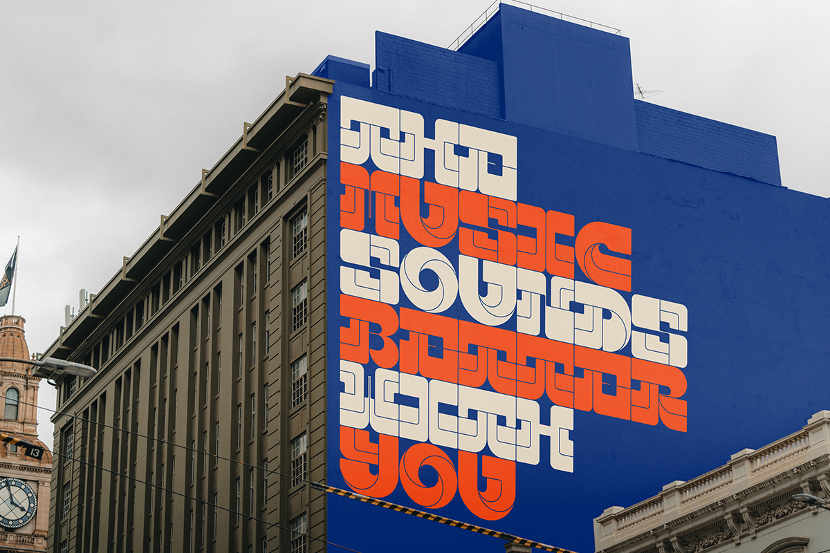
UBERDANK is an innovative new display font deigned by Alan Cheetham, the graphic designer behind the brand identity and custom type oriented A Studio. Alan doesn’t usually create commercial typefaces, meaning UBERDANK‘s addition to Type Department is a very special offering from the studio; ready to bring a taste of bold, retro charm in your next project.
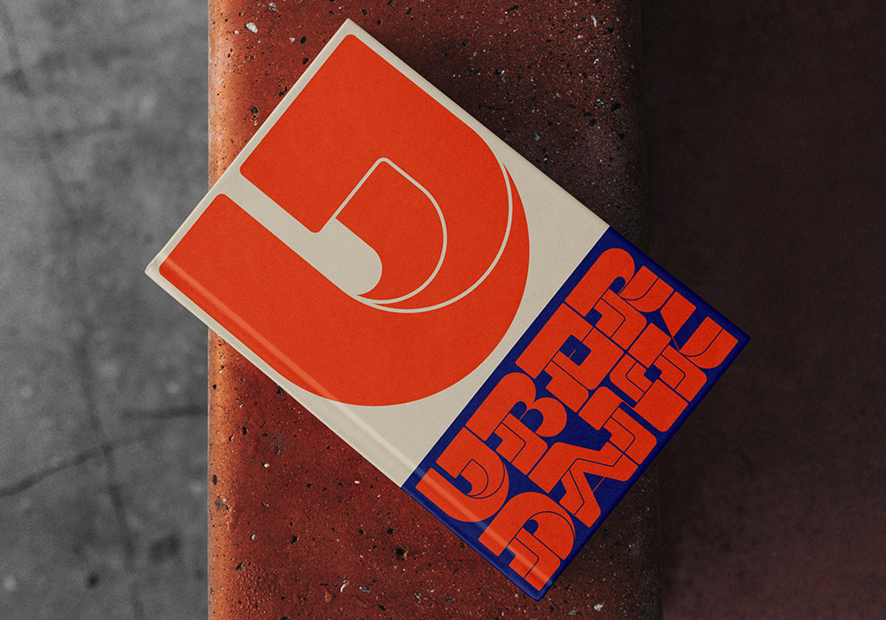
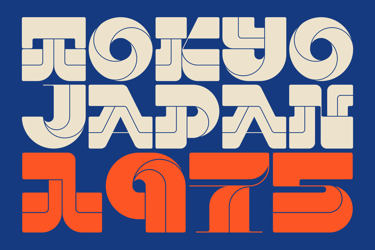
Having participated in the 36 Days of Type challenge for the past five years, Alan tells us he would usually use the time to go all out creating experimental, standalone letterforms, unique from one another. This year, however, he decided to try out creating a coherent set over the challenge that could be adapted into a unique, bold font – the final result being UBERDANK.
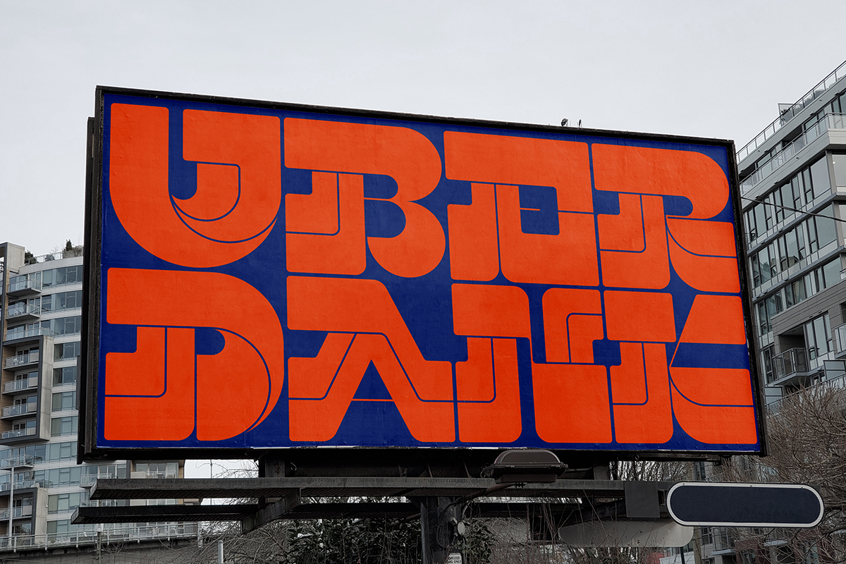
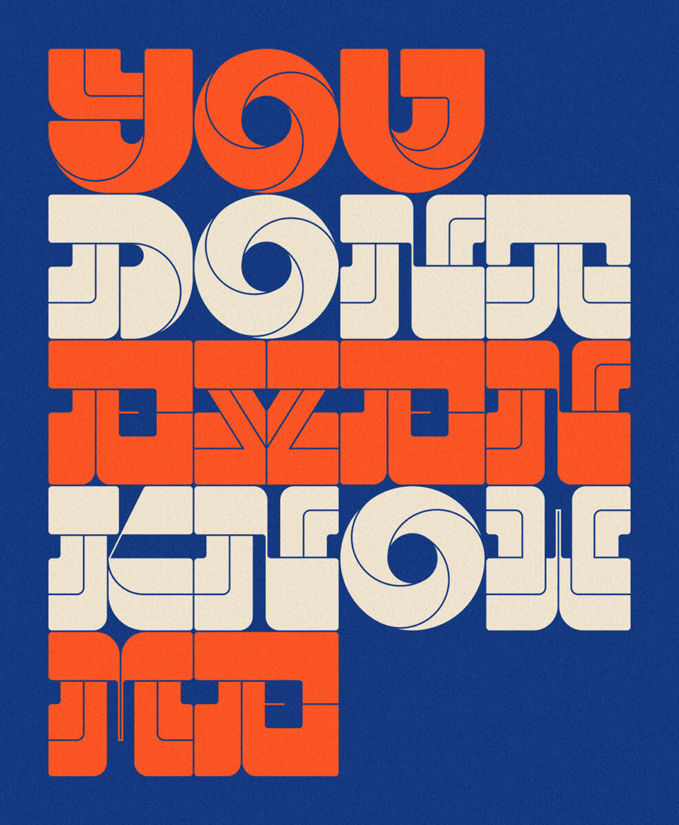
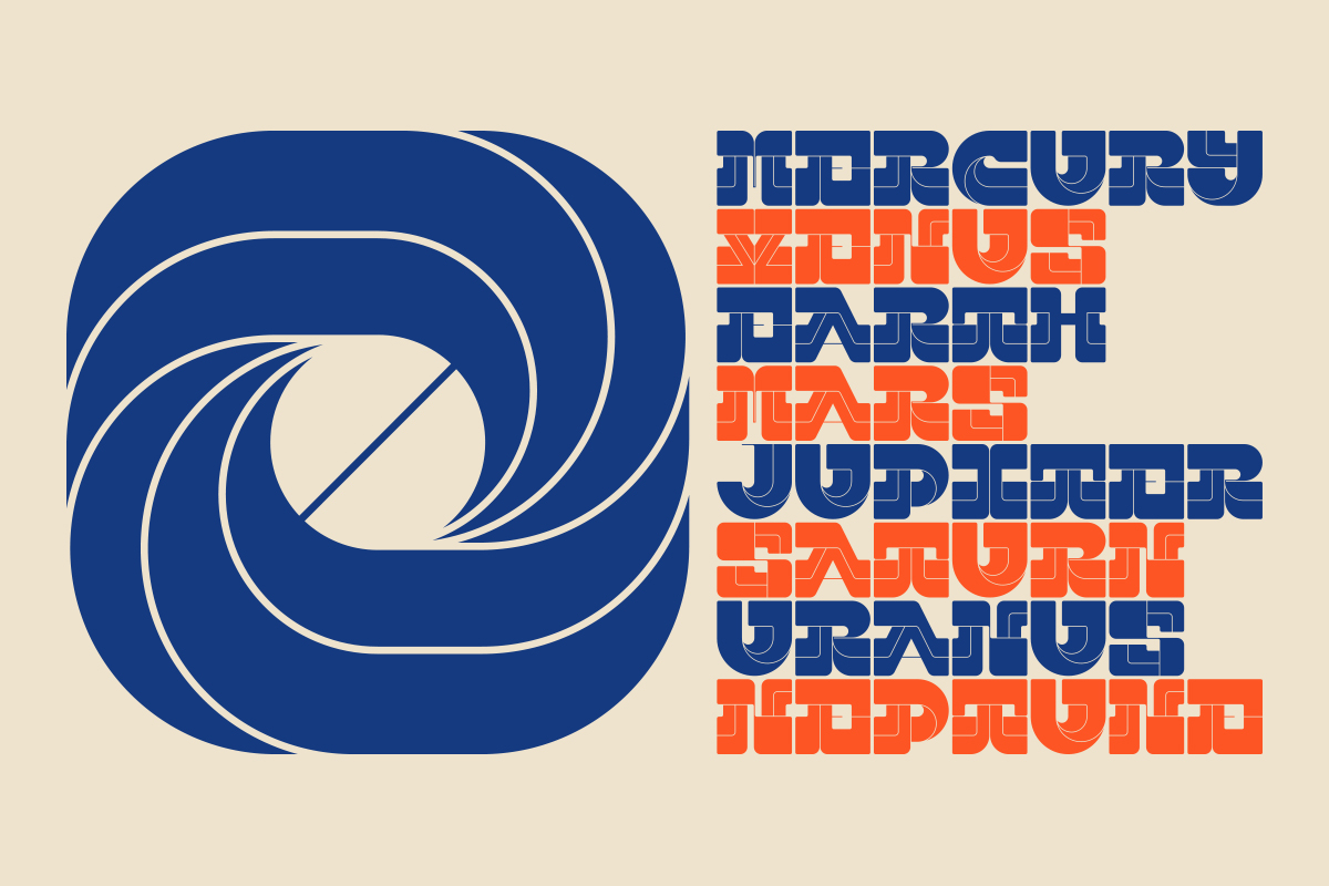
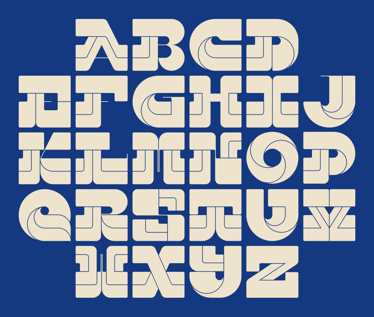
“The main design features of UBERDANK are definitely within the subtle but highly effective line work that runs consistently through each letter,” says Alan. “This subtle keyline feature not only helps each character flow into the next, but creates a sort of stencil-like quality that helps provide a sense of greater visual impact for bold headlines or even distinctive logo design.”
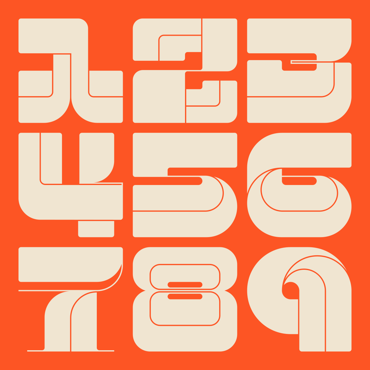
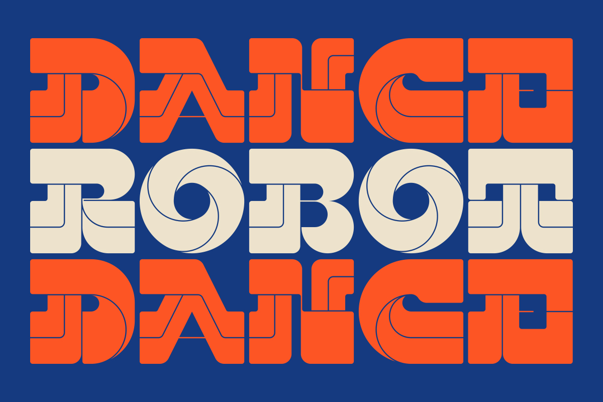
Aside from UBERDANK‘s bold visual impact as an innovative, retro-flavoured font, its forms are also designed with a unique structure. “It is both a highly compact modular font and a mono weight font,” Alan explains. “Each character has been designed on a perfectly square grid structure, which makes UBERDANK ideal for stacking and tessellating, maximising space application.”
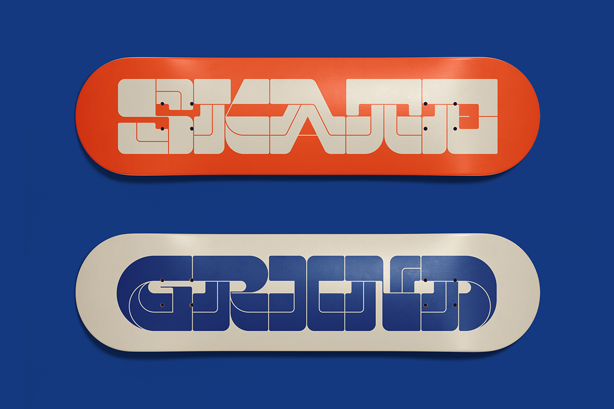
Most effective for punchy headlines in both digital and editorial, large scale print and logo design, UBERDANK is perfect for contemporary designs looking for striking, high-impact type – bringing a unique edge with a retro undertones. Check out UBERDANK on Type Department to explore what it can do for your next project.

