Custom fonts are a steadfastly popular way that brands connect with customers in a unique, memorable voice. “If a brand is a person,” Mucca studio founder Matteo Bologna has said, for example, “its custom font is like the sound of their voice…Any thought expressed by that person will be reinforced by the sound of their voice.”
Over the last few years, we’ve seen tons of brands jump on the custom font bandwagon, with type becoming a more and more central graphic element of visual identities. If you cast your mind back to January 2021, you’ll remember Burger King’s new visual identity, complete with a custom font, whilst brands such as McDonald’s, Universal Studios, Forever 21 and many more have refined their logotypes or refreshed their typographic voice. More recently, M&M’s revealed their new ampersand-focused rebrand, designed to signify inclusivity and togetherness. Their new look was also dropped with their very first custom typeface (although the idea of a brand based on ‘inclusivity’ has received some critique, given the ethics of the operations at companies like M&M’s).
To get straight to the source, the creators and foundries behind the fonts, I spoke to the talented folks at KOBU Foundry. They share what makes a good custom font as well as why fonts are so powerful for brands.
Hi! Firstly, what custom fonts have you created at Kobu Foundry?
To this date, KOBU Foundry has released two custom font families, and we have a third in progress that will be revealed later this year.
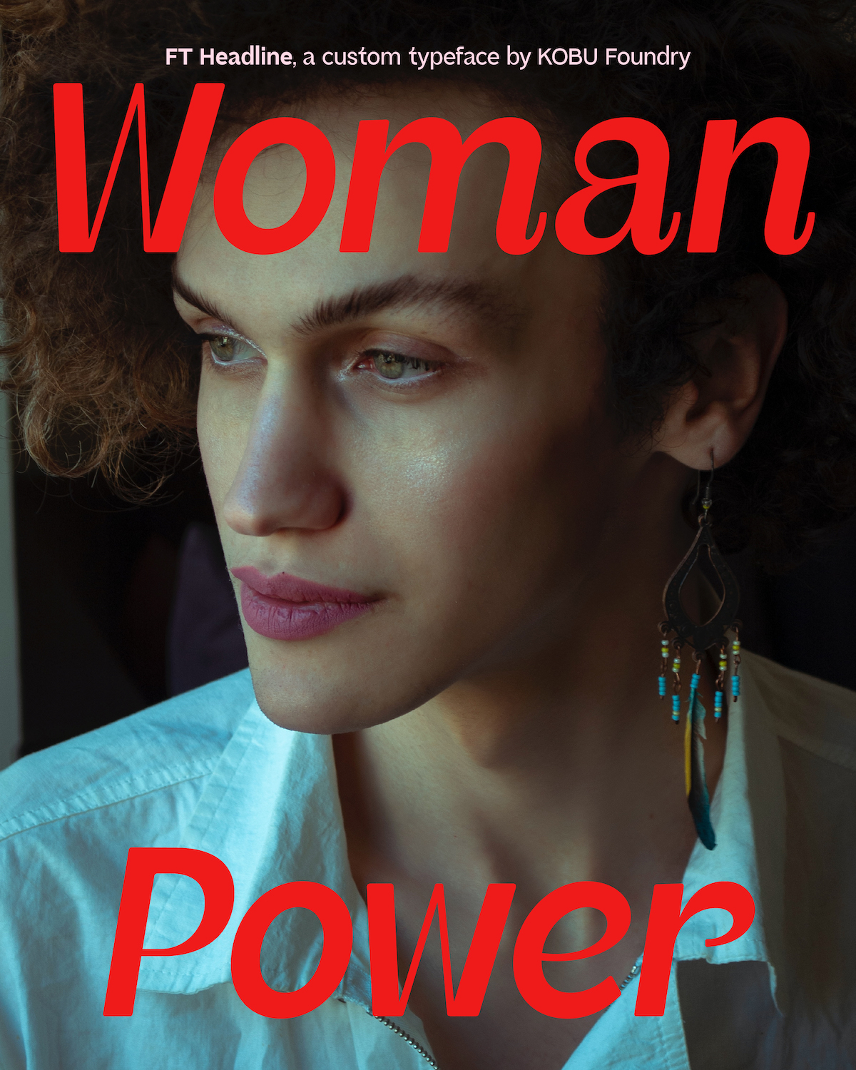
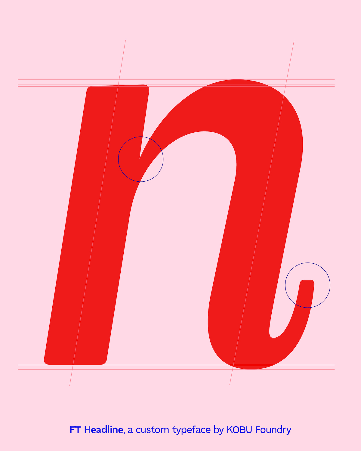
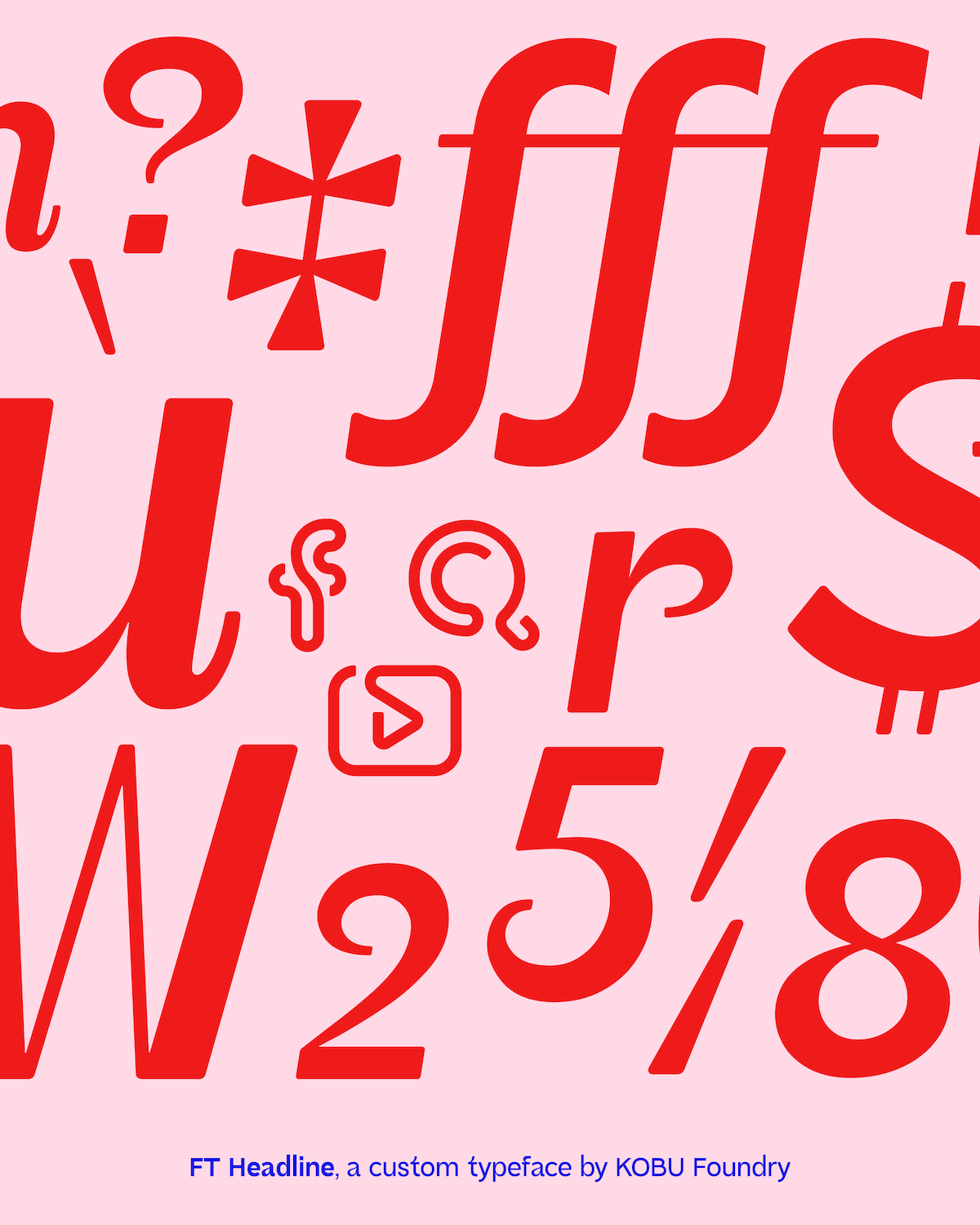
Facialteam rebranding, 2022
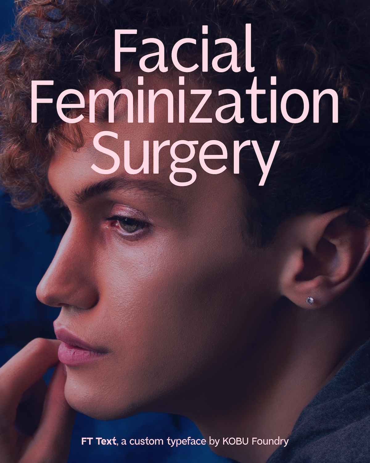
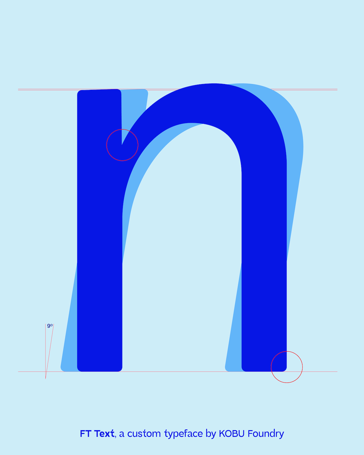
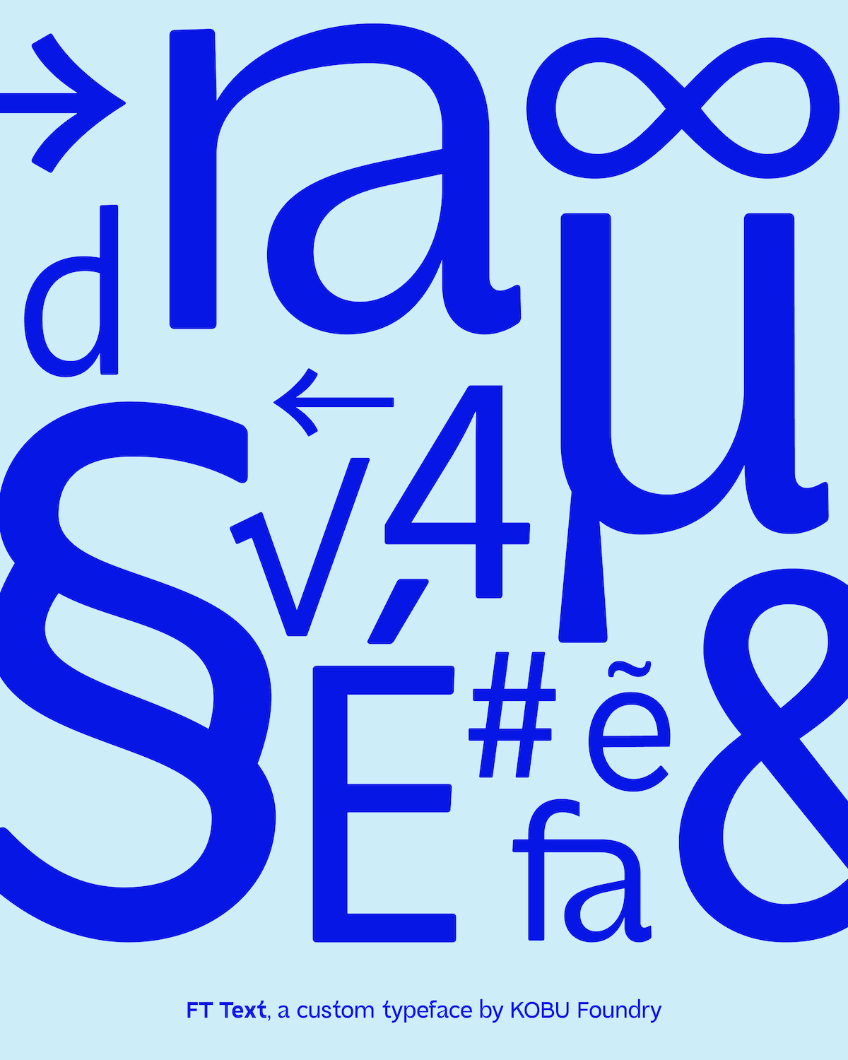
As we worked closely with Facialteam to rethink their branding efforts, we felt that custom fonts would really add value to their perception. This gave rise to a font family comprised of three different typefaces: FT Headline + FT Text + FT Icons. They are world leaders in facial feminization surgery and have more than 15 years of experience empowering the transgender community.
The brand needed to express its core values visually and so the typefaces were also designed with the brand’s social impact in mind.
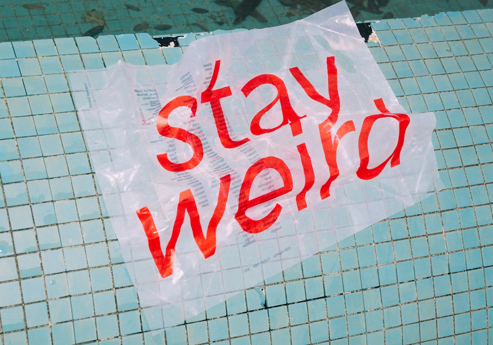
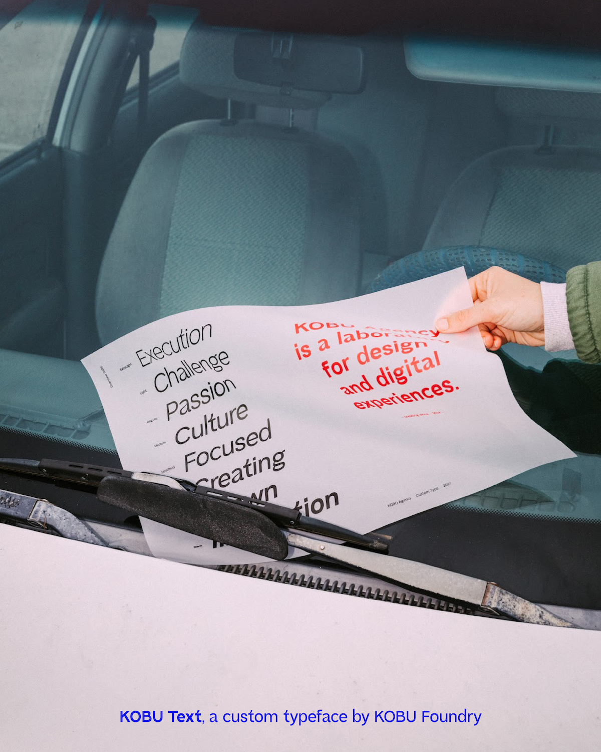
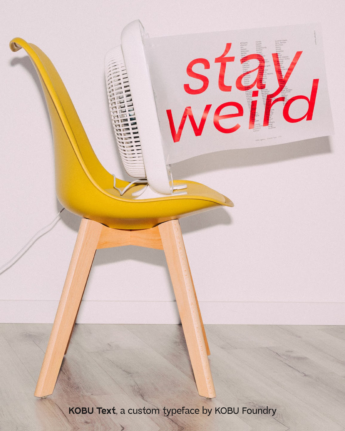
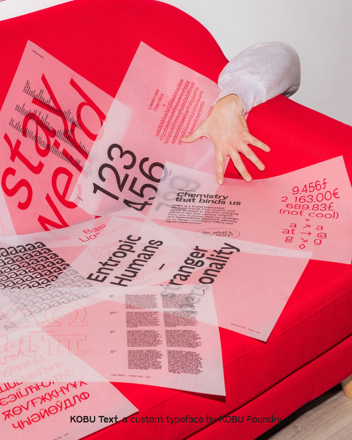
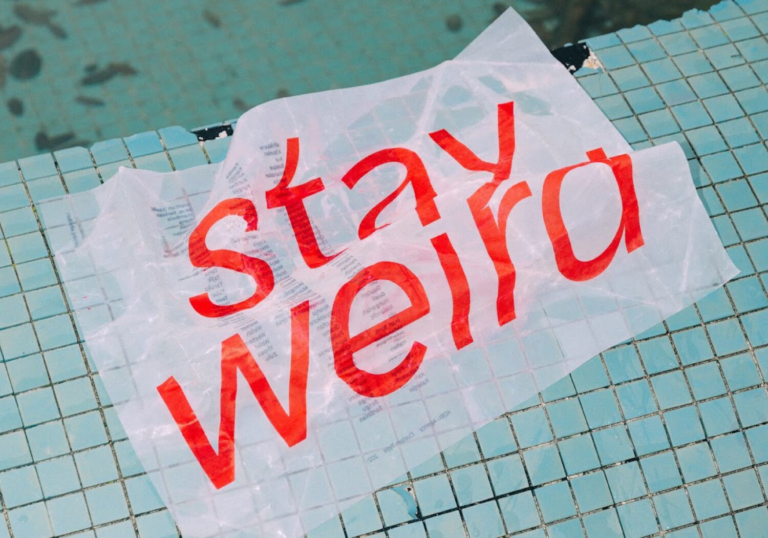
KOBU Agency rebranding, 2021
KOBU Headline and KOBU Text were created between 2020 and 2021 as part of the agency’s rebranding. As we started exploring our core pillars (“Stay weird. Push boundaries. Find meaning.”), and having launched KOBU Foundry one year before, we felt we needed to have a way to visually communicate our mission, and typography needed to be a tool in that process.
What difference does a custom font make to the process of building a brand?
The most obvious impact is the time it takes to implement a rebrand. Our creative process leads us through several stages of surveys, interviews and brainstorms with the client before delivering the creative concept, and we incorporate the typeface ideation within this already established process. In the end, building a brand identity is literally generating identification both with the company’s stakeholders and the brand’s target audience. Adding a custom typeface design to this process only makes this goal more feasible.
Typefaces can make or break a brand. In the last five years, we have finally seen brands embracing the design of custom typefaces. At KOBU, we are constantly looking for ways of building meaning into brands, and a custom typeface represents this additional layer of meaning: a design element that portrays a unique flavour of charisma and helps bring everything together. It must be a translation of the brand’s positioning.
For example, with FT Headline™, its grand and elegant design is a tribute to the transgender woman, visually exploring the sans serif charismatic beauty. At the same time, it conveys the empathy, femininity, elegance and premium sense of Facialteam.
What role does a custom font play in shaping the relationship between a brand and its customers or audience? And how do you as a foundry play a part in this?
Let’s take the example of FT Headline for Facialteam: we designed this custom font to speak directly to the heart of the brand’s tribe. All the edges of the font are rounded (though mildly) to ensure it would remain in line with the typeface of the brand’s logo. At the same time, it breathes inspiration from fashion and conveys a sort of elegance and femininity that we wanted to portray to engage with Facialteam’s patients.
Additionally, for the FT icons, we interpreted the overall concept behind the brand (“Your revelation journey.”), expressed through a continuous line. Thus all icons of the typeface are designed using a continuous line.
What makes a good custom font for you? What key things need to be thought about and integrated into the design process?
Legibility would be the key point that really needs to be considered for the font’s practical application. But the intangibles associated with the typeface’s design are as important: what sort of emotion does it convey? Does it feel premium? Is it fun? Is it aligned with the brand’s purpose and positioning in the market? We must ensure that the typeface reflects the brand’s personality.
As for the process, to begin with, the typeface design should always reflect the core creative concept behind the brand. Our typeface designer, Brígida, loves to kick off the project by interpreting the brand, its personality and its people. The next stage is to, explicitly or implicitly, capture all those elements into details of the typeface characters.
Do you ever encounter difficulties when agreeing on the design of a custom font with a client as a foundry?
Of course, as with any creative work or anything open to subjective interpretation. We do our best to ensure alignment as soon as possible and base all design decisions on clear and transparent criteria, to minimize difficulties at later stages. But we always need to compromise and ensure that the end result makes everyone proud.
What brands do you think are making particularly successful use of custom fonts right now?
We love what the guys from Plau did with the rebranding of Canal Brasil – they were able to capture the vibrant life and spirit of Brazil and convey that both visually and technically through the use of variable fonts.
Thank you!
You can find more from KOBU Foundry on socials, check out their latest font, Ereganto™ Serif, on their font shop or discover their 2021 Type Factory exhibition here.